Zune is long gone, but it left an impression on me forever
Zune was cool to me in spite of the iPod's domination.

Zune turned 13 years old in 2019, and that realization made me a bit sentimental. Yeah, it's long dead, and it never stood a real chance of challenging the iPod on a large scale. But Microsoft's plucky music player was innovative in its own ways, and it was cool to me despite its very uncool reputation.
In a world of iPods in every backpack, I was one of those weirdos carrying around the OG Zune after I saved up enough to buy one in 2007. Yeah, I understood the allure of the iPod then, and there was always the pressure to fit in. However, it was precisely because the Zune was so different that it appealed to me.
And when I say different, I mean it. For the young ones reading this, that original Zune was a heavy brick of a device that definitely didn't look as elegant as the iPods of the time. Instead of Apple's smooth click wheel navigation, you had to punch your way through songs using regular old buttons. Oh, the horror.
Despite its size, the original Zune had a lot going for its design, though. For one, it felt sturdy as hell; like you could chuck it through a wall and it'd be just fine. There was also the plastic it was made of, which had this super premium feel and a slight translucent quality that looked great.
Beyond its exterior design, though, it was the interface that really drew me in. You could tell Microsoft put a lot of care into not only how you sorted through and selected songs, but how it looked. The design felt fresh and futuristic. It was well beyond the iPod's boring, simple menus of the era. And though you were unlikely to run into many Zunes in the wild, Microsoft had this neat feature where you could quickly share songs with other Zune users. That was a big deal at the time.
I'll always look back on Zune as the piece of tech that left the biggest impression on me.
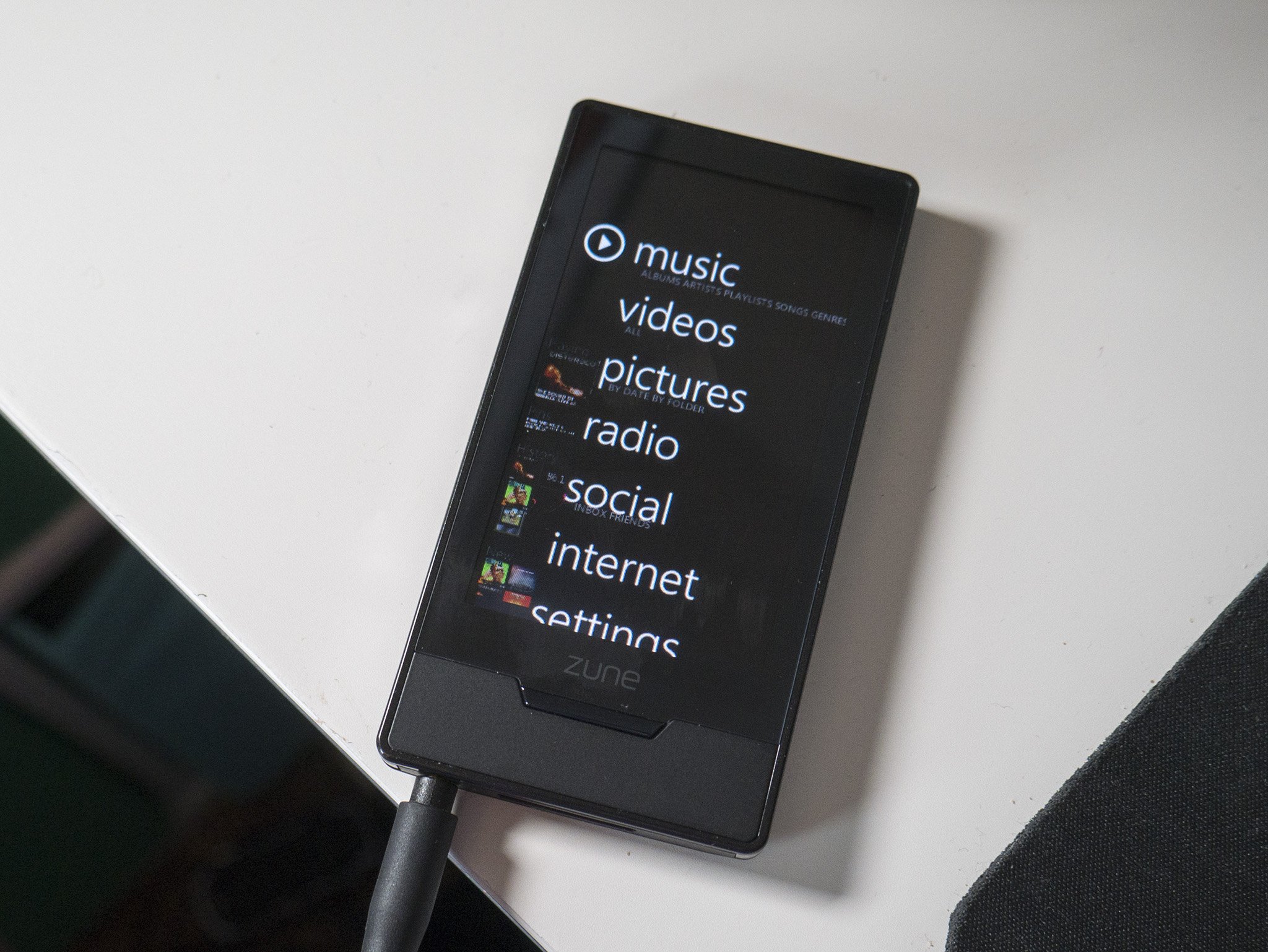
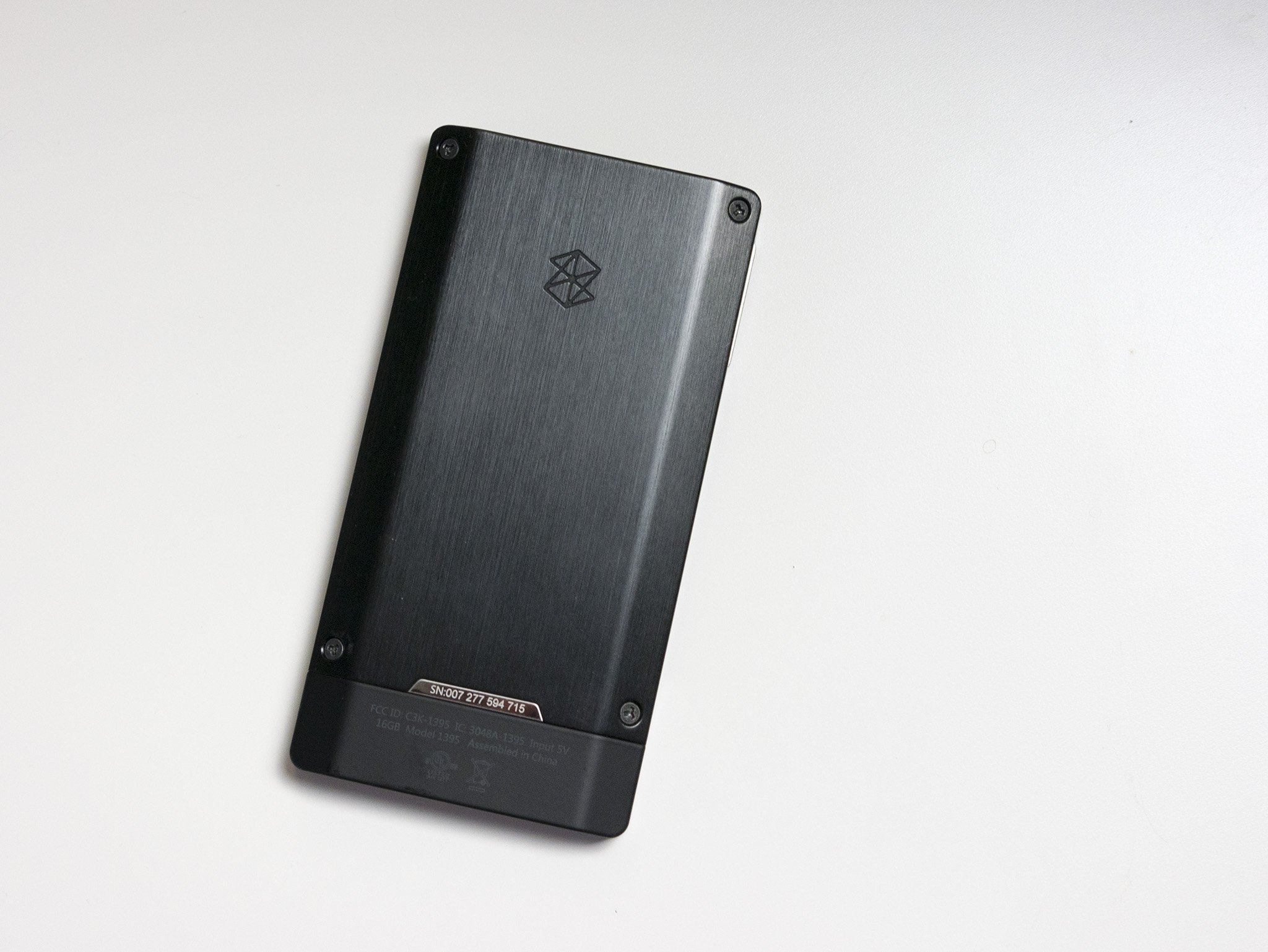
The chunky Zune went through a couple of design iterations in the coming years, slimming things down, altering the look of the buttons, and more. It was the Zune HD in 2009 that completely overhauled the look and feel of the player, adopting an elegant aluminum shell, a fantastic (for the time) OLED screen, and a redesigned UI that would lay the groundwork for Microsoft's Metro design philosophy seen in Windows phones.
The Zune HD was a bit of a revelation for me. It competed with the iPod Touch, adding support for apps (though there were few) and a web browser. In a time before I had yet to jump on the smartphone bandwagon, the Zune HD was my smartphone (so long as I was in range of Wi-Fi).
Get the Windows Central Newsletter
All the latest news, reviews, and guides for Windows and Xbox diehards.

But it was the Zune PC software and subscription service that really had me hooked. You could, at the time, subscribe to Zune Pass, which let you access and download millions of songs from the Zune Marketplace's catalog for a monthly fee. For a time, that also gave you 10 free songs to keep each month.
This was before music streaming with apps like Spotify was common, and it made the iPod feel like it was stuck in the stone age. It also fostered a sense of music discovery that was hugely important to me at the time. I found a ton of artists and songs that I never would have otherwise if I had the barrier of buying every track before I could listen to it.
Nowadays, we're spoiled for choice when it comes to having access to millions of songs within seconds anywhere we go, and that's a good thing. But for me, I'll always look back on Zune as the piece of tech that left the biggest impression on me. The hardware was unique, the software design was polished and modern, and Zune Pass gave me an unprecedented feeling of freedom in music exploration.
Updated June 12, 2020: This article originally ran for Zune's thirteenth anniversary in November of 2019. It has been updated and edited slightly for our nostalgia series.
Zune HD made me wish I never bought an iPod
Put those rose-colored glasses on and embrace the past with more in our tech nostalgia series.
- Windows Central
- Android Central
- The best Android tablet was the Pixel C
- Galaxy S Fascinate retrospective review
- HTC Inspire 4G retrospective review
- Why the Moto X was the best
- Honeycomb: The Android version we all forgot
- Nexus Q was super weird but influential
- NVIDIA Shield is timeless
- The phones that made us fall for Android
- How Android has changed over the years
- Android phones with physical keyboards
- Admit it, Android sucked before 2017
- The wild early days of Android smartwatches
- iMore
Dan Thorp-Lancaster is the former Editor-in-Chief of Windows Central. He began working with Windows Central, Android Central, and iMore as a news writer in 2014 and is obsessed with tech of all sorts. You can follow Dan on Twitter @DthorpL and Instagram @heyitsdtl.

