A slick new Fluent Design setup experience is coming to the Xbox One X
The next Xbox One setup process provides a peek into the stylish future of the console's operating system.
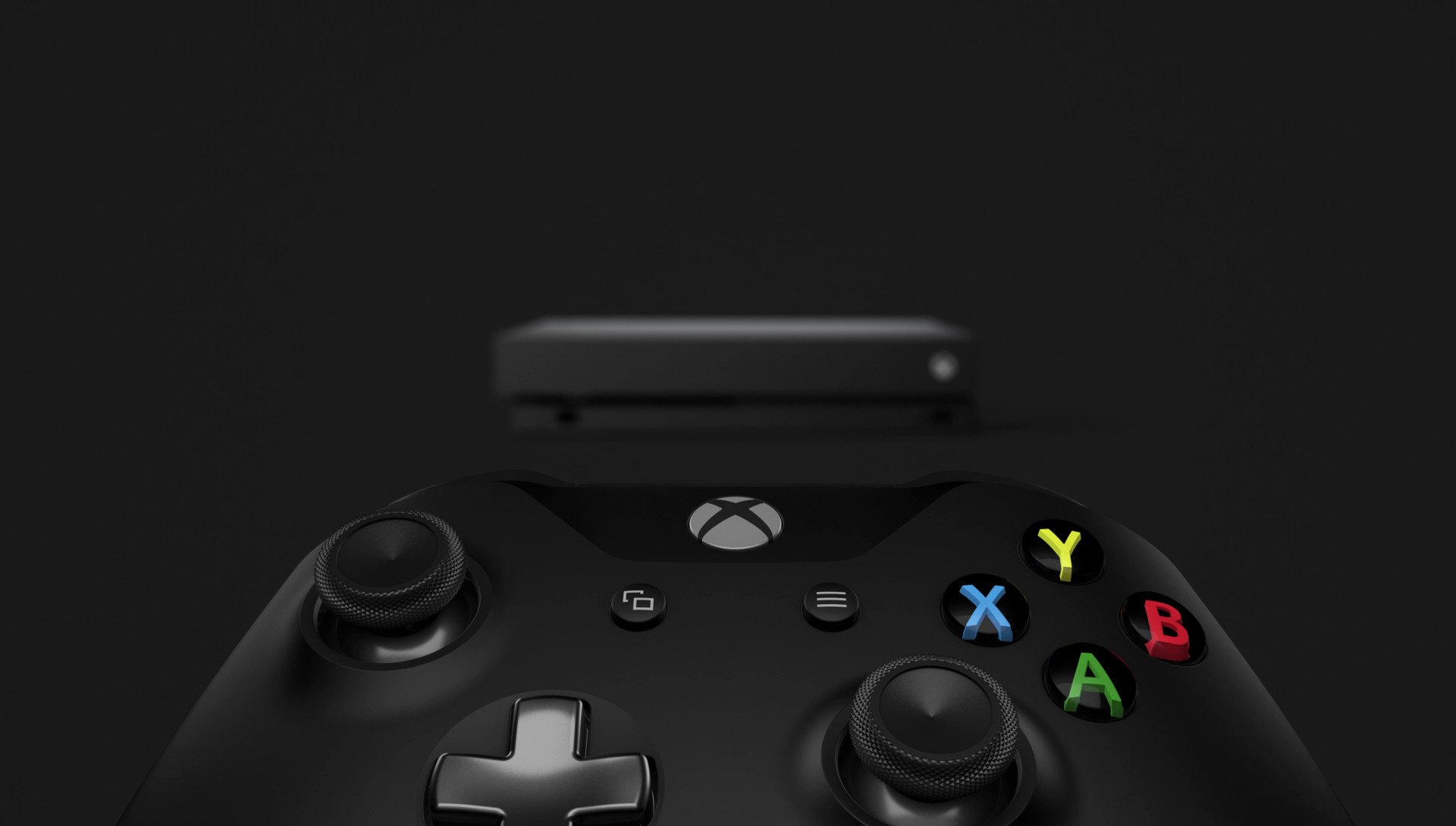
Over recent months, Xbox Insiders have tested the next wave of features on their way to the Xbox One. As an extension of this year's Creators Update, support for Mixer co-streaming, Controller Linking, and a tweaked dashboard are all among the changes just around the corner for all Xbox One users. And while none of these features are truly ground-breaking for the console, the update paves the way for the "Fall Creators Update," which is currently on track for a release later this year.
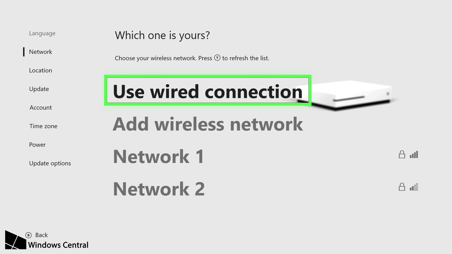
Looking past the prominent additions, the start of a visual overhaul appears to be surfacing behind the scenes. Upon resetting an Xbox One console running version 1706 of the operating system, Xbox Insiders are now greeted with a newly streamlined out-of-box-experience (OOBE). Most notably, this takes clear guidance from Microsoft's recently debuted "Fluent Design System" – an upcoming take on the company's universal design language.
The Fluent Design System introduces further texture and layering to user interface (UI) elements, while still maintaining some minimal aspects first introduced in Windows 8's Metro Modern interface. Although its rollout is still in the early stages, examples of the new language have already made an appearance through pre-release versions of Windows 10. Up until now, these changes have been mostly absent from the Xbox One, with a heavier push expected later this year.
Checking in on Microsoft's new Fluent Design System for Windows 10
In the first "wave" of its rollout, Microsoft has outlined five key elements of the approach: Material, Light, Scale, Depth, and Motion. These all build on the company's existing product family and interfaces, with effects to interpret the five new philosophies. The next Xbox One OOBE provides a glimpse of what to expect from the Xbox One operating system going forward, adopting several of these components throughout its design.
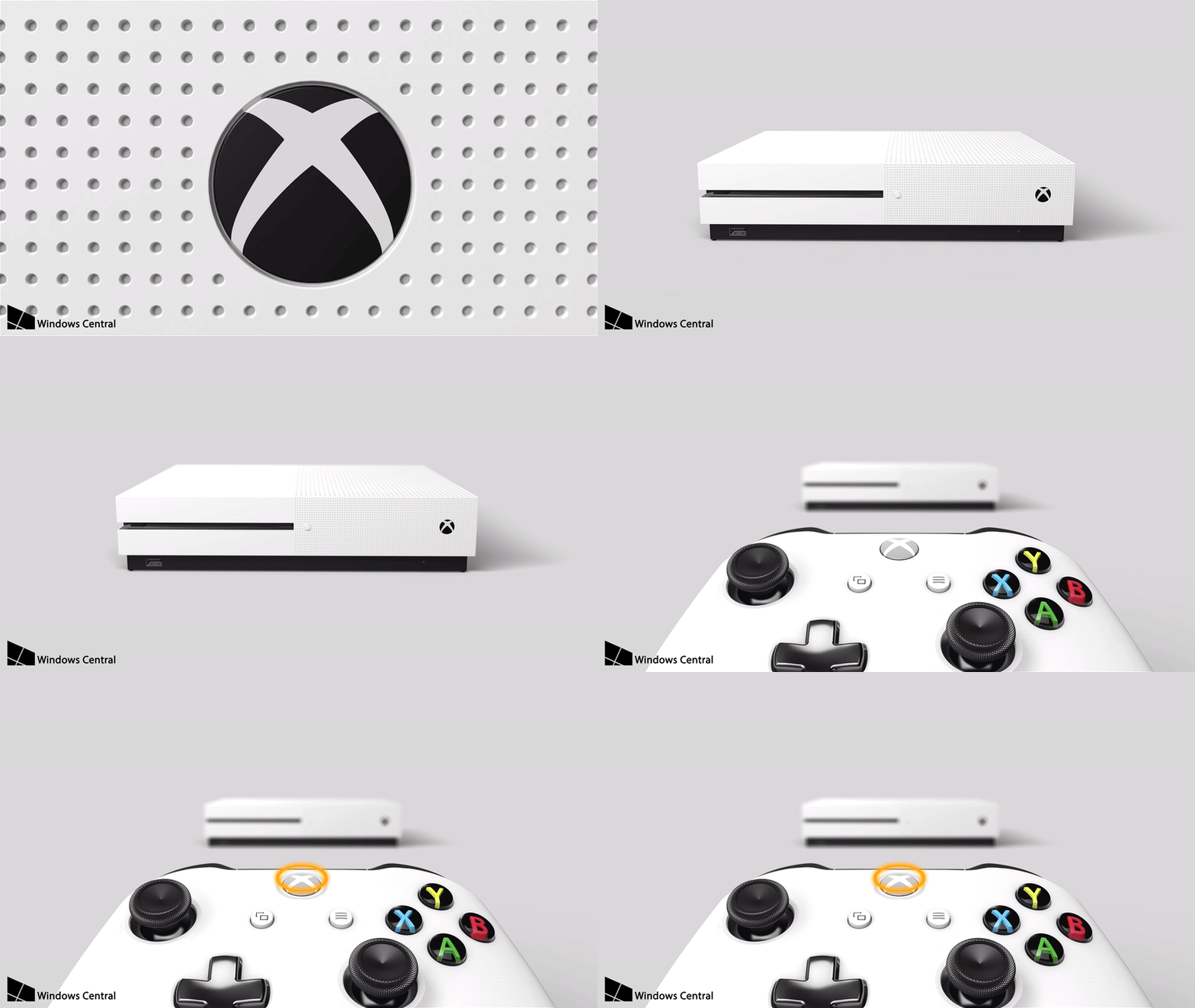
Following a hard reset, the new OOBE initially boots up with a slick animation of a console moving across the screen. This sweeping animation smoothly transitions into the main menu, which serves up a majority of the set-up process. From the outset, traits of the Fluent Design System come into play, fading the console into the background behind an acrylic blur.
This "acrylic" effect adds a level of translucency to the OOBE and is expected to be a major component of the next Xbox One dashboard redesign. In versions of Windows 10 currently available to Insiders, this is used to allow color to seep through from objects situated in the background. As previously seen in Microsoft's previous mock-ups of a Fluent Design-inspired Xbox OS, this may be used to add depth and translucency to elements such as the Guide menu in the future.
Get the Windows Central Newsletter
All the latest news, reviews, and guides for Windows and Xbox diehards.
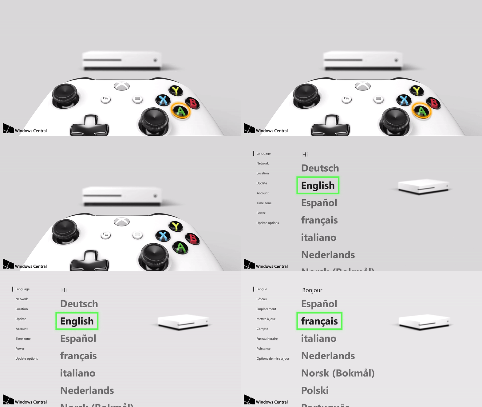
Going forward, the Xbox One OS will heavily inherit its design from surrounding elements, with colors influenced by the objects situated on-screen. While obvious implementations of this lie with the pop-out Xbox Guide and overlays, the early stages of this concept can also be seen under the hood of the OOBE.
One of the interesting aspects of the new OOBE application is its adaptability, through elements that change depending on the console in use. While a white background and black text are used for the Xbox One S, the setup process adapts accordingly when resetting an original black Xbox console.
Via a reputable source, I can also confirm a variant of this next OOBE is set to be used for the Xbox One X when it launches later this fall. Although currently a work-in-progress, we've obtained assets from the setup experience for Microsoft's upcoming new console. This indicates the same application is used across all three systems, with only some visual alterations in accordance with the hardware itself.
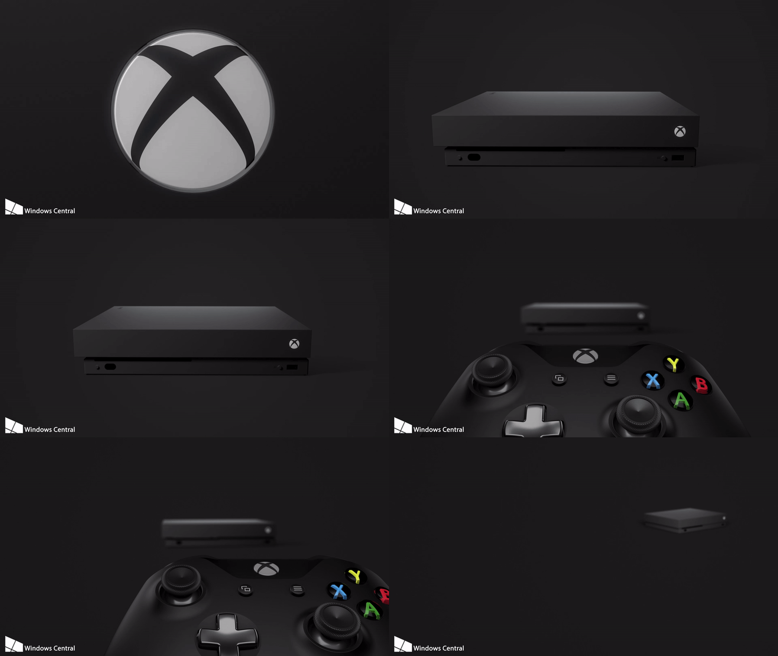
Working through the setup process, there's generally a much smoother feel to movement – even when simply navigating up and down a menu. Known as "connected animations," these add a new level of fluidity to the OS through pre-choreographed transitions. A subtle transition now takes place when moving between UI elements, instead of the harder cut present in current versions of the Xbox One OS.
From these changes, both style and fluidity are expected to be among the biggest changes currently in the works. The Xbox One's interface has received a fair share of criticism over the years and following multiple revamps, its speed and functionality have improved significantly since the 2013 debut. While we're unsure of exactly how and when these upcoming changes will propagate across the Xbox ecosystem, the progress made on the OOBE alone is promising.
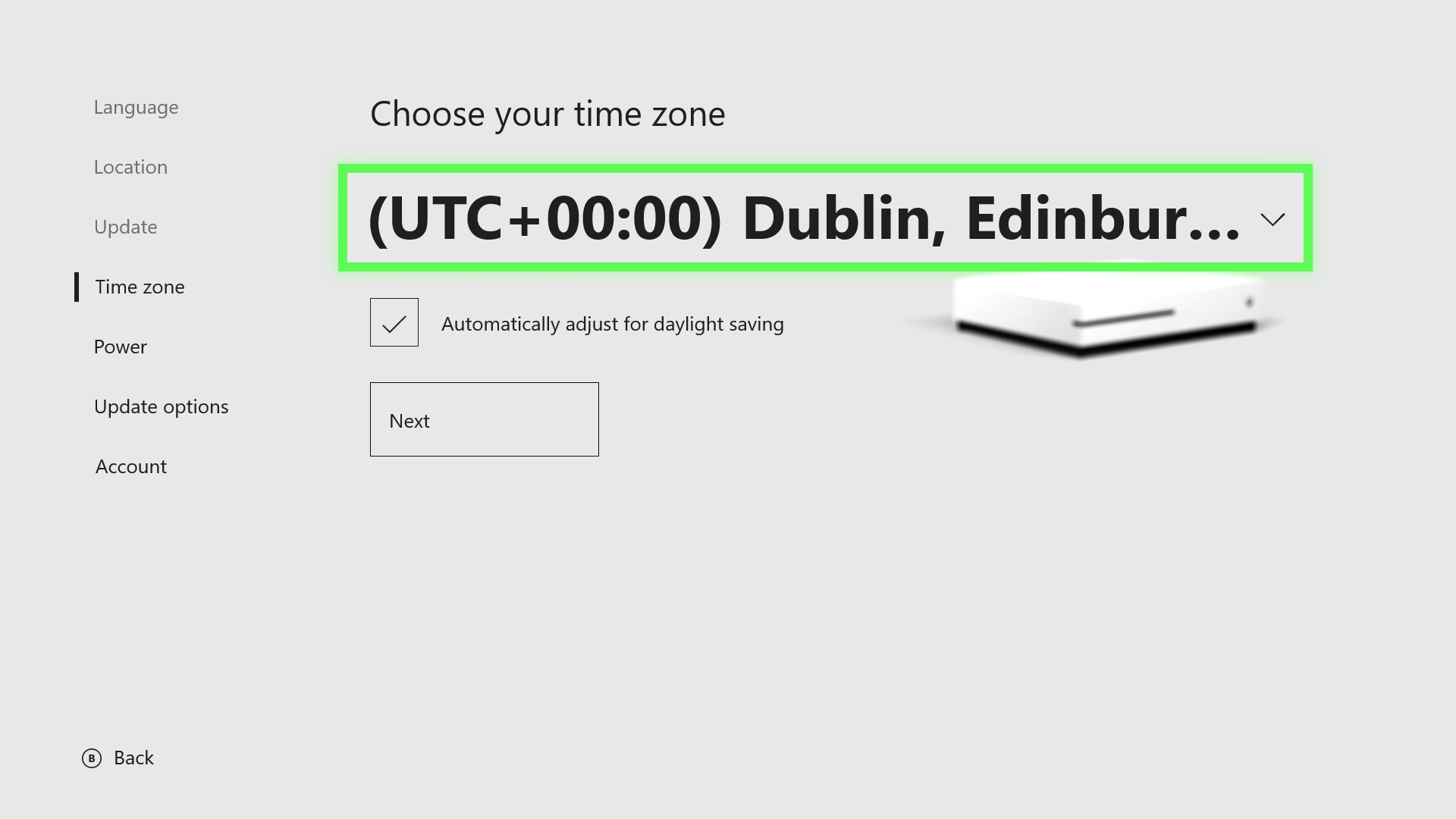
As for actual changes to the functionality of the OOBE – at this point, the set-up process itself seems to practically unchanged. After choosing your language and region options, configuring some preferences, and signing into a Microsoft account, you'll be handed off to the "Welcome" app, which walks first-time users through the core Xbox One functionality.
While the Welcome application does promote the new Controller Linking sign-in feature, the new features in the 1706 release aren't anything that would affect the initial Xbox One setup process. However, it's plausible new options may be present in this OOBE later this year, once the features of the Fall Creators Update begin to roll out to the first Xbox Insiders.
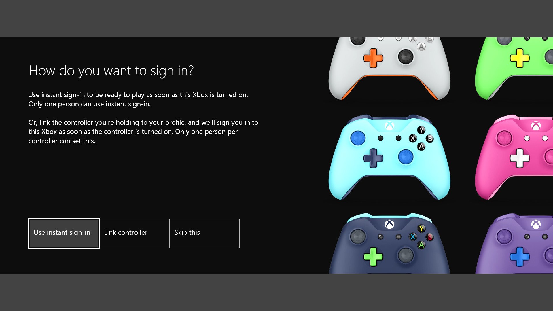
Despite that its core functionality is unchanged, the new OOBE provides a potential look into the future of the Xbox One's user interface design. While aspects of the Fluent Design System have made an appearance on PC and Mobile, this is the first instance of the new approach designed with a controller in mind. More so, this gives a better idea of how the language translates between devices, regardless of both the form factor and input method.
For those wanting to take their own look, the next OOBE is now available to all members of the Xbox Insider Program. What do you think of the new look for the out-of-box experience? Let us know your thoughts on the redesign in the comments section below.
Matt Brown was formerly a Windows Central's Senior Editor, Xbox & PC, at Future. Following over seven years of professional consumer technology and gaming coverage, he’s focused on the world of Microsoft's gaming efforts. You can follow him on Twitter @mattjbrown.

