Xbox One Media Remote Review – Almost all the right buttons
The Xbox One is quite the media playing powerhouse, poor user library streaming aside. With support for most popular video streaming services like Netflix, Hulu, and Amazon, Blu-ray playback, and the ability to control many cable TV boxes directly through the console, it has most of the movie and TV-watching bases covered. Kinect voice commands for video playback can be fun too.
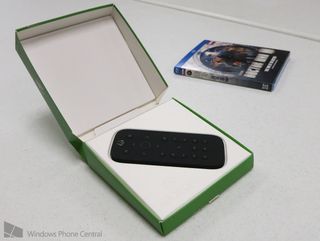
Still - for many movie and TV watchers, nothing beats the feel, convenience, and responsiveness of a traditional remote control. Microsoft has finally released the Xbox One Media Remote with just those people in mind. Despite widespread stock issues since the remote’s release, we’ve finally managed to pick on up and put it through its paces.
Small and fun to hold
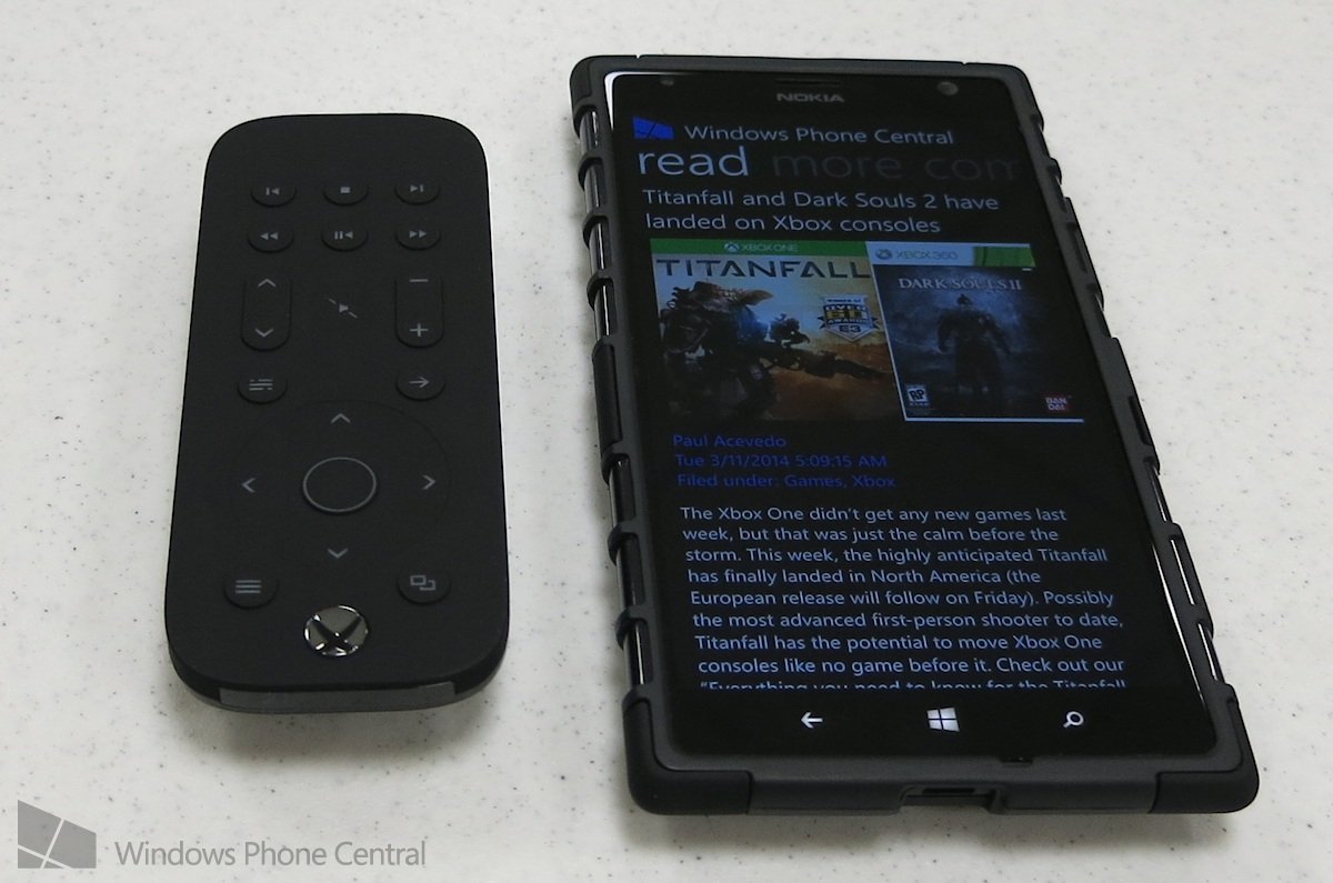
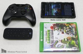
Compared to the original 360 remote control, the Xbox One Media Remote is downright tiny. The entire device has a soft, smooth exterior which makes it surprisingly pleasant to hold. Lending to that ergonomic design is the remote’s convex back, which curves outward. This causes a little wobble when you set it down on the back, but you can always place it face down if that bothers you.
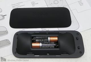
The back is one large piece with a subtle Xbox logo engraved into it. Instead of a separate battery compartment door like most remotes have, the entire back plate must be removed to access the batteries. It takes a little getting used to, but makes for a more attractive appearance.
The Media Remote is entirely matte black. The button labels all have a very dull appearance that could make the remote hard to distinguish if placed on black furniture. Luckily, the buttons won’t be hard to see in the dark thanks to the built-in gyroscope. Tilt the remote or press a button and they all light up a cool white color.
Buttons
Although the Xbox One Media Remote houses 20 buttons, that number proves slightly anemic for movie playback. Noticeably absent are the A, B, X, and Y buttons found on the Xbox 360 remote (and for which Playstation remote controls also have their own equivalents). This causes problems because the Media Remote can’t emulate all the basic functions of an Xbox One controller. We’ll expand on that in a bit.
At the top of the remote is a shiny Home (Guide) button, the only non-soft button on the device. It still lights up though. The Home button is essential for quickly returning to the Home screen or back to the most recent app. It also powers the console on and off in the same way as a standard controller.
Get the Windows Central Newsletter
All the latest news, reviews, and guides for Windows and Xbox diehards.
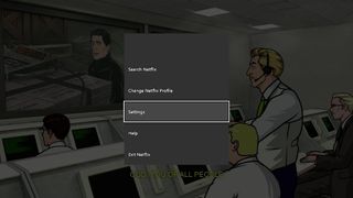
Just below that, you’ll find the View (Back) and Menu (Start) buttons. Menu is fairly important because it opens context menus on the Home screen and within the various video playback apps. You can use it to close programs on the Home screen, access the Settings menu within Netflix, and many other functions.
View on the other hand has absolutely no purpose on this remote control. It does nothing on the Home screen, nor do any of the video apps I tested utilize it. Considering the remote lacks a few important buttons, the designers really should not have blown one on a function irrelevant to video playback.
Ironically, the view button’s label suggests a useful purpose: managing snapped applications. One of the main purposes of snapping apps is to enable video playback while playing games and performing other functions. It would be great to toggle control between the snapped app and the main window with a single touch of a button, but instead we have to double-tap the Home button.
The recessed arrows and enter button allow the remote to navigate system menus, Blu-ray and DVD menus, and video playback apps like a boss. Enter essentially acts like the A button on a controller, as it always confirms menu selections. However, the arrow pad and enter don’t truly emulate a controller’s d-pad and A button, which we’ll cover shortly.
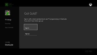
Below the arrow pad sit the Back and OneGuide buttons. Back acts a lot like the B Button would, backing out of menus within apps and the system menu. The OneGuide button launches the OneGuide with its TV listings and other functions. If you haven’t connected your console to a supported cable box, the button won’t be of any use to you.
Next you’ll find Volume buttons, Mute, and Channel buttons. Mute is the only button that doesn’t extrude from the remote, but it’s still easy to press. The Volume and Mute buttons do absolutely nothing if you haven’t set your Kinect up as an IR blaster. That’s silly considering the Media Remote *is* an IR remote and could communicate directly with other devices even without a Kinect.
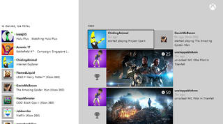
The Channel buttons (surprisingly) do make themselves useful in the system menus. From the main home screen, pressing them will jump between Home, snapped apps, and the Store/Bing screen. In many system menus like Friends’ Activity, the channel buttons act like page up and down buttons, scrolling quickly through content. That said, not every menu makes use of them.
Finally, the standard array of Play/Pause, Rewind, Fast-forward, Skip Back, Skip Forward, and Stop occupy the bottom of the remote. Play is easy to find by touch because of that non-extruded Mute button.
Performance issues
Much as I love video streaming, I still watch a ton of Blu-rays and DVDs. The Media Remote mostly improves the disc-watching experience, with one major exception. It lacks a dedicated menu button! The pop-up menu is an essential component of navigation on Blu-rays, and DVD menus also get lots of use. Yet somehow, not a single button on the Media Remote performs those functions.
With a regular Xbox One controller, you can launch a disc’s pop-up menu by pressing the Menu (Start) button. The same button on the remote does nothing. To access a pop-up menu or top menu, you have to press Play/Pause to open the playback menu, select the ellipsis button on the side of the menu, and THEN find the menu button of choice. What a convoluted and unpleasant place to hide one of Blu-ray and DVD’s most important functions.
I already mentioned the Media Remote doesn’t emulate the exact same functions as a regular controller, which explains why the remote’s Menu button does nothing during disc playback. It turns out that apps must specifically support the remote in order for it to work. Guess which uber popular video app doesn’t support the remote then? YouTube! Launch the YouTube app and you won’t be able to navigate at all. Only the Home or Back buttons will exit the app.
Overall Impression
The Xbox One Media Remote’s lack of a menu button for disc playback and incompatibility with YouTube need to be fixed ASAP. Luckily, those are both simple app issues that Microsoft can address without much effort. The Media Remote SHOULD have included all four main face buttons and emulated a standard controller, just like the Xbox 360 remote did before it. But throwing out things that worked fine in favor of lesser implementations has been a common design trait of the Xbox One (see our launch review for many more examples).
Those complaints aside, the Media Remote is still an essential purchase for movie and TV lovers. It’s far too easy to interrupt playback by hitting the triggers on a regular controller, and Kinect voice commands sometimes fail to work. The Media Remote provides exactly the instant responsiveness and convenience you’d want in a remote control. It works great with Netflix, Hulu, and Amazon Video, and also does an admirable job of navigating system menus. The price could be a little lower, but you won’t find a better video control option for the Xbox One anytime soon.
Note that the remote remains scarce at the time of review because Microsoft short-shipped all domestic retailers. The supply issues should clear up within a week or two.
- Xbox One Media Remote – $24.99 – Amazon Link
###August, 2014 Update
The Media Remote now works with YouTube!
Paul Acevedo is the Games Editor at Windows Central. A lifelong gamer, he has written about videogames for over 15 years and reviewed over 350 games for our site. Follow him on Twitter @PaulRAcevedo. Don’t hate. Appreciate!
