Among the new features are 1080p Game DVR, a refined dashboard experience, new customizable content blocks, and much more. For a full rundown, hit this link.
As we head towards the launch of the Xbox One X, let's examine all the new changes.
Dashboard and design: Fluent takes center stage
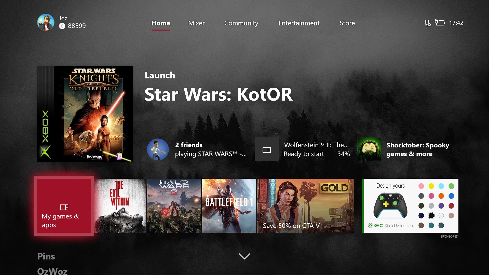
The new Xbox dashboard utilizes Microsoft's "Fluent Design System" to bring translucency and additional motion to the home screen. Whether you like it or not will be subjective, but it brings in minor design inconsistencies that I personally find annoying.
On the main dashboard, there's a large bar beneath the main icons that utilizes Microsoft's glass-like acrylic texture, which is also found in the Windows 10 Fall Creator's Update Action Center and Start Menu. The bar highlights the Games & Apps tile, three recent programs or games, and an ad for Xbox deals, and then another ad for sponsored content. There are settings to control the translucency of the acrylic texture, but you're not really given a great deal of control over how it looks. It would be nice if acrylic supported more fine-tuning.
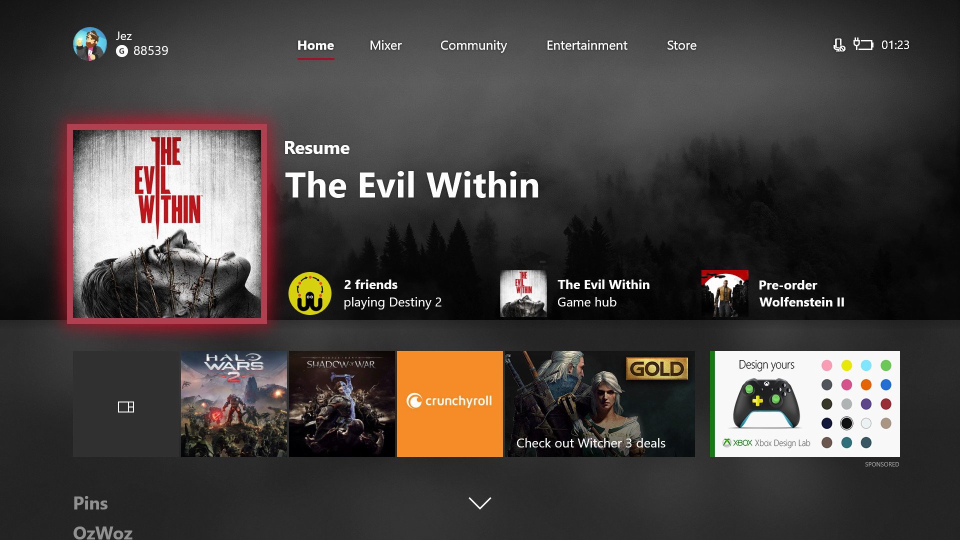
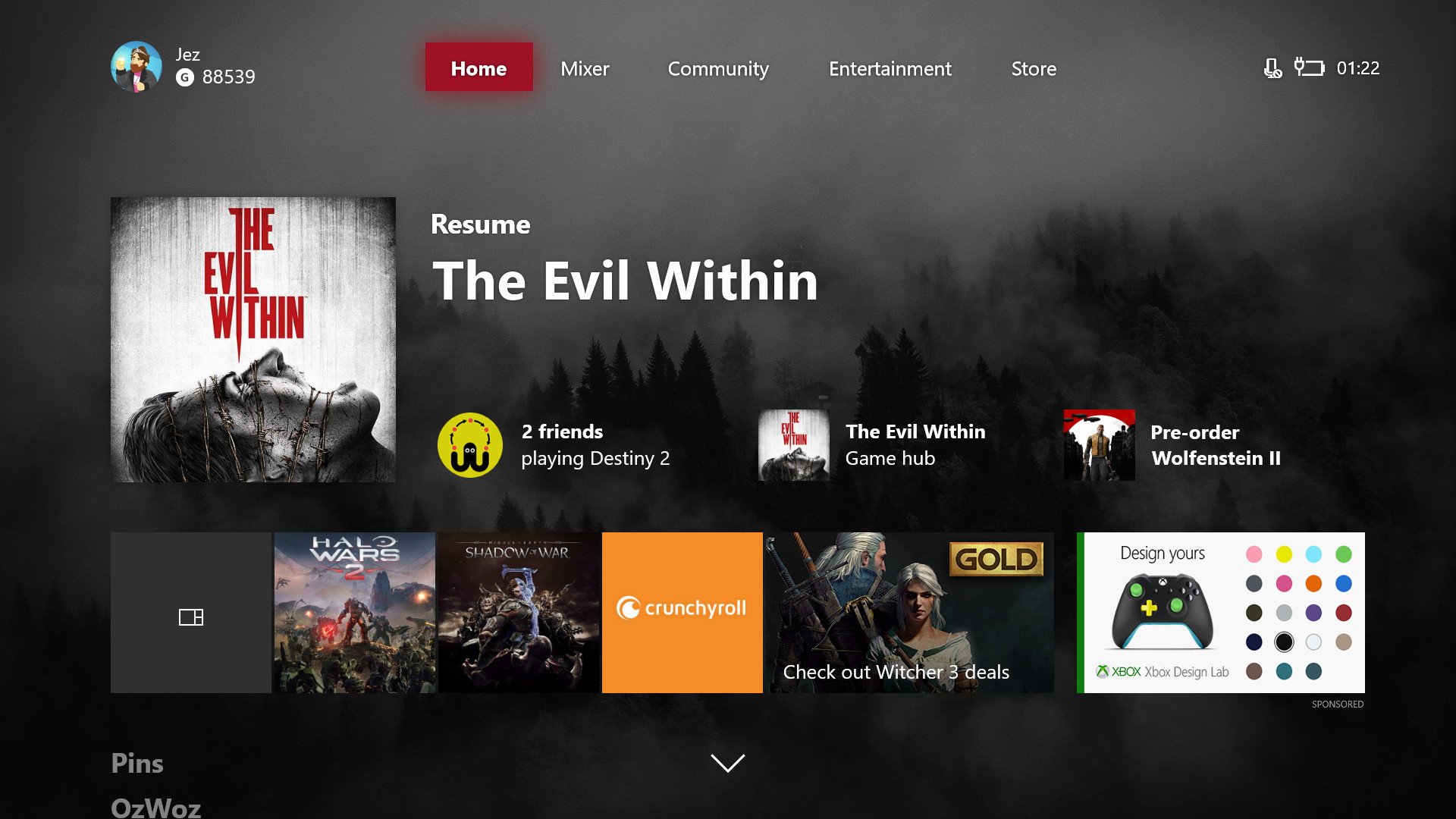
Annoyingly, the new ads don't seem to take into account parental content restrictions, giving youngsters ads for 18-rated games. Seems like a bit of an oversight considering they're more prominent than they used to be.
The new dashboard is blazing fast.
Speaking of ads, there are new "suggested content" blocks next to the main, active app or game. The tiles are algorithmic and are supposed to reflect content that might be most relevant to you. You can press the menu button to "downvote" the content you don't want to see, to try and customize the algorithm.
It's useful being able to see when a game is updating or see if a friend is online and playing, but sometimes you might get suggestions to join certain clubs or follow certain people you might not even know. I've downvoted some of the more annoying suggestions, and thankfully, haven't seen them appear again since.
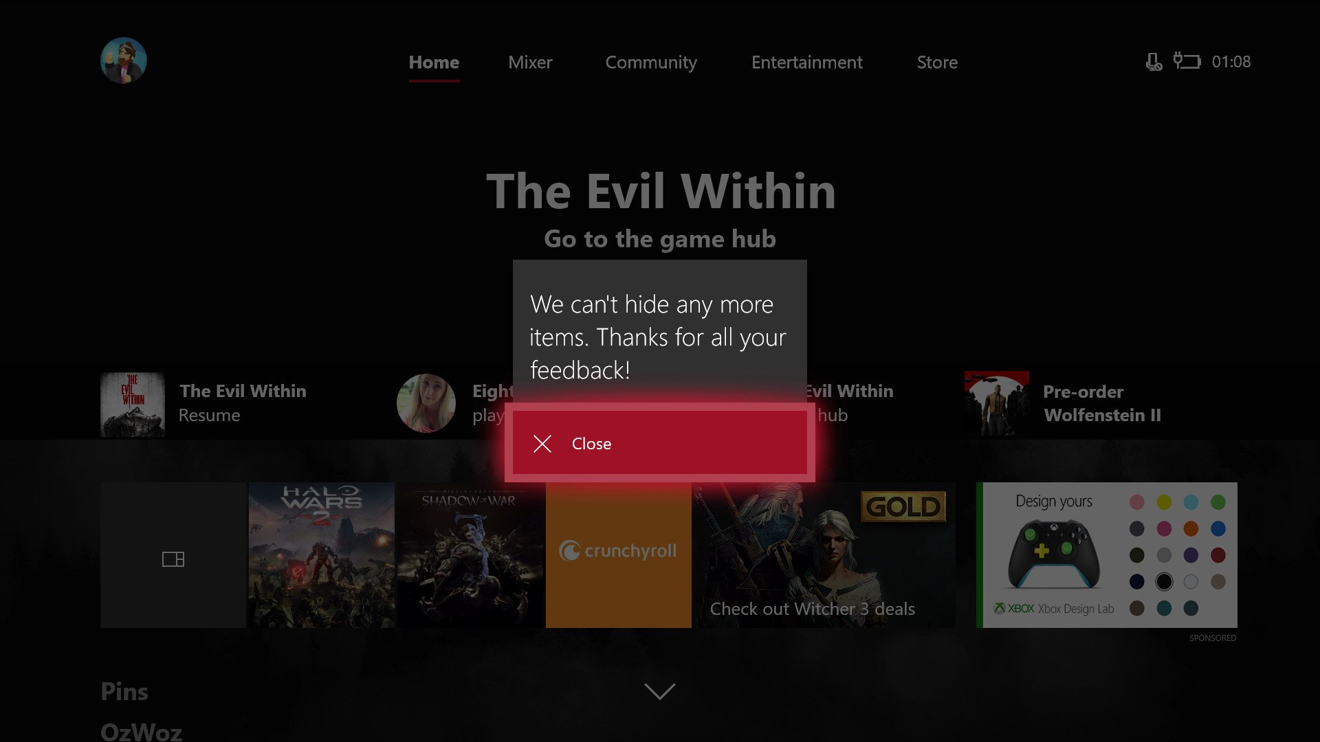
The acrylic texture appears throughout the OS now, on different labels and areas. It has a grainy quality that not everybody likes, as it appears a little pixelated. The new dashboard has other issues with that, though.
You can access every part of your Xbox right from the Guide now, which is a big usability boost.
You won't really see it sitting far away from the monitor in the living room, but it's pretty clear that certain assets on Xbox Live weren't meant to be stretched to a larger resolution, appearing blurry with artifacts when used on certain elements, especially in the main tile which is larger than similar tiles used on other parts of the OS. Higher-res assets would potentially lead to dips in performance, though, and that's one area where the new dashboard truly excels – it's blazing fast. You can make it faster still by turning off animated transitions.
Fluent Design principles also add a new "glow" to the edge of highlighted elements You can alter the color of this glow, based on your accent color choice, but it strikes me as inconsistent with other Fluent Designs across Windows 10. There are no "Reveal" white-glow effects for the cursor or click event, which are present on Windows 10 PCs and on Windows Mixed Reality. (See Reveal in action below.)
Overall, right now Fluent Design on Xbox One feels a little like a mash-up of Windows 10's old design language and the new one. It works, but it feels less consistent across the product range than the previous, more mature design language.
New Guide: Boosting usability and speed
The new dashboard is certainly a speed boost over the previous dashboards. We're a long, long way from the sluggishness of the original 2013 OS, despite the amount of content the dashboard pulls from the internet. Loading up the new community tab or 350 "ready to install" games from my digital library is near-instant on my 150MB/s fiber connection, but of course, results will vary with your internet speed.
The biggest change in terms of speed is the new Guide menu, which is an improvement on the previous version, pulling in more features from the main dashboard. There are new flyout menus, which Microsoft refers to as "blades" internally in homage of earlier Xbox dashboards, and they provide quicker access in certain scenarios.
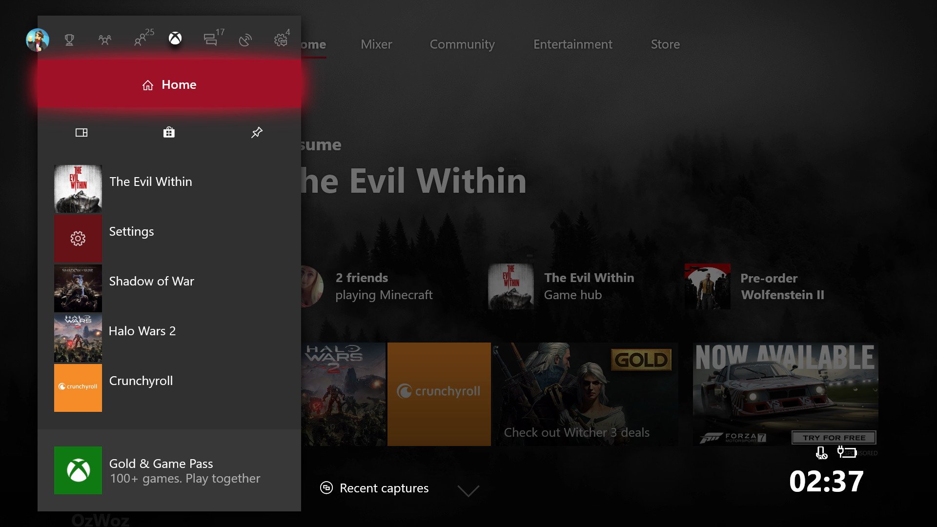
Microsoft built the Guide around the premise that you can move from a game to any other area of the OS without heading to the home screen first. You can access quite literally every part of your Xbox right from the Guide now, which is a big usability boost.
While viewing your friends list now requires an extra jump, the new "People" section grants a few new extra options. You can get a quick look at friends who are online and in games and get quicker access to your clubs, recent players you might want to message, as well as find new friends, suggested friends, and search for new clubs.
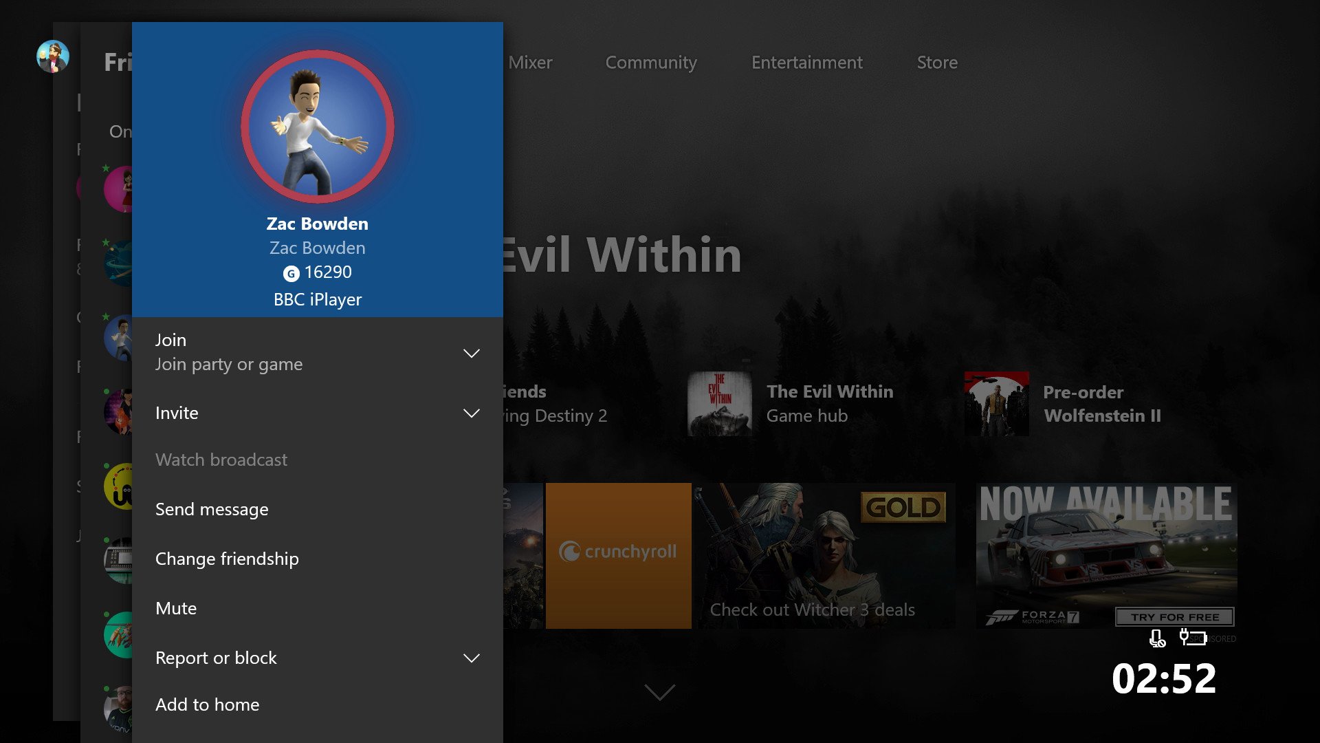
It would've made more sense to use acrylic textures on the new blades, rather than in the other areas of the dashboard. The whole point of translucency is so you can see elements that are behind your current activity, but there's no telling how this might have impacted performance.
Similar to the new People tab, other sections have been split apart to provide faster access. Xbox Live messages now have their own section under Communication, rather than cluttering up your social communications. But it's not totally intuitive. Party and game invites now appear only in the new Multiplayer section, rather than the notifications section, which only includes achievements, activity feed notifications, and Windows 10 app messages. This will be confusing at first for those who have learned to find notifications under, well ... notifications.
Overall, the new Guide is a big improvement, helping the flow across the entire Xbox, while looking sleek in the process, despite a number of features it squashes into a relatively tiny space.
New features: Content blocks, Xbox One X prep, and more
There's a ton of smaller new features that made it into this update, many of which help prepare the OS for the 4K behemoth that is the Xbox One X. There's a new screen dimmer designed to exercise the pixels on OLED panels, which 4K sets often use. It even provides large-size notifications, so you can see friends coming online from across the room. There's the option to enable 4K asset downloads of games that support the Xbox One X, and you can transfer them from your existing Xbox One to your shiny new X either via a home network or an external HDD. And it all just works.
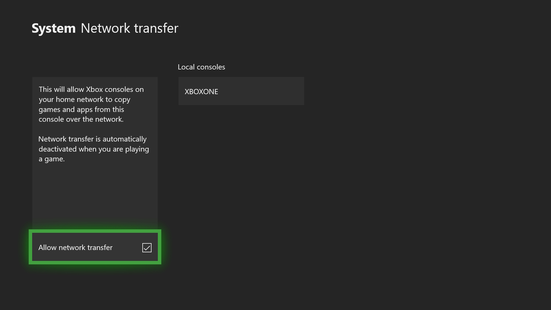
Beyond 4K preparations, the new update brings in improvements to the Game DVR, which has been a little neglected over the years. I would have liked to have seen improvements to Microsoft's Upload Studio app, which lets you splice clips together, particularly now that Mixer is a thing. Perhaps in the future, we can see a Universal Windows Platform (UWP) version of the app across Xbox and Windows 10, allowing creators the opportunity to edit videos without expensive software.
For now, you have to capture to an external drive, which allows continuous recording for up to 60 minutes. You can also capture shorter clips locally at 1080p for the first time, lifting the console's long-standing 720p limitation. Of course, the Xbox One X will be capable of full 4K recording too.
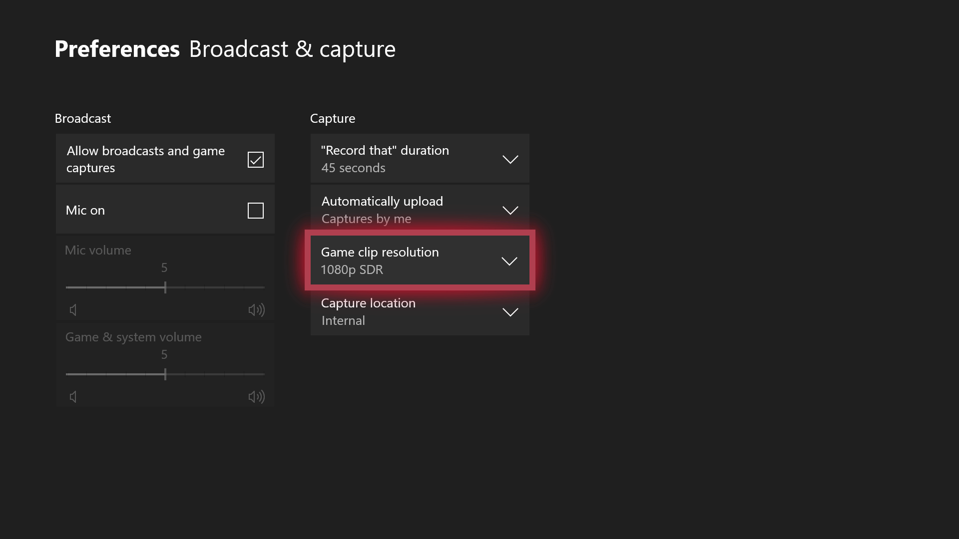
The update also brings in Content blocks, which are similar to Live tiles. You can now add friends, games, and certain other Xbox features to the home screen, such as pins.
You can now add friends, games, and certain other Xbox features to the home screen, such as pins.
The customizable Content blocks are useful for getting quick access to friends and seeing relevant information at a glance.
You can also pin Game hubs for specific games, which pulls in recent clips and news posts related to the game, but only if the developer actually updates their hub with status updates. Most of them don't.
The Content blocks are a little underwhelming right now, but the feature has potential. It would be cool if Game hubs brought in news stories from outside sources, related to a specific game, powered by Bing News maybe. You also can't pin Clubs, which seems like a big missed opportunity, particularly given how cumbersome chatting and navigating Clubs is at present.
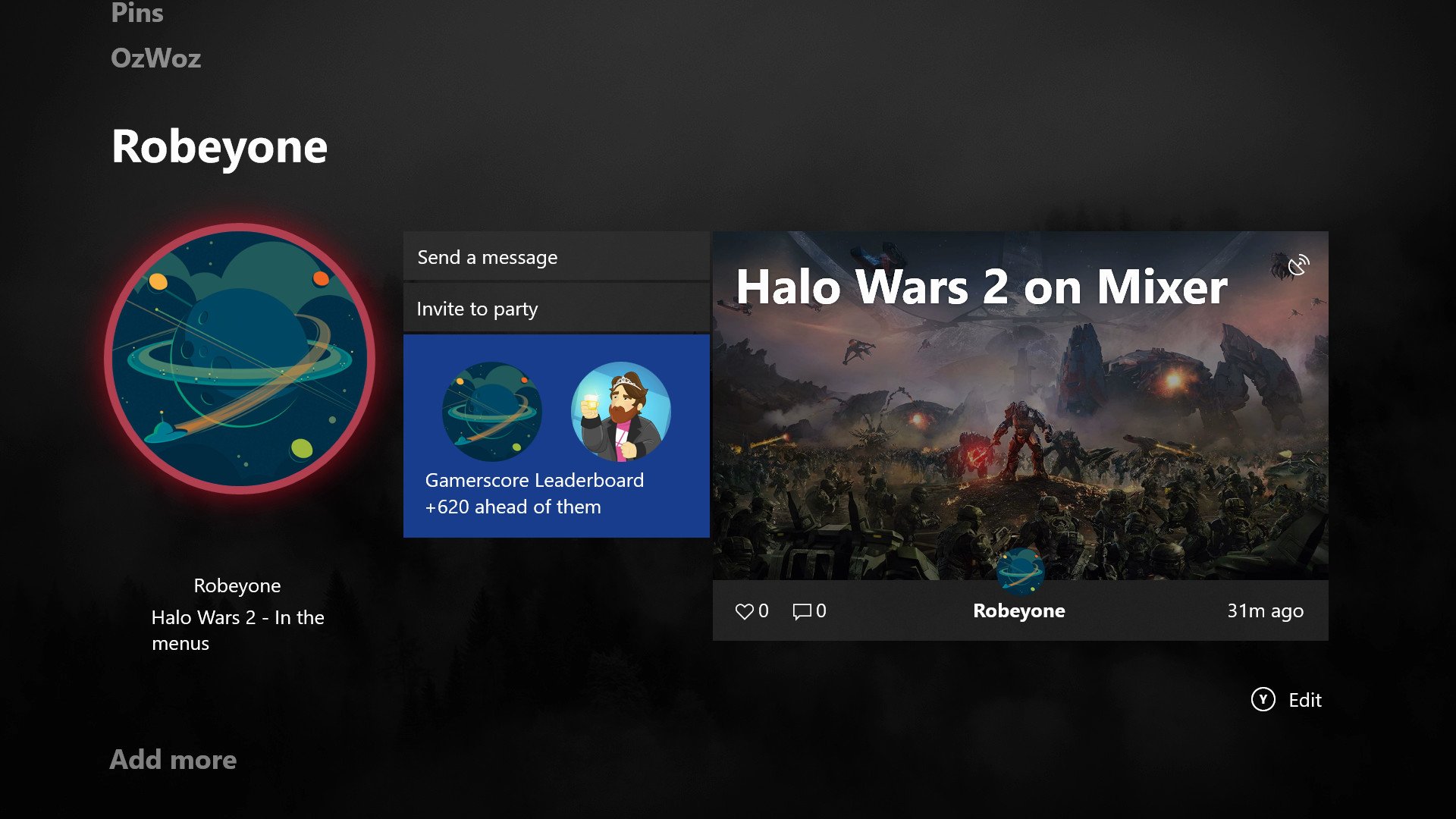
Clearly, Microsoft has plans to build on Content blocks. Xbox platform Corporate Vice President Mike Ybarra told us recently that he envisions a world where Twitter could be a Content block, providing at-a-glance information and notifications. Allowing developers to hook into the Xbox dashboard in this way could help drive interest in UWP development too.
OG Xbox backward compatibility: Old is new
Perhaps the most awesome thing about this update is the addition of original Xbox backward compatibility, bringing a handful of classic games into the modern era.
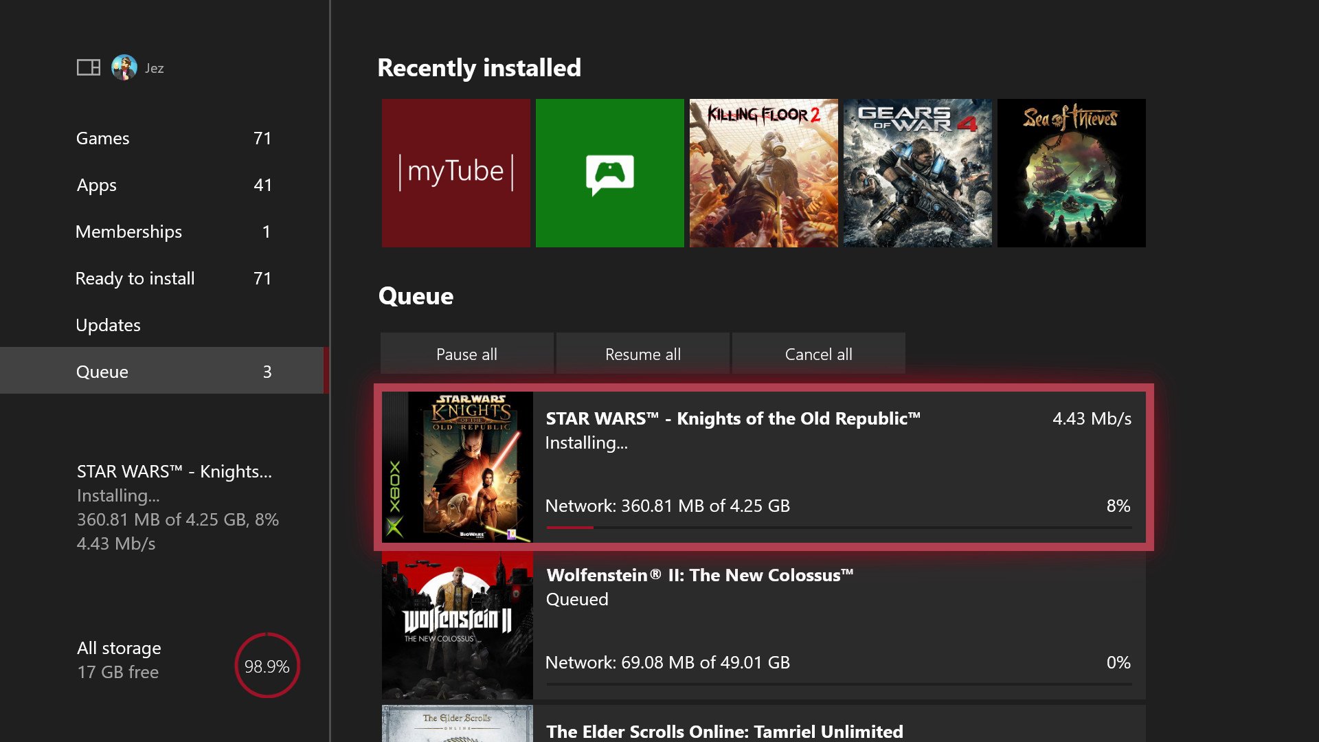
The first wave of additions brings classics like Crimson Skies, Star Wars: Knights of the Old Republic, Psychonauts, and Ninja Gaiden Black to the Xbox One, all purchasable digitally or usable with existing discs you might have buried in a closet.
The emulator even bumps up the resolution where possible, allowing games to appear at their maximum quality without any changes to the underlying code. The engineering prowess on display here truly exemplifies Microsoft's expertise.
KOTOR. ON MY XBOX. IT JUST WORKS. 60 FPS. HD. WHAT. pic.twitter.com/Cu7T1joWWZ— Jez☕ (@JezCorden) October 24, 2017
Star Wars: Knights of the Old Republic on Xbox One.
Conclusion: A step sideways
The Xbox One you have today is very different from the original vision set out by former Xbox head Don Mattrick in 2013. Kinect is now a total afterthought, games are front and center at the cost of media and entertainment (RIP Groove), and Microsoft put its games on PC both as part of Xbox Play Anywhere on the Windows 10 Store and Steam.
I just hope Microsoft focuses on polishing the features and services it already has, rather than scrapping them.
While I don't think we're going to see any more sweeping redesigns of the dashboard, the Xbox fall 2017 update feels like a step towards a grander vision rather than a polished update. Fluent Design remains inconsistent and immature across the continuum of Windows 10 devices, with different elements being used in different places inconsistently. Content blocks aren't as useful or pervasive as they could be, and Cortana, well, is still practically useless, despite the rise of voice-controlled assistance in products like the Amazon Echo or new the Harman Kardon Invoke.
The new Guide is fast and intuitive, though, and the performance upgrades on the dashboard are a welcome boost. The addition of OG Xbox backward compatibility is huge and should prove to be a flagship feature for fans of nostalgic classics.
Of course, Microsoft can't prioritize everything simultaneously. I just hope it focuses on polishing the features and services it already has, rather than scrapping them. Why have Cortana developments and improvements halted? Why is Spotify's inadequate UWP app deemed a preferable replacement for the feature-rich, user-focused design of Groove Music? How come Upload Studio hasn't seen a meaningful update in months, despite Mixer and content creation becoming a focus? Hopefully Microsoft can answer some of these questions in future updates, as we head towards new Avatars, game gifting, and other promised features on the roadmap.
More: Five tips and tricks you NEED for the new Xbox dashboard
Pros:
- OG Xbox backward compatibility is amazing.
- Speed improvements are significant.
- Lots of new features for free.
- Helps you prepare for the X.
Cons:
- Fluent design implementation is inconsistent with Windows 10.
- Cortana, Upload Studio, and others are neglected.
- Spotify UWP is pathetic compared to Groove Music on Xbox.

Jez Corden is the Executive Editor at Windows Central, focusing primarily on all things Xbox and gaming. Jez is known for breaking exclusive news and analysis as relates to the Microsoft ecosystem while being powered by tea. Follow on Twitter (X) and Threads, and listen to his XB2 Podcast, all about, you guessed it, Xbox!
