When Zune was somewhat retired and replaced by Xbox Music a lot of you were bummed out. Not because a product you like had its named changed, but because the actual product somewhat regressed. The Xbox Music app that launched with Windows Phone 8 and Windows 8 was lacking by many standards and even lost some features we came to love with Zune. With Windows 8.1, Microsoft is steadily improving Xbox Music to a point that we’re using it daily on our machines. The latest update furthers that march of steady progress. Let’s check it out.
Many of you running the Windows 8.1 Preview have noticed that Xbox Music has improved substantially, both in terms of aesthetics and functionality. We first looked at the update back when we were at Build. What’s new in the latest update?
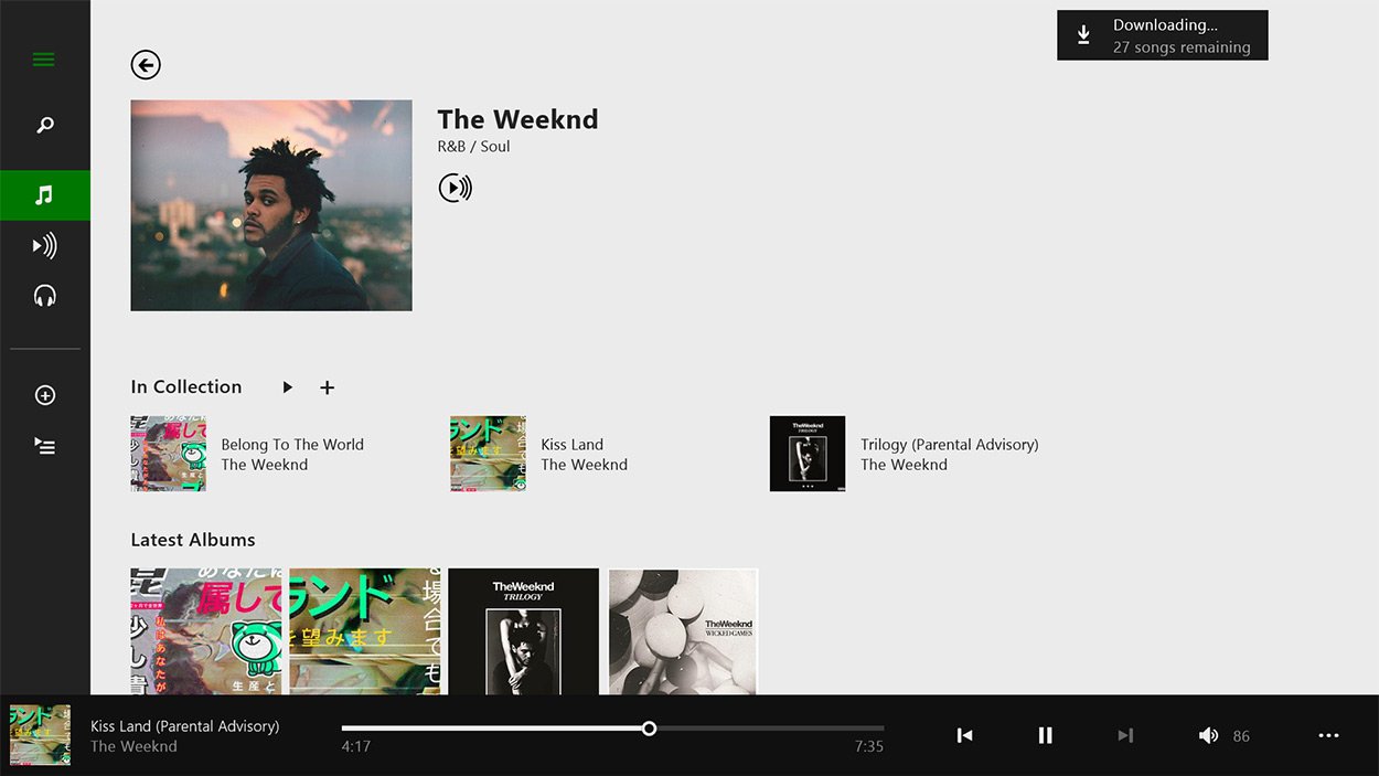
- New artist details –for both the Store and your collection –show everything you have from a given artist, along with that artist’s latest albums, most popular songs, and similar artists.
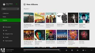
- Redesigned the New Albums and Top Music galleries to better emphasize album art
- Improvements to the way collection notifications look when the app is snapped
- Aligned the look and feel of dialogs with other redesigned parts of the app

After checking out the changes for ourselves we’re liking the direction Microsoft is going. I can’t speak for the rest of the crew here, but to be honest I never touched Xbox Music on Windows 8. Now I can’t stop using it on the Windows 8.1 Preview. The difference for me has been night and day. The small changes in the latest update are very welcomed. The new artist details in the collection are handy. You can now see what you have from an artist and don’t have with one glance.
What are you guys and gals thinking of Xbox Music in the Windows 8.1 Preview? What else do you want to see added and/or improved on? Sound off below.
Running Windows 8.1 Preview? Grab Xbox Music in the Windows Store.
Get the Windows Central Newsletter
All the latest news, reviews, and guides for Windows and Xbox diehards.
