Xbox exec Mike Ybarra discusses the new UI, suggested content, and more (exclusive)
On the Xbox Two podcast (of which I'm a member), Xbox Platform Corporate Vice President Mike Ybarra randomly jumped on for a chat!

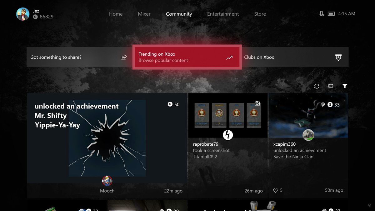
The Xbox Two podcast is an informal show all about the week's news in Xbox and the games industry in general, and we just crossed our twentieth episode. Ybarra graciously offered to jump into the show and answer some of our questions on the Xbox dashboard, which has been updated with Fluent Design Elements for Xbox Insiders on the Alpha Ring.
During the 90-minute long show with myself and Mr. Rand al Thor (with a million gamerscore), Mike Ybarra talked to us about the new dashboard, the Home screen, the future of "Content Blocks," feedback over Suggested Friends, and more.
Ybarra on 'Content Blocks' and customization:
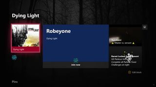
We have to listen to the feedback, adjust as we go forward. We're happy with the general speed and tone of the update, but a lot of stuff not plugged in yet. So like, with more updates over time, more features will come in and the UI will change and adjust as we push towards our launch date.For the last, I would say, three years or so people have always asked to be able to customize Home themselves. So what you're seeing is just the basic start of that customization. We call that 'Content Blocks.' These are blocks at the bottom of Home that users can set, delete, they can have no blocks at all, or just pins, or they can have five friends pinned, four games pinned, and pins for a Club. Right now the limit is 10, that's just an arbitrary number, we're just testing it to see how it goes. We know from early testing that people really want to be able to pin the things that they're doing.

This is just the start of what we want to do with Content Blocks, both for this release and in the future. You can imagine a world where you have a Twitter Content Block, and you can see your latest Tweets there or DMs that you want to see. That's just one example I made up here. But certainly as we go forward, we think the Content Block idea of giving gamers the ability to customize their home is something that not only apps and game developers will embrace, but consumers will embrace as well. So you're seeing just the cusp of what we really want to do here.
Ybarra on the main Home screen and suggested content
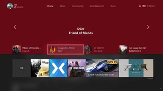
The other major point in the dash is the top part of Home. There's been a lot of feedback on this. I've seen the Reddit threads, I've seen the NeoGAF threads. There's a lot of positive but also feedback both from people that have the build and don't have the build. One of the biggest pieces of feedback is, "don't show me [suggested] friends." All of this is algorithmically driven, what we have right now is that none of those algorithms working in the background.

So you see suggested friends and things like that as placeholders. What it really is intended to be, especially for our core audience, in the Alpha Ring, and people like us who play lots of games, is items like a reminder to not miss an upcoming Arena tournament on Saturday, or maybe a Club that you're in has a [Looking For Group ad] and they need a player for Destiny. It's supposed to be, it will be context specific information for you based on the clubs, groups you're in and the games you're playing to make sure you know what's going on. There are two small blocks to drive that sort of thing.We've had a host of feedback like "don't suggest friends to me," there are some cases where people do like that. For example, if I'm brand new to Xbox, and I have two friends, and I'm like "wow I wish I had more people that played Halo 5," or "I wish I could find broadcasters that broadcast the games I like more." It's an intelligent back end that will drive that. We know there's a bug in there that is suggesting friends to people that have lots of friends, we understand that feedback, give us some time to optimize that. I really like that if one of my friends is broadcasting a game on the PC or Xbox that it shows up there, because I'm a pretty big watcher and broadcaster myself. There's value there, we just have to figure out the right algorithms in the back to make sure people are getting the right things that they want.
Ybarra on Fluent translucency for the Guide and other elements
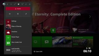
I think what you're seeing in this build is very early elements of Fluent Design language we're introducing as part of Windows 10. We're going to use that more and more going forward. We really like the internal builds of Windows 10 that we see, and we look at the vision of the design team, Chris Novak, who runs design for Xbox, he's the person who is representing the Fluent Design language in this system.

I've seen further iterations of what [the dashboard] looks like, and definitely, we've seen lots of feedback about the gray. We're iterating on some elements. The challenge of that is balancing very nice visuals with speed, performance, and responsiveness. So we're in the earliest stages of looking at the full stack of the design language and saying, 'What can we apply in a way that keeps our speed yet it enables some of the light in terms of how users interact with the [design] model?' So you'll see more there as we go forward.We're looking at a couple of things [on the Home screen]. One, it's a very early build, and we haven't looked at all the apps. There are some apps that just have screenshot backgrounds that just looks bad. There's several that do that, even the Mixer one is a little weird. So we're going through and looking at all of that. We're looking at the gray segment, that's out there as well. We certainly have feedback that says people want full-screen pictures, even if they're not using a custom background image, they want more color versus the gray that they see. I don't know what the team has in mind here, it's part of the feedback being looked at. I'm sure that they're going to come up with ideas on what we can do there, and communicate to users what that will look like.
Wrapping up
The show with Ybarra lasted for almost 90 minutes, and a huge range of topics was discussed. Be sure to have a listen to the full show right here.
Big shout out to Ybarra who simply jumped on to take questions from fans and address the feedback over the dash, which has been a little mixed thus far. Mike really slammed home the idea that these are simply the early stages of a long journey towards refinement for the Fluent Design System on Xbox One, and in November, the Xbox One X.
The Xbox Two Podcast with guest Mike Ybarra
Get the Windows Central Newsletter
All the latest news, reviews, and guides for Windows and Xbox diehards.

Jez Corden is the Executive Editor at Windows Central, focusing primarily on all things Xbox and gaming. Jez is known for breaking exclusive news and analysis as relates to the Microsoft ecosystem while being powered by tea. Follow on Twitter (X) and Threads, and listen to his XB2 Podcast, all about, you guessed it, Xbox!