WPCentral Review: Windows Phone "Mango" (preview release)
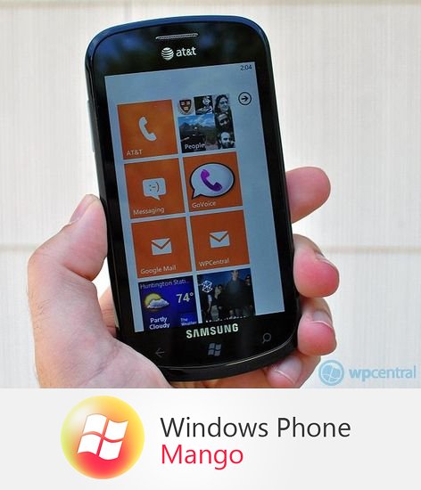
To say "Mango" for Windows Phone 7 is a large update is a bit of an understatement. It's massive. Although we have had two updates to our fledgling OS, both have been relatively minor. "Mango", however, is Microsoft's attempt to fill in all the gaps left from the v1.0 release last fall. Can it succeed?
We've been able to handle a preview release of "Mango" for the last few days and have put it through various tests, comparisons and the all important "just using it like a normal phone". Our device was the venerable Samsung Focus running Windows Phone 7.661.WP7_5_Trial (mojobld).20110607-1957, which means this is a relatively late build (June 7th) and as you can see, Microsoft seems to be going with "7.5" for this release.
How did it fair? What did we learn? Lets just say you won't be disappointed and yes, it's basically everything Microsoft has been touting it to be since February--no smoke and mirrors here. So hit on past the break for our hands on review, four videos, photos and more. Then you can hit us up in comments and we'll try our best to answer.
"It's the little things that matter"
"Mango" of course brings "intelligent multitasking" and Internet Explorer 9 to the table--no small feature set. But before we get to those, lets talk about all of those "small things" that Microsoft has done, because it's those that go to show the level of care in detail that Microsoft is giving to the OS.
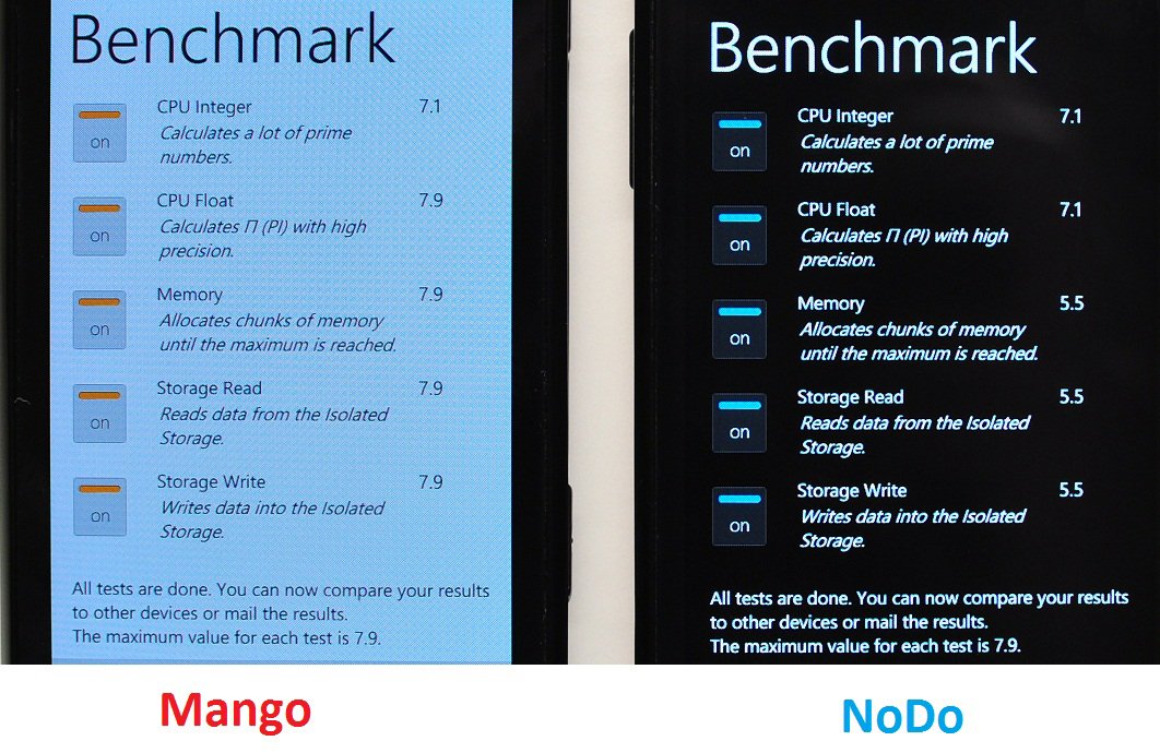
"Mango" is certainly fast. While it's not as big a boost as "NoDo" back in February, Microsoft has continued to shave off a half-second here, a half-second there. "Mango" is a little more zippy on launching apps as well as closing them--it's a small change, but one you will certainly notice when using it everyday. We loaded up 'Benchmark' (Free) by Schulte Software in the Marketplace and let it run through it's barrage of tests on both Samsung Focuses. Neither device has an SD card on board, but both do have apps installed. We're a bit surprised by the results, but after 21 passes, the Focus with Mango performed much faster than the NoDo version. Is that luck or the improvements to Mango? After 21 runs, we think it's Mango, but we're willing to consider other opinions (upon a 2nd set of 21 tests, NoDo improved slightly, but was still below Mango):
The tiles too are easier to move around and manipulate--while not a cool new feature, it shows Microsoft is paying attention to the small annoyances that we've had since launch e.g. getting tiles "stuck" near the top of the screen when shifting them.
Get the Windows Central Newsletter
All the latest news, reviews, and guides for Windows and Xbox diehards.
The Zune buttons both in the player and toast notification are are larger, making it easier to change tracks or play/pause. Likewise, the volume meter is gone, replaced instead by a larger, more "Metro" numeric system. Going to programs, you may have seen the new "jump list", similar to contacts, that allow you to find your apps more easily by tapping the first letter. What's interesting is that jump list won't appear till the magic number of 45--meaning you have to have at least 45 items (including native apps) in programs before you get the jump list. The threshold seems appropriate because less than that and scrolling is short enough to eyeball your listings. Smart.

Other little things include the Battery Saver options, which disable all background services (e.g. automatic email fetching) and apps that run in the background. You can of course still use those features, just manually. Battery saver kicks in at about 20% battery life and you'll see a little heart-icon over the battery to let you know. Of course it is completely optional too, in fact you can enable it without hitting the 20% threshold.
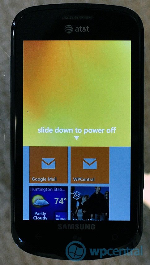
Some other little changes include the shutdown screen. Similar to the lock-screen in design and function, when you hold the power-button to shut off the phone, a screen slides down now giving you one extra-step to power down. We suppose it's a good "safety" function to prevent accidently power offs as well as giving the process a little flair.
Oh and did we mention Wallpaper? While not listed under the Pictures Hub, in Settings under the Lock Screen section there is a "Wallpaper" button that will take you to the Picture Hub and also a wallpaper gallery built in with (currently) 28 sleek wallpapers, including solid-colors that match Themes. Nice touch.
Intelligent Multitasking
Multitasking in "Mango" is certainly interesting. While it's not the full-blown system that Android uses, "Mango's" is a little more refined. When in an app, if you hit the Win key to go back to the start scree, you've basically added the program to the multi-task window--a card like system similar to WebOS. However, if you hit the back-arrow instead, that essentially "exits" the app and it won't go to the multitasking window, giving users a bit of control over how the system handles. For limits, it appears that you can have six apps in memory at a time, which while not a huge number, it should be more than enough for your most used functions. There is no performance "hit" with the number of apps that are frozen--in fact, you would never notice the system unless someone showed it to you (hold down the back arrow).
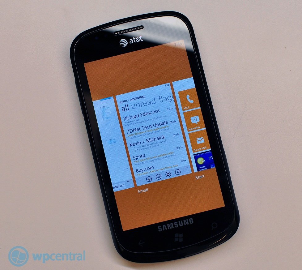
It's not clear yet if apps need to be coded for this feature using the new SDK, but we did notice some odd behavior.[Update: Indeed, you need to recompile your app with the 7.1 SDK to get "fast resume" to work, which is why this feature does not work with current apps. Thanks, Arif, for the info!] Native apps e.g. email appeared instantly, right where they left off, but third-party apps had to refresh themselves i.e. pull-data before you could use them again. This included Xbox LIVE games, like "Sonic the Hedgehog", "Doodle Jump" and "Hydro Thunder Go!", which would have to re-start their level if you exited out of the app and hopped back in using the cards, somewhat defeating the purpose of multitasking. Other games though, like "Pinball League The Juggler", "Orb", would pause the game, allowing you to continue when you resumed.
IE9--the hardware browser
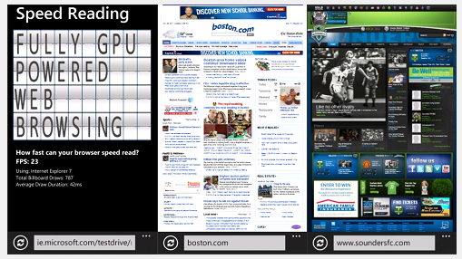
Does IE9 live up to the hype with its hardware acceleration? In short, yes it does. Scoring 95/100 on the Acid3 Test and rendering pages more quickly than any other browser we've seen, IE9 is the real deal. As we mention in the video, some folks lament the idea of a dual-core (CPU) Windows Phone saying we don't need the power, but if IE9 can take one of those cores, we could see some serious mobile browsing in the future.
But what about now with our single core devices? It still loads web pages extremely fast, is compliant with most standards (HTML5, CSS3, SVG, DOM, XHTML) and is just a pleasure to use (especially over WiFi we bandwidth is less of a concern). Third party browser add-ons like SurfCube still work too, meaning nothing seems to have been broken by the update.
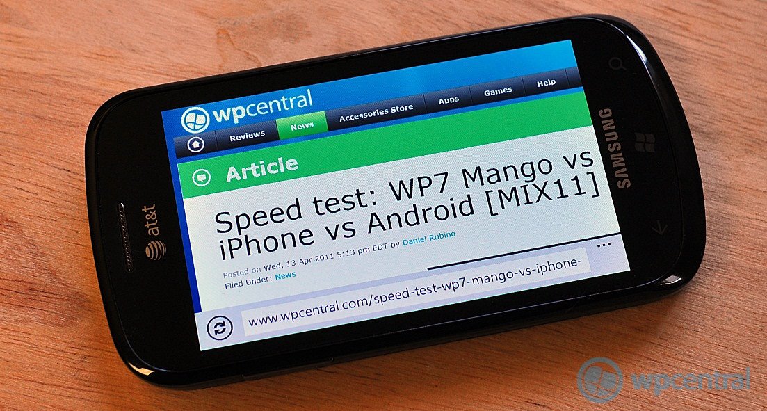
We had no crashes either and we're told it has "Protected Mode for browsing safety and Hang Protection for browsing reliability", ensuring a consistent experience. The shifting around of the address bar to the bottom works well and it's great to see it in landscape too. By reducing "chrome" you essentially have a full-screen browser on the device now, making it visually more enjoyable with little distraction. Finally, in the release-version of "Mango" you'll be able to directly Tweet or share via Facebook any page you're on within the browser--a nice addition.
Bing gets overhauled
Bing was always a little anemic in Windows Phone 7 and NoDo--sure it was there, worked well, but we were missing a lot of the cooler things that the Bing team was working on. Finally, in "Mango", we get a more bull Bing-experience.
First, the hardware key for Bing aka the magnifying glass, universally takes you to Bing Search. Not even in the Marketplace will it search there (they added a soft-search button for that). It's a bit of an odd change, in fact developers were hoping that Microsoft would relax the control on that search key so that devs could use it for in-app searches, but alas Microsoft has gone the other way, taking it completely for Bing. Quick Cards are also a new, unified way of presenting information that is searched for anytime you use Bing--movies, books, CDs, etc. all presented with "About", "Reviews" and "Prices" (if applicable). It's a nice touch and makes Bing very fast since, once again, there is no "chome" aka UI frippery.
Second, Bing Images is there, thankfully. Any search you do will also bring up some pictures which is pretty sweet. The downside? You can't do anything with the pics--can't share, can't download, can't use as wallpaper, just stare at them. At least there are plenty of "image search" apps out there to fill in that gap, but we hope Bing Images gets an update before release.
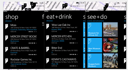
Local Scout is certainly one of the highlights of "Mango". While it can be extremely useful for travel, it's just as useful for your hometown. Let us explain. When you first launch it, it of course uses geo-location to pinpoint your location. From there, you have four sections: "Eat + Drink", "See + Do", "Shop" and "Highlights". "Eat + Drink" and "Shops" are pretty basic--they show you what places are around you, allowing to tap for more information including hours, address and reviews. But "See + Do" and "Highlights" are dynamic, meaning they change regularly. Specifically, "See + Do" will show you things that are going on today around you--events, concerts, live performances, fairs, you name it. It's a way to discover things to do instantly and with no effort. Very impressive and one of our favorite new things.
Bing Music is still being developed but it certainly works. Like Shazam, Bing Music will identify ambient music around you, then search for it in the Zune Marketplace, allowing you to stream, purchase or download (if you have a Zune Pass). It worked well enough for mainstream music, was a little rougher on more obscure things, but seeing as it is still in development, we expect big improvements by launch. Either way, it's great to have such a function native to the phone.
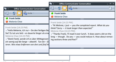
Finally, Bing Vision is the other big deal. By actively using the camera, you can scan barcodes (US only), QR (many regions), Microsoft Tag (many regions), commercial media (CDs, DVS, Books, Posters and Magazines--but may be limited to US only) and finally even translate text into/from English, French, Italian, German and Spanish. It's the Swiss Army Knife of camera scanners and it works very well. We used it regularly to try and scan all sorts of items and had a high percentage of success--in fact it was fairly enjoyable to use. Once an item is identified, a results screen comes up with information, reviews and prices (if applicable) from various merchants. In theory, if the merchant is someone like say Amazon.com, it should launch into the Amazon app (or so we believed) but that feature does not yet seem complete in this build.
Games Hub
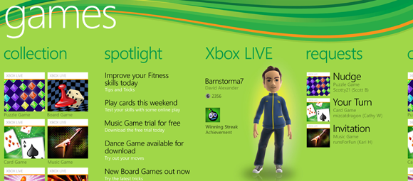
The Games Hub, where all things Xbox LIVE are located, received some updates as well, though no major new features. Some of the changes include having your avatar completely animated from within the app, instead of using Xbox LIVE Extras. That's because XNA and Silverlight can live within the same app now. Some aesthetic changes include making it all white, using smaller icons in a list, adding friends/messaging tiles and "Spotlight" where you can get the latest Xbox news. While these changes are small, it unifies the look and feel of the Games Hub with the Xbox LIVE branding and system. Adding those tiles and refining the look goes to show you how deep and careful Microsoft is considering appearance here and we approve.
And yes, game requests are there for what we assume will be multiplayer (asynchronous) game play in the future. Finally, Xbox LIVE Extras is relegated to the task of avatar customization via the Marketplace. It's still an optional download and only there if you want to change your features, style or purchase new items in the Marketplace. It works well enough and is quite zippy.
Zune Player
Of course the Zune Player gets some nice additions as well, specifically Smart DJ which will allow you to basically create a Pandora-like streaming experience: you pick your favorite band or song, select Smart DJ and from their the Zune system will create a dynamic playlist based off of that style. It's been on the Zune HD player for awhile so nice to see it brought to WP7.
Other little changes include moving of the play/pause, forward/back buttons to the top of the screen and making them larger. This is now 100% consistent through they system. In addition, you have your Favorite button ("heart"), repeat and random buttons all accessible on the player screen.
While podcasts have been supported via the Zune Desktop, you can now do it over-the-air via the Zune Player/Marketplace. You can download a single episode or subscribe (and manage) any podcast, and video is supported as well. Of course there's a catch: you can't download any podcasts (audio or video) over 3G but have to be on WiFi, similar to how downloading large Xbox LIVE games works now.
The other cool thing is now 3rd party streaming apps like Last.fm and Slacker can take advantage of background tasks, allowing for streaming in the background while using the Zune Player controls--a very nice addition.
Oh and 'Marquee' has thankfully be re-named to the much more specific 'Apps' for 3rd party app integration. Some other minor changes include modifications to the UI e.g. 'History' now scrolls only down instead of overlapping to the right.
Hands-free Messaging and Speech
Yes, the Microsoft TellMe speech system is still in effect in Mango and has received some nice upgrades. First and foremost, you can now say "Text
[[ person x ]] " and it will create a text window for you, then ask you to say your message. Once completed, you can "cancel' , "try again" or "send" for a complete hands free experience. Likewise, when a message comes in you can have it read to you and respond--all very cool stuff and it worked as well as any other speech-to-text system we've tried e.g. Android.
Calling options are now expanded too. You can now say "Call John, on mobile using speakerphone" and get exactly that--a perfect setup for in car driving. You can also use the speech command while on a phone call, using "Call" to call another person or "press" to press a number.
Facebook, Twitter, Threads and Groups

No doubt "Mango" steps up with social networking and keeping in contact with friends and family. If you're a Facebook fiend, you'll appreciate how "native" it is now in Windows Phone 7.5--specifically from your "Me" hub you can check-in via Facebook (and Windows Live), post a message and set chat status. You can also finally receive notifications via Facebook and Windows Live right within the OS--so forget that Facebook app. In addition, native chat for Windows Live and Facebook is here, making this all but a Facebook phone (though currently, the feature is not available in this preview build). Finally, Facebook Events can be added directly to the Windows Phone calendar and include the ability to see the description, attendees and decline/accept from within said calendar--very nice.

Twitter is almost here. We know it will be in the final version and Microsoft has talked about it. Unfortunately, we do see "Twitter" under "Add an account" but it's listed as "Coming soon!" for now. However, we can see that it will require you to connect your Twitter account via Windows Live, not a stand alone. Microsoft did, however, provide us with a screen shot to get an idea of what it looks like and we can say it will feature: Tweet, reTweet, comment, replay with @ mention, share web pages (via IE9) and share photos via the Photo Hub.
Threads, to refresh, is the ability to combine text messaging, Facebook and Windows Live Messaging all in one place. The idea is that you can seamlessly continue a conversation with some regardless of medium. This is done by linking the person to all the various accounts under the People Hub and then the OS "knows" to combine everything together. Seeing as we were unable to test Facebook Chat, we'll have to leave a more in-depth review later. Needless to say, the theory is at least sound and should make a much more sane experience in today's multi-client world.
We should also mention "face recognition" is here too. From your photos in your Picture Hub to online pics (SkyDrive, Facebook), a little square will appear over a face, which then allows you to "tag" them. This goes even deeper with Facebook since they're starting to automatically identify and tag faces, which is a little creepy. Still, for those of you who tag your friends in photos for uploading, this should be a great feature.
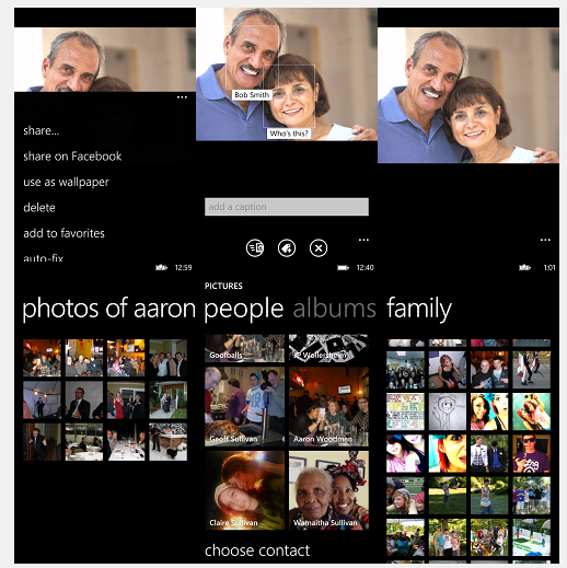
Finally, Groups is something we've seen earlier: it's the ability to create clusters of contacts e.g. family, friends, co-workers and then have all of their information under one hub, including "status updates, photo updates, check-ins, missed calls, new SMS, email, IM, or voicemail". From their you can even create a Live Tile for that Group and the above information will dynamically change as information rolls in. It's truly a new and different way to keep up socially with your friends and family. What's neat too is the system will recommend a Family Group based on the last names in your People Hub.
Loose Ends: Email, Maps and Marketplace
Last but not least are the changes in email, maps and the Marketplace. While significant, they're a little less exciting then some of the previously mentioned changes.

Email first and foremost now has threaded message. That is easily one of the best changes yet and it works pretty well, although it does take some getting used to, specifically the way the headers work is a bit different (it's an extra line of information) and the ordering is the opposite of Gmail with the newest message first and previous emails below. That actually makes sense when you think about it, but some of us have been "trained" by Gmail to have it in a descending order so at first glance things seem a bit off. Likewise there are significant changes to Outlook support, including:
- Read IRM emails
- Alpha-numeric PIN
- Set Out of Office messages
- Search email server for messages
- View & sync multiple Calendars on an account
- Sync To-Do list
Then there is the ability to create a unified email box (numerous accounts linked together as a Live Tile--very convenient) and the new function of creating a Live Tile from a sub-folder. That last part is real useful. For instance, we have a WPCentral sub-folder in our Gmail account. Normally we have to open email, choose Folders and then select the folder we want to see new messages. Now, we can create a Tile that goes right to it on the Start screen. Moreover, you'll now get notifications for that sub-folder. In essence, you've created a whole new in-box and in theory, you can do this unlimited times. However, in doing this change, Microsoft did move the Folder button to the list and in turn, the Sync option gets its own button. Some may find that a bit jarring at first but it seems to make sense in a traditional email way.

Maps finally gets turn-by-turn driving directions. While not as full-featured as some 3rd party offerings, it is free and works well enough. Also, you can now have the maps "Rotate with my current direction" or "Always orient north", something we think will benefit from the addition of a hardware gyroscope.

Last but not least, the Marketplace gets a nice make over. Before, when you chose an app in the Marketplace, it's information was all on one screen. Now there are four that flow nicely with Metro. Those four screens are 'details', 'reviews', 'screenshots' and 'related', with the latter smartly giving a list of similar apps (it's actually really accurate). Since each area now has it's own section, detail is great, the screenshots are laid out in a better fashion (smaller, tiled) and reviews are easier to read. Plus, you can now see an app's rating before you click on it, allowing you to pass over those 1 or 2 star apps. The other neat feature is the ability to get suggestions as you type in the Marketplace, speeding up the process of getting that app.
Conclusion
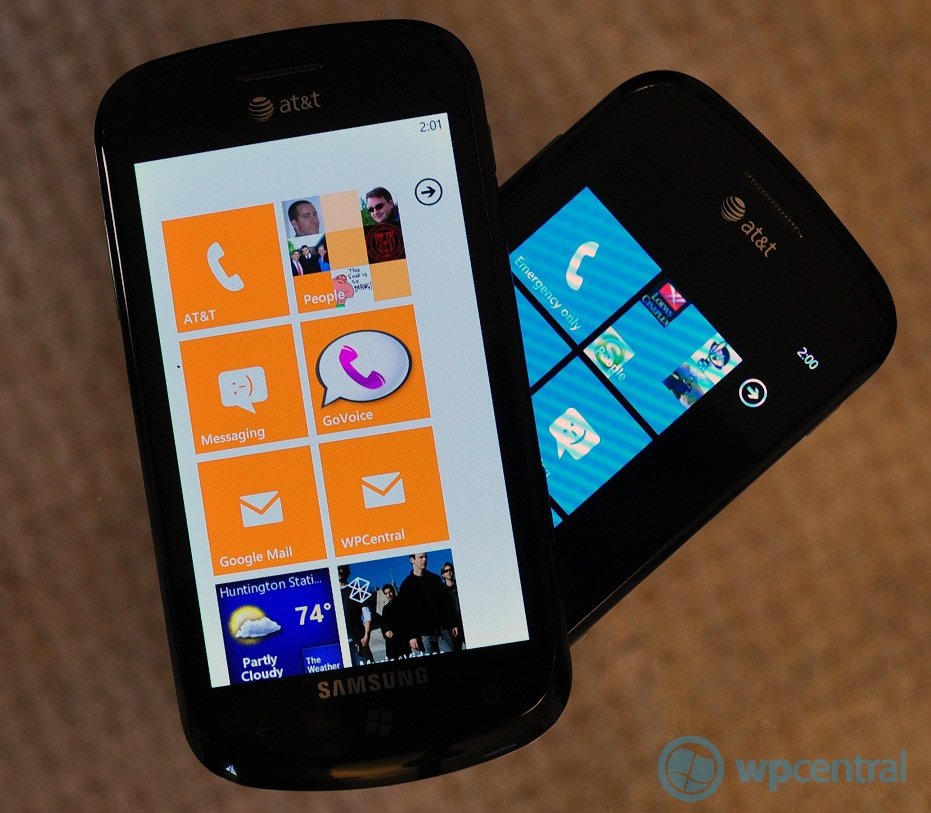
Whew! Did you actually read all of that and watch those videos? Than congratulations, you know as much about "Mango" as we do now. So what did we learn?
In our opinion, Microsoft has so far done a fantastic job with "Mango", delivering many new features, fixing complaints from users and expanding the usage of our smartphones way beyond what "NoDo" has given us. What makes "Mango" so interesting is nothing feels tacked on. It's not like Microsoft saw what the competition was doing and decided "we can do that too!", resulting in an OS that has features haphazardly slapped together, but nothing to unify them. The changes in Windows Phone 7.5, on the other hand, feel like an extension of a vision, of a philosophy of how our mobile phones should work. While Apple has simplicity down (just one button!) as their guiding force, Android seems to have a "throw the kitchen sink in there too" mindset, resulting in a more chaotic, inharmonious experience.
It's almost odd to see such an approach from Microsoft, who's more often been associated with pragmatism not elegance. But "Mango" aptly demonstrates that Windows Phone 7 was not just a one-hit design, but rather the beginning of a whole new ecosystem (which we're now seeing extending to Xbox and the PC).
The most odd thing about "Mango" is the lack of a "killer feature". That's not a put down either. What we mean is there are so many new things on board, that there can't be an agreed upon single "wow" feature. Instead, the user is allowed to pick and choose what they feel is the best. For myself? The performance improvements, IE9 and Bing are all amazing, with IE9 being ground-breaking. For others though, the tight social-network integration or Office improvements could be their killer feature. In short, there's something for everyone in this update.
Is it all rosy? Perhaps not, there's still some "Microsoft control" over the OS is still present, the permanent "tool bar" above the keyboard takes away precious real-estate, the inability to download podcasts over 3G seems over-protective, etc. But these come off as more nits than full on criticism. With so many fixes, new features or expansions of old ones, it seems a bit difficult to levy serious criticism. For being a "preview release" the OS is substantially stable, with only the rarest of hangups and demonstrates how far along in development Microsoft is with "Mango", making that fall deadline extremely plausible (and hey, it works on the Focus already--heck, Sammy even gave us a new firmware update this weekend).
But there's another half to this "Mango" equation: developers. A lot of things in this update won't shine until devs start cranking out new or updated apps that leverage all the new APIs, gyroscopes, augmented reality tools, new Live Tile system, address book access, socket support, multi-tasking, etc. When that happens, we an really be prepared to be wowed.
Microsoft has added frosting to last year's cake, now it's up to devs to add the candles. In short, Mango is delicious.
Mango Image courtesy of: VanSoaked (DeviantArt)

Daniel Rubino is the Editor-in-chief of Windows Central. He is also the head reviewer, podcast co-host, and analyst. He has been covering Microsoft since 2007 when this site was called WMExperts (and later Windows Phone Central). His interests include Windows, laptops, next-gen computing, and wearable tech. He has reviewed laptops for over 10 years and is particularly fond of 2-in-1 convertibles, Arm64 processors, new form factors, and thin-and-light PCs. Before all this tech stuff, he worked on a Ph.D. in linguistics, performed polysomnographs in NYC, and was a motion-picture operator for 17 years.
