Windows Phone Navigation App Smack Down: NAVIGON vs. HERE Drive+
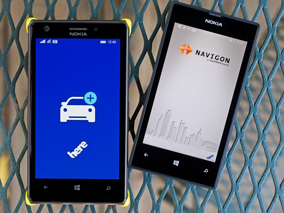
The Windows Phone Store has a nice selection of navigational apps that can help you get around town or get across the country. NAVIGON and HERE Drive+ are two of the more popular options available on Store shelves. Along with a full host of features, these two mapping apps take advantage of downloadable maps to help minimize your dependency on data while traveling.
I recently took a short jump out of town and decided to re-visit both these apps to see if one stood heads and shoulders above the other. I used both apps periodically on the round trip journey, as well as around town while at my destination. While we've looked at these two navigation apps before, having logged 1,300 miles on my trip I figured it was worth taking another look at things.
Let me get the common ground items out of the way first.
Both NAVIGON and Drive+ performed nicely by creating routes quickly, had nice voice navigations, accurately displaying my speed, re-routing without delay and marking my location within an arm's reach of my actual location. I hate to take the easy way out but both apps did a good job getting me to where I needed to go. Neither were perfect and here is what shined and what could use a little work.
HERE Drive+
HERE Drive+ works off a map view. The app's menu is pulled up from below the map with options to set your destination, view your recent destinations, view any favorite destinations, view your commute routes, save a location, access the find your car feature, turn on/off your internet connection, and access the settings. You also have links to send Nokia feedback and view the About page.
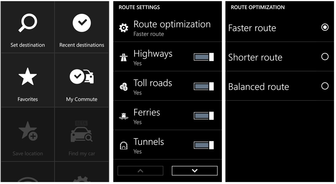
Two quick thoughts on the menu options. The commute feature will track your daily commute and help optimize your travels with traffic information. This feature may save you a few headaches with your daily commute. The find your car feature allows you to save your car's location to help you track back to it. This feature should come in handy when you park in a huge parking lot at the mall, airport, sports arena, etc.
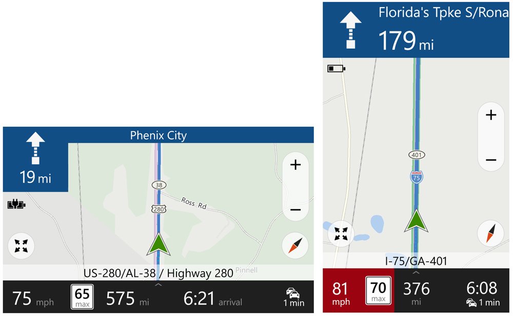
The display while navigating is one of the strong suits with HERE Drive+ and found it to be the better of the two. At the top of the screen in large print you will see your next turn information. Across the bottom of the map view is the name of the road you are currently traveling on and just below that you will find your speed, the speed limit, miles until your destination and approximate arrival time. At a glance, I found it easier to read the HERE Drive+ screen.
Get the Windows Central Newsletter
All the latest news, reviews, and guides for Windows and Xbox diehards.
One of more noticeable drawbacks with Drive+ when compared to NAVIGON is the lack of route selection. While the settings will allow you to optimize your routes based on the fastest, shorter, and balanced variables you are only given one possibility when Drive+ generates things. Plus, there didn't seem to be consistency in the route planning. For example, the route I received to get me to my destination wasn't simply reversed for my trip home.
Granted things corrected itself with re-routes once I missed the first turn on the new route but what if I wasn't familiar with these roads? I think Drive+ would benefit from giving you a few route options and if not, the app should stay consistent by reversing your route home.
NAVIGON
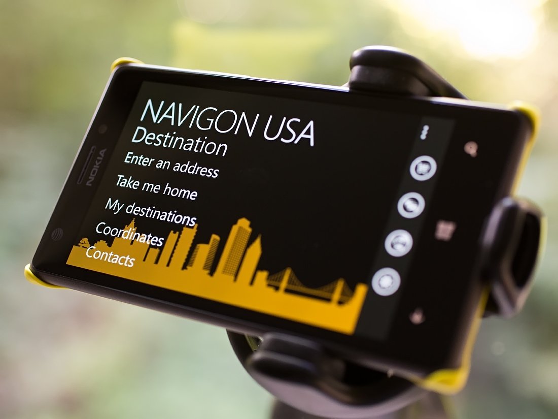
NAVIGON has been around for some time now and is more menu based than HERE Drive+. Available in US, Europe and Australian versions that map app has three main menu pages that include a Destination page, a Search for POI page and a More page. Destinations can be entered by address, your home address, a saved destination, by coordinates, and from the contact information in your People's Hub.
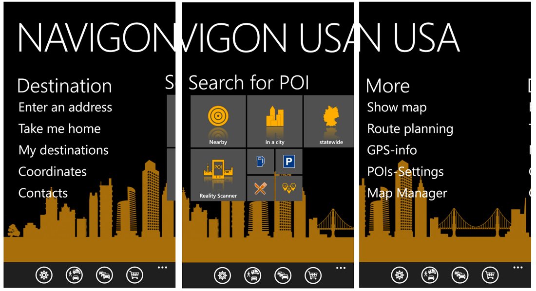
The POI page is a nice touch that lets you search for points of interests such as restaurants, gas stations, banks, airports, shopping centers and more. NAVIGON includes twenty-five POI categories and has the ability to search by what is nearby, in a city, in a State or by category. The app also has a reality scanner, which uses your Windows Phone camera to create an augmented reality scanner to identity POI's in your field of view.
The More page covers viewing your map, view your route planning options, view the GPS information, tweak your POI settings and manage your downloaded maps. Across the bottom of all the main pages are four control buttons that access NAVIGON's settings, your travel profile, view traffic and access NAVIGON's in-app purchase options.
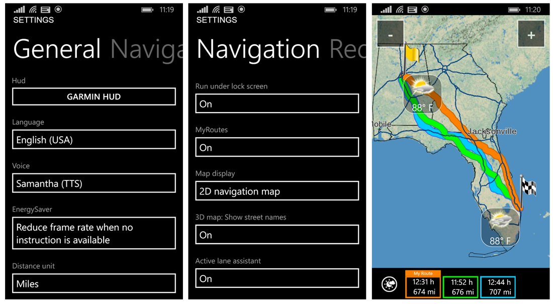
In generating a route, NAVIGON will typically give you three choices of routes. They say there is more than one way to skin a cat and there's often more than one way to get to your destination and I like how NAVIGON gives you that choice.
On the other hand, I wasn't a big fan of the navigational map with NAVIGON. Even though map data is powered by HERE maps, NAVIGON has put their own look on things (which isn't necessarily a bad thing).
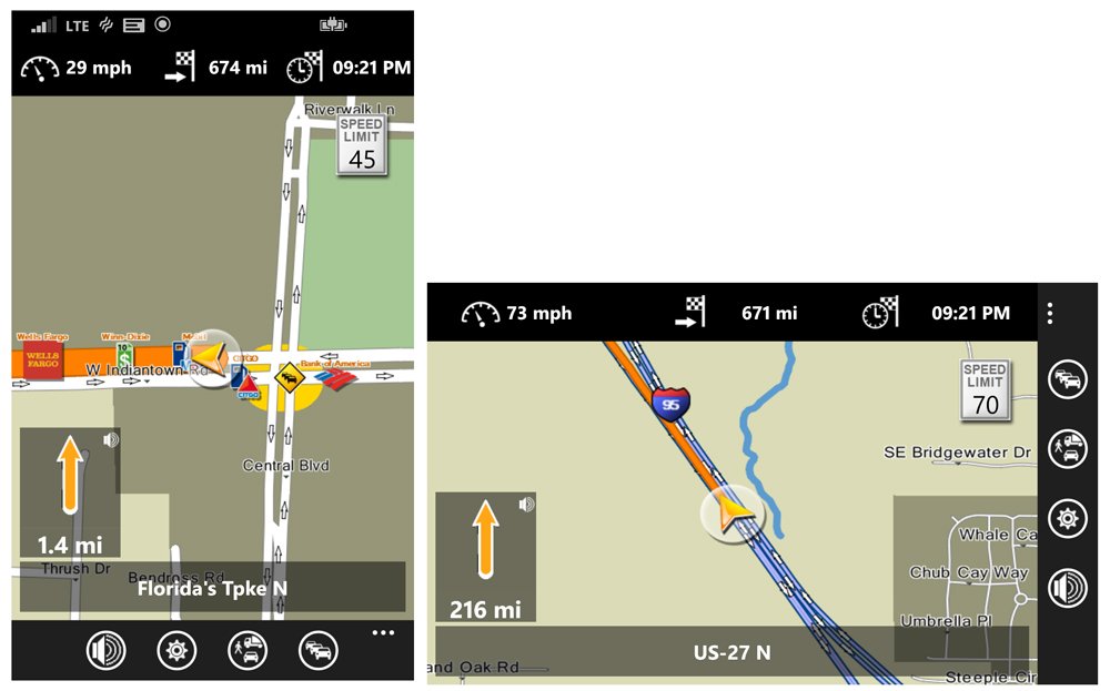
Compared to Drive+ it seemed more cluttered and hard to use at a glance. At the top of the screen you will find your current speed, distance to your destination and approximate arrival time. The posted speed limit will appear in the upper right corner of the map with your next turn in a window in the lower left corner of the map. Your current road information runs across the bottom of the map. Four control buttons line the bottom of the navigational screen to let you mute the voice navigation, access the settings, view your travel profile and view traffic information.
Compared to Drive+, I found it difficult at times to glance at NAVIGON's map and pick up key bits of information. In heavy traffic this can be important when you don't have the luxury to sit and study a map screen. It's not a bad layout, reminds me of a Garmin NUVI and I will admit, the more you use NAVIGON the easier it gets to pick out the information.
Across the board issues
While I found both NAVIGON and HERE Drive+ to be capable Windows Phone apps, a few issues can apply to both these navigational apps. Maybe it's more accurate to phrase these as potential areas of improvement than issues, as in problems.
First, neither app would reflect the estimated arrival time for the Time Zone of the destination. For example, I left the U.S. Central Time Zone and traveled to the U.S. Eastern Time Zone but my estimated arrival time was displayed for Central Time. While it's easy to add or subtract an hour here or there, it can get confusing. I'm not sure what the roadblock is to get the arrival time to reflect the destination's time zone but it would be a nice touch.
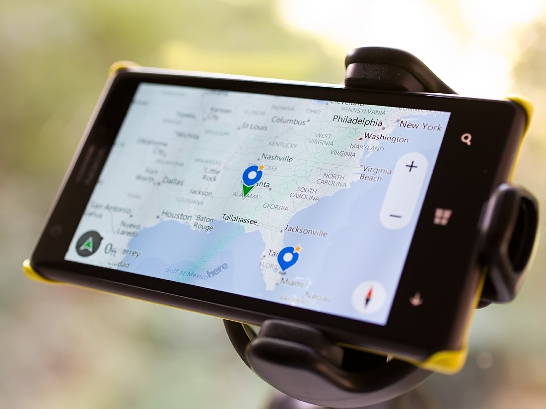
Second, it would be so nice if these apps had the ability to enter a destination address audibly. There are countless times I'll be driving, need help finding an address and have to pull over to type in the address. Sure, some of us who are running Windows Phone 8.1 can use Cortana but if I'm already in one of these apps, I shouldn't have to leave the app to enter the address using voice commands.
Lastly, more voices are needed! Okay, that one may be a little on the superficial side of things but I miss my old TomTom GPS unit that had celebrity voices. You do have a few male/female voice options but wouldn't it be neat if Yoda, Master Chief or maybe even Tiny Tina from Borderlands were available to guide you down the road?
Bringing it all home
Wrapping it up, here is how I see both these Windows Phone navigational apps.
- HERE Drive+ has the easier to read map display.
- NAVIGON has the advantage of offering three routing options
- HERE Drive+ has the commuter and find my car feature
- NAVIGON has a robust menu with options to find points of interests
- HERE Drive+ is free while NAVIGON is running $49.99
- HERE Drive+ is part of the Nokia Collection but will be available for all Windows Phone 8.1 devices
- Both need the estimated arrival time to reflect the local time of your destination
- Both need the ability to enter addresses audibly
I'm going to take the easy way out and say that I really don't know if you could go wrong with either NAVIGON or HERE Drive+. None of the downsides noted are deal killers with either app and the downloadable maps is a big plus. It may make for a weak smack down but they are two nice apps.
I keep both of these apps on my Windows Phone and usually rely on HERE Drive+ for around town trips when I need to take advantage of the glance friendly display. I use NAVIGON more for longer hauls when I have more time between turns to study its screen. If I had to get off the fence I so often sit upon and had to choose only one, it would likely be HERE Drive+ for its easier to read at a glance display.
Let us know below in the comments how you see things. Is NAVIGON or HERE Drive+ your daily driver or do you prefer another option?
- HERE Drive+ - Windows Phone 8 Lumia Phones - Free - Store Link
- NAVIGON USA - Windows Phone 8 and 7.x - $49.99 - Store Link


George is the Reviews Editor at Windows Central, concentrating on Windows 10 PC and Mobile apps. He's been a supporter of the platform since the days of Windows CE and uses his current Windows 10 Mobile phone daily to keep up with life and enjoy a game during down time.

