Windows Phone apps that help you keep up with your calendar events
Windows Phone Central App Roundup: Calendar Apps
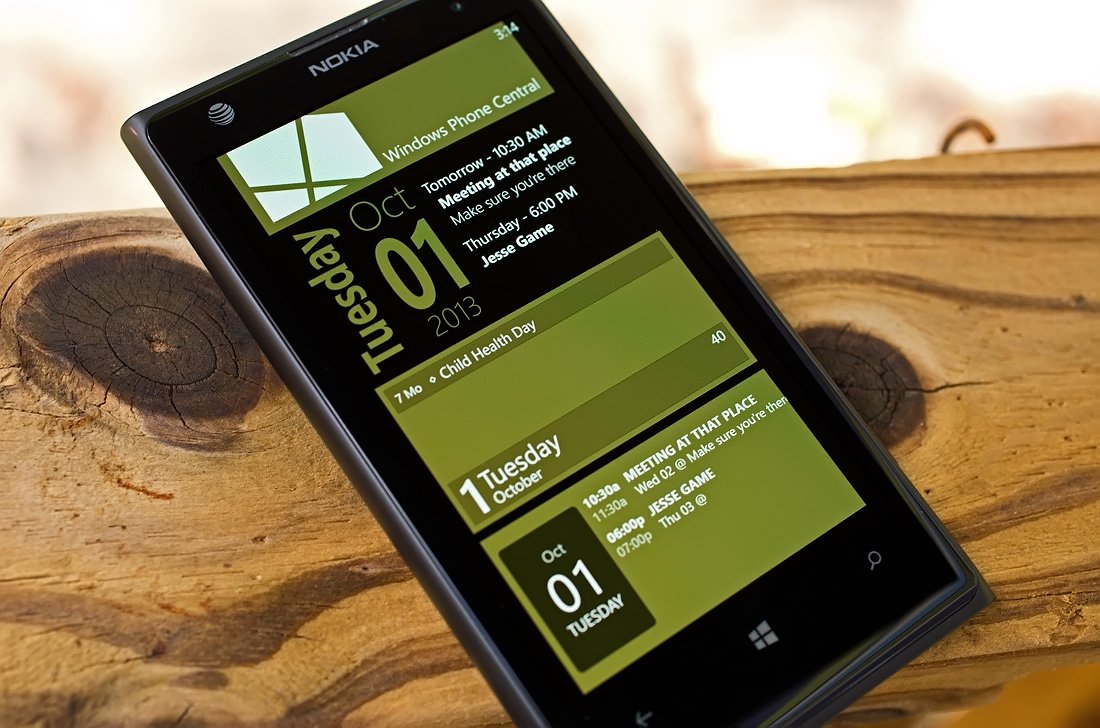
While the native Windows Phone calendar app has it's usefulness, it can be a little lacking with regards to features. A little on the vanilla side if you will.
Luckily there are some nice third party options in the Windows Phone Store that can provide a little more functionality and features to your Windows Phone calendar. Apps that will help you keep track of where you need to be and when you need to be there. And that's the focus of this week's roundup... calendar alternatives.
We picked three of the more popular calendar apps in the Store that offers you an alternative to the native calendar app on your Windows Phone. If we missed your favorite calendar app, there's no conspiracy afoot just went with these three based on their popularity. Feel free to sound off below in the comments with your pick for a Windows Phone calendar app.

Simple Calendar (free/in-app upgrades): Simple Calendar has been around for some time now and is a very popular calendar alternative that gives you... well... a simple view of your appointments and events. The app has a very robust Live Tile and lockscreen support, plenty of settings to help the app fit your needs better and is just a sharp looking app. Between functionality and appearance, Simple Calendar should make everyone's short list for calendar apps.
Once you launch Simple Calendar the app automatically taps into your existing Windows Phone calendars eliminating the need to spend time setting up the connection. The main view for Simple Calendar is a monthly calendar view that lists your daily appointments below. Basically creating a monthly and daily view on the screen. In tapping on a specific appointment, you can pull up more details on that appointment.
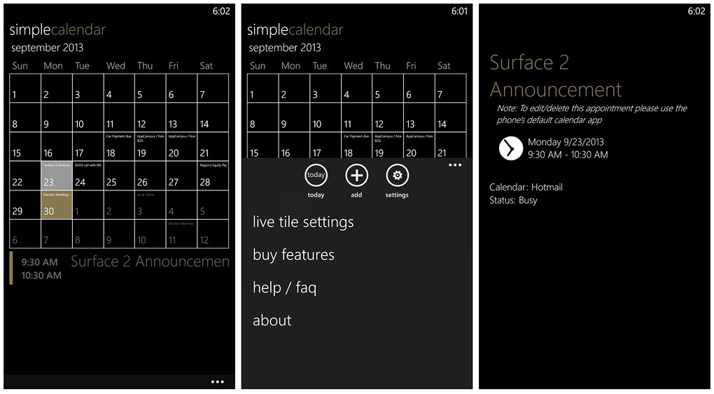
Simple Calendar Main View, Menu, Navigation Menu, and Appointment Display
Simple Calendar utilizes the native Windows Phone calendar screens to add an appointment. However, while you can add an appointment to your calendar through Simple Calendar you'll need to go into the native calendar app to edit or delete it (OS restriction).
Get the Windows Central Newsletter
All the latest news, reviews, and guides for Windows and Xbox diehards.
There isn't a weekly, daily or year view for Simple Calendar. I can live without a yearly view and with your daily appointments listed below the monthly calendar, there really isn't a need for the daily view. However, a week view wouldn't be too bad or the ability to zoom into the monthly calendar. The fonts can be awfully tough to read if your trying to plan ahead at a glance.
The calendar view mimics your Windows Phone Theme's background color. If you have a black background for your theme... the backdrop for Simple Calendar will be black. Choose a white background and you get a white backdrop.
Up under the three-dot menu you'll find hidden button controls to go to today's date, add an appointment and access Simple Calendar's settings. You also have links to the app's Live Tile settings, in-app purchases, a help section and the customary about screen. As far as in-app purchases are concerned, you can purchase additional Live Tile designs and remove the ads.
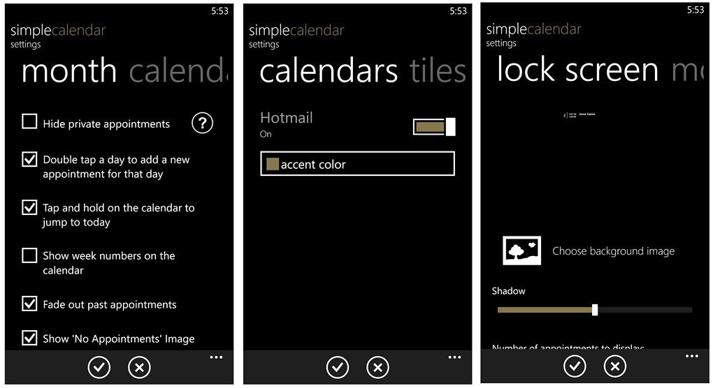
Simple Calendar Settings Pages
Simple Calendar's settings cover a lot of ground and include:
Month Options: Here you will find general options that pertain to navigation and what's displayed.
Options to hide private appointments, double tap to add an appointment, tap/hold the calendar to jump to today's date, display the week numbers on the calendar, Fade past appointments, display "No Appointments" image when applicable beneath the calendar, display a background image (a calendar watermark of sorts) and choose with day the week starts on.
Calendars: Here's where you can turn on/off the calendars your Windows Phone links with and choose a custom color for that calendar.
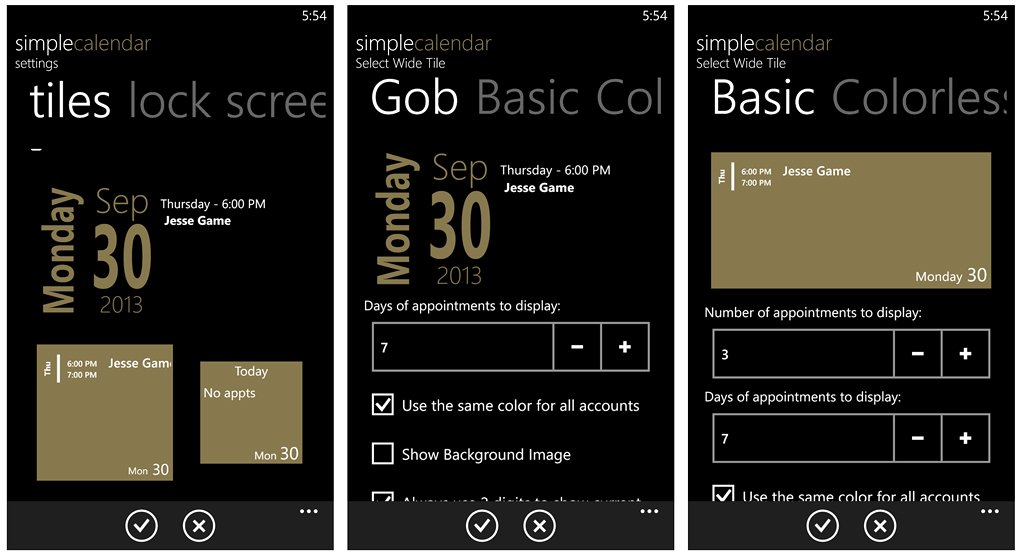
Simple Calendar Live Tile Options
Tiles: Simple Calendar's Live Tiles are definitely one of the strongest selling points of the app. They are really clean looking tiles that give your Start Screen a boost in appearance. In addition to looking great, the tiles provide a nice windows to see what's on your daily schedule at a glance.
All three tile sizes can be customized with up to four styles (two come with the free version, two available for in-app purchase). You have Basic, Colorless with the free version and Gob and Frodo styles that can be purchased in-app. Each style has options that include choosing how many days of appointments to display and a few appearance options (background image, color, etc.).
Lockscreen: Lockscreen support includes options for choosing your wallpaper image, setting the transparency of the display, the number of appointments to display, the number of days displayed, to use the accent color, show the last updated time and whether or not you want to display all day appointments.
Simple Calendar has a simple, clean appearance that makes it easy to stay up on your pending appointments. While you can add appointments to your calendar through Simple Calendar, it would be nice if you could edit/delete appointments as well. Understandably this limitation is not exclusive to Simple Calendar and an issue with OS limitations that can't be avoided.
If you're looking for a simple way to keep up with your appointments, it's hard to overlook Simple Calendar. I do wish the calendar view could be dialed down just a little (two-week view maybe?) to avoid tapping on every date to see what your extended schedule looks like (or maybe a larger font to help those of us with aging eyes).
All totaled, Simple Calendar is a popular Windows Phone calendar app well worth trying. The base app is a freebie with ad-support kicking in after seven days. You can purchase the additional Live Tile themes and get rid of the ads through in-app purchases.
Simple Calendar is available for Windows Phone 8 devices and you can pick it up here in the Windows Phone Store.

Simple Calendar General Settings and Live Tile Settings
Quick update: Simple Calendar was updated yesterday to version 2.6 to address a few bugs that included a few bugs associated with the Live Tile. The update also makes the option to hide private appointment universal. In the process you have a new settings page, General, that let's you hide private appointments and a new Live Tile settings page where you'll need to choose you Live Tile size. In identifying the size, the app will only attempt to update that tile size. You still have all the customization options, you just have to specify which tile size you'll be using.
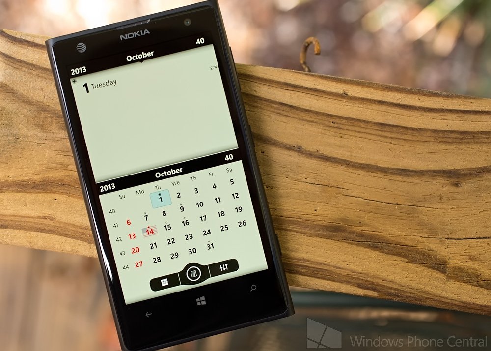
Chronos Calendar (trial/$1.99): Chronos Calendar is a well received calendar app for both Windows Phone 8 and 7.x devices. The calendar app has Live Tile support, built-in holidays and language support for over 50 cultures and Countries. Chronos Calendar does lack lockscreen support.
Chronos Calendar's design is simple and fairly straight forward though navigation takes a little time to get the hang of. Chronos also has the ability to get around the Windows Phone OS restrictions by directly syncing with various calendar servers (google.com, outlook.com, etc).
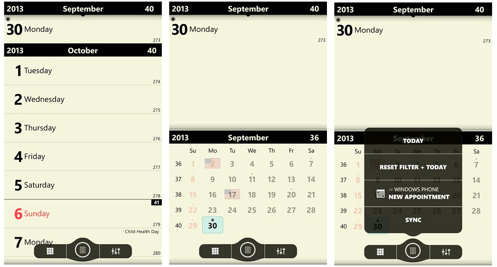
Chronos Calendar Main Page Views
The main page has two view options, a split screen with a day view up top and monthly view down below or a scrolling daily view that spans about seven days viewable at once. A control panel sits at the bottom of the screen with controls to toggle the view (the checkerboard button), navigation/sync options (the center button) and access your settings (right button with the equalizer icon).
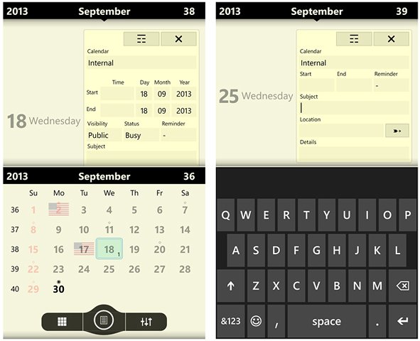
Chronos Calendar Appointment Entry
The center button options include jumping to today, reset any filters in place, add an appointment and sync your calendars. You can also add an appointment by tapping on the day view. If you are syncing to calendar services (outlook.com, google.com, etc) Chronos has a proprietary appointment entry. If you are tapping into the internal calendar, you will use the native Windows Phone calendar entry screens.
Settings cover general options and your calendar options. They break down as follows.
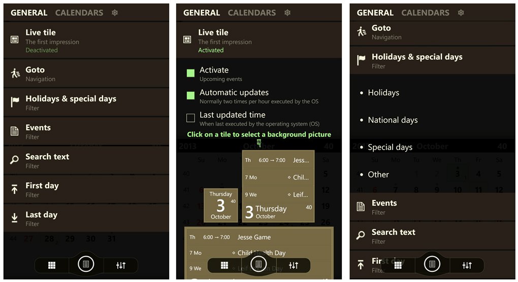
Chronos Calendar General Settings
Live Tile options that include activating the Live Tile, selecting the background image, update frequency, various font sizes and colors and four layout styles.
GoTo is a navigation option to go to today, the beginning of the previous year, beginning of this year, or the beginning of next year.
Holidays and Special Days is your filter settings to display holidays, National days, special days or other events. The event/holiday will be displayed in the upper right corner of the daily calendar view.
The remainder of the General Options cover additional filters for events, text search and first/last day of the week, month or year.
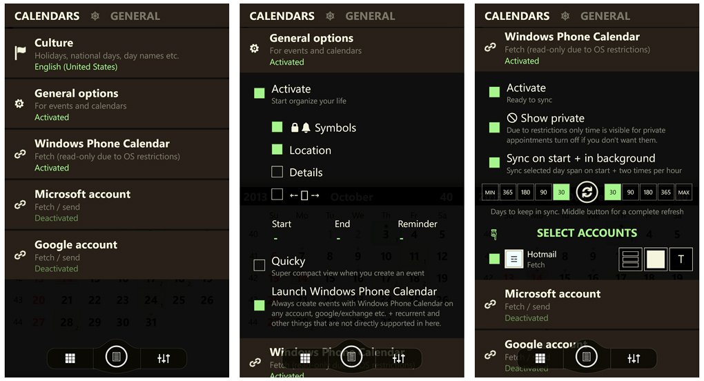
Chronos Calendar's Calendar Settings
The Calendar Options deal with culture settings that will set the holidays and events for your Country of choice. General options let you choose what details for appointments are displayed and options to always create an appointment with the Windows Phone calendar. Set-up screens for syncing with your Windows Phone calendars (internal) or syncing with your Microsoft or Google accounts (in the cloud).
If you sync with your internal calendars, you can only view and add appointments to your Chronos Calendar. If you sync with external Google or Microsoft calendars you can view, add, and edit appointments. You just have to remember to sync with these accounts to have the edits/changes put into effect.
Chronos Calendar isn't a bad alternative to the native Windows Phone calendar. The layout is simple and straight forward, the Live Tile customizable to meet your needs, and the ability to sync between calendar accounts to add/delete/edit appointments can come in handy. If you prefer to stay internal with your appointments, you can do that as well but lose the ability to delete/edit your appointments.
Chronos does lack lockscreen support but that may not be a deal breaker for you. I wouldn't mind seeing a few color options for the calendar views but otherwise Chronos is a pretty solid app.
There is a free trial version available to let you give Chronos Calendar a test drive with the full version running $1.99. It is available for both Windows Phone 8 and 7.x devices and you can pick up your copy of Chronos Calendar here in the Windows Phone Store.

Super Calendar (trial/$1.99): Super Calendar throws just about everything a calendar can handle on to your Windows Phone. From Live Tile and lockscreen support to audible appointment details, Super Calendar is riddled with features but navigation can take a little frustrating at times (mainly with settings).
Super Calendar is available for Windows Phone 8 devices only and automatically taps into your native Windows Phone calendar. As with other third party calendar apps, Super Calendar is limited to viewing and adding appointments to your calendar. Adding an appointment/event to the calendar utilizes the native Windows Phone calendar entry screen.
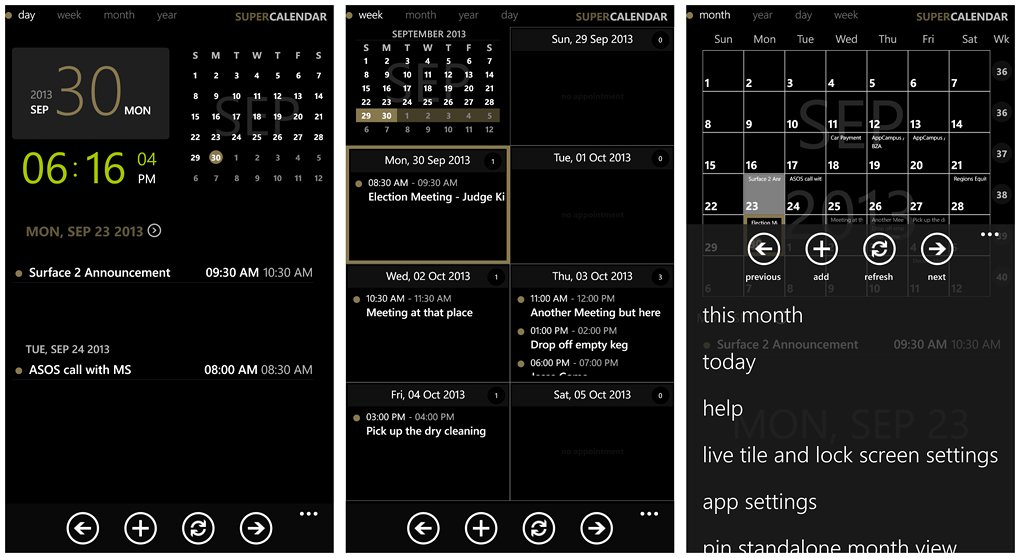
Super Calendar Main Page Views
Super Calendar has four calendar views from the main page of the app. You have a year, month, week and day view (you can go into the settings and pick one as your default view).
The day view has the date/time displayed in the upper left corner, a monthly calendar in the right corner and your daily schedule listed across the bottom half of the screen.
The weekly view has a monthly thumbnail in the upper left corner and then a seven day view scattered across the rest of the screen. With the monthly view if you tap on a date, any appointments for that date will appear at the bottom of the screen.
The year view doesn't display a yearly calendar but rather a scrollable list of all you appointments for the year. You can search your appointments by keyword or jump to a particular month with the tabs that line the bottom of the screen.
In tapping on an existing appointment Super Calendar will display a more detailed account of that event. At the bottom of the appointment view you'll see two control buttons. One to pin the appointment to your Start Screen, the other to launch an audible reading of the appointment.
At the bottom of the calendar pages you'll find four control buttons to navigate forward and backwards between the months and days, to add an appointment, and to refresh the calendar. Up under the three-dot menu you will find options to return to this month/day/year (dependent on which view you are on), jump to the help section, access the Live Tile and lockscreen settings, access Super Calendar's settings, pin a stand alone day/week/month/year view to your Start Screen and close the app.
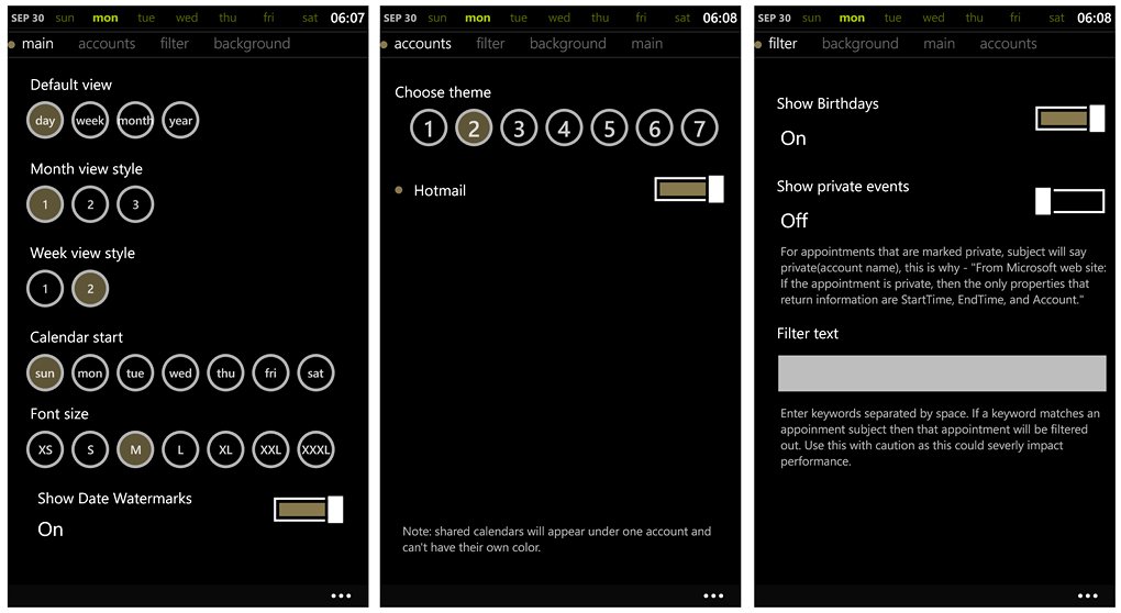
Super Calendar Settings
Settings span four general areas. You have main, account, filter and background settings. They break down as follows.
Main: These options cover Super Calendar's display choices and cover your default view, monthly view styles, week view styles, start day for your calendar, font size, and turning on/off date watermarks. The downside to this settings page is that you don't have a preview of your display options.
This can be a little frustrating and means a lot of back and forth to find the view that fits your needs just right.
Accounts: Here is where you can turn on/off any accounts your native Windows Phone calendar taps into. Naturally if you turn off a calendar, those appointments won't be displayed. You also have seven theme choices to assign a color to each account. Shared accounts will appear under one account and you won't be able to assign separate colors.
Filter: This gives you the option to filter out birthdays, private appointments, or appointments by keyword.
Background: To further customize Super Calendar's appearance you can add a customized background image from your Pictures Hub. To prevent the image from being overwhelming, you can set the brightness of the image as well.
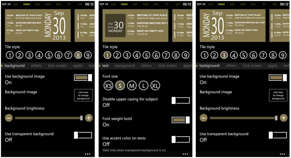
Super Calendar Live Tile Settings
Super Calendar's Live Tile and lockscreen settings are covered under another settings menu. Super Calendar has nine Live Tile styles that range from text only to a few that resemble a lot like Simple Calendar's tile styles.
Along with the overall style choices you can set the number of appointments that appears on the tile, show past events for the day, turn on the back side of the tile for more events, set the text size and color, choose a background image, and turn on/off the display for update times and week numbers.
Super Calendar's lockscreen support is a little on the lacking side with only one default style that shows upcoming appointments for, what appears to be, the current week.
Super Calendar isn't a bad option to consider and while the calendar views are easy to navigate around, the settings user interface could use a little fine tuning. I like the calendar view options but you really need a way to preview the choices without going back/forth between the view and settings screens. While the developers have been active in updating Super Calendar to add more features and styles, I wish they would have been more creative with the Live Tile styles. The latest update did add a few styles but they are strikingly similar to what we see with Simple Calendar's Live Tiles.
I do like the multiple calendar views and the audible appointment detail feature can come in handy. I also have to give kudos to the developer for adding settings for the font size. As someone who's eye sight isn't what it used to be, the larger fonts is very helpful. While I see room for improvement, as is, Super Calendar is a feature rich calendar option worth considering.
There is a seven day trial version available for Super Calendar with the full version running $1.99. Super Calendar is available for Windows Phone 8 and you can pick it up here in the Windows Phone Store.
Which is the best?
As with most of our roundups, finding the best of the bunch isn't as easy as it sounds. The best choice often boils down to personal preference and needs.
I will say that Simple Calendar's simplistic approach and Live Tiles can be very appealing for those wanting to keep up with their appointments at a glance.
Chronos Calendar has the advantage of being able to add/edit/delete appointments through the online synchronization. The user interface isn't the smoothest but with a little use, it grows on you.
Super Calendar could be considered the heavy weight choice of the three with it's multiple calendar views, audible appointment details, and display settings. But the user interface, particularly with the settings, isn't the greatest.
All three have appeal and are worth trying. Personally, I use my Windows Phone more so to see where I need to be next and my computer for managing my appointments. For that reason, the simplicity of Simple Calendar appeals to me the most. But let me hop back on the fence and say that none of the three options in this week's roundup are back choices.
Your needs may differ and there are plenty more calendar options available in the Windows Phone Store. If you have a fancy for one of the apps in this week's roundup or if you prefer another alternative to the native Windows Phone calendar, feel free to share your thoughts in the comments below.
George is the Reviews Editor at Windows Central, concentrating on Windows 10 PC and Mobile apps. He's been a supporter of the platform since the days of Windows CE and uses his current Windows 10 Mobile phone daily to keep up with life and enjoy a game during down time.

