Windows Phone App Review: Fhotoroom version 2.0

Fhotoroom v2 brings a new look to the photo editing app
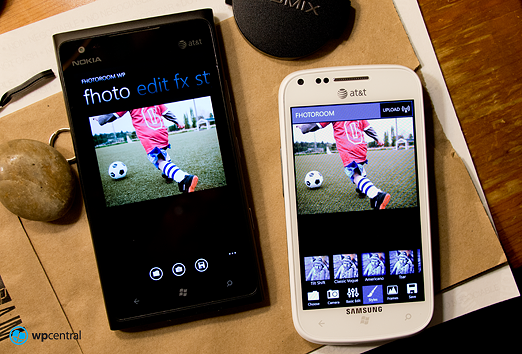
Fhotoroom is a popular photo editing app for your Windows Phone that includes a Photo Sharing Network that throws a social networking twist into the pot. We mentioned over the weekend that the app was recently updated to version 2 which brings a new menu and user interface layout to table.
It's not as if the old layout of Fhotoroom sucked wind but the new version moves away from the multiple page editor to a single page layout. The results is a larger preview image and one stop editing. The Photo Sharing Network may not appeal to everyone but if you're looking for a straight forward photo editor with plenty of filters, Fhotoroom is worth consideration.
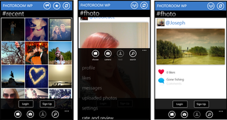
As with the previous version, Fhotoroom launches to a thumbnail page that is populated with images submitted by other Fhotoroom users. You can refresh the thumbnail page to see more images, pull up an individual image, and comment on the image. Below you have options to pull up an existing images from your Pictures Hub or launch the in-house camera app to capture/edit a new image.

The three dot menu pulls up options related to your Fhotoroom membership (profile, messaging, uploaded photos, etc.). Up above the thumbnails are three control buttons that will launch the Fhotoroom news blog that includes the about and help screens, pull up your favorite images, and refresh the thumbnails.
In a nutshell, the update brings these changes to the photo editor:
- Updated all filter for faster performance
- Updated Tilt Shift for easier use and better quality with boundless borders
- Updated Tsar, Classic Pro, Tinge. Herc, Velvia X
- Added New Style Filters Rain, Kapla, Copa, Haze, Adele and Ansel
- Light FX has been completed rewritten and added new light leaks
- Textures has been completely rewritten from the ground up
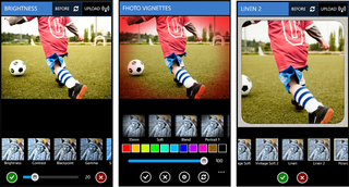
Version 2.0 throws a new user interface into the mix. Instead of swiping back and forth between your preview page, the effects page, the frames pages, and styles page you know have your preview image with buttons at the bottom of the screen to toggle between the editing tools. The new layout makes previewing the effects easier because you never leave the preview image. To help you gauge the edits, a before/after button will appear in the title bar once an edit is applied. Or if you prefer, you can double tap the image to toggle between the before/after views.
Get the Windows Central Newsletter
All the latest news, reviews, and guides for Windows and Xbox diehards.

Depending on the editing tool, all you options are laid out beneath the preview image with thumbnail examples and an application bar to let you apply the effect anywhere from 0% to 100%.
Once you're done editing images can be saved to your phone or uploaded to your Skydrive account. If you're a Fhotoroom member, an upload button is in the upper right corner to allow you to upload and share your images on the network. Improvements on the Photo Sharing includes:
- Merged Profile Page with Main Page
- Reorganized Main page with new menu icons
- Profile name at the top now is also direct link to your profile
- Like and commenting system have been updated
- Photo loading is faster
- Photo liking is almost instant
- Profile can now link directly to personal website, twitter page, facebook page etc. for better self promotion
- Added extra profile support to turn on/off emailing
- Over each photo now has the option to tweet other peoples photo to your twitter account if setup
I won't say the Photo Sharing Network is a bad idea but I wouldn't mind being able to turn it off in the settings so you could go straight to the editing pages. Membership in the Fhotoroom network is free but not everyone will see the appeal of the sharing network.

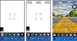
As far as the in-house camera app is concerned, there have been a few performance boosts and the layout has been tweaked a little to be more user friendly. Only if your shooting in Manual will you see the additional settings for flash control, exposure control (looks like a spot meter) and a grid overlay. When you are shooting in one of the four program modes (action, night, landscape, or portrait) these controls are... well... controlled by the automatically.
Overall the update improves the performance of Fhotoroom, makes it a little more efficient in navigating around the editing tools, and increases the social network capabilities. I like having the preview image in front of you while edits are being applied as opposed to going to a different page to choose the edits, then swing back to the preview page. Again, the sharing network isn't going to be for everyone but the improvements add to the social experience.
If you've used Fhotoroom in the past and are upgrading from v1.19, look for the update alert in your Marketplace app. If you're looking for an easy to use photo editor that has a decent amount of editing tools, Fhotoroom is worth at least a try. Fhotoroom is a free app for your Windows Phone that you can grab here at the Windows Phone Marketplace.

George is the Reviews Editor at Windows Central, concentrating on Windows 10 PC and Mobile apps. He's been a supporter of the platform since the days of Windows CE and uses his current Windows 10 Mobile phone daily to keep up with life and enjoy a game during down time.
