Windows Phone App Review: Clearer

The other day we took a look at the Windows Phone app Zero, a gesture based To-do list manager. We then received several tips suggesting another gesture based To-do list manager for your Windows Phone, Clearer.
In many ways Clearer is just like Zero but with a bit more features. Which is better? Both Windows Phone apps do what they do really well. I'll try to break the differences down in a bit but for now, if you like gesture based apps Clearer is well worth a try.
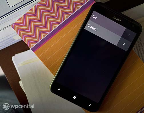
The layout of Clearer has your category lists appearing on the main screen of the app. From there you have various gestures to add categories, delete categories and view the associated lists. When you first launch Clearer, you will be walked through a tutorial. Watch closely and if you miss a step or need a refresher course, you can access the tutorial from the settings.

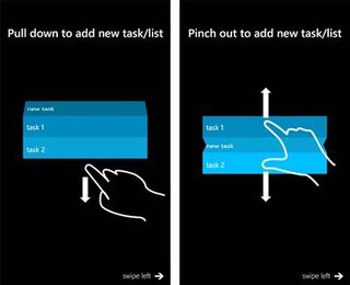
Just walking through setting up a category and list with Clearer, if you swipe down you create a category and your keyboard appears to let you give the category a name. When done you will see a new banner with the new category and a number (zero) on the left side of the banner. This number represents how many tasks or items you have listed within this category.
Just tap on the number and you are sent to the item/task creation screen. Swipe down to add items (repeat as needed) and pinch the list to return to the category page. If you swipe to the right on a category or task banner, that item is deleted. If you slide a task to the right, it is marked completed but not deleted. To reorder the tasks or categories, just tap, hold and slide the banner to where you want it.

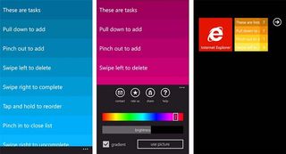
Clearer does have a three-dot menu on the task/list view. From the three dot menu, you have button controls to contact the developer, rate the app, share the app, and view the tutorial. You can also change the color of the list banners, the brightness or use a picture from your Pictures Hub as the background.
As with Zero, Clearer does have live tile support that will show the total number of outstanding tasks/items you have. However, Clearer's live tile flips to show you the categories and tasks/items associated with each category.
Get the Windows Central Newsletter
All the latest news, reviews, and guides for Windows and Xbox diehards.
So which is better? Zero or Clearer? Both are very nice Windows Phone apps. Clearer gives you a little more customization tools (change the color of the banners, use a picture as the background, etc.) while Zero is slated for a back-up feature. Clearer also has text auto correct to help you type more efficiently and a more effective live tile.
I do like the confirmations that appear as you slide banners/categories one way or the other on Clearer. If you're not sure which way to slide, if you slide slow enough you will catch these confirmations and be sure you're heading in the right direction. It makes for a friendlier user interface. I spent a little time with Zero reminding myself what left or right swipes meant.
All in all, I liked Clearer. Until the back-up feature is up and running with Zero, I'd have to give Clearer the nod. And even when the back-up feature goes online, Clearer may still get the nod. I liked the text auto correct, color options, live tile and slide confirmations. Clearer was more stable than Zero, not crashing once. Don't get me wrong, Zero is a good app but Clearer gives you more bang for your buck (for the time being).
There is a free trial version of Clearer available that is fully functional but limited to only on list category. The full version will run you $.99 and you can find Clearer here at the Windows Phone Marketplace.

George is the Reviews Editor at Windows Central, concentrating on Windows 10 PC and Mobile apps. He's been a supporter of the platform since the days of Windows CE and uses his current Windows 10 Mobile phone daily to keep up with life and enjoy a game during down time.
