Windows Phone 8.1 Review
Our comprehensive overview and review of Windows Phone 8.1
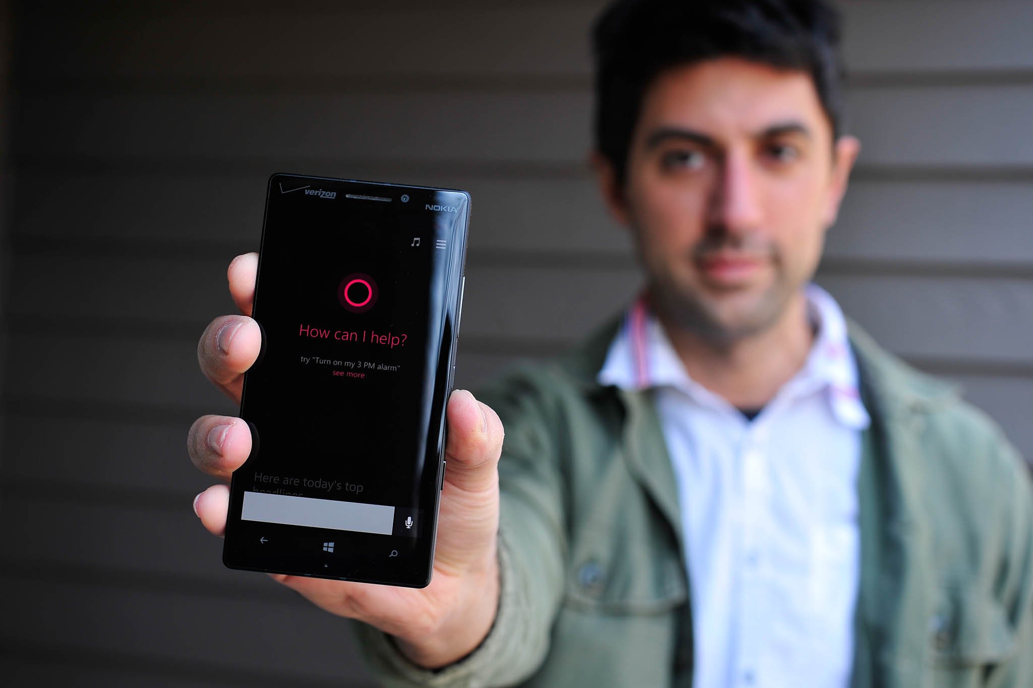
After eighteen months of being, Windows Phone 8 is getting its first major OS update from Microsoft. While Windows Phone 8.0 has had three minor updates between late 2012 and 2013, it is Windows Phone 8.1 that will finally bring a small avalanche of new features and improvements to users. The update is free and expected to arrive for all current Windows Phone 8 devices in the coming months, though starting today, a Preview for Developers is now live should you want to take the OS for an early spin.
I have been using the Preview release of Windows Phone 8.1 for nearly the last two weeks on a Nokia Lumia Icon. Reviewing a whole OS, especially one as robust as Windows Phone is no small feat. Regardless, I’ll go through what I think are the biggest new features and even some small changes that I think users want to hear about.
Is Windows Phone 8.1 really a game changer? And has Microsoft finally delivered a product that the masses can adopt? Let’s find out.
This is one huge update
Let’s just get this out of the way. Windows Phone 8.1 could easily be called Windows Phone 8.5 or even 9. This doesn’t feel like a 0.1 update. This feels like a long-term project that Microsoft has been working on, delivering a massive set of new features to end users. Heck, the ‘reviewers guide’ could pass as a short novel, coming in at 239 pages.
The changes to the OS are significant, not minor patchwork. The only reason Microsoft is calling it ‘8.1’ is to align it with its bigger brother, Windows 8.1 for desktop. That’s fine, although it does slightly downplay this update’s significance.
If I had to cite history, this is equivalent to the Windows Phone 7.5 update dubbed ‘Mango’ from back in 2011. Windows Phone 8.1, nicknamed ‘Blue’ is just as substantial. Mango was a much needed update as Windows Phone 7.0 was a re-launch of Microsoft’s mobile platform. Windows Phone 8 was also another re-launch, as Microsoft had to reboot the kernel and the entire architecture of the OS. In that regard, 8.1 makes sense. It’s a catch up update. But it’s also more.
New Start screen experience, Theme syncing and UI changes
For the most part, Windows Phone 8.1 keeps the core of Microsoft’s design intact. There is no backing away from existing UI principals, just expansion and refinement.
All the latest news, reviews, and guides for Windows and Xbox diehards.
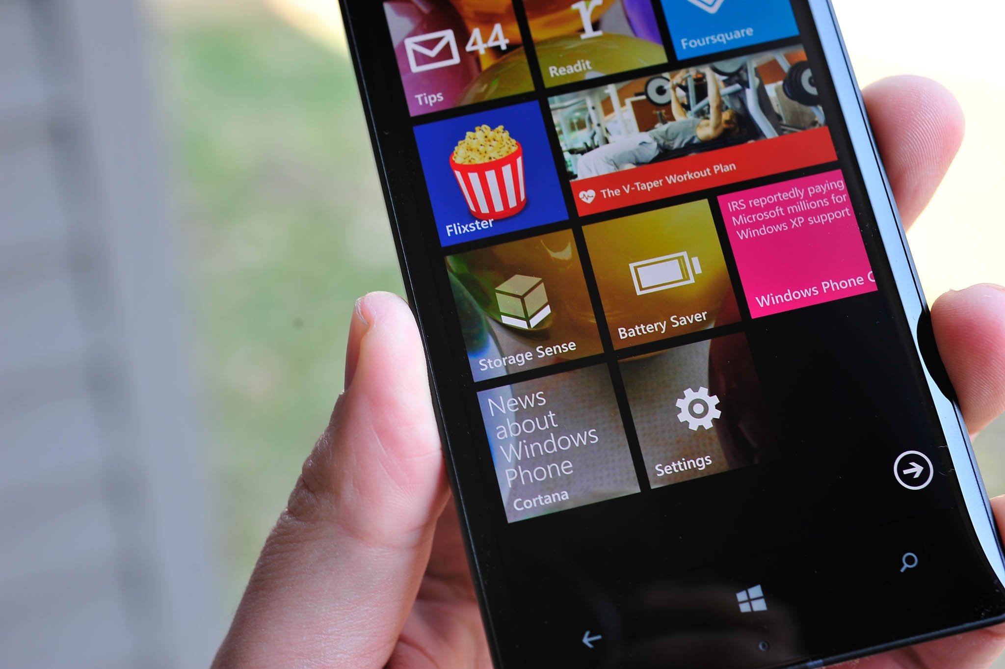
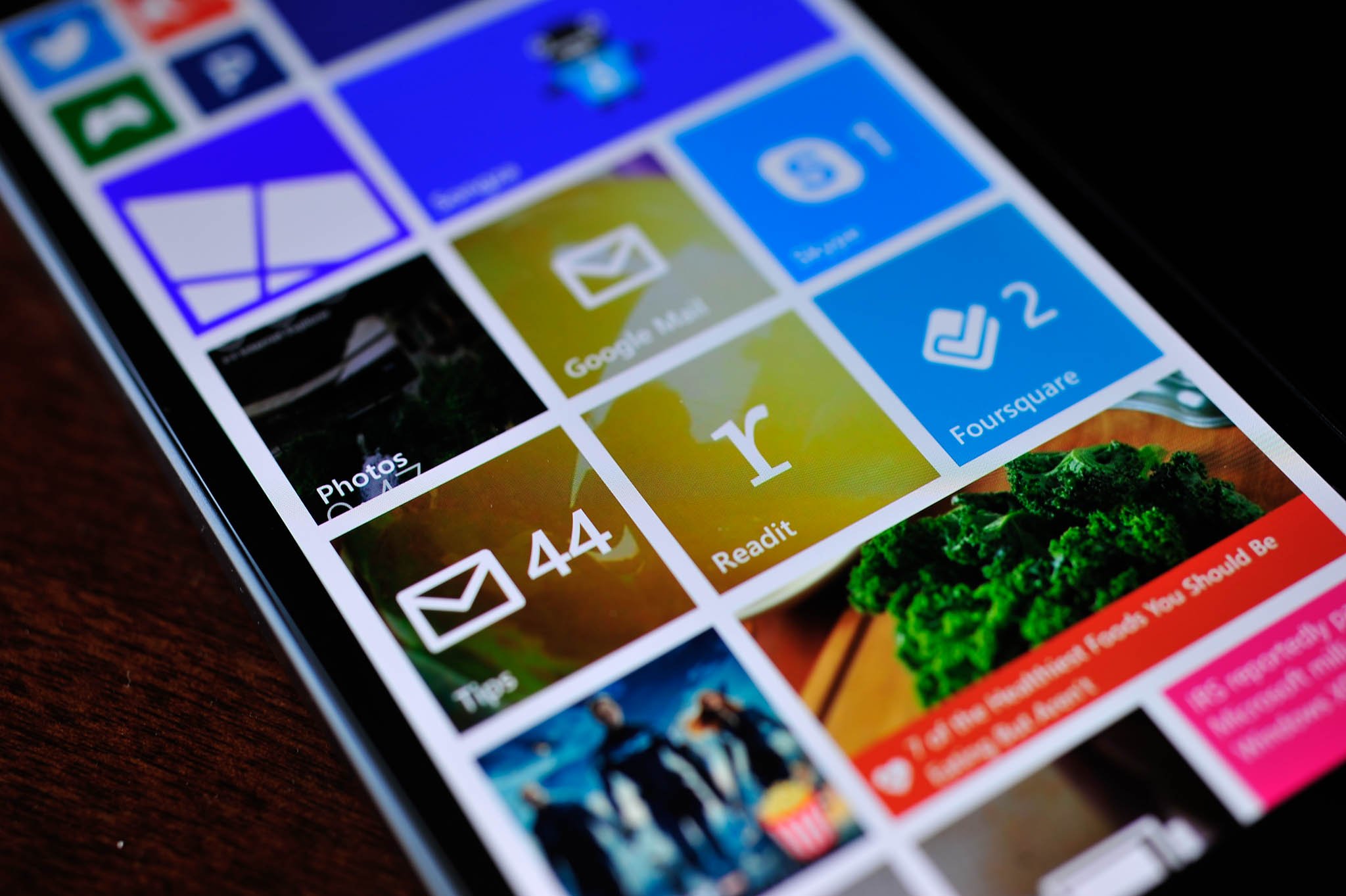
The most interesting feature in that regard is the option for backgrounds on the Start screen. Many people had requested this ability to customize further the look of their device, as iOS and Android both have the ability to set a ‘wallpaper’. Many thought Microsoft would follow suit, with a background image replacing the dark or light themed background and the Tiles on top of the new wallpaper.
But this is Microsoft, and they wanted to be different. So with 8.1, users now have the ability to basically skin the Tiles by overlaying an image of their choice. That’s not entirely accurate though as what is really happening is some Tiles are becoming transparent, with the user image showing through the Tile.
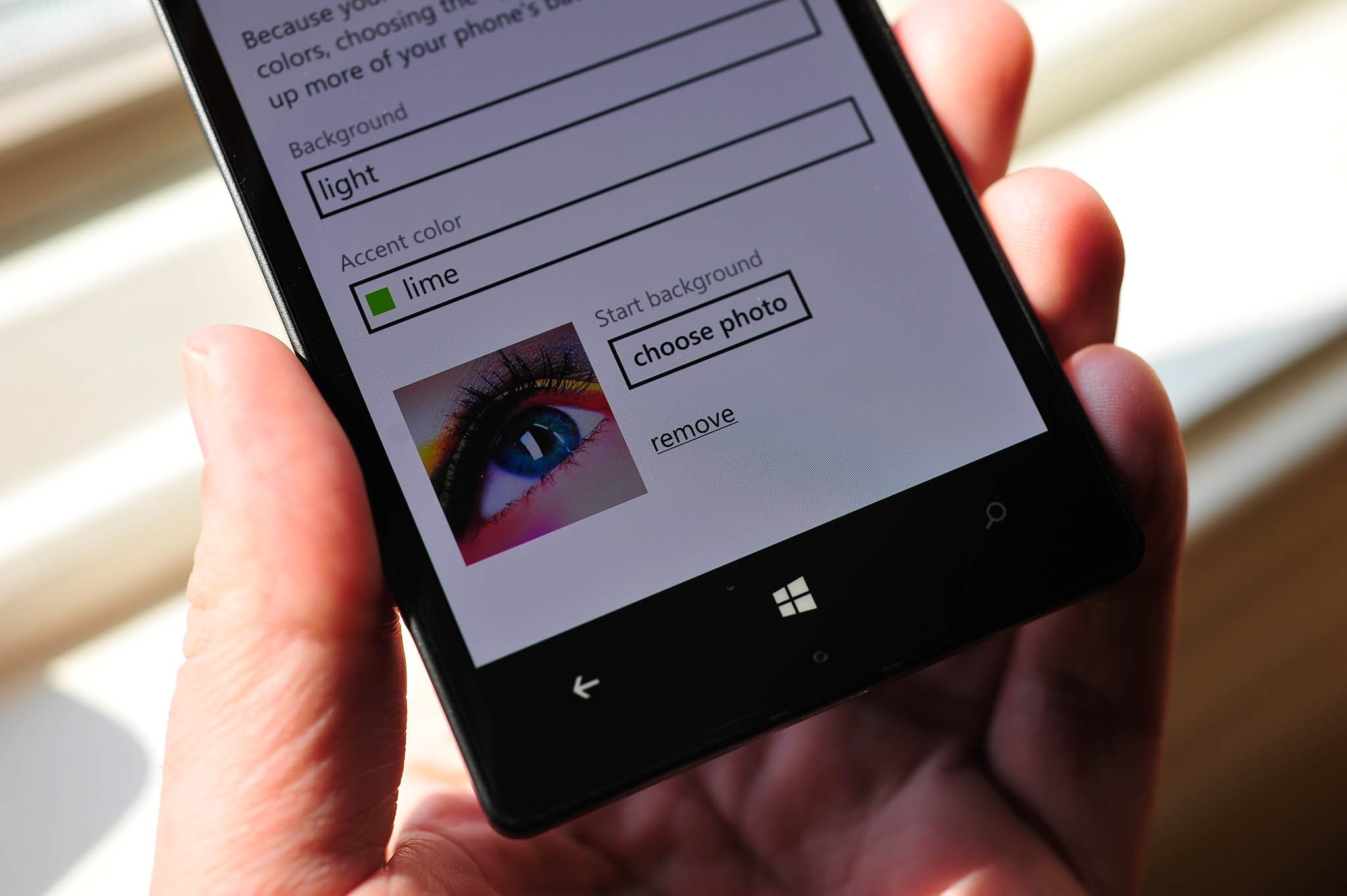
How it works is if an app uses the ‘Iconic design’ for its Live Tile, it will show the image behind it. If the tile uses a ‘Flip layout’, any area of the background that is transparent will show the background image. As a result, some apps will have a ‘see through’ ability with the new background images, while others will remain a solid, preselected color e.g. Facebook. The effect can be seen within our own WPCentral app, where we let the user choose between an Iconic or Flip design for their Live Tile. If the user chooses Iconic and it’s pinned, within a few minutes the Tile will update with the transparent background effect. That may cause some confusion amongst users, at least initially, but I think developers will adjust their apps going forward.
Still, the effect is daring. Microsoft once again has chosen a different path, and while not everyone may like it, I think many will appreciate the feature once they find that one right photo. Users can choose from a loaded library of 41 images from Microsoft, or they could choose photos from their Camera library, Saved library, OneDrive or even Facebook. Heck, you could even make a background of a solid gradient color and use that. It’s up to you. If you don’t like the new background image, you can still choose from one of 20 colors for the system Accent. Unfortunately, Microsoft has not given users a color selector for Accents, so that is one area where I would like to see improvement.
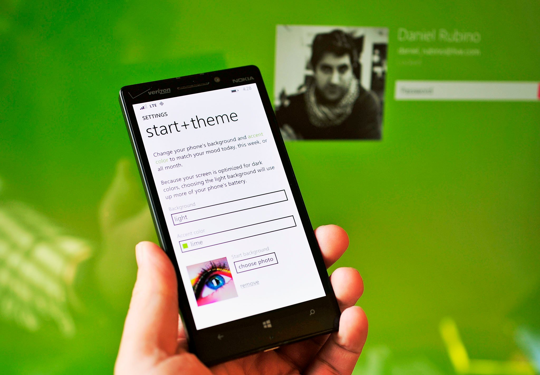
Speaking of Accents, if you’re running Windows 8.1 on your Surface or PC, your Accent theme color can now sync between your Phone and that device. The process is fantastic and works when you choose an Accent color under Settings > Start + Theme. Once chosen, within 30 seconds to a few minutes your PC and all Microsoft linked devices will all change their Accent colors, as well. This is a user option, found under Settings > Sync My Settings > Theme, and it can be disabled should you want to keep them separated.
Finally, here are few other notable but small changes in Windows Phone 8.1
- Signal strength, data connection, Wi-Fi, Battery, Location and more all remain on the screen; they no longer auto-hide
- New People Hub redesign with smaller fonts
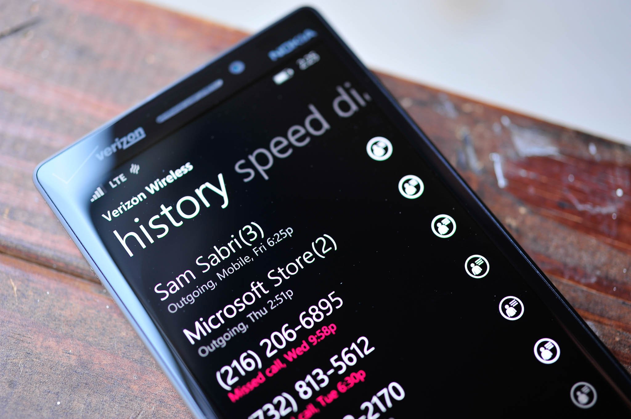
- Phone history now groups repeat calls from a user with ‘(#)’ representing number of calls
- Speed Dial is finally here under Phone
- Larger font for Time on the Lock screen; moves down on the screen if there are notifications
- Charging notification alert has changed to a shorter, less annoying sound
- Freshly installed apps say ‘new’ under their titles in the App list
- Games are installed under the App list in addition to the Games hub
- Games hub removes SmartGlass linking and adds new Friends and Messages icons
The changes that Microsoft have brought to 8.1 are welcomed. Don’t get me wrong, there’s still room for improvement, but there’s enough here to make the OS feel very fresh and to keep users busy with some new customizations. However, I’d still like to see:
- Large Tile size, similar to Windows 8.1 (basically 4 medium Tiles, combined)
- Accent color chooser
- Background images look better blurred; give users a tool to blur images before setting as background
Move over Siri, here’s Cortana
If there’s one feature that is perhaps overrated in smartphones, it’s voice assistants. Sure, it feels futuristic to bark commands at your phone, only to have a semi-robotic voice acknowledge and bend to your will. It feels good. It feels empowering. It’s occasionally even helpful.
But while Siri gets all the attention, I’d personally say that Google Now found on Android phones – and exemplified on the Motorola X – is the real game changer. Google Now is not merely a voice assistant, as the service learns about your activities e.g. where you live, where you work, and it predicts behavior, presenting information to you without prompting. That is different. That is also Microsoft’s Cortana.
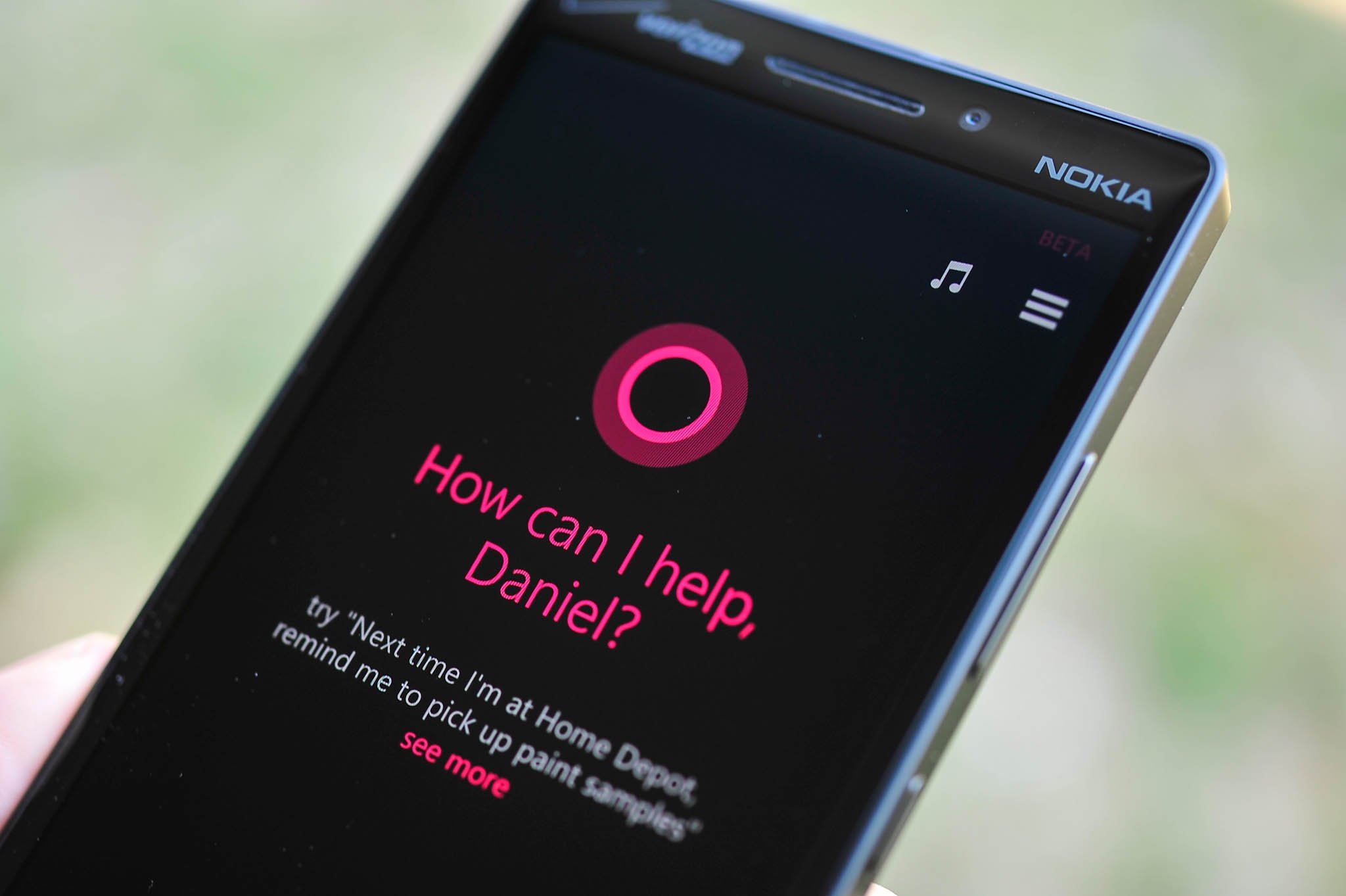
I don’t want start a tirade on Google versus privacy, as many others have – and will do – a far better job than I. But let’s just say letting Google know everything about you is not without its concerns. That’s where I think Microsoft has some leverage with consumers. Cortana is beyond Siri, but it is also more than Google Now in that it puts your privacy first.
While Cortana can learn things about you, it stays local on the device, isolated in her ‘Notebook’. Cortana’s Notebook can be edited by the user, and it leaves control in their hands as opposed to Microsoft’s. Microsoft is even eager to point out“we do not show advertising within the Cortana experience and currently do not use the information gathered in the notebook to send targeted ads to the user”. That’s somewhat refreshing, although one could make hay of the “currently do not” as something that may change in the future. Let’s hope not.
Cortana is leaps and bounds better than the TellMe service that it’s replacing. Like Google Now, it’s powered by a search engine (Microsoft’s Bing) and it is really something of a cornerstone technology for Redmond, as Cortana will presumably be incorporated into Windows, Xbox and who knows what else in the future (smartwatches?). Named after the fictional, artificially intelligent (AI) character in the Halo video game series, Cortana for Windows Phone is certainly something worth talking about. Microsoft calls Cortana “a more personal personal assistant” than the competition. So, is it?
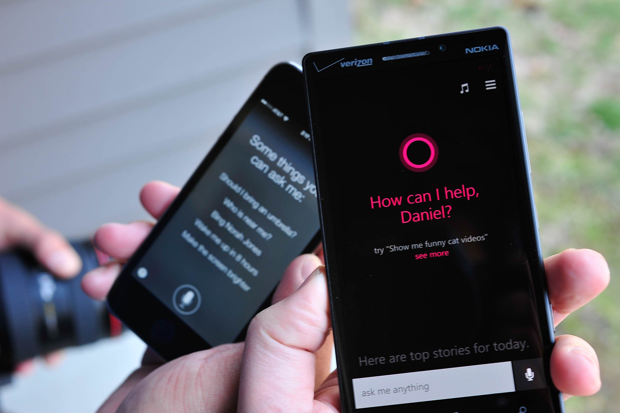
Here’s what I can say about Cortana after using the service for a few days:
- The speech recognition is far better than TellMe in Windows Phone 7/8
- The setup guide, which allows you to input likes and interests, is smart
- Cortana’s design is excellent. It’s minimalist and keeps in line with Microsoft’s Modern UI
- The Daily Glance, which features news and information you’re interested in, works well
- Cortana is relatively easy to use and understand
As far as raw functions, here’s what Cortana is capable of:
- Phone – make a call
- Messaging – send a text message
- Calendar – Add an appointment
- Flights (e.g.: “what’s the status of AA 125?”)
- Reminder – create a reminder (more on that below)
- Note – create a note (saved to OneNote) including speech to text and audio recording
- Alarm – set an alarm
- Music –play music; ID music e.g. ‘What is this song?’
- Places – get directions
- Settings – e.g. ‘Turn on Wi-Fi’ or ‘Turn off Bluetooth’
- Search – Ask a question, search for something, etc.
- Search on device – Search for an email or text message from a contact
- Third-party app integration – Cortana can deep link into apps, so that you can make a call on Skype, post a Tweet or check-in via Foursquare
Other little gems about Cortana include the ability to set people and location reminders, in addition to your run of the mill time/date ones that we’re all familiar with. A location reminder works by telling Cortana to set a reminder. Once she starts listening, record the reminder and mention a specific location e.g. Harry’s Restaurant (or even something vague like Dunkin Donuts). Cortana, using Bing, will then match the location ‘Harry’s Restaurant’ with local search. If found, Harry’s Restaurant will then have an address below it, displaying a hit in the results. If you say something vague like ‘Dunkin Donuts’, Cortana will ask you which location with a pre-sorted list based on your current whereabouts. The next time you are at that particular place, Cortana will automatically pop up a reminder for you. Microsoft calls this experience ‘geofencing’ and it’s certainly a powerful tool (third-party developers will also have access to this via the 8.1 SDK).
Likewise, you can set a people reminder. This prompt is based on one of your contacts, and it is triggered the next time you interact with that person via text, email or phone. It sounds pretty amazing: “Remind me that I owe Mark Guim $20” but, unfortunately, I had a hard time getting it to work as a voice command. However, I was able to do it under the ‘Remind me’ section of Cortana, where you can manually enter in the information and the corresponding triggers (time, place or person). According to Microsoft, “Cortana is the only digital assistant which can set reminders based on the people in your life” and I have to admit, it’s quite attention-grabbing.

- TIP: When on the Lock screen, hold down the Search key to launch into Cortana’s voice mode for a quick search or request!
You can also pin Weather or your News items to the Start screen for quick access. Weather wills how the current temperature at your present location.
Finally, another flagship feature for Cortana is Quiet Hours. That feature is what it sounds like: the ability to control alerts and notifications for certain times of the day. But while a certain blanket setup would have gotten the job done, Microsoft added an ‘Inner Circle’ and ‘Breakthrough rules’. Your Inner Circle is a select group of users who will get special treatment with Quiet Hours, giving them the ability to bypass the filter. The ‘Breakthrough Rules’ are various options, including:
- Anyone breaks through if they call 2 times in 3 minutes
- Inner circle breaks through
- Texts: Inner circle breaks through; Ask Inner Circle: Break through?; or No one can break through; Reply that I’m busy right now to contacts who aren’t allowed through
That final option, with the auto text reply is really brilliant. Users are told that you are working but if they reply with “Knock knock” and their message that is so imperative, it will bust through the Quiet Hours wall. It’s perfect for emergencies and messages that need to get to the user. Once again, Microsoft has taken a feature and added their own distinctive twist to it. That’s how smartphones should be in 2014: not just a set of rules, but something that is reactive and well, smart…
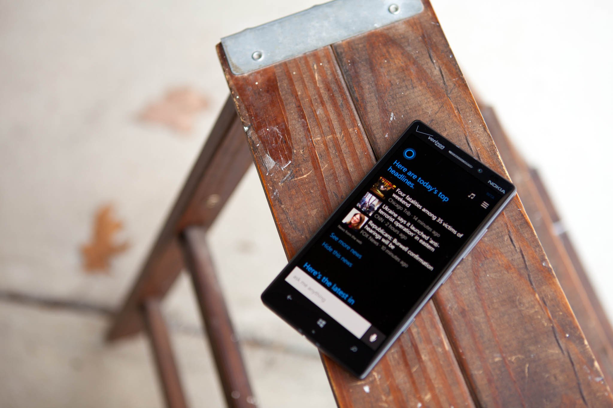
When put up against Google Now and Siri (we’ll have that in a follow up article today) Cortana certainly held her own. Even though Microsoft is behind on releasing Cortana and it is still technically ‘beta’, the service is at least on par with Siri and even Google Now for almost every function. Whereas some may lament that it’s ‘too little, too late’, I have to give credit to Microsoft for making a compelling service all on their own.
Cortana’s story though will become more interesting in the coming months, when the public begins to use the service collectively. It’s only then can Microsoft fully refine the algorithms and bring Cortana completely online. Likewise for Cortana’s voice, which is a mash-up of Jen Taylor (voice of Cortana in the Halo franchise) and Microsoft’s current generation text-to-speech engine. That will begin to change as Taylor records more and more voice clips for the Cortana service, growing alongside the burgeoning personal voice assistant tech.
For now, Microsoft’s Cortana is a solid first effort for their next generation service and is more than just a novelty.
Action and Notification Center
While Cortana will garner a lot of headlines and pop-culture references, it’s the Action and Notification Center that users will end up using dozens of times a day. For a long time, Microsoft’s customers have asked for a proper notification center for Windows Phone, and while Live Tiles are certainly helpful, in today’s complicated mobile world, a single repository for all alerts is a must.
Windows Phone 8.1 breaks the Center into two parts: the Action center with Quick-Action buttons and the Notification Center, which falls below it. The Center is accessed by swiping down from the top of the screen, and it even works while the phone is on the Lock screen. However, if you have the device PIN locked, you can dismiss items and even toggle the Quick-action buttons, but you can’t pull up emails, text message or read the alerts in full.

The Center is smart too. If you’re in a game or a ‘full screen experience’, the Center won’t pop up. Instead, you’ll get what Microsoft calls the ‘handle bar’, which is a little colored handle the pops down. If you did want to get to the Notification Center, just pull it again. This ensures that accidental swipes won’t disturb your game or video. Clever.
For the Action Center, you have four quick-action buttons (five if you’re on a Lumia 1520 or other large screened device). Those buttons are configurable and can be set to toggle Wi-Fi on/off, enable Location based GPS, launch the camera, turn on VPN and more. While the list is pre-determined, it’s a solid selection. The only complaint I have is that there is there is no toggle for data, which is important for emerging markets.
Below the Quick-action buttons are a ‘Clear all’ and ‘All Settings’ quick links. The former is to dismiss alerts in the Notification Center, while the latter is shortcut to the device Settings. I like both and found myself using them equally in frequency.
When it comes to notifications, the Notification Center behaves as you would expect: items show up and are sorted by category (emails, messages, app alerts) and time of arrival. It’s obvious, clean and easy to use. To dismiss, you swipe to the right, just like how you dismiss Banner notifications (what Microsoft used to call ‘Toast’ notifications). A little icon also appears at the top of the screen that signals you have alerts waiting in the Notification Center. It looks like a little newspaper, and it’s easy to spot.

For alerts, users can now configure each app to their liking. If you want Facebook notifications but not the Banner alerts, then you can configure that under Settings > Notifications + Actions. Simply pick the app you want, e.g. Facebook and from there you can:
- Toggle if the alert is shown in the Action Center
- Toggle notification banners on or off
- Select the notification’s sound for that app (users can copy their own sounds via the PC or Mac sync client)
- Toggle vibrate on/off
The choices Microsoft has given to users in 8.1 for alerts and notification is much more powerful than what was found in 8.0. It’s easy to use, easy to understand and if my experience is anything to go by, the Action and Notification Center will be one of the first things you do each time you turn on your device. In fact, when I would go back to using an 8.0 phone, the Action Center was the feature I missed most. I’m simply blown away by how often I use it, and I think it will be a huge hit for users of Windows Phone. Like I said, Cortana will get the headlines, but the Action Center will be your go-to baby each day.
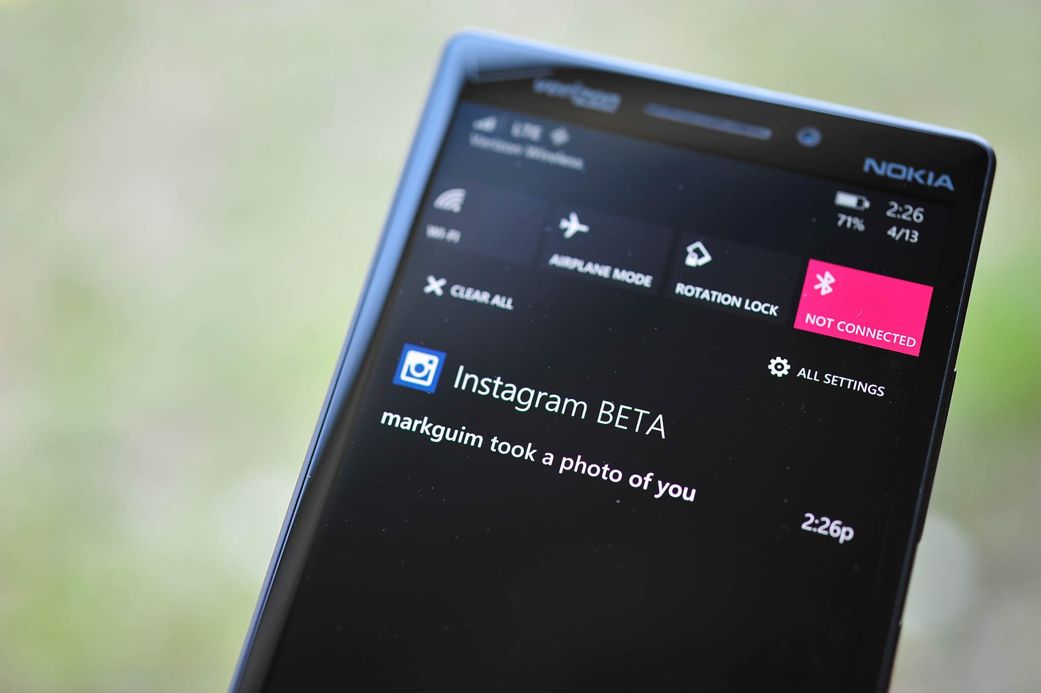
Microsoft has done well with the duo Action and Notification Center for 8.1. While it’s not revolutionary, or game changing, it is well thought out and in many ways, that’s more important new feature.
Word Flow and Shape Writing
Typing on Windows Phone has always been a very good experience. In fact, the default (and only) keyboard on Windows Phone has served users well over the last few years, mostly due to Microsoft’s excellent text-prediction engine, which is unrivaled by the competition. With 8.1, Microsoft is adding a new feature, Shape Writing, to what they are calling their Word Flow keyboard.
Shape Writing is basically Swype for Windows Phone. Swype is a popular third-party app on Android that allows users to drag their finger to form words instead of touch-typing. But Shape Writing is not Swype. Microsoft did not license their technology nor is it from SwiftKey. The Shape Writing found on 8.1 is Microsoft’s own technology, developed by their Research team. It works with their existing text-prediction and truth be told; it’s damn powerful. I found myself using Shape Writing whenever I had to write something more than a few words, and it felt much better than touch-typing.

That’s not to say auto-correct, and text-prediction are the same either. Microsoft has added a few addition to that in 8.1 as well, including:
- Suggest emoji – now, when you type certain words, not only will you get the auto-complete full version of that word, but next to you’ll have its representative emoji (aka emoticon). It’s shrewd and gets you to use emoji you may have been oblivious to
- Adding contacts – Word Flow will automatically add the names from your contacts into your library, auto-correcting and auto-suggesting proper names right away
The Word Flow keyboard has also set the Guinness Book of World Records for the fastest keyboard on the planet, besting Swype on the Galaxy S by a full 7.5 seconds. It’s no gimmick.
Granted, Microsoft has still not opened up keyboard access to third-party developers, so don’t expect Swype or SwiftKey to appear anytime soon. But considering how good the typing experience is on 8.1, I’m not entirely sure there is a strong need for it. Choice would be virtuous, but it’s not something that users are dying for, either.
If I had to choose one of my favorite features on 8.1, the Shape writing experience in Word Flow is near the top. I was never a huge fan of touch-typing (in comparison to a physical keyboard), but Shape writing goes a long way in ameliorating my fat finger mistakes when typing.
Back up this, back up that; Sync this, sync that
Backing up. It automatically ranks up there with filing taxes. It’s tedious, but it’s necessary and up until now, it’s been a feature missing from Windows Phone. Users currently have the ability to back up some things on their current Windows Phone, including a list of apps and games installed and even some basic settings. But it pales to a full device restore.
Microsoft completely changes that in Windows Phone 8.1. There are now a few things that are optimally (and optionally) backed up to the cloud, including:
- Apps + Settings – Save browser favorites, Start screen design, passwords, and most settings to the cloud
- App backup – Save app content like high scores, notes, and settings to OneDrive for participating apps
- Text messages – Download messages from last month, last year, any time
- Photos + Videos – Photos (Don’t upload, Good quality, Best quality via Wi-Fi); Videos (Don’t Upload; Best Quality via Wi-Fi)
Those features are found under Settings > Backup and users can opt in or out of the saving feature and even manage those backups. As you can tell from the wording, app settings, notes and high scores for games will require developers to configure their app to “participate”. That means we’re not out of the woods yet, since apps and games will need to be updated in order to take advantage of these tools. But at least Microsoft has now provided the resources. Start screen layout is a big change, as previously you could restore app installations, but not their placement on your Start screen.
Clearly, backing up was no trivial task to implement and Microsoft appears to have made a great job of giving developers the necessary tools. Let’s hope they take advantage of them.
Likewise, users can now sync settings across devices. I mentioned this above with Theme syncing, which can be found under Settings > Sync my settings. Other options include:
- App Settings
- Internet Explorer
- Passwords
For Internet Explorer, if you’re using IE11, you can now sync bookmarks across your devices and even bring down passwords. Likewise for App settings, which will become more important once apps become more unified on Phone and Desktop.
Look, backing up is never fun but 8.1 does an admirable job of making device restores, picking up a new phone and saving old game scores much easier and painless. It remains to be seen just how well in functions “in the wild”, but I’m content with the effort made with this release.
Internet Explorer 11, a new Store layout, Skype integration, new calendar and more
All the above is impressive for a “0.1” update, but 8.1 certainly has much more under her belt. Here are a few other very significant changes:
- Internet Explorer 11 – InPrivate browsing (secretive browsing mode), Reading View optimizes text in articles; Unlimited tabs, up from the previous six limitation; Password and bookmark syncing with your PC; Pre-fetching, pre-rendering of pages and Browser Optimization Service (BSO), which “compresses images, JavaScript, and HTML text on webpages to reduce data consumption by up to 70 percent for browser page loads”
- Store – The Store now has a new design and features analogous to Windows 8.1; App updates can be automatically updated; Choose to update apps only over Wi-Fi; Download history; App history; Reviews have their own page and ability to be sorted based on most helpful, most recent, highest rated or lowest rated; previously purchased apps and games now consider that, without the confusing “purchase” screen; Location-based app suggestions and finally, Force check for app updates
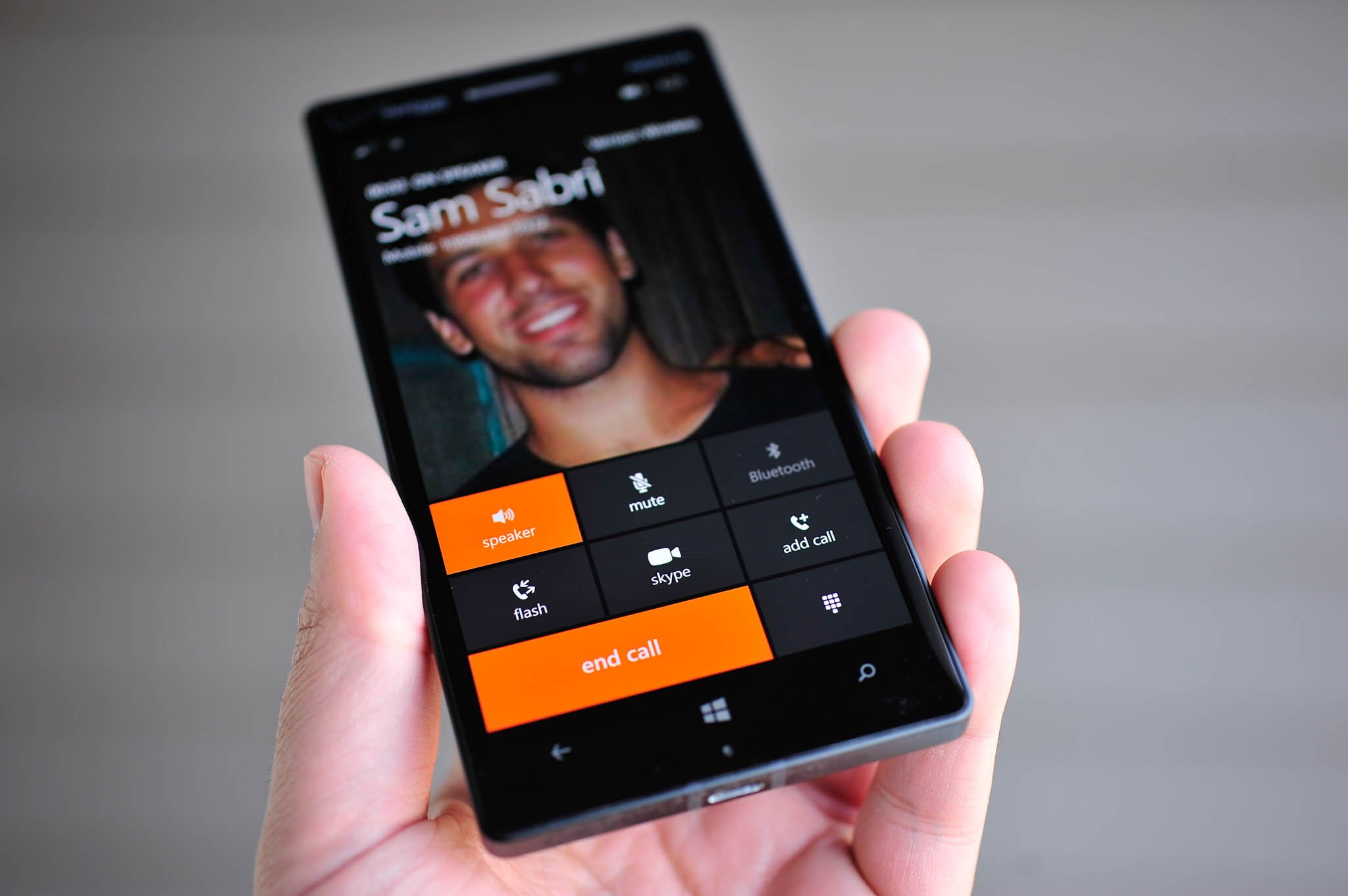
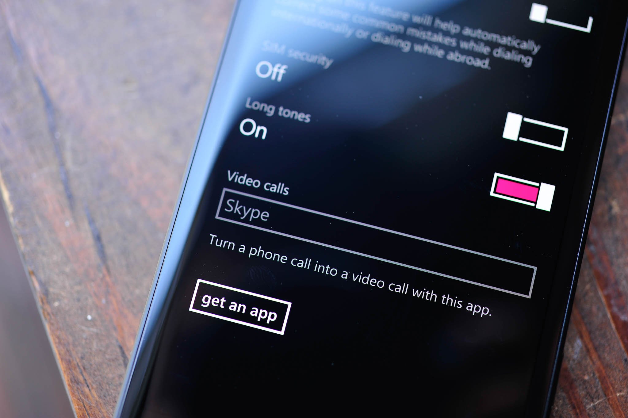
- Skype integration – Believe it or not, Skype and other VoIP apps get even better in 8.1, with Skype tying into the in-Call screen. When you are on a phone call, you can now “upgrade” the standard carrier call to Skype with a single tap. The process hangs up the current call and automatically dials the contact on Skype, initiating a video call. It’s not 100% seamless, but it’s certainly easy to use and crafty. If you don’t like Skype, other VoIP apps can be selected as the default video-calling app under Phone > Settings > Video calls
- Calendar and week view – Finally, the calendar app gets updated with a day, week, month and even year views. Users can swipe to reveal the following day, week, month and year and even optionally display the weather forecast for those calendar days; Tasks are now integrated as are multiple calendars from Facebook, Outlook, Gmail and Reminders (from Cortana)
Those are all really excellent improvements over 8.1, and I’m glad to see almost every nook and cranny of the OS get a fresh polish with this update. The new Store is really fantastic, although it is a bit slower to load graphics upon first loading than the current version, and I do kind of miss the banner background images (it’s now just plain black instead). Automatic app updates, forced-update checks, downloads only over Wi-Fi and seeing previously purchased apps are all exactly what the Store needed to make it one of the best around. Combined with the “One Store” unification that 8.1 brings for Desktop and Phone, consumers will also begin to see single-app purchases across both platforms going forward, including in-app purchases and settings. Want to buy a game on Windows Phone and get it on Windows 8? Done. That should will be the coup de grâce for the last of user complaints about Microsoft’s Store and give them an advantage of Android and iOS.
Sense is everywhere
Wi-Fi Sense, Data Sense, Battery Saver, Storage Sense. Microsoft is going all out in making the services that power Windows Phone much easier to manage. I think this is an inevitable problem with smartphones and Microsoft is not immune from it: the more advanced an OS becomes the more complicated it gets. Apple’s iOS was easy to use in 2007. Today, iOS 7 is just almost as feature packed as Android and its complexity reflects that.
Microsoft is addressing some of that with their ‘Sense’ initiative on Windows Phone. It’s a good idea, as it helps users manage things that otherwise could be a little tedious or convoluted. Let’s take a look at what 8.1 brings and builds upon.
- Wi-Fi Sense – You can now share your personal Wi-Fi login credentials with other Wi-Fi Sense users who are also in your contacts; Automatically login into public Wi-Fi networks and agree to their Terms & Services without touching anything on your device
- Data Sense – Find free Wi-Fi hotspots on the map with Wi-Fi Guide (ties into Wi-Fi sense for logins); Set data limit and frequency, reset date, etc.; Browser data savings including new “Automatic Savings” mode, which will “switch from Standard to High Savings mode when you are within less than 5 percent of your data plan limit.”
- Battery Saver – Previously, Battery Saver would kick in when you only had 20% of battery left. It still does that, but you now get an app by app breakdown of what is consuming your precious power, including when active versus in the background. You can also set an app to override the Battery Saver function, so that you can continue to get WhatsApp or Facebook update while the rest of your phone has restricted power consumption; Users can pin the Battery Saver app to their Start screen for a Live Tile that reflects the current battery status
- Storage Sense – This is a tool to help you manage your data on your Windows Phone by allowing you to move photos, downloads, music, videos and now apps and game to a storage card (if your device supports it). Not only can you store media on a storage card, but the OS will move them there as well; Users can pin Storage sense to your Start screen to get a new Live Tile that will flip to show your current remaining storage
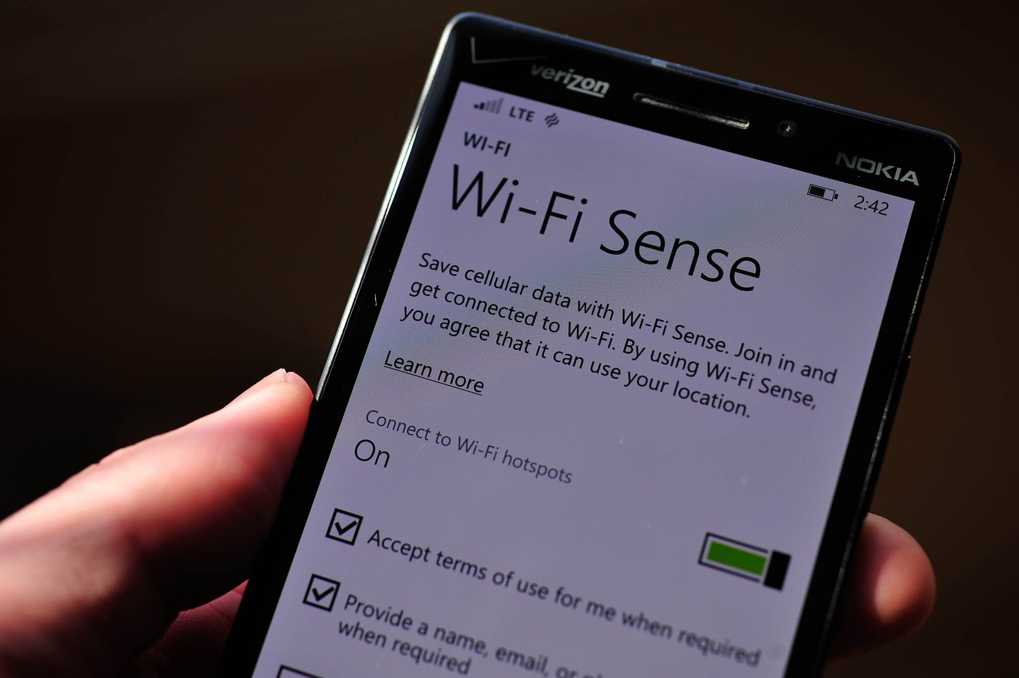
The Sense and Battery Saver services certainly help in making things easier to manage on Windows Phone. Microsoft traditionally has shied away from giving users tools to “manage” things because they believe users really shouldn’t have to do such things. I agree, but the reality of smartphones in 2014 is they are still complicated, and users want the control. Microsoft has given that but with some bonuses, like Wi-Fi Sense. Sharing of Wi-Fi passwords is great but like Rooms (which is still in 8.1), it assumes the user has a Windows Phone to take advantage of the function. That’s not Microsoft’s fault, but it certainly limits how much you can use that new feature.
I really like the auto-login to public Wi-Fi. There’s nothing more annoying than having to launch Internet Explorer to hit an ‘agree’ button or even worse, type in some bogus user data so that they can collect the information for marketing purposes. I get how ‘free’ Wi-Fi works, but it’s still tedious. Microsoft has done something previously only the hacking or modding community did: give users a way to circumvent annoying prompts. It’s useful and devious, so much so you wonder how some free Wi-Fi provides would react to it (assuming Windows Phone has substantial market share).
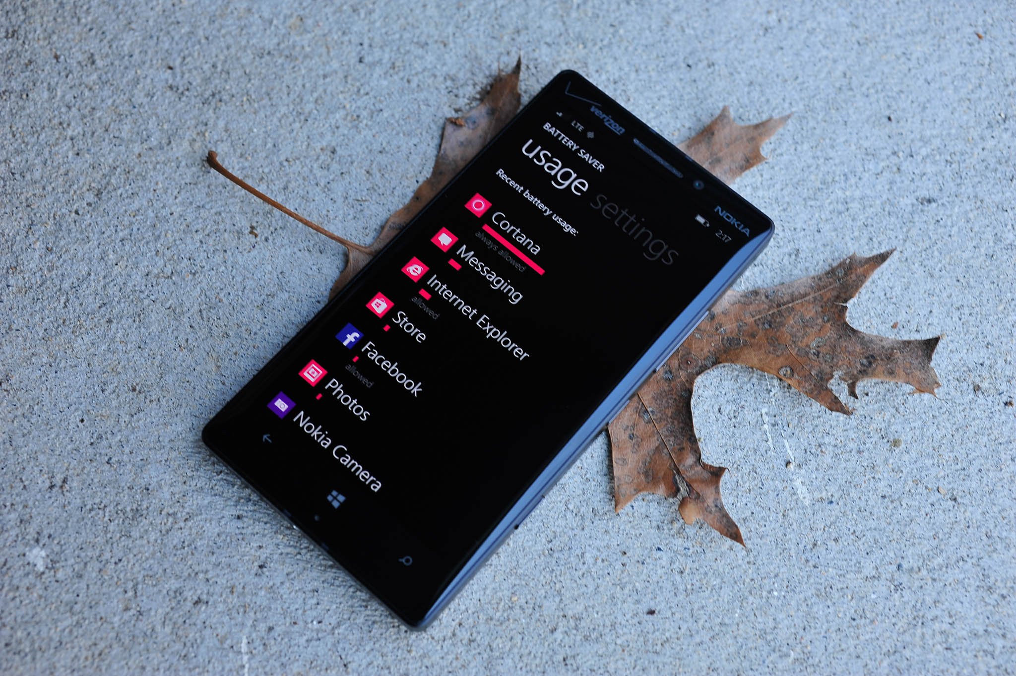
The new Battery Saver is impressive as it gives users an idea if a certain app is sucking down too much in resources. Microsoft’s Store certification process should catch such apps, but it’s still a good tool to have just-in-case.
Finally, Data and Storage Sense gives users even more control over their device and helps control costs. Data Sense is still something carriers need to support, so while those participating in the Developer Preview may get the tool, it may not appear in the official builds due later this summer. That’s unfortunate, but not exactly Microsoft’s fault either. Hopefully even more carriers will embrace Data Sense for 8.1 in 2014.
Wrapping it up
I covered a lot in this review of 8.1, and I still feel it’s incomplete. Over 5,000 words, seven new hands on videos and over 20 photos still does not capture all of the improvements, changes and new features in Microsoft’s massive update. What did I miss? How about:
- VPN support built in
- S/MIME for encrypting emails
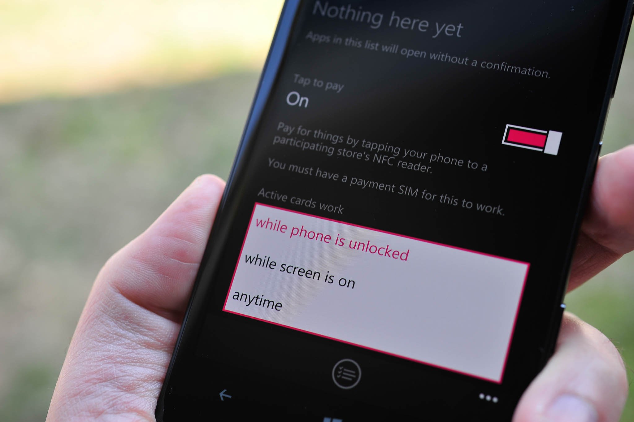
- NFC ‘trusted apps’ to bypass the confirmation screen
- Tap to pay moves from Wallet to NFC
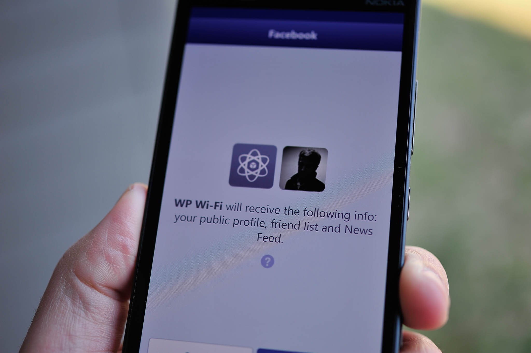
- Social Extensibility framework – Installing certain social-network apps will tie into the OS, allowing you to sign in once and have their data integrated into the People Hub e.g. Facebook
- Facebook Messaging is removed, replaced by a new app; Facebook integration is still included in the People Hub and Me Tile
- Set default ‘Post an update’ and ‘Check in’ apps under the Me Tile; opened up to third-party developers
- Local Scout has moved to Maps
- Microsoft Maps now has new 3D aerial view
- Mute thread in text messages
- Restrict background data when roaming (Data Sense)
- Custom volume settings for Ringer/Notifications and Apps/Media
- Dual SIM support (for new hardware)
- Enhanced YouTube and HTML5 in browser experience
- Miracast and USB support for screen projection
- Revamped Microsoft Camera app with Burst Mode, configurable settings for the viewfinder
- Collections in the Photos Hub, grouped based on location + date/time + activity
- Podcast integration with new app and Bing services
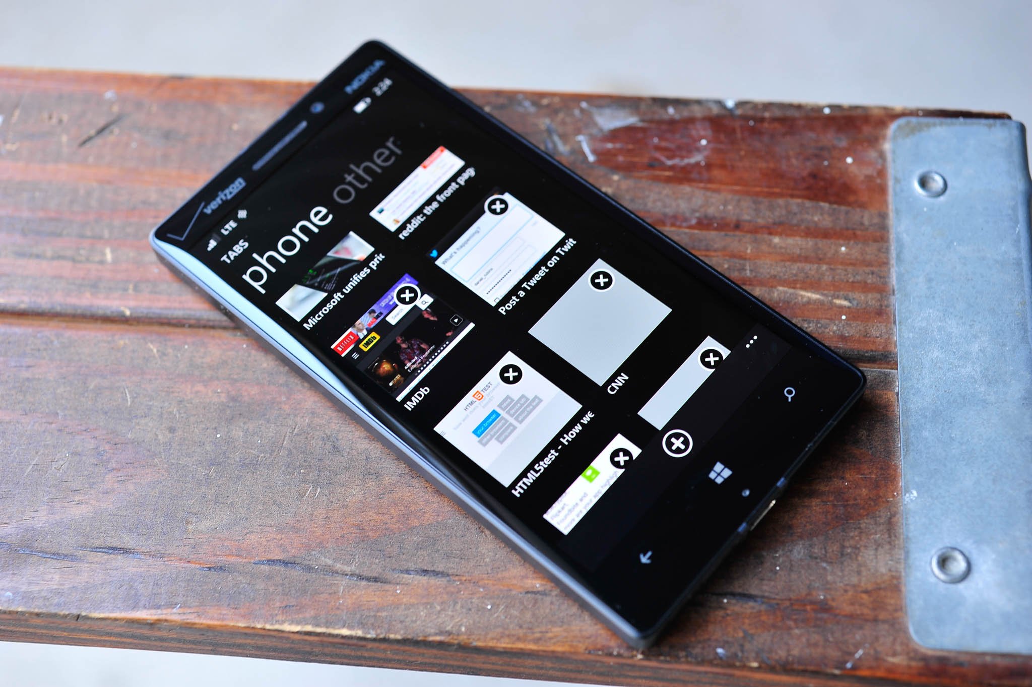
- Swipe down in task-switcher display to close out app (the ‘X’ still remains, too)
- Auto-download of images in email
- Xbox Music and Xbox Video are now separate apps (still no HD video, though it is coming)
- All the backend changes for developers and OEMs, including Qualcomm Snapdragon Sensor core support, UMDF 2.0 driver support for driver unification across Windows hardware, etc.
And I’m quite positive even with that bulleted list, I’ve overlooked or forgotten to mention something.
But forgetting a feature list and overview—how is the OS now? As a long time Windows Phone user, I’m quite impressed with it. It has certainly changed the way I use my phone, including the following features:
- Action Center
- Cortana
- Shape writing
- Install apps to SD card
- The OS is just smarter
That’s not to say everything is perfect in this ‘preview’ release. Instagram, which itself is still in ‘beta’, had some network issues (they seemed to be resolved now); I’ve had issues with the power button not turning the device on and occasionally IE would bug out. Miracast, while supported by the OS, is not quite ready for Nokia hardware as they will need the Lumia Cyan update for new drivers. Likewise with USB screen projection, which I could not get to work.
But overall, these were minor inconveniences for a ‘preview’ release. The OS feels fast; animations have been tweaked for an improved user experience. The new features don’t feel tacked on, but rather well thought out in advanced. And they work. That’s the beauty with this update as almost all of you will get something you really wanted. There’s still room for improvement, but the gap between Microsoft, Apple and Google is certainly getting narrower with today’s release.
I’m done saying Microsoft has finally caught up to the competition. I’m done predicting whether or not Windows Phone will finally catch on in the United States, where it sits at around 4% market share. I think 8.1 is a fantastic update from Microsoft, and it shows a new level of commitment to their mobile OS. I’m not sure it’s enough to catch up to Android or even iOS, but I’m not sure Microsoft really needs to. The OS is solid, hardware – especially from Nokia – is outstanding, and the apps are finally being built for Windows Phone at the same time as Android and iOS.
For current Windows Phone 8 owners, you’ll be knocked off your socks with this update. For those who are not on Windows Phone and reading this, you may finally be swayed with all of the new and improved features. What’s more, we expect Microsoft to deliver two updates to 8.1 this year with GDR1 and GDR2. What those updates will bring, we’re not entirely too sure, but we’re excited to see what happens next.
- If you have a Windows Phone 8.0 device, you can now get the 8.1 Preview on your phone!

Daniel Rubino is the Editor-in-chief of Windows Central. He is also the head reviewer, podcast co-host, and analyst. He has been covering Microsoft since 2007 when this site was called WMExperts (and later Windows Phone Central). His interests include Windows, laptops, next-gen computing, and wearable tech. He has reviewed laptops for over 10 years and is particularly fond of 2-in-1 convertibles, Arm64 processors, new form factors, and thin-and-light PCs. Before all this tech stuff, he worked on a Ph.D. in linguistics, performed polysomnographs in NYC, and was a motion-picture operator for 17 years.
