Windows Phone 7: the evolution of Metro

All the latest news, reviews, and guides for Windows and Xbox diehards.
You are now subscribed
Your newsletter sign-up was successful
Join the club
Get full access to premium articles, exclusive features and a growing list of member rewards.
We've already seen a few examples of how Microsoft is continuing to change the UI in Windows Phone 7 (see here and here) and now Paul Thurrott has documented even more.
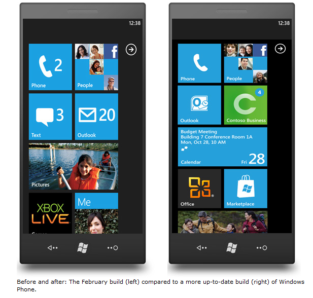
Probably the most interesting are the changes to the main Start screen as seen above with the February version to the left and the newer "TechED" version on the right. Basically some of the tiles have shrunk, the mail tile became more specific by denoting an Outlook icon and Marketplace has taken front stage as it should.
Thurrott goes through some other minor changes as well as discussing his experience with the OS from a few months ago. As always, a good read.
Article continues belowAll the latest news, reviews, and guides for Windows and Xbox diehards.

Daniel Rubino is the Editor-in-Chief of Windows Central. He is also the head reviewer, podcast co-host, and lead analyst. He has been covering Microsoft since 2007, when this site was called WMExperts (and later Windows Phone Central). His interests include Windows, laptops, next-gen computing, and wearable tech. He has reviewed laptops for over 10 years and is particularly fond of Qualcomm processors, new form factors, and thin-and-light PCs. Before all this tech stuff, he worked on a Ph.D. in linguistics studying brain and syntax, performed polysomnographs in NYC, and was a motion-picture operator for 17 years.
 Join The Club


