Windows Mobile User Interface Roundup
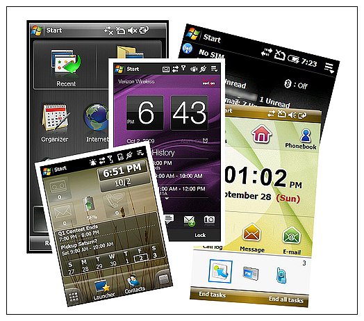
Gone are the days Windows Mobile fans had to settle on the "stock" Today Screen. Third Party user interfaces have grown in popularity and capability over the past year to give you plenty of choices for your Windows phone. Choices that include SPB's Mobile Shell, Vito's Winterface. Proprietary interfaces have also increased in popularity and capability such as HTC's Touchflo 3D and Samsung's Touchwiz. The variety isn't limited to Windows Mobile Professional and those who fancy Windows Mobile Standard have a few choices as well.
So, what's your favorite user interface? The Windows Mobile Today Screen has come along way and may very well be tops on many user's lists. Choose your favorite in our poll then ease on past the break to see some of the choices available for your Windows phone.
Windows Mobile Today Screen
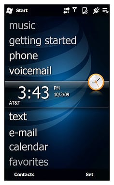
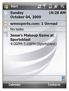
The stock Today Screen for Windows Mobile Professional received a major face lift with version 6.5 bringing it more in line (design-wise, sort of) with it's non-touchscreen, Standard cousin. The sliding design puts more information and functionality at your fingertips but is missing one key ingredient; speed dialing.
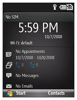
For those still running Windows Mobile 6.1, the stock Today Screen remains the single-page-style interface. You have information windows to various Windows phone features that can launch you directly to said feature.
The native Today Screen (WM 6.5 or 6.1) has a limited amount of customization in the settings menu where you can choose from a number of panels to display. You can also use a number of pre-loaded wallpapers or use your own image as a backdrop.
SPB Mobile Shell 3.5
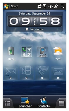
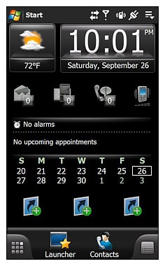
One of the more popular user interfaces, Mobile Shell puts a considerable amount of functionality at your fingertips. Offering two layout styles (Professional and Life Style), the customization options for Mobile Shell is equally considerable; almost to the point of being overwhelming.
Mobile Shell offers users the ability to choose from a number of pre-defined icons or widgets (as well as user created) that can be re-arranged as desired on multiple pages of each layout style. Mobile Shell does a good job of allowing the use of icons that will send you past the front door of an application , directly to a bookmark, file, or feature of the app.
Get the Windows Central Newsletter
All the latest news, reviews, and guides for Windows and Xbox diehards.
Mobile Shell 3.5 enhanced the graphic appeal of this user interface and also improved the touch navigation.
Winterface
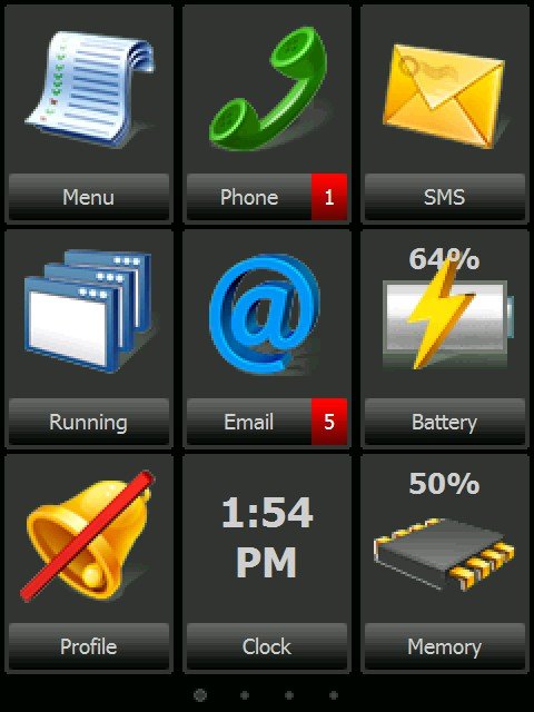
Vito Technologies throws their name into the user interface hat with Winterface. If you like large icons that are spread across a series of pages (similar to the iPhone's layout), Winterface may be the choice for you. It was recently updated to offer a wider selection of icon themes to increase the appeal.
The biggest downside to Winterface is that it doesn't replace the Today Screen as the other interfaces do. You can still revert back to the Today Screen by closing out Winterface without the need to go into the Today Screen settings.
As with SPB's Mobile Shell 3.5, touch navigation has also improved with the updated version of Winterface.
Proprietary User Interfaces
While there are a few third party apps that are pretty much a universal fit for the Windows phones, there are a few user interfaces that are proprietary to particular manufacturer of the Windows phone.
HTC TouchFLO 3D
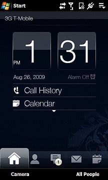
TouchFLO 3D is HTC's proprietary user interface and for those not familiar with this UI, it's a touch navigable interface that uses a series of pre-set tabs to access various features of your Windows phone.
The tabs, for the most part, serve as a front door to certain features of your Windows phone and range from the Calendar Tab that displays your monthly calendar and will send you to your calendar app to the Weather Tab that will show you the current weather conditions and three-day forecast. We have also seen wireless carriers include custom tabs to highlight the provider's branded software. AT&T includes a Programs Tab filled with shortcuts to AT&T branded software while Verizon and Sprint include tabs for their GPS Navigation software.
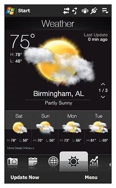
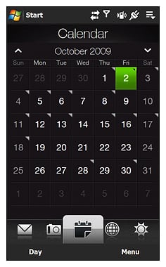
The graphics of TouchFLO 3D gives your Windows phone a "wow" factor but are limited to sorting and hiding the various tabs. You can't create tabs or modify existing tabs. There are some third-party themes that can be installed to add a degree of customization to the interface but nothing to customize the substance of these tabs..
Touchflo 3D is currently on version 2.1 with version 2.5 being found in some custom ROMs and the pending HTC HD2. Version 2.5 will add widgets and more customization to this proprietary UI. Hopefully, when the updated versions hit the market, they will be available through the various wireless carriers for their v2.1 phones.
Xperia Panels
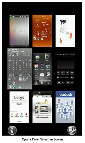
Sony introduced us to panels with their Xperia line of Windows phones. Panels are simply touch navigable screens that are designed around a function or application of the Xperia. They are very similar to the tabs of Touchflo 3D but called panels as oppose to tabs.
There's a degree of customization with panels in that you remove or hide unwanted panels. You can also download additional panels ranging from Facebook to Google to CNN.
Samsung Touchwiz
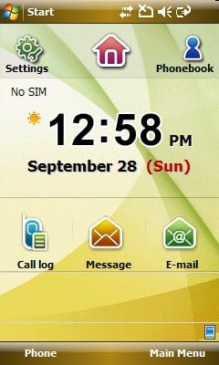
Samsung uses widgets with their Windows Mobile Professional devices in their proprietary interface Touchwiz. Widgets (icons to us old timers) launch applications much like icons. Why the name change is beyond me but it happened.
Touchwiz also has a control panel to the side that launches applications as well. It doesn't have the graphic impact of Touchflo 3D or the movement of Sony's Panels but it is more customizable through the widget use.
Standard Choices
While not as numerous, there are a few choices out there if you're using a Windows phone running Windows Mobile Standard.
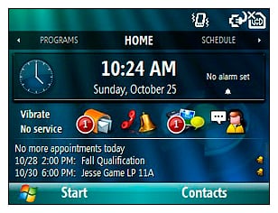
Facade has recently been updated to be more of a complete user interface than a Today Screen plug-in. It replaces the vertical panels of WM Standard with horizontally sliding pages.
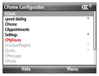
CHome Configurator isn't a user interface alternative but rather a modification utility for the WM Standard Today Screen. It allows you to add custom panels to the Today Screen and modify existing panels. If you need a speed dialing or favorite contacts panel, CHome will allow you to create one. I see it as a must have utility for every Windows Mobile Standard user.
Other Choices
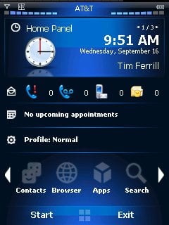
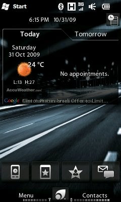
There are other alternatives out there such as SHBT's MyHome that replaces the Today Screen with a combination of information panels and sliding icon bar. Then there's PointUI which is a free (paid version also available) user interface that also replaces the Today Screen much like MyHome but with a touch more functionality.
Windows phone users have a wide assortment of user interfaces to choose from, offering a wide range of customization features to help make your Windows phone match your personality and needs.
So, what is your user interface of choice? Are you a Mobile Shell fan or like to stick with the proprietary interfaces such as Touchwiz or Touchflo?
Phil is the father of two beautiful girls and is the Dad behind Modern Dad. Before that he spent seven years at the helm of Android Central. Before that he spent a decade in a newsroom of a two-time Pulitzer Prize-finalist newspaper. Before that — well, we don't talk much about those days. Subscribe to the Modern Dad newsletter!

