The Windows Mobile Interface


So this entry started as a simple post about how Laptop Mag [via Ciccone] has scored an interview with HTC CEO Peter Chou about HTC's plans for 2008. It's turned into an analysis of why I think the Windows Mobile interface works (and doesn't work) the way that it does and ends with 5 suggestions for Microsoft to improve it. Sometimes these things just sneak up on you.
First, let's get that interview out the way. Quite a bit of it is Android-centric (since that's due later this year), but there's plenty of crunchy Windows Mobile goodness to, er, crunch:
The Windows Mobile platform has a lot of good stuff inside, but the user interface has not been easy. It is very techy and not intuitive. HTC decided to innovate on the user experience, so we launched the HTC Touch and it was a great success. [emphasis mine]
Here's one other tidbit that Chou drops:
This year, we are coming out with even more exciting new product innovations, and we are more focused on the mobile Internet experience. Mobile Internet is going to be key in terms of making the experience more successful.
Will HTC fix our browser problem before Microsoft does? Ponder that for a second, then read on for my thoughts (and rants) about the Windows Mobile interface!
Lizard Brain Intuition
Ok, with regard to that first part of Chou's quote, that the interface is “very techy and not intuitive.” Seems like the time to mount a full throated defense of the WM interface. But no: Chou is right. Although there are some intuitive elements to Windows Mobile (i.e. “Just start typing” to find stuff in contacts, email), they're the kind of “intuitive” that aren't immediately discoverable. Which is the opposite of what “intuitive” is supposed to mean. A contradiction, right? Right.
“Intuitive” is different for different contexts. Here's what intuitive usually means: The ideal interface would somehow get into our lizard brains and we would “get” it like we “get” how to pick up a rock. That's an intuitive interface: a freaking rock. Pick it up, throw it, break stuff. Advanced users: skip it across the water. The iPhone and TouchFLO are much closer to that “lizard brain” intuition than Windows Mobile by dint of their “just touch/move parts around” interface. Microsoft needs to catch up in this field in the worst way. Chou is exactly right, WM is not intuitive in that sense.
“System Intuition”
But there are other kinds of “intuitive interfaces” that we learn very early and though they might not be based on our instinctual lizard brain, they are learned deeply enough that they may as well be “intuitive.” The mouse on your computer is a good example. Sure, there's a “move stuff” metaphor there, but clicking for selecting is the sort of thing you have to learn, but once you do you can apply it in all sorts of scenarios. Same thing for the “right click” on the desktop. A little weird, but once you get that you can generally click the right mouse button for “other options” it can become second nature.
Get the Windows Central Newsletter
All the latest news, reviews, and guides for Windows and Xbox diehards.
I'll call it “system intuition” even though there's almost surely an actual term for this kind of learned, quasi-intuitive interface knowledge. I just don't know it. If you do - please educate me via the comments!
Driving a manual transmission car, operating various faucets via knobs and levers, dialing a telephone. All learned interfaces that aren't immediately intuitive but become learned so deeply that they may as well be.
Windows Mobile can have this kind of System Intuition for “Pro” users. It often can't for most others. This is a problem.
Windows Mobile is not Windows
The fundamental problem with the interface on Windows Mobile is that Microsoft attempted to leverage our desktop “system intuition” for the smartphone. In theory, this isn't all that bad of an idea. There's a comfort level to mapping an already-known interface to another context. It also can bring along certain associations that can be helpful to the new context. So, for example, a smartphone that you interact with “like Windows” might feel inherently more “like a computer” and “more powerful.”
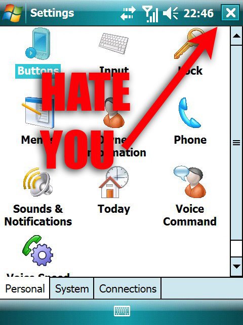
Here's the thing, though, the desktop is a crappy interface for a mobile device. Here's another thing: people don't feel all that fuzzy about Windows anymore. Here's the last and most important thing: the Windows Mobile interface is hardly like Windows desktop at all and suffers where it actually is like the Windows Desktop.
This is why I cringe every time somebody tries to sell Windows Mobile by saying “It's just like Windows. It's very familiar.” It's not just like Windows, it has an entirely different interface that only partially maps to Windows. Again, where it does map, it stinks. Examples of how Windows Mobile is worse because it shares interface elements with Windows Desktop:

- The drop-down “Start Menu” on Windows Mobile Pro. Yes, many people like this, but the target area for the elements in this menu are too small. This is bad
- Right clicking by holding down the stylus or the 5-way pad. Seriously, this is a bad idea.
- The stylus, period. Again, some folks like it. I find the stylus a horrible stand-in for the mouse and will go to extreme lengths to avoid having to use it. Bad.
- The “x” to “close” but not “quit” (though sometimes it will) programs. First off, I shouldn't have to think about memory that often on my mobile device. Bad. Secondly, there's another area (the task manager) that's tangentially related (on many versions of Windows Mobile) Bad. Oh, and it's a really tiny area in the upper-right-hand corner that's difficult to tap with my finger. Really Bad.
...I could probably go on, but I want to point something out here: many of my gripes are based on Windows Mobile Pro, the touchscreen version. I've said here and in our forums that I prefer Smartphone edition lately but can't rightly explain why beyond a feeling that it handles memory better. Now I can explain it: Smartphone Edition has less of the Windows Desktop System Intuition built into its interface and feels better for it.
An Interface To Do List for Microsoft
Let's just end with a few ways Microsoft can fix this:
- Forget about the desktop. It doesn't exist. It never existed. Instead, think about how you interact with that rock I mentioned earlier. It's not a mistake that Jeff Hawkins invented the Palm Pilot by carrying around a block of wood. Whatever the present-day equivalent of carrying around a block of wood is, do that.
- Unify the platform (you said you would): It's bad enough that there's Desktop Windows interface elements in Windows Mobile. It's well-nigh unforgivable that Windows Mobile Pro and Windows Mobile standard don't share the same interface “System Intuition.”
- Keep your strengths (yes, you do have them). One example: that “just start typing” feature, it's really cool. It's a core strength. Let me “Just start typing” for everything. Contacts. Email. Apps. Appointments. Internet, even, if the bandwidth is there. (Update: see also "glanceable information" in the comments!)
- Maintain some backwards compatibility, but don't kill yourself to do it. You guys handled the PocketPC 2003 -> Windows Mobile transition really well, you can do it again with the next version.
- Work with your manufacturers to let them customize, but don't let them go crazy with it. Right now it's just a little too “Wild Wild West,” out there. We want innovations like TouchFLO, but we also want consistency.
A tall order, perhaps, but check out that there iPhone, it's pretty serious stuff, interface-wise.
Home to the most invested and passionate Microsoft fans, Windows Central is the next generation destination for news, reviews, advice and buying recommendations on the Windows, PC and Xbox ecosystems, following all products, apps, software, AI advancements, and accessories. We've been around for more than decade, and we take our jobs seriously. Windows Central writers and editors value accuracy and editorial independence in everything we do, never receiving compensation for coverage and never pulling punches.

