Windows Mobile 7 vs. WM6.5: Calendars & Settings (updated)

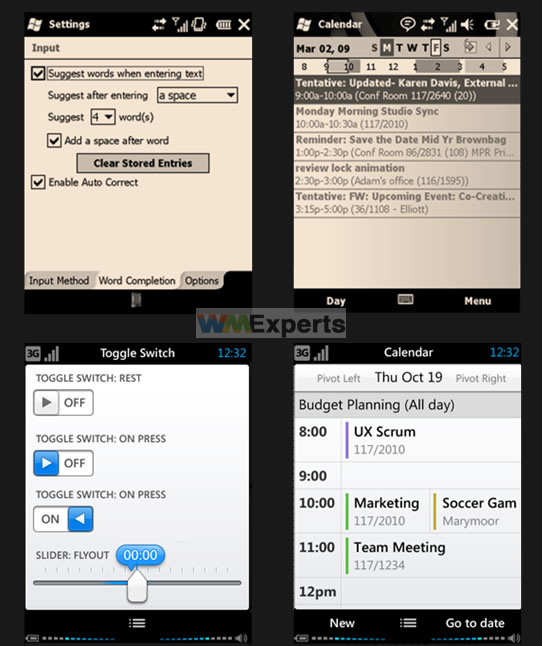
Here's something interesting that dropped in our mailbox. What you see here the top row is normal, vanilla Windows Mobile 6.5, but the bottom row was supposed to be WM6.5.1.
Of course for those of you who have played with WM6.5.1, you might have surmised those design elements are not part of that build and in fact, you would be correct.
From what we've been told, the bottom row is now, roughly speaking, what WM7 will look like. This was an internal mockup used for design planning.
Sure, not mind blowing but the comparison is nice to see and those little improvements to dialog boxes and menus go a long way in the end.
Update: Looks like the mad tipster's on the loose again. Pocketnow's been slipped some more shots from this same batch, it appears.
Get the Windows Central Newsletter
All the latest news, reviews, and guides for Windows and Xbox diehards.
