Windows Mobile 6.5 - The Full Feature List

All the latest news, reviews, and guides for Windows and Xbox diehards.
You are now subscribed
Your newsletter sign-up was successful
Microsoft announced Windows Mobile 6.5 today. The software is still not quite ready for release but will go to manufacturers soon and will start arriving on handsets towards the end of 2009. WM6.5 brings all sorts of new features to Windows Mobile Pro (touchscreen) and a handful to Windows Mobile Standard (non-touchscreen). WM Standard saw its big feature update with 6.1, and with Professional plays some catchup with 6.5. As of this writing, it doesn't appear that any current Windows Mobile smartphones will receive an update to WM6.5. Instead, many of the new devices announced at MWC09 will be upgradeable to 6.5.
Overall, you should know that 6.5 matches up pretty well with many of the leaks we've seen in the previous weeks. The emphasis here is "finger-friendly," and it means that you'll be able to leave your stylus in the silo. We have a brand-new Zune-esque Today Screen, a new Hexagon Start Menu, "embiggened" softkey menus, and an all-new version of Pocket Internet Explorer. There also are plenty of small touches throughout, like a new unlock screen that's better than anything else out there.
Still, at the end of the day, 6.5 is definitely not the radical improvement we've all been waiting for with Windows Mobile. There are plenty of improvements, but it's clearly not a game-changer. So as we run down the new features, we won't pull any punches, but don't let the occasional gripe get you down, 6.5 really does look to be a solid release, it's just that deep down it's still Windows Mobile 6. But do note that everything you see here is from an alpha build. So if something looks a little janky, it just might be.
Article continues belowEnough of the preamble, time to get on to the screenshots and features. Read on!

Microsoft announced Windows Mobile 6.5 today. The software is still not quite ready for release but will go to manufacturers soon and will start arriving on handsets towards the end of 2009. WM6.5 brings all sorts of new features to Windows Mobile Pro (touchscreen) and a handful to Windows Mobile Standard (non-touchscreen). WM Standard saw its big feature update with 6.1, and with Professional plays some catchup with 6.5. As of this writing, it doesn't appear that any current Windows Mobile smartphones will receive an update to WM6.5. Instead, many of the new devices announced at MWC09 will be upgradeable to 6.5.
Overall, you should know that 6.5 matches up pretty well with many of the leaks we've seen in the previous weeks. The emphasis here is "finger-friendly," and it means that you'll be able to leave your stylus in the silo. We have a brand-new Zune-esque Today Screen, a new Hexagon Start Menu, "embiggened" softkey menus, and an all-new version of Pocket Internet Explorer. There also are plenty of small touches throughout, like a new unlock screen that's better than anything else out there.
Still, at the end of the day, 6.5 is definitely not the radical improvement we've all been waiting for with Windows Mobile. There are plenty of improvements, but it's clearly not a game-changer. So as we run down the new features, we won't pull any punches, but don't let the occasional gripe get you down, 6.5 really does look to be a solid release, it's just that deep down it's still Windows Mobile 6. But do note that everything you see here is from an alpha build. So if something looks a little janky, it just might be.
All the latest news, reviews, and guides for Windows and Xbox diehards.
Enough of the preamble, time to get on to the screenshots and features. Read on!
Finger Friendly
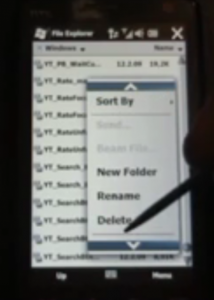
The new features of Windows Mobile 6.5 that likely will give you the most mileage are also the least-flashy and longest-overdue. We're referring to the fact that WM6.5 is finally starting to become finger-friendly. Throughout the entire OS you can drag to scroll — including the "end of list bounce" so often cited as uniquely iPhone. Many UI elements like the Start Menu are thumb-friendly, as are all of the soft-key menus. While this new finger-friendly focus will filter down to third-party apps, it may not happen right away, so don't give up that stylus just yet. Plus, well, Windows Mobile still seems to be stuck with resistive screens instead of capacitive.
New Today Screen

The new Today Screen is just as you've seen elsewhere: nice big text with indicators telling you the number of new items within. As you select the different elements, they expand to reveal more information so that you can click in to the related app. One nice touch that's new (or at least no longer squirreled away) since WM Standard's sliding panels is the ability to directly access your IE favorites.
The new Today Screen is definitely very slick, giving you a clearer view of your wallpaper while still presenting plenty of useful information. For those who love to customize their Today Screen up the wazoo, you can always revert back to the standard Today Screen in order to use your plugins and Today Screen apps.
New Start Menu
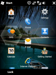
We're going to go ahead and file the new Windows Mobile 6.5 Start Menu under "Be careful what you wish for." See, many of us here at WMExperts have long railed against the traditional drop-down Start Menu. There is plenty wrong with it — it's not finger-friendly, it tries to cram a desktop UI into a smartphone, it's kind of squarish and ugly, it's a bit of a pain to configure. We asked Microsoft to get rid of it, so it did.
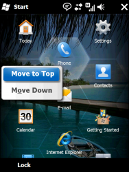
The new Start Menu is as you see above: a flat list of hexagons (though some are folders, letting you drill in). You simply swipe-scroll to see them all. The good parts: it's clearly designed to be finger-friendly; you can visually tell whether you're at the top or bottom because you can always see that you've 'run out of hexagons;' you can (finally) rearrange the icons to your liking.
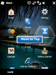
... Which brings us to the bad. Re-arranging of icons doesn't happen via tap-and-hold then drag-n-drop. Instead, you can "Stick" an icon by "sending it to the top" and then amongst the icons you've stuck, you can move them up or down. So it's a great way to create a handful of favorites. But once you really want fine-grained control of the location of all your apps, you're going to find yourself in a nightmarish miasma of tapping, holding, moving top, tap-holding again, moving down. Repeat. Repeat. Repeat.
The irony of it is, we were almost better off with the standard square grid. First of all, square grids are friendlier to the D-Pad (you can still use that on the hexagons, by the way, going left or right just takes you to the one left/down or right/down — ala Q*Bert). Second of all, at least when we were forced to have our apps listed in alphabetical order, we knew where to go for "Tetris." Now we need to either remember that it's one of those stickied apps or scroll down, and down, until we find it. The inability to create custom folder and/or pages (ala the iPhone) really hampers the Start Menu.
Still — we asked them to give us a finger-friendly Start Menu, and so they did. It's just that the thing feels half-done.
New Lock Screen
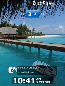
If you want to wash the bad taste of the new Start Menu out of your mouth, just lock the screen on Windows Mobile 6.5. The new lock screen is seriously great. As you can see above, you're presented with your wallpaper, the date, time, and upcoming appointments. You're also presented with a button up top that you can slide left or right to unlock. Already we're caught up with most modern smartphones here: a simple today screen with slide-to-unlock that provides you with just a bit of information.
But wait, as they say, there's more. Notice that the button up top has a number on it. If, instead of sliding left or right, you slide down, you get the following:
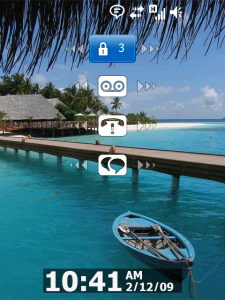
Now your lock screen shows you exactly what those three alerts are. In the example above it's one voicemail, one missed call, and one missed IM. Now what you can do is slide one of those secondary buttons to unlock your phone and jump directly to the indicated task. If it's a voicemail, it unlocks and calls your voicemail. If it's an e-mail, it unlocks and jumps to Pocket Outlook ... and so on and so forth. Very nifty, Microsoft. We're fans.
Pocket Internet Explorer
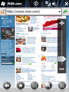
Pocket Internet Explorer 6 is here, built off of Internet Explorer 6. Web designers, this is the part for the wailing and gnashing of teeth. Done? OK, let's move on.
As you can see from the screenshot above, PIE6 does a (pretty) good job rendering pages accurately. You also get larger buttons on the bottom for back, favorites, keyboard, search, and a catch-all menu. These buttons disappear when you're zoomed in, so they don't get in the way of what you're reading. As for that zooming, you'll be doing it via the zoom bar instead of by some sort of multitouch fanciness.
App Marketplace
Yes, there will be an App Marketplace. Latest we've heard is that it will be on 6.5 only (but we're hoping that will change). No, we don't know much more than that. OK, yes, we do know one more thing, it will be called "Windows Marketplace for Mobile." No, we don't know what Microsoft has against simple names, either.
Improved Look and Feel
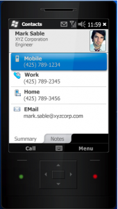
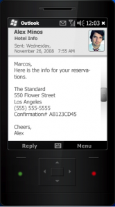
Windows Mobile has never been the prettiest thing out there. And while 6.5 isn't going to win any beauty contests either, it does at least sport a look and feel that seems as if it belongs in 2008 (and maybe even 2009 in a few places).
What about Windows Mobile Standard?
For those of you wondering just what 6.5 will bring to Windows Mobile Standard, the answer is most of the above. As we said earlier, many of the new features on 6.5 relate to it becoming more finger-friendly, but that doesn't really apply to non-touchscreen devices. So stay tuned for more on 6.5 standard, but expect the improved look & feel, Pocket IE, and the App Marketplace at the very least.
Wait, that's it? Isn't this little more than a Skin?
Well, er, not really, no. Windows Mobile 6.5 appears to be all about giving Windows Mobile a small shot of UI juice to help the platform maintain until the next version of Windows Mobile gets out the door. There aren't a lot of innovations here that haven't already been covered by the likes of HTC and other third-party developers. There are a few bits that are genuinely new — we're fond of the unlock screen and also think Pocket IE does look good. There are plenty of bits that just plain don't do that much more.
But don't forget that Microsoft also released the My Phone service as well as Microsoft Recite. Also, truly, the real hotness often comes from manufacturers, who are out in force at MWC09.

Phil is the father of two beautiful girls and is the Dad behind Modern Dad. Before that he spent seven years at the helm of Android Central. Before that he spent a decade in a newsroom of a two-time Pulitzer Prize-finalist newspaper. Before that — well, we don't talk much about those days. Subscribe to the Modern Dad newsletter!
