Windows 11 Build 22000.51: Everything you need to know
Here's a closer look at the new features and changes for Windows 11 Build 22000.51. We even show you many improvements that Microsoft didn't mention.
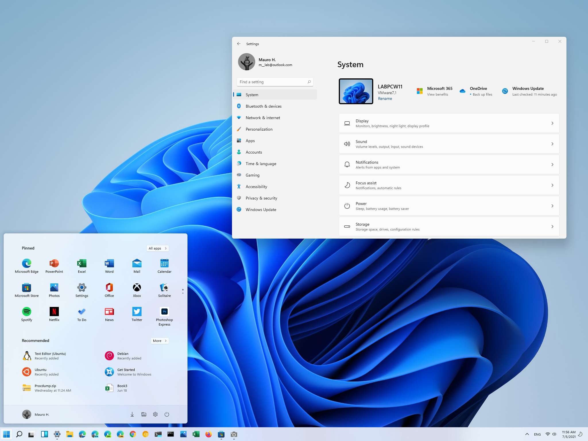
Microsoft recently published the first preview of Windows 11 (Build 22000.51) for devices enrolled in the Dev Channel of the Windows Insider Program, and with it, the company introduced a slew of significant interface changes, features, and updated apps coming this holiday season.
In this flight, you will find the new Start menu and a taskbar that both now have a centered alignment and a fresh take on Action Center that includes two experiences: "Notification Center" and "Quick Settings." In addition, there's a preview of the updated version of File Explorer that no longer includes a ribbon menu.
Windows 11 is also introducing a new Widgets feature to consume news and other content, a bunch of multitasking features like Snap layouts and groups, a new Microsoft Store and Get Started apps, a redesigned Settings app with new features and improvements, and a lot more.
In this Windows 11 guide, we will dive deep into the new interface changes, improvements, and new features that Microsoft has made available with Build 22000.51.
Windows 11 Build 22000.51 changes
These are the most important features, improvements, and changes to the user interface that Microsoft has been working on for Windows 11 so far:
Start menu
Windows 11 Build 22000.51 introduces a new Start menu design similar to the one the company was building for Windows 10X. The new menu and the updated taskbar appear centered on the screen, and it ditches the Live Tiles for traditional icons.
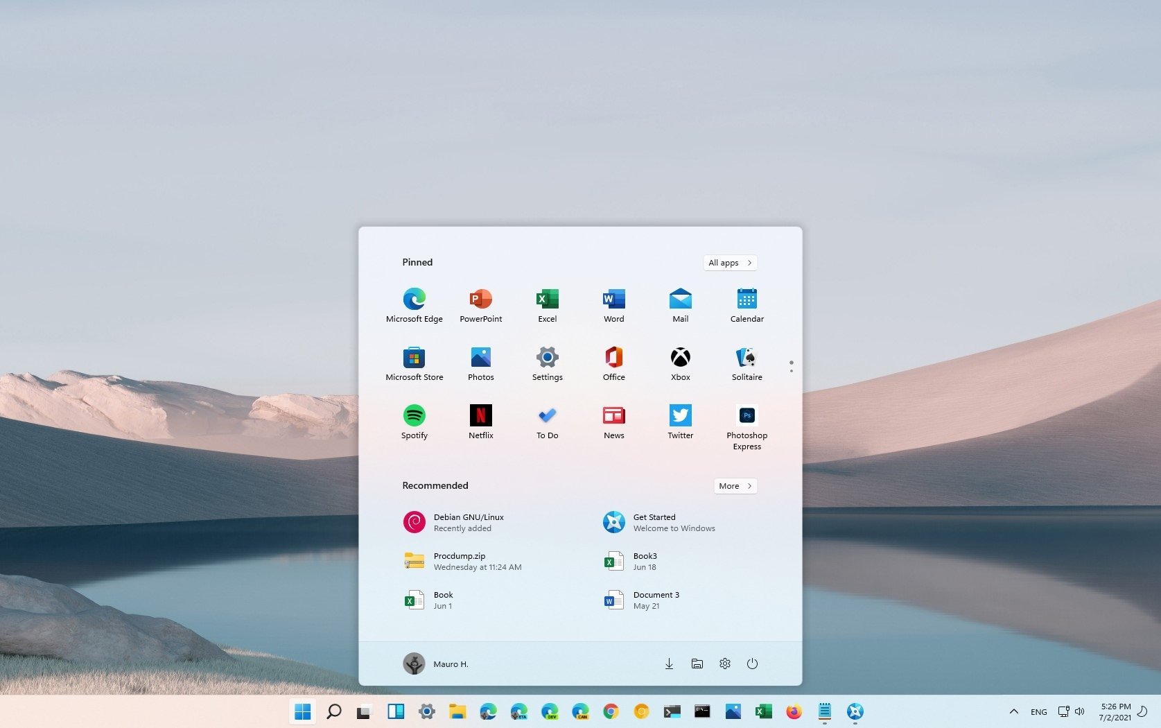
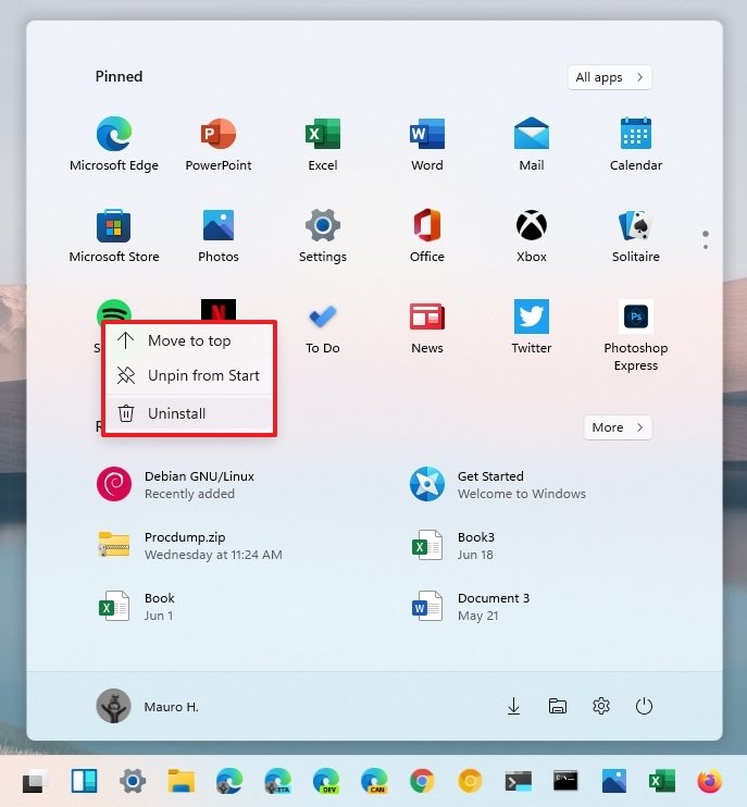
The Start menu has three sections. The "Pinned" section is at the top, and it includes quick access to your favorite apps. You can right-click any app to access the context menu with different options, including moving the item to the top, opening the file location, and uninstalling the app. It's also possible to drag the icons around to change their position.
Get the Windows Central Newsletter
All the latest news, reviews, and guides for Windows and Xbox diehards.
The default layout includes three rows and eight columns, but you are not limited to only 24 items. You can pin as many apps as you want since you can scroll down to jump to different pages. You can also use the dots on the right side to jump between pages.
You will find the All apps button to access the list of all installed applications in the top-right corner. This part is where you will find the "most used" and "recently added" lists. Like in previous versions, you can use the dial to jump to different sections within the list.
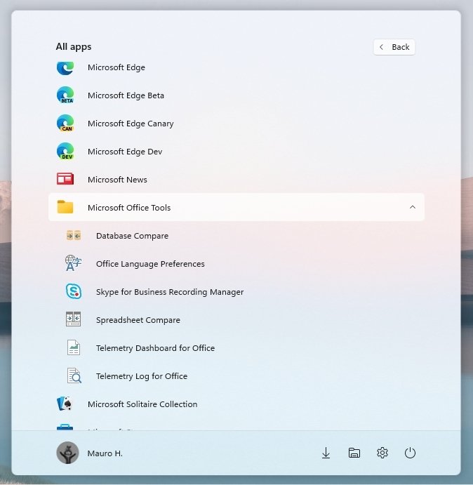
The Recommended section is where you will find cloud-powered recommendations to files you may want to pick up where you left off and apps.
You can right-click the header to refresh the content, and you can click the More button to access even more recommendations. However, during the time I spent with this build, these options appear and disappeared without warnings.
If you see an item, you don't want. You can right-click and select the option to remove it from the page.
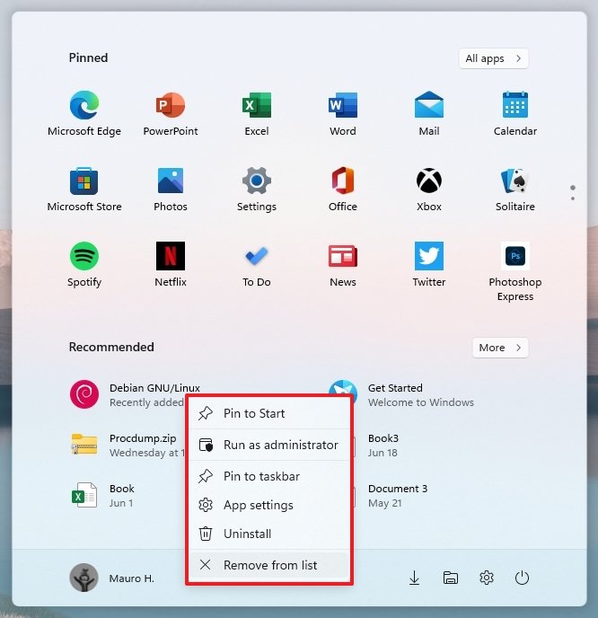
In this version, it is no longer possible to resize the menu, use it in full-screen mode, or create groups. Also, the experience comes with many promoted apps, which you may not be able to differentiate between your own apps and may cause to install apps you don't need.
Then at the bottom, you will find the section that includes the profile menu and power options. The empty space in the middle is where you can place quick access to different folders, such as File Explorer, Settings, Documents, etc.
Taskbar, Notification Center, Quick Settings
The new taskbar also includes a centered alignment, but you can always configure it to the left like in previous versions.
The bar is a little taller than before and includes a lot of improvements. For example, in addition to having all the items aligned in the middle, you will notice a new Start logo, new icons for Search, Task View, and Widgets. (Cortana and My People are no longer part of the experience.)
When you hover over some of these icons, a new jump list menu will appear with some recent items or a quick view of the feature. Open apps will show thumbnails just like before.

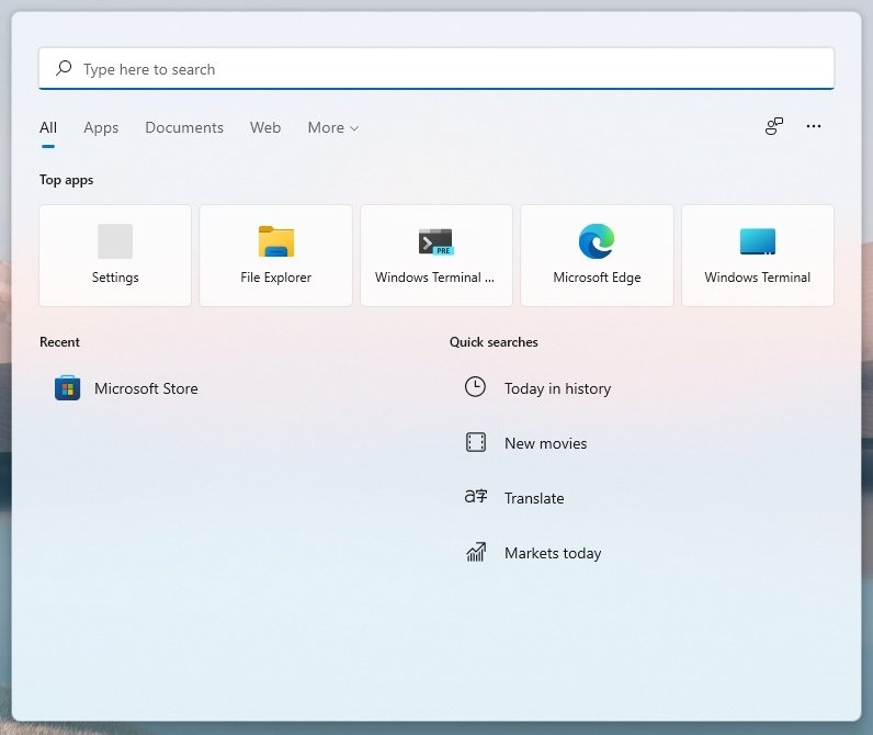
Since there is a new Search button, the search box is no longer a feature in the taskbar. Also, the Search experience has been updated with a search box located at the top. And you will no longer find "Timeline" as the feature has been stripped out of the OS.
There's a new small indicator that changes size for running applications to distinguish whether the app is minimized or maximized. And there is a new progress indicator for installing applications.
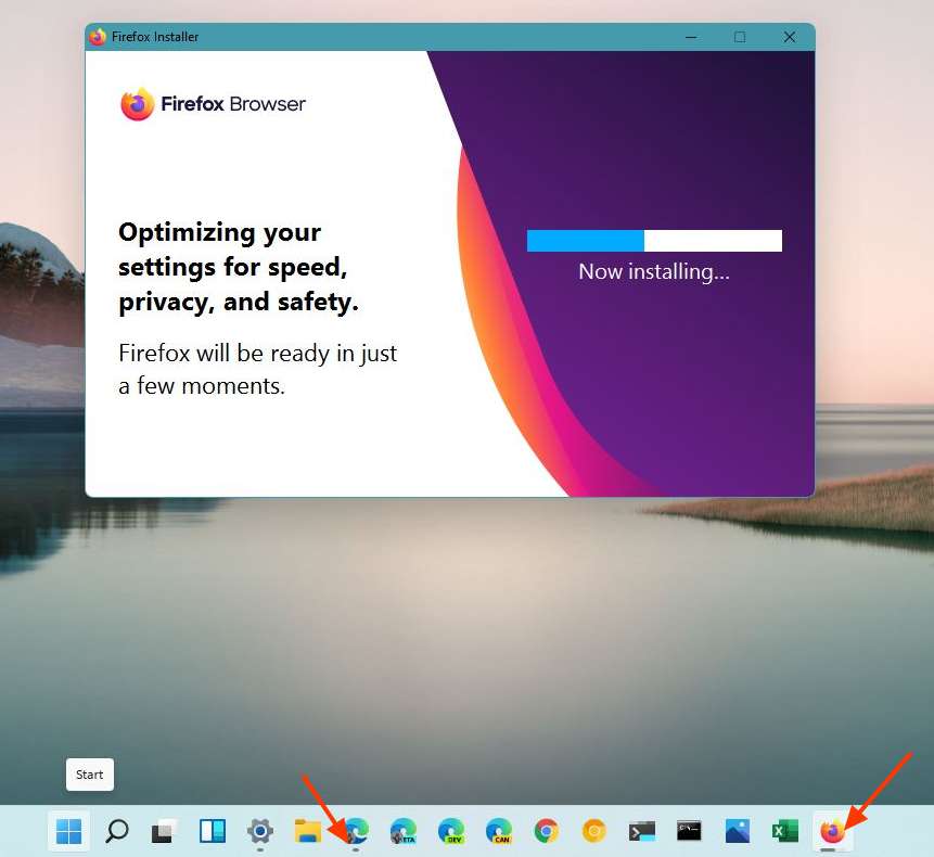
In Windows 11, you cannot resize the taskbar nor change the location to either top, left, or right. The only supported position is at the bottom. It's possible to show the taskbar across monitors, but you cannot show the Start menu and other items from the primary menu across all displays.
The taskbar context menu has also been reworked, and it now only includes an option to open the Taskbar settings page. In the settings for the taskbar, you can add or remove items, control the icons that appear in the corner and the apps that appear in the overflow menu.
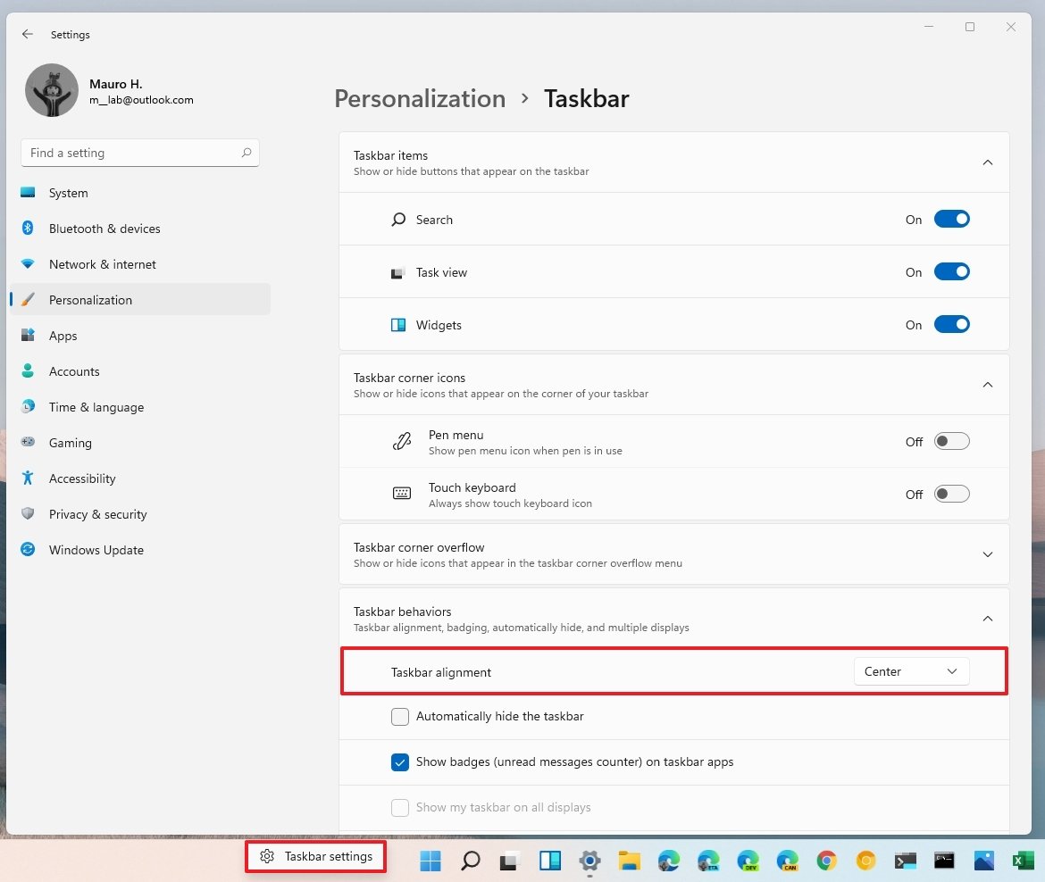
In the "Taskbar behaviors" section, you'll find the options to change the taskbar alignment, hide the bar automatically, and show badges. Also, there is even a new setting to show or hide the desktop using the corner button (Windows key + D keyboard shortcut).
Quick Settings
The taskbar included with Windows 11 Build 22000.51 also introduces a new notification area that now groups icons into an actionable button that brings up the new Quick Settings flyout. This menu includes the most common settings, such as volume, brightness, wireless, Bluetooth, Focus Assist, and others. However, the Tablet mode option has been removed since the company will be making the touch experience only on compatible devices.
If you are playing audio or video with Microsoft Edge, the Quick Settings will also show new media controls above the settings.
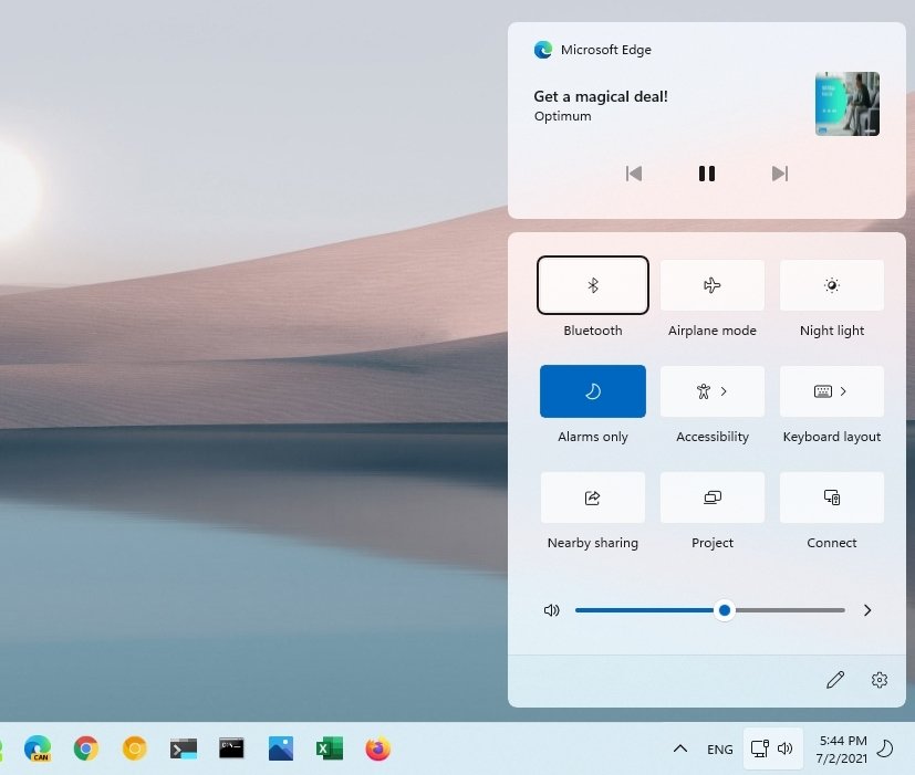
When you right-click the network or volume icons, you can access the network and volume settings. However, you will also notice a Volume mixer option that opens the experience in Settings instead of Control Panel.
You can also open the experience with the Windows key + A keyboard shortcut.
Notifications Center
Then there is the group of "date and time" and Focus Assist icons that you can click to open the new Notifications Center, which replaces Action Center. This experience includes all your notifications and a full-month calendar view, but it doesn't allow you to create calendar events like it was possible in previous versions.
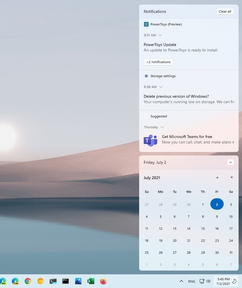
You can also open the experience with the Windows key + N keyboard shortcut.
Task View and Desktops
The new version of the OS comes with the Task View experience and "Virtual Desktops" feature that has been renamed to Desktops.
You can click the new Task View button or the Windows key + Tab keyboard shortcut to use both experiences. Similar to the previous version, you can view all your running applications and use all the same options as before but with the difference that Timeline is no longer part of the experience, and the controls are at the bottom of the interface.
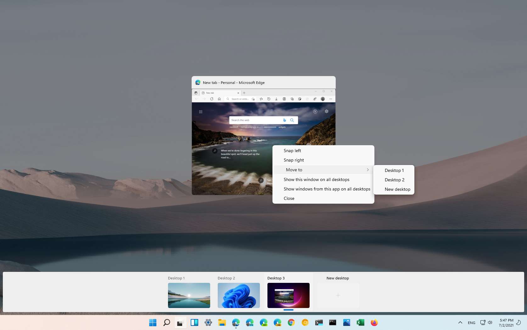
In the new experience, you can reorganize, create, and customize as many virtual desktops as you need, and each one can have a different background. Also, hovering over the Task View button will now show a preview of all the desktops.
Widgets
Widgets in Windows 11 is an experience similar to the "news and interests" feature already available on Windows 10. It features a bunch of cards with different types of information, such as weather, news, sports, stocks, traffic, and you can even display Microsoft To-Do lists and more.
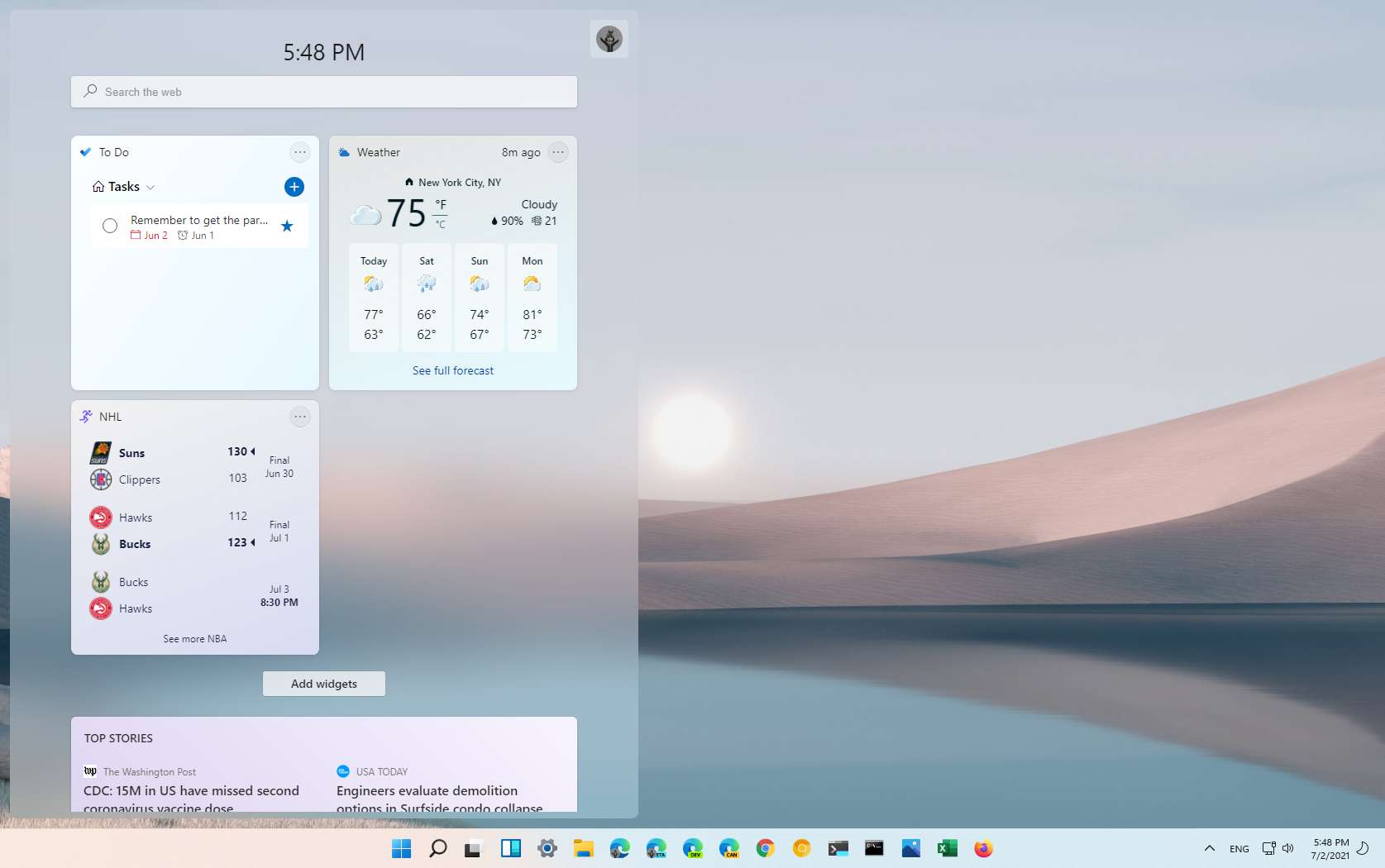
The experience takes the full height and almost half of the screen, but the company has shown videos expanding the interface across the entire screen. The Widgets interface also includes a search box to look up things on Bing with Microsoft Edge, and it shows the current time. And you can click the profile button or the "Add widgets" button to customize the experience.
You cannot disable the feature, but you can remove the button from the taskbar settings if you do not want to use it.
Multitasking
Another big focus of Windows 11 is improving the multitasking experience. And Build 22000.51 ships with at least four significant improvements, including Snap layouts, Snap groups, and changes for managing multiple monitors.
Snap layouts is a new feature part of the Snap assist experience that brings a menu with different grids, which you can use to snap windows on the screen by hovering over the maximize button. Once you select a snap layout and position, Snap assist will guide you to continue positioning windows in the remaining zones. Depending on the size of the screen, you may see four or six different grids.
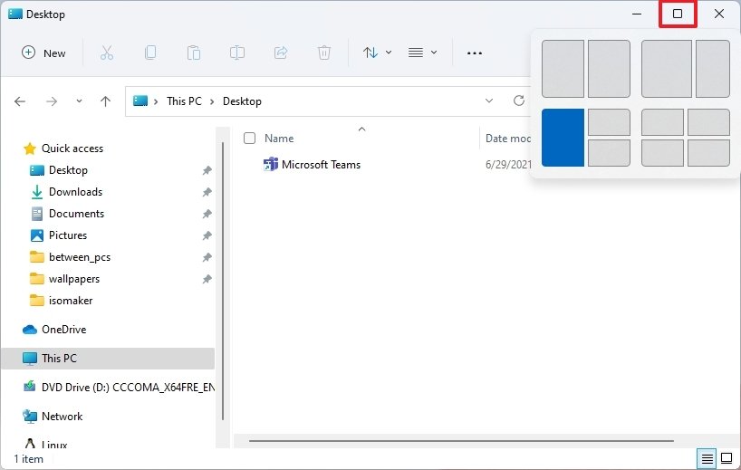
Also, if you are snapping in portrait mode, when snapping to the right and left, Snap Assist will snap the apps to the bottom and top as you rotate the screen.
Furthermore, when dragging windows manually to any of the corners or sides of the screen to snap the window, you will now see a new visual with transparent elements previewing how the windows will snap in place.
While you have been able to snap windows for a long time, Snap layouts will come in handy to help users manage windows, and thanks to the new layouts, it will make it easier to manage windows in wider displays.
You can also invoke the Snap layouts using the Windows key + Z keyboard shortcut.
"Snap groups" is a feature that is part of the taskbar experience that lets you switch back to different groups of snapped windows when switching to another app, so you do not have to re-snap them again to get back to what you were doing faster.
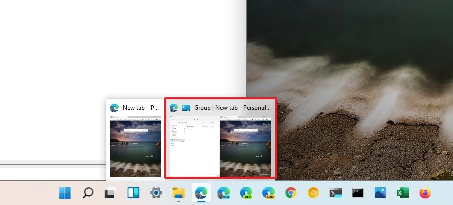
These features are enabled by default, but you can disable them from the Multitasking settings page.
Windows 11 Build 22000.51 also comes with new settings to make it ease the pain using an external monitor with your laptop. For instance, when you disconnect the external monitor, all the running applications on the external display will minimize automatically. Then when you reconnect the monitor, the system will restore all the apps to their original location.
The feature comes enabled by default, but you can manage this experience from Settings > Display > Scale & layout > Multiple displays. The settings include:
- Remember window locations based on monitor connection.
- Minimize windows when a monitor is disconnected.
File Explorer
Microsoft is also working on a new version of the File Explorer app, and even though it does not come with support for tabs, it comes with the same legacy look but with a modern interface.
In this new version, the ribbon-style menu is gone, and it has been replaced with a new menu with new icons (without labels) for basic commands, including copy, paste, rename, share, and recycle. And now, the menu and the title bar are combined into a single element with semi-transparent visuals.
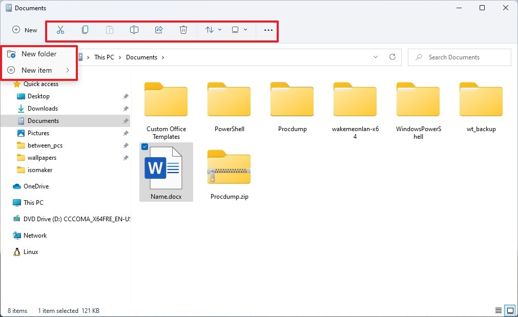
Also, you will find a "New" button that opens a menu with options to create folders and different items like Shortcut, Compressed Folder, Text Document, etc.
Since there is no more ribbon with tabs, the new Explorer is accommodating the other tabs command in three new drop-down menus, including "Sort and group options," "Layout and view options," and "See more."
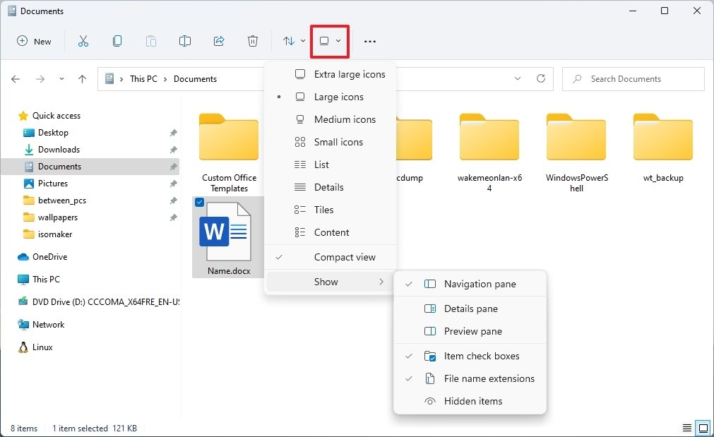
In the Sort and group options menu that's where you will find the options to sort content by name, date modified, type, and more.
The Layout and view options menu is the place to find the options to show items in different sizes, such as extra-large, large, small, list, details, and more. The menu also includes the option to enable the compact view instead of the new view with more padding.
In addition, the Show submenu also includes the options to manage the left pane view, show or hide extensions, or hidden items.
Finally, the See more (three-dotted) menu houses the commands for selections, compressed to ZIP file, and Options to manage the app settings.
Similar to the ribbon menu experience, the options in the new modern menu will adapt to the content, meaning that depending on where you are and the files you are managing, you will see different settings. For example, the "New" menu will not show the option to create a new folder if you in the "This PC" page. However, the "See more" menu will include the options to manage network locations and map network drives.
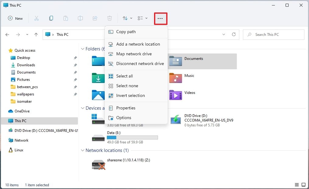
If you view a zip folder or select an image, you will see different options in the menu.
The File Explorer on Windows 11 also comes with a new context menu. When you right-click an item, you will see the new menu that includes a first row with commands for quick access to cut, copy, rename, share, and recycle, and the rest of the items will be different depending on the items you are selecting.
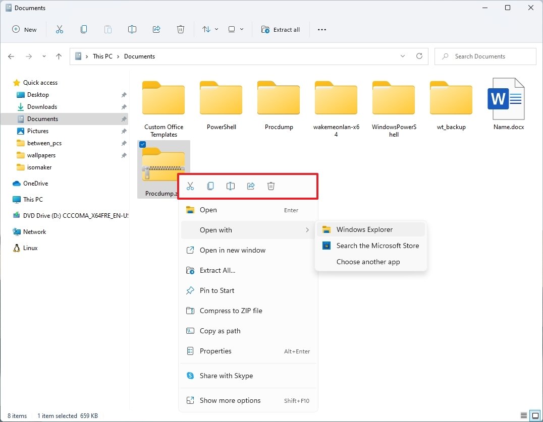
The new context menu implements a new interface with rounded corners, more padding between items, and simple and consistent iconography for each action.
If you like the more traditional menu, you can select the Show more options item (or Shift key + F10 keyboard shortcut), and that will open the classic menu.
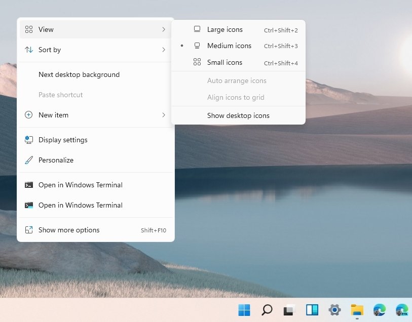
The new context menu style is available in File Explorer, Desktop, and across the experience.
Then there is also the new scrollbar, which is more minimalistic, and it's the new design you will see across all the remaining legacy elements.
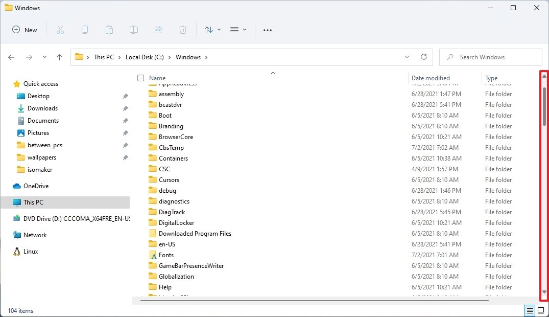
Asides from the new menu, which is basically the entire design, plus some other tweaks, the new app still a work in progress since a lot of parts, such as the recent locations menu, Folder Options settings, This PC, driver properties, and format tool continues to use the legacy interface, and the dark mode doesn't work correctly.
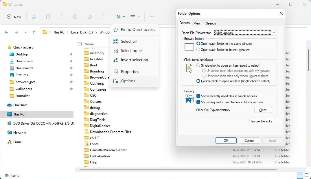
It's early to judge the experience, but in my opinion, the new design might impact productivity. For example, if you relied on the ribbon menu, it will take more steps to create a folder, and since there are no labels, it could be easy to get confused with the new buttons (for example, copy, paste, and rename).
Windows Ink is now Pen menu
In this flight, Build 22000.51 is also renaming "Windows Ink Workspace" to "Pen menu," and the experience has been redesigned to now let you pin any app you want.
Voice Typing
Although Microsoft is also touting the Voice Typing app as new to the first preview of Windows 11, the new and improved app to help you type using your voice has been available for a number of builds.
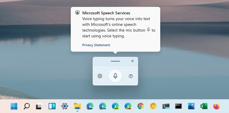
The app has a new user-friend interface and quick access to settings. You can also invoke the app using the Windows key + H keyboard shortcut.
General UI and sounds
Windows 11 is all about the rounded corners. You will find this design style across all the elements, including frames, buttons, flyout interfaces, menus like context menu, Start menu, taskbar, Notifications Center, and Quick Settings.
Microsoft is also implementing new design materials, including Mica and Acrylic. Mica is a new material that will let the desktop pass through the application frame and indicate that the window focuses on whether you are using the dark or light mode.
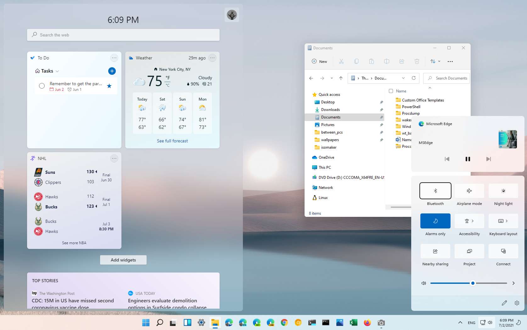
According to the company, the Mica material is a very performant visual effect, it will save battery life, and psychologically the rounded geometry for corners provides a feeling of safety and makes the app's interface much easier to scan.
Then there is the Acrylic material that creates a more translucent physical texture, and you will see this effect more when using Snap Assist, Widgets, other features.
In addition to the new material, starting with Build 22000.51, the OS is also getting a new dialog box with a more straightforward design matching the Windows 11 design style with a white background and buttons that match the system color accent.
Font
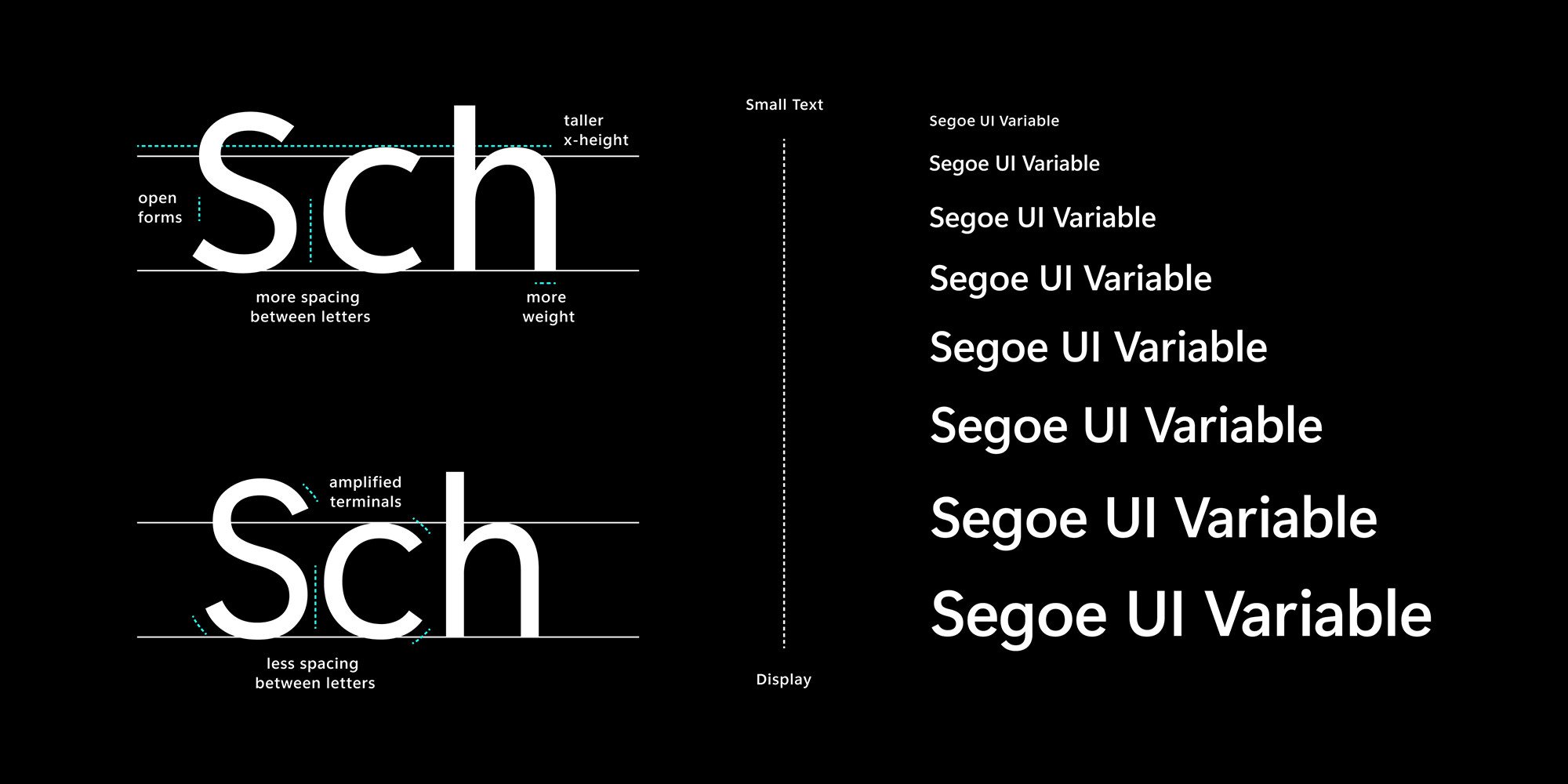
As part of the system overhaul, the new Segoe UI Variable font family that features changes to scale the font seamlessly from small to larger display sizes is fully implemented. This new font is based on the legacy Segoe with new improvements for better legibility at small sizes and better outlines at display sizes.
Animations
Windows 11 also introduces new animations to make the system feel snappier and more comfortable using. You will notice these animations as you slide features in and out, snap or resize windows, open apps from the taskbar, and click or remove buttons from the taskbar.
There is even a new loading animation for installing apps or updates.
Sounds
This is a big deal for many users. The startup sound is back, and it has a new melody. In addition, almost all the sounds for common actions have been replaced with new sounds designed to be a little more atmospheric and lighter. You will also find that the sounds will be slightly different depending on whether you are using the dark or light mode.
Lock screen and Sign-In screen
You are also getting a preview of the new Lock screen. The experience looks similar to the previous version, but it now centers the time and date information on the screen like on your mobile phone.
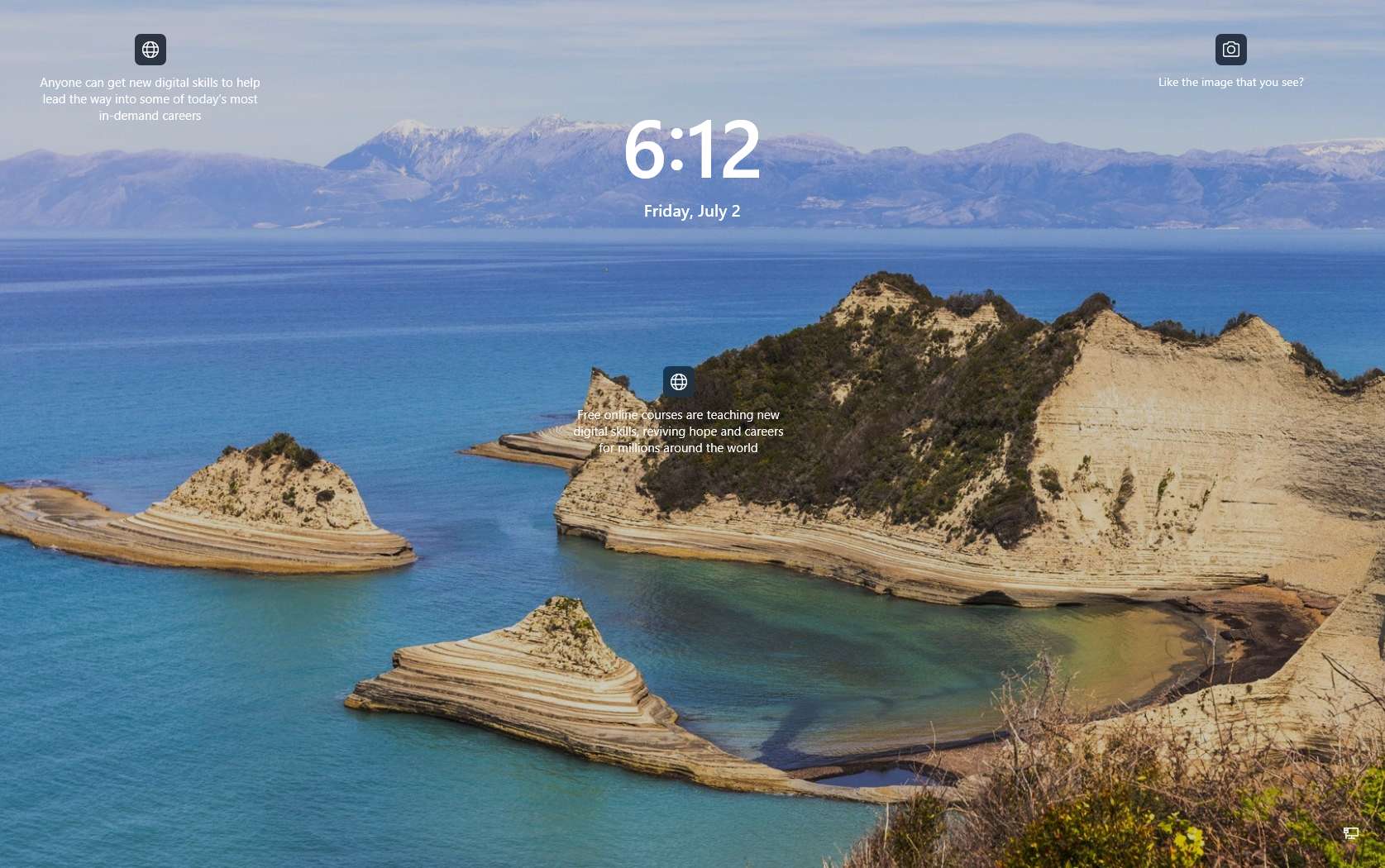
The Sign-In screen looks exactly like the one on Windows 10, but it now includes new iconography for bottoms available in the bottom-right corner. Also, the text box to enter the password or PIN now has a colored underline. (You will see this virtually in any text box across the experience.)
Settings app
Windows 11 Build 22000.51 also comes with a brand-new Settings app. The app features a new interface using the new Mica material for the frame, rounded corners, and new colorful icons. And all the settings follow the same organization as it was on Windows 10, but now they grouped differently.
As you open the app for the first time, you still have the left pane for navigation, but it no longer features a main page like the legacy version. Instead, you are taken to the "System" page.
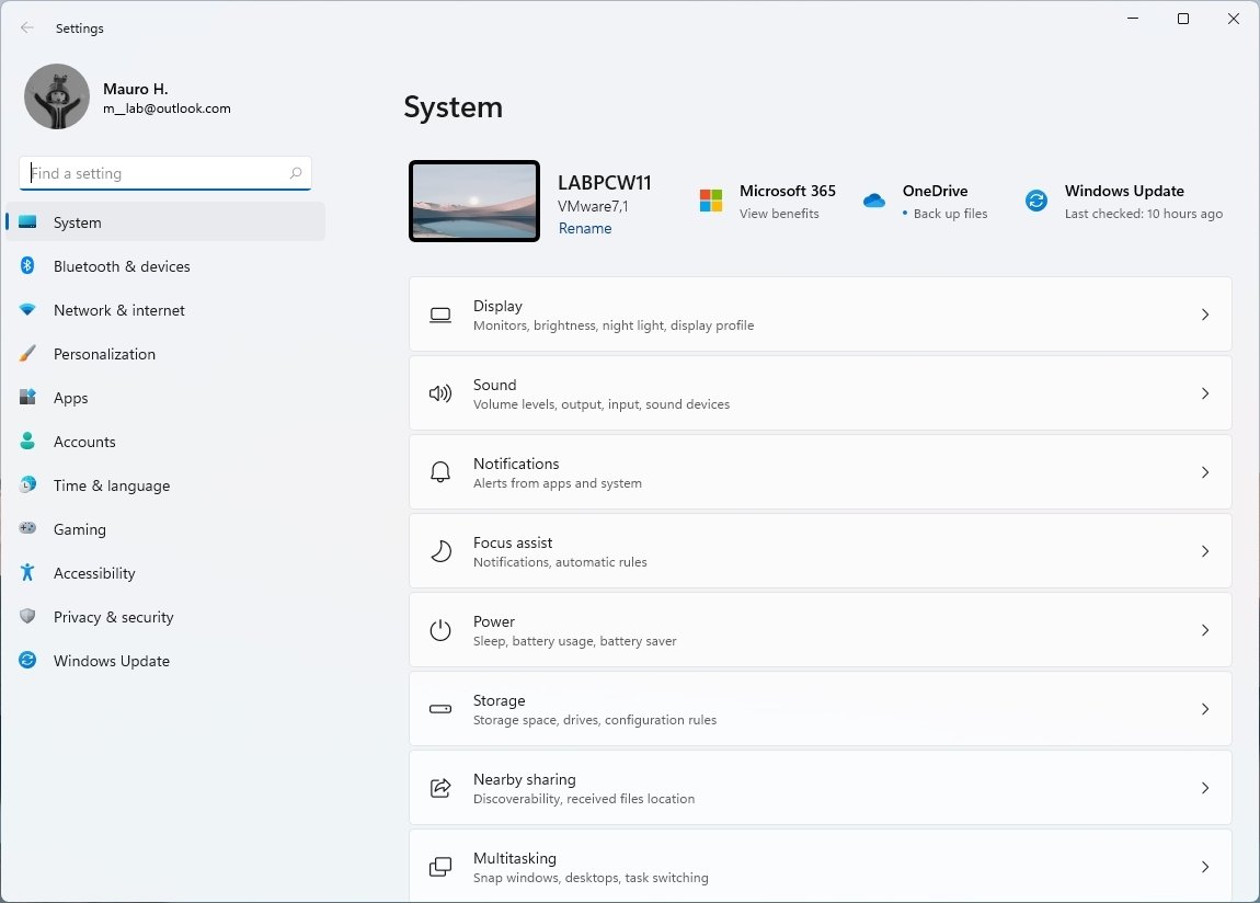
When you navigate the settings, you will notice the breadcrumbs that let you know where you are as you go deep into the settings. You can also click each breadcrumb to jump between pages.
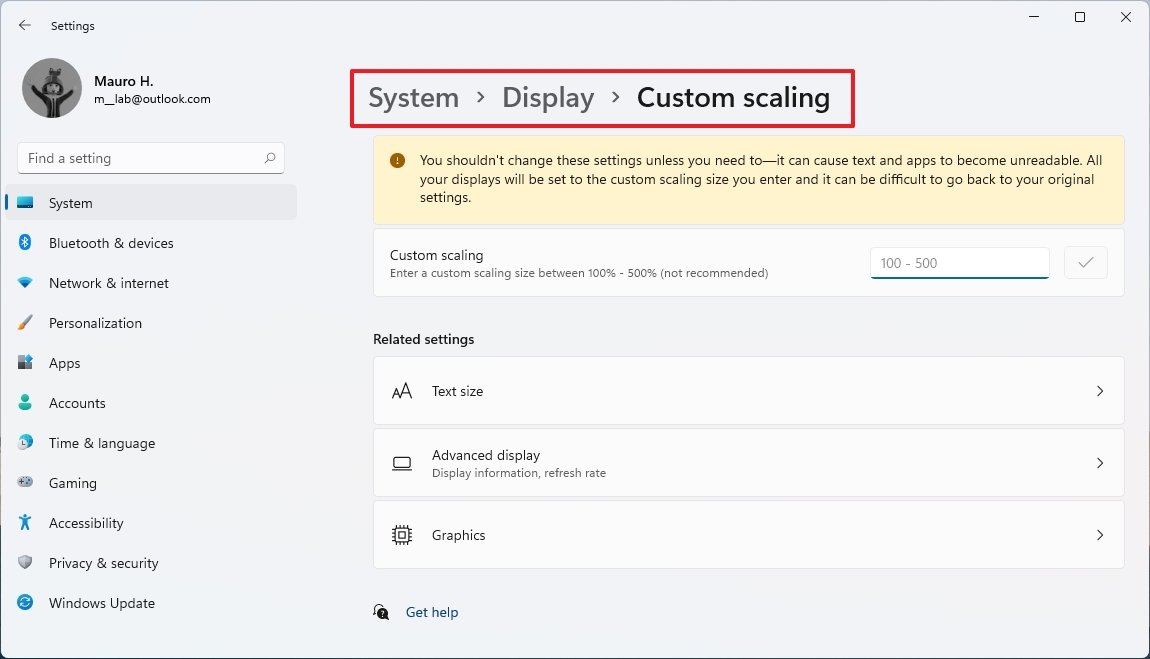
Pages can also have hero controls that highlight specific features and frequently used settings, which can change as you modify the system configuration. For example, the System page includes a screen icon representing the system with the current background preview, computer name, and an option to rename the system. Then at the left, you will find the status for Windows Update, OneDrive, and Microsoft 365.
Inside each of the sections, you will find a list of pages with related settings. The settings organization has a similar structure as the experience available on Microsoft Edge, where you click the page name to access the settings. Inside the pages, you may find more pages or different sections to customize the experience.
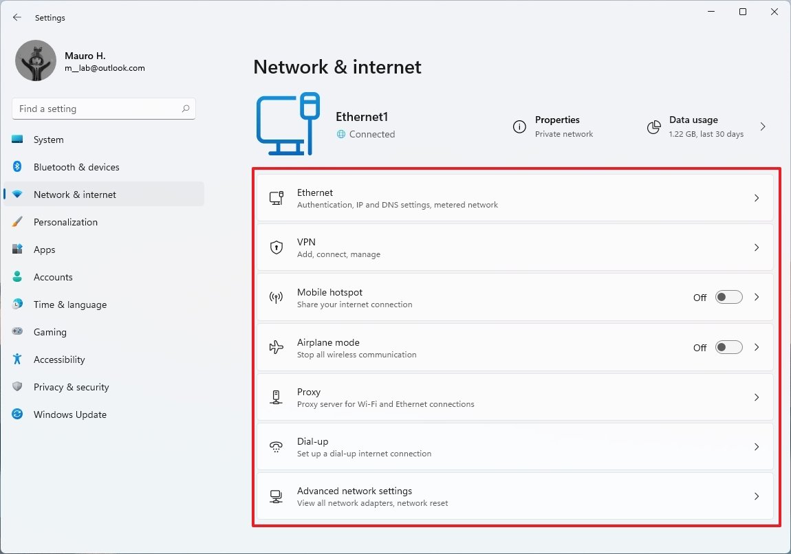
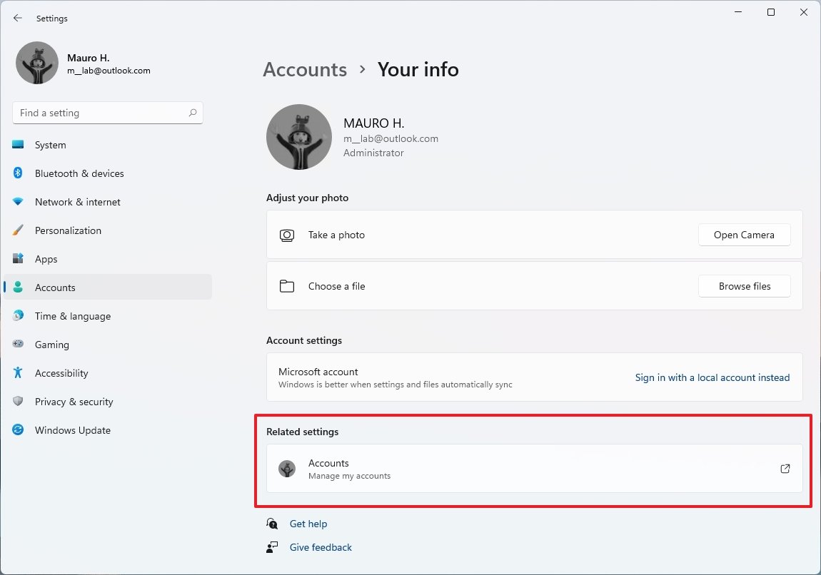
The navigation pane on the right is now at the bottom, and the links to other related settings now appear as buttons to match the style design of the app.
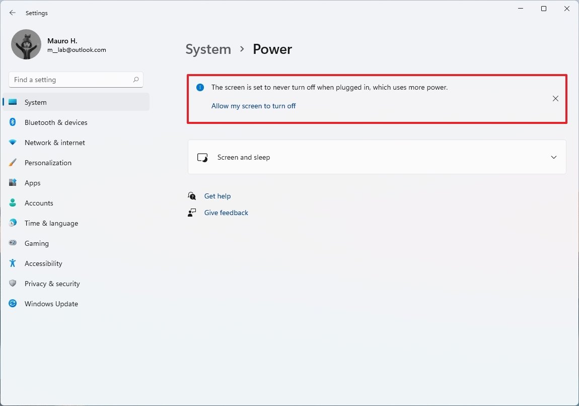
The Settings app will also be able to recommend settings based on your current configuration. For instance, if the device is set to never sleep, you may find a recommendation explaining that the feature is disabled, and enabling it could help to save battery.
Since the settings are virtually the same as ones for Windows 10, we will highlight only the interesting changes.
System
In the System section that's where you find the options to configure the Display, Sound, Notifications, Focus assist, Power, Storage, Nearby sharing, Multitasking, Activation, Troubleshoot, Recovery, Projecting to this PC, Remote Desktop, Clipboard, and About.
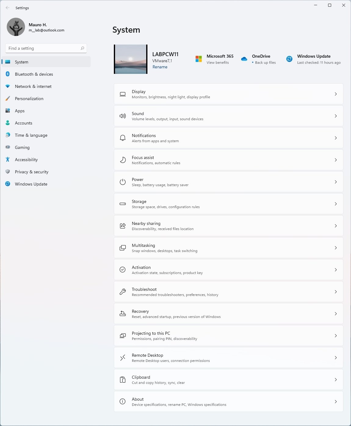
The hero controls in this section include an icon representing the device with the current background preview, computer name, and an option to rename the system. Then at the left, you will find the status for Windows Update, OneDrive, and Microsoft 365.
On System > Display, the Scale & layout section has been updated with new Multiple displays settings, including:
- Remember window locations based on monitor connection.
- Minimize windows when a monitor is disconnected.
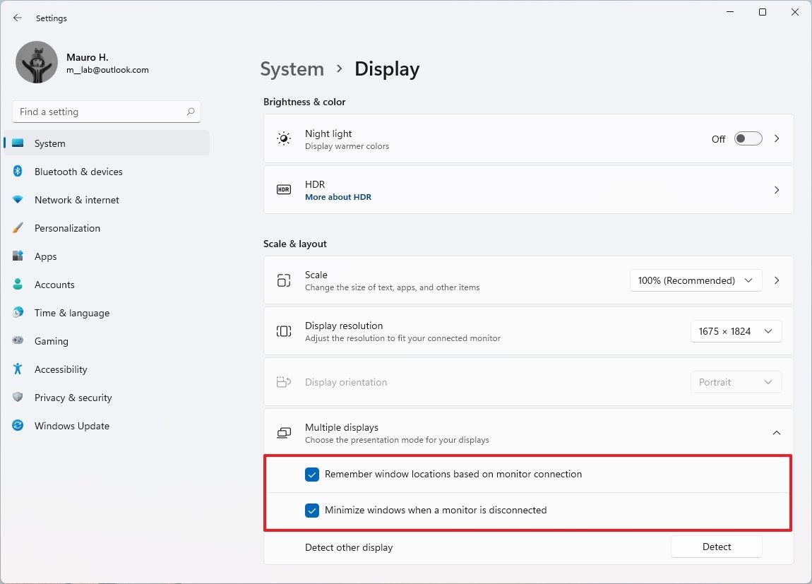
As previously described, using these settings when you disconnect the external monitor, all the apps will minimize in the taskbar. Then when you reconnect the monitor, the system will restore all the apps to their original location.
On System > Display, in the Advanced display page, there is an option (Dynamic) to configure the new Dynamic Refresh Rate (DRR) feature that allows Windows 11 to automatically lower or increase the display refresh rate to reduce the power consumption.
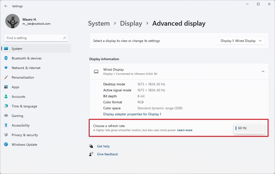
The option will be available only for a laptop or device with a display of 120Hz refresh rate that also meets other requirements.
On System > Sound, in the Properties page for input or output devices, the experience has been redesigned with high-quality icons for the peripheral, driver information, and settings previously only available using Control Panel.
For example, the properties page for the speakers includes permission options, the ability to choose the audio format, and other audio-specific settings.
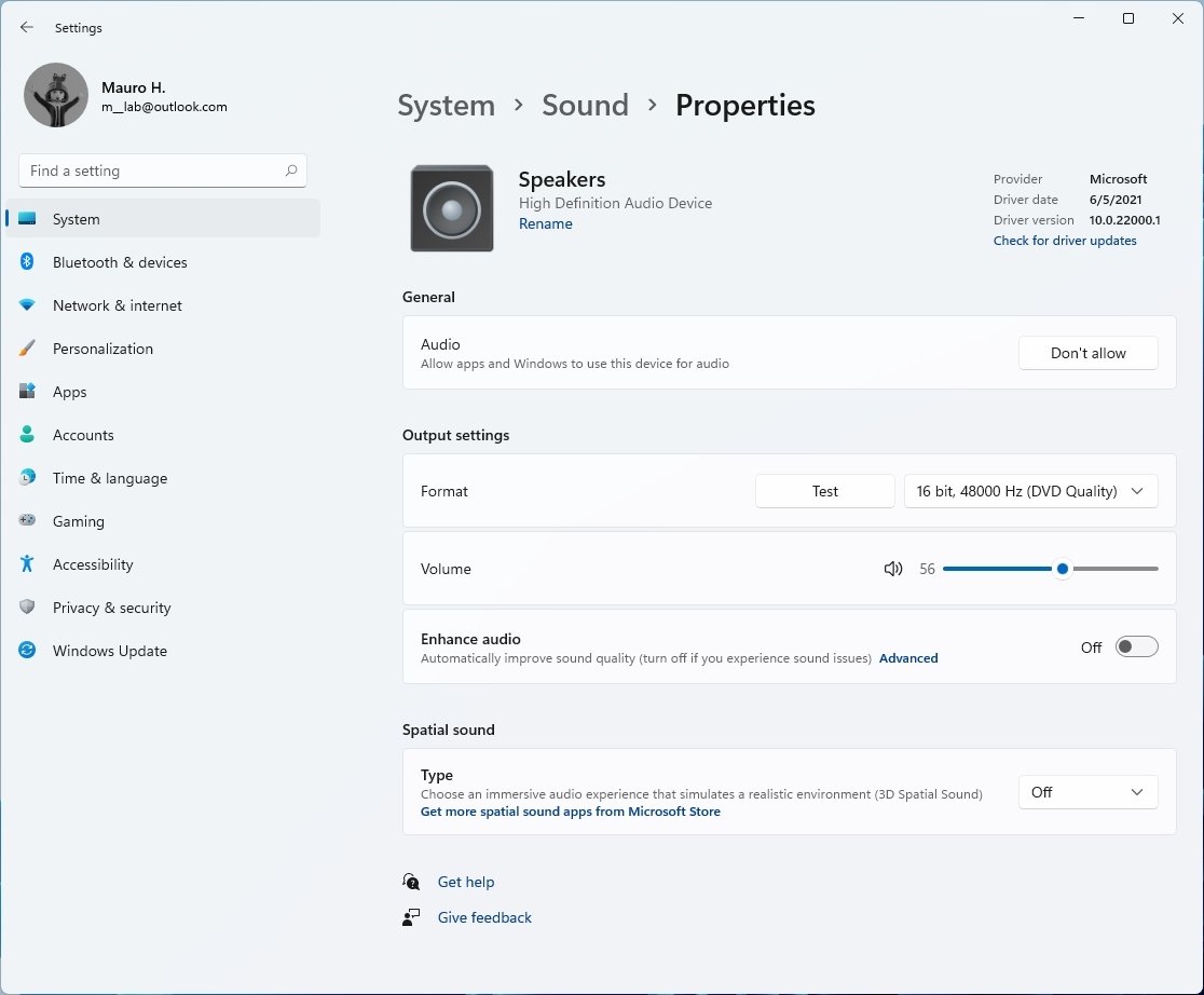
In the Sound page, the Output section also includes an option to combine the left and right audio to produce mono sound, and there are options to pair new output and input devices using Bluetooth or other connections.
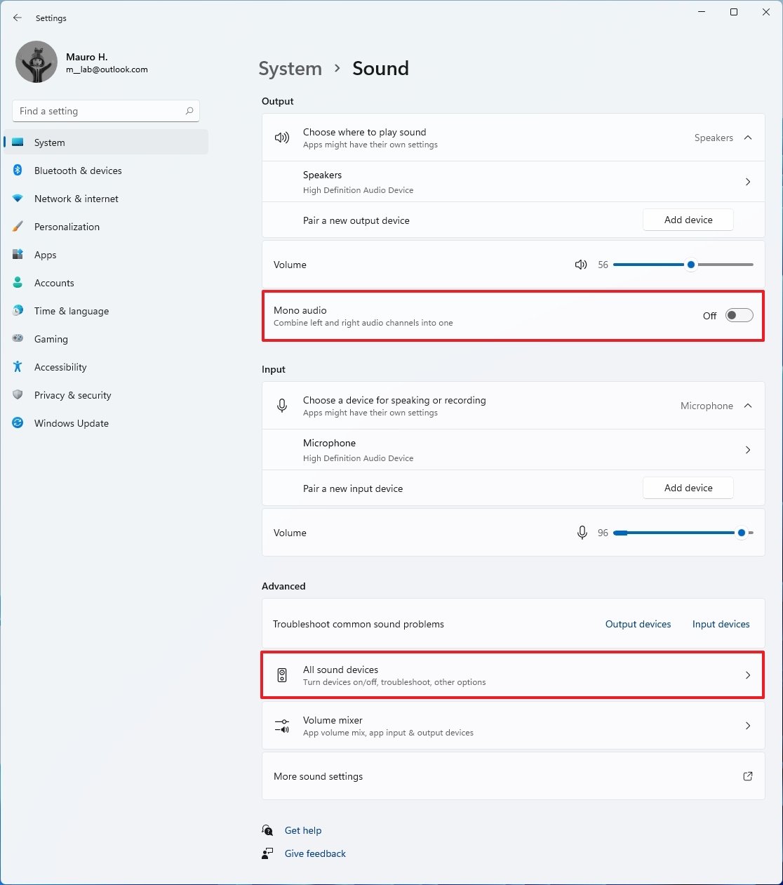
At the bottom of the page, Windows 11 Build 22000.51 includes an option to access the "All sounds devices" to turn devices on or off, troubleshoot, and find other options.
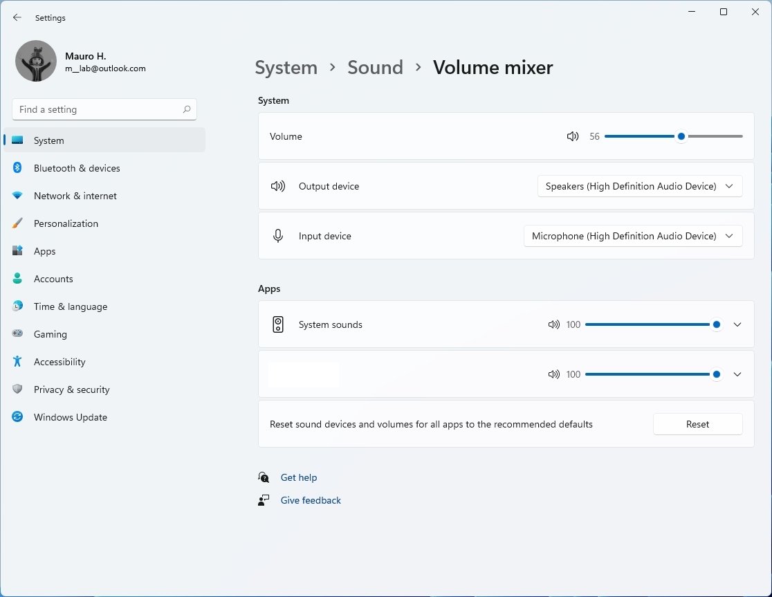
In this flight, the "App volume and devices preferences" page has been renamed to "Volume mixer." It includes all the same settings, and it replaces the legacy mixer menu available in the taskbar.
On System > Multitasking, the "Snap windows" section has been updated with two more features to enable or disable Snap layouts and Snap groups:
- Show snap layouts when I hover over a window's maximize button.
- Show snap layouts that the app is part of when I hover over the taskbar buttons.
And then there's a new option:
- When I drag a window, let me snap it without dragging all the way to the screen edge.
The "Show suggestions in your timeline" is no longer available since Timeline is no longer a feature on Windows 11.
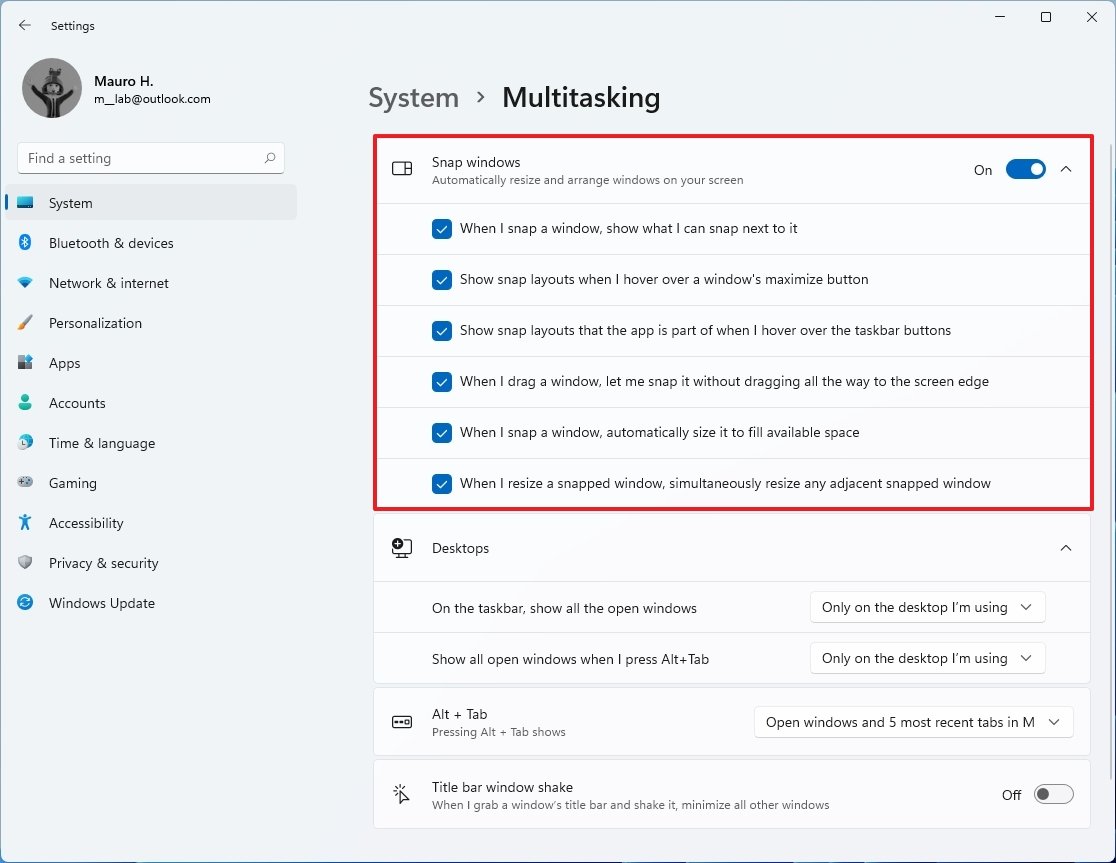
The "Virtual Desktops" settings have been renamed to "Desktops." The section includes all the same settings as before.
Bluetooth & devices
The Bluetooth & devices section only includes a giant button to bring up the setup to add new devices for hero controls, and it houses the pages to customize Bluetooth, Devices, Printers & scanners, Your Phone, Cameras, Mouse, Touch, Pen & Windows Ink, AutoPlay, and USB.
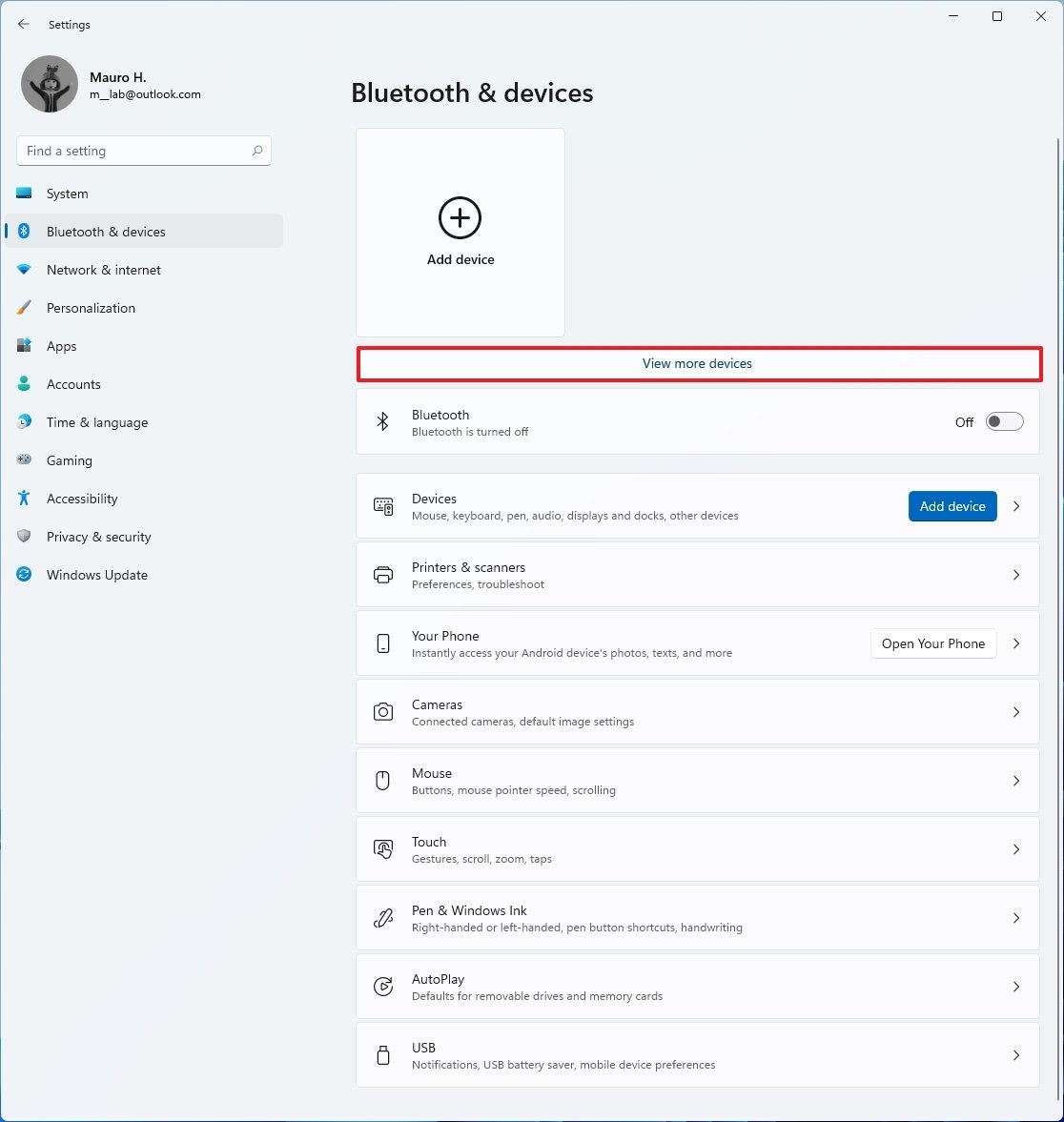
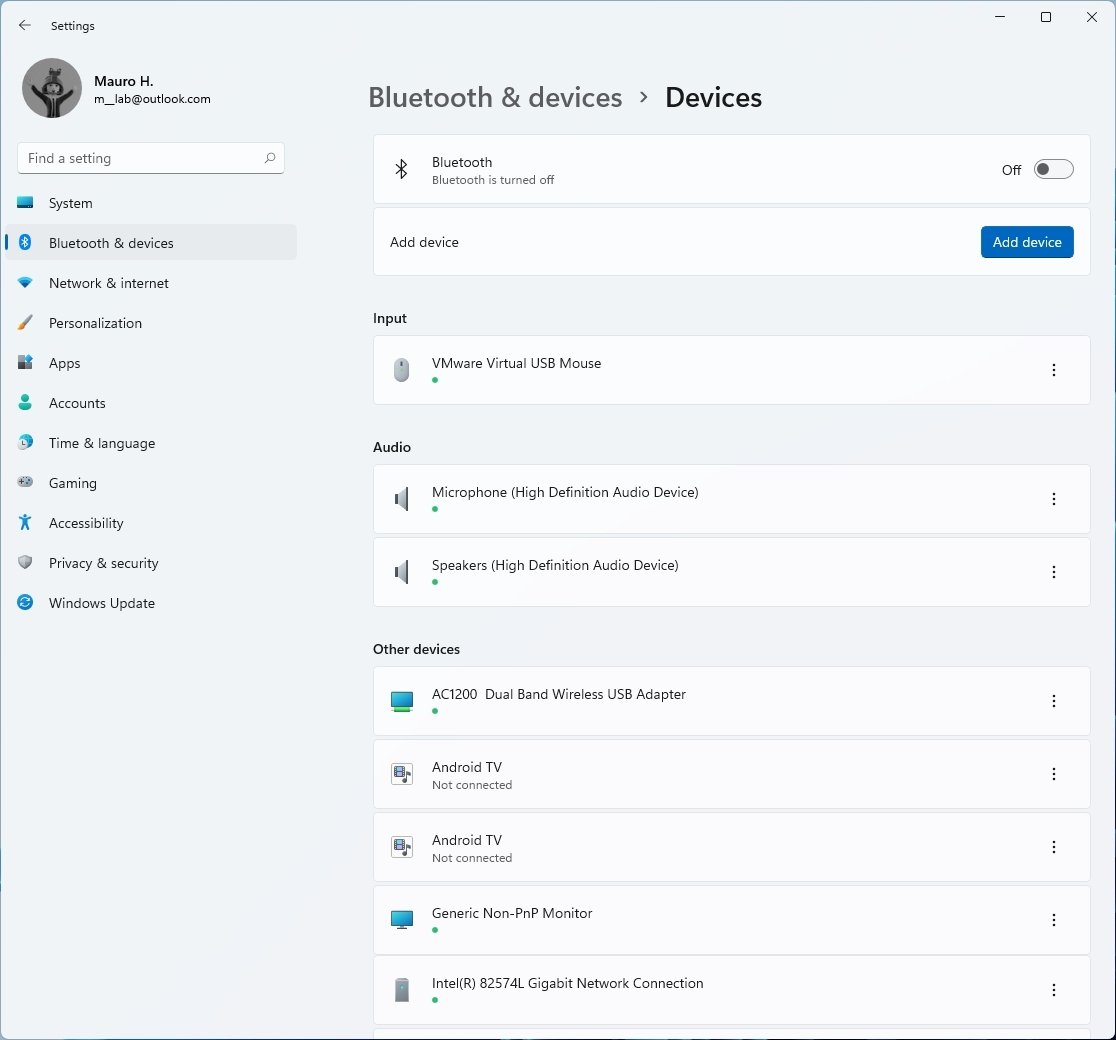
Starting with Build 22000.51 to see all your devices, you need to click the "View more devices" option or click on "Devices," which also happens to include an "Add device" button to install a new device quickly.
While all the pages were available in previous builds, there is a new Touch page that appears even when you don't have a touch-enabled display, and it houses the options to control touch features.
Also, as part of the gesture improvements, this preview includes new touch gestures to make it easier to switch between apps and desktops. These gestures are similar to the ones you would use on a touchpad, including:
Three-finger gestures on Windows 11:
- Swiping left or right to switch to the last used app.
- Swiping down go back to the desktop.
- Swiping up to open Task View.
Four-finger gestures:
- Swiping left or right to switch to the previous or next desktop.
- Swiping up or down go back to the desktop.
Network & internet
In the Network & internet section, you will find the active network connection, access to the properties for the active network connection, and data usage information as hero controls. This section includes the settings for Ethernet, Wi-Fi, VPN, Mobile hotspot, Airplane mode, Proxy, Dial-up, and Advanced network settings.
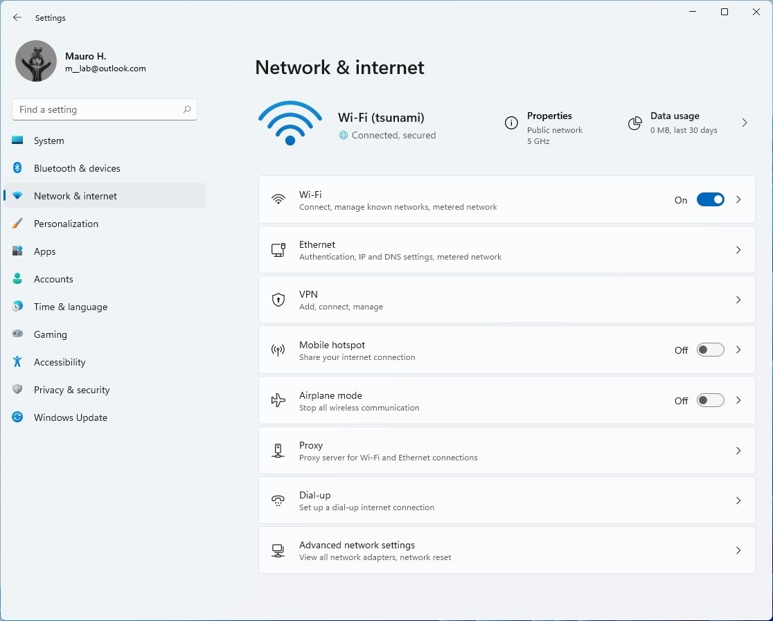
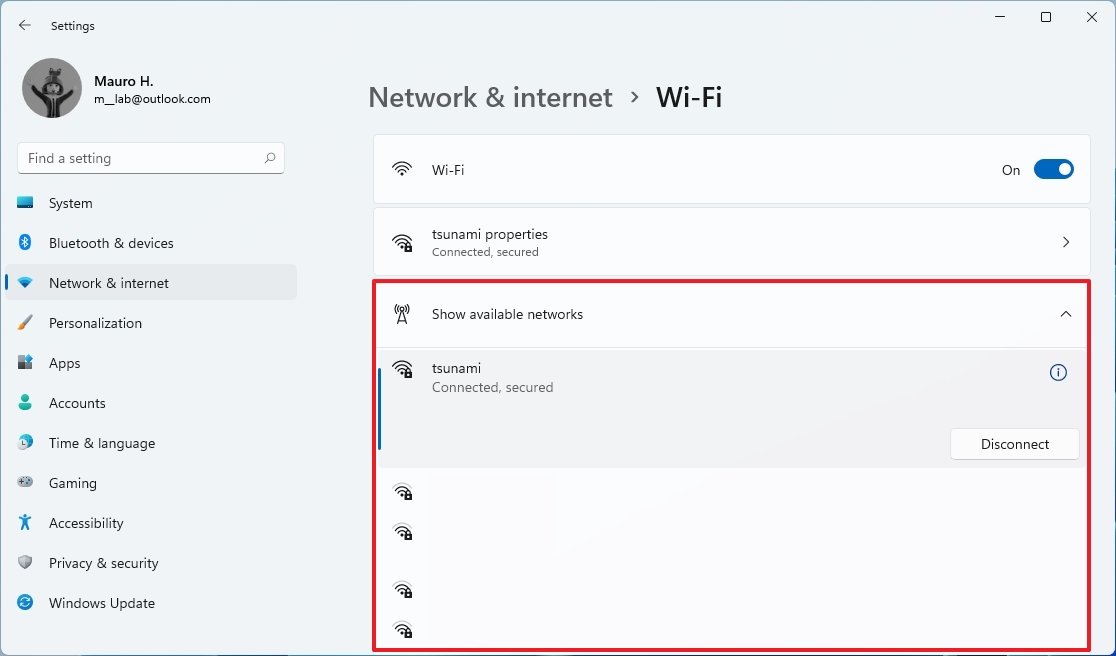
On Network & internet > Wi-Fi, the page includes all the same settings as before, but now you can view the available networks without opening the network flyout.
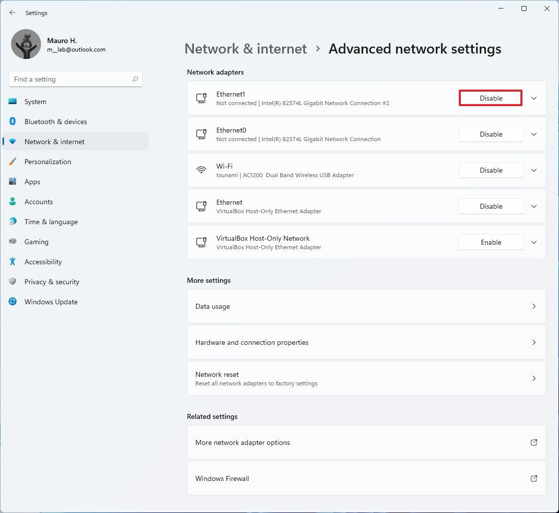
On Network & internet > Advanced network settings, this page is new, and it allows you to enable or disable network adapters without having to access the Control Panel.
Personalization
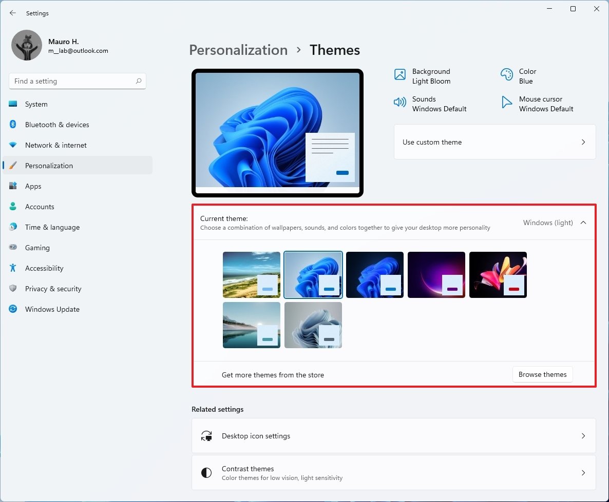
In the Personalization section, you will find a preview of the current theme and the options to choose between the six new default themes as hero controls. This section includes the settings for Background, Colors, Themes, Lock screen, Touch keyboard, Start, Taskbar, Fonts, and Device usage.
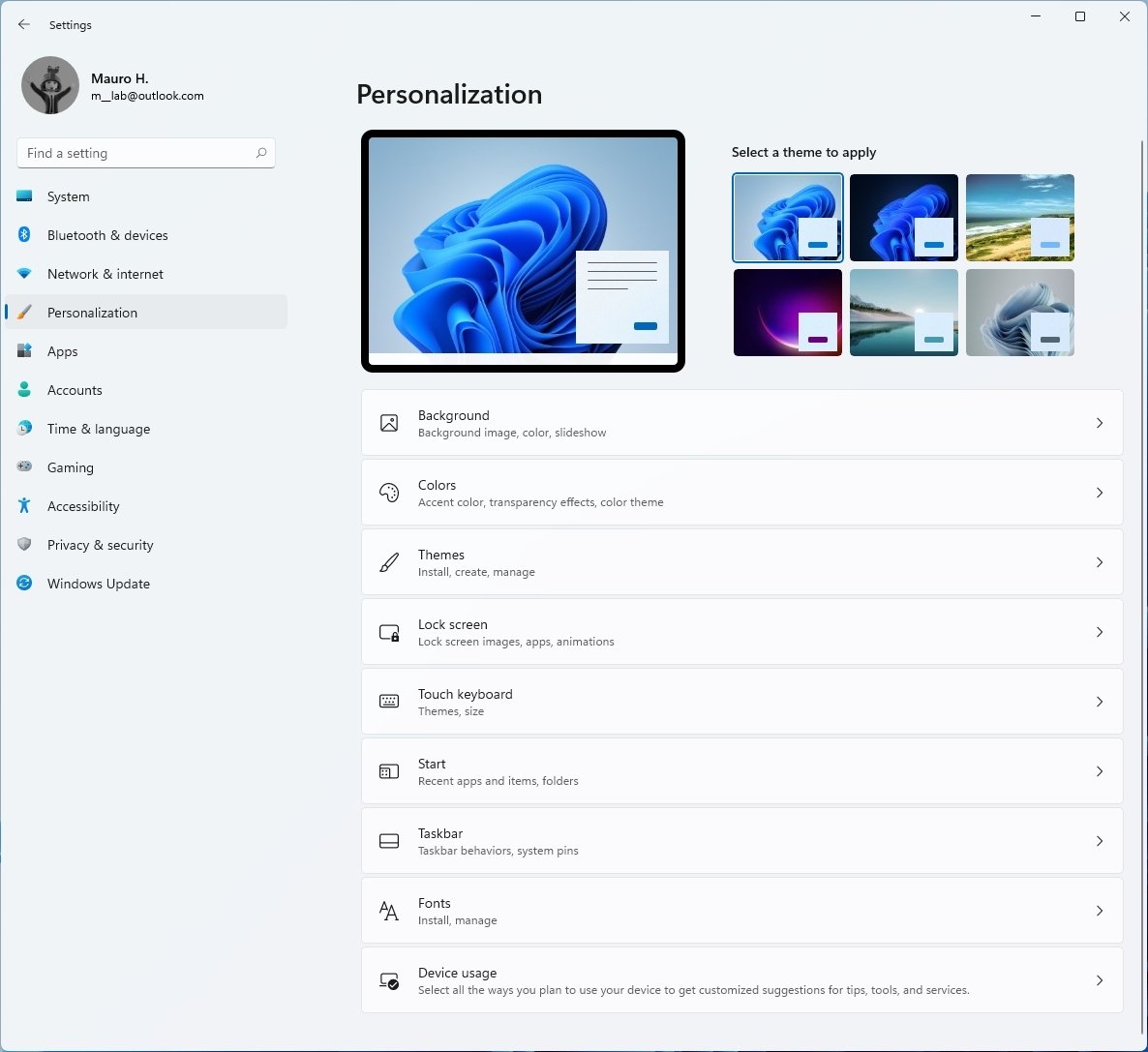
On Personalization > Themes, the page only includes the six new themes for Windows 11.
On Personalization > Touch Keyboard, this page is new, and it includes the options to change the sizes of the keyboard. Also, you will find 12 themes you can use to customize the touch keyboard. Furthermore, there's an option at the bottom that lets you customize the theme with custom colors.
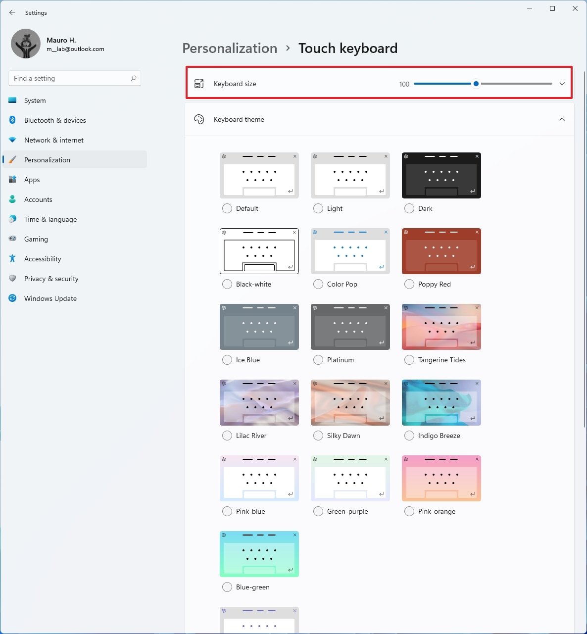
Other options include the ability to enable or disable the key backgrounds, select the key text size, and option to preview the changes.
On Personalization > Start, the page has been updated to reflect the settings for the new Start menu. As a result, a lot of the legacy settings have been removed, and you can only show or hide recently added apps, most used apps, and jump list items.
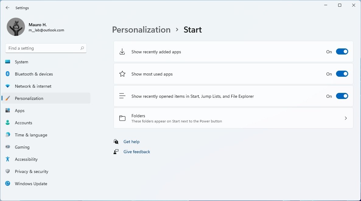
The "Folders" option lets you choose what folders (Settings, File Explorer, Documents, etc.) appear next to the power button in the Start menu.
On Personalization > Taskbar, the page has been updated to house all the settings corresponding to the new taskbar. Similar to the Start settings, many legacy options have been removed, including the ability to change the taskbar location, show small icons, and other options.
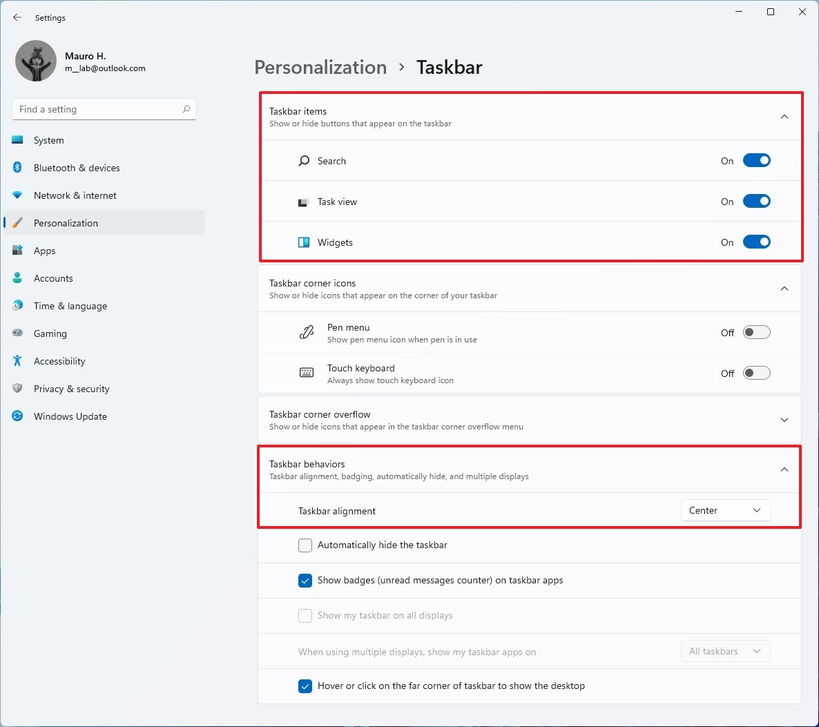
The page is divided into three sections, including Taskbar icons that let you add or remove the Search, Task View, and Widgets buttons.
The Taskbar corner icons section includes options to add or remove the Pen menu and Touch keyboard buttons in the taskbar's notification area.
The Taskbar corner overflow section lets you show or hide icons that appear in the taskbar corner overflow menu.
The Taskbar behaviors section includes the settings to change the taskbar and Start menu alignment to the left or center. Also, you get the options to hide the taskbar automatically, show badges for apps, show the taskbar across all the displays, and there is a new option to enable or disable the show desktop button in the far corner.
Apps
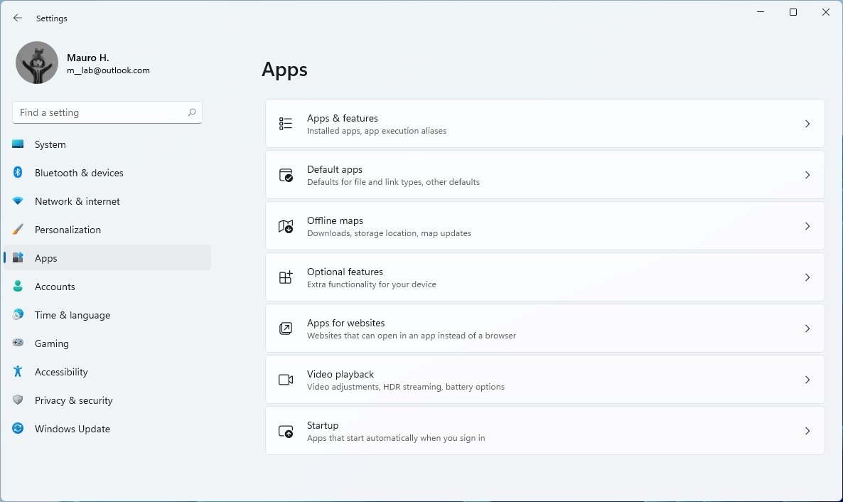
The Apps section doesn't have hero controls, and it is the place to find the Apps & features, Default, Offline maps, Optional features, Apps for websites, Video playback, and Startup pages.
On Apps > Apps & features, the page includes a new Share across devices feature, allowing you to continue the app experience across your devices connected with a Microsoft account. You can choose to disable the feature or set it only to share the experience with your devices or any device nearby.
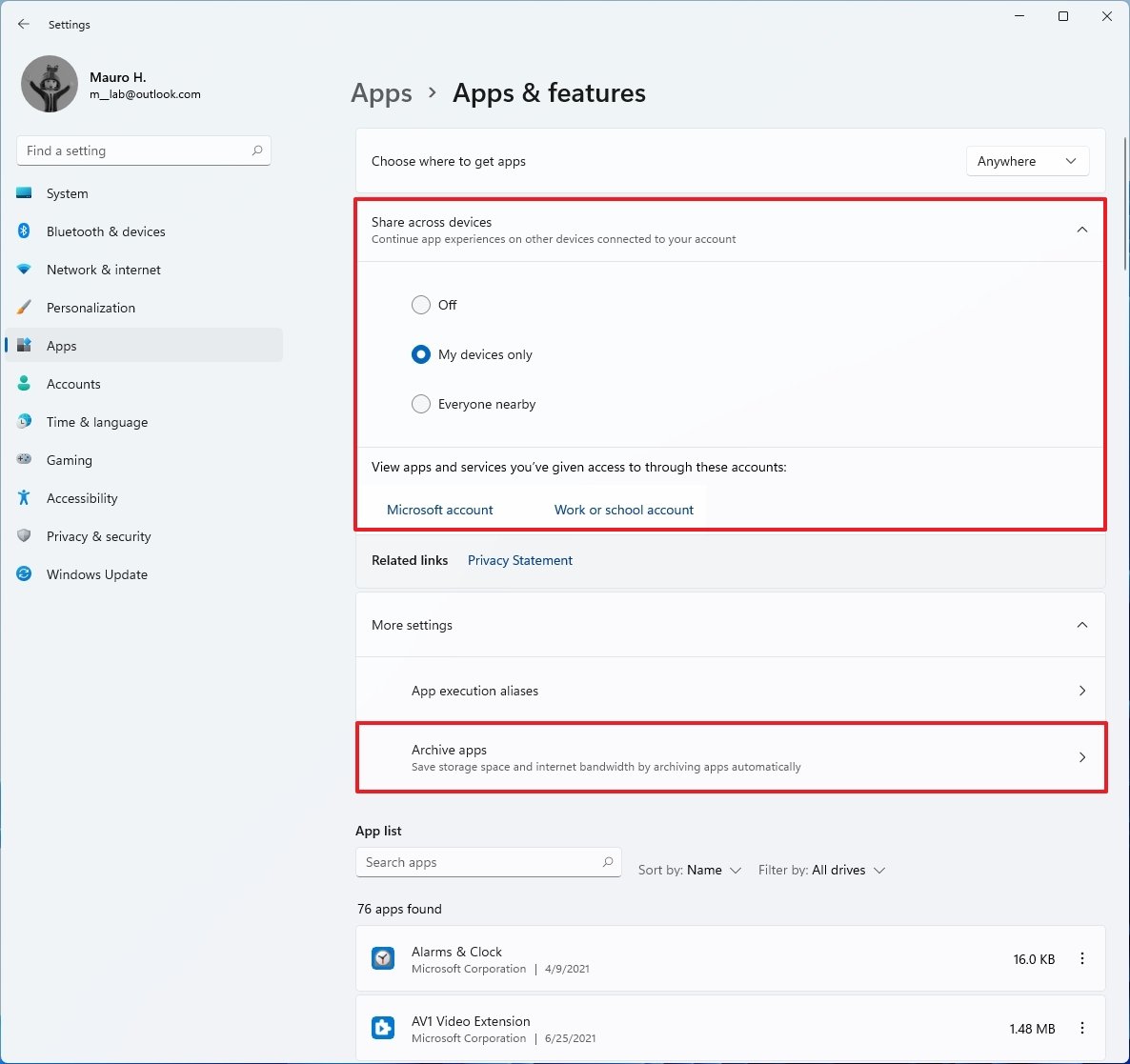
You will also find "Archive apps" under the "More settings" section. The feature is meant to save storage and internet bandwidth by archiving those apps from the Microsoft Store you don't use frequently. Then the next time you use the app, it'll download automatically from the Store.
The feature isn't entirely new. It was previously available in Insider builds, but the company is now bringing it back with Build 22000.51.
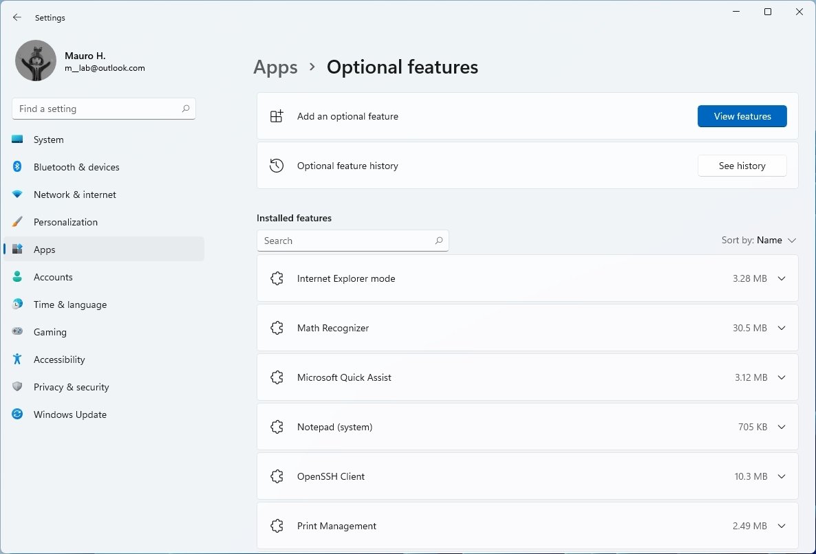
On Apps > Optional features, this page was previously under Apps & features but now is part of the "Apps" section. Other than moving the page forward, everything is still the same.
Accounts
In the Accounts section, the information about your account, rewards from Microsoft, and OneDrive backup information are the hero controls. This section houses the Your info, Email & accounts, Sign-in options, Family & other users, Windows backup, and Access work or school pages.
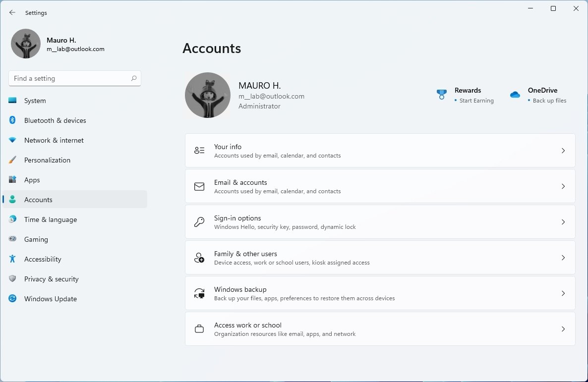
On Accounts > Windows backup, this page replaces the "Backup" page and no longer includes the options to access the legacy backup feature from Windows 7, nor will you find the settings to use File History to back up your files. However, you can still access these features from Control Panel.
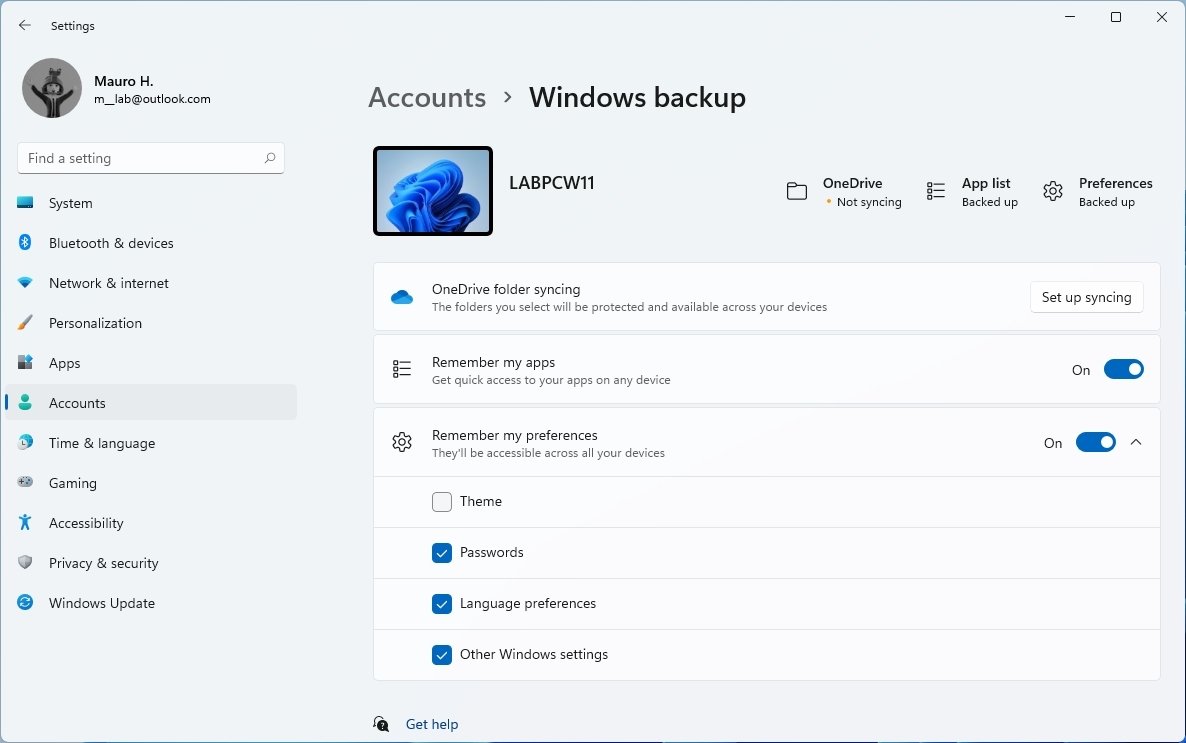
The page now pushes users to use OneDrive to backup files and sync preferences to the cloud.
Time & language
In the Time & language section, you will find that Windows once again brings together the "Language & region" settings into a single page with all the same settings as before. This section includes the Date & time, Language & region, Typing, and Speech pages.
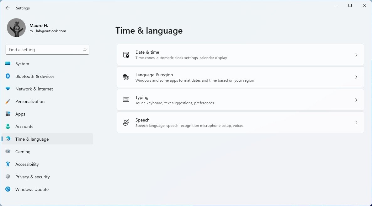
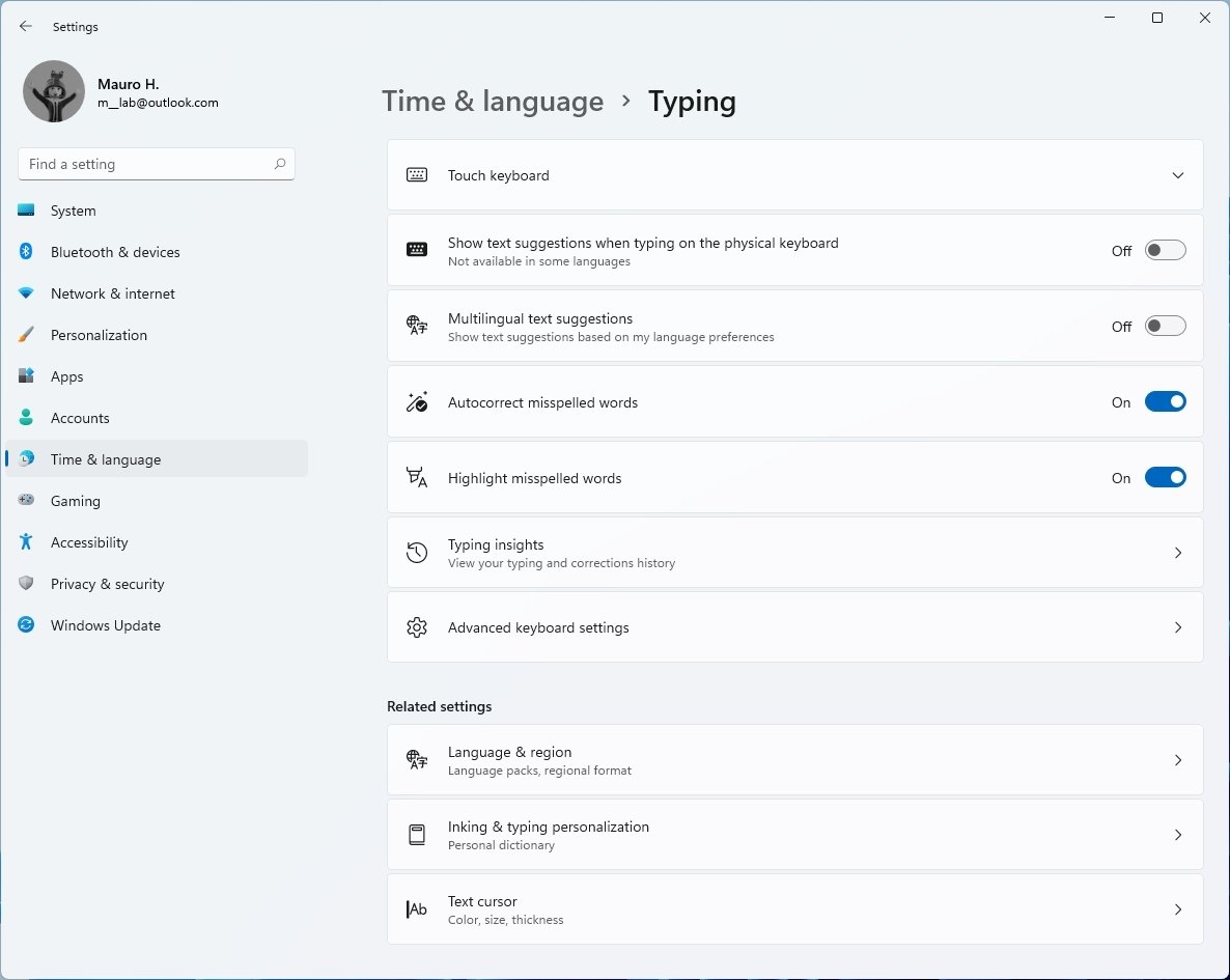
On Time & language > Typing, the new page is new to this section. Previously, it was located in the "Devices" section, and like before, it includes the settings to configure the touch keyboard, suggestions, auto-correction, highlight misspelled words, typing insights, and more.
Accessibility
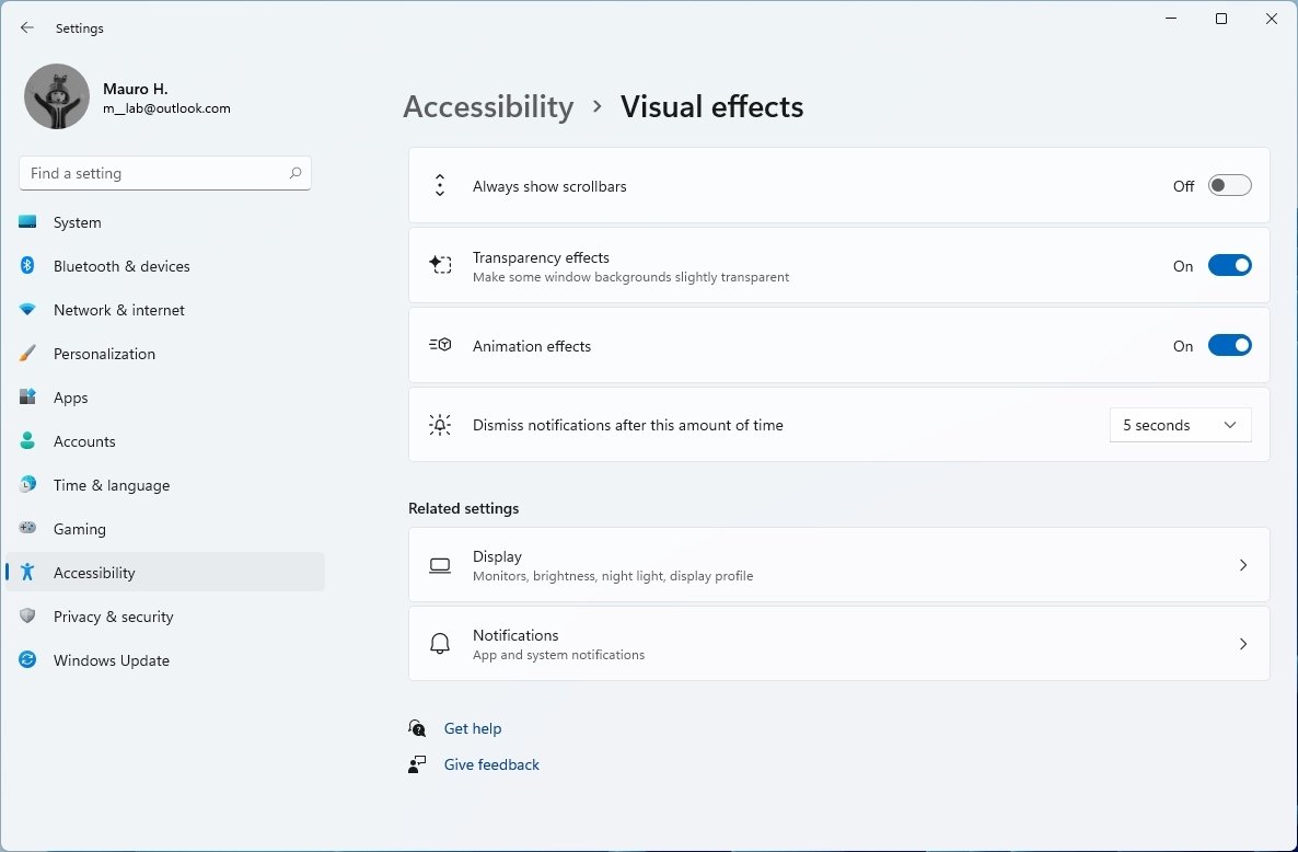
The Accessibility section includes the settings for Text size, Visual effects, Mouse pointer and touch, Text cursor, Magnifier, Color filter, Contrast themes, Narrator, Audio, Captions, Speech, Keyboard, Mouse, and Eye control.
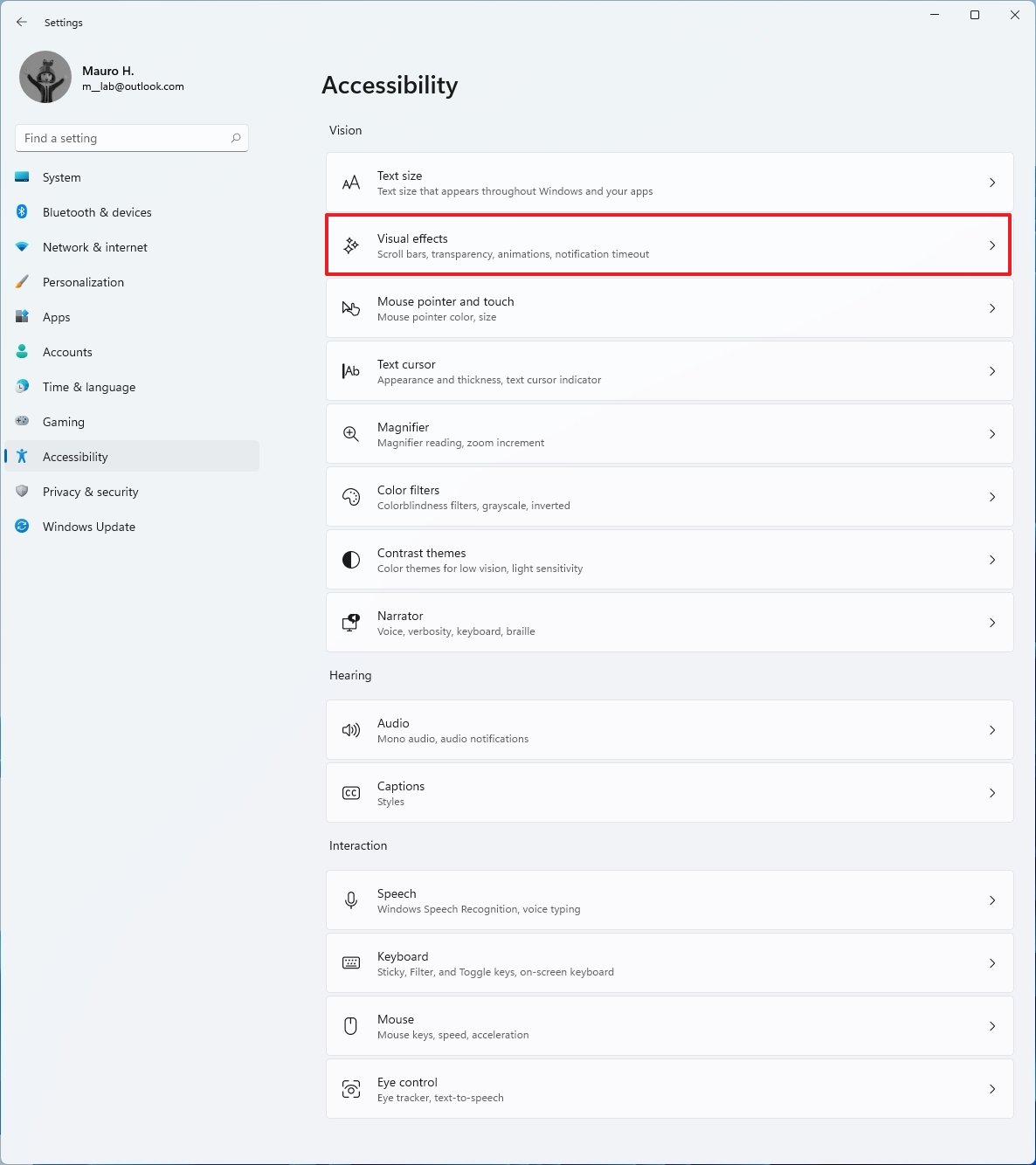
On Accessibility > Visual effects, this page is new, but the settings were previously available in the "Display" page, which is no longer available starting with Windows 11 Build 22000.51.
Privacy & Security
The Privacy & security section replaces the "Privacy" section available in the older version of the Settings app. It includes all the same pages as before like General, Speech, Inking & typing personalization, Diagnostic & feedback, and Activity History, but it now also has the Searching Windows page.
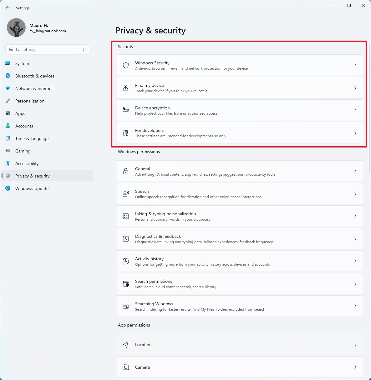
In addition, there's a new Security section where you will find the settings for Windows Security, Find my device, Device encryption, and For developers.
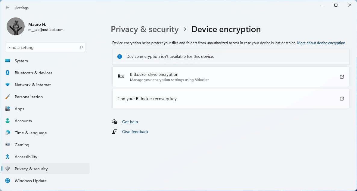
On Privacy & security > Device encryption, the page is new and includes the links to configure BitLocker on supported editions of Windows 11.
Windows Update
The last section is Windows Update, and while this setting isn't new, it now appears as its own category. The page features a visual element indicating the update status and a more prominent button to check for updates for hero controls.
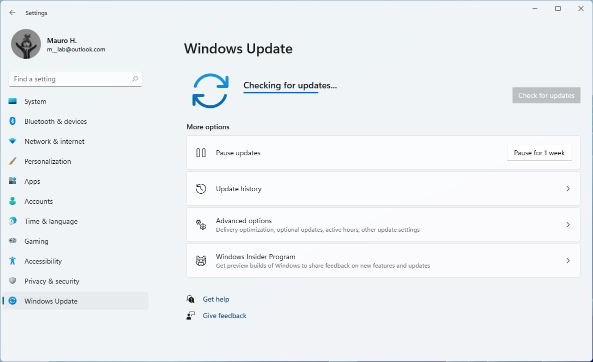
Also, there is a new animation for when searching for updates, and Windows 11 will now let you know the estimated time to install a system update. You will also notice that accessing the page will no longer trigger the update automatically. However, the system will continue to check and download updates automatically in the background.
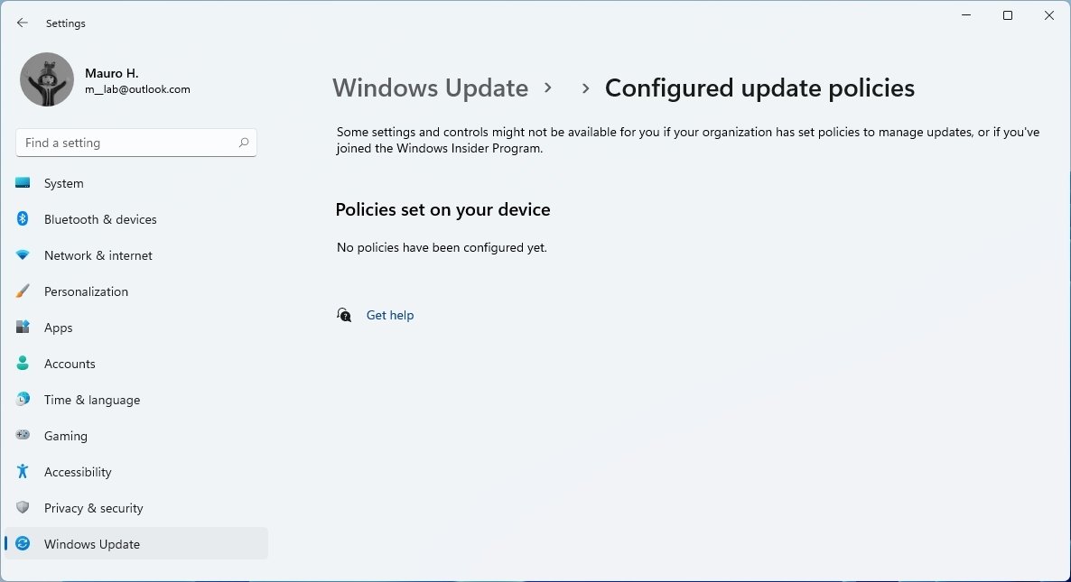
Inside the "Advanced options" page, under the "Additional options" section, a new Configured update policies page will list any policy that your organization may have configured on the device.
Windows 11 apps
In addition to the new features and changes, Windows 11 Build 22000.51 also introduces a couple of new applications, including a new Get Started and Microsoft Store apps.
Get Started
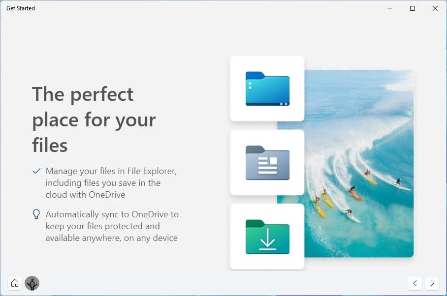
The Get Started app still a work in progress, and it appears that Windows 11 will ship with an app to help users get started. However, the app promotes only OneDrive, Microsoft Edge, and the Your Phone apps at the time of this writing.
Microsoft Store
Starting with Build 22000.51, Microsoft is making available the first preview of the new Microsoft Store.
The new experience does not come built into the OS, but it's available through an app update. Once you received the new version, you notice a redesigned experience using rounded corners, a search box front and center, and a left navigation pane to the browser between the different categories, including home, apps, gaming, entertainment, and library.
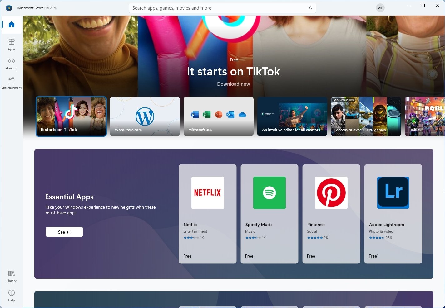
Perhaps one of the most significant changes for users is that the Store will now host virtually any type of apps, including traditional win32, Universal Windows Platform (UWP), Progressive Web Apps (PWAs), Xamarin, Electron, React Native, and Java apps.
Furthermore, Microsoft is bringing more big names in apps, including Adobe Creative Cloud, Disney+, TikTok, Zoom, Microsoft Teams, Visual Studio, and even Notepad and Paint.
According to the company, the new Microsoft Store has been redesigned to make more space for content, keeping the experience responsive and straightforward.
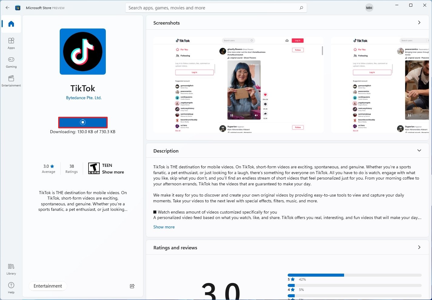
There's a new layout to view apps with bigger screenshots, descriptions, and ratings. Also, when clicking the "Install" button, the downloading and installing visuals are similar to the Apple App Store.
Microsoft is also introducing policies changes to allow developers to implement their own third-party commerce platform for their apps, allowing developers to keep all the revenue. For those who rely on the Microsoft Commerce platform, the solution will continue to exist with revenue share at 85/15 for apps and 88/12 for games.
Windows 11 will also support Android apps through the Microsoft Store in partnership with the Amazon Appstore, but the feature will be available in future updates.
Setup change
This flight introduces various other changes around the setup and startup process.
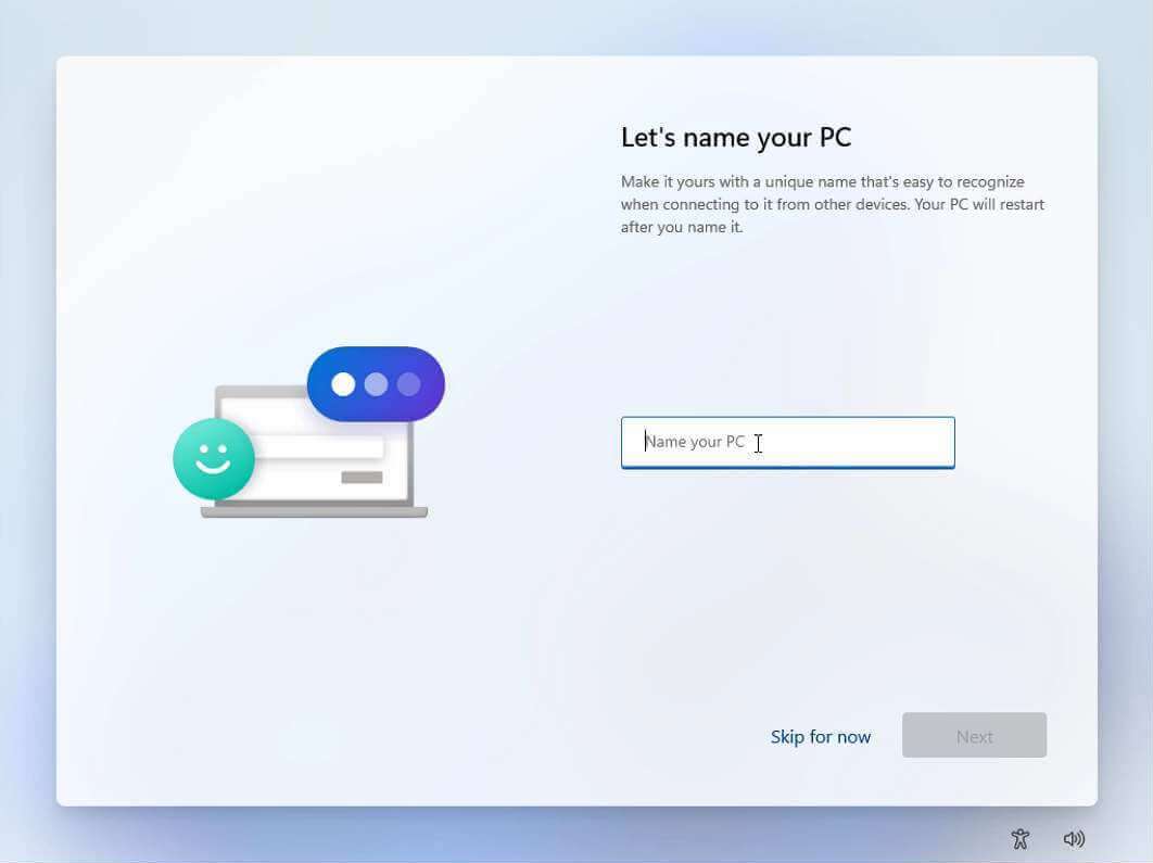
Windows 11 Build 22000.51 also comes with a new out-of-box experience, which is the experience after the installation that guides you through the steps to complete the setup, including creating a new account, choose your privacy settings, and customize your preferences after an installation or on a new device.
The updated version of the OOBE features a modern and user-friendly interface with light colors, rounded corners, inviting animations, and new iconography.
Although most of the steps are the same as in the previous version of Windows, you will now be able to choose a name for your computer instead of generating one randomly. Windows 11 will show an option to restore your settings from previous setups.
If you install the Home edition of Windows 11, you will be required to connect to an internet connection and set up the device with a Microsoft account, which is not a step you can skip. However, you will still be able to create a local account after the setup.
After completing the setup, during the "Getting things ready for you," you will see a new animation with new glowing colors.
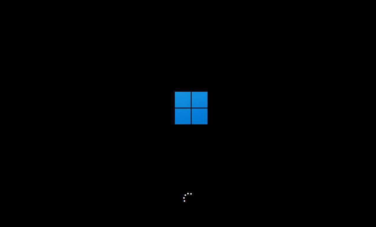
Finally, the startup Windows logo has been updated with the new flat design.
Other improvements
In addition, Windows 11 now comes with support for Wi-Fi 6E. This is a newer version of the wireless technology 802.11 standard that has been designed to take advantage of the 6GHz band and other enhancements to increase higher transfer speeds.
Starting with Windows 11 Build 22000.51, Microsoft is no longer supporting the 32-bit version of the OS, which means that moving forward, only the 64-bit version will be supported.
More Windows resources
For more helpful articles, coverage, and answers to common questions about Windows 10 and Windows 11, visit the following resources:
- Windows 10 on Windows Central — All you need to know
- Windows 10 help, tips, and tricks
- Windows 11 on Windows Central — All you need to know
Mauro Huculak has been a Windows How-To Expert contributor for WindowsCentral.com for nearly a decade and has over 15 years of experience writing comprehensive guides. He also has an IT background and has achieved different professional certifications from Microsoft, Cisco, VMware, and CompTIA. He has been recognized as a Microsoft MVP for many years.

