Windows 11: This is the new System Tray and Action Center experience
We take a closer look at the new Action Center experiences on Windows 11.

Windows 11 ships with a new Action Center and System Tray experience that's quite the departure from the old one. Gone are individual flyouts for system specific functions, and in its place are two separate flyouts that split the Action Center's "Quick Actions" and "Notifications" into two menus. Let's go hands-on.

On Windows 11, the System Tray area can still be found on the far right of the Taskbar. At first glance, it looks to be the same as it was on Windows 10, but a closer look will reveal that it's actually quite different. To begin, the dedicated Action Center button is gone, with notifications now popping up next to the date and time only when a notification has been missed.
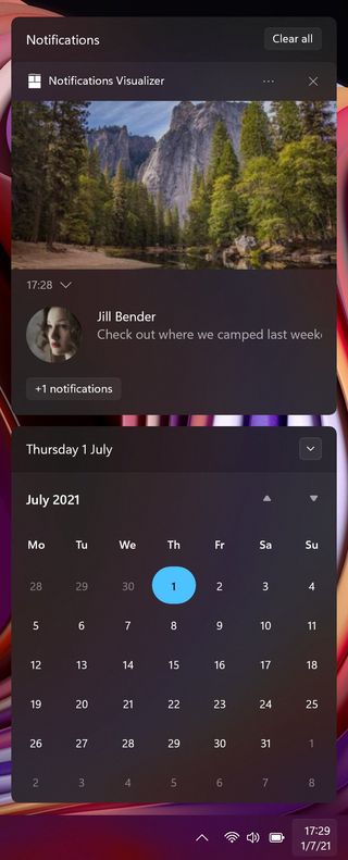
The actual notifications UI is now accessed by clicking on the date and time, which will also pull up a calendar flyout. Your notifications are housed above the calendar UI in a separate box, where they can be managed, cleared, or actioned upon.
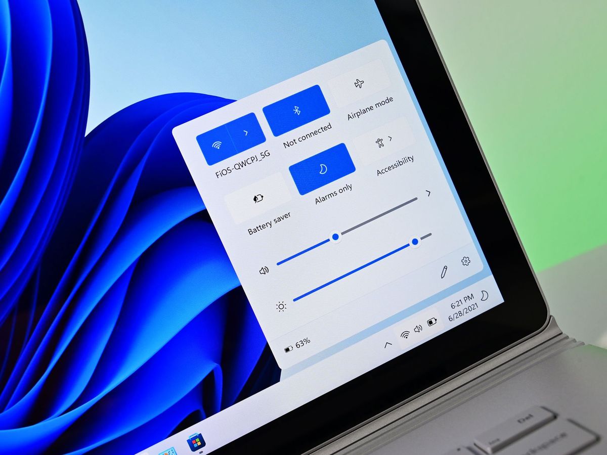
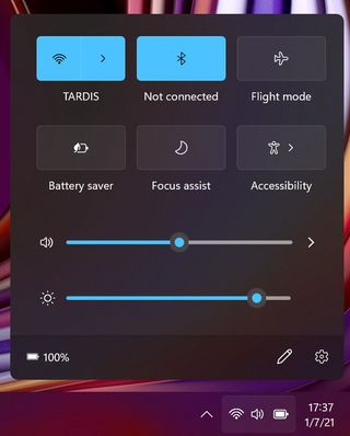
Next to the date and time is your status icons for battery, internet, and volume. No longer are these icons individual flyouts, but rather one big button that opens a new "Quick Settings" menu. This menu is where all of your Action Center Quick Actions have moved to, as well as things like the volume control, audio devices selection, Wi-Fi list, and more.
Instead of each of these things being their own flyout menu that lives on the Taskbar, Microsoft has consolidated them all into this single Quick Settings menu, once again to save space on the Taskbar. You can edit the Quick Settings panel by adding or removing your most used Quick Actions, just like you could on Windows 10.
If music is playing, you'll also find a new music control UI that sits above the Quick Settings panel. This control lets you play, pause, skip forward, or skip back currently playing music without having to navigate to the music player you're using. If you're using an app that is using your microphone or location, indicates for either will show up in the System Tray as well. Confusingly, for the mic it looks like you can use the icon to mute, but you can't. Hopefully that'll be something you can do in the future.

The System Tray still includes the old-school overflow menu where apps go to store an icon if they run in the background, and you can still move these icons to the main System Tray on the Taskbar if you wish. On the far right of the Taskbar is the "Show desktop" button which still exists but is now invisible until you hover your cursor on to it. This is so the System Tray area looks clean while maintaining that legacy feature, and I much prefer it this way.
Get the Windows Central Newsletter
All the latest news, reviews, and guides for Windows and Xbox diehards.
That said, Microsoft has moved the Show Desktop button ever so slightly so that it no longer works when you mouse your cursor into the very far corner. You have to move it a few pixels in so that it's exactly on the show desktop button, which is causing issues for lots of people who used to be able to aimlessly through their cursor into the corner and click. Hopefully, this will improve before Windows 11 ships.
I like the new Quick Settings panel, though I wish it was a little more in-depth with some of its submenus. Functions such as Wi-Fi and Accessibility have deeper menus such as being able to view the Wi-Fi list, or enabling/disabling certain ease of access functions. I'd like to see the same thing for Bluetooth or Night light, as right now they simply act as a toggle and don't have any deeper menus through the Quick Settings panel.
I'd love to be able to click into the Bluetooth button to see all my currently connected devices and their battery percentage. Or click into Night Light to configure how strong the orange tint is or to schedule a time for it to come on. Right now, for most of the settings in the Quick Settings panel, you need to go into the main Windows Settings app to configure them.
Check out our other Windows 11 feature highlights
We've been diving into all the new Windows 11 features over the last few weeks. Here's a collection of our coverage so far:
