A closer look at Microsoft's new Action Center on Windows 10X
Microsoft's new Action Center for Windows 10X has a modern design and notable improvements

Windows 10X is Microsoft's modern take on what Windows as an OS can be in 2020 and beyond, featuring an entirely new user interface built with contemporary and fluid design at the forefront of its experience. Today, we're taking a closer look at the new Action Center that Microsoft is building out for Windows 10X. It's quite the departure from the experience on Windows 10 and is an improvement in pretty much every way.
Welcoming a new design
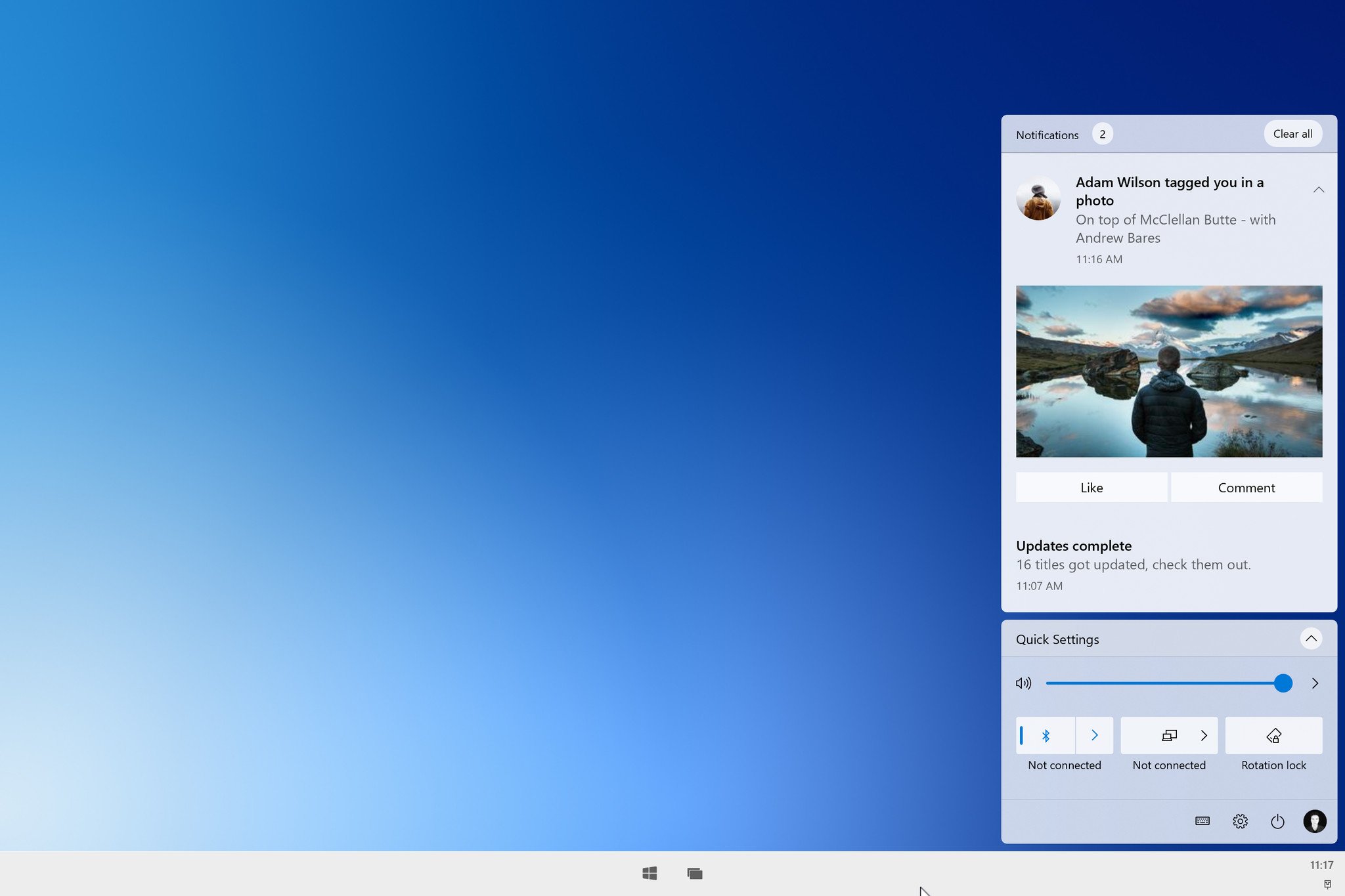
We kick things off with an overview of its design. Visually, the Action Center on Windows 10X looks very different from the Action Center on Windows 10. It's split up into different "panels" with your quick actions (now known as quick settings) at the very bottom, and your notifications housed above it in a separate panel. Functionally, these serve the same purpose as they do on Windows 10, but the quick settings panel has a couple of new tricks up its sleeve.
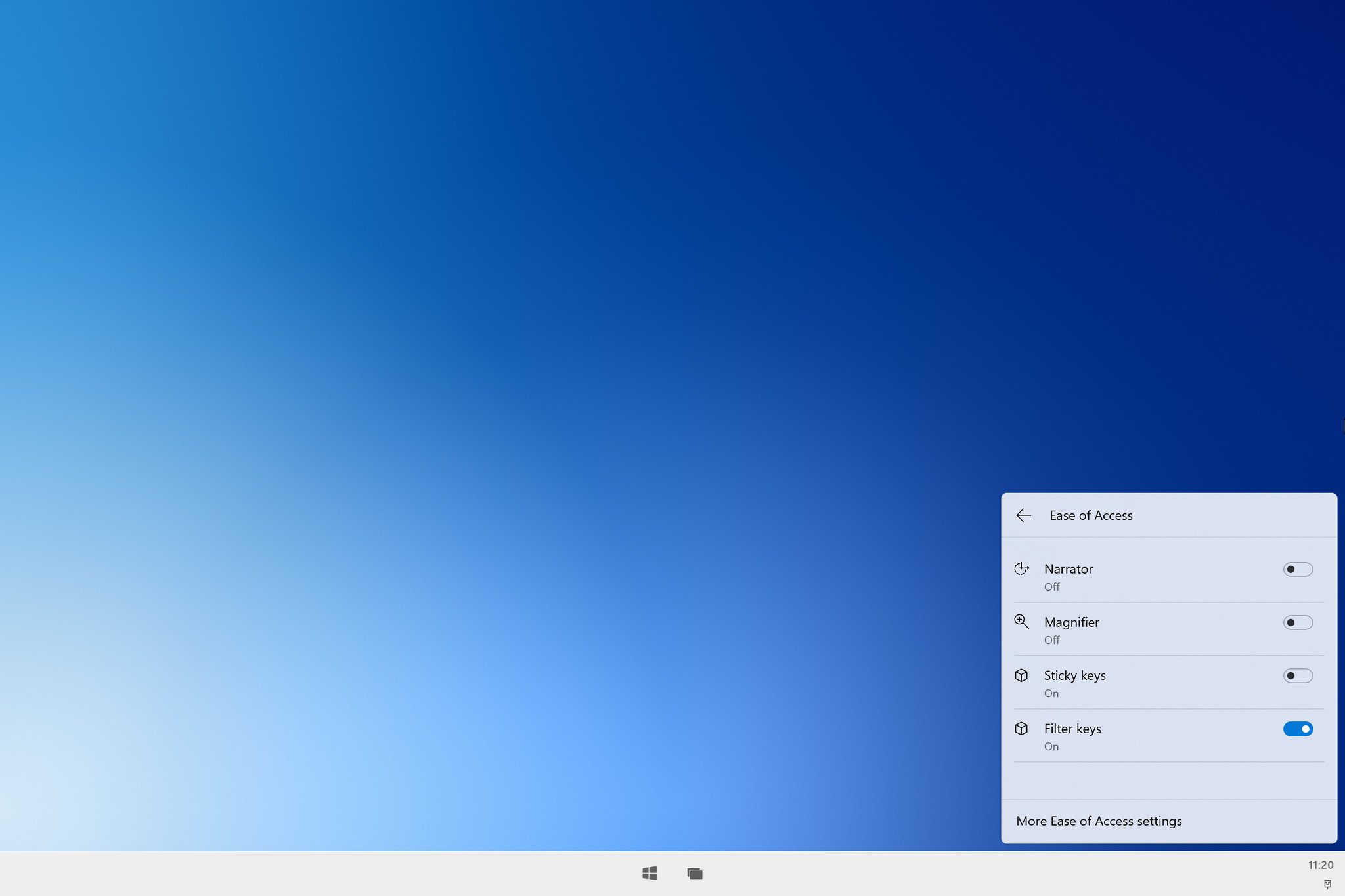
The first new ability is that certain quick settings are now configurable directly from within the Action Center. Actions like Wi-Fi, Bluetooth, and ease of access are configurable without being taken to another applet or the Windows Settings app first. On Windows 10, the quick actions operate as an off/on toggle only, with no way to configure them directly from within the Action Center itself.

Being able to configure some settings for quick actions is a massive improvement over what Windows 10 has. It's much more intuitive, as there's no reason to be taken out of the UI you're currently in to change simple things such as Bluetooth or ease of access settings. This new Action Center is so much of an improvement that I'm hoping it shows up on the full Windows 10 OS in the future.
Music control
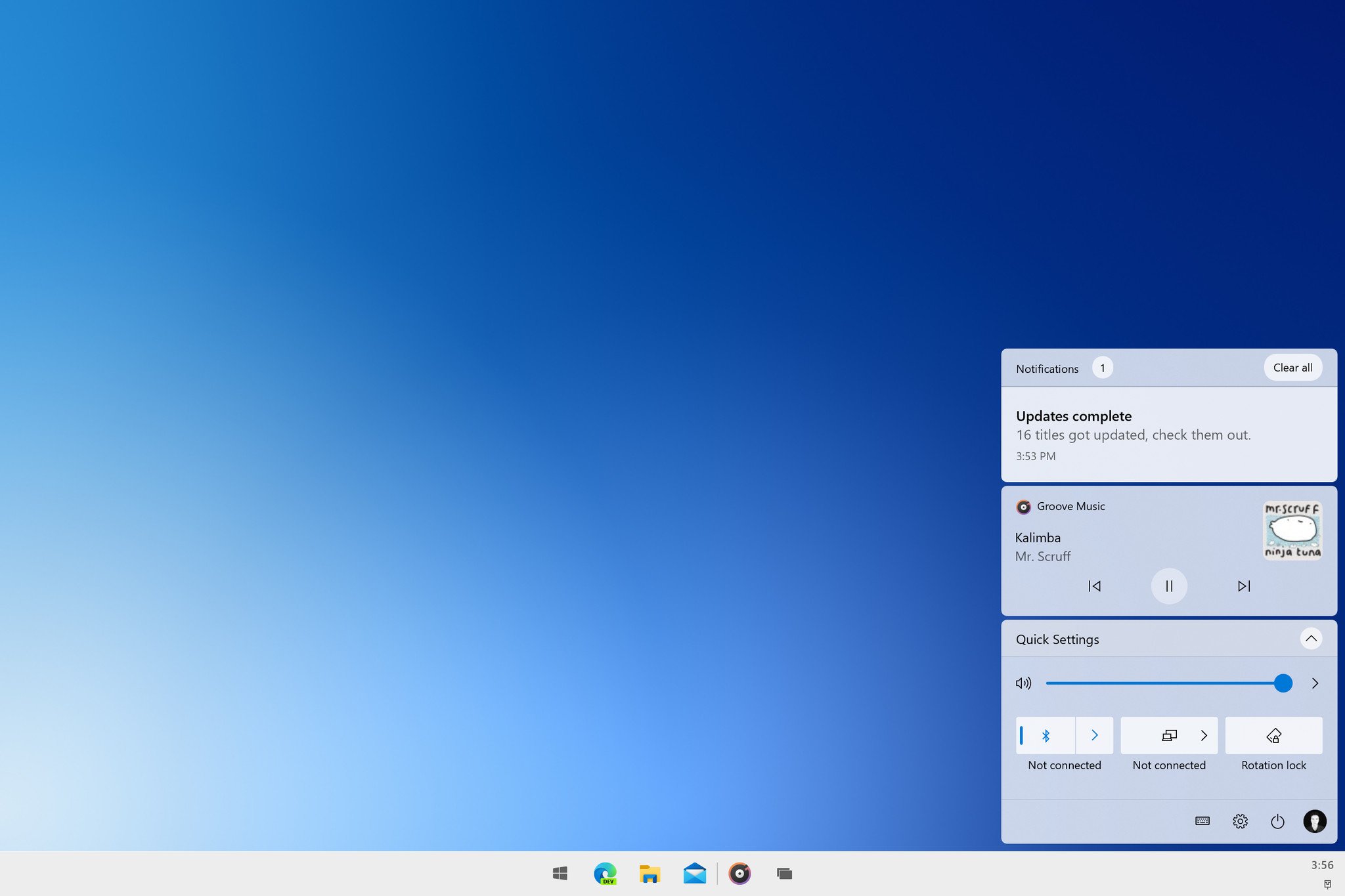
Also new to the Action Center on Windows 10X is a new music control panel that appears whenever an app is playing audio. It replaces the dated music control UI on Windows 10 with something that fits the rest of Windows 10X's aesthetic. As of right now, there's no way to scrub audio that's playing through this panel, but I wouldn't be surprised if that shows up in a later build before the public launch.

The notifications panel that sits above the music control and quick settings panel behaves similarly to Windows 10. It houses all your notifications, and groups them under different apps when they come in. You can jump into the Windows Settings app to further control where and how notifications appear, and there's a "Clear all" button at the top right of the notifications panel.
The Action Center also acts as your system tray overflow, with details like battery percentage appearing in the bottom left on a device with a battery inside. You've also got power options, a settings shortcut, and your user profile picture located at the bottom right, as those functions no longer reside with the Start menu on Windows 10X. Clicking on your user picture will give you options to lock and sign out of your PC.
Get the Windows Central Newsletter
All the latest news, reviews, and guides for Windows and Xbox diehards.
That's our closer look at the new Action Center on Windows 10X, shaping up as a sizeable improvement over its predecessor. I really appreciate the added functionality with the ability to configure certain quick actions from directly within the Action Center itself, but it is missing things. You can't see your calendar overview from clicking the clock anymore, for example.
This is prerelease software, so there's still time to add and improve things. What are your thoughts on the new Action Center so far? Let us know in the comments.

