Windows 10's tablet mode will be Surface Go's biggest weakness
Surface Go is primarily a tablet, but sadly Windows 10 isn't tablet-friendly in its current state.

The Surface Go is not a laptop. It's the first Surface in a long while that's built primarily as a tablet for consumption and entertainment purposes over being a straight up laptop replacement, and that's going to be the Go's biggest pain point due to Windows 10. A good tablet is about more than just good hardware, you need a good OS experience to go along with it. Unfortunately, Windows 10 doesn't have a good tablet experience to offer, not when compared to iOS on the iPad at least.
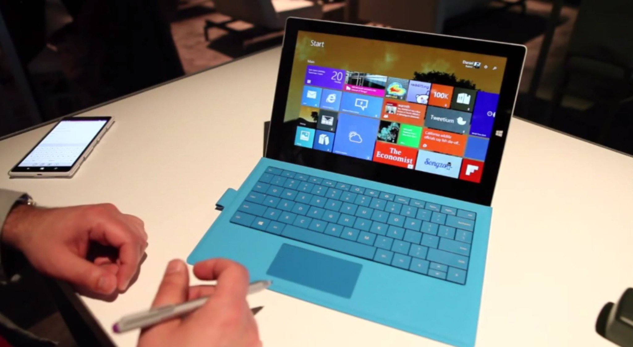
It wasn't always like this, though. Back in 2014, Microsoft had an excellent OS for tablets known as Windows 8.1 that was built from the ground up for touch-first experiences. It wasn't so great on desktops, but was an interesting new way of interacting with Windows on tablet based devices. The original Windows 8.x tablets were before their time, thanks to both design and software experiences that were fast and fluid, beautiful, and animation heavy; everything you'd want from a tablet experience for consumption.
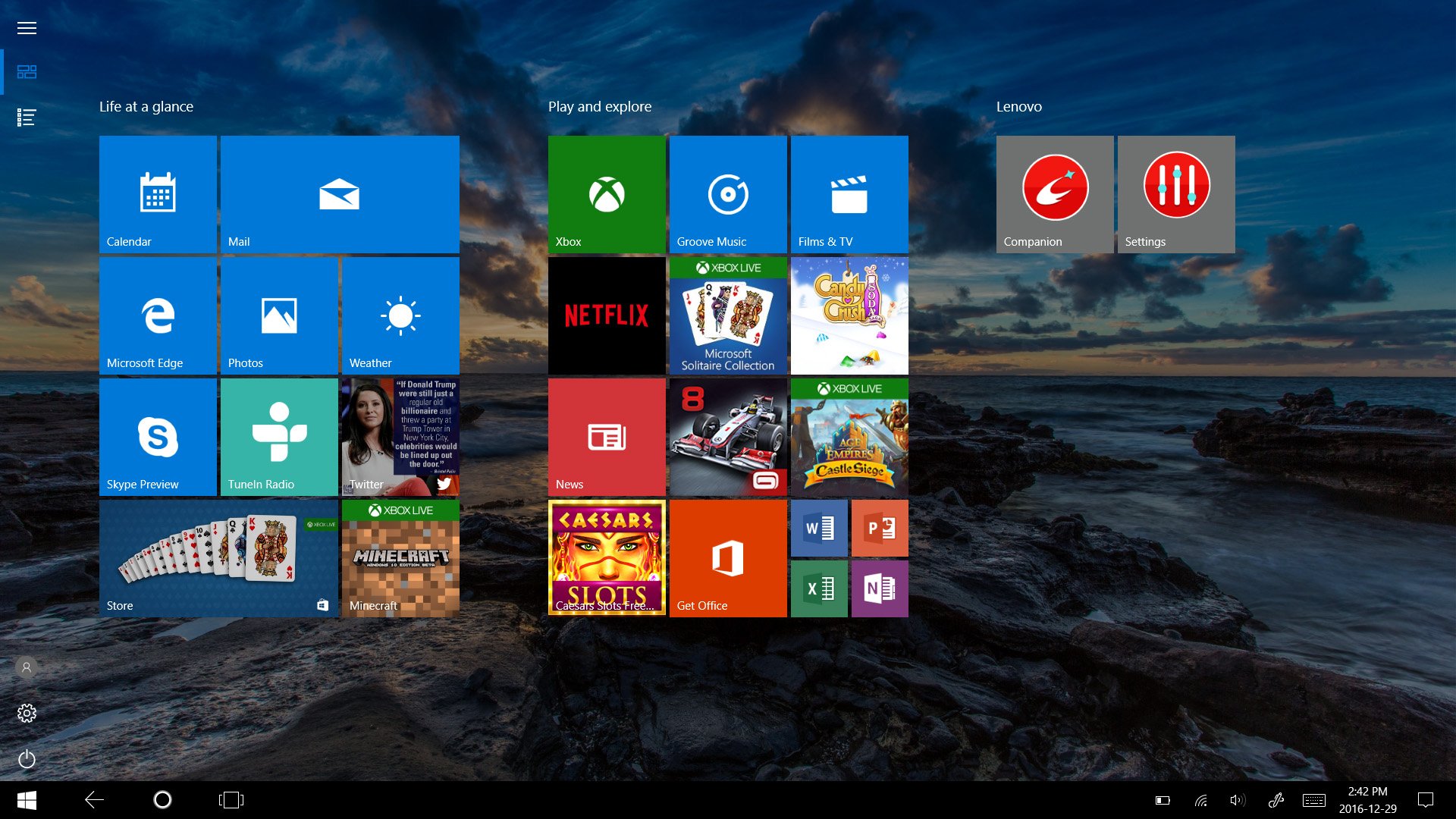
The tablet experience on Windows 10 is nothing like this. It's bare of any animations or gestures, and it most certainly isn't as beautiful as it used to be. Its biggest problem is that it's very obviously a desktop experience that has been poorly optimized for tablets. It still has a taskbar that's only there so that you can go back to Start, any animation it does have are just fade effects with no real flair to them, and many of the apps, such as Edge, aren't really optimized for tablets at all.
On the iPad, everything flows together. You tap on an app icon, and that app icon floats in to fill the entire screen. To go back, you just swipe up from the bottom of the screen and the animation follows your finger until you drop it back to the home screen. It's a beautiful experience and is all part of why the iPad is such a good tablet. On Windows 10, tapping an app icon on the Start Screen initiates a fade effect, which just isn't as nice. To close an app, you just tap on the Start button, and the app fades away again. Not intuitive at all.
And that's without evening mentioning the bugs. Windows 10's tablet mode is full of bugs, especially around the keyboard. It's not as reliable, and crashes way to often for a keyboard; an important part of the tablet experience. I often find myself having to tap things twice before they activate too, especially on the Start screen.
Microsoft has nailed it before

Back in the Windows 8 days, the tablet experience was super gesture based. On tablets, gestures are the best way to go about things because they're so easy to do. On Windows 8, you could swipe in from the right on any screen to open the Charms Bar, which would have different options for you that were contextual depending on the app you were in. To get to multitasking, you'd swipe from the left. You can still do this in Windows 10, but the experience has been severely mutilated.
Get the Windows Central Newsletter
All the latest news, reviews, and guides for Windows and Xbox diehards.
For example, on Windows 8 you could swipe in from the left, and your previously opened app would follow your finger. It'd be stuck to it, making the user feel like they were in control with what they were doing. From here, you could quickly swipe back towards the bezel to see all your open apps or flick the app to the right to switch to it. On Windows 10, this experience is nothing like that. You swipe from the left, and a fade effect throws you into Task View.
There's no fluidity here. On Windows 8, the gesture interaction responded to your movement, but on Windows 10 it simply acts as a shortcut to Task View. There's no connected animation that connects the gesture to opening the Task View UI, you just swipe and then everything fades to Task View. It really sucks. The lack of connected animations is one of the biggest reasons why Windows 10's tablet experience feels so rough. It just feels unfinished.
On the Start Screen itself, there's just very little customization you can do now. Sure, you can still change your accent color and arrange your tiles, but there's no longer any awesome patterns or effects that you can apply to the background of Start. It just shows your desktop background, which is fine, but nothing like it used to be. What's more, the Start Screen sometimes does a terrible job of making use of space, leaving large gaps where tiles aren't allowed to be placed.
Now, don't get me wrong, Windows 10's tablet mode is good in some areas. For example, it's the best when it comes to pen input, but unfortunately, that isn't enough to call it a great tablet experience. It needs to go back to what it was with Windows 8.1; a much more beautiful and fuller experience than what it is today. Windows 10's tablet mode just feels unfinished, and it really shouldn't three years into its existence.
Four things to fix

To fix tablet mode on Windows 10, Microsoft needs to do four things. First, bring back the connected animations. Connected animations are the glue that makes a good tablet experience good; the iPad nails it, and Windows 8 nailed it. Windows 10 falls short in this area. Dragging from the left bezel should initiate an animation that follows the gesture you're performing, not just act as a shortcut that's disjointed with the action that I'm performing.
Second, it needs to figure out a better navigation system than relying on the taskbar. The taskbar is an old, unwelcome UI element on tablets. It's a bad way of showcasing relevant information to the user without building a new experience for it. I shouldn't have to tap the Start button to go home, I should be able to use a gesture to do that instead.
Third, and this ties in with the second point, apps should be tablet optimized and be able to operate in full screen. Microsoft Edge is a huge offender in this area, with no real tablet optimized UI unlike with Internet Explorer in Windows 8 or Safari on iPad. Also, the taskbar being on screen at all times takes up valuable screen estate, which could be put to better use showing app content.
Fourth, Microsoft needs to focus on improving overall performance and stability. I find there's lots of dropped frames when manipulating Windows 10 in tablet mode, even with the minimal animations already implemented. Microsoft also needs to improve stability of system elements such as the keyboard, which crash way too often on the latest release.
5 things Microsoft could do to improve tablet mode
Windows 10 does get some things right, including treating desktop apps like tablet apps when in Tablet Mode. Windows 8 was poorly received because Desktop and Tablet Mode were treated as two different things, which was very jarring when going back and forth between UIs. On Windows 10, desktop apps operate and behave just like UWP apps when in tablet mode, which is exactly how things should be.
I'll admit, when Windows 10's tablet mode first launched, I was excited about its future. In fact, I even liked it. But, nothing has really changed since its initial debut in 2015. It's still missing some of the magic that Windows 8.1 had, and that's a huge problem.
Overall, Windows 10's tablet experience isn't terrible, but it definitely isn't good. It's a basic experience that offers no real game-changing capabilities over what the iPad or other tablet platforms offer. Arguably, the other thing Windows 10 needs is better tablet apps from third-party developers, but that's an issue that's out of Microsoft's hands. For now, all they can and should be doing is focusing on the OS experience.
I'm told that with CShell, Microsoft is planning to improve tablet mode which is very reassuring. For now, though, we have to make do with the lackluster tablet mode we have today. What are your thought on Windows 10's tablet mode? Do you prefer it over Windows 8's or the iPads? Let us know!

