Windows 10 Review
All the latest news, reviews, and guides for Windows and Xbox diehards.
You are now subscribed
Your newsletter sign-up was successful
Windows 8.1 and everything before it is dead. Long live Windows 10.
This chant is what Microsoft is indirectly telling the public with its first major OS overhaul since 2012's Windows 8. Moreover, let's be clear for die-hard Windows fans the last few years have been nothing but a battle. The general public has all but ignored Microsoft's tiled new world and slumping PC sales reflect this indifference too. Toss in the rise of mobile computing and Microsoft had to do something radical to win back its audience.
Windows 10 is supposed to be that clarion call for change. Windows 10 is not just a new OS but an entire platform that very shortly will span PCs, laptops, tablets, wearable accessories, holographic computers and even the Xbox One.
Article continues belowWindows 10 is an OS for all things and all people. So says Microsoft. It is never actually finished either. Microsoft is making Windows a 'service' with constant upgrades, new features, and patches resulting in a more dynamic computing environment. Does it hold up? What does someone like me who liked Windows 8.1 a lot think about all the changes?
This is my review of Windows 10.
Before we break down Windows 10 into its features along with the traditional 'the good, the bad and the ugly' let us talk about Microsoft's shift in philosophy. It is important for the bigger picture, so join me for the ride.
Windows Converged
Windows 10 is first and foremost not just an OS update. Sure it is that but it marks something much more dramatic namely the realization of the 'three screens and a cloud' vision from a few years back. Microsoft no longer uses this apt phrase, but it applies perfectly to Windows 10.
All the latest news, reviews, and guides for Windows and Xbox diehards.
Back in 2009 Steve Ballmer described Microsoft's vision for the future in an interview for TechCrunch:
"We used to talk about mainframe computer, minicomputer, PC computing, client-server computing, graphical computing, the internet; I think this notion of three screens and a cloud, multiple devices that are all important, the cloud not just as a point of delivery of individual applications, but really as a new platform, a scale-out, very manageable platform that has services that span security contacts, I think it's a big deal...."
Ballmer goes on:
"It is the next big generational shift in the computing platform. And people are going to want applications, I'll call them that, or services, depending on whether you like old fashioned words or new words, but they're going to want things that service them across those environments ...."
Ballmer was referring to the convergence of computing around three screens -- the PC, the smartphone, and the television. This dream was not achieved in Windows 7, nor Windows 8. However, those were necessary steps to Windows 10 (Microsoft has skipped 'Windows 9' to convey this paradigm shift). Okay, there were missteps too. The core of Windows 10 is now applicable to servers, your home computer, and coming this year your smartphone, TV, and even the Microsoft Band wearable.
Assuming the world goes along with Microsoft, this change is a massive paradigm shift. Never have we seen an operating system that can live everywhere and be anything. Microsoft is attempting to transcend the home PC with a forward-looking OS that can be put on any computer no matter its size. Even the 'three screens' part is now outdated. Devices like HoloLens (holographic computer) and the Internet of Things (IoT) are devices that do not even have formal displays with a traditional graphical user interface (GUI). Windows 10 can run there too.
The beauty of this architecture is that if the traditional home PC as we know it dies (and it very well might) Microsoft's Windows will survive. Whether it is your tablet, athletic device, phone, gaming console or whatever comes next.
This introduction brings us to two major meta-level changes to Windows 10: Windows as a Service and Continuum.
Windows Forever
Windows 10 might as well be just called Windows. Version numbers are a conceptual device for demarcating upgrades. It no longer applies. Sure, we still need the '10' designation for other reasons. Try doing a web search for 'Windows' and you'll drown in a sea of vagary - but Windows 10 is the beginning of Windows as a Service (WaaS).
The phrase Windows as a Service is a bit misleading. For many, the word service implies punctuated monthly or yearly financial charges akin to Netflix or even Microsoft's own Office 365. However, this is not the case here. Assuming you have a PC or laptop with a valid Windows 7 or Windows 8 license key, Windows 10 is a free upgrade that will receive free upgrades for the life of the product.
Indeed, Microsoft offers complete support for Windows 10 until October 2020, including new feature additions. Further support for security and bug fixes run even longer through October 2025.
Once you upgrade to Windows 10, it is yours forever. Granted, Microsoft is likely to release a 'Windows 11' in 2020 but in four years, the computing world is also likely to be a very different place. Even then, it is not clear what Microsoft would do as there are extreme market pressures to keep Windows free persistently.
Good-bye Patch Tuesday
Putting aside the costs – or lack thereof – Microsoft's approach to Windows 10 is vastly different from previous desktop releases. The Windows team is not releasing massive service packs any longer with rolled-up fixes and new features. There likely won't be a 'Patch Tuesday' either for those once-a-month security updates.
Windows 10 users should instead expect a steady stream of updates whenever they are needed. One reason Microsoft can do this is they have broken down core OS components into separate, updatable apps through the Store.
No longer will users have to risk upgrading the OS each time Microsoft wants to change something. Instead, they are taking the smartphone model in which they can continually improve the OS through direct core component updates to users.
Microsoft's continuing iterations of Windows 10 means that it is a living, dynamic OS that could look and behave very differently in the years to come. This change is needed. The computing world is now very unstable, and Microsoft's OS needs to be proactive not just reactive.
Windows Anytime
In 2015, the home PC where families gather around to view the world through their screen is going away. Personal computing for the car ride, on the couch, at school, in the cubicle at work, is now the norm.
Continuum means that your computer changes according to your needs. Take away your keyboard and Windows 10 automatically goes all-touch.
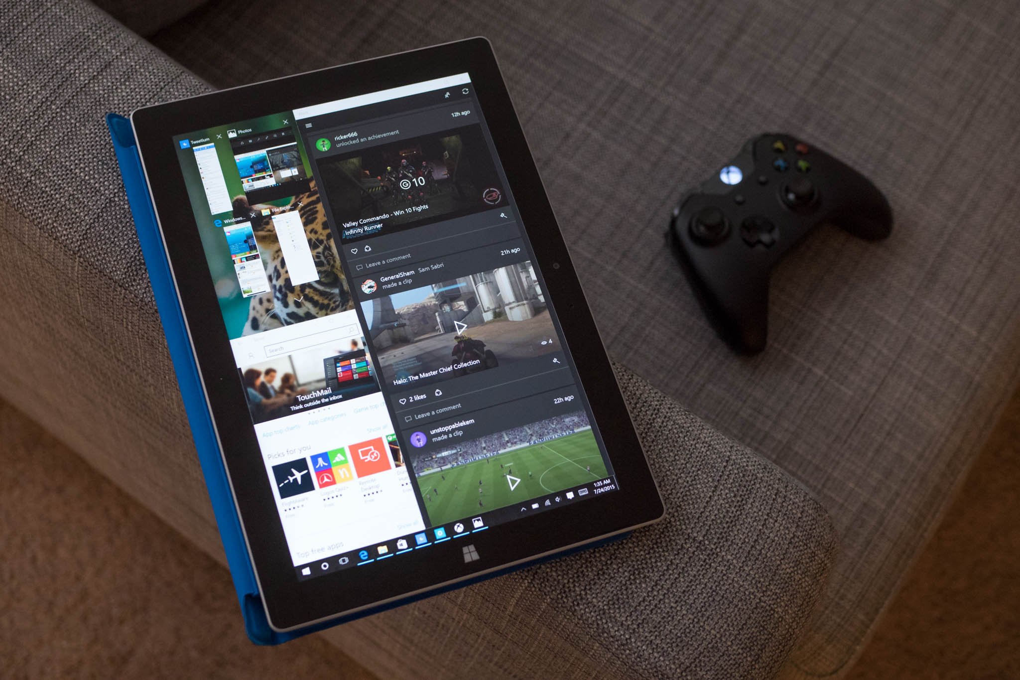
Windows 10 can be used for your main computer. In fact, it is built for it. Nevertheless, the way we use devices has changed and Windows 10 reflects this with its new feature called Continuum. Continuum means that your computer changes according to your needs. One-half of this refers to the rise of 'two in one' computers which are a laptop one minute and a tablet another. That hardware story has been around for a few years now as exemplified by the Microsoft Surface. However, with Windows 10, the answer to how software can counter this hardware is here.
Continuum means when you remove your keyboard the OS adjusts to a touch-only interface, hiding elements for mouse and keyboard users. Alternatively, adding a keyboard and mouse shifts the OS back to a more traditional desktop environment. Windows 8 style for tablets, Windows 7 for PCs and laptops and no thought for the consumer.
Continuum is Microsoft's answer to those who complained about Windows 8 and 8.1 and its focus on touchscreens. In effect, Microsoft went too far with Windows 8, and now they are dialling it back with Windows 10. However, instead of just undoing what they did they are adding flexibility to the OS for different scenarios.
I'll talk more about Continuum and how well it works later on the in the review. For now, just know that with WaaS and Continuum, Microsoft is making Windows an OS for any device in a world that is always changing.
Start Menu Reborn
Ever since the release of Windows 95 computer users around the world have used the famed Start menu. Microsoft buried this beloved tool with Windows 8 forcing users instead to adopt its new touch-friendly Start Screen that took the full display.
Users revolted. People forgot about Windows.
Microsoft began to back away from this decision with Windows 8.1, which defaulted back to the desktop and old Start Menu for traditional PCs and laptops and kept the Start Screen for tablets. Although this bought Microsoft some time before Windows 10, this two-pronged approach was one of many redundancies in the OS that left a bad impression for users.
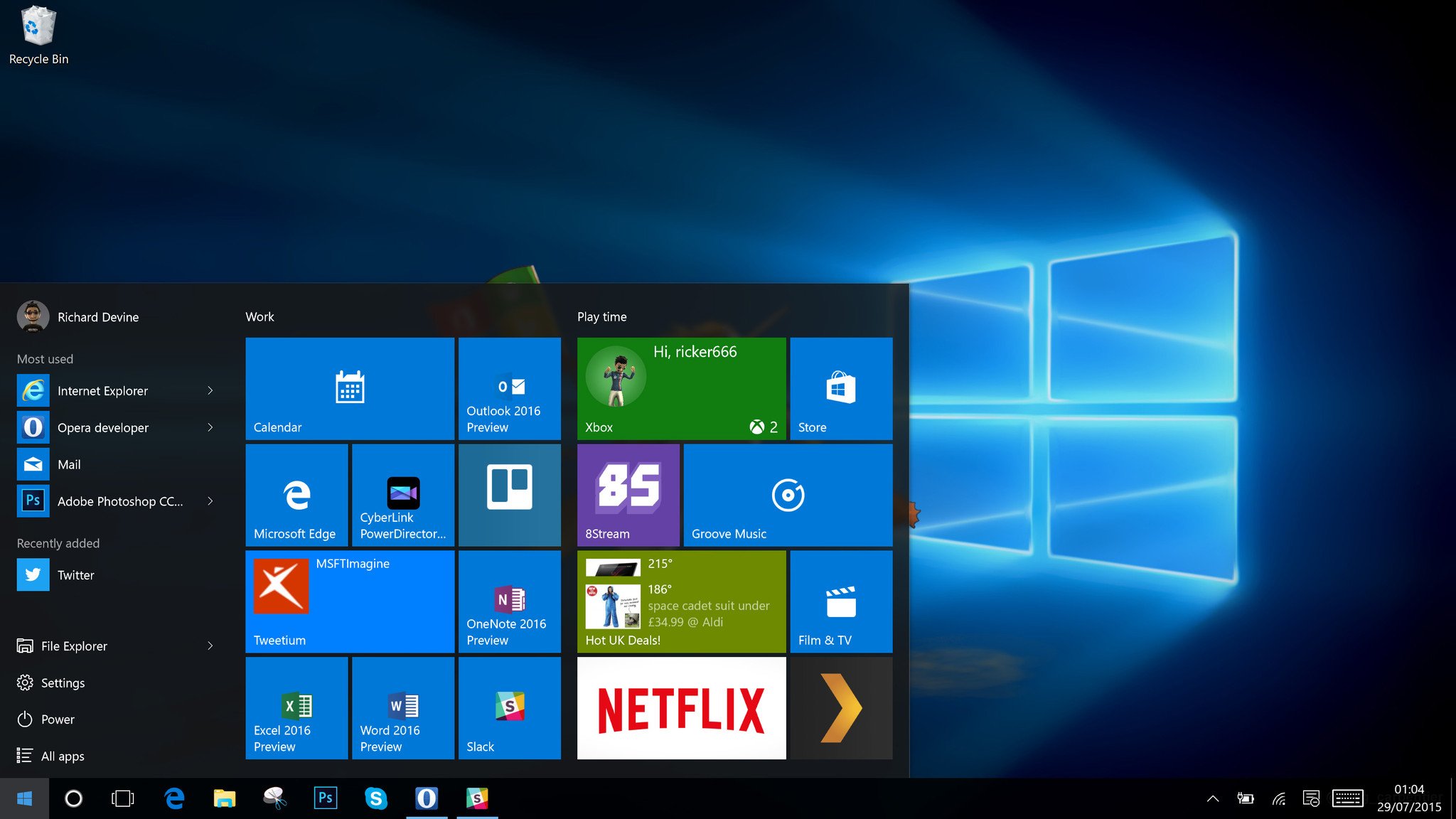
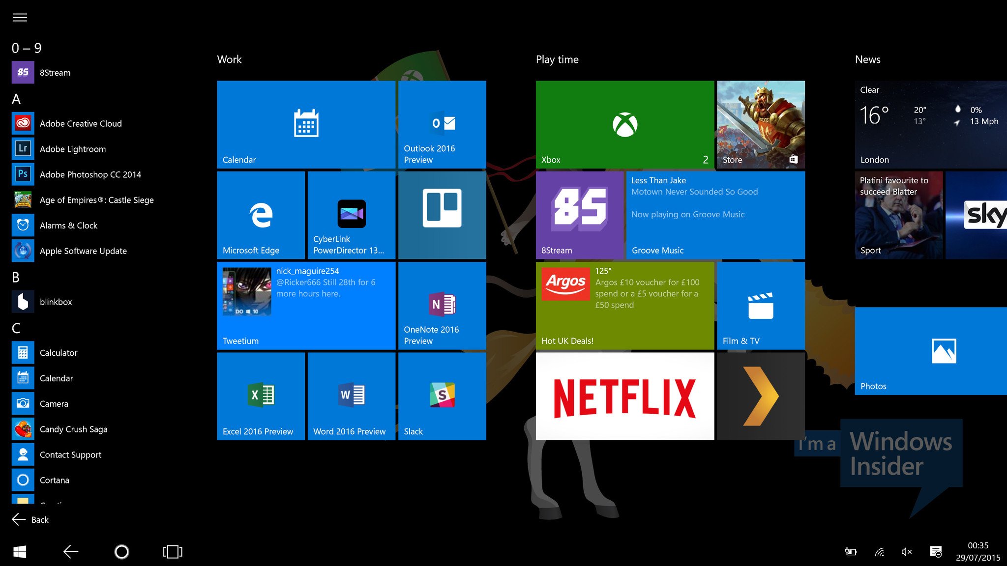
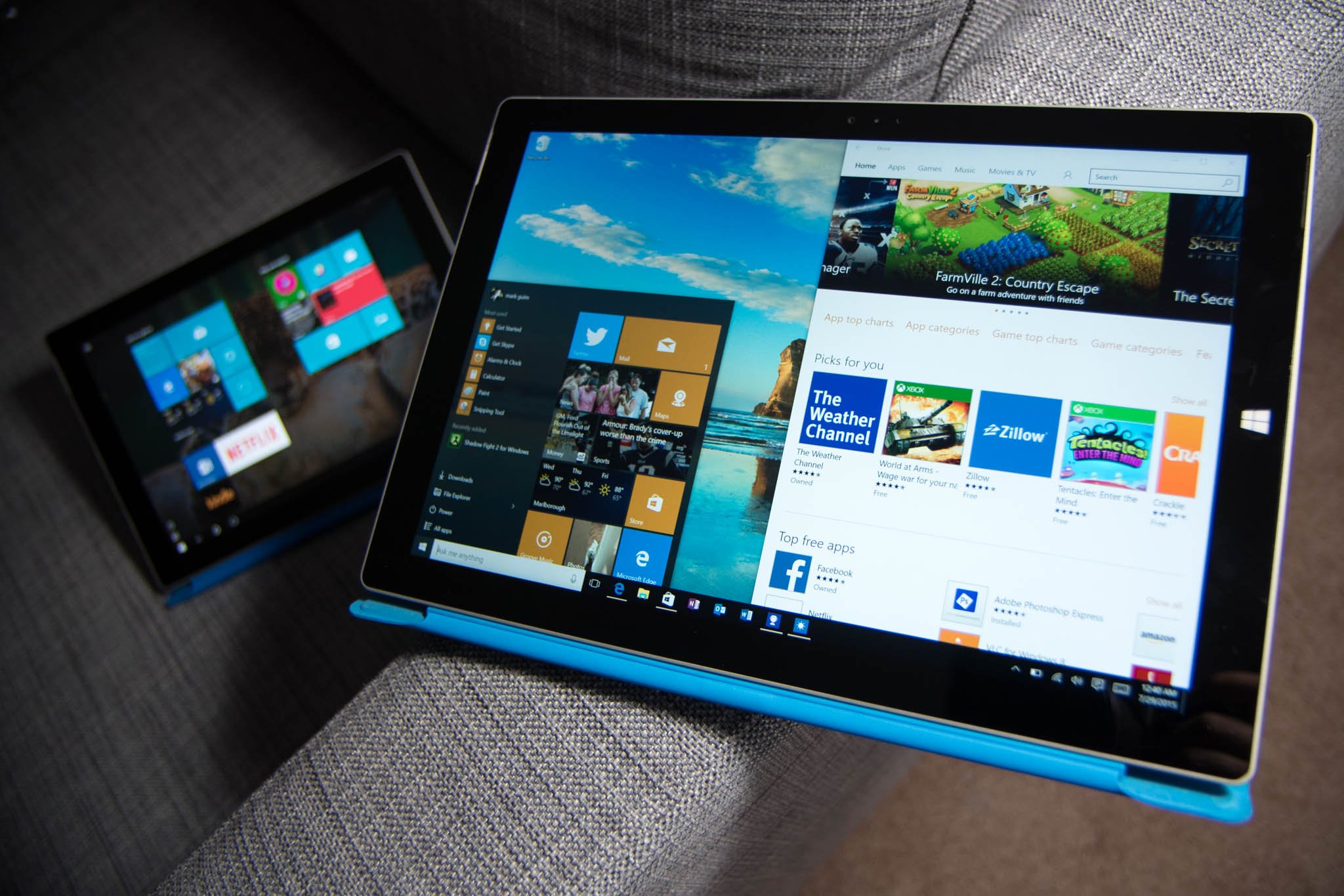
Windows 10 gets rid of the Start Screen. It still exists in a muted form for tablet users, but most people are greeted with the new Start Menu for Windows 10, which is an amalgamation of the old and the new. Instead of just a program menu, users can have a selection of apps that live as Live Tiles in the menu as well.
When companies try to do hybrid approaches they usually fail. This failure is because the feature feels like it is bolted on or forced. However, the new Start Menu in Windows 10 works because Microsoft gives users a choice. Yes, the new Start Menu is a chimera, but it is a good one that could have existed even if Windows 8 did not. In fact, here are the many ways users can configure and use the new Start Menu
- Start Menu + Tiles (default): Most used apps, Program file list, shortcuts and Live Tile area
- Start Menu: Most used apps, Program file list, shortcuts but no Live Tile area
- Start Menu + Tiles (full screen): Most used apps, Program file list, shortcuts and Live Tile area
Users can also simply grab the edge of the new Start menu to resize it vertically or horizontally until it takes as much space as they want. For those with large displays and a lot of Live Tiles, you may prefer to make this area of the menu large, whereas laptop users may opt for a smaller design.
All of these design choices are meant for different groups, including traditionalists (no Live Tiles) and those who prefer the full-screen experience in Windows 8.1. To be fair, Microsoft does not make option two very easy to implement. There is no toggle to turn the Tile section on or off as you might expect. Instead, a user would need to unpin each App from the Tile area until they are all gone.
Luckily, not many programs are listed there to begin with, and most users will likely leave at least some apps present. And why not? Live Tiles are fantastic.
How to enable full-screen Start menu in Windows 10 desktop mode
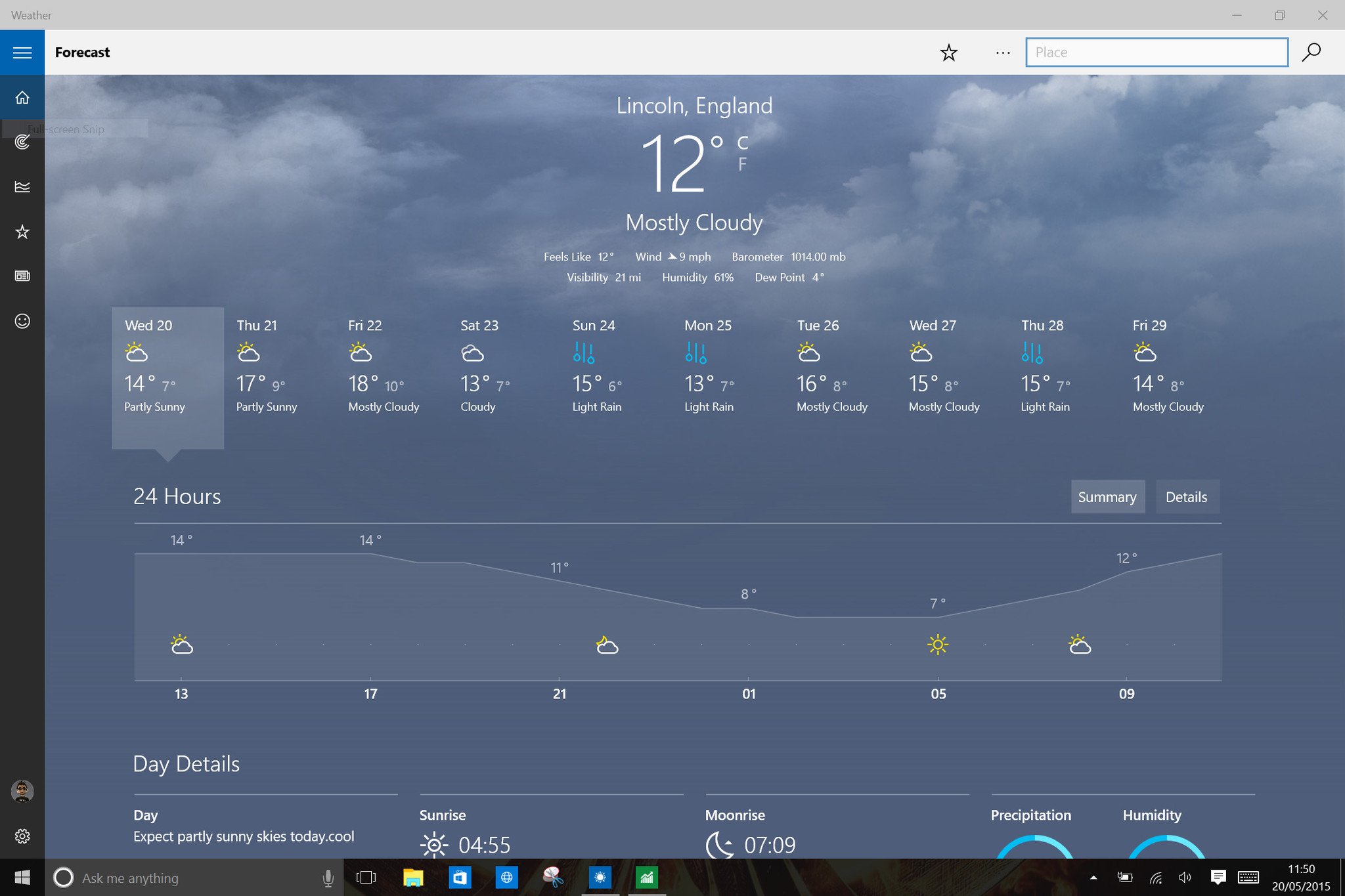
Philosophically, the Live Tiles are supposed to reflect 'Life at a Glance'. This feature is clearly inspired by Microsoft's Windows Phone and it is great that they kept it. These apps with Live Tiles are ideal for tasks like Weather, the Store, News, Sports, Photos, Twitter where you want to be able to peek at what is new without opening the app. For instance, Weather can show you current conditions as well as the week's forecast, whereas the News app displays the latest headlines.
This glance-ability is key to the Windows 10 experience.
Besides the Live Tile area, there is also a customizable section for quick access areas including Settings, Photos, Videos, Downloads, Documents, File Explorer and more. These quick access folders can be found under Settings and users can easily toggle which ones they want to appear. They certainly make it easy to access frequently used folders.
Microsoft has succeeded with the new Start menu. I don't find myself missing the Start Screen at all.
The Start menu can recommend new apps for you that you may be interested in and display which apps were recently installed. All of this is user optional.
In my opinion, Microsoft has succeeded with the new Start menu. Even as someone who enjoyed the Start Screen on Windows 8.1 I fully understand the criticism from desktop users. In fact, on my touchscreen-enabled Dell XPS 27 I never used the Start Screen nor touch. I find using Windows 10 much more advantageous than 8.1 for these reasons and do not find myself missing the Start Screen at all.
The new Start menu in Windows 10 is a winner. It brings back what worked, jettisons what hasn't and most importantly gives users the final word on its design.
Action Center
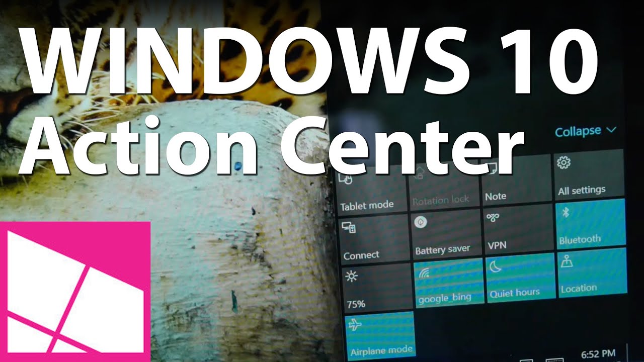
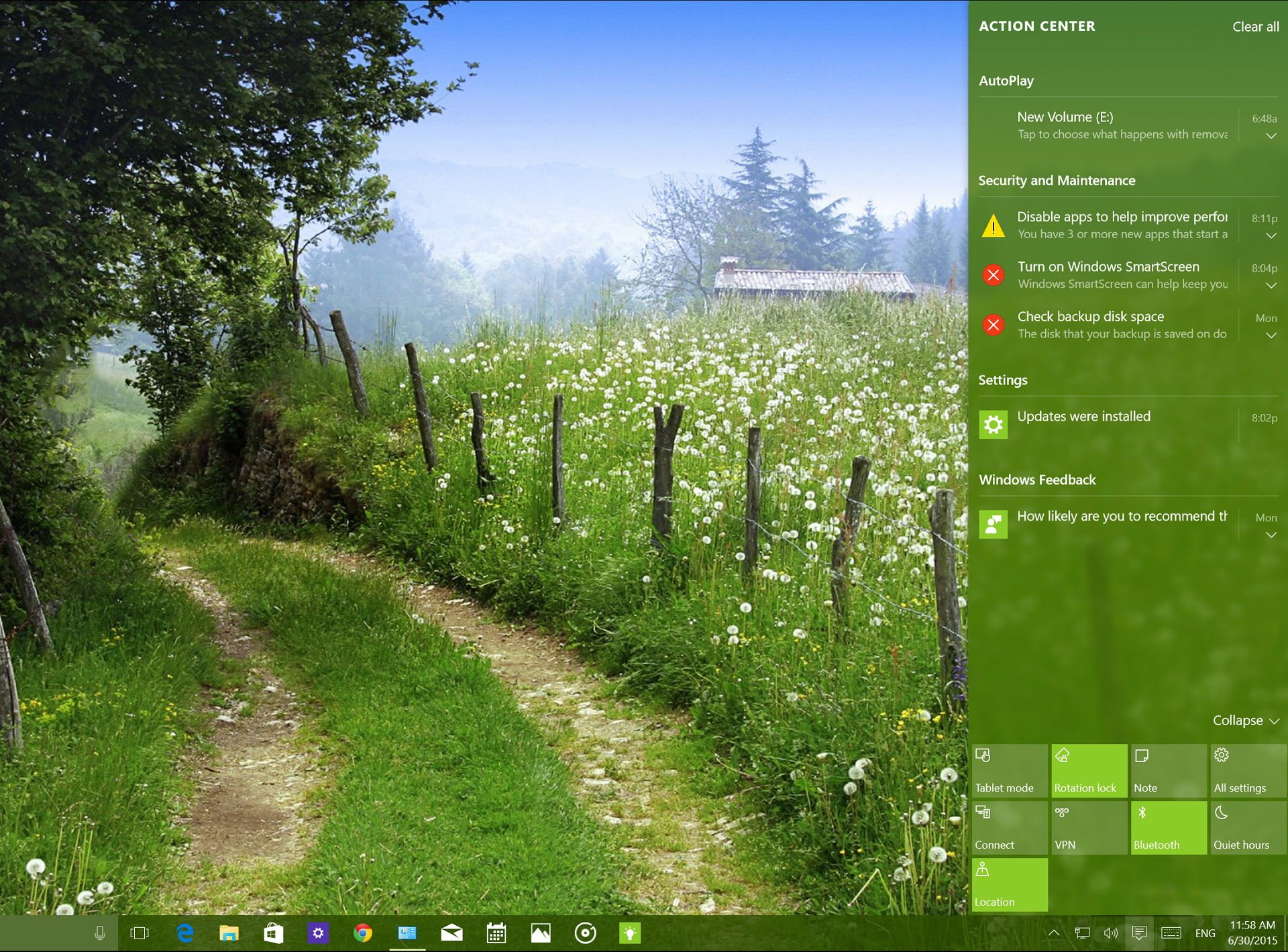
Notifications are nothing new having arrived with Windows 8.0 a few years back. However, what is new is the Action Center, which is a carryover from Windows Phone. Conceptually, a storehouse for all notifications and quick actions is not unique, and that is its strength. Anyone who uses Android, iOS or Windows Phone knows what this section does and why they would want to use it. Once again we are seeing the smartphone model carry over to PCs and desktops.
So let's break it down. There are two main areas: one for notifications from apps like Email, Twitter, News and Weather and another for quick actions to toggle on or off various functions on your laptop or PC.
Notifications now appear on the lower right of the display when they first arrive versus the at top style from Windows 8. These notifications are immediately viewable, and users can click them to open up the corresponding app. However, if you miss the notification, they are collected into the Notification Center, where you can view them later. This feature fixes a significant problem in Windows 8.1, which had notifications but no way to see them if they were missed.
Notifications for each app can also be configured individually. This option is ideal if you do not want to be interrupted. Users have three configuration options for all apps:
- Show notifications
- Show notification banners
- Play a sound when a notification arrives
I think this a well-thought-out design as it mimics the well-regarded system on Windows Phone. With these options, you can have a notification appear in the Notification Center for Weather, but not necessarily have it pop up as a live banner. Likewise, you can have the notification arrive as a banner, but it remains silent with no audible alert.
Settings are universal, so every app on the system – regardless if it is first or third party – behaves exactly the same.
I prefer this system for something like email, where I want to see what has arrived but not get a notification banner for each new email possibly disrupting me from my work. Since these settings are universal, it means each app on the system – regardless if it is first or third party – behaves exactly the same. That is fantastic.
The notifications on Windows 10 are robust, configurable and most importantly consistent. However, things could still be better. The discoverability of app notification settings is poor as you need to tap the apps' name under Settings > System > Notifications + actions and not the icon (which does nothing). It is just not very clear that you can configure app notifications with such fine detail.
Quick toggles
Down near the bottom of the Notification Center users can find quick actions for everyday functions. Users can tap the 'expand' arrow to reveal up to 12 toggles with the first 4 being custom choices. For instance, if you want a Bluetooth toggle in the top four, you can choose that under Settings. For my Lenovo Carbon X1, I want to have the Cellular toggle readily available, so I can turn on or off my LTE connection.
At least that is the idea. I have had issues with the cellular toggles not doing their job, and I'll chalk that up to some early release bugs. The rest of the toggles, however, worked without issue.
Other options include Display brightness, Battery Saver, VPN, Location, Quiet Hours and more. Quiet Hours lets you silence your notifications and alerts for all apps. Battery Saver disables power-hungry apps in the background and conserves energy to prolong your laptop's battery.
Conceptually I find the quick-action toggles and notifications very easy to understand, and I find myself often making use of them. I think users will appreciate how this tool works without any misperception.
Toggles are simple, and they make computing life easier.
- How to manage wireless network connections in Windows 10
- How to optimize battery life in Windows 10 devices using built-in settings
The look of Windows 10 and Multitasking
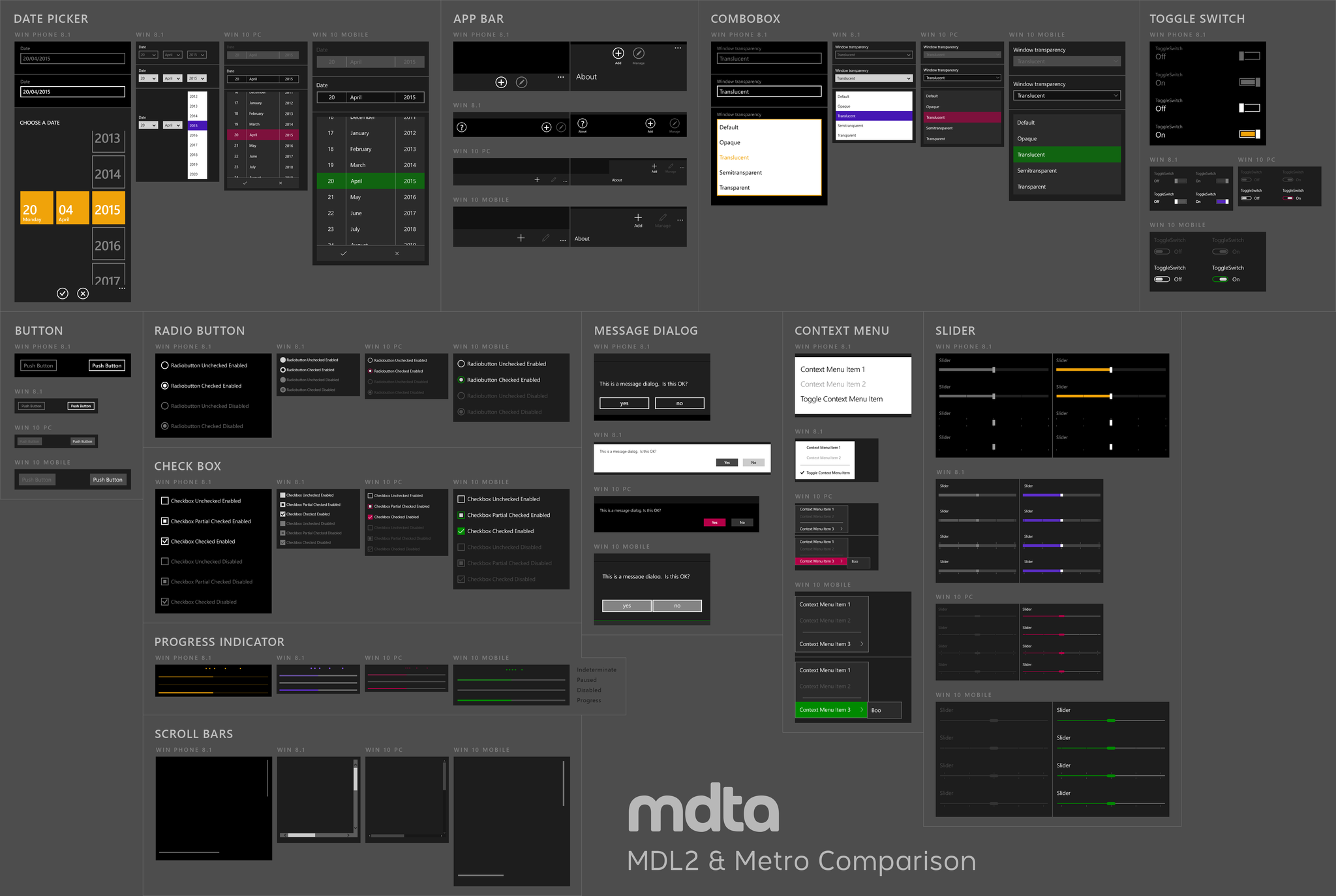
With Windows 10 we can see Microsoft Design Language 2 (MDL2) a continuation of the Modern design principles forged in Windows Phone and Windows 8. Early on, fans of Windows Phone rebelled against the changes, but over the last few months, users have become accepting and even enthusiastic about the new design elements.
I know I have.
I liked the look of Windows 8.1 quite a lot and at first found the new Start menu off-putting. After using Windows 10 on numerous devices for months now, it is just the opposite. I recently picked up the Surface 3 with LTE, and I was repulsed at having to use Windows 8.1. This reaction was when I knew Microsoft was on to something with Windows 10.
With Windows 10, Microsoft is continuing to flatten just about every aspect of the UI that they can render. The whole OS looks like it was steam ironed. There are virtually no 3D elements or drop shadows or hints of three dimensionality here.
Even all the icons have been thinned and hollowed making them more minimal than ever. It feels lean and mean. The one area where we still see color is in File Explorer, which stands out as being different from the rest of the OS (even if they did update the icons to be more modern). There are also some odd inconsistencies with some icons being white for the Store and Mail, while File Explorer and Microsoft Edge are yellow and blue, respectively. This difference is not a bad thing per se, and it is likely to help ease people into transitioning to Windows 10, but it would be nice to see a little more consistency.
Old parts of the OS still can be found too like in Control Panel. The majority of the most common settings are now found in the new, ultra clean Settings app, but there are still some more advanced options under Control Panel. Microsoft is getting rid of Control Panel but for now, it and things like Device Manger still look like the "old" Windows. These artifacts reflect the amount of work Microsoft has had to put into in updating the OS, and clearly there is still some clean up left.
Another inconsistency is the myriad menu designs for various apps depending on where you click. It is a minor detail that most won't notice, but it does demonstrate that Microsoft has some contradictions to sort out.
In terms of customization, users can choose various accent colors under Settings and have these reflected on the Start Menu and Taskbar. Alternatively, you can leave the Start menu and taskbar dark, or let Windows choose an accent color for you based off of your background wallpaper. Although there is a good amount of contrast, using a light yellow color with a white menu can make text had to read, so not everything is perfect.
Windows is for multitasking
In Windows 10 users can still use the Snap feature to split an app on one side of the display with another on the other side. This feature makes working with documents or programs a breeze. Although Snap is not new, there are some improvements in Windows 10. For instance, you can now snap up to four apps onto a display. There is also a new 'snap assist feature' the lets you pick which app you want to snap to the other half of the screen. It is smart, works well, and makes one of the most important multitasking features in Windows even better.
How to use Snap Assist in Windows 10
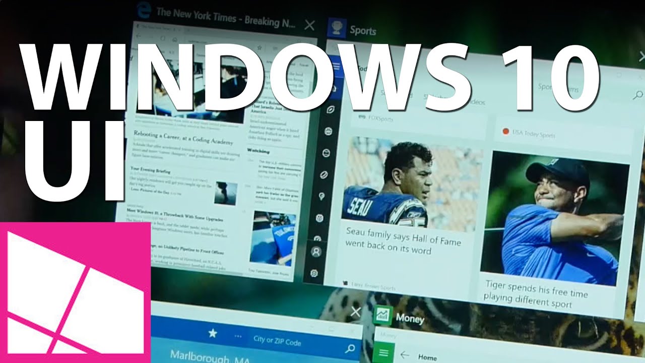
Speaking of multitasking, the alt-tab method to switch between apps is still present with a nicer looking design. There is also a new Task View option complete with its own button on the Task Bar. This feature lets you get a meta look at your desktop and all apps running to let you easily choose which app you want to go to or even close it. Under Task View, you can also find the new ability to add more desktop views, which is even a better way to manage projects or to keep your social apps away from your work apps.
In conclusion, the new look to Windows 10 is keeping in line with Microsoft's minimalist, clean and high contrast approach to UI design. Text pops and the thin fonts with wire-frame icons give the OS a very modern look.
It will be curious to see how the general public responds to Microsoft's newly designed Windows 10, but there is enough here for Windows 7 veterans and those who enjoyed Windows 8 without offending either camp.
Cortana
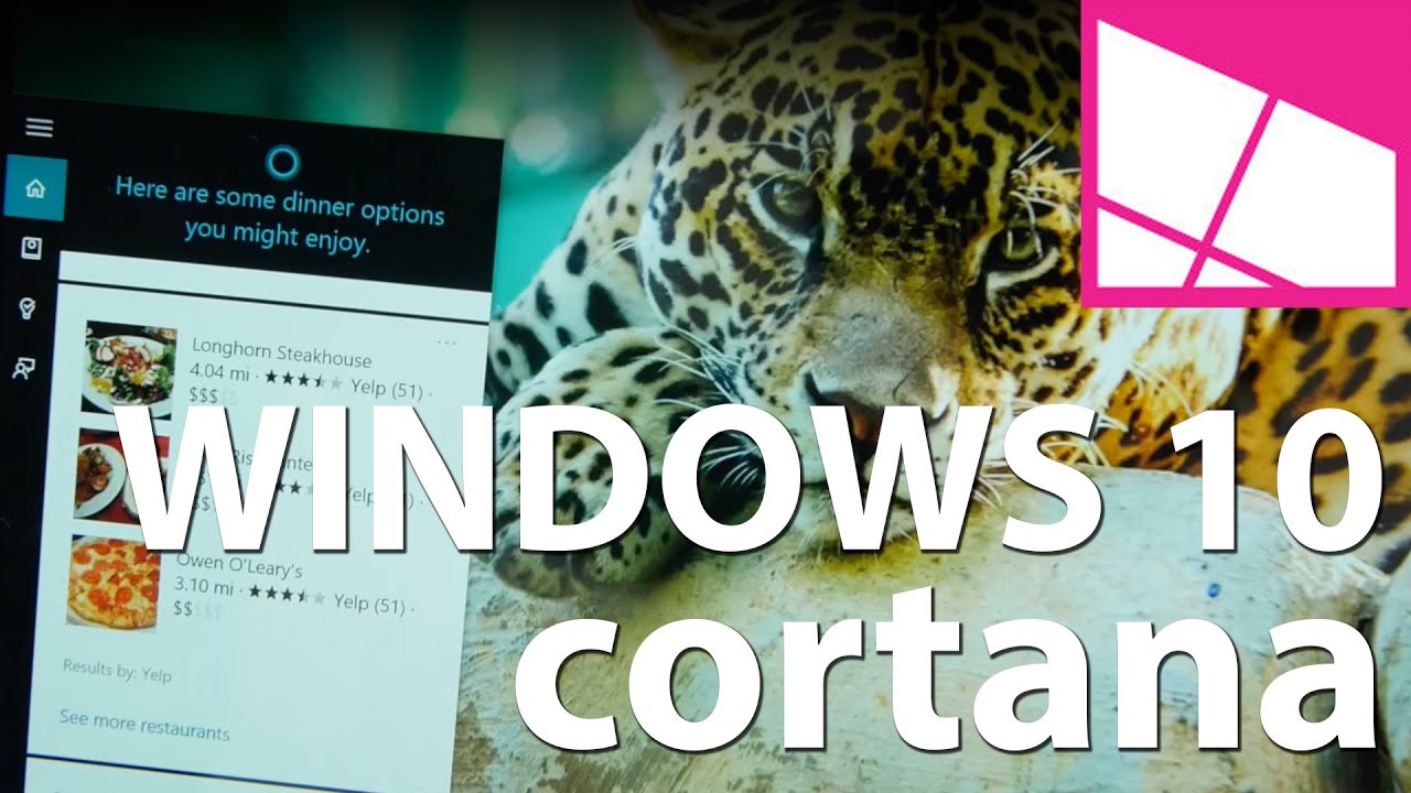
Microsoft's Cortana is another feature making a jump from Windows Phone to Windows PC. First introduced with Windows Phone 8.1, Cortana is Microsoft's digital personal assistant and is more than just a search tool. The name derives from the holographic artificial intelligence character in the popular Halo game franchise and the comparison between the two is more than skin deep.
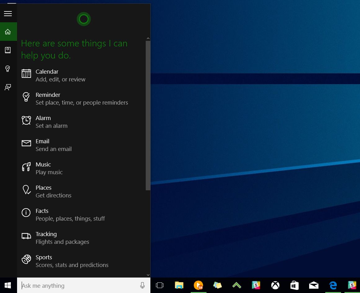
Cortana in Windows 10 at first seems like it could be gimmicky. After all, Microsoft is no stranger to assistants and invariably comparisons to Microsoft's infamous Clippy are made. However, this is 2015, and the technology has changed drastically. Indeed, Cortana is more than just a search engine with some flair, for instance, here are few things the assistant can perform:
- Bring up the current weather, or a forecast in some other part of the planet, even on a specific day
- Monitor your flights including delays, gates and the time you should leave to get to the airport in time, even considering live traffic conditions
- Schedule reminders including location-based ones using a Windows Phone e.g. "Remind to pick up milk next time I am at the supermarket."
- Notify you when to leave for home, work, or meetings/calendar events
- Track your favorite sports team
- Send an email using your voice including handling the recipient, subject, and body
- Recommendations for news, movies, entertainment, concerts in your area, follow your stocks
- Launch apps e.g. "Hey Cortana, launch File Explorer."
Many of these are referred to as "Interests" and they are filed under Cortana's "Notebook", which lives in the cloud. The language is meant to evoke a secretary working for a boss who must keep notes on your likes, dislikes, and general preferences. Just like a real notebook, users can access it and delete or modify any information they do not wish to share with Cortana.
This control over information and privacy is one of the things that set Cortana part from Google's services, which are more convoluted for data control.
Cortana's notebook is linked to your Microsoft Account and floats, meaning whatever Windows 10 machine you log into it has the same Cortana experience. If you already use Cortana on Windows Phone, the same experience passes to Cortana on the desktop and vice versa.
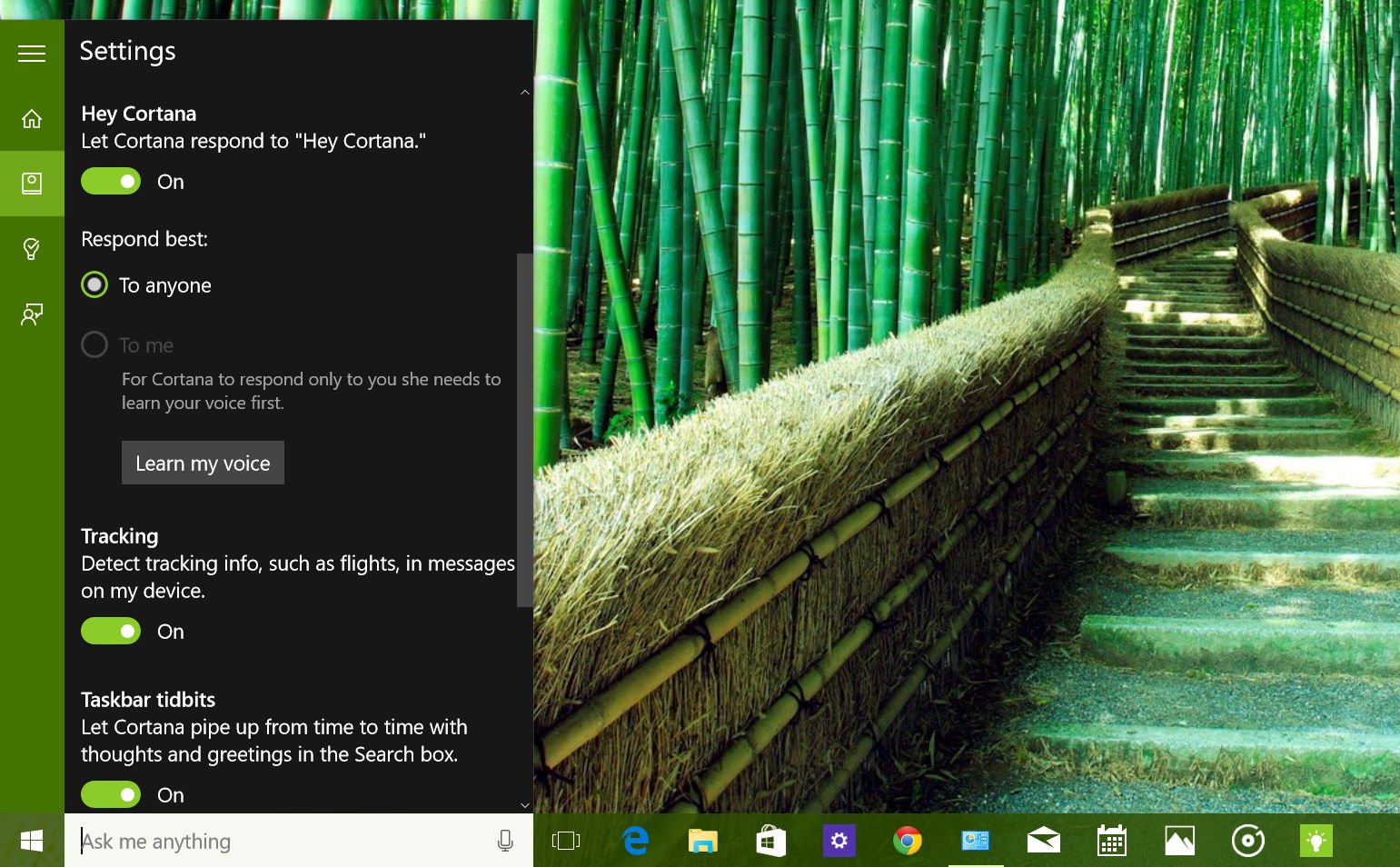
What makes Cortana exciting is the utilization of 'Hey Cortana' an always-on optional system by which a user can verbally call for the assistant using a desktop microphone (or a laptop's built in one). It uses natural speech, so you do not need to memorize commands like in the past. If users prefer, they can also bring up Cortana with a Win + C keyboard command for a quick search. It is an efficient system but if you have numerous Windows 10 devices around saying 'Hey Cortana' could cause a small ruckus.
How to manage Microsoft and user accounts in Windows 10
Cortana also resides in the system taskbar right after the Windows Start menu (this can be disabled as well). Just tap in the search area and Cortana springs to life with all of your latest interests.
I find Cortana to be one of the true gems in Windows 10. For people who do not use all of the assistant features, you are still getting very tailored news and entertainment content delivered as a mini-newspaper. What makes the assistant even more exciting is its evolving nature. Based on user feedback and ideas, the Cortana team is constantly thinking of new ways to make use of the technology but trying to avoid gimmicks.
New Cortana features are pushed through the backend, so it does not need a software update. New things just go live, which is also a problem for discoverability. Currently, Cortana does not tell you what new tricks it can perform.
Despite all the coolness of talking to our computers and phones, I'm not convinced that people will use Cortana to its fullest capabilities
Will people make use of the technology? Despite all the whiz-bang coolness of talking to our computers and performing tasks, I am not necessarily convinced that people will use Cortana to its fullest capabilities. I do think people are more likely to talk to their PC at home or in the office where privacy is more attainable versus in public on a phone.
However, there are still barriers to getting people to learn about and take advantage of all that Cortana can do. In that sense, Microsoft has some work cut out for them in bringing this feature to the masses. Even I find myself only half using most of the features although perhaps that is more a reflection of my lifestyle than personal preference.
Luckily Microsoft has started to roll out a 'how to' campaign within Cortana to help folks.
Cortana is not quite the A.I. genius behind Cortana in the Halo game franchise, but for 2015 it is likely the best we can do right now. Considering that Google and Apple's voice-assistants live mostly on phones or in a web browser, Cortana stands an excellent chance of becoming the default personal assistant.
Later this year, Microsoft is releasing Cortana on iPhone, Android, and even the Xbox One. Besides reaching a larger audience, this rollout enables more feedback to be collected on how people are using Cortana (and what they are trying to accomplish) improving the technology over time. In that sense, like Windows 10 itself, Cortana is a constantly evolving tool and its brightest days are still down the road.
On Windows 10, Cortana is only available for the U.S., UK, China, France, Italy, Germany and Spain. Cortana is also expanding to Japan and Australia, and in English in Canada and India for those on the Windows Insider program (early access). Later this year, Cortana will be available to Windows Insiders in Brazil and Mexico, and in French in Canada as well.
Microsoft Edge
There is no secret that Internet Explorer is one of the most joked about browsers today. This despite the fact that it is still one of the most widely used because it is the main browser in Windows. Internet Explorer though is ancient, and it is not built for the mobile world to which we now belong. Combined with its maligned reputation, it is no wonder why Microsoft would want to move beyond it.
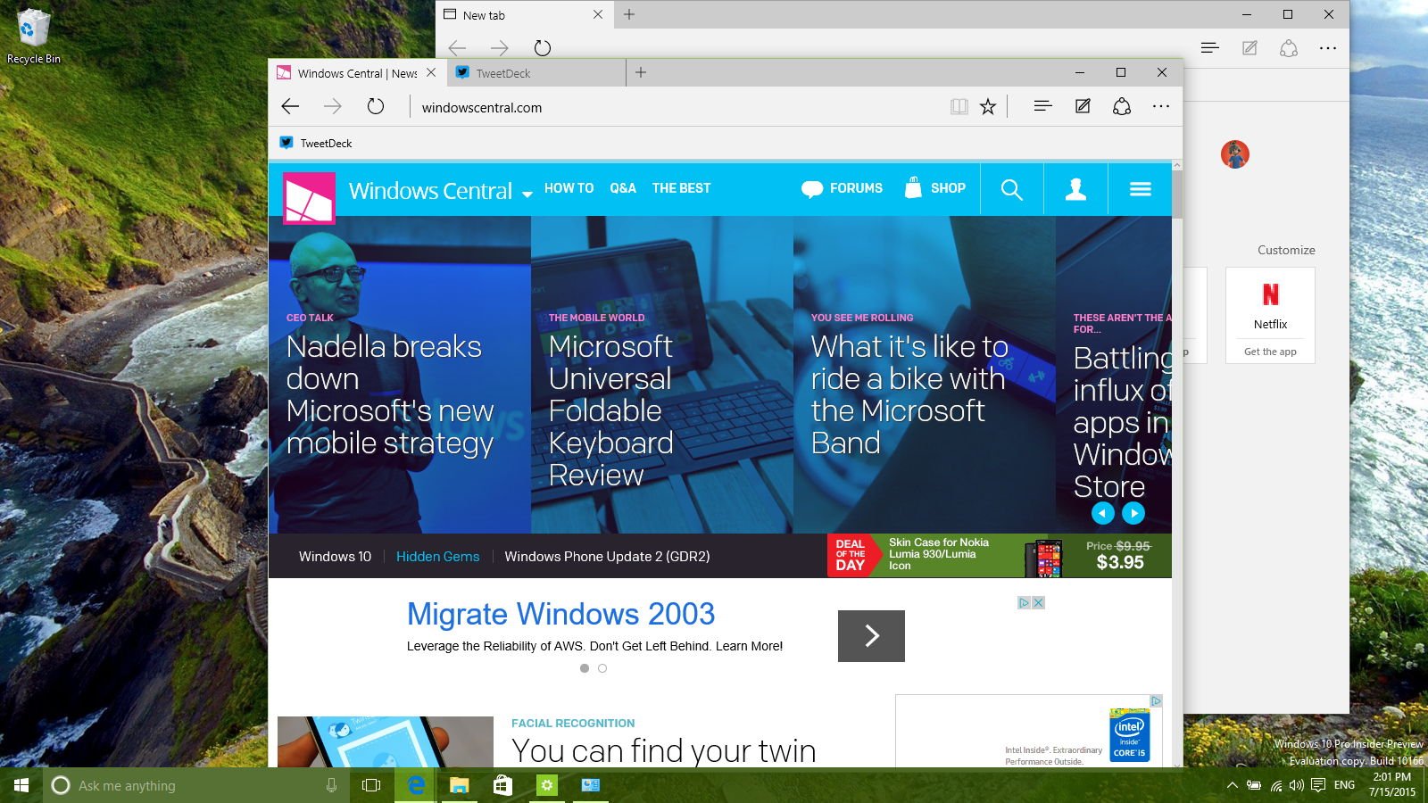
Because of these reasons, Windows 10 is bringing a new web browser called Microsoft Edge.
I find Edge one of a fascinating aspect of Windows 10. Web browsers no matter how light and nimble always get worse with age whether it is Google's Chrome, Opera, or even Firefox. I have preferred Chrome now for many years because of its speed, design and browser extensions. However, even I loathe it as Google crams more and more into it. The core of the browser may be fast, but the bloat around Chrome Apps make it frustrating to use.
How to change Microsoft Edge's default search engine in Windows 10
Microsoft Edge is a chance to start new. Being able to build a web browser from the ground up has to be a liberating experience. This rise from the ashes approach is even more the case with Edge as Microsoft ditched IE legacy support too, something that they had originally planned to keep. Instead, legacy users can still find Internet Explorer in Windows 10, but it is buried within the system. (Need to find it? Just ask Cortana.)
The biggest improvements with Edge come from its new design, feature set, and being built to run on everything from PCs to tablets to phones. The browser has to be light, and it has to be efficient.
Design
Microsoft Edge has a very clean and minimalist look. It blends in with the general UI of Windows 10. In fact, one could argue that it is too austere, with little color or eye candy. According to Microsoft, that is by design as they want web content to be the focus of your eyes, not the browser itself, which should fade into the background. While I agree with this philosophy, Edge in my opinion could use a little bit more flair.
Edge also ditches complex menus and overwhelming options for the casual user. On the main Settings page, users only have around six choices. Under the rarely accessed 'advanced' settings, another twelve. When compared to Google Chrome, Edge feels like a breath of fresh air in terms of simplicity and design.
Edge feels like a breath of fresh air in terms of simplicity and design.
Microsoft brings live previews for web pages and even more color with highlighted tabs in a future update rumored for October, but for now, users are left with a perhaps a too-clean browser experience.
Users can also choose between Dark and Light theme settings. Microsoft says they were surprised by the number of users who prefer the Dark one, although it seems to be like an obvious choice. Interestingly, though, I prefer Light for my large desktop and Dark for my laptop for some reason. Perhaps having an option is a good thing after all.
Edge also brings a few new functions to make browsing on Windows 10 fun and unique; these include Reading Mode, Annotating web pages, Cortana, and Reading List.
Reading Mode
Reading Mode is not that new. It is found in Windows Phone and users of Windows 8.1 who chose to use the Modern version of IE could also access the feature. However, in Windows 10 is built into the main desktop browser and is readily more accessible.
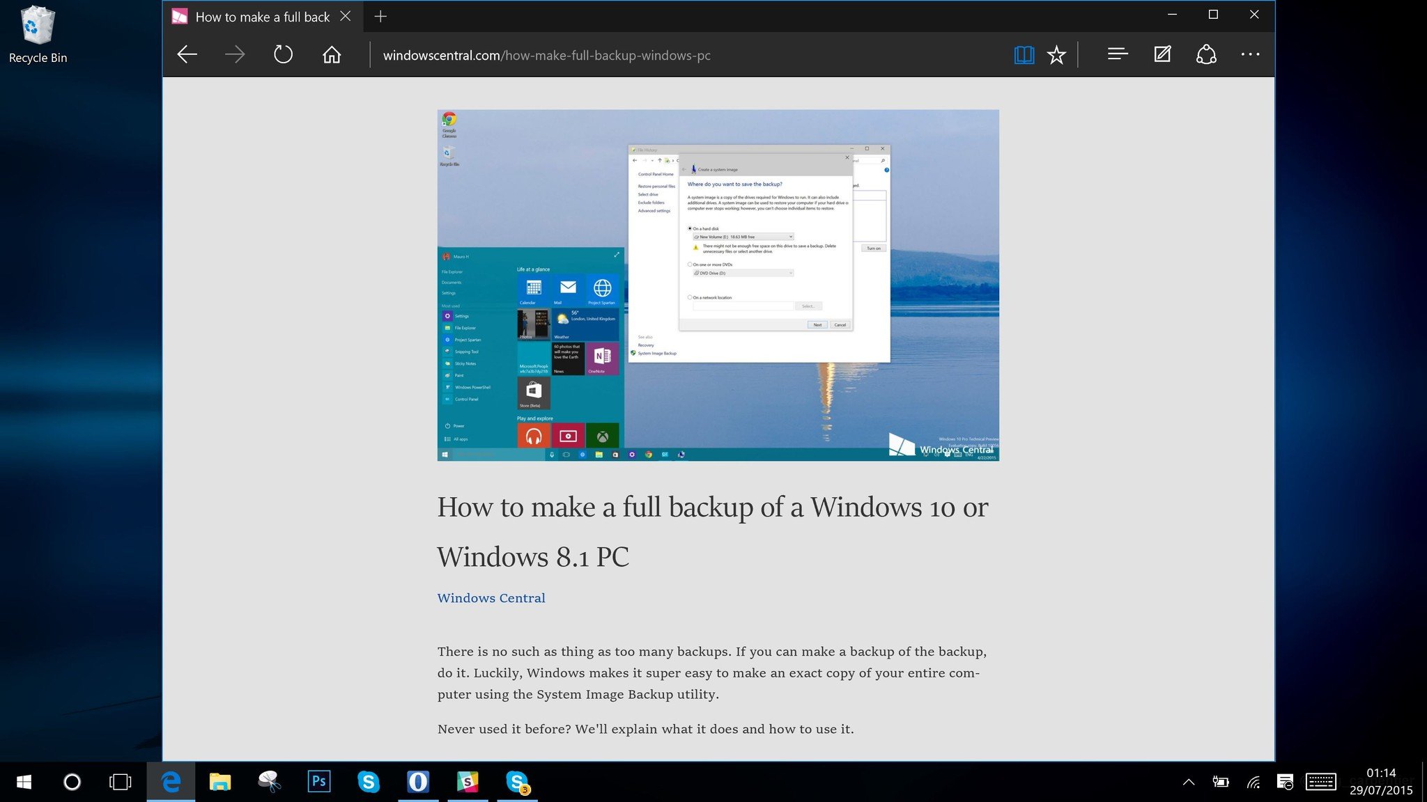
Reading Mode simply strips away the chrome of a web page, leaving nothing behind except the images and text. The mode is enabled by clicking the book icon in the browser toolbar. There is even neat animation of flipping pages to let you know it can be enabled. It is a fantastic tool to use when reading a very long article as it removes all distractions.
Being able to choose background tones (Default, Light, Medium, or Dark) and text size also gives users just enough customization for their preferred reading style.
Cortana
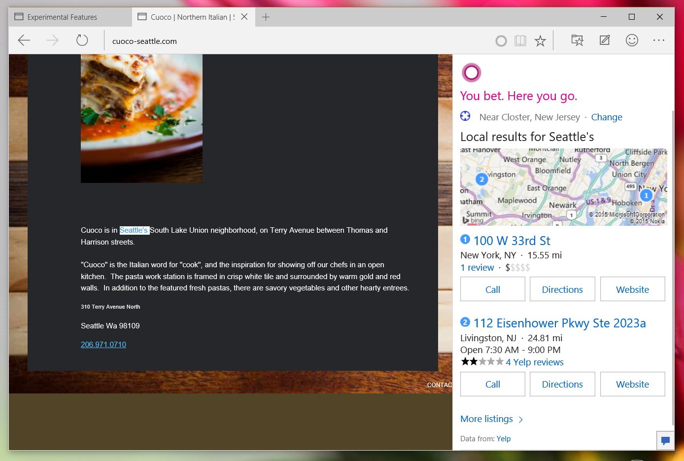
Cortana is not just the system default search for Windows 10 it is also the first extension for Microsoft Edge. Microsoft built in the feature in a subtle but unique way: simply highlight a word and right-clicking users can choose 'Ask Cortana' to send the inquiry to the personal assistant. Nevertheless, instead of opening a new web page, the assistant slides in from a panel on the right side with the requested information. This function keeps the user within the original web page experience while also answering their question.
Cortana in Edge can look up information about a person, or give a definition just by using 'Ask Cortana'. Likewise, users can type in 'Weather + location' in the address bar to bring up current conditions, do simple math, and more saving you time without having to perform an actual search.
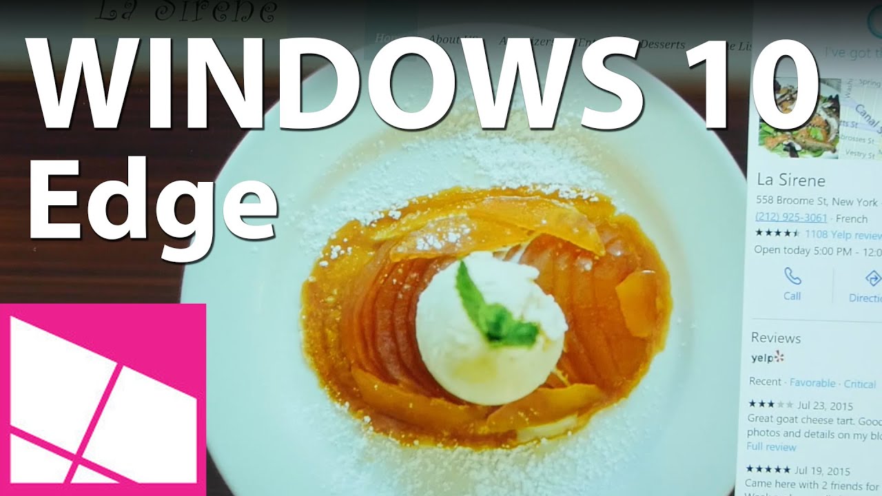
Another feature Microsoft is introducing is the ability to bring up information about a place, such as a restaurant. When on a web page for an eatery, Cortana will subtle notify you that it has more information, including directions, hours of operations and reviews. It is a clever usage of the assistant and it no way feels gimmicky. However, since it is still new, the feature only works in some major metropolitan areas like New York City, making it hit and miss for most users right now.
So far, Cortana is off to a great start in Edge, but like all the other functions it needs to time to gestate as Windows 10 grows.
Annotating the Web
In Edge, users can enter into an 'edit mode' that lets you draw on a web page (if your device supports a pen) or use the keyboard to add notes. You can then screen capture your work and share with your friends or family. The idea is an old one but applied to a new situation. Ideally, people will use to a collaboration tool when considering purchases, vacation trips, or anything they find interesting. Since the work is saved an image file, the receiver does not need any special software to view it. This neutrality helps break down and barriers that may prevent a user from adopting it.
I cannot say I am a big user of annotations in Microsoft Office, OneNote, or now Edge, but I do see the value in its function. At least it is easy to use, unique, and it serves a purpose.
How to use Web Notes on Microsoft Edge for Windows 10
Reading List
Finally, another new feature in Edge is the ability to save a web page for later reading. This Reading List is similar to other services that let you index articles instead of just bookmarking the page or website. To use Reading List, you just hit the Favorites star but instead of listing it under Favorites, you choose Reading List instead. Here the article and lead image are saved in order of date, making it easy to browse through your list.
I like the idea of Reading List, which is why services like Pocket are popular. However, the implementation in Microsoft Edge feels half-baked at this time. For instance, there does not seem to be any real synching between it and different instances of Edge on your other computers. So for now, your Reading List appears to be local, which has to be either an oversight, a coming feature or a bug (if it is supposed to sync). There is also the issue that this does not sync up to Reading List the app, which is a separate app that serves the same purpose but without the browser. That app works by "sharing" a new story to the Reading List app, which then categorizes the listing. You would think that the app and the browser would sync, but alas that does not seem to be the case.
Reading List has the potential to be a big feature, but for now, it remains only a good idea not fully realized.
Edge as a browser
Compared to the Internet Explorer duality of Windows 8 Microsoft Edge is a huge step in the right direction. Having two different web browsers was just insane. Sure, Internet Explorer is still there if you need it so in theory that could be confusing for some, but most people will never even notice. Seeing as the Edge and IE logo are similar, most users should feel comfortable with using it.
The browser itself is really good. I am using the majority of the time even over Chrome. I still prefer Chrome for one reason: extensions. Whether it is LastPass, Reddit Enhancement Suite (RES), Magic Tube, or AdBlock, Chrome extensions are a vital part of my internet life.
Later this year Microsoft is adding extension support to Edge, including porting over Chrome extensions.
The good news here is that Microsoft is adding extension support, likely in October during the 'wave 2' refresh for Windows 10. These are not supposed to be just proprietary ones for Edge either as Microsoft has detailed that Chrome extensions can be ported over directly to their new browser. It remains to be seen how well they can execute on that feature, but if they live up to their promise. Edge could easily overtake Chrome, Firefox, or Opera.
Unless you are married to Google and the tight integration of their services into Chrome, I see zero advantage to using it over Microsoft Edge once those extensions arrive. Microsoft has already boasted faster speeds for benchmarks, and this is just the beginning.
Any shortcoming in Edge should easily be fixed in the next year as Microsoft has built a very solid base in which to build off of for the future. For instance, I do find it hard to see which tab is active when I have 20 of them open with the Dark theme (yes, I am one of those people). I also prefer Chrome's omni-search bar, which lets you search within a website from a search. There is also the missing swipe gesture for forward and back (which is still coming). Moreover, yes, I have even seen Edge crash on occasion. However, all of these feel like beginner issues that will be solved over the next few months.
I would also like to seem some animations for when a web page is loading, maybe some vibrancy and how about some levity? Cortana is fun and so why not add some colorfulness to Edge?
There are few shortcomings in Edge, even an occasional crash, but overall it is a solid refresh for what looks to be an exciting new browser. If it is not the best now, it has all the makings to be so shortly. Microsoft should be proud of this accomplishment.
Apps, apps, apps
Although Windows 10 is an OS update, it is much more than that as well. Windows 10 has been app-ified with many core features broken down into the smartphone app model. This model is a wise choice for a few reasons:
- You no longer need an OS update to fix broken native apps or add new features
- Due to the prevalence of smartphones and their app stores, bringing that model to the desktop PC brings immediate familiarity to new users
In fairness, Microsoft had already started down this path with Windows 8 and 8.1. However, in Windows 10 Microsoft's first-party apps are even more prevalent and form a greater core of the Windows 10 experience.
Out of the box, new users upgrading to Windows 10 can expect the following apps:
- Calendar (formerly Outlook Calendar)
- Groove Music
- Mail (formerly Outlook Mail)
- Maps
- Microsoft Phone Companion
- Movies & TV
- MSN Money
- MSN News
- MSN Sports
- MSN Weather
- OneDrive
- Photos
- Store
- Windows Alarms & Clock
- Windows Calculator
- Windows Camera
- Windows Voice Recorder
- Xbox
Most of the apps like Voice Recorder, Alarms & Clock, and Maps are all relatively self-explanatory. This observation, however, does not diminish their aesthetic achievements. Alarms is shockingly minimal, which considering how important they can be may not be a bad thing. Voice Recorder, also barebones, is a simple go-to app to record audio with the ability to share, trim, delete or rename the file.
Maps is a gorgeous topographical tool that brings up your current location, can search for addresses or establishments and give directions for the car, walking or transit. It even features street side photos to visualize your destination. You can also share the information easily with your contacts including full directions with maps, which is ideal for email. The app is mostly geared for those who are mobile since it is a universal app for Windows Phone too. However, if you have a Surface 3 with LTE, you can readily use the tablet as a giant GPS tool, especially since you can download maps for offline usage saving data.
Speaking of, Maps is powered by Bing and Cortana so that saved locations and data is synced between devices.
Additionally, users have access to Office 365 with a traditional PC installation or utilize the new Touch Office apps including Word Mobile, Excel Mobile, PowerPoint Mobile and OneNote.
There is also a new music app called Groove, which replaces Xbox Music from previous versions of Windows. Functionally, they are the same but Groove does bring Windows 10 influences and a very clean, minimalist approach to curating our music catalog.
Everything you need to know about the Groove music app on Windows 10
The Groove app is still missing some much-needed features like gapless playback, but these and others should arrive in the future through the Store as an app update.
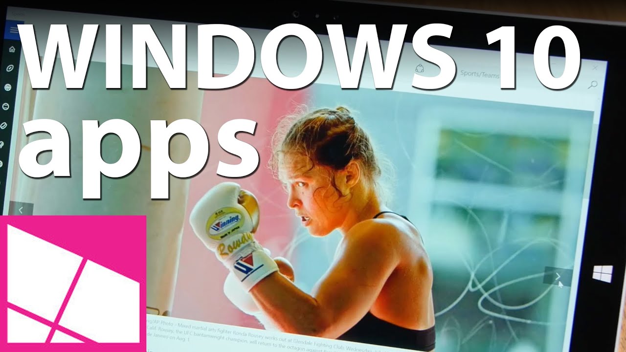
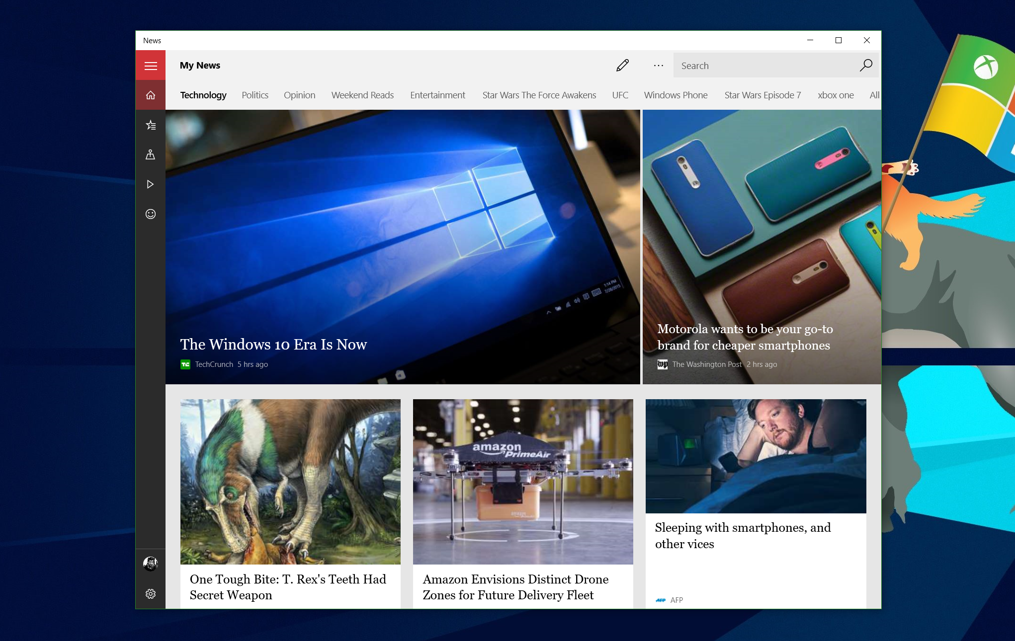
I have always been a fan of Microsoft's first-party apps, even if they are constantly undergoing reinvention. In this case, all the MSN apps have been rewritten to be Universal Windows Apps allowing them to run on Windows 10 Mobile and Windows 10 for PCs and laptops. The design of these apps also ditches the pivot (swiping left or right) for main navigation and they have introduced the more universally familiar 'hamburger' navigation menu (the three bars near the top).
All of the MSN apps were rewritten to work across Windows 10 Mobile and Windows 10 for PCs and laptops, and have been redesigned with more universally-familiar navigation.
MSN News, Weather, Sports and Money are likely to be used by many users right out the gate. MSN News simply aggregate information from other news sources, much like how Bing News works now. Users can add topics through Interests for various subjects and users can also track customized topics. For instance, Cortana and MSN News both follow news on Start Wars: Episode 7 and UFC for me, bringing me all the latest news from around the web on those topics. The interests in MSN News mirrors Cortana adding a nod of consistency between the services. Indeed, MSN News is a subset of Cortana, and they are all tied together by Bing.
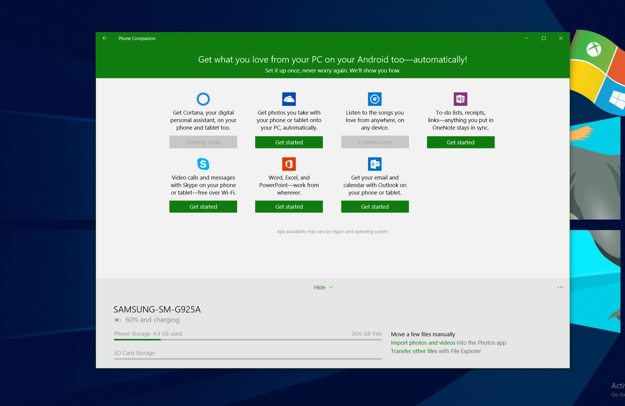
Additionally, with universal logins through a Microsoft Account even those on iOS and Android can sync their interests between devices. This feature is part of the beauty of Windows 10 that it is still very device agnostic. Those using Android or iOS feel right at home. Indeed, when you plug in your smartphone to Windows 10, a neat Phone Companion app pops up to greet you. That app itself does not do too much, but it serves as a frontend for Microsoft's services. If you are using an iPhone or Android, it tells you which Microsoft apps you can use on your phone to match your Windows 10 desktop. These apps include OneDrive, Skype, Office, Groove Music, Cortana and more.
I suspect deeper integration is coming down the road for smartphone users, but for now, it is all done through Microsoft's services. Things like texting from your computer to your phone are not here yet and besides using File Explorer to manage your phone's files, there is not much direct interaction.
Mail and Calendar, which drop the Outlook branding on Windows 10, but retain them on iOS and Android, let users connect multiple email services. Gmail, Yahoo, Outlook, or a custom entry are all compatible. Likewise, calendar syncing is also present between those services.
Email is a very personal thing with some users needing the very powerful (and overwhelming) Outlook for Office while others prefer a more minimalist approach. Mail and Calendar fall in between as it is not overflowing with features, but it is more than just a basic app too. The design of the app is modular so that it adjusts to your screen size and whether or not you have it windowed. Users can even add their own custom background image for the blank panel that displays when no email is selected.
Microsoft has done an admirable job on their first party apps. Specifically, they do not feel half-baked like they did with Windows 8. Indeed, rumors claim that interns built many of those original 8.0 apps. Now, however, Mail, Calendar, Maps, Groove Music and more all feel like full-fledged apps with outstanding functionality.
Even better, these are apps like on your smartphone, so users can expect to receive frequent updates to add new features, improve performance, or fix any issues that may occur.
Store
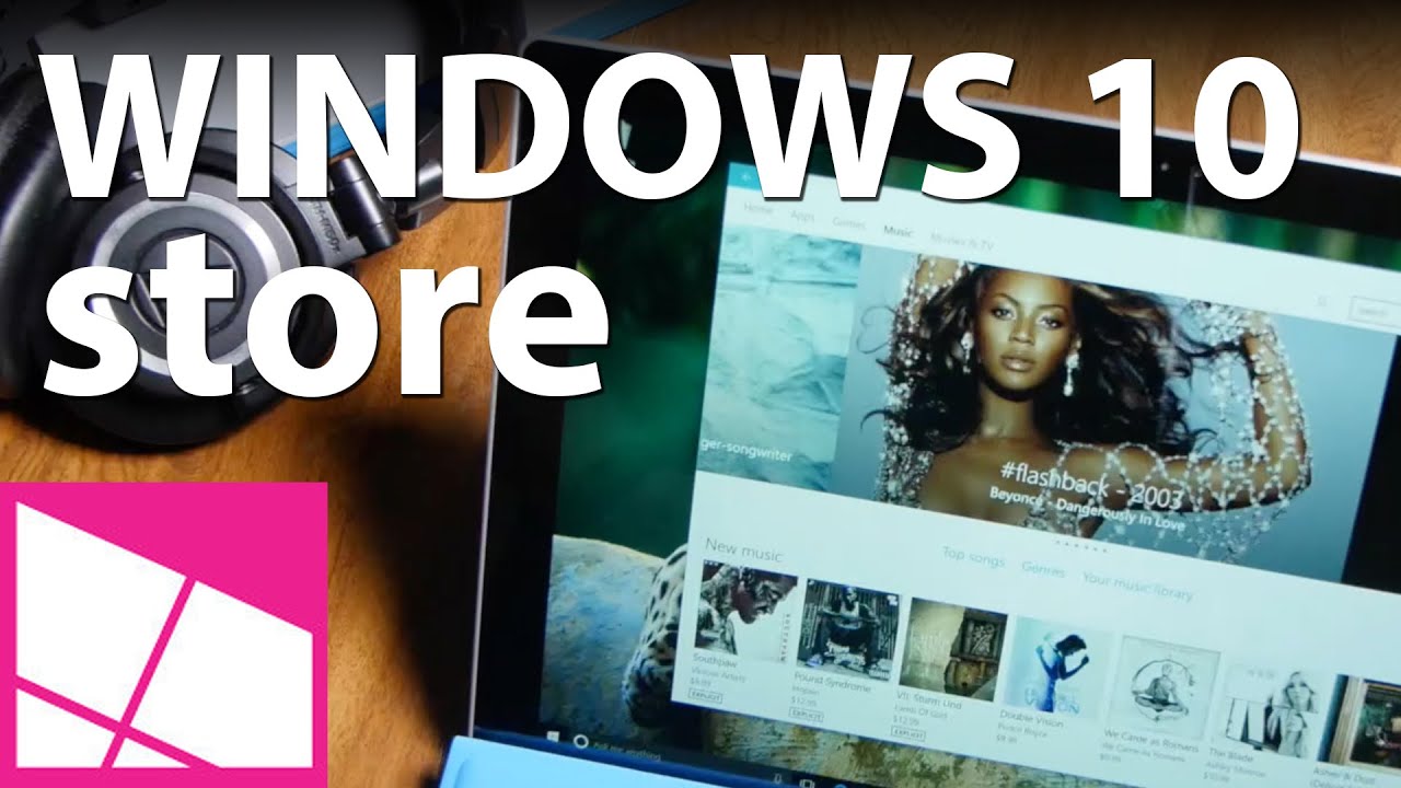
App Stores are nothing new but Microsoft has finally done the right thing and merged all of their services into one Store for Windows 10. This unification includes stores for Apps, Games, Music, and Movies & TV all under one virtual roof. Now, users can buy a song, a TV show, and the latest Windows games all from the same app.
Besides unifying the separate stores, the app itself is completely redesigned with a more top-down approach as opposed to the previous left to the right style.
Whether you like the new store design will be a personal preference. However, with the larger, more professional app images, better information flow and the surfacing of related content, the store certainly feels and looks better from my perspective.
Like any store, clicking on an app or game delivers information about that software, screenshots, ratings and reviews, general information, and similar apps that people also like. Since apps and games are becoming universal with Windows 10 and Windows 10 Mobile, singular store listings are becoming commonplace with users having the ability to choose between Phone or PC for images.
Under Moves & TV, users can watch trailers, rent movies, or buy titles in standard or high definition. There are also built-in reviews powered by Rotten Tomatoes with cast and crew information. Prices are competitive although you may occasionally find something cheaper on Amazon.
Jumping into music, you can preview songs, buy individual tracks or whole albums. If you have a Groove Music Pass for $9.99 a month, you can also stream any album and even download them for offline usage to your phone, tablet or PC. However, this can a bit confusing as you can only use the Groove Pass in the Groove app, but it does nothing in the Music Store. The Music Store is just for buying music, but you cannot download tracks using your Groove Pass.
Once explained, this separation makes sense but if you are a Groove Music Pass holder, finding the download menu button in the Groove app is not evident. It took me numerous attempts to find it under the ellipsis menu. Additionally, you are allowed to stream or download songs to only four Groove Pass devices, and you can only swap out a device every 30 days. So make sure you read the fine print if you use several devices or change devices frequently. If you are not a Groove Pass user, then the Music store is simply a place where you can buy individual MP3s or whole albums through your Microsoft Account.
The new Store is a huge step in the right direction but there is still plenty of room for improvement.
Overall, the new Store is a huge step in the right direction but there is still plenty of room for improvement. For instance, apps and games do not reveal which version number they are on nor when they were last updated with a date stamp. I also still find the divide between Groove Music the app and the Music store a bit confusing as well, as noted above.
Nevertheless, if there one awesome feature that I like about the Store it is the ability for it to update itself through the Store. Indeed, we have seen Microsoft roll out numerous updates over the last few months, and we are sure there are many more to come. These updates can only mean that today's shortcomings will be gone tomorrow. Stay tuned.
Windows Hello makes passwords obsolete
In this day and age passwords are a way of life. Even more so since many of us with sensitive data opt to use the strong but cumbersome two-factor authentication. I will not go into details about my password but let's just say it is more than ten random characters and a rather large pain to enter in each time.
In the past, companies have gotten around this through things like fingerprint scanners and facial recognition. Lenovo is a big proponents of this as their Yoga 3 Pro's camera can match your face, and my X1 Carbon has an effective fingerprint scanner.
In the past, companies made their own fingerprint scanners or facial recognition cameras. Microsoft's building that in with Windows 10.
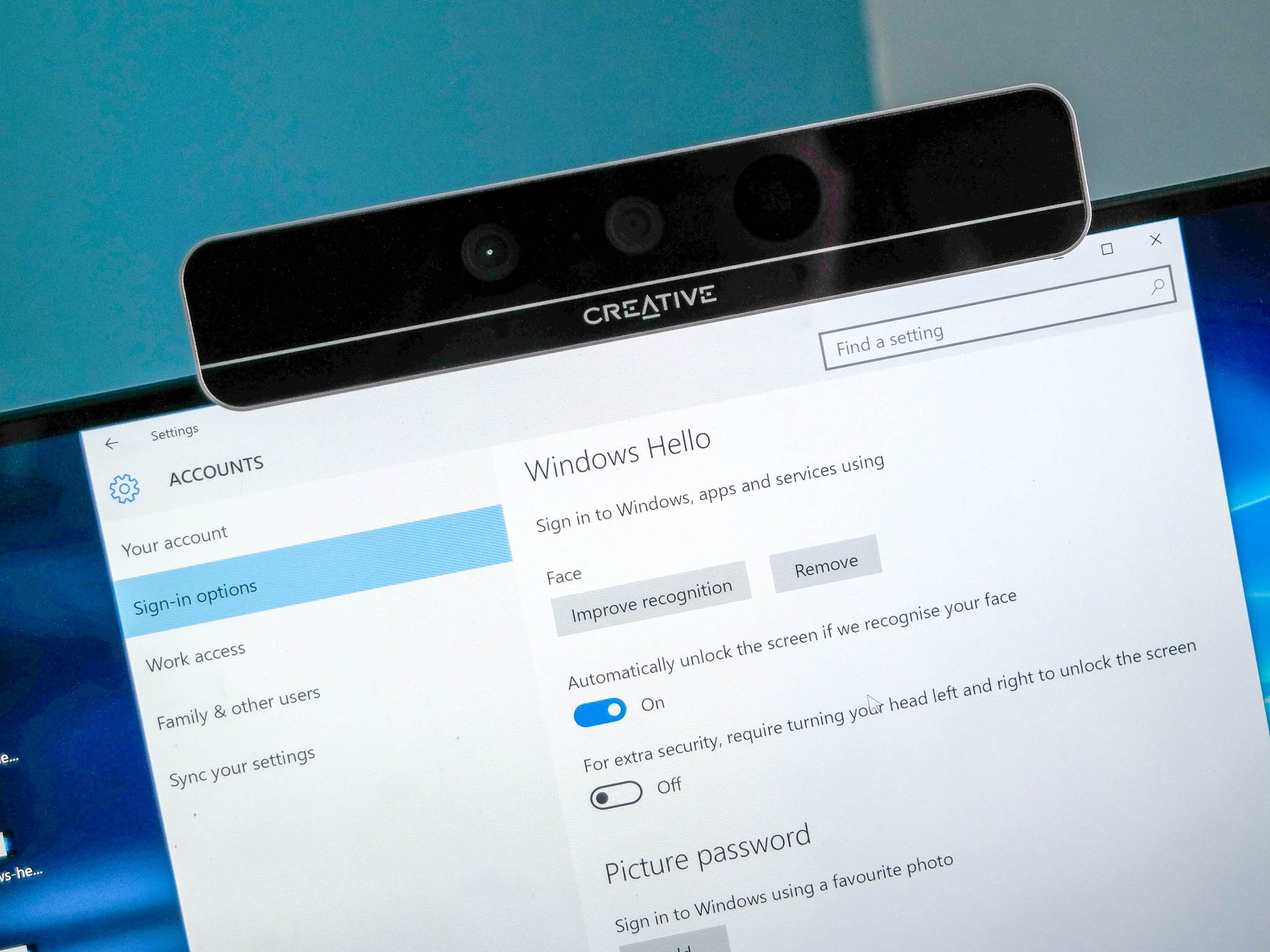
Windows 10 though is different as it integrates these functions into the OS directly, and this is called Windows Hello. On an X1 Carbon, this means you do not need to use Lenovo's proprietary software. Instead, you can jump to Settings > Accounts > Sign-in options and set your fingerprint there. This feature certainly makes the OS much more efficient.
There is also optional facial recognition, which relies on Intel's RealSense camera technology. Many of us at Windows Central are using a developer camera called the F200, which can be purchased for $99. However, you can already buy some laptops with RealSense cameras built in, and many more are coming this year. (I suspect Microsoft's Surface Pro 4, expected this fall, will feature it).
The RealSense cameras rely on RGB (traditional cam), infrared, and 3D. This is not just matching your 2D face to a photo, but rather the contours of your face, regardless of lighting conditions. Yes, it works in a dim room too. This tech means it is much more secure, works in more conditions, is much more accurate and significantly faster. Indeed, average unlock times were one second or less, which is quicker than me typing in a long password or even a pin.
I did have occasional issues with the F200, including it not turning on when the computer wakes from sleep (something I sort of solved here) and every once in a while I did have to recalibrate. Luckily recalibration (and even initial setup) takes less than 30 seconds. It is astonishing technology.
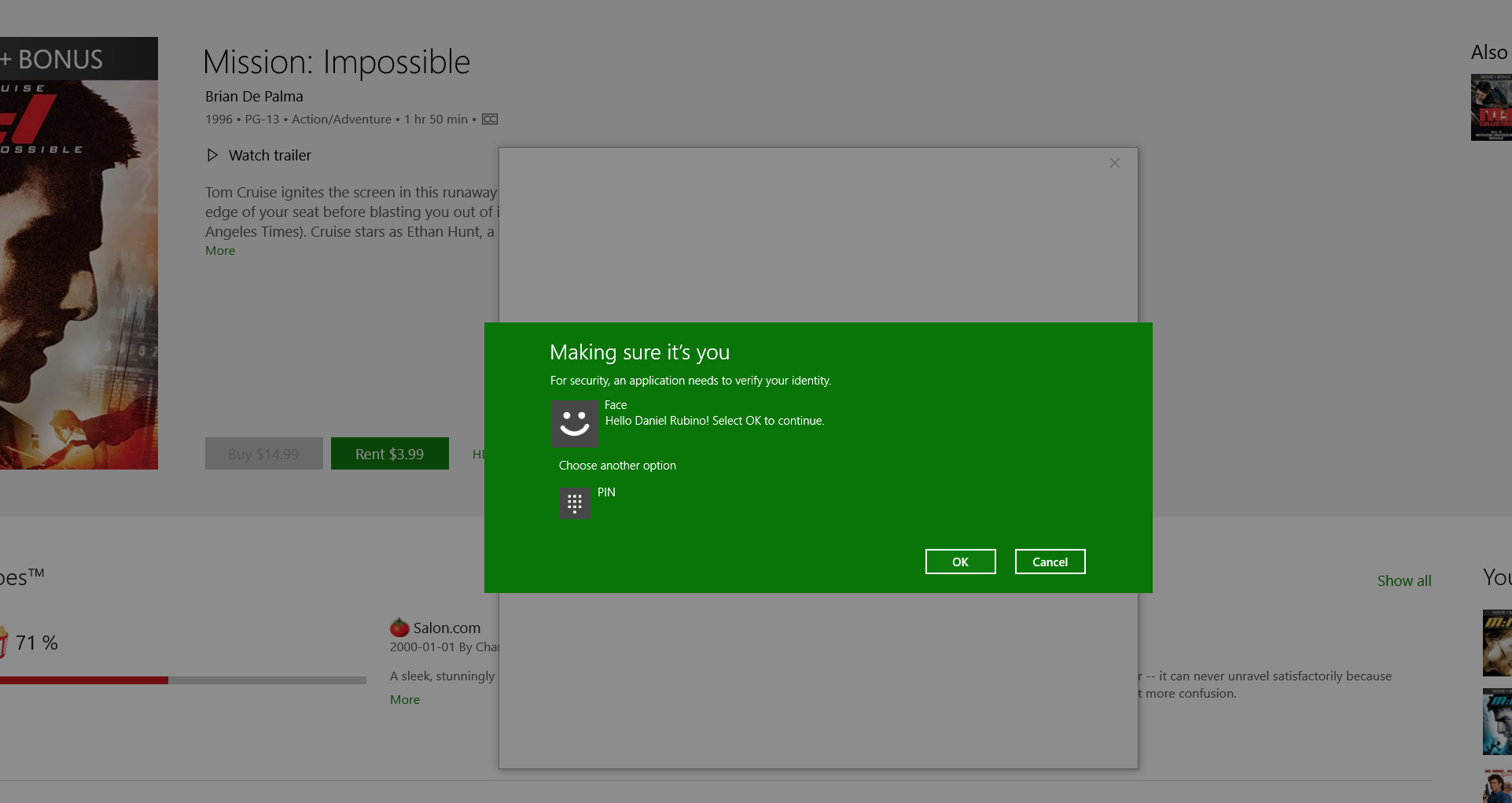
It is more than just signing in to your computer too. Windows Hello, both for fingerprint and facial scanning, works for buying things in the Store. Like most marketplaces, Microsoft asks you to type in your password before you make a purchase (oddly, this cannot be yet overridden in settings). Instead of typing in your password, though, you can just swipe your finger or look into the camera.
How to set up Windows Hello facial recognition in Windows 10
Microsoft does plan to roll out Windows Hello to their Passport initiative, although details about that project are still unclear. Microsoft has also told me that at this time they do not plan to open up to third-parties meaning not to expect LastPass integration. That is a bit of a shame and hope some middle ground can be found, although they cite security concerns as the reason for the decision.
What happens to my Windows Hello data?
An obvious question in this day and age is what does Microsoft do with your facial mapping data or fingerprints? The short answer is nothing because they do not have access to it. The biometric data collected by Windows Hello lives on that PC and not in the cloud. In fact, it never leaves your computer. This inability is why users of multiple computers will need to set up Windows Hello on each device as it does not roam with your profile. The actual data is encrypted on your device, and even if a thief stole your computer and managed to reverse-engineer the encryption, they still could not use the data to unlock any other computers (or at least would find it extremely difficult to do so).
All in all, I find Windows Hello extremely useful. Using a RealSense camera makes you feel like you are in the future as the computer winks at you once you are recognized, unlocking your PC to do business. In an age where time is important, shaving those few annoying seconds – especially if you enter the password in wrong – lowering your stress level and making you more efficient.
Even more interesting is the prospect of Windows Hello coming to Windows Phones, something that is expected this fall. This is cool stuff, folks.
Stream Xbox games (Restrictions may apply)
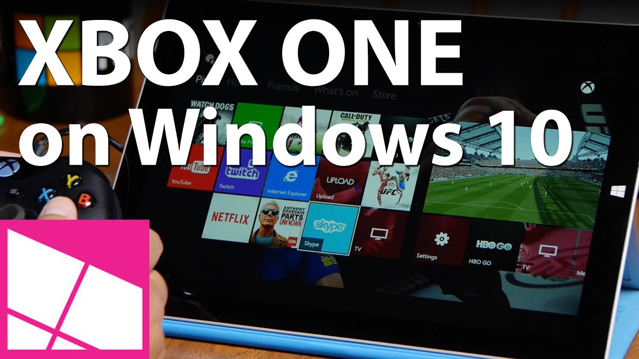
One feature that sounds amazing on paper but is a bit of a letdown is Xbox game streaming. The idea here is that you can stream any Xbox One game to a PC, so long as you are on the same network.
The system is very easy to use. Launch the new Xbox app, which is excellent by the way, connect up to your Xbox through the app and enable streaming. With an Xbox controller connected through USB to your PC, you can control and play games from your Xbox.
Being able to play Peggle 2 on my Dell XPS 13 laptop? Just awesome.
Xbox One game streaming is awesome. But it also monopolizes the console and your favorite media might not be available.
What is not great, however, is that game streaming means you are mirroring your Xbox One. This renders the Xbox useless for anyone in the living room as all they see is someone playing a game remotely. If you run cable TV through your Xbox, you cannot even watch it.
Sorry married couples, but will still need two Xbox Ones if you truly want to be able to play games while your spouse channel surfs.
You also have to be on the same network due to bandwidth concerns, so no, you cannot use this at work (unless you can work from home). Moreover, if you are in the U.S. forget about streaming media like cable TV or my beloved UFC TV app due to media rights issues.
I get we are early stages of this technology, and I suppose dual-streaming (one to the TV, the other to a PC) is possible. For now, unless you are alone in the house game streaming may be less exciting.
I still find uses for game streaming e.g. in my office with three displays. I do not have an Xbox in here, so this means in the middle of the day I can take a break and play a quick game while I still monitor Slack and Twitter. That is damn cool.
However, for now, I am afraid game streaming will find a limited audience.
How to stream Xbox One games to Windows 10
Continuum
As explained earlier, Continuum is one of the new features that people with 2-in-1 devices can leverage to make better use of that hardware. At its essence, Continuum changes the OS from a tablet usage scenario to a desktop version and vice versa.
The OS in tablet mode ditches all mouse and opts for a full-screen experience. On the taskbar, Cortana shrinks to just an icon but takes up the left side of the display when accessed. There is also a nice back button reminiscent of Windows Phone that lets you switch back to the previous app. The previously mentioned Task View is there as well to let you quickly manage running apps.
The Start Menu also grows into a Start Screen in Tablet mode. It is not quite as expansive as the version of Windows 8.1, which had an infinite sideways scroll. Instead, you are left with a finite space for your Tiles. If you need more apps, you need to tap the hamburger button near the top left corner.
There are also some nice gestures like swiping from the left to access Task View and swiping from the right to bring up the Action Center for notifications and quick toggles. Swiping down closes an app. All of these are dead simple.
In general, the tablet experience in Windows 10 is good but not great. It feels like Microsoft leaned heavily on improving the desktop over tablets and to be honest, that is understandable. However, I did not care for the hamburger menu and app list, which has a jarring refresh that makes you think you did something wrong. Touch elements are mostly right but in areas like the Store I found menu items a bit smaller than I would like, including tapping your photo for your account or swapping between store sections.
It feels like Microsoft leaned heavily on improving the desktop over tablets and to be honest, that is understandable.
Also, I find it odd that although this feature is called Continuum it is only referred to as Tablet Mode in the OS. I think this is a minor complaint though as obviously users will likely hunt for tablet mode instead of Continuum.
Windows 10 is also very smart about this whole desktop versus tablet mode. For one, you can override it at any time with a simple toggle in the Action Center. You can also have the OS ask you each time you add or remove a keyboard, or set a default so that it always changes or never changes modes. I think this let's leave it to the user is the right approach. The OS holds your hand through the process in an elegant and smart way.
Ironically, of all my Windows 10 devices the Surface 3 and Surface Pro 3 have had the most issues with the update. Nothing major but just odd quirks related to Continuum and orientation switching. I am not too concerned though and I plan on adding Windows 10 to my Surface 3 LTE tonight as soon as it is available.
The Good, Bad, and the Ugly
Now that I have covered the main new features of Windows 10 let me talk about what works and what doesn't.
The Good: Insider Program
Microsoft has done an admirable job of fixing the mess from Windows 8 and 8.1. However, instead of just guessing at what people wanted they did something unique: they crowdsourced data. The Windows Insider program was set up to let users get an early look at what Microsoft was building. However, instead of just being onlookers, Microsoft built in ways for users to rate features, submit recommendations, and vote on new ideas. This program is not to say that Windows 10 is 100 percent determined by nerdy power users. Microsoft did have ideas and plans, but they used user feedback to help guide them along the way.
The Windows Insider program, which does continue after today, is a brilliant move, and I think it has paid off with Windows 10. The OS feels polished, is very fast to launch apps, and is more stable. Not only have they fixed things, but they added useful features as well e.g. Cortana, Action Center, Windows Hello and more.
How to switch between fast and slow rings on the Windows 10 Insider Preview
The Good: All the new Windows 10 features
Whether it is Cortana, the new Start menu, the Action Center or even the overall look, Windows 10 is an astonishing upgrade. I mention how I was not too enthused months ago and yet I now find it hard to go back to Windows 8.1.
Perhaps a better way to say this is I do not find much in Windows 10 poorly thought out, ugly or lacking a real function. Many of the multitasking features and the new Start menu are true tools to help you work.
Microsoft is right. Windows 10 is for people who do.
The promise of universal Windows apps, integration with other Microsoft services, and Xbox game streaming are all fascinating consumer features that I think real people can use. True, I find Xbox game streaming a bit of a novelty but it is an impressive novelty that I think will get more robust in the future.
The Good: Windows 10 is a platform and service
At the very beginning, I outlined how Windows 10 being a service was a dramatic change from the past. We can talk of 'final' builds but in reality there is no such thing. Windows 10 is now just Windows, and it will constantly upgrade and improve through OS and Store updates. This approach is radically different from the giant but infrequent OS updates in the past.
The fact that Microsoft can constantly develop this OS, especially with the continuation of the Windows Insider program, means this OS is just going to get better. Even if you have issues today, I feel confident that I do not have to tell you to wait six months. A few weeks should do it, at most.
Microsoft is a consolidated, lean, mean machine, and Windows 10 reflects this transformation.
Finally, with Windows 10 going to phones, wearables, the Xbox One, HoloLens, and mini-computers with no displays, the OS is one of the biggest platforms ever to launch. The potential here is massive, and it is thrilling to see what comes next.
The Bad: Upgrade or Fresh Install?
In experimenting with doing an upgrade from Windows 8.1 to Windows 10 versus a fresh ISO install, I have found that each has advantages.
Upgrades are nice since they keep your working drivers in place if Windows 10 ones are not yet available. When I did a fresh install on my Dell XPS 13 it took quite some time to get Cortana working by realigning speech recognition, language, and locale. Downloading the right speech language pack was particularly frustrating as it is so buried. Same with the microphone. On my Lenovo Yoga 3 Pro, I have not yet figured out how to get it to recognize Continuum after a clean installation.
Surprisingly, my Lenovo X1 Carbon, Dell XPS 27, and HP Spectre x360 were relatively fine. I did have to install drivers manually with the X1, but Lenovo now has all of them Windows 10-ready. Dell has plenty of Windows 10-ready drivers for their 2015 XPS 13 laptop, but my 2013 XPS 27 so far has nothing.
In short, I ran into fewer problems when I did an upgrade than a clean install. However, there is something to be said about doing a fresh install and overall, performance seems a little bit better. Plus, you get that nice cozy feeling of a clean computer. Just try to download the driver packs before you wipe your computer as you can save yourself some energy later.
- How to prepare your PC for the Windows 10 upgrade
- How to install Windows 10 apps to an external drive
- How to upgrade Windows 7 to Windows 10
In the end, I would not put too much emphasis on either option as the update process has been pain-free with no crashes or nerve-racking scenarios. From cursory reports and our experiences, as you would expect, computers with older hardware or AMD graphics have more driver than machines from 2015. OS updates are never a 100 percent safe adventure, but Windows 10 does go a long way in working out of the box.
The Ugly
Nothing.
I know that probably seems too generous. However, I cannot find any show-stopping reasons why if you are on Windows 7 or Windows 8 you should not upgrade. To get Windows 10 to run everywhere, Microsoft had to strip it down, meaning it should run very well on older hardware. This update is not Windows Vista with the graphics-intensive Aero Glass situation.
Additionally, whatever issues I have pointed out in this review are likely to be gone in the coming months. We know 'Threshold wave 2' is due in the October-November timeframe, which brings browser extensions and further low-level OS optimizations. Moreover, with WaaS, we should expect a steady stream of updates and new software in the Store.
Windows 10: The Verdict
I have spent a considerable amount of time with Windows 10 these last few months. I am now running the OS on six PCs all without any major issues. On the contrary, I love the experience. Windows 10 is delightful. It is fun. It is smart.
What an exciting thing to see Windows 10 arrive and to see people gush about Microsoft's latest creation. Because this time, it is 100 percent warranted
Microsoft has finally found its way again and they are just getting Started. Welcome back, folks. Now get doing!
- Windows 10 Support Forums at Windows Central
- Windows 10 Main News Page
- Windows 10 Tips, Tricks, and How-tos

Daniel Rubino is the Editor-in-Chief of Windows Central. He is also the head reviewer, podcast co-host, and lead analyst. He has been covering Microsoft since 2007, when this site was called WMExperts (and later Windows Phone Central). His interests include Windows, laptops, next-gen computing, and wearable tech. He has reviewed laptops for over 10 years and is particularly fond of Qualcomm processors, new form factors, and thin-and-light PCs. Before all this tech stuff, he worked on a Ph.D. in linguistics studying brain and syntax, performed polysomnographs in NYC, and was a motion-picture operator for 17 years.
