It's been almost seven months since the last Windows 10 feature update was released to the public, and we're due for another big one. After some early issues, Microsoft today will begin rolling out the Windows 10 October Update to the world again, bringing with it new features, enhancements, and more to millions of Windows 10 PCs.
Microsoft has gotten very good at making sure these big new updates don't change much on the surface, ensuring users won't be freaked out by huge new changes once the update is installed. The changes will only become apparent once you start digging a little bit. On that note, we did some digging to find the most significant new changes and features available in the October 2018 Update.
To be clear, the big issue that caused Microsoft to initially pull the update has been fixed, meaning when the update reaches you, you won't need to worry about losing your files when the update eventually installs itself.
- Video walkthrough
- Desktop and File Explorer
- Cortana and Search
- Your Phone
- Snipping Tool
- Cloud Clipboard
- Microsoft Edge
- Windows Settings
- Miscellaneous
- Conclusion
Video walkthrough
Reading not your thing? Check out our in-depth video walkthrough showcasing all the noteworthy new changes and features in the October 2018 Update.
Windows 10's desktop and File Explorer
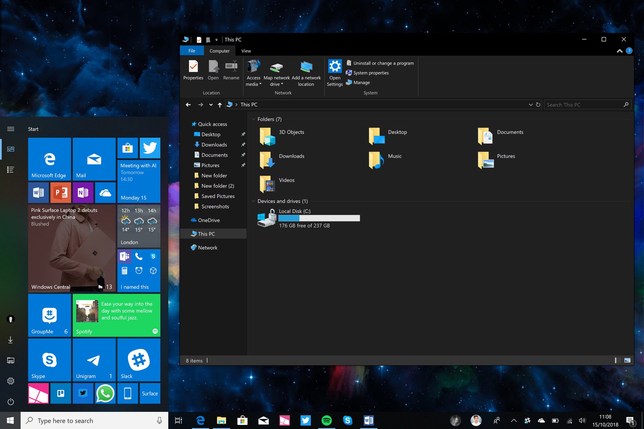
Starting with the October 2018 Update, you can now name live folders in the Start menu. In the past, you could not name folders you created in Start. It works just like naming a group of tiles, you drag one tile over another, create the folder, and a text box at the top of the folder gives you an opportunity to name it.
There's also a new context menu design that appears in some apps and text boxes. This is the best take on a context menu Microsoft has ever put into Windows, but unfortunately, it's not the only context menu available in the OS. Microsoft's context menu dilemma still exists, meaning you'll find different context menu designs all across the system when in different apps.
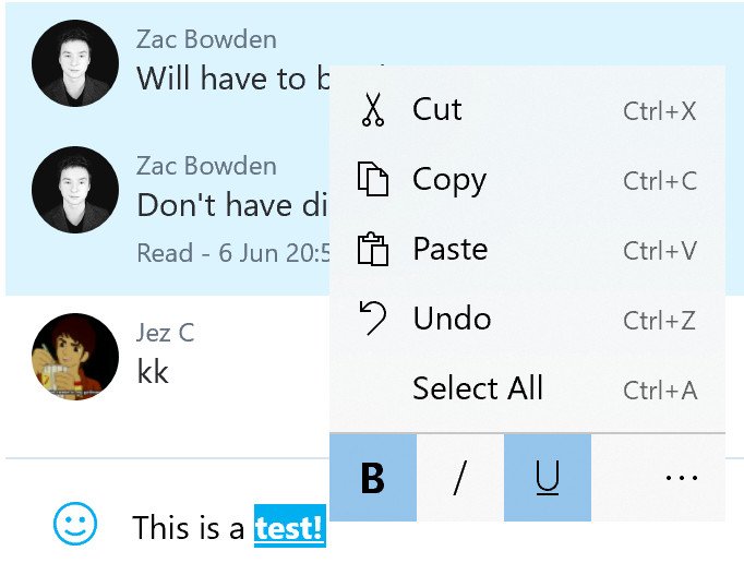
The new context menu is animated and features Acrylic Blur effects that make it look beautiful when opened. The other nice design change with these context menus is that they also feature icons next to all the listed options. I also love how this context menu design provides formatting options when opened in a text field where text supports formatting. So instead of having to remember the different keyboard combinations for making text bold or italicized, you can now right-click and press a button that does it for you.
Microsoft also updated the File Explorer with a new dark mode UI, which brings it in line with other built-in system apps that support dark mode. This is a change you'll appreciate if you use your PC late at night and don't want your retinas burned to a crisp by opening File Explorer to grab a file. This also makes the context menus on the desktop dark, which is a nice touch.
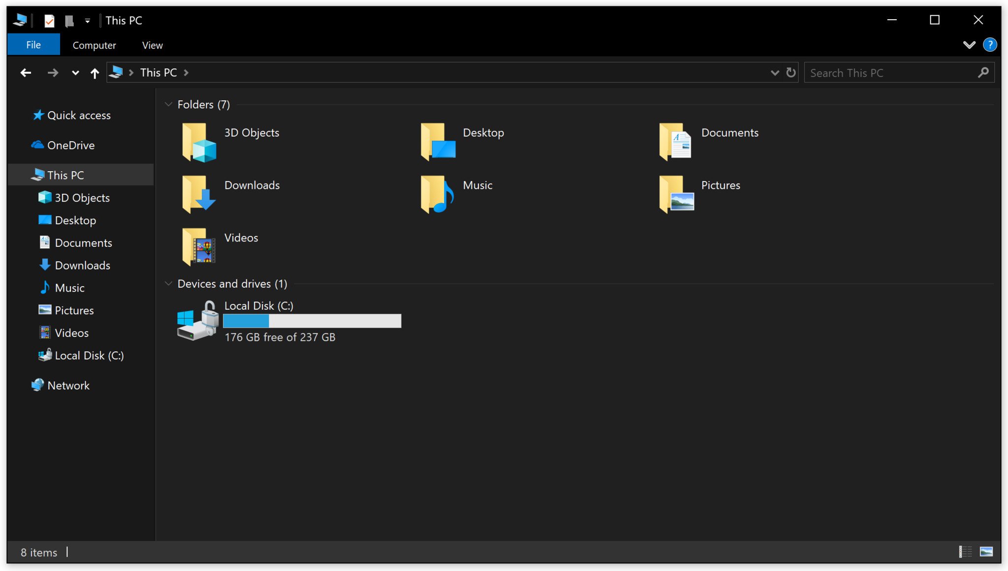
Admittedly, File Explorer's new dark mode is not perfect. I think it looks nice on the surface, but many have expressed their dislike of the different shades of gray used to achieve the dark looks. Some also don't like how the icons appear when dark mode is enabled. I don't have an issue with this. What I do have a problem with is how dark mode isn't consistent across all the inbox apps, and more importantly, how it isn't applied to all of File Explorer.
You'll notice that even with dark mode enabled; there are still several parts of File Explorer that simply aren't dark. The copy dialog, for example, is still blindingly white, as is the file properties window. None of these areas have been themed to match dark mode, making them even more jarring when messing around in the File Explorer with dark mode switched on. I wish Microsoft would have spent more time theming every part of File Explorer with dark mode.
The new context menu design is great, but it's only used sparsely throughout the OS. File Explorer's dark mode is a promising start, but Microsoft needs to do more work to "complete" it.
Windows 10's Cortana and Search
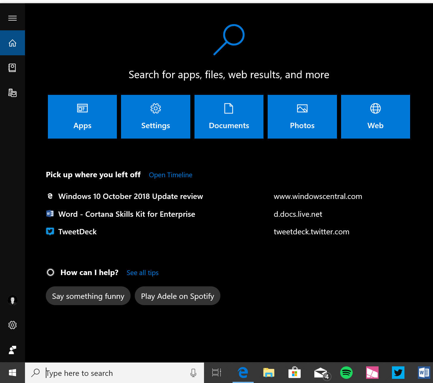
The search user interface is now much wider and emphasizes search over Cortana being a personal assistant. In the previous Windows 10 update, Microsoft outright ripped out the Cortana "glance view" feature, which emphasizes Cortana's virtual assistant side of things over search. In the October 2018 Update, Microsoft is continuing to make Cortana more search orientated.
Now, Cortana's UI is much wider and gives the user the option of searching specific categories within the OS. So upon opening search, you'll find five big boxes that highlight search within Windows. You won't even see the Cortana icon anymore; it's now a search glyph. When searching, you'll be presented with a UI that's split down the middle; on the left are your search results, and on the right are more details about your specific searched file or web result.
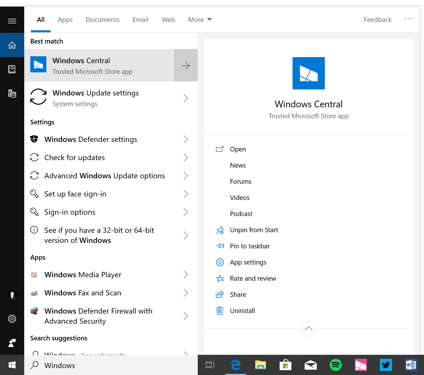
I love the new search UI, but unfortunately, it doesn't fix Windows 10's inconsistent search problem, which sees users search for something but have other things come up as results instead. For example, sometimes, the user can search for an app, but instead of that app being the top result, a similar app will be the top result instead. Microsoft is aware of this problem and is working on improving search in a future update.
Below the search categories in Cortana's Home is a bigger emphasis on Timeline. You'll see your last three Timeline activities, allowing you to pick up where you left off straight from search instead of opening Timeline to do it. Below that is Cortana, which suggests commands you can ask at the click of a button. There is not really any Cortana UI in Windows 10 right now, which is weird. For now, though, Cortana's presence in search is very minimal, and rightly so, as many didn't like Cortana's dominance in the search area anyway.
Windows 10's new Your Phone app

Ever since Microsoft gave up on its own mobile platform, the company has been obsessed with ensuring Windows PCs are best friends with Android and iOS. With the October 2018 Update, that effort takes a leap forward as Microsoft begins to integrate your phone with your PC with a new app called "Your Phone."
Microsoft has big ambitions for this app, with the eventual goal of being able to control your Android phone straight from your PC. Right now, it only works with Android phones, but Microsoft promises that iPhone functionality will be coming at some point, albeit in a limited state thanks to Apple's limitations on what third-party developers have access to on iOS.
Using the Your Phone app, Android users can hook up their phones to their PCs and share photos and SMS messages between the devices. This means that you can start and respond to SMS messages you've sent on your phone directly on your PC. The SMS sync capabilities work OK, but it could be faster. It takes a few seconds for messages to come through in the Your Phone app once the text has landed on your phone, and sometimes it can take up to five seconds to send an SMS using the Your Phone app, which makes things feel sluggish.
I've also noticed that sometimes the Your Phone app will stop sending notifications when new SMS messages come through after a period of time, and that the notifications themselves, when they do come through, aren't actionable, meaning I have to open the app to respond to a text rather than just responding to it directly from the notification. These are all issues that can be solved via app updates independently from the OS.
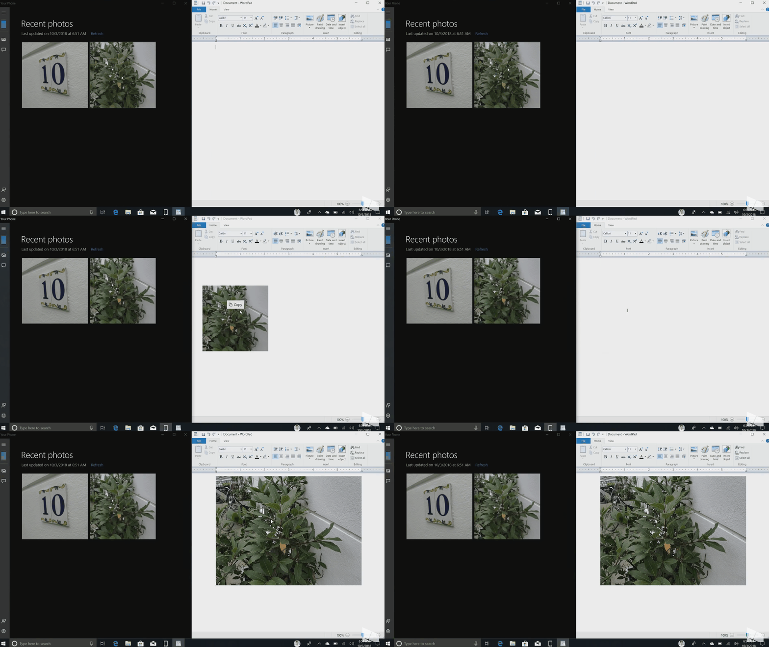
The other Your Phone feature that works right now is the ability to see and share the last 30 photos taken on your phone, directly on your PC. The photos-sync function in Your Phone works way better than it should. Your photos show up as if they are locally available on your device, and you can edit them, share them across apps, and even drag them out of the Your Phone app and into other apps or the desktop. It works like magic and is super simple.
No longer do you have to wait for photos to upload to the cloud before you can download them onto your PC or rely on a cable to plug into your PC so that you can transfer photos to it. It's worth noting as well that the app features a pretty UI, with a straightforward layout with Your Phone's features in the left sidebar and content taking up the rest of the app.
Your Phone in the October 2018 Update is a good start. There is room for improvement, which is likely why Microsoft is still tagging the app as in preview in some areas, but overall, the experience is OK. I am looking forward to Microsoft building upon the foundations it has laid out.
How to setup the Your Phone app
The new Snipping Tool in Windows 10
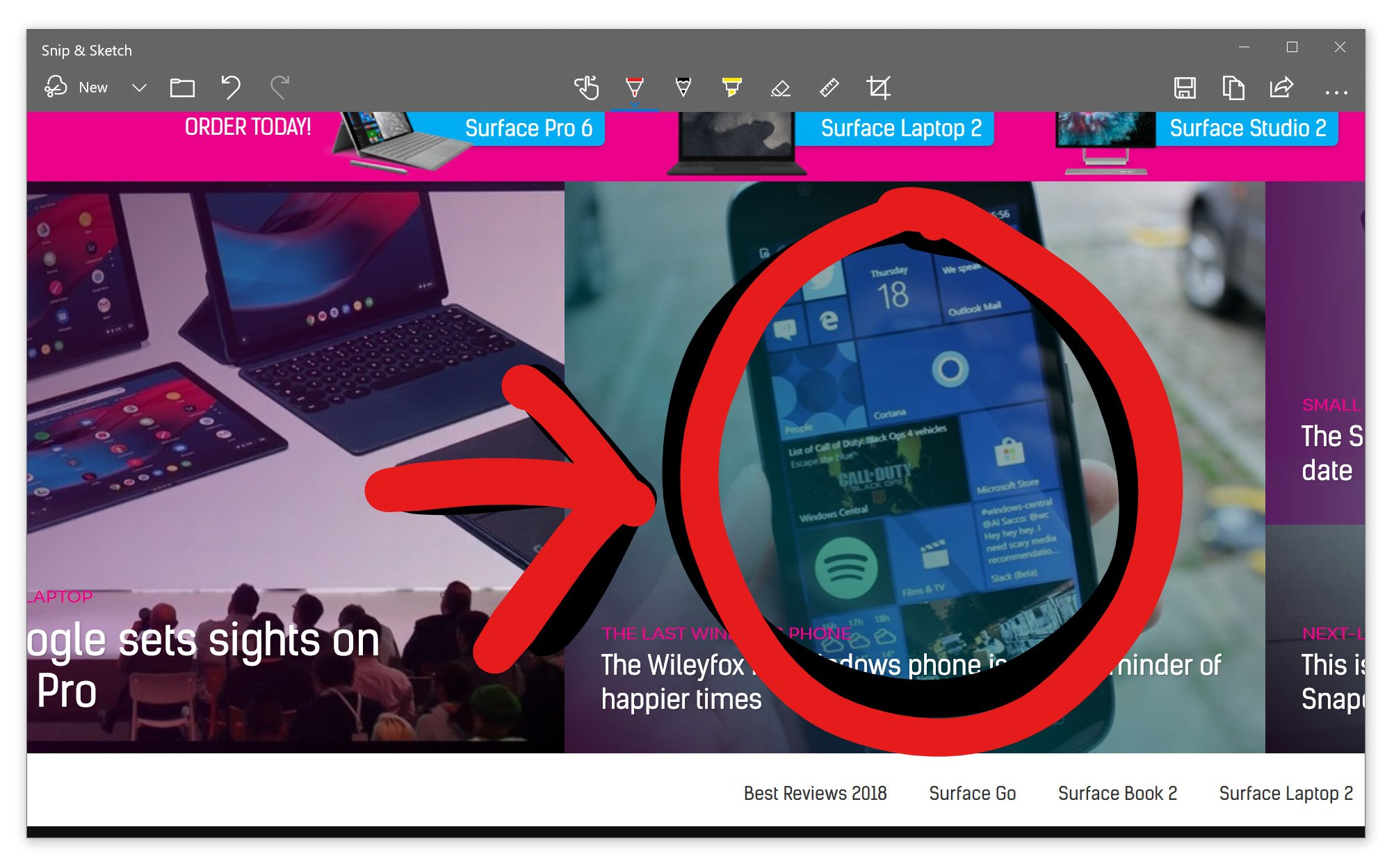
If you're a fan of screenshotting stuff within Windows 10, Microsoft has reworked that entire experience; gone is the old snipping tool and in its place is a new, universal snipping bar that's accessible using the Windows key, Shift, and S. It simplifies the screenshot experience, providing you with three screenshotting methods: rectangular snip, freeform snip, and full-screen snip.
Once the screenshot is taken, Windows will pop up a notification saying it has automatically been added to your clipboard, meaning you can instantly paste it into a social network, app, or location. But, if you click the notification, it'll take you to a dedicated screenshotting app that allows you to edit it further with ink.
This doesn't replace the straightforward WIN + PrtnScn key combination that takes a full screenshot and puts it on a dedicated screenshots folder in your Picture area. But it does replace the WIN + Shift + S key combination that was used for the old snipping app. You can set the new snipping experience to show up by pressing PrtScn on your keyboard if that's something you'd prefer, which I recommend everyone does as it makes invoking the new snipping bar a lot easier.
Windows 10's new Cloud Clipboard
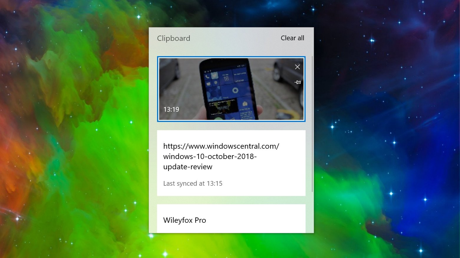
Microsoft's new clipboard experience in the October 2018 Update is arguably one of this release's biggest new features, even though it's off by default. Microsoft has built a new clipboard history feature into the OS that when enabled will save everything you've copied in a session for pasting later. So, no longer will Windows immediately forget the last thing you copied when you copy something new.
This new clipboard function can be accessed at any time using the WIN + V key combination, and once invoked you will be able to scroll through everything you've copied in that session. In addition to merely remembering everything you've copied, it also has the capability of syncing that copied data to the cloud, allowing you to sync data across all of your devices that are logged in with the same Microsoft Account.
That's where the "Cloud Clipboard" name comes in. If you enable the syncing capabilities in addition to the history function itself, you will be able to copy text and images on one device and paste it on another. Microsoft is aware that some users may not like the idea of syncing everything you copy to the cloud, which is why this functionality is off by default.
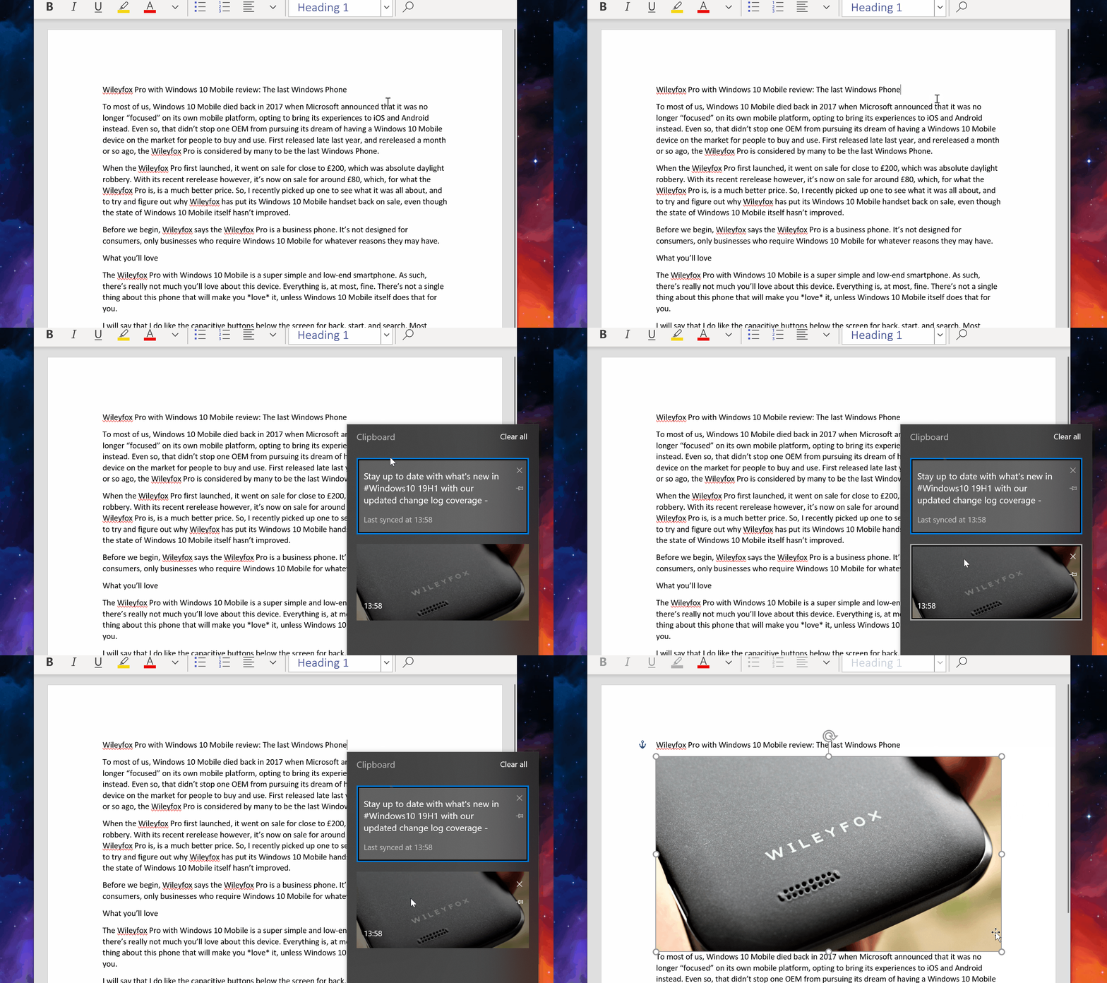
Microsoft will also be bringing the Cloud Clipboard to SwiftKey on Android in the future, meaning you'll be able to copy and paste content between not only Windows devices, but your Android devices as well.
The clipboard will only remember what you've copied per session, meaning if you log out or restart your PC, the clipboard will be empty when you log back in. There is a function that allows you to "pin" copied content to the clipboard, however, which will save it permanently until it's unpinned again. Pinning something you've copied will allow you to retain it in the clipboard even after a restart.
The most significant problem with this new feature is that it's utterly undiscoverable unless you've been told it exists. For one, it's off by default, and the switch to turn it on is buried in the Settings app. Even when it's on, there's no real obvious way to invoke it unless you know the key combination. Microsoft really needs to work on making this function more discoverable to users.
How to enable the new Cloud Clipboard feature
Microsoft Edge
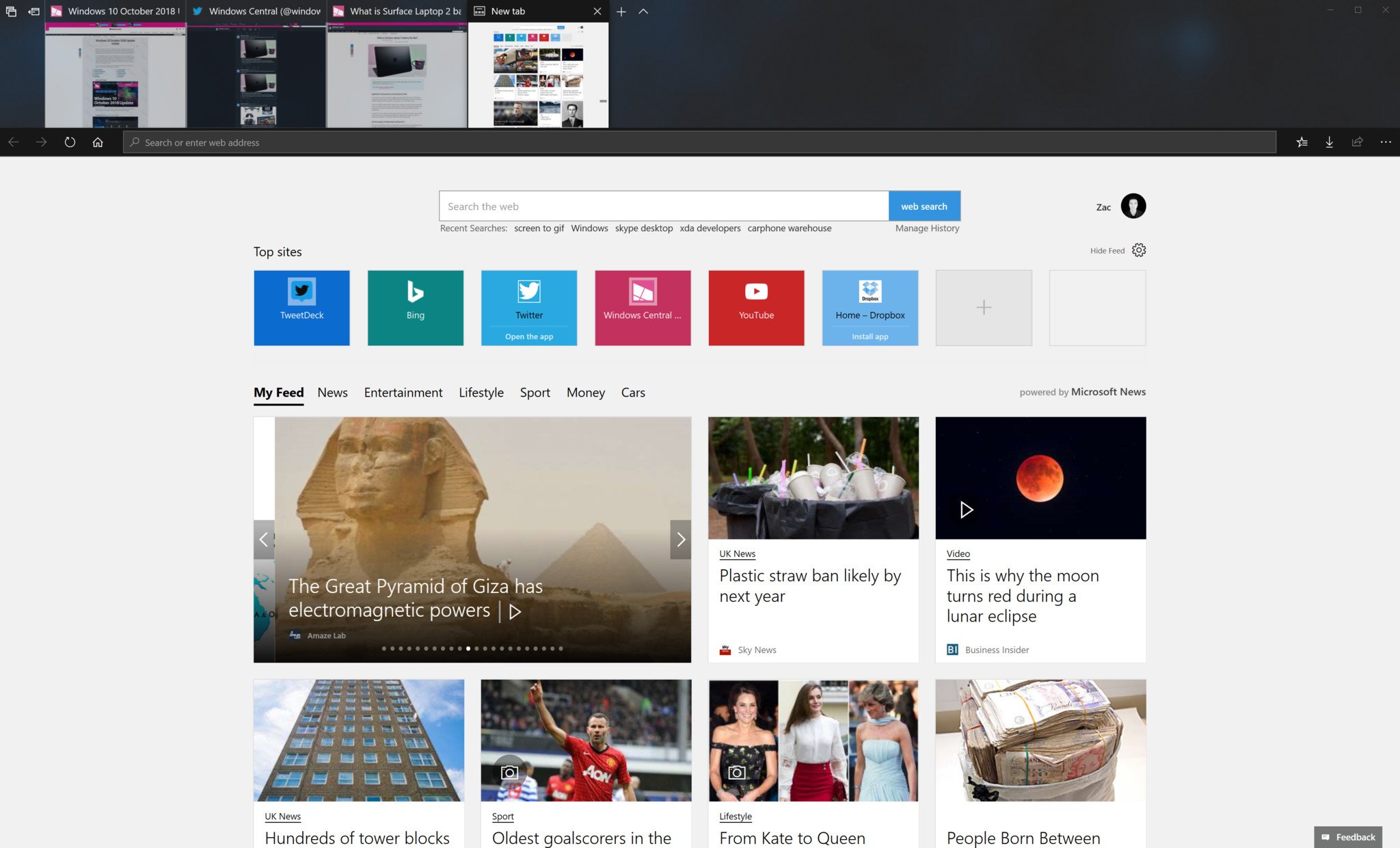
As is always the case with a new Windows 10 feature update, Microsoft added new features and improvements to Microsoft Edge. Most of the improvements are under the hood, with the only real differences on the surface being some minor UI changes and behavior tweaks.
Users can now finally customize which buttons show up along the right-hand side of the address bar. Previously, those buttons were inexplicably not customizable, but now, you can change them. You can hide them, or add more. There's also a subtle drop-shadow effect apparent across the tabbed, which is nice.
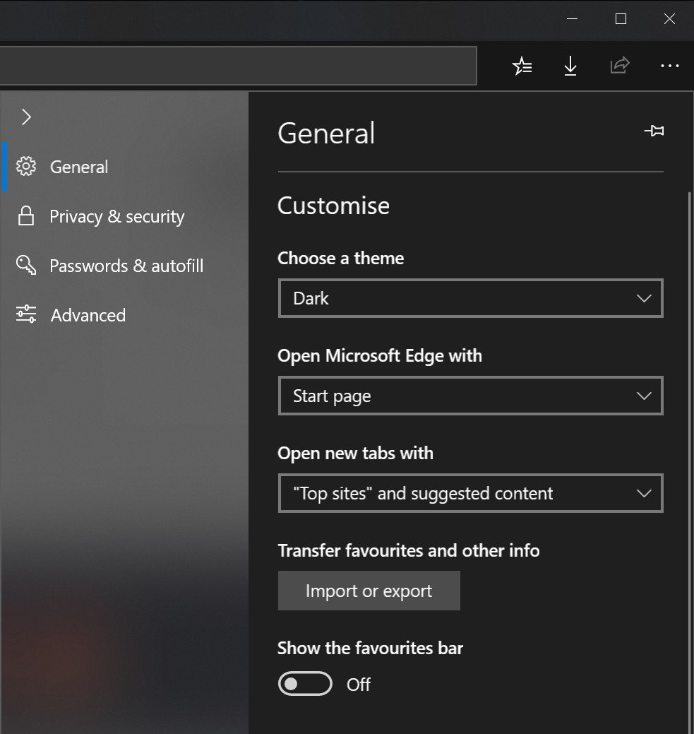
Microsoft also updated the "Settings and more" menu with an improved UI that also includes icons and reveal effects, which look pretty nice. The settings area itself has also been updated with the same UI you can find in the Hub area, meaning both areas now feature consistent designs that should make things less confusing.
Also new in Edge with the October 2018 Update is the ability to block websites from automatically playing audio or video content.
You can now mute tabs before any audio begins playing, even if there is no audio element on the webpage. Just right-click the tab, and select mute.
The PDF reader has been improved with minor changes, and the PDF icon has been updated with a much nicer looking one. If you tried Edge when Windows 10 first came out and didn't like it, try it again. It's improved two-fold since it's initial debut.
Windows 10 Settings
There are more settings than ever in the Settings app in the Windows 10 October 2018 Update. Microsoft has continued to add more of its legacy Control Panel into Settings, and this time sound settings are the latest to be ported over. You can customize all your system sound settings directly in the Settings app, including setting your default audio source for input and output.
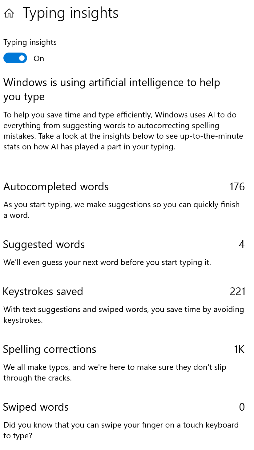
Microsoft added a new "typing insights" feature into the Settings app that will keep track of all your typing habits and data, just like SwiftKey does on iOS and Android. This is off by default, but once enabled, you will see typing statistics such as autocompleted words, suggested words, keystrokes saved, and spelling corrections.
Windows Defender has been renamed to Windows Security in the Settings app, and the Windows Security settings app now features Fluent Design in some areas. Microsoft has also given Delivery Optimization its own category underneath Windows Update. Previously, it was buried within the Windows Update area.
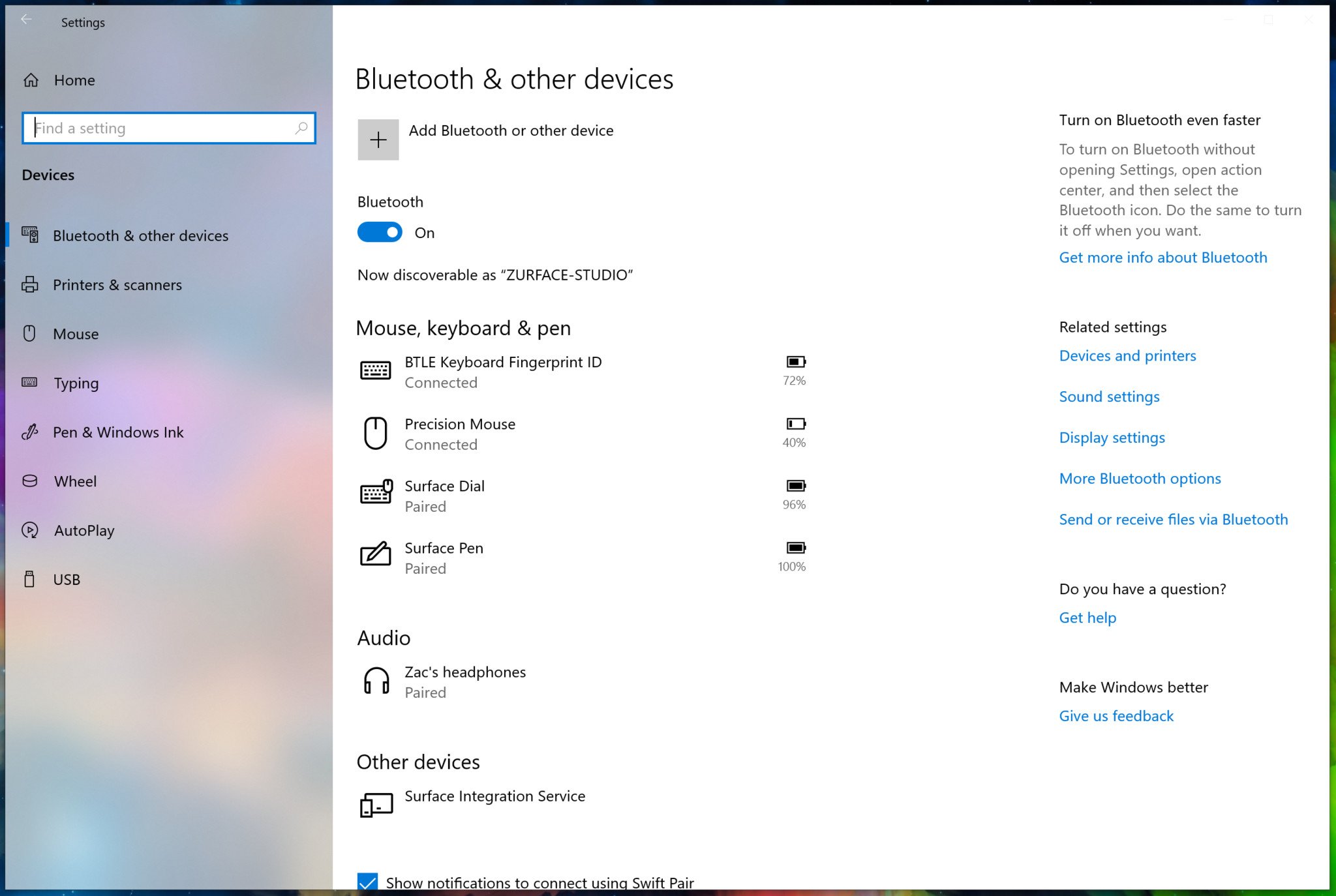
Bluetooth devices will now finally also show you their battery percentages when connected to your device. This is something that was available in the Surface app initially, but it's now built natively into Windows 10.
The Settings app also provides tips and tricks on its homepage and will even suggest questions being commonly asked in the sidebar of specific categories, providing quick and easy answers to those questions.
Lastly, and this is a big one, Windows Update now uses machine learning to determine when the best time is to install a new update. Microsoft continues to try and improve the system behind Windows Update so that it doesn't interrupt your workflow. Machine learning should allow Windows Update to figure out when you are and aren't using the PC, and slot in a good time to alert you that an update is ready. This functionality works in the background and isn't configurable. Since this is the first release to feature such functionality, it's not been tested all that much, so it's too early to determine if the Machine Learning is actually helping.
Miscellaneous changes, improvements, and notables
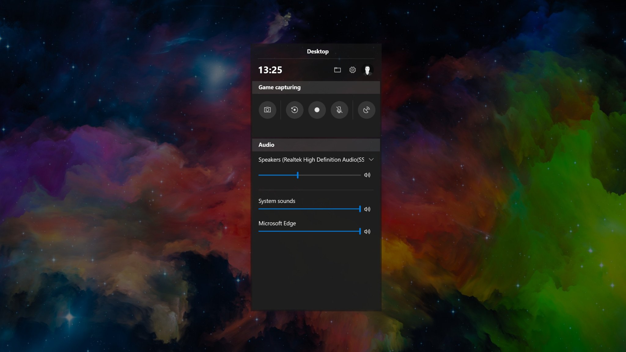
Game Bar has been updated with a new UI, which looks much cleaner. You can still stream straight to Mixer, and in a future update, Microsoft will be adding performance data to the Game Bar, as well.
The built-in Skype app for Windows 10 has been updated to the same version of Skype for desktop. This is version 8, meaning it comes with the new modern UI and more. In fact, you'll find that the Windows 10 app is faster than the desktop one, thanks to it using React Native.
App windows will no longer feature a colored accent around them by default. Now, the colored border is simply dark grey, which matches the drop-shadow effect behind windows, making for a cleaner UI. You can turn on the colored borders, but otherwise, colored borders are no longer the default behavior.
For reasons unknown, Timeline is still incredibly laggy. Animations are not smooth, and that makes using the feature feel sluggish and broken even on the highest-end PCs. I find that the lag is present mainly on devices with screen resolutions higher than 1080p. Microsoft really needs to fix this.
October 2018 Update final thoughts
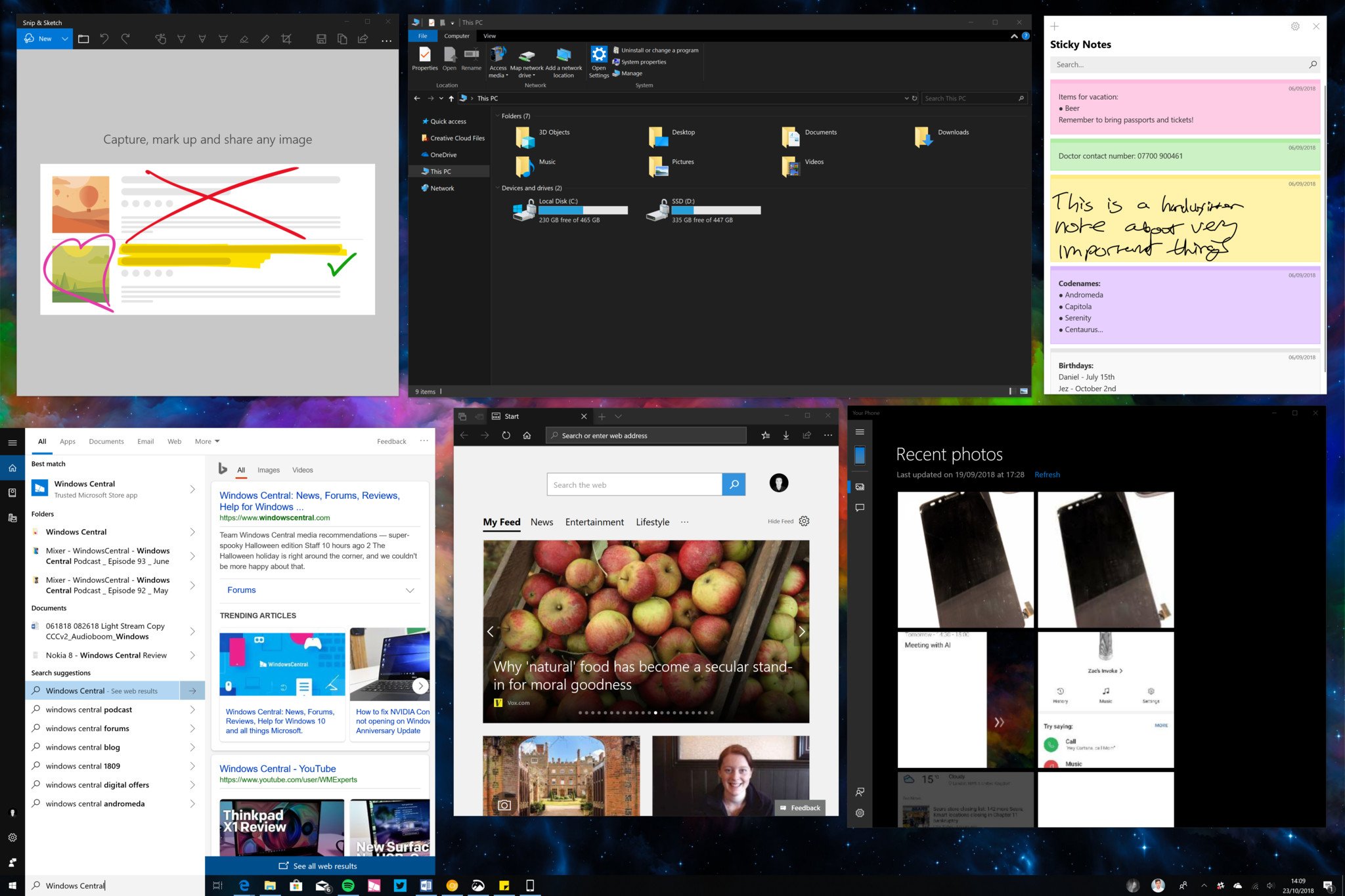
The October 2018 Update is not a major release. At this point, that's par for the course when it comes to "Windows as a Service." This is still a great update, though, packing lots of little changes and improvements that make using the OS more pleasant.
As should always be the case with a new release, the October 2018 Update is the best version of Windows 10 yet. It's more refined and well-put together. Microsoft has really nailed making sure these updates don't change everything all at once, as users hate nothing more than coming back to their PC and finding everything has changed.
Pros:
- Cloud Clipboard is awesome.
- Your Phone has potential.
- Edge is really good now.
- Lots of little changes add up.
Cons:
- Buggy at launch.
- Cortana is in limbo.
- Some features are undiscoverable.
- Timeline is (still) laggy.

