Windows 10 May 2019 Update review: Simple changes make Microsoft's OS run smoother
The latest Windows 10 feature update is here. This is our review.
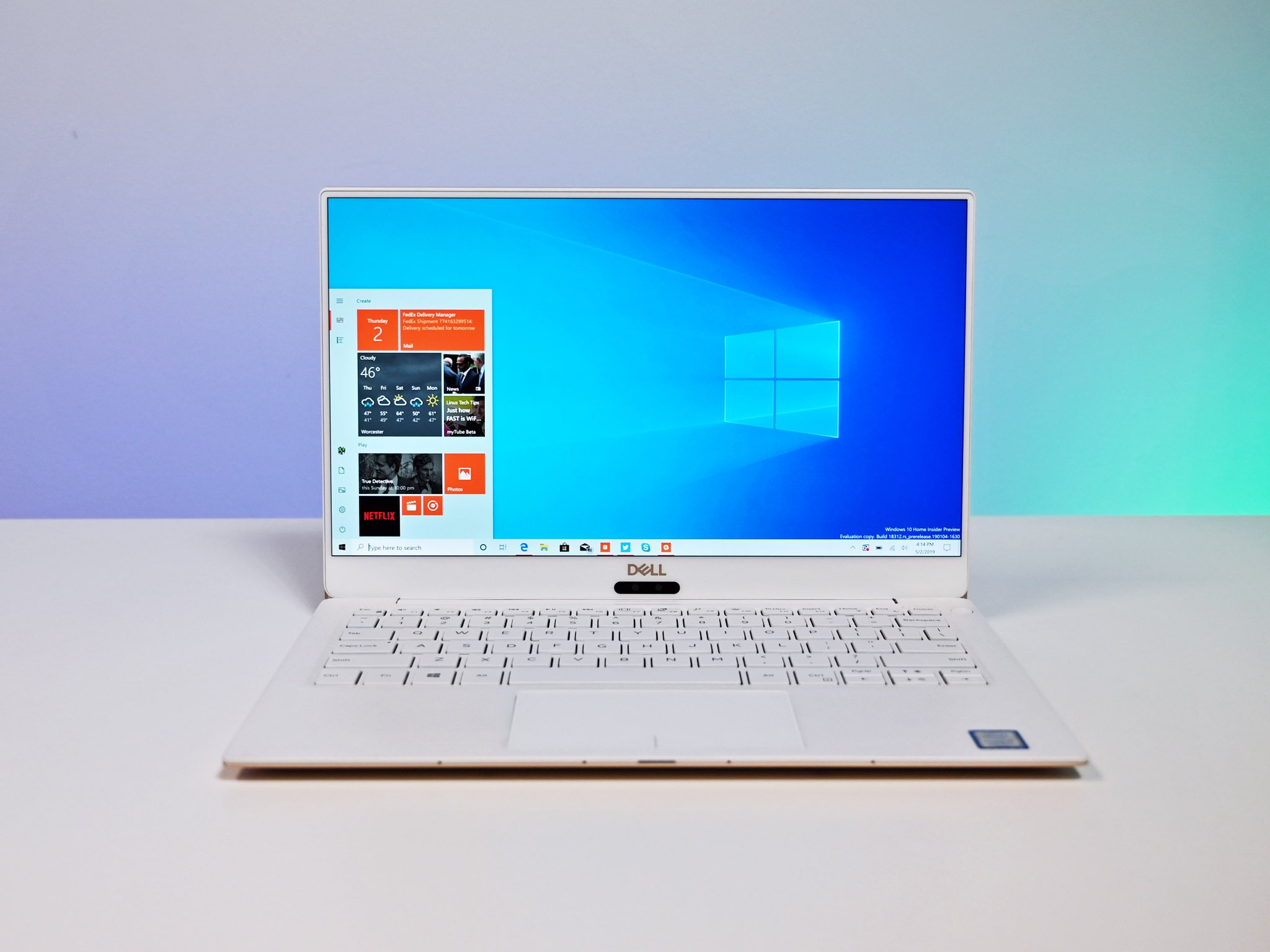
It's been eight months since the last "major" Windows 10 feature update started rolling out, packing lots of refinements and notable new features that make using Windows 10 more enjoyable. In May, another major update of the same caliber started rolling out to users across the world, featuring more enhancements and refinements to the overall user experience while introducing a couple of notable new features along the way.
Known as the Windows 10 May 2019 Update, this latest release from Microsoft is in no way a huge update, just like the previous ones before it. Upon upgrading, you'll likely notice very little has changed on the surface, and that's by design. Microsoft is not trying to force significant changes onto users, instead opting for more subtle updates that change things over time. Some of these changes are good, some not so much. Let's dive into it all.
We've updated this article in July with our latest thoughts and opinions on the new features available in this update.
From $139Bottom line: The May 2019 Update brings new changes and enhancements to Microsoft's OS, but not without some rough edges around search and Cortana.
For
- New light theme.
- More consistent UI.
- Windows Sandbox is great.
- Windows Update improvements are awesome.
Against
- Search and Cortana split is horrible.
- Cortana and My People don't support light theme.
- Video walkthrough
- Start, Taskbar, and Action Center
- Search and Cortana
- Windows Sandbox
- File Explorer
- Settings
- Windows Update
- Miscellaneous
- Conclusion
Video walkthrough
Reading not your thing? Check out our in-depth video walkthrough showcasing all the noteworthy new changes and features in the May 2019 Update.
Windows 10's Start, Taskbar, and Action Center
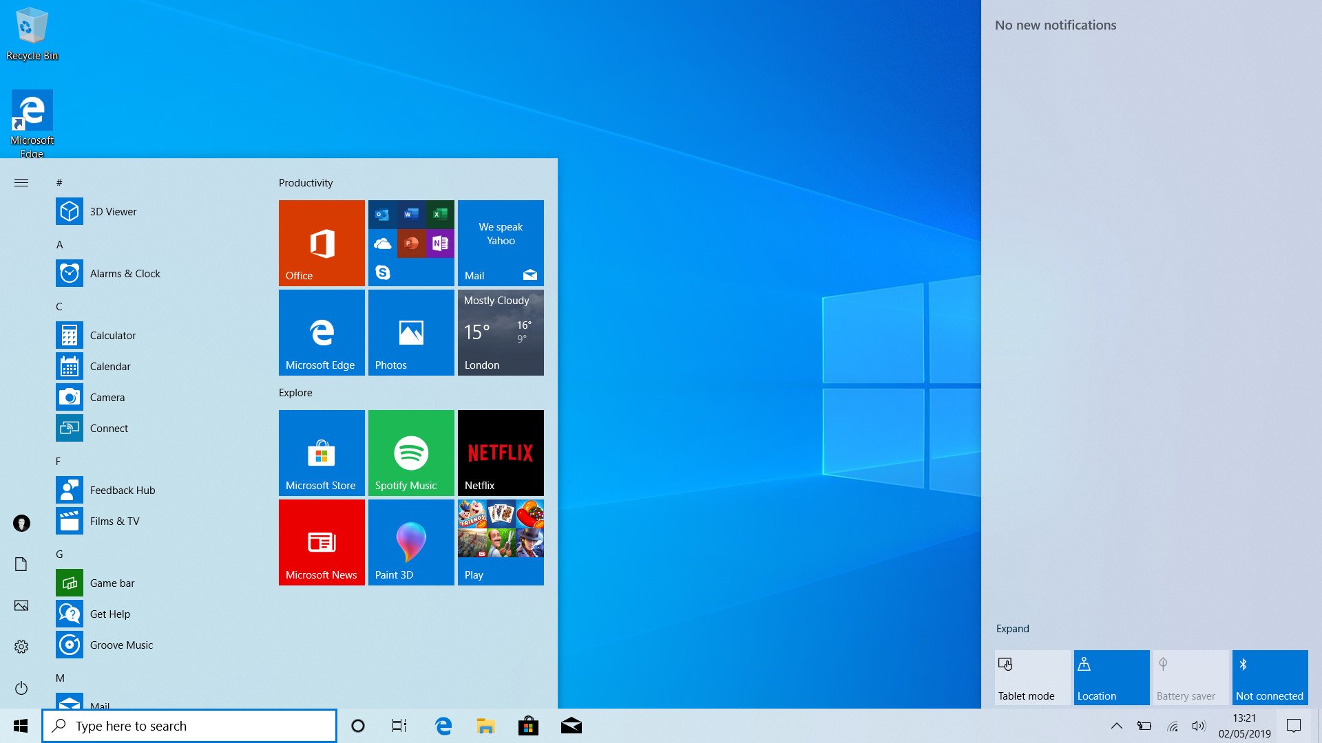
Starting with the Windows Shell, which includes things like the Start menu, Action Center, Taskbar, context menus, and touch keyboard, Microsoft is introducing a brand new "light" theme that changes these interfaces from using dark colors to light colors instead. This gives Windows 10 a fresh, modern look. While I think the dark theme is still the best, many prefer light user interfaces as they can look cleaner and more contemporary when done correctly.
Microsoft has done a great job with the new light theme. It's more or less consistent across the board, with only a couple of areas (Cortana and My People) that for some reason haven't been updated to support the new light mode. It's arguably much more consistent than the dark theme is, and that's because most of Windows 10's legacy user interfaces are light and haven't been updated to support dark mode. So, if you use the light theme, pretty much all the interfaces you interact with will be light.
The light theme isn't perfect, however. Some of the Fluent Design effects, notably the reveal effects, don't show up too well in places like the Start menu. This is odd because Microsoft has a specific version of reveal for light interfaces that uses a dark highlight instead. For whatever reason, Microsoft decided to not put much effort into making the Start menu use that version of the reveal effect, meaning you lose out on the cool highlight effects when using the Start menu in light mode.
Get the Windows Central Newsletter
All the latest news, reviews, and guides for Windows and Xbox diehards.
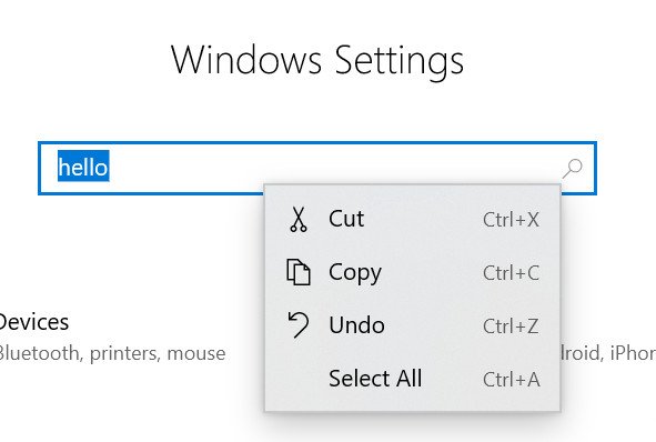
On the flipside, some Fluent Design effects stand out way more, such as the newly added drop shadows behind context menus. Speaking of which, context menus in Start, the taskbar, and other modern areas of the OS have been updated with Fluent Design, meaning they now feature things like acrylic blur effects, reveal effects, and drop shadows. This makes modern context menus look very clean and fit in nicely with the rest of Microsoft's Fluent Design System. It's still not consistent everywhere, but it's a good step forward.
Another notable change to the Start menu is a new default layout when clean installing or setting up a new PC with the May 2019 Update preinstalled. Microsoft has reduced the number of tiles that are pinned to the Start menu by default to just nine, under two groups instead of three or four. This makes the Start menu look way less noisy, and much more professional to new users just looking to get their programs up and running on a new PC.
All of the third-party tiles that promote apps in the Microsoft Store are all under one group now, which is excellent because Microsoft has also added the ability to unpin entire groups from the Start menu with a single click. If you right-click the header of a group, an "unpin this group" option will appear. Clicking it will simply remove all the tiles within a group, meaning you can get rid of those pesky advertisement tiles very quickly.
Moving onto the Action Center, Microsoft added a new brightness slider to the quick actions area. This is something users have been asking for since it was removed in the first Windows 10 release, and Microsoft finally listened. In addition, Microsoft updated the way users edit quick actions, now being able to do it directly from within the Action Center without being thrown into a separate settings window. You can pin, unpin, and move around quick actions directly from within the Action Center, which is a much better system than the previous one.
Windows 10's Search and Cortana
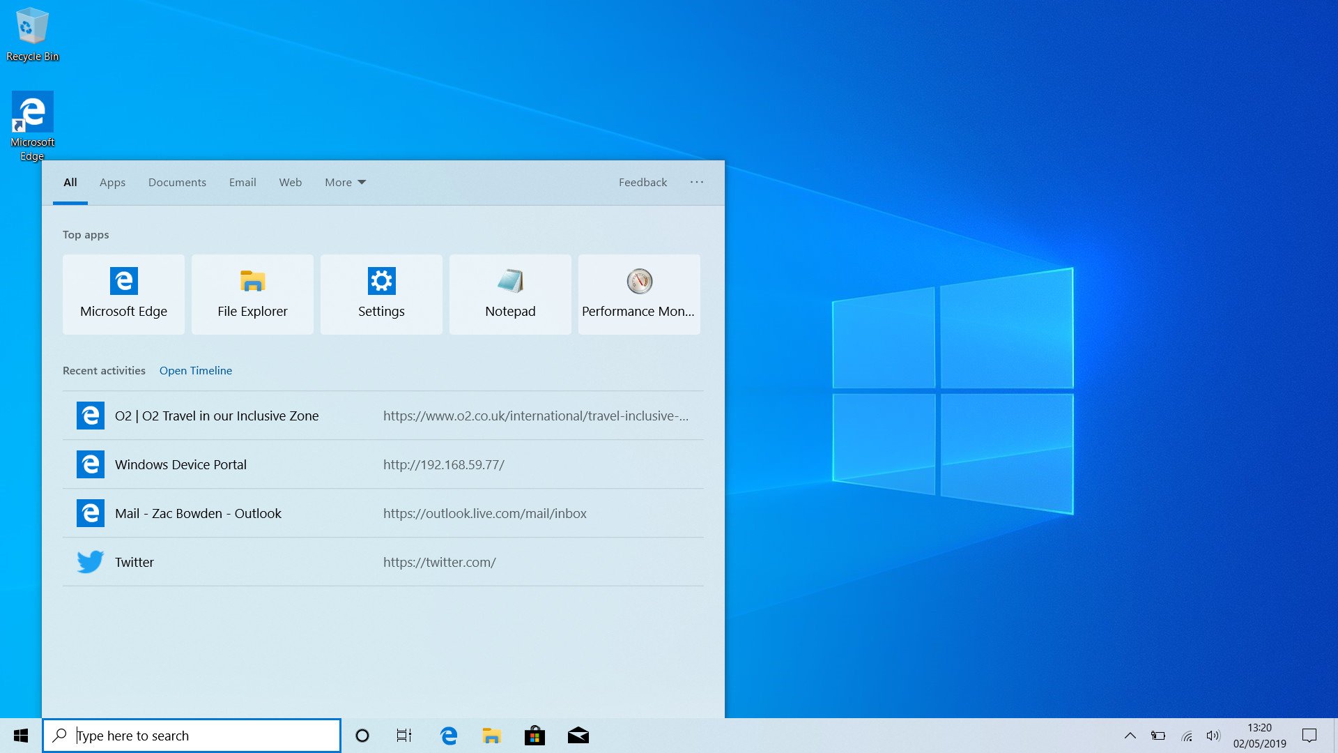
Microsoft made some big changes to the Cortana and search experiences in the May 2019 Update, and it outright split them in two. This comes after years of feedback from users being frustrated with Cortana's presence in the search UI on Windows 10. People just wanted to search without Cortana getting in the way, and now with the May 2019 Update, you can do just that. Unfortunately, the separation of these two features hasn't been elegant. In fact, I'd argue this is the weakest part of the May 2019 Update.
To be clear, search still works as search, and Cortana still works as Cortana. It's just that now these two features have their own separate buttons on the taskbar that take you into the same user interfaces that they had before. Zero work has been done to accommodate the fact that these two things are now standalone experiences. This leads to some confusing UI that doesn't make any sense, and it is mind-boggling as to how this was allowed to ship.
The search and Cortana split feels really unfinished.
The new Cortana experience isn't really new at all. It's the same old Cortana experience, which if this were three years ago wouldn't be much of a problem. But over the last few Windows 10 feature updates, Microsoft has pulled out things like the Cortana feed, which gave Cortana a little more substance than just being a button that lets you talk to your computer. Now that Cortana and Search are separate, Cortana has nothing in it. There's no upcoming weather forecast, no forthcoming meetings, no nothing.
What's worse, you can no longer type to interact with Cortana. The Cortana button on the taskbar simply invokes Cortana listening, and since there's no UI, there's nothing else you can do except access the Notebook or close Cortana. There's no text bar to type into, and that's because the search feature is the thing that retained the bar on the taskbar. Not Cortana.
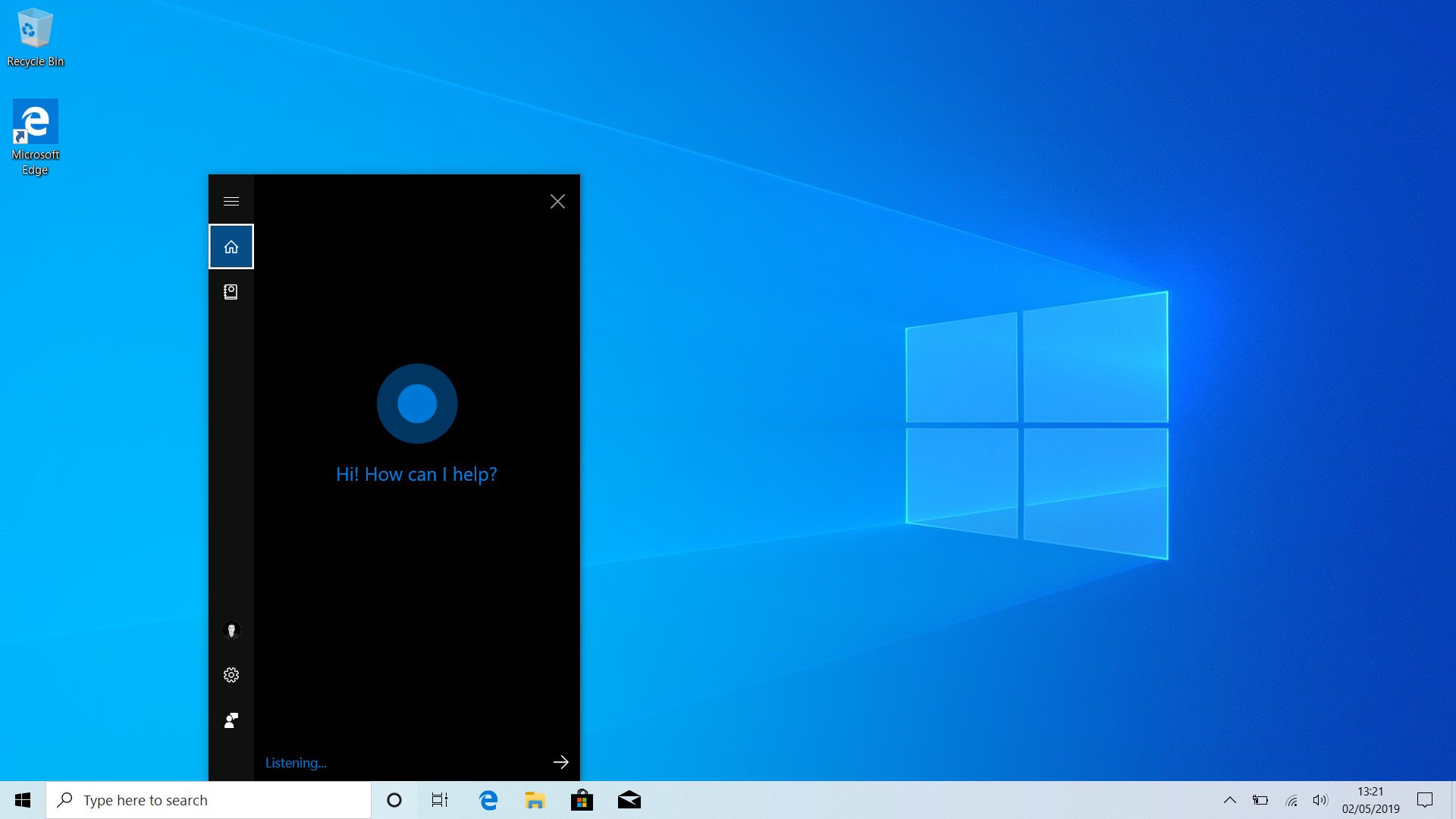
Even though Cortana and search are now separate, underneath they're still together. This means that even though the search bar is now tied to the search UI, and visually has nothing to do with Cortana, you can still use it to interact with Cortana. This makes for the most confusing user experience I've ever used. Why even have a Cortana button in the taskbar that does nothing if you can still use the Cortana commands in the search bar using the search UI? It makes no sense.
I've noticed not all commands work as intended the search box, either. I typed "turn off my Xbox" one time, and it pulled up Cortana and asked if I wanted to turn it off. I said yes, and Cortana then went ahead and powered off my PC as I was using it, not the Xbox.
The whole point of splitting Cortana and search is so that Microsoft could build out each feature as its own thing, without getting in the way of one another. Unfortunately, Microsoft has opted to do the bare minimum here. Microsoft is planning to further this separation with an actual good Cortana experience with the next major update coming in spring 2020, but that's a long way away. For now, we're stuck with this.
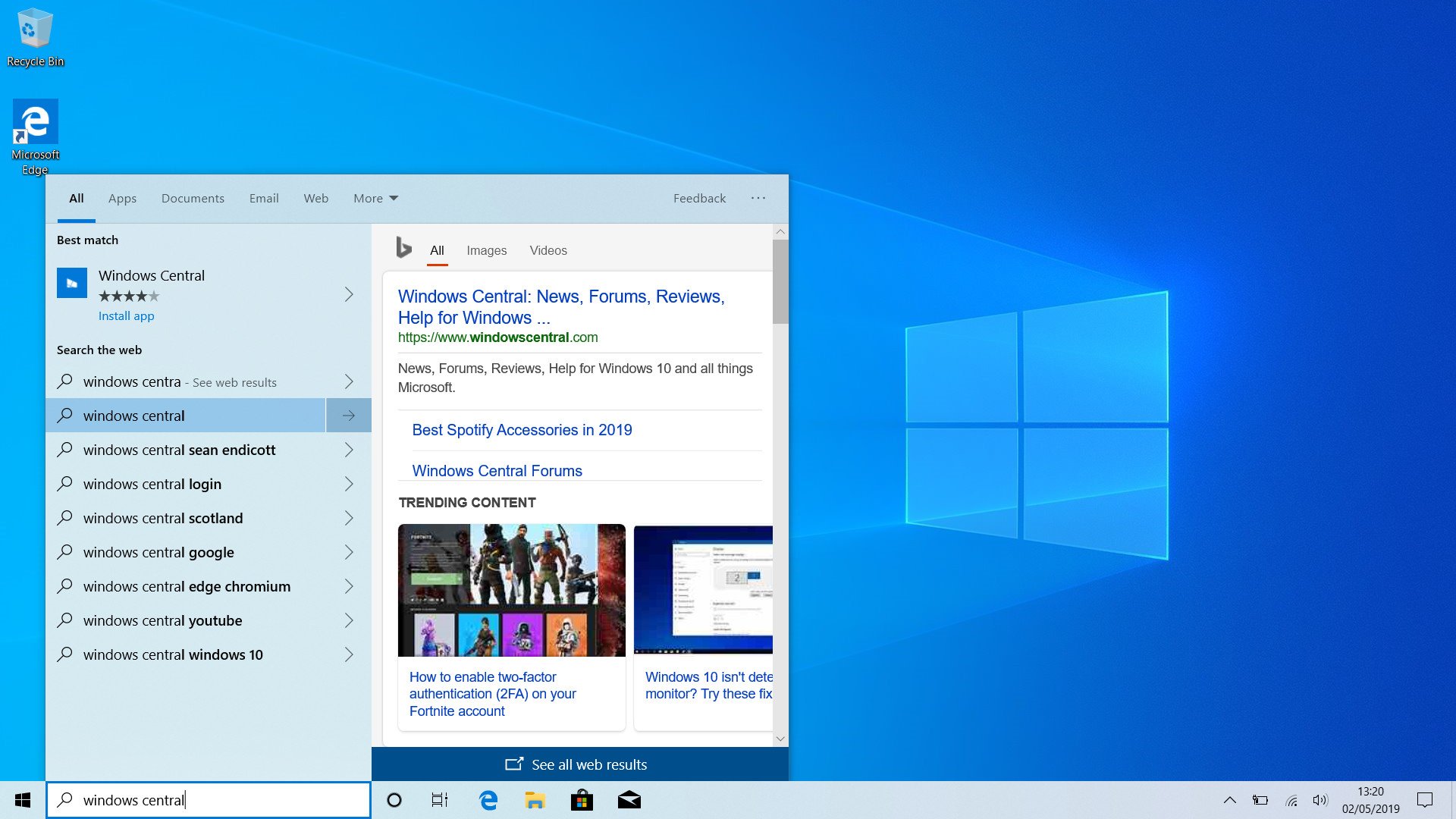
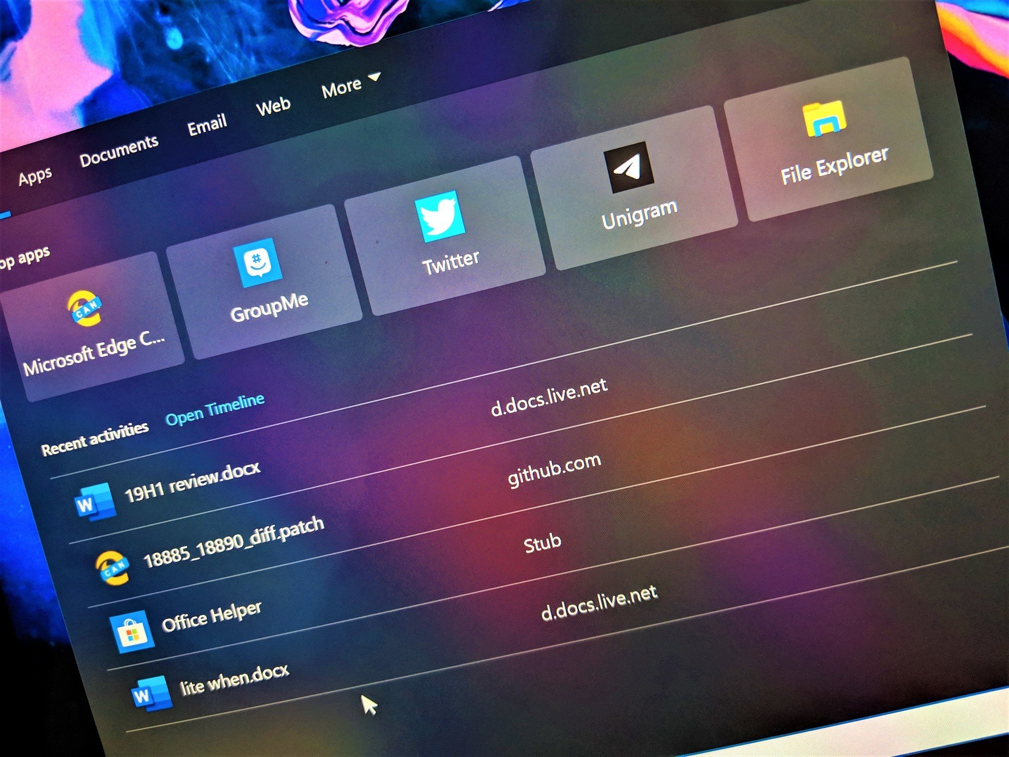
On the search side of things, the UI is more or less the same when searching, but there's now a new landing page that shows your most used apps and recent Timeline activities. It's a clean UI, but for some reason, Microsoft is using custom context menus that aren't like anything else in the Windows Shell. They have no animation, no Fluent Design, and don't even adhere to the dark theme.
Search is now separate from Cortana, so it no longer has a hamburger menu along the left side. Typically, this wouldn't be a problem, but since Microsoft hasn't updated the UI, it's very obviously missing a hamburger menu now. It just looks stupid having this unnecessary gap that's the exact width of the Start button between the edge of your screen and the beginning of the search UI.
Also, Microsoft did a poor job integrating the search UI and the Start menu. You can still begin typing directly on the Start menu, but instead of getting a smooth transition from the Start menu to the search UI, the Start menu briefly closes and the search UI pops up without any animation. It's quick, but clunky.
Overall, the Cortana and Search split in the May 2019 Update feels unfinished and needs serious work. Microsoft says it has improved the search algorithms under the hood, which should result in more accurate and faster searches. But the overall user experience is rough.
Windows 10's new Sandbox feature
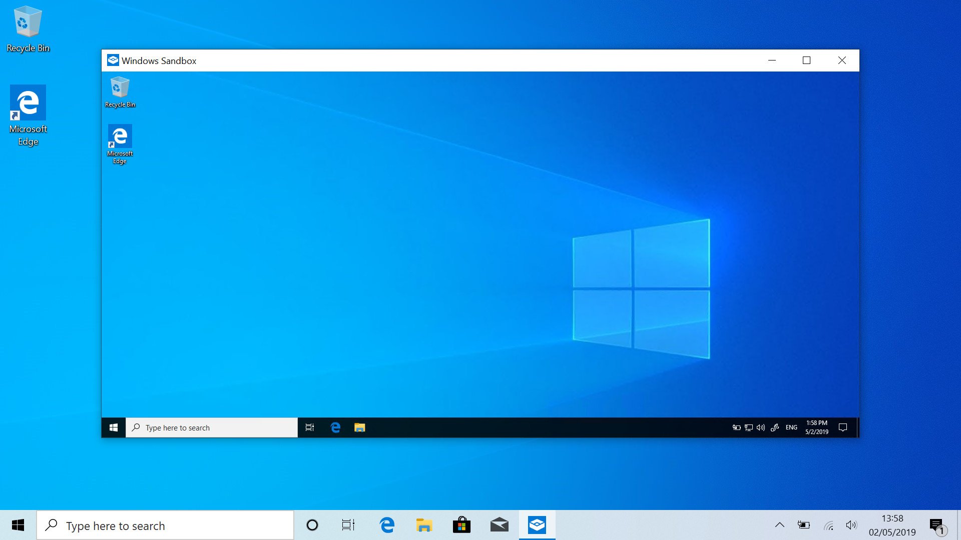
This is arguably one of the more significant new features in this release, but only if you're a Windows 10 Pro or Enterprise user. If you run Windows 10 Home, unfortunately, Windows Sandbox is not available. Essentially, Windows Sandbox allows you to run programs that might not be safe in a throwaway virtual machine, untouched from your actual OS.
For example, if I were to download a random .exe from the web, and I wanted to run it, instead of risking my actual Windows 10 install, I can just boot up Windows Sandbox, and run the .exe in there. If it turns out to be safe, I can install it on my main OS; if not, I can close the Sandbox and all its contents are discarded forever.
Sandbox is a power user feature, meaning most users likely won't find it very useful. In fact, it's turned off by default, requiring you to go into a legacy Control Panel applet to enable it. Once enabled, you'll find the Windows Sandbox feature in the Start menu's apps list. The throwaway virtual machine runs the same version of Windows 10 that you're running normally, except with nothing installed. It's a clean slate every time.
Improvements to File Explorer
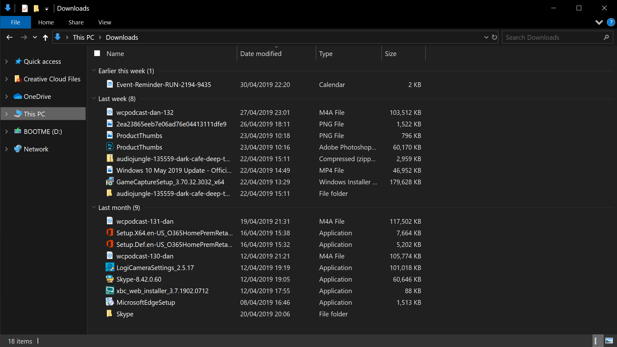
Some minor changes have been made to the File Explorer in the May 2019 Update, all designed to make using it a little easier. Microsoft changed the default view for the downloads folder, now putting your most recent downloads at the very top and categorizing them under dated tabs. This has been in Windows for a long time but wasn't set as default until now.
This view for the downloads folder is a much better way of organizing your downloads. Previously, your downloads would just organize alphabetically, like most other folders on your PC. This meant that, for the most part, you would have to hunt for the file you just downloaded in the downloads folder. That's no longer an issue now that the default behavior is to have the most recent download at the very top of the list in the downloads folder.
Microsoft also updated the File Explorer icon a bit, giving it a slightly warmer color so that it doesn't clash with the new light theme. This isn't something you'll likely notice unless you compare them side by side.
Windows 10's updated Settings
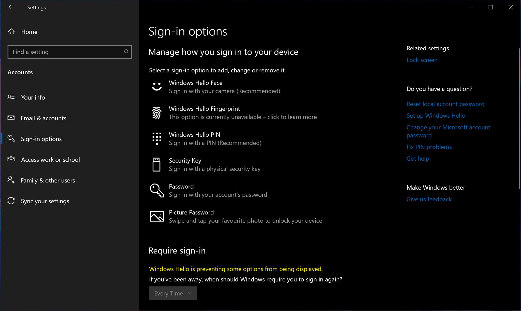
As is the case with every new Windows 10 feature update, Microsoft did some new stuff with the Settings app. To begin, Microsoft has updated the account security area of the Settings app, cleaning up the UI and making things a little more organized. You'll now see all of the options available for setup on your account, including things like Windows Hello facial recognition, fingerprint login, or iris scanning. You can also easily set up with a standard PIN, physical security key, standard password, and even a picture password from Windows 8.
This new UI is so much cleaner and straight forward, but I wonder why Microsoft decided that it's necessary to list sign-in options even if they are unavailable on my device. Windows Hello fingerprint shows up on my Surface Book 2, even though it doesn't have a fingerprint scanner. I'd much prefer if the options that were unavailable on my device didn't show up at all. Either way, the new UI is a great improvement that makes setting up account authentication more straightforward.
Microsoft updated Focus Assist to come on automatically when entering fullscreen mode within an app. So, if you're using Netflix for example, and you enter fullscreen mode to watch your video, notifications will no longer bombard you while you're in fullscreen mode. You can turn this off, of course, but the idea is if you're entering fullscreen, you likely don't want to be interrupted.
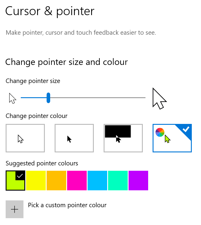
There are also plenty of new ease-of-access options available in the Settings app, including the ability to change the color of your cursor and resize it with more granular controls. While Windows has always had the ability to resize your cursor, it's never been this easy. It's now just a simple slider, that updates on the fly without you needing to click "apply" every time you set a size.
Windows 10's new Windows Update
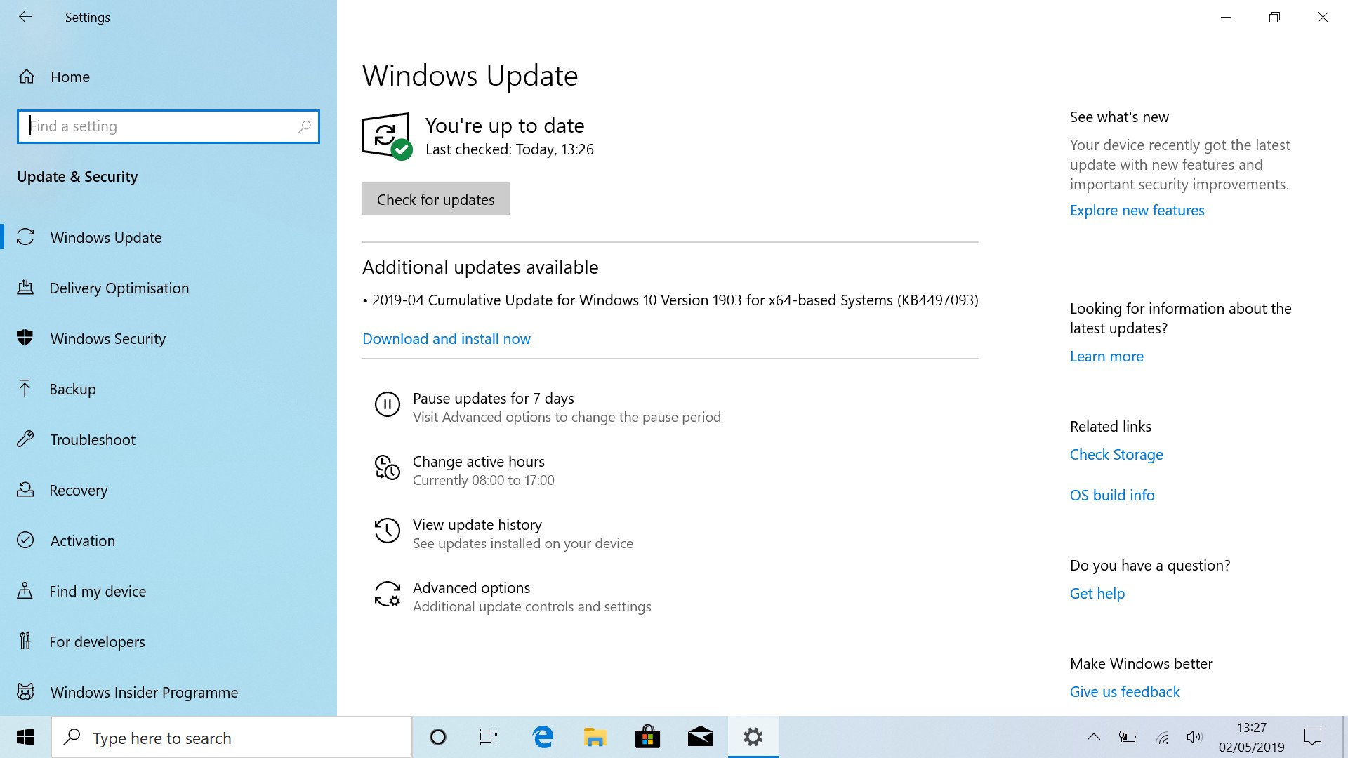
Windows Update received some pretty significant upgrades with the May 2019 Update, and it's good news for users. Microsoft is backing off its heavy-handedness when it comes to forcing updates onto users. Starting this month, users will no longer be forced to install new feature updates unless they explicitly click on an install button for it. You will still have to install security patches and driver updates, but the big feature updates won't be forced straight away.
Eventually, the latest feature update will be forced, but only once the version of Windows 10 you're using runs out support, which is usually every 18 months for users upgrading to a new version of Windows 10 on release. So, for example, if you were to install the May 2019 Update upon release, you wouldn't have to install any other feature updates released between the May 2019 Update and 18 months after.
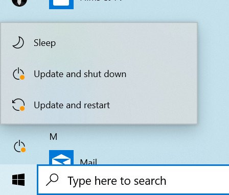
This doesn't mean Microsoft isn't going to alert you of a new feature update, however. Microsoft added orange indicators that sit in the System Tray and Start menu when an update is pending install. I find them quite handy, as it's an easy and subtle way to tell if my PC needs to restart.
Microsoft added the option to delay Windows 10 security and driver updates for up to 35 days. These updates are forced on a more frequent basis, as they're designed to keep your PC running securely and smoothly, but you can pause them. This is new for Windows 10 Home users, who previously were unable to pause security updates.
So overall, Microsoft really improved Windows Update with this release. The only time the PC will forcefully restart is if the user has delayed an update for an inexplicable amount of time. There's now plenty of time for a user to find out an update is available and prepare their PC to install it.
Miscellaneous changes
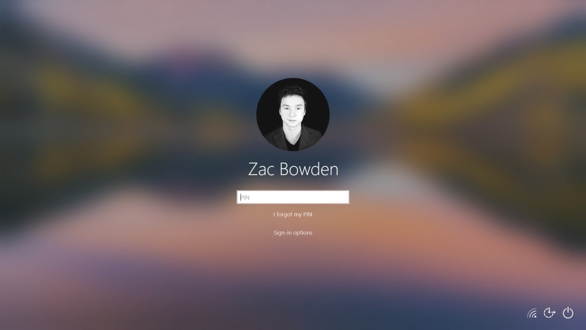
One notable change that you probably wouldn't notice unless you were told is the wallpaper on the lock screen will now blur when you go to login. It's a nice, subtle design choice that puts the login screen inline with other Fluent Design areas of the OS.
Microsoft is also focused on privacy with this update, adding little things like a microphone icon in the system tray whenever an app is using your mic. Clicking on the icon will bring you to a settings pane that lets you control what apps can access your microphone.
Cloud Clipboard received some minor updates, reducing the overall size of the UI to make it more natural for keyboard and mice users. I still think discoverability of this feature is abysmal. I wouldn't be surprised if no one used it, because they don't know it's there. It's off by default, likely for privacy reasons, but there's nothing during setup that would indicate that there is such a feature. The only way you'd know is if someone told you about it, or you just happen to stumble across it in Settings.
Finally, Microsoft says it has updated the reliability of the Start menu. I've had mixed results with these claims, however. On one device, Start works fine all of the time. It opens instantly and is very fast. On another device, however, Start crashes at least once a day and doesn't pop up for about 10 seconds after that.
May 2019 Update final thoughts
So, should you install the May 2019 Update?
I think so, yes. Microsoft took extra special care to make sure this update is free of any data-losing bugs or major issues. It's spent an extra month in testing to ensure this. I know, because this update was supposed to be called the April 2019 Update, until Microsoft decided to give it a little more testing time. That's a good thing.
I think the improvements to Windows Update are worth it alone. The new light theme is something cool to check out, and the other smaller miscellaneous changes make the update feel complete. Search and Cortana really do need some work, though. The search function is fine, but the split is rough and does not make for a very good user experience.
The Windows 10 May 2019 Update is rolling out now as a free update for Windows 10 users. If you don't own Windows 10 yet, you can buy it right from Microsoft now.
Windows 10 May 2019 Update full reviewHow to get the May 2019 Update ASAPMay 2019 Update common problems and how to fix themFull list of changes in the May 2019 UpdateAll of our May 2019 Update resources in one place
Cheap PC accessories we love
Take a gander at these awesome PC accessories, all of which will enhance your Windows experience.
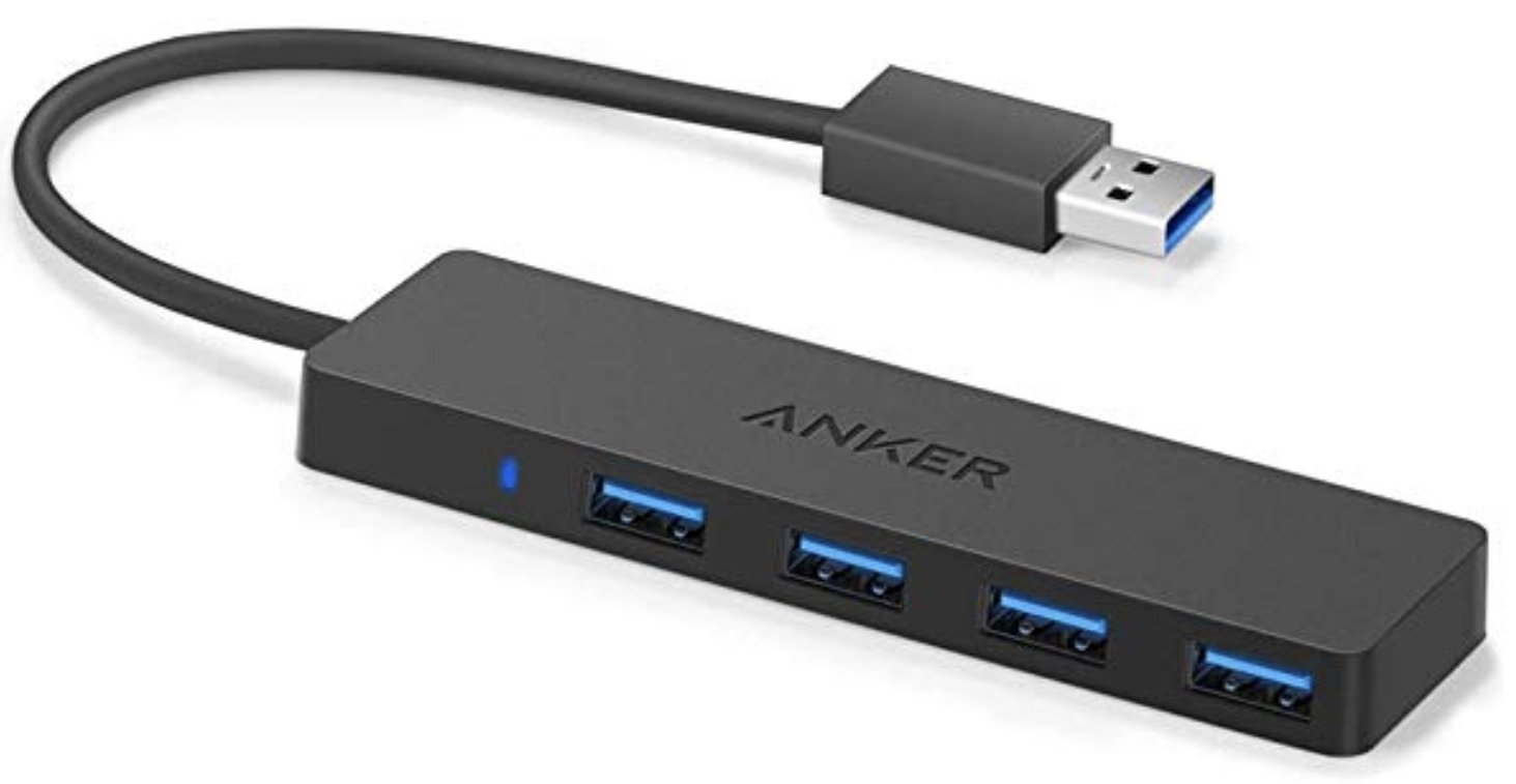
Anker 4 port USB 3.0 hub ($10 at Amazon)
Whether on a desktop or laptop PC, you always need more ports to connect things to. This hub gives you an additional four USB 3.0 Type A ports.
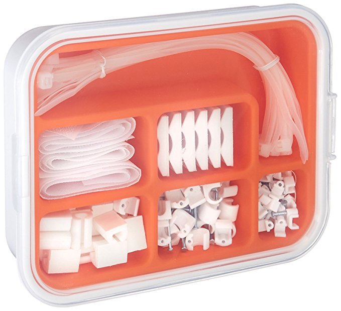
Ikea Fixa Cable Management System ($11 at Amazon)
This IKEA cable management kit is your ticket to a clean setup. It's simple and functional.
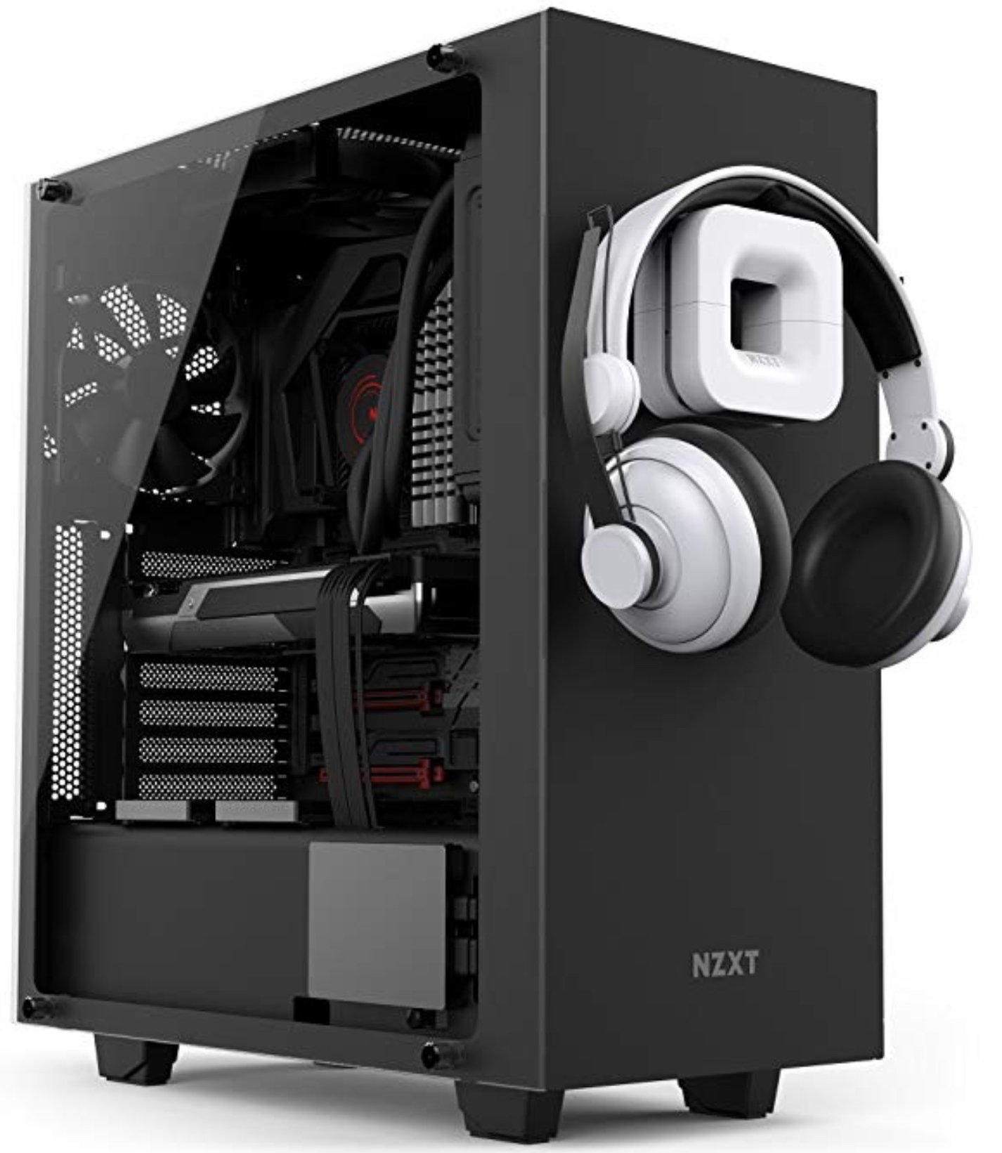
NZXT Puck ($20 at Amazon)
This clever little accessory has powerful magnets on the rear to make it stick to any of the metal panels on your PC case or anything else. It's great for hanging accessories like headsets.

