Windows 10 design refresh outed in Project NEON concept screenshots
Last year we revealed that Microsoft is working on Project NEON, an OS design language refresh for Windows 10.

Project NEON is an evolution of the current Windows 10 design language, MDL2, and is intended to bridge the aesthetic gaps between traditional Windows and future paradigms, such as AR holograms.
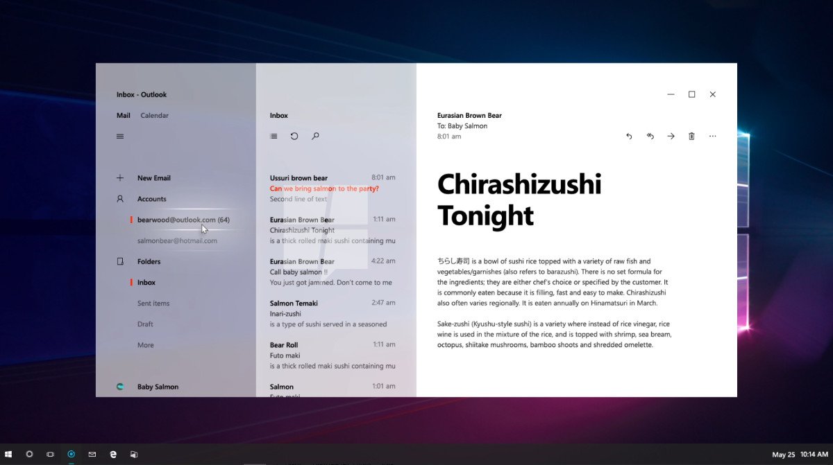
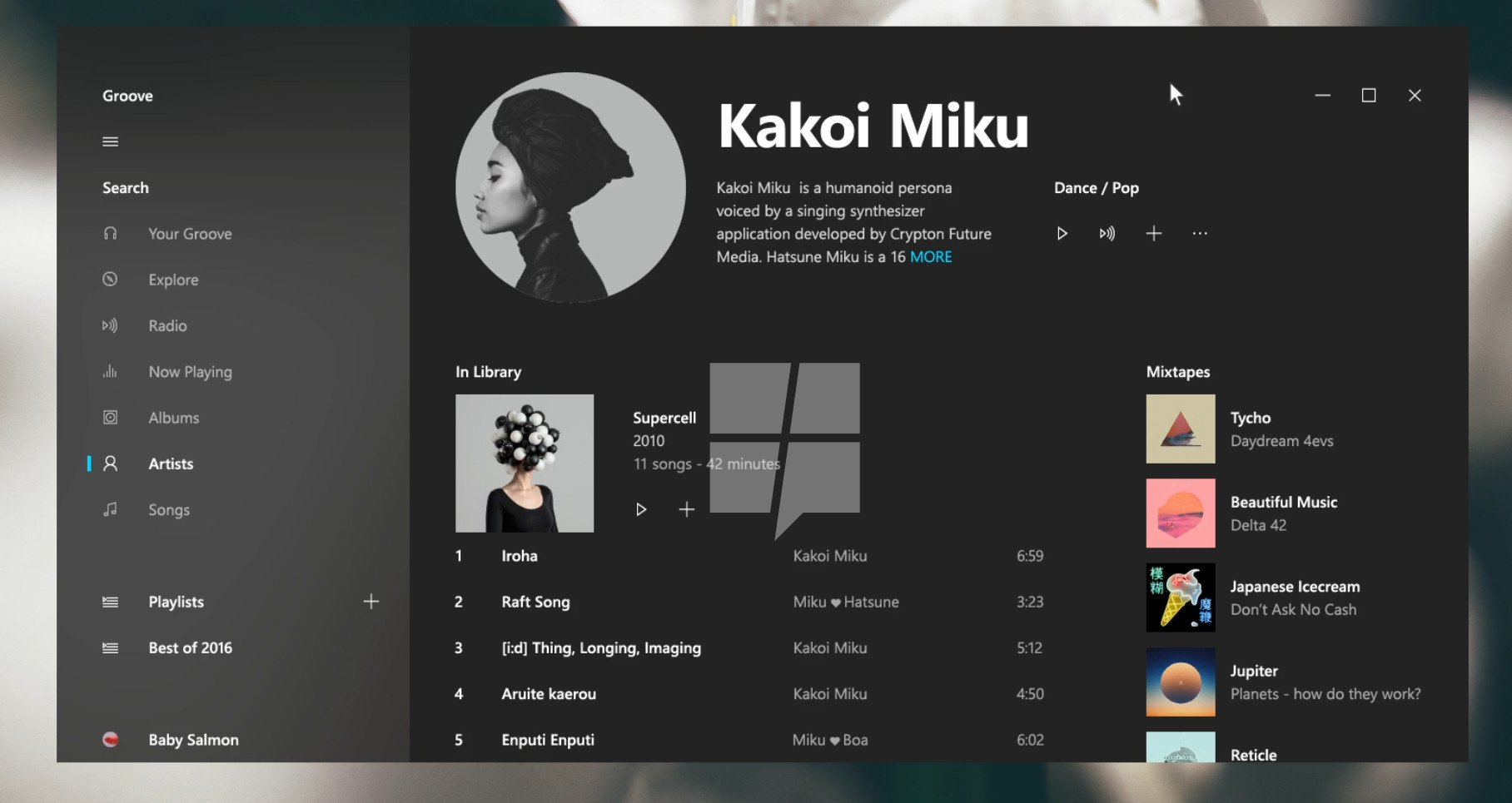
MSPoweruser has obtained a couple of concept shots detailing how Project Neon will alter Groove Music and Mail & Calendar, both of which already use transparent elements which will be more prevalent among apps designed with Project NEON conventions in mind.

Project NEON will make heavy use of animated transparent blurring effects that are already present in Microsoft Groove, the Start Menu, and the Action Center. As you can see above, apps designed with Project NEON conventions will feature transparent menus that are reminiscent, at least superficially, of the way HoloLens' holograms sit translucently on top of the real world.
MSPoweruser reports that this effect is being branded as "Acrylic" by Microsoft, and developers will be able to use the effect to blur elements within their apps, in addition to the app itself.
NEON also appears to give interactive elements a new coat of paint, dropping the solid square borders for a glowing outline that follows your cursor, similarly to the way HoloLens apps gently feedback the position of your finger when selecting menu items. See the video below for an example of this in action.
It's highly likely we'll see NEON make its full debut at Build 2017 which kicks off on May 10th.
Get the Windows Central Newsletter
All the latest news, reviews, and guides for Windows and Xbox diehards.

Jez Corden is the Executive Editor at Windows Central, focusing primarily on all things Xbox and gaming. Jez is known for breaking exclusive news and analysis as relates to the Microsoft ecosystem while being powered by tea. Follow on Twitter (X) and Threads, and listen to his XB2 Podcast, all about, you guessed it, Xbox!
