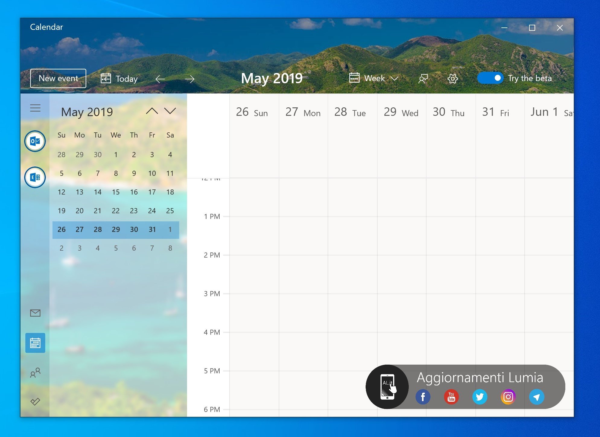
Windows 10 Calendar is getting a slick new look, according to leaked screenshots
Your Calendar app may soon look a whole lot nicer.

What you need to know
- A set of leaked screenshots shows off a new design coming to Windows 10's Calendar app.
- The design overhaul presents a sleeker Claendar with reworked UI elements and more Fluent Design touches.
- There's no indication of when this experience will be available to test.
It looks like a slick new design is in the works for Windows 10's Calendar app. A set of screenshots revealed by Aggiornamenti Lumia show off an in-development version of the visual overhaul, which incorporates Fluent Design elements and repositions some of the UI elements for a cleaner looking experience.
According to the screenshots, Microsoft will roll out a toggle with this design that allows you to switch between the release and beta versions of the Calendar app on a whim. We've seen this done with other Office services, most notably when Microsoft began testing its new Outlook.com experience.
As for the design itself, Aggiornamenti Lumia reports that the new app will default to a new landscape theme as the background image. New Fuent Design elements are also being added to the menu section.

If you compare the leaked screenshots to the current Calendar app, you can also see where Microsoft has shifted some UI elements in this newer version. The button to create a new event, for example, is now located in a permanent position at the top left of the window, accessible at all times. Likewise, the miniature month view appears to be constantly visible even when your calendar is set to week view.
The font for the month and year at the top of the window is now bolder, but takes up less space compared to the current app. The arrows for moving between months or days have also been shifted to the left of the month name, and a settings cog is always accessible from the top bar.
Shortcuts to the People, Mail, and To-Do apps remain available on the left menu bar.
There's no word on when this update might trickle out for users to test, but it's looking like a promising visual refresh. It's likely we'll see this become available for Insiders to test in the coming months.
Get the Windows Central Newsletter
All the latest news, reviews, and guides for Windows and Xbox diehards.
Dan Thorp-Lancaster is the former Editor-in-Chief of Windows Central. He began working with Windows Central, Android Central, and iMore as a news writer in 2014 and is obsessed with tech of all sorts. You can follow Dan on Twitter @DthorpL and Instagram @heyitsdtl.
