Windows 10 build 10122: Everything you need to know
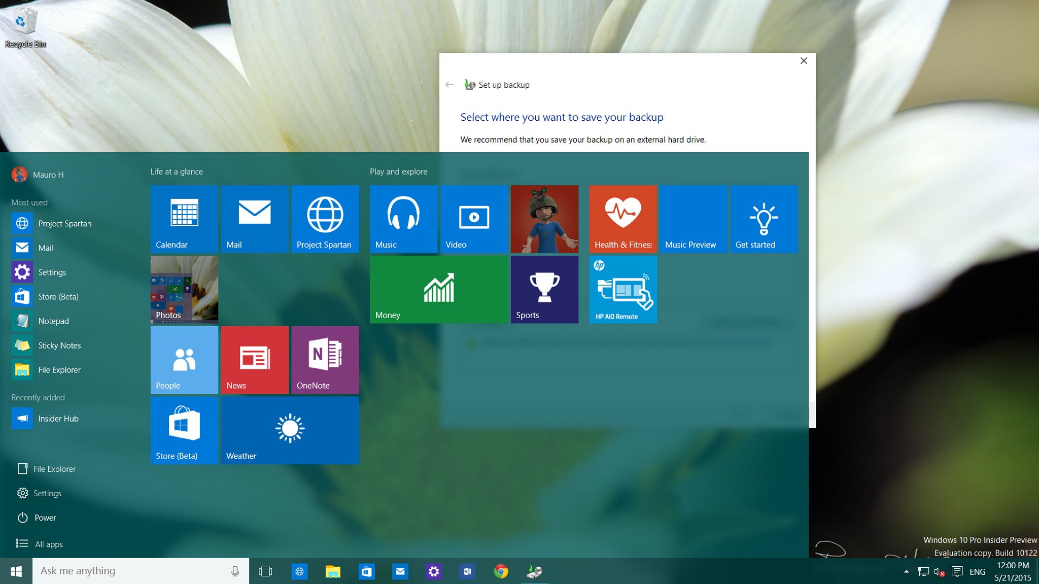
On May 20, Microsoft officially released Windows 10 build 10122 to the Fast ring of updates. In this new build, the company has rolled out an even more stable and polished version of its next operating system. Build 10122 includes a variety of fixes and improvements on the Start menu, Continuum, Cortana, Microsoft Edge, Settings, apps, and other various tweaks across the OS.
Since the release of Windows 10 build 10074, we have seen a number of leaks. Instead of listing all the changes since the last leak, we are going to see everything that happened since the last official release.
Below, you will find all the new changes found in Windows 10 build 10122:
Start menu
While we have seen many changes to the Start menu, in build 10122, Microsoft continues tweak the menu to make it as perfect as possible. In this build, users will notice that officially the company is moving the "File Explorer" and "Settings" buttons to the bottom of the menu, right above the "Power" options. The two new buttons also feature new icons that follow the icon design that Microsoft is bringing to Windows 10. It's also worth pointing out that in this build, jumplist menus still not present on Start, which is a feature we've seen Microsoft demo during the Build conference.
The software maker is also lifting the limit of two rows of Live Tiles groups, and now users can expand the Start menu to fit a third row of Live Tiles.
Groups have been streamlined. Names are shown completely, and there are no cut-off letters. Groups are also now aligned closer to the edge of Start.

Another noticeable change is that Microsoft has officially removed the full-screen button that appeared in the top-right corner of Start menu. It's not completely gone, though. The option to make the Start menu full screen can be found in the Settings app, under Personalization, on the new Start area.
Get the Windows Central Newsletter
All the latest news, reviews, and guides for Windows and Xbox diehards.
According to the company, many users were getting confused and thought that clicking the full-screen button was the Tablet Mode option. To avoid further confusion, Microsoft has decided to move the option to the Settings apps, which also makes Start look less cluttered and more stylish.
This new build also brings new app suggestions to Start and the 3D flip animation for Live Tiles get a little more refined. The tiles like Search, Camera, Alarms & Clock, and others tiles that do not feature their own color scheme, also now take the color scheme from Windows.
Continuum
Microsoft has added new improvements to the Tablet Mode (Continuum). Now users will notice that the list of apps and power settings section are no longer part of the Tablet Mode experience. This section can be accessed by using the new hamburger button located in the top-left corner of the screen. This change makes the Start menu look more like the Start screen, which is something that many Windows 8.1 fans will feel good about.
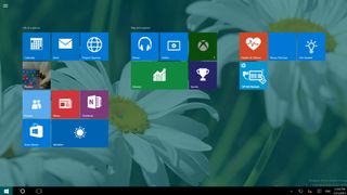
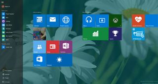
It's worth noting that going into Tablet Mode will also make Live Tiles bigger, which makes it better for touch.
Cortana
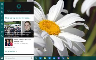
As we have previously seen from the Microsoft demos, Cortana now features a new dark theme and takes the height from the Start menu, the "Places" icon has been updated and there is a new feedback button in the main menu. If users enable the "Hey Cortana" feature the new mini version of the personal assistant will be part of the experience.
Microsoft Edge
Microsoft Edge has received quite a few improvements in Windows 10 build 10122.
For those wondering, Microsoft still refers its new web browser as "Project Spartan" instead of Microsoft Edge.
Users can now pin pages to Start, though in my time testing this new version of the operating system, Microsoft Edge keeps crashing every time I try to pin a web page to Start and the web page pin will never appear on the Start menu.
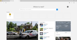
In build 10122, Microsoft Edge officially introduces a new "New Tab" page, which features a variety of suggested content including your top sites with tiles that will alert you if that particular website features a Windows app in the Store. There is also a section for the trending news, featured apps from the Store, weather information, and an infinity list of news articles, which I can only assume is curated from MSN.com.
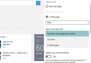
Users can also change the behavior of the "New Tab" page going to the browser settings to only show a blank page, top sites, or top sites with suggested content.
Another interesting addition to the New Tab page is the search box, which unlike Chrome, it doesn't suddenly move you typing into the address bar. You'll also notice that the New Tab page features top sites and/or suggested content, but the address bar does not appear at the top. You use the search box on the page, but the address bar shows up when you can click near the top.
On the top-right corner of the page, you'll notice your profile picture, which you can click to access your account settings, view your Microsoft account, or to open a new InPrivate session.
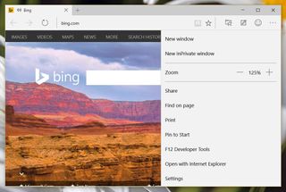
The updated version of Microsoft Edge also includes a new icon to indicate which tab is making sounds, just like Chrome (refer to previous image with the Bing tab open).
The new web browser can now save forms and passwords, and there is support for InPrivate mode, which is an option from the main menu or when opening the new tab page. Also, the software maker is now letting users enable or disable Cortana in the web browser.

When pages can be opened in Reading view mode, the "Reading view" icon will animate in the address bar.
Under the hood, Microsoft Edge also includes improvements in the Chakra engine and it introduces class-leading ECMAScript implementation and more. Here is a breakdown of what's new in Microsoft Edge.
Apps
In Windows 10 build 10122, Microsoft is removing the Music and Video app from Windows 8.1, and is renaming Music Preview and Video Preview to Music and Video.
Users will notice that the software giant is also updating its MSN apps with new UI changes and a few new features. You can find more information in my previous write-up here.
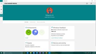
In this new build, there is a new Insider Hub app, and as we have previously seen, Microsoft has completely overhauled the app. Now the app is a universal app, and there is a new homepage where Quests are featured front and center. You can move to different sections easily with the menu in the top-left and the hamburger button to view your profile, alters, announcements, a new view for badges that you have earned, and much more.

Settings
As we have seen in a previous leak of Windows 10, the Settings app now features all its main content center within the app. The "Devices" icon has been updated, and now each Settings page you access will stay highlighted to indicate where you are in Settings.

Moving between sections, users will notice that the back button has been relocated to the title bar in the top-left corner of the screen.
The Settings sections no longer feature its own icon no matter where you are in Settings. You will only see the gear icon, which brings you back to the main section of Settings when clicking it.
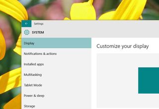
Now let's look over what's new in each of the Settings sections:
Inside of System, Speech, Windows Defender, and Share have been removed from the list. Power & Sleep has a new Wi-Fi area, which indicates that related settings will be included in the future.
For Windows 10 Pro, inside of System, About now has a new "Join Domain" and "Join Azure AD" options.

Personalization in Windows 10 build 10122 has a new Start section. You can enable the full-screen Start experience here, which Microsoft removed from the Start menu. You can also disable whether to "store and display recently opened items in Start and taskbar".
There are a few other options including: "Occasionally show app and content suggestions in the Start menu," "Store and display recently opened programs in Start," and "Show the recently added apps group." But they are grayed out, which means that users can not currently control these options. The same is true when trying to customize the same option per app when you click the "Customize list" link.

Inside of Personalization, Colors now have a new animation when loading the colors you can use in Windows.
In Accounts, Your Account now shows a circular image of your user profile, and there is a new "Create your picture" and "Other accounts you use" icons.
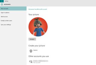
And the Sign-in options inside of Accounts has a new "Related settings" area linking to the "Lock screen".
In Time & Language, you will now find the Speech option Microsoft has removed from the System section.
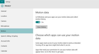
Privacy has a new Motion area to let Windows and your apps use the motion data and collect motion history.
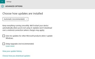
In Update & security, under Windows Update, Advanced options, there is a new "Delay Upgrades (not recommended)" option.
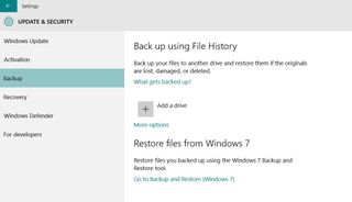
Update & security, under Backup there is a new link to Backup and Restore files from Windows 7.
Other changes
In Windows 10 build 10122, Microsoft has made various other changes to the operating system. For example, in the new build, the company has changed how users set default apps. Starting with build 10122, all apps (traditional desktop programs and Windows apps) will no longer prompt users to change the default. Only when you double-click a file, you will be prompted to change the default for the new app, which will eliminate the need to randomly prompt users to set default options.
We have previously seen this, but officially in build 10122, Microsoft has updated its pill switch and the slider switch throughout the operating system. This is something that a lot of users dislike, but the company seems to make the move anyway.

Users will now also notice that apps feature a button in the title bar as needed, and users will see this behavior more in the Settings and Windows apps.
Throughout the operating system, in File Explorer, Control Panel, etc., users will see that Microsoft is changing the title bar. For example, in build 10122, users will see a white title bar, instead of the old gray title bar background, and the windows border has been updated as well.

The white context menu that only appeared on the taskbar, now can be found on the desktop and throughout the operating system.

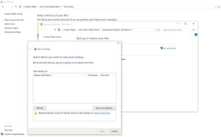
In the Control Panel, users will now find the "Backup and Restore (Windows 7)" feature, which replaces the "System Image backup". Everything works the same as before, but now users have the option to restore files right from the tool interface. It appears that Microsoft is mainly bringing this feature back to help Windows 7 users brings their files to Windows 10, as such, it's unclear what the future is for this utility.
Wrapping things up
The name of "impressive" is well deserved for this build, as we can see there is a lot going on with Windows 10. However, this particular build of the operating system has been released to the Fast ring of updates. There is a big bug that causes Microsoft Edge to crash if you're running the operating system with an AMD graphic card. The company is currently advising Windows Insiders to skip this build until there is a permanent solution. Other than this big issue and a few other known problems, this could be considered one of the most stable and polished version of Windows 10 that we have seen.
It's a very exciting time for all Windows fans, as we're getting closer to RTM and the summer release. Moving forward, we can only expect the operating system to get more stable and better.
How do you feel about the changes coming in Windows 10 build 10122? If you're using an AMD system, are you having a lot of issues? Let us know your thought in the comments below, and don't forget to use the Feedback app to let Microsoft know what you want in Windows 10.
Mauro Huculak has been a Windows How-To Expert contributor for WindowsCentral.com for nearly a decade and has over 15 years of experience writing comprehensive guides. He also has an IT background and has achieved different professional certifications from Microsoft, Cisco, VMware, and CompTIA. He has been recognized as a Microsoft MVP for many years.
