Windows 10 build 10114 unveils new Start menu, Settings tweaks, and overhauled Insider app
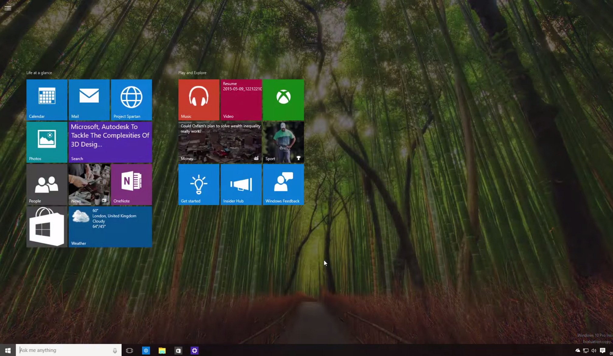
While Microsoft has recently rolled out a new preview of Windows 10 with a number of changes and improvements, a new unreleased version of the operating system, which hasn't even leaked onto the web, has surfaced revealing a few UI changes and improvements.
This time it is Windows 10 build 10114 (which is another partner build from winmain_prs channel) that has appeared in a new video published on YouTube highlighting improvements in the Start menu, Settings app, and a new overhauled Insider Hub app, among other things.
Let's break down the new changes in Windows 10 build 10114!
Start menu
The Start menu in this unreleased version of Windows 10 preview, shows many similar changes that Microsoft revealed at the Build and Ignite conference. However, during the Build conference the company showed a number of changes on Windows 10 build 10072, 10105, and 10110, and during the Ignite conference build 10072, 10074, and 10107. That all means that seeing a bigger build number doesn't necessary mean that they will include all the changes Microsoft is planning for its operating system.
Now, like in Windows 10 build 10072, we can see in build 10114 that Microsoft is relocating File Explorer and Settings links above the Power options and each link now features their appropriate icon.
"Recently Added" apps list also appears below the "Most used" app list.
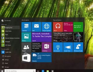
It's worth pointing out that Microsoft says that the Recently Added list will also become the "Suggested" list over time, which will highlight apps you haven't tried from the Windows Store.
Get the Windows Central Newsletter
All the latest news, reviews, and guides for Windows and Xbox diehards.
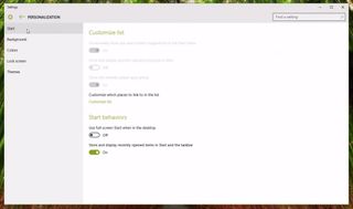
As I have previously mentioned, we can now see that Microsoft indeed is removing the full-screen button located in the top-right corner of the Start menu, and there is a good reason. It's because, the software giant is opting to move this particular setting to the Personalization area. Now, opening the Settings app and going to Personalization, users will find a new "Start" area to customize the menu.
The new Start area includes two section: "Customize list" and "Start behaviors".
The Customize list has all the settings grayed out, which means that they are currently unavailable. But we might be able to change them once they appear in a public preview.
In this first section, users will find the following configuration options:
- Occasionally show apps and content suggestions in the Start menu (default behavior is On)
- Store and display recently opened programs in Start (default behavior is Off)
- Show the recently added apps groups (default behavior is On)
As you can see, eventually Microsoft will give users more control on how the operating system promotes apps from the Store and how already installed apps will surface into the Start menu.
The Start behaviors is where things get a more interesting. This section is where users will be able to configure the Start menu into full-screen mode.
The Start behaviors contain two options:
- Use full-screen Start when in the desktop (default behavior is Off)
- Store and display recently opened items in the Start and the taskbar (default behavior is On)
Like in previous builds, enabling full screen on the Start menu does not require users to log off of their system. It transforms the menu into something very similar to the Start screen for Windows 8.1 (Yes! The Start screen is back!).
Once the Start menu goes into full-screen mode, users will notice that tiles will get bigger (refer to the feature image above), which is a welcome tweak as it will make easier for touch-enabled devices.
Furthermore, the full-screen version of the Start menu only features Live Tiles -- long gone is the Windows 7-like part of the menu. Now, Microsoft is including a new hamburger button on the top-left corner of the screen to access the "Most recent" list, File Explorer, Settings, Power options, and All Apps.
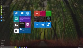
If you remember, we had already seen this behavior during the Build conference when Microsoft's Joe Belfiore showed off Windows 10 for small tablets. The new change makes the Start menu less cluttered, something that those Windows 8.1 fans will appreciate.
Settings
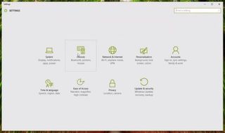
The Settings app looks almost unchanged since Windows 10 build 10108. All the settings appeared centered, but users will see that "Devices" now features a new icon, which looks more appropriate.
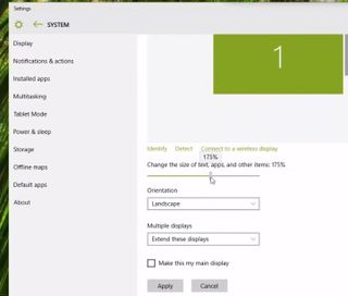
In Windows 10 build 10114, the slider to change settings and control the system volume has been updated too.
Insider app
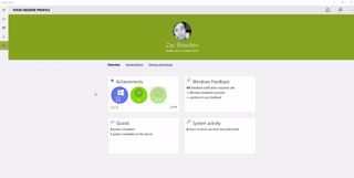
The Insider Hub app has been completely overhauled with a significant new user-interface. The UI looks very similar to a blog site. There are two main areas: the content list and the sidebar with information about the user's profile, the version of Windows 10 preview you are currently running, activity, feedback activity, and announcements.
The app also features a hamburger menu button on the top-left corner of the screen to access the different areas, including Announcements, Alerts, and Your Profile.
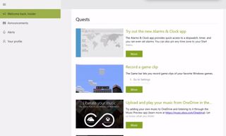
- Announcements: In this area, users will find all the official announcements from Microsoft.
- Alerts: This area will include all the alerts as they become available.
- Profile: In here, users will find all the profile information. You can check Achievements, Windows Feedback, Quests, and System activity.
Dark theme
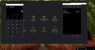
In Windows 10 build 10074 and previous builds, we have seen that the operating system will also include a new dark theme. In build 10114, the theme has improved though it is still not working properly.
As you can see in the image below, the Calculator and Alarms & Clock apps have a white title bar, even though the dark theme is enabled. However, the Settings app does show a dark title bar, which should be the correct behavior. Although, Settings takes the system color, some things are not working, as you can see in the image, the font color is dark when it clearly should be white.
Cortana
If you were expecting to see any changes on Cortana, well, this is not your day. In Windows 10 build 10114, Cortana appears unchanged, but it includes all the new UI improvements we have seen in Windows 10 build 10074.
However, it's worth noting that more tweaks are coming to Cortana. We have previously seen in build 10107 that Microsoft plans to include a new mini version of the digital assistant with a dark background that appears when users invoke the "Hey Cortana" command.
Wrapping things up
Although, these changes aren't major, they are welcome additions that bring all the elements of Windows 10 closer together.
Now, we start to see a Windows 10 that looks good, and this is something we all have waiting for a long time.
Moving forward, we are going to continue to see small changes. Instead of big improvements the company is focused on fixing bugs, and improving what's already included to make the operating system stable for its release later this summer.
Finally, Windows 10 Build 10114 is not a version that Microsoft is planning to release to Windows Insiders, but we might start seeing some of these changes and improvements in upcoming public releases.
What do you think of the subtle changes? Is this an OS that you can stand behind? Let us know in comments!
Source YouTube (WinBeta)
Mauro Huculak has been a Windows How-To Expert contributor for WindowsCentral.com for nearly a decade and has over 15 years of experience writing comprehensive guides. He also has an IT background and has achieved different professional certifications from Microsoft, Cisco, VMware, and CompTIA. He has been recognized as a Microsoft MVP for many years.
