Windows 10 April 2018 Update review: It's about the little things
The next Windows 10 feature update is here, and it's packing lots of new changes and refinements. Here's our full review!
Starting next week, Microsoft will begin rolling out a brand new feature update for Windows 10. Dubbed the "April 2018 Update," (or Version 1803 for short,) this release is the fifth major feature update to Windows 10 since its original debut in July 2015. Microsoft has committed to releasing two feature updates every year, and Version 1803 is the first for 2018. This release brings with it new features and refinements, but unlike previous releases, this one focuses more on the refinements and less on the new features.
While that may sound like a bad thing on the outside, this makes for a far more 'well-rounded' release that's one of the better Windows 10 updates as of late. There aren't so many new blockbuster features shouting in your face; instead, Microsoft has focused on continuing to modernize the OS, make things work better, and improve on things that were broken or redundant.
So, without further ado. This is our full Windows 10 April Update review.
- Video walkthrough
- General experiences
- Windows Timeline
- Microsoft Edge
- Cortana
- Nearby Share
- Focus Assist
- Miscellaneous
- Conclusion
Video walkthrough
Reading not your thing? Check out our in-depth video walkthrough showcasing all the noteworthy new changes and features in the April Update!
More Fluent
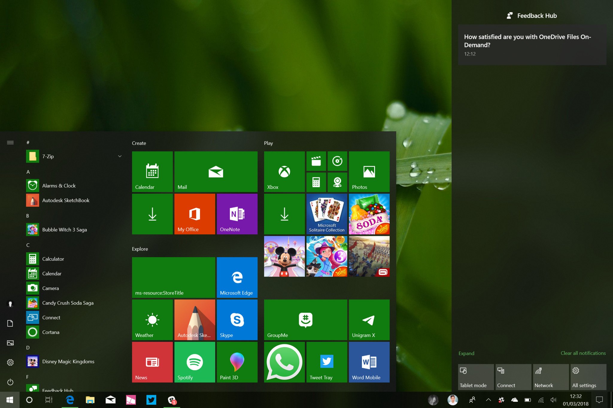
As with every Windows 10 release, Microsoft has made a few changes to both the Start menu and Action Center. However, these changes are not major in any way. Microsoft has merely added a few new UI effects and additional behaviors to improve usability. The most notable change to both the Start menu and Action Center is the inclusion of more Fluent Design effects, something that Microsoft began implementing with the Fall Creators Update last year.
With the April 2018 Update, users will now notice a hover effect that follows the cursor around the Start menu's live tiles and apps list, as well as in notifications and Quick Actions in the Action Center. These are small changes that add to the 'delightfulness' of Windows, something the OS has been severely lacking in previous releases. Version 1803 is the first Windows 10 update that I think focuses more on the delightful aspects of an experience, something macOS has nailed for years.
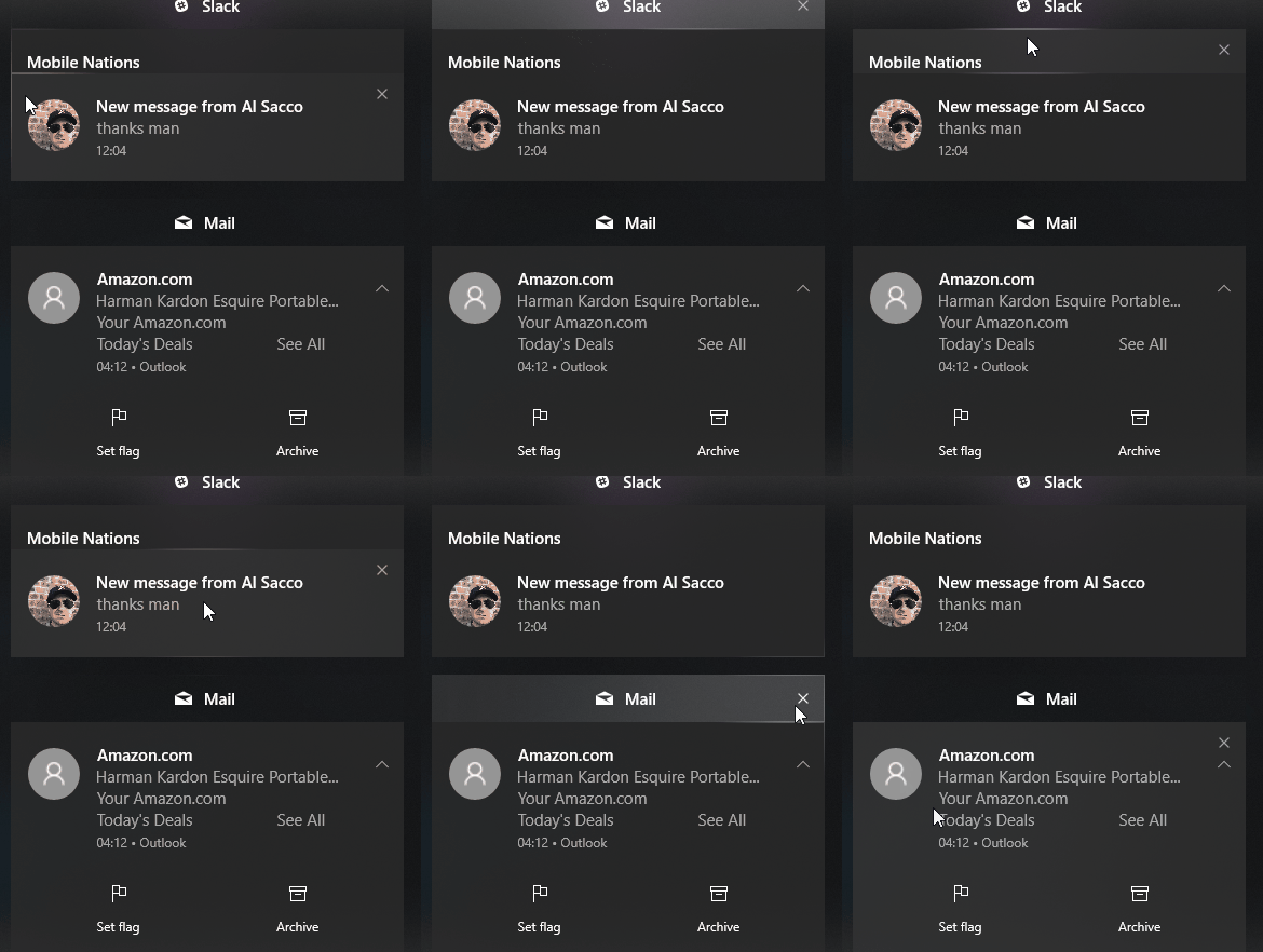
You'll also find these effects in a lot more places than just Start and Action Center. In this update, Microsoft has focused on adding hover effects to all kind of places in the OS, including the Settings app, most apps, and even some elements of the taskbar such as the Date and Time flyout, and more. Microsoft has also added a new blur effect to the taskbar that looks great when using the right wallpaper. Otherwise, it's an unnoticeable change unless someone tells you about it first.
Get the Windows Central Newsletter
All the latest news, reviews, and guides for Windows and Xbox diehards.
In addition to the hover effects (which are officially referred to as Reveal effects,) Microsoft has added the Documents and Pictures folders to the Start menu's hamburger menu by default in an effort to help users find those locations more easily when powering on a new computer. You can remove these if you want, but this change is in the name of making more File Explorer locations easily discoverable like in Windows 7 in an attempt to ease the transition from the 2009 OS.
Also new in this release is the ability to jump straight into an app's settings by right-clicking it in the Start menu. Previously, if you wanted to get any info on an app you had installed, you had to open the Settings app and manually navigate to the Apps area, and then find the app you wanted to know more about. In Version 1803, you simply have to right-click an app's icon, select More > Settings and that's it, you get taken straight to the app settings area.
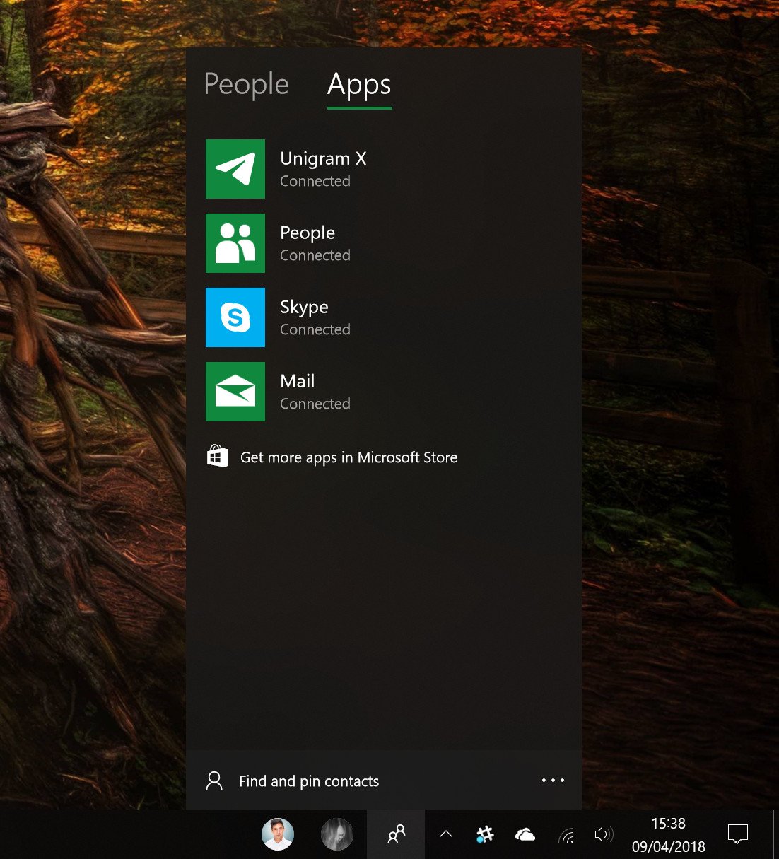
The Action Center is more or less the same as it was in the last update, except users with a trackpad can now dismiss notifications by using a two-finger swipe gesture. Finally, My People has been improved with a few new settings and behaviors. You can now drag contacts to arrange them on the taskbar and pin excess contacts in the hub who you need to frequently contact but don't deserve a space on your taskbar.
You can also now customize how many people show up on the taskbar. Three is the default limit, but you can push it up to 10 if you have a monitor that's big enough, but I can't imagine anybody has that many best friends. Microsoft has also updated the My People hub with a new design, featuring the new Reveal and blue effects, and the hub itself will now link to the Store where you can find more apps that support My People.
Windows 10 Timeline
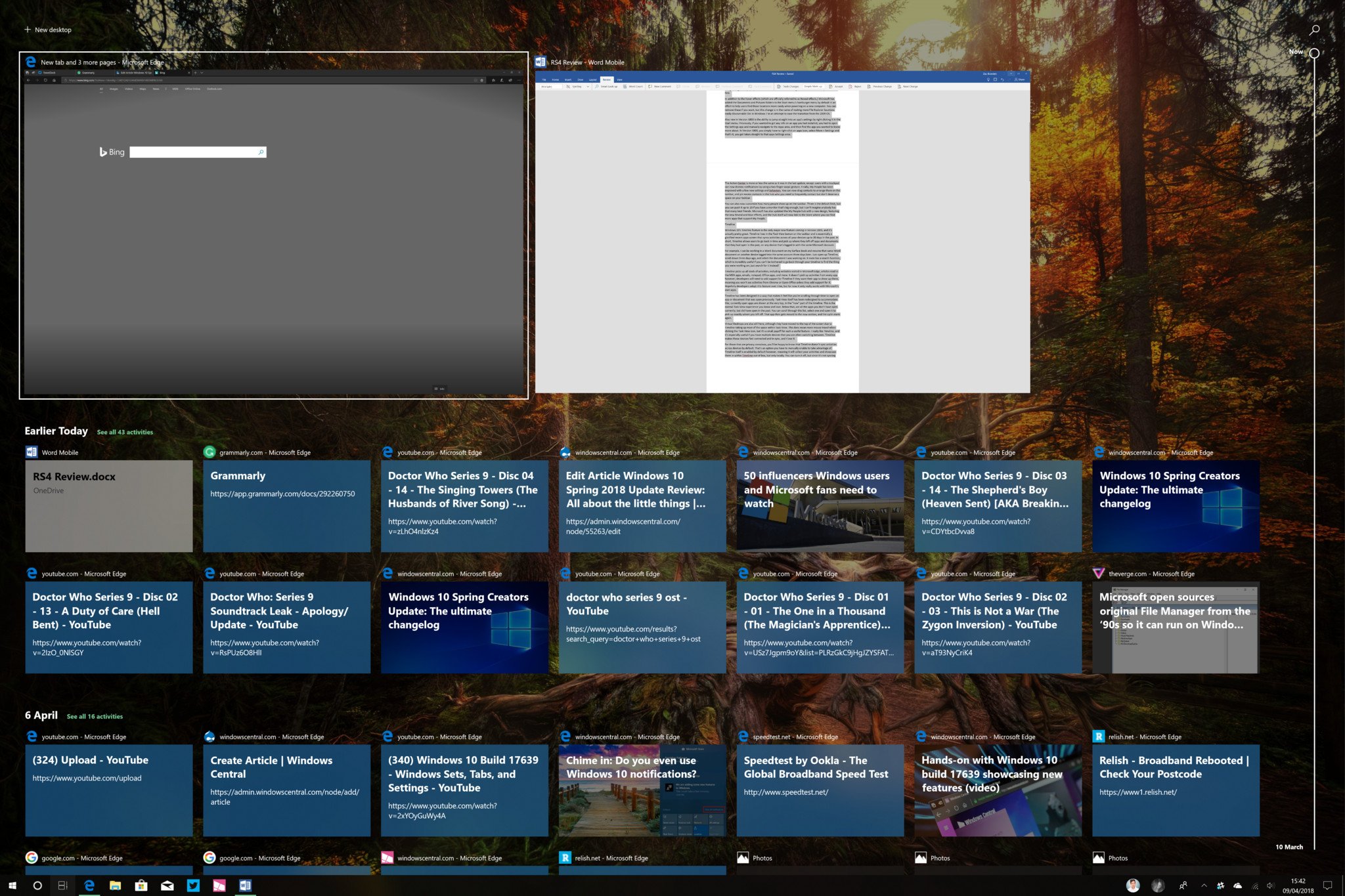
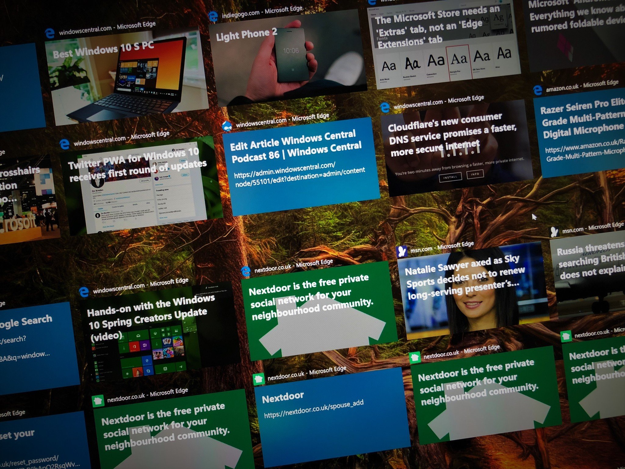
Windows 10's Timeline feature is the only major new feature coming in this update, and it's pretty great. Timeline lives in the Task View button on the taskbar and is essentially a glorified recent apps screen that syncs activities across all your devices up to 30 days in the past. In short, Timeline allows users to go back in time and pick up where they left off apps and documents that they had open in the past, on any device that's logged in with the same Microsoft Account.
For example, I can be working on a Word document on my Surface Book and resume that same Word document on another device logged into the same account three days later. Just open up Timeline, scroll down three days ago, and select the document I was working on. It even has a search function, which is incredibly useful if you can't be bothered to go back through your timeline to find the thing you were working on; search for it instead!
Timeline picks up all kinds of activities, including websites visited in Microsoft Edge, articles read in the MSN apps, emails, notepad, Office apps, and more. It doesn't pick up activities from every app, however; developers will need to add support for Timeline if they want their app to show up there, meaning you won't see activities from Chrome or Open Office unless they add support for it. Hopefully developers adopt this feature over time, but for now it only really works with Microsoft's own apps.
Timeline has been designed in a way that makes it feel like you're scrolling through time to open an app or document that was open previously. Task View itself has been redesigned to accommodate this; currently, open apps are shown at the very top, in the "now" part of the timeline. This is the normal Task View experience you know and love. Below that, are all the apps you don't have open currently but did have open in the past. You can scroll through this list, select one and open it to pick up exactly where you left off. That app then gets moved to the "now" section, and the cycle starts again.
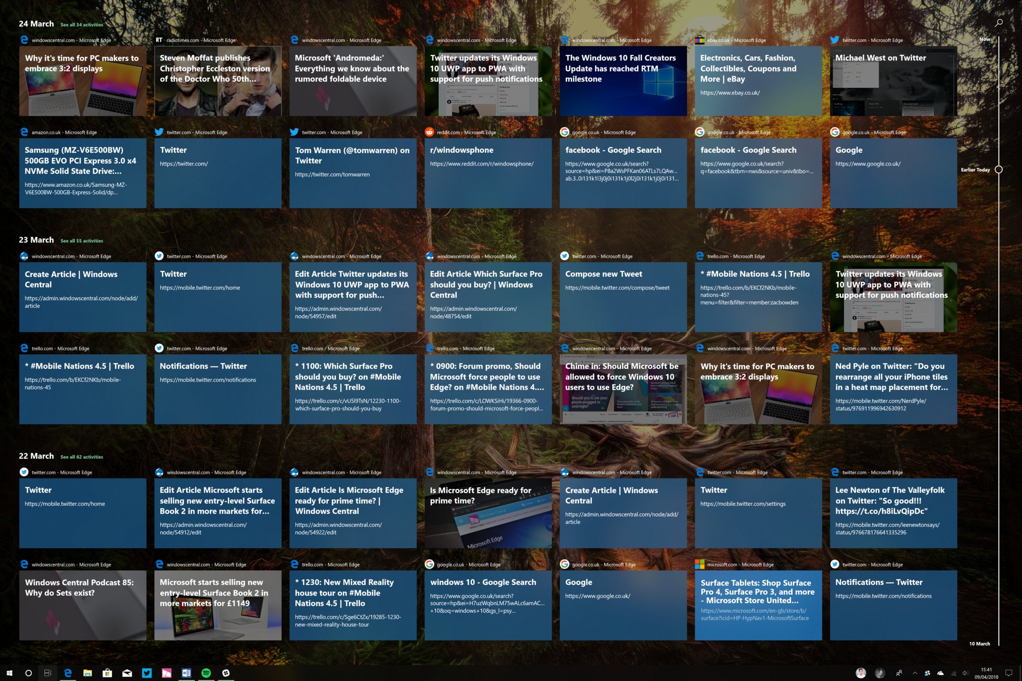
Virtual Desktops are also still here, although they have moved to the top of the screen due to Timeline taking up most of the space within Task View. This does mean more mouse travel when clicking the Task View icon, but it's a small price to pay for such a useful feature. I really like Timeline, and it's especially useful if you have multiple devices that you are often switching between. Timeline makes those devices feel connected and in-sync, and I love it.
For those that are privacy conscious, you'll be happy to know that Timeline doesn't sync activities across devices by default. That's an option you have to manually enable to take. Timeline itself is enabled by default, however, meaning it will collect your activities and showcase them in within Timeline out-the-box, but only locally. You can turn it off, but since it's not syncing anything to the cloud unless you tell it to, I'm not sure many people will care. The option is there regardless though.
The true usefulness of Timeline will depend entirely on how often you need to open up a webpage or document you were looking in the past, and whether or not you use multiple Windows 10 devices that are logged in with the same Microsoft account. I find being able to resume activities that I started on another device incredibly useful and convenient; it makes all my Windows devices feel like one, and that's great.
One really odd issue I've noticed with Timeline is a collection of graphical issues that seem to span across a variety of devices. Timeline is very animation heavy, and it appears Microsoft still has work to do in optimizing those animations. Even on my high-end PC, the animations will often drop frames. On my Surface Studio, the animation doesn't even display properly. I've also had issues with Timeline not showing up at all at times, which is incredibly frustrating.
Microsoft Edge browser
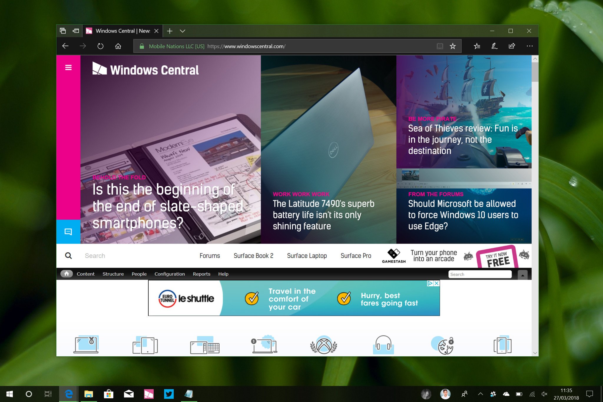
With this release, Microsoft Edge has yet again been improved a fair bit, and that's great news. Every Windows 10 update since Windows 10 was released back in 2015 has improved Edge in some way, and that trend continues here with the April Update. I've been using Edge since it was first made available in preview, so I can definitely see where the improvements have and haven't been made.
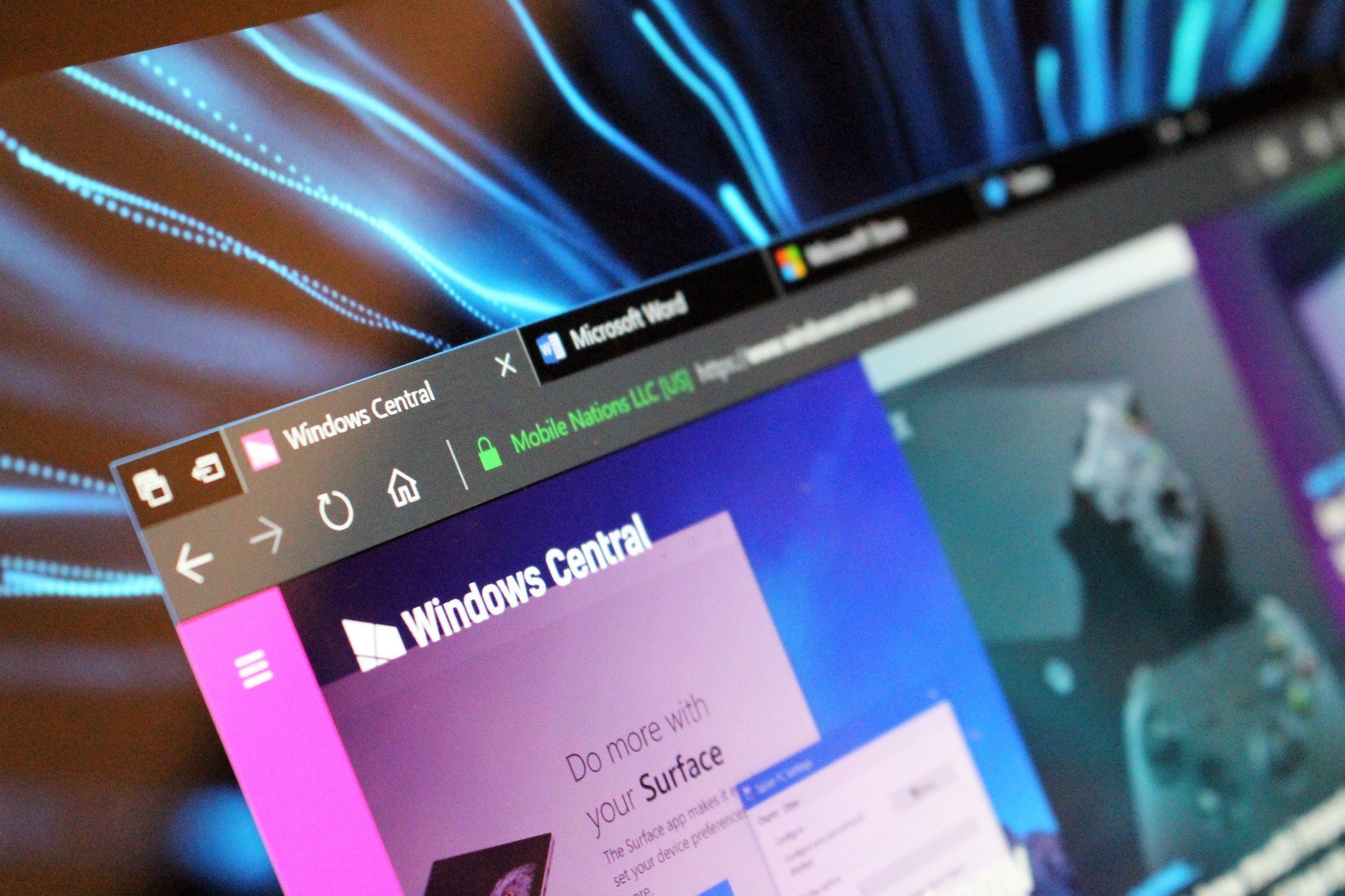
I'm happy to report that Microsoft Edge, at least for your average Joe or Jane, is more than fine as a daily browser now. It's stable, with Edge crashing about as often as Chrome does for me, and it's a lot faster and cleaner than it was previously. Microsoft has updated the Edge UI with Fluent Design effects and has even improved the blur-effect found in the title bar that allows your wallpaper to bleed through more obviously. It looks excellent.
What's more, Microsoft has redesigned the 'Hub,' which stores all your Bookmarks, Downloads, Books, History, and Reading Lists. No longer is it a small sidebar that's confined to the very right of your screen; instead, it's a large panel that slides out and takes up as much room as it needs, making the overall experience feel less cramped and more inviting.
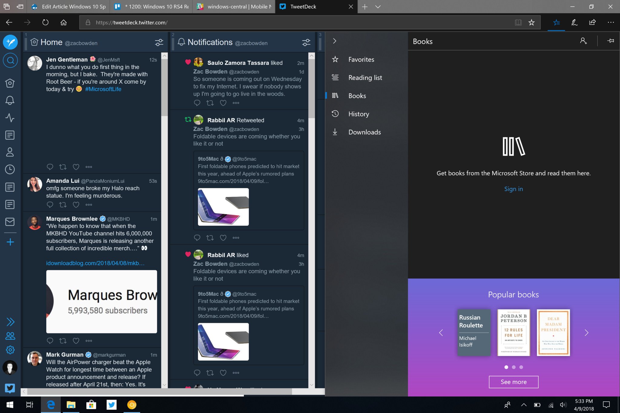
Other than that, the categories within the Hub are more or less the same, except for the Books area. The Books area has been redesigned to showcase Books that are available to buy a read right now, which increases discoverability of the Microsoft Store. Unfortunately, the Book Store itself is limited to the United States, meaning those outside of the States won't see this category at all.
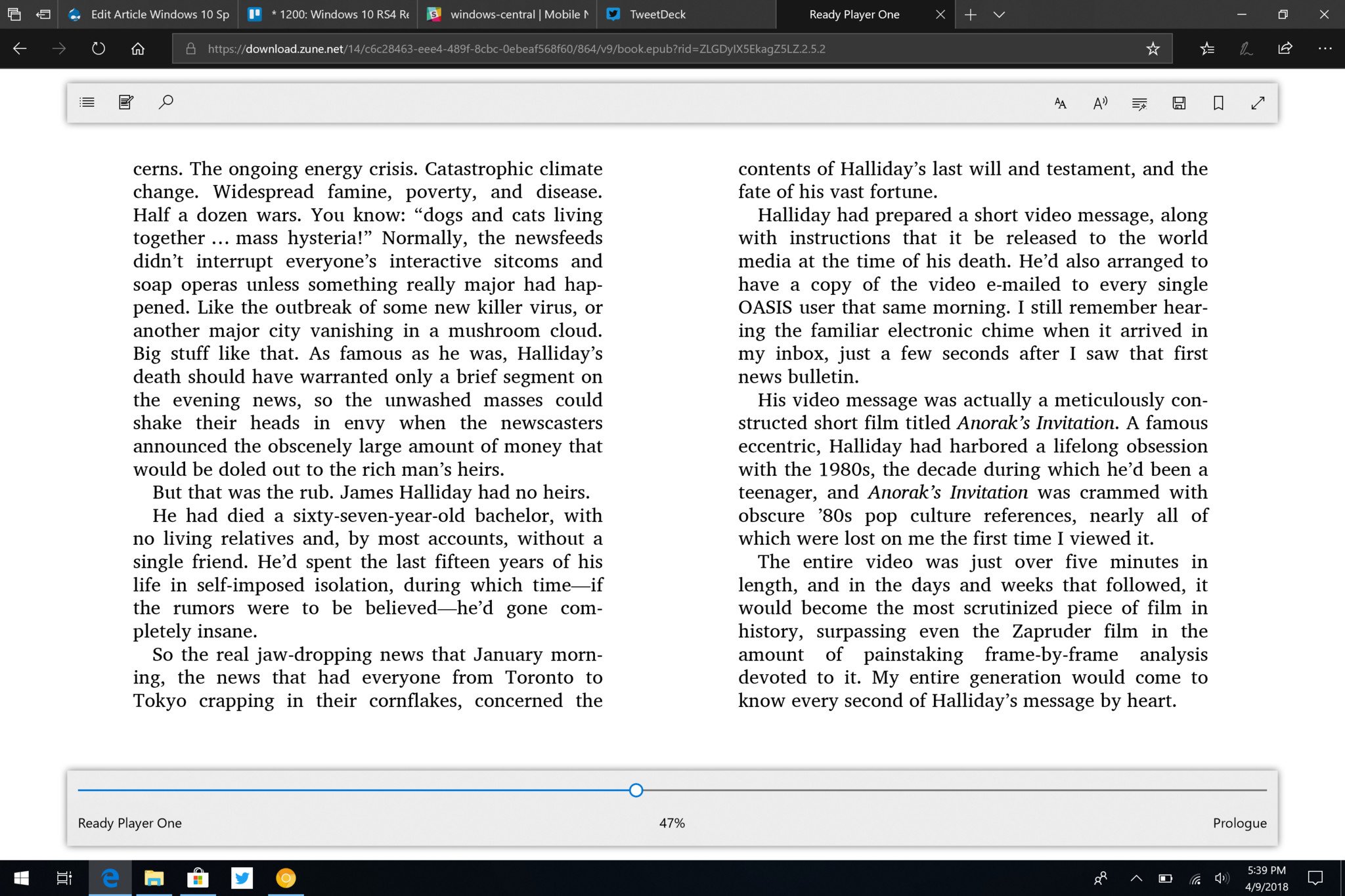
On the subject of books, the Book reader itself has been redesigned too. It's now much easier to use, with a scrubber at the bottom allowing you to quickly scroll through pages in a book and a whole bunch of features and options at the top. These features include a read-aloud mode, grammar checker, highlight capabilities, bookmarks, annotating capabilities, and notes. The Edge book reader is one of the better book readers I've seen out there, which is great to see.
Most of the other changes made to Edge are smaller yet useful. For example, Edge finally has a mute-tab button now, meaning if you're someone who browses with multiple tabs open at one time and one of them starts playing an ad or music, you can easily find it and mute it without having to click into it and find the media that's playing. Also new is Edge's ability to automatically fill out preferred information in address boxes, name forms, and so on, just like in Chrome.
Under the hood, Microsoft has done lots of work to enable something called 'Progressive Web Apps', which essentially allow some websites to behave like apps on your PC. For example, you'll now find that some sites can request to send you notifications, which will deliver regardless of whether or not you have Edge open, just like an app on your phone.
Overall, many of the improvements made to Edge in the April Update are small but useful. The most notable improvements are to do with book support, but I can't imagine many people use Edge as a book reader, and since the Book Store itself is limited to the United States only, it's not something most people are going to even know about. Everything else is great, and I really love Edge in this release.
Windows 10 Cortana
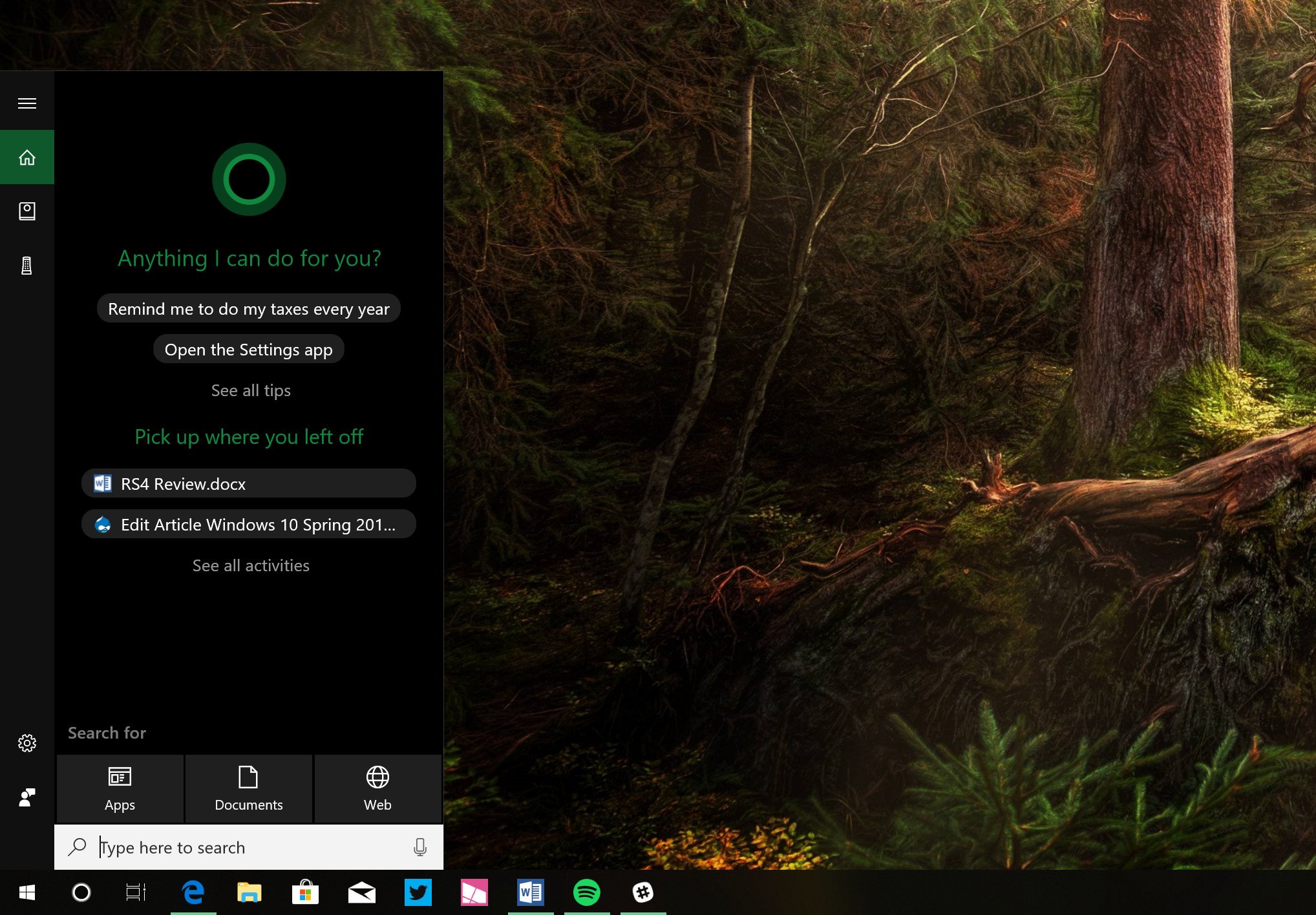
Cortana is in a really weird place in the April Update, because its experience is seemingly scattered across the search function and the Action Center now. Microsoft has ripped out the old Cortana Home UI that used to present itself whenever you'd click the Cortana button or search bar and is now showcasing some of that information in the Action Center instead ... but search is still called Cortana, even though Cortana's main features aren't in there anymore.
If you're someone who actually uses Cortana for the 'at-a-glance' day view, you're going to be in for an unwelcome surprise with the April Update. Since Cortana's Home UI is no longer there, there's no way to easily see your upcoming appointments, latest news, or packages that are being tracked unless you go into the notebook first or ask Cortana directly. I don't think many people used Cortana for this anyway, but if you did, the April Update makes getting to these things a little tougher.
Microsoft says a lot of Cortana's proactive content (such as pick up where you left off, reminders, package tracking, etc.) will now pop up in the Action Center when it is necessary to the user. It won't be there all the time, but say if a package ships, Cortana will pop a notification to tell you that, which will live in the Action Center until you dismiss it. It's not a perfect replacement for the Cortana Home UI, but it's better than nothing.
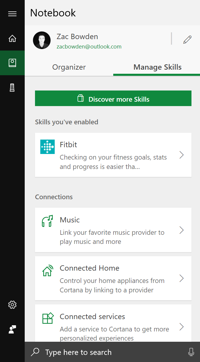
The good news is the Cortana Notebook has been redesigned with a much more welcoming UI that, depending on your country, will better surface different tasks and skills that Cortana is capable of. Each of Cortana's capabilities is now categorized, and in the US, the ability to add more skills to Cortana is now better presented to the user.
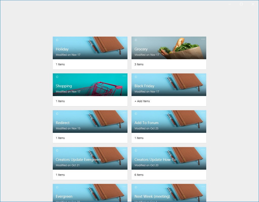
There's also a new Cortana Lists feature, which automatically adds things to lists that Cortana thinks you might want to have listed. For example, when browsing on Amazon, Cortana will ask you if you want to add whatever it is you browse for to your shopping list, just in case you're interested in buying something but don't currently have the money. This way, Cortana can save it for you, and then you can cross it off the list once you buy it.
In reality, this feature is more useless than useful. I'm yet to find myself being thankful for Cortana's suggestions here; more often than not I just prefer creating my own lists, that's when I remember the feature exists. It's buried in the Notebook, and doesn't show up as a dedicated app in the Start menu nor does it feature a live tile.
So, Cortana isn't in the best state in the April Update. The removal of the Cortana Home UI makes for a clunky, jarring experience, as Cortana is now showing up in multiple places of the OS. This is because Microsoft is in the middle of rethinking Cortana, which will involve slowly moving Cortana into the Action Center full time, along with introducing a new chat-based UI akin to the likes of Google Assistant on Android.
Those changes aren't coming in the April Update, however, so for now we're going to have to put up with Cortana being all over the place. Not great.
Windows 10 Nearby Share
One nifty new feature in the April Update is the ability to share web pages, documents, photos, and basically anything that supports the Windows 10 share feature with devices that are physically nearby via Bluetooth. Gone are the days of needing to transfer something from one device to another but not having a USB around, resulting in you having to email yourself which is a cumbersome experience. With Nearby Share, you can share directly to other devices wirelessly, kind of like AirDrop on Apple devices.
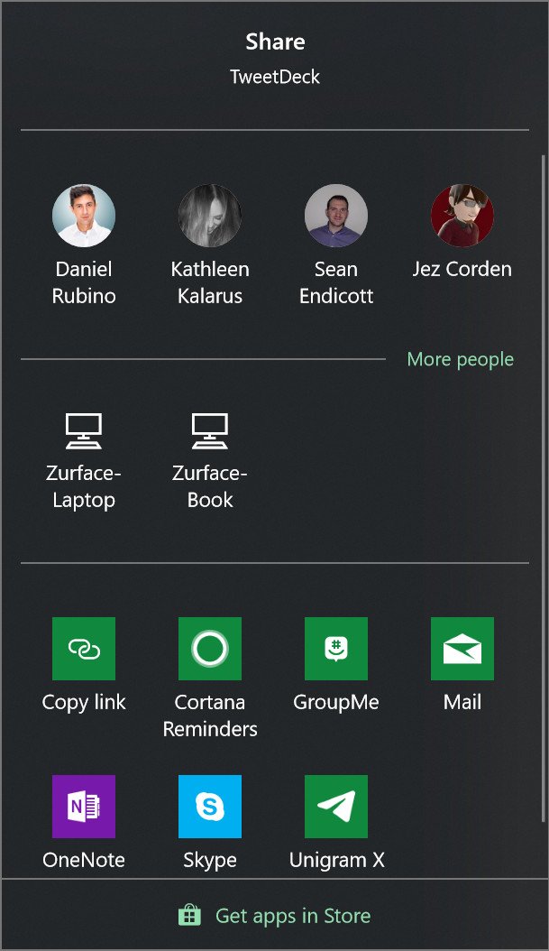
This isn't tied to your Microsoft Account, either, meaning you can share things with devices nearby that aren't yours. This is great if you need to send a friend or co-worker a file, but don't have a USB around to do it. Just tap on the share icon, select the device that's nearby, and send it. The receiver will have the option to accept or decline the file, and if accepted, the file will transfer over Bluetooth. In my testing, it works pretty fast for basic things like photos, documents, and web pages. I wouldn't trust it with super large files, though.
This is one of those features that you likely won't use often, but will prove incredibly useful when the time comes to it. It's off by default, but you can enable it easily via the Action Center. Microsoft has made it into a quick action that can be toggled on and off whenever you feel like it. I leave mine on, but you might want to turn yours off if you find yourself in public spaces and don't want to constantly receive requests to receive files from strangers.
Windows 10 Focus Assist
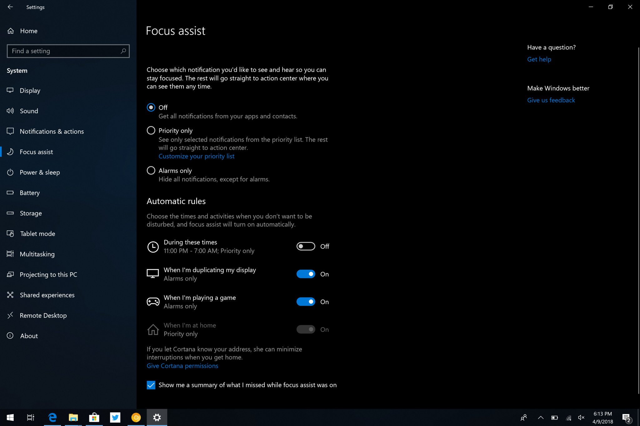
Microsoft has redone the Quiet Hours function in Windows 10, giving it a new name and a couple of new capabilities. No longer is Quiet Hours a simple tool for shushing notifications for a period of time. Instead, Focus Assist is designed to help you stay focused when you need it; shutting out notifications in smarter, automatic ways without you really needing to think about it.
For example, whenever you launch a game, Focus Assist will come on to make sure no notifications pop up during an intense match with your friends or enemies. It'll also enable itself whenever you project your screen to ensure no saucy messages from your significant other pop up during an important meeting with your boss. Once done, Focus Assist will turn off and show you a summary of all the things you missed while Focus Assist was enabled.
You can even customize which apps and people can break through when Focus Assist is on, so if you have an app that you absolutely must see notifications from regardless of whether you need to focus or not, you can set that up too. I do wish Microsoft added the ability to customize which apps enable or disable Focus Assist; for example, it'd be cool if I could set it so whenever I open Word, Focus Assist comes on automatically. Alas, that's not a feature, at least not yet.
Finally, and I think this one is the coolest; you can setup Focus Assist so that it automatically comes on when you're at home. This is a feature primarily designed for those who use their laptop for work and home related stuff. When at work, notifications about meetings and projects are important, but at home, you likely don't want all that noise. Focus Assist can automatically turn on once you reach your home so that you don't get bombarded with work-related stuff outside of work. Pretty neat!
Other useful changes
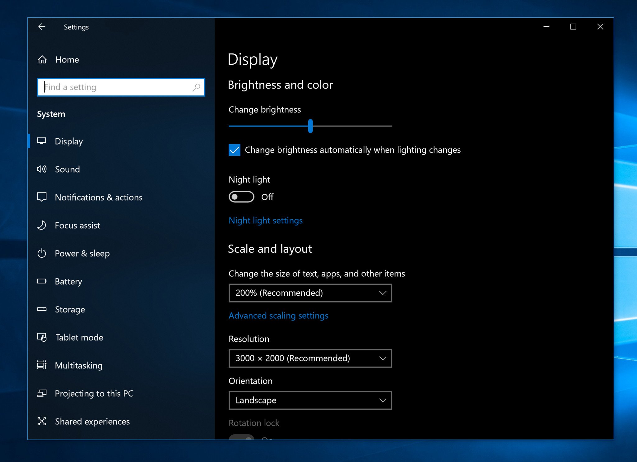
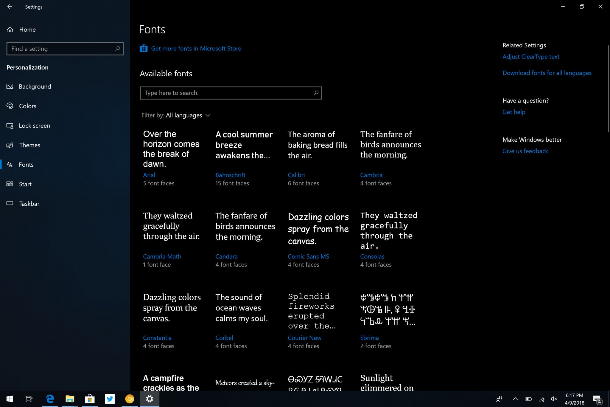
As with every new update, there are all sorts of new settings and miscellaneous changes that don't fit into any other categories, the biggest of which is Microsoft's continued modernization of the old Windows Control Panel. The April Update is the biggest yet in regards to this slow transition, moving over lots of older Win32 applets into the new modern Settings app.
For example, you can find things like Fonts, Language Packs, Sounds and Devices, System Startup Apps, and even Disk Cleanup in the Settings app now. Microsoft is slowly but surely deprecating the Control Panel, and while the Control Panel still exists in the April Update, it's slowly becoming less relevant as more of it gets moved into Settings.
Microsoft has also added updated display options which help with how Windows scales legacy apps. There's a new "Fix blurry apps" notification that pops up whenever Windows display scaling changes, which is designed to help make legacy apps not look blown out or super small when that happens.
Bigger changes have been made to Windows Update, which will now showcase an icon in the System Tray when there's an update pending installation, which should help give the user a heads up that a restart will be required soon. Microsoft knows that updates are an inconvenience to the user, and is trying to give them as big a heads-up as possible.
Microsoft has also done lots of work behind the scenes to make updates install a lot faster once a reboot has begun. In fact, Microsoft has sped up this process considerably, so that most modern PCs should only be out of action for less than 20 minutes. This is a huge improvement over the hour or more it used to take on some devices, and a welcome change that I'm sure many will appreciate.
There's now a new "one-click" Bluetooth pairing mode that works with a handful of Bluetooth peripherals. Just like how you can connect a pair of AirPods to an iPhone with one click, the same can now be done with some Bluetooth devices on Windows 10. For example, if I attempt to pair my Surface Precision Mouse with my Windows 10 PC, Windows will pop a notification asking if it can connect to it. Tap yes, and that's it. It's super easy and quick, although it doesn't work with all Bluetooth devices.
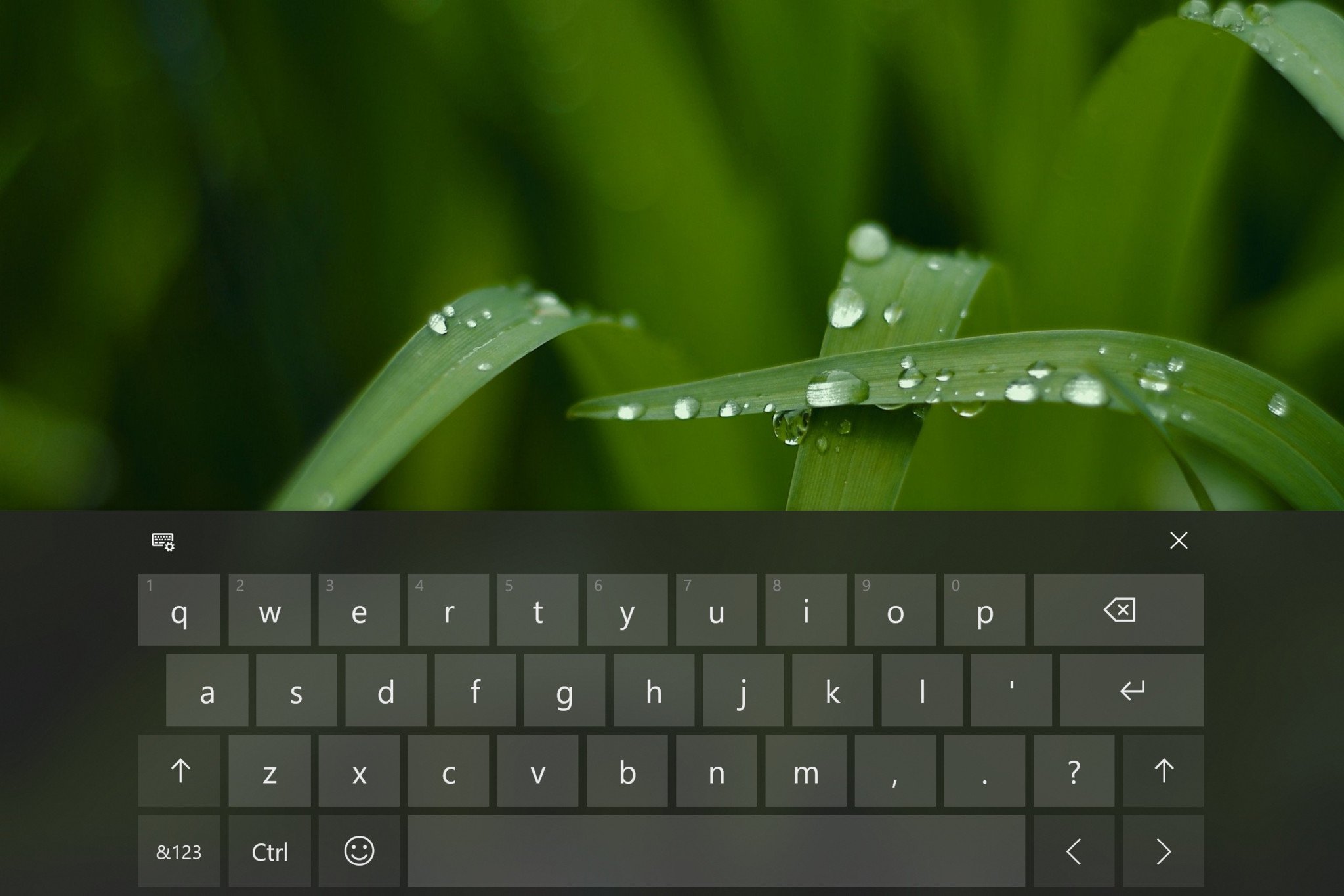
The on-screen keyboard has been given the blur effect treatment, and the larger keyboard now supports shape-writing. Microsoft has also updated support for eye tracking, with an improved navigation bar with more options and features. For pen users, when tapping on a text field, a pen field will now popup allowing you to write directly into the field with ease. This is a much better system than before, which required you to write into a separate pen field.
Those using physical keyboards in the US can now take advantage of new on-screen suggestions, similar to the suggestions you get on a virtual keyboard on your phone. You can use the arrow keys or mouse to select the works, which can prove useful for when you're trying to type out a word you can't quite remember how to spell. I personally don't think it enhances my writing speeds, but perhaps that's because I'm already pretty fluid in my typing capabilities. This feature is also off by default, which is interesting.
Also new in this release is the ability to set input and output audio devices per app. This can be done via the Settings app, and lets you manually choose where you want audio to come from in a specific app, which is excellent. So for example, you can now make it so Google Chrome outputs audio to your headphones, and have iTunes output audio to your PC's speakers. Pretty neat!
There are also lots of new security improvements, as with every release. You can learn more about the new security enhancements in the April Update here.
Final thoughts
The Windows 10 April Update is a good update. We're in an age now where new versions of Windows don't bring huge new changes, and that's okay. Most users don't like it when everything changes at once anyway, so I think it's smart that these new updates are only bringing small, incremental changes that make for lots of change over a long period of time.
If you go back and use the original version of Windows 10 that launched in July 2015, so much has changed. But, going from update to update, those changes aren't noticeable. Windows 10 today is a much better and far more well-rounded product than the Windows 10 that originally launched, all without anybody really noticing.
Timeline is super-useful, at least for me, but that usefulness will depend on whether you use apps that support it and whether or not you have multiple devices or reopen things you had open in the past. I like being able to go back in time and see everything I had done on my PC on a certain day in the past, and quickly resume any tasks or projects I had going at that time.
What's less good about this update is Cortana, and how Cortana seems to be in a weird limbo as she moves out of Windows Search and into the Action Center. The missing Cortana Home experience is going to bum out some people for sure, and there's no real replacement for it, at least not yet. You can still get access to all the things Cortana is watching for you, but you've gotta dig for it or ask Cortana to show it. That's not great.
The other not great thing about the April Update is Microsoft's continued lack of commitment to anyone outside of the United States. Lots of new and improved features in the April Update are US-only, which is absurd for a company as big as Microsoft. Unless you're in the United States, the only new feature you're getting in Cortana is the new Notebook UI; everything else doesn't work.
Book support is U.S.-only, on-screen suggestions are U.S.-only, Cortana Skills are US-only, devices in the Microsoft Store are US-only, and I'm sure there are many other features that I'm missing that are region restricted. Microsoft is beyond bad at supporting users outside of the United States, and unfortunately, this trend is showing no sign of stopping.
Microsoft is running the largest beta and feedback program ever. The Windows Insider Program is full of willing participants all over the world who are happy to test and submit feedback about Windows features before they're ready. How Microsoft is unable to ship features outside the United States at launch is ridiculous based on this fact alone. It's not like Microsoft doesn't have the data, because they do.
Apple does a better job at this; heck so does Google. The only company failing at this is Microsoft, and it's unacceptable. I assumed that when this trend first started with Windows 10, it was only temporary as Microsoft was still finding its feet with Windows as a Service, but it's been three years now, and it's still happening. Why should anybody outside of the US buy a Windows machine if Microsoft isn't committed to bringing those users the latest features and capabilities?
Luckily, the biggest changes in the April Update are available outside the US, including things like Timeline and Nearby Share. Overall, the April Creators Update does the job, and since it's the latest version of Windows, I always recommend updating if only for the security improvements and the fact that you're remaining up-to-date over anything else.
The Windows 10 April Update starts rollout out on April 30.
Pros:
- Timeline is useful.
- Nearby Share is great.
- Focus on refinements.
Cons:
- Lots of US only features.
- Cortana Home is gone.
- Timeline is laggy.
More Resources
- Windows 10 Support Forums at Windows Central
- Windows 10 News
- Windows 10 Tips, Tricks, and How-tos

