How the new Windows 10 Start menu may help Windows phones succeed
When an individual or multibillion-dollar tech company loses their way, it is wise that they go back to where they began to find a fresh start.
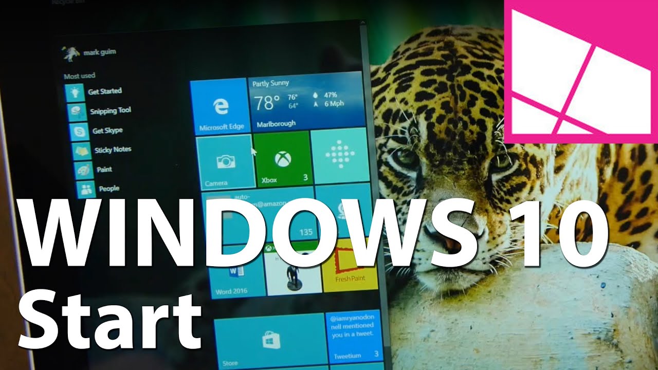
The new live tile enhanced Start menu in Windows 10 not only consoles the Windows faithful who lamented its end in Windows 8/8.1. It may also be Microsoft's key to reaching the masses with its mobile dream.

Classical conditioning
Renowned psychologist Ivan Pavlov is famous for his work with classical conditioning. Through a series of experiments where he presented stimuli, such as ringing a bell, followed by the offering of food, Pavlov's dogs began to associate the stimuli with the food. This association was evidenced by the dogs beginning to salivate when they heard the bell, even when there was no food offered. They had been conditioned.
Starting Off
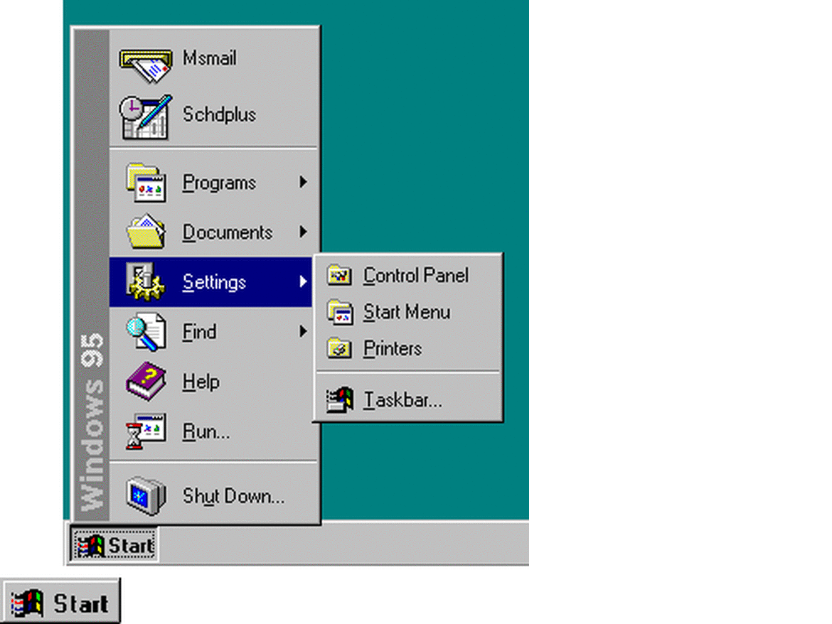
Anyone who has ever used a Windows PC knows how important the bottom left corner of the screen is. Since Windows 95 that corner is where we've gone when we wanted to make things happen. If you want to launch an app or do some other task, it all begins with 'Start.' Though there are options like the ability to pin things to the taskbar, our minds, like those of Pavlov's dogs, are conditioned for the bottom left corner where the Start button resides. And that's ok.
Microsoft trained hundreds of millions of us for nearly two decades to think that way. The Start menu became a familiar tool as we sat in front of our computers for hours at work or home. We constantly deferred there when we knew exactly what we wanted as well as when uncertainty crept into our workflow. Regardless of the results we always knew that it was at least a start. (Pun intended)
The frequency with which we engaged the menu made it profoundly familiar in its reliability, position, and presentation. Through repeated interaction, an image of the Start menu with its list of helpful apps and tools has been seared into the minds of 1.5 billion of us. We'd recognize it anywhere. If that familiar tool were slapped into another OS we'd feel right at home. We've been conditioned.
In 2012, Windows 8 took that all away. The long reign of the Start menu had ended.
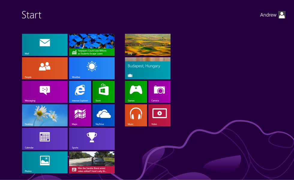
Huh?
That's the response many people had when they first saw the Windows 8 Start screen.
All the latest news, reviews, and guides for Windows and Xbox diehards.
"What are all those colorful rectangles, why are they moving and more importantly… where's my Start menu!?!"
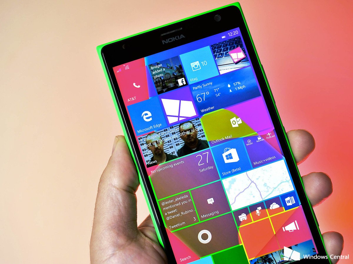
Windows Phone fans immediately recognized the live tile dominated UI. It was a deliberate reflection of the Modern UI found on Microsoft's mobile OS. And of course, that was the point.
Steve Sinofsky, former president of Microsoft's Windows Division, committed the firm to a radical course. The goal was to use Windows to make the live tile Modern environment familiar to the 100s of millions of people who had never touched a Windows Phone. After all, if consumers began interacting with this new 'Modern' Start screen on the desktop, wouldn't the live tile environment on the phone be less jarring for the uninitiated? That was the hope. But this radical shift backfired. The industry cried foul.
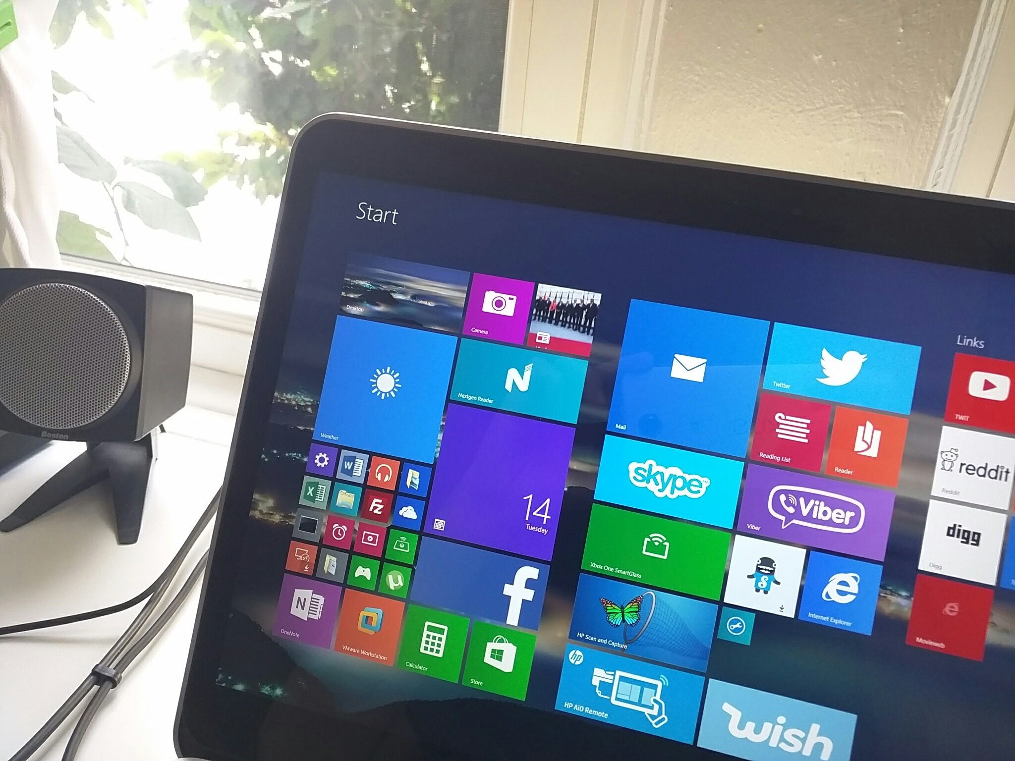
When Microsoft capitulated (kind of) to industry demand and added the Start button in Windows 8.1 they added insult to injury for many users. This Start button didn't behave as we had been conditioned. It just bounced users between the desktop and modern environments. Consequently, when we instinctively deferred to the bottom left corner and clicked the Start button to make things happen, well, the menu didn't happen.
Training Days
Microsoft's intentions were commendable. After nearly 20 years of a Start menu, Microsoft had learned that users could be conditioned. Their hope was that they could use their Windows platform, which had an install base of 1.5 billion users, to condition the industry to embrace their mobile UI.
You see, with iOS and Android dominating the shift to mobile computing, Redmond tried to gain an industry foothold with a unique mobile UI which the market at large rejected. Microsoft's efforts at differentiation with a UI based on dynamic live tiles that deliver up live data was in stark contrast to the static icons found on iOS and Android. This was a double-edged sword, however. These live tiles were so unfamiliar to iOS and Android users that they were a barrier to Windows Phone's adoption.
Redmond is to be applauded for using its Windows platform to bolster its mobile efforts. It's radical implementation in Windows 8/8.1 however overshot the mark. With Windows 10, I believe Microsoft strikes a balance.
Windows 10 the 'Start' of a win-win
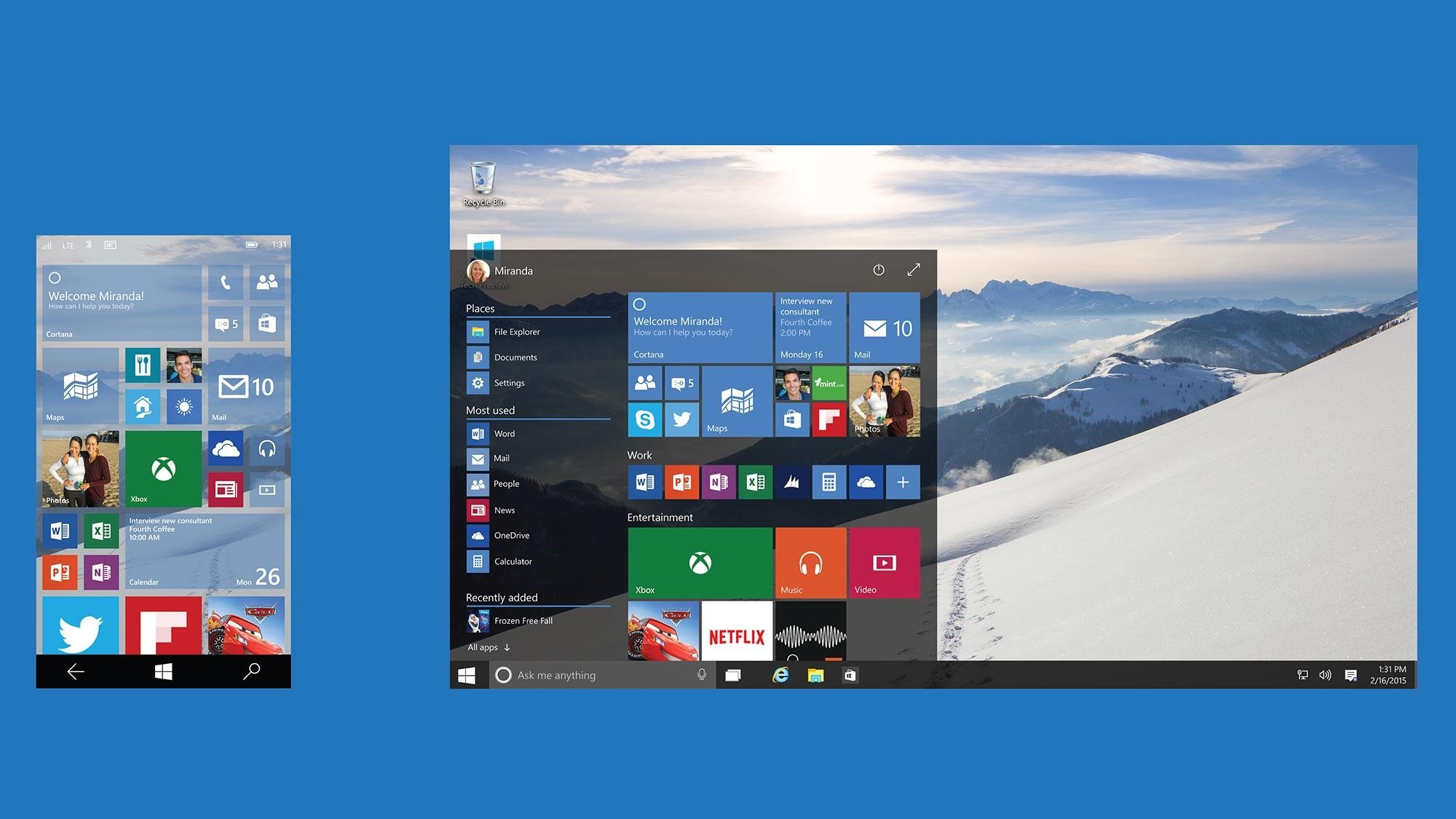
After nearly three years, the Start menu's back. And it is reassuringly familiar in its reliability, position, and presentation. Wrapped in the latest iteration of the Windows OS that familiar image Microsoft seared into our minds is still recognizable. Per our conditioning, we feel right at home with the new Start menu despite one very obvious difference.
To the right of the familiar options are those dynamic live tiles that previously dominated our screens in Windows 8/8.1. But now, confined to the Start menu, they're not overbearing. They're manageable and, unlike in Windows 8, they don't act like a barrier to the things we want to do.
As a matter of fact, it is only when we want to get things done that we see them. This is a very powerful point.
On a psychological level, because the live tiles are seen only when a user wants to get things done there is a positive association between getting things done in Windows and the live tiles. Even if users don't interact with live tiles each time they use the Start menu, the association is there. The Start menu with all of its positive legacy is now being leveraged as a means to add value to the live tile modern environment.
Let's take a closer look.
The look of things
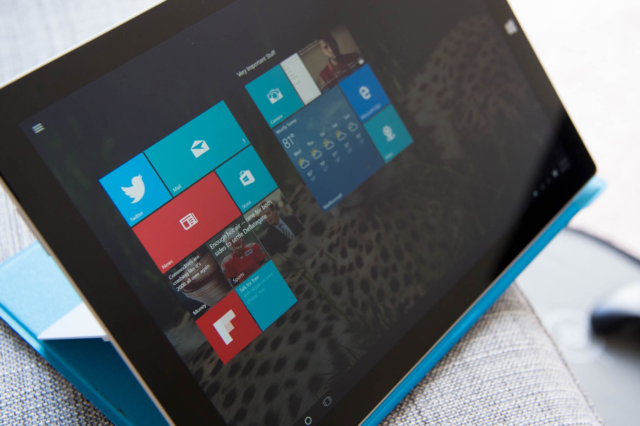
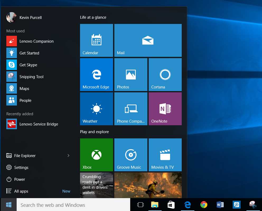
Though the Windows 8/8.1 UI was reminiscent of Windows Phone, it didn't look, nor was the side scrolling pane of tiles, navigated like Windows Phones' UI. With Windows 10 Microsoft makes the live tile portion of the Start menu look and feel like the Windows Phone UI. Its default layout and dimensions are virtually a replica of the Windows Phone Start screen. Additionally the vertical scrolling menu is consistent with the way a user would navigate a Windows phone.
Microsoft's reimagined effort to make Windows Phone's UI familiar to the masses is off to an amazing start. Approximately 81 million Windows 10 users are now flashing that "Windows Phone Start screen" before their eyes whenever they go to Start. With a goal of hundreds of millions of users on Windows 10 in 2-3 years, Microsoft's audience for its surreptitious introduction of the "Windows Phone Start screen", will be increased by an order of magnitude. This dwarves the current audience of Window Phone's users who make up just 2.7% of the smartphone market.
Effectively placing a Windows Phone Start screen in front of every Windows 10 PC user is an ingenious strategy. Coupled with the positive association with a trusted tool for getting things done it is a brilliant long play. Classic conditioning. Pavlov would be proud.
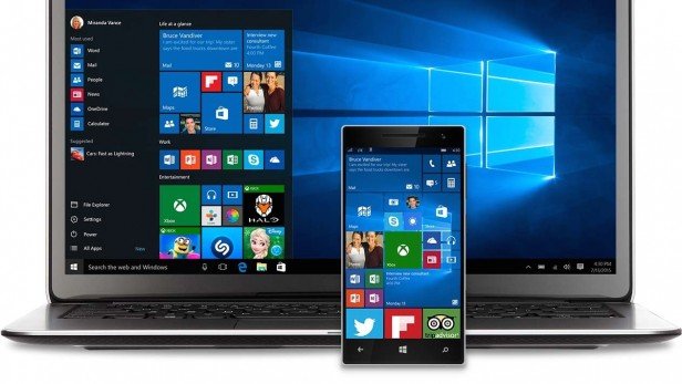
Overtime conditioned users who see live tiles on a Windows phone in a carrier store or on a user's phone in public, will find the UI instantly familiar and may positively associate it with getting things done. That, "what is that?", lack of familiarity may finally be eradicated.
Every time a user launches the Windows 10 Start menu the barrier to Windows Phone's unfamiliar UI is chipped away.
It's not just about looks
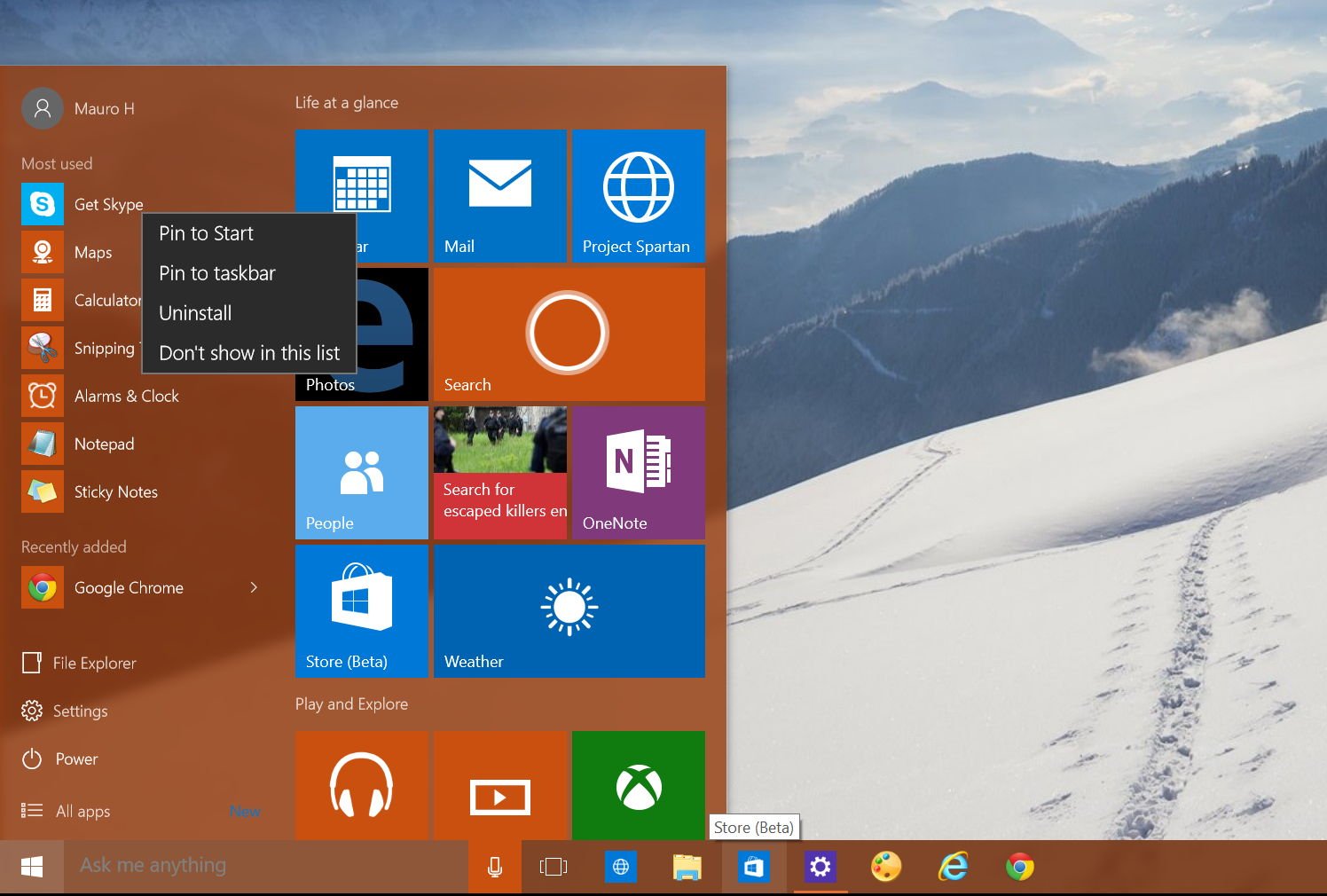
The commonalities between the live tile portion of the Start Menu and the Windows Phone Start screen don't end with looks. Users can resize and reposition live tiles on the Start menu in the same fashion as they would on a Windows phone Start screen. As users learn to tailor the Windows 10 menu to their liking by pinning, resizing and re-positioning apps, they are also learning how to navigate and personalize a Windows phone. The process is virtually identical. Microsoft is slick.
Long Play
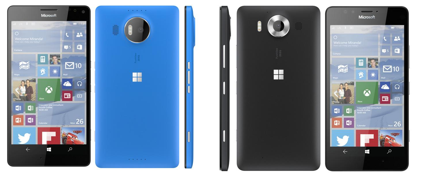
This Fall Microsoft will release the CityMan and TalkMan, two premium Windows 10 phones. These phones aren't meant to compete directly with iPhone and android flagships. They are for Windows fans. This, I believe, is Microsoft's positioning for the long play. Don't be fooled, ultimately Microsoft is after mobile share.
When Microsoft's premium phones launch this Fall millions of flagship-hungry fans will buy them in droves. We'll likely see the largest surge in Windows phone's sales ever. In the wake of the successful Windows 10 for PC launch, this surge will be a great data point for Windows 10 as a platform. It will provide a powerful launch pad for Microsoft's Windows 10 message.
This positive messaging will likely keep Microsoft in the news cycle during the launch of Apple's new iPhones and iOS9 over the next quarter and beyond. Additionally with millions of Windows fans enthusiastically demoing their long awaited 'flagships' to friends and family, high-end Windows phones will finally be visible in the wild.
With a news cycle validating their claims and the subtle undercurrent of a Windows 10 Start menu familiarizing consumers with the Windows Phone UI, it's likely that these high-end premium devices won't be as easily dismissed by the iPhone and android faithful as previous Windows phones were.
Don't get me wrong. Consumers won't be swayed. Yet.
But with the effects of clandestine conditioning, high-end devices and persistent Windows 10 news they may finally begin to take notice. This is a long play after all.
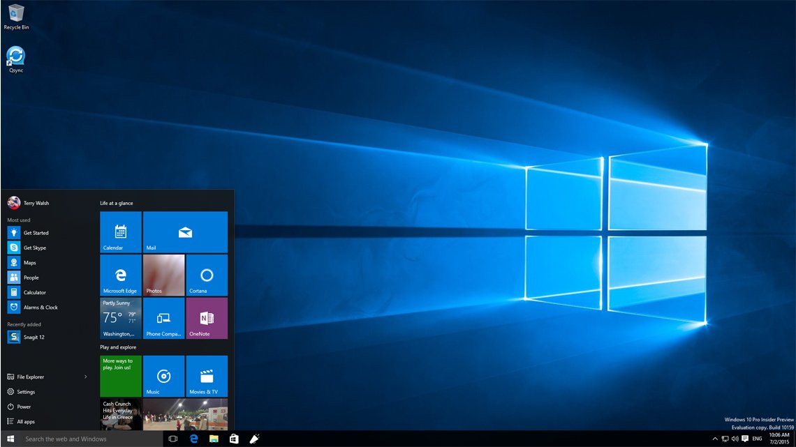
It will take time for the Windows 10 Start menu to remove user bias against the Windows phone UI and acclimate them to navigating it. But users, conditioned for that bottom left corner, will find the association with a useful tool and the live tile environment almost inescapable. (Users can remove tiles from the menu, but most will likely leave them.)
A year from now, with 100s of millions of people on Windows 10 the Windows phone UI will be more familiar to the world than ever. All thanks to the Windows 10 Start menu.
Microsoft by this time will likely have a truly innovative flagship phone in the market that showcases a more mature Windows 10 Mobile OS. That device will ideally capture the attention of a market that will then be more familiar with the Windows 10 Mobile UI. And it will likely not be just for fans.
After all, Nadella clearly stated in his 7/8/15 memo that the narrow focus to three phone segments was a near term goal. By the end of 2016 with the combination of iOS, android and Win32 app porting hopefully in full swing, a growth in the universal apps portfolio and the conditioning effects of the Start menu, Microsoft may be better positioned to take a more aggressive stance in mobile.
"In the near term, we will run a more effective phone portfolio,... We plan to narrow our focus to three customer segments…We'll bring …Windows fans the flagship devices they'll love."
Wrap-Up
There are many barriers to winning consumers to Windows phones. That said the Windows 10 Start menu is designed to accomplish what is arguably the most difficult challenge for Microsoft. Conditioning the human mind to like something either unfamiliar or disliked. Nadella's goal is that users go from needing Windows to loving Windows. It seems that at least in regards to phone he is prepared to subtly condition users to that end. That's classic.

Jason L Ward is a Former Columnist at Windows Central. He provided a unique big picture analysis of the complex world of Microsoft. Jason takes the small clues and gives you an insightful big picture perspective through storytelling that you won't find *anywhere* else. Seriously, this dude thinks outside the box. Follow him on Twitter at @JLTechWord. He's doing the "write" thing!
