Why Microsoft is considering a pivot away from live tiles on Windows
A new Start menu without live tiles is in the works at Microsoft, but why? Let's explore.
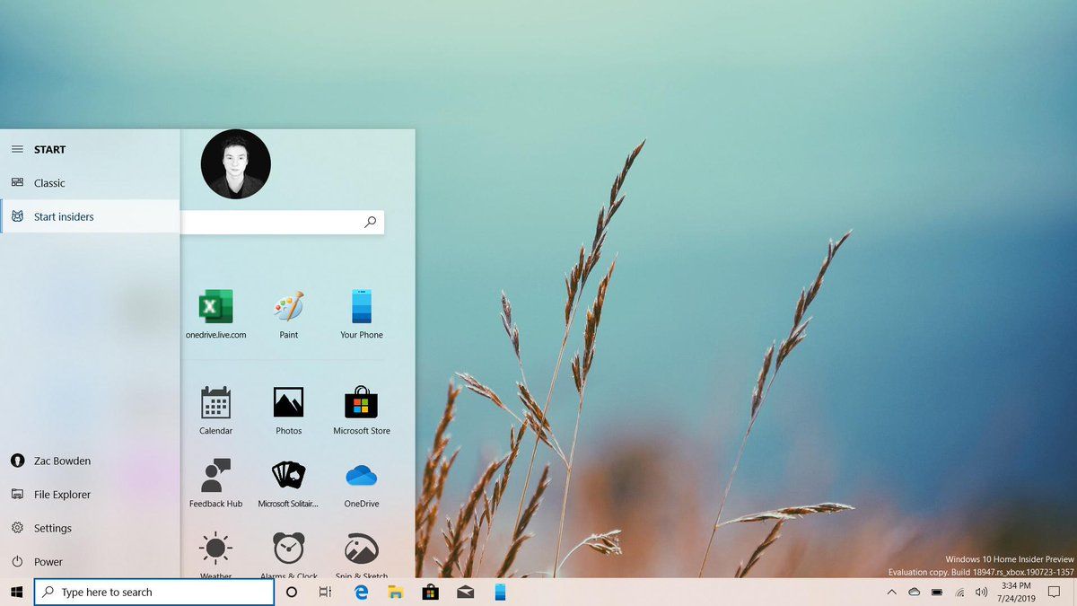
Thanks to a recent Windows 10 build leak, it's now been confirmed that Microsoft is experimenting with a new Start menu design which drops live tiles in favor of a more traditional static grid of icons. I first wrote about this possibility earlier this year. Many responded with a whole list of reasons why I was wrong and how live tiles are a staple Microsoft UX that is recognizable and adored globally.
While they are most certainly recognizable, I wouldn't go so far as to call them adored, at least not anymore. When Microsoft first introduced live tiles with Windows Phone 7 in 2010, the industry was a very different place. The idea of a "notification center" on smartphones was only just coming around, and live tiles were a different take on that idea. Android and iOS had swipe down notifications, and Windows Phone had live tiles.
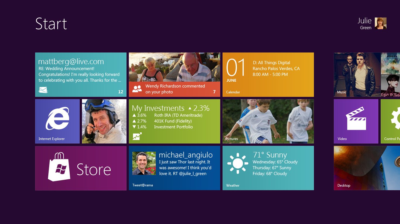
But it wasn't until 2012 where Microsoft shoved live tiles into the spotlight, with the launch of Windows 8 on PCs. This version of Windows is infamous for being rejected by the masses because of the massive shift in UI that placed live tiles front and center in a touch-orientated UI. When complaining about Windows 8, it's the "colorful squared touch interface" that people pointed to first. Naturally, Microsoft's insistence on forcing this experience onto users left a bad taste in a lot of people's mouths.
Demoted from the top
Microsoft eventually backtracked on this by finding a compromise between the old Start menu and the new live tile interface for Windows 10. But doing this meant live tiles were no longer "required" for people to use their PC. A couple of years ago, a source shared with me a document that detailed usage stats of several taskbar buttons, including the Start menu. While I can't share specific numbers, the number of people who were taking the time to customize their live tile layout was not huge.
Many people just don't care for live tiles.
Admittedly, that data is old now, but I can't imagine it has improved much since then. Either way, I'm pretty confident that this is one of the main reasons as to why Microsoft is considering a pivot away from live tiles. What's the point in building out a totally customizable user interface if nobody is using it? People just want to launch apps from the Start menu, and not have to worry about customizing or missing out on info provided by an ever-changing live tile.
There's also lots of feedback across the web from users that suggest people find live tiles to be too noisy, confusing, and challenging to manage. I can see where those complaints come from. I used to frequently lose the Microsoft Store tile in my Start menu thanks to its live tile always promoting other apps to download. And on the flip side of this, there's the problem of developers just not supporting live tiles well. Win32 developers weren't even able to take advantage of live tiles until 2017.
Lack of developer support
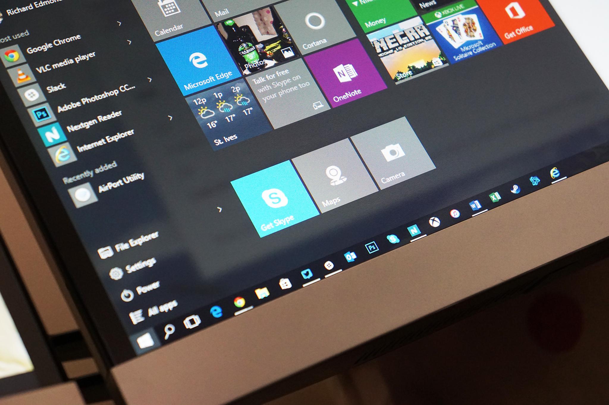
This restriction means the live tile feature was exclusive to modern apps for five whole years. Windows 8, Windows 8.1, and the first few Windows 10 releases were limited to modern apps supporting live tiles only. That meant that even if people wanted to use live tiles, they probably couldn't because the apps they use didn't support them. These days, things are better, but most Win32 programs still don't have excellent live tile support.
Get the Windows Central Newsletter
All the latest news, reviews, and guides for Windows and Xbox diehards.
And that, ultimately, is the other big reason as to why I think Microsoft is pivoting away from live tiles. As the industry slowly moves over to building Progressive Web Apps that work across all platforms, there's even fewer chances developers are going to want to build out live tile support for their apps. Making PWAs fit into the Windows experience seamlessly should be Microsoft's number one priority and asking them to build a live tile is extra work many developers won't do.
Perhaps live tiles can evolve as "widgets" in the future.
Every app, whether it's a Progressive Web App (PWA), Universal app (UWP), or Win32 program, has an icon. Only a small percentage of those also have a live tile. So why build an entire user experience around something that a minority of apps support? It makes more sense to develop your user experience around the thing everyone has and make that experience the best it can be. It's also simpler, cleaner, and more straightforward for users to deal with icons instead of live tiles.
Perhaps we could see live tiles evolve as "widgets" you can pin to your desktop. But I don't think we'll see them around for much longer as an integral part of Windows. I don't believe this pivot away from live tiles is a bad thing, either. Sure, it's sad, but once Windows 10 Mobile went away, the live tile interface really didn't make much sense anymore. I'd rather Microsoft focus on a clean, easy to use and easy to understand Start menu experience for Windows going forward.
Over to you
What are your thoughts on Microsoft's possible pivot away from live tiles? Let us know in the comments.
Our favorite Surface accessories from Microsoft
Every one of these valuable Surface accessories is Windows Central Approved and guaranteed to please.
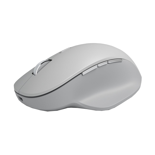
Surface Precision Mouse ($77 at Amazon)
The Surface Precision Mouse is not only one of favorite Surface accessories, it's one of our favorite mice for any PC. It's packed with valuable features and customizable buttons. Its scrolling and tracking are seamless and spot-on. And it's rechargeable so you never have to buy new batteries for it.
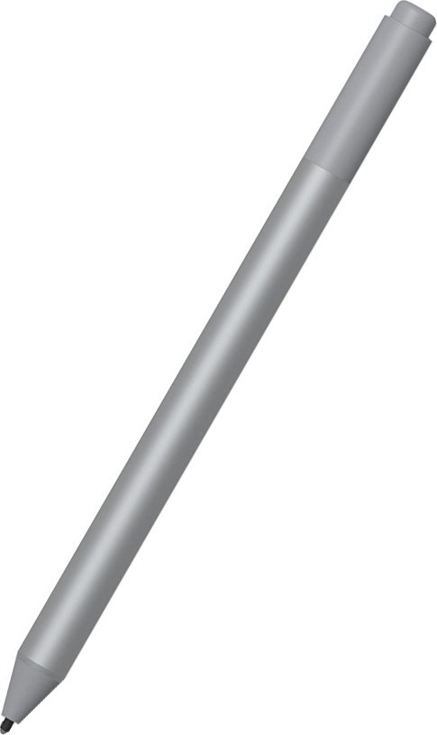
Surface Pen (From $72 at Amazon)
Every Surface owner needs this Pen. Period. It supports 4,096 levels of pressure sensitivity, tilt support for shading density, and enjoys supremely low latency. When paired with a Surface PC, the potential is endless. And it comes in a bunch of cool colors.
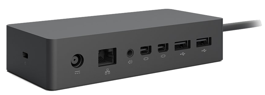
Surface Dock ($136 at Amazon)
With two Mini DisplayPorts, four USB-A 3.0 ports, an Ethernet port, and a 3.5mm audio jack, this dock gives you the ports you need to stay connected to all your favorite devices. Plus, it easily turns your Surface into a desktop power hub. We highly recommend it.

