When Thumbboards Attack!
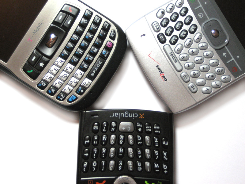
I've been using the YAQKWMS (Yet Another Qwerty Keyboard Windows Mobile Smartphone) tag for awhile now as a sort of inside joke - well, if a joke that only I get counts as "inside." Anyway, the punchline to this interior humor is that these phones are pretty tough to distinguish from one another. They all share Windows Mobile 5 with few (if any) software enhancements, they all have QWERTY thumbboards and 320x240 screens. And so on.
That's unfair, though, because the hardware differences between these YAQKWMS are more than just cosmetic - they have real world functional differences. I'm not just talking about specs, though of course those are important - slight differences in battery life, the addition (or subtraction) of side buttons, the inclusion of WiFi, and more all add up to making your decision a little more difficult.
Today we're going to ignore all that and focus on one aspect: thumbboards. And furthermore we're just going to focus on the big three here in the US, the ones with the most saturation in the US market right now: the T-Mobile Dash, the Cingular Blackjack, and the Motorola Q (available on several networks). Read on for a thumbboard smackdown between these big three Smartphones.
The Contenders
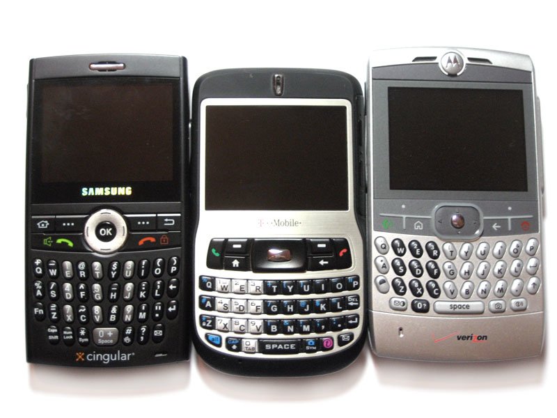
The oldest of the bunch is the Motorola Q, released in May of last year. It's out now on Verizon, Sprint, and the GSM version should hit pretty soon. The MotoQ is pretty much the baseline for these types of phones - not necessarily because it's the minimally acceptable, but just because it was first.
Next up is the T-Mobile Dash (HTC Excalibur to some of you). Released in October of last year, it's the only one of the three we're testing that has WiFi Built-in. In terms of overall form factor the Dash is actually my favorite of the bunch despite the fact that it's a bit wider than the Blackjack. This is because the Dash is the least "squarish" - it's rounded on the back making it feel much more pocketable.
Last up is the new kid on the block, the Cingular Blackjack made by Samsung. It has the least width of all three, yet manages to remain competitive in thinness (though I should mention that its camera sticks out quite a bit on the back).
Keyboard Feel
Let's start with the most subjective metric we can: the overall feel of these thumbboards. I'm mainly looking for tactile feedback, spacing, and the overall experience of typing on these little buggers.
Get the Windows Central Newsletter
All the latest news, reviews, and guides for Windows and Xbox diehards.
MotoQ
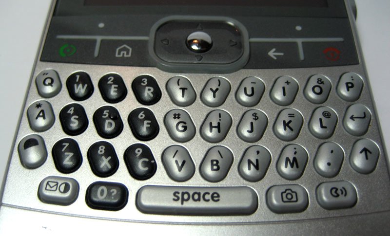
The MotoQ's keyboard is the widest of all three of our contenders and so naturally it feels the least cramped of all three. The keys are nicely raised above the base of the phone and are strongly angled out in a "v" formation. The keys are furthermore very nicely shaped themselves: they're well-rounded and well-separated so there's little to no question as to which key you're pressing.
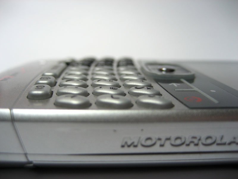
Tactile feedback is also decent enough - there's a clicky feel to the keys that's just a touch mushy but not enough for me to complain. Although the MotoQ is the only device here without soft-touch paint (which really helps with grip), it's actually not too bad to hold - the raised portion on the bottom-rear of the phone (raised, at least, if you haven't gone for the extended battery) actually serves as a neat little spot to rest your fingers.
Really, my only gripe feel-wise with the MotoQ is that it feels just a little top-heavy, though let me say again that's a very subtle and subjective thing. Also aggravating is that the only shift key on over on the right side and the only backspace is way up over the main keyboard. That probably shouldn't bother me as much as it does, but there it is. Overall feel rating for the Q: 7/10.
T-Mobile Dash
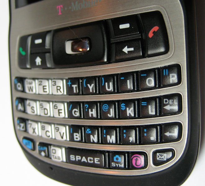
The Dash is definitely the odd one of this bunch. Rather than clearly spacing the keys horizontally, they're only spaced vertically. The keys are mashed up against each other horizontally in a way that looks nice enough but feels pretty awkward. The keys themselves also seem to have the least surface area of all three devices, which is odd given that the device has more width to work with than the Blackjack. There's also little-to-no shaping to the keys: they're mostly flat and almost perfectly square. The overall result is a keyboard that feels cramped and which doesn't provide much confidence with regard to which key you're actually hitting. It's certainly not the worst thumbboard I've ever used, don't get me wrong, but it has its issues.
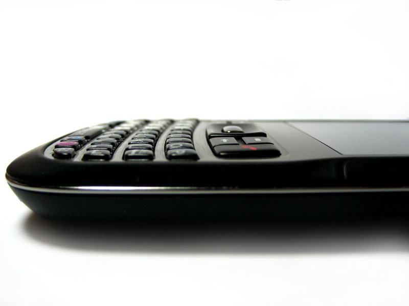
On the other hand, tactile feedback and sound is my favorite of the bunch. Not only is the "click" very satisfying, but so is the "pressure" of each key - they seem to almost "clack back" like a regular full-size keyboard.
Finally, the Dash's overall shape also helps with the keyboard's feel. As I mentioned above, the Dash itself is nicely beveled on the back and it also has soft-touch paint covering all but the very front of the device. Overall feel rating for the Dash: 5/10
Cingular Blackjack
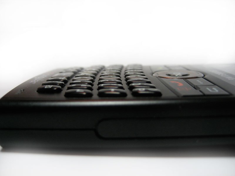
The Blackjack's keyboard has the least width of the bunch, though Samsung has apparently attempted to make up for that by adding quite a bit of height to the keys - they're very tall. The keys appear to "stick up" about as much as the Q's, but they're not as rounded as those found on the Q. These flatter, taller keys make for a poorer typing experience overall - the keyboard feels relatively cramped and I'd say my "confidence" that I'm hitting the right key is mediocre at best.
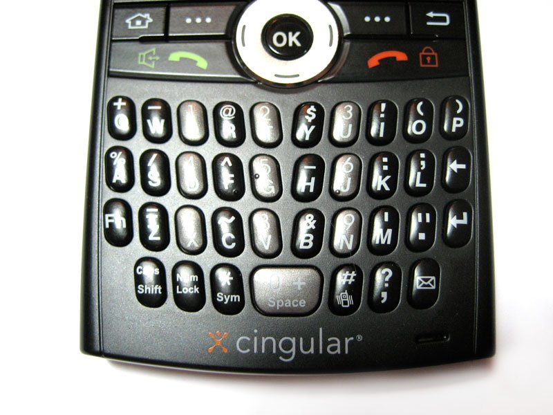
Tactile feedback is good, I'd put it in between the Q and the Dash. The Blackjack also has softtouch paint -- though it's only on the back of the phone -- which helps with the overall feel of holding it in your hand. Another nice touch is that the number buttons for dialing are actually spaced out in the middle of the keyboard - Samsung set it up so that you can press either the number button or the button to the right of the number to dial. So, for example, to dial 5 you can either hit the 5/g key or the h key - which means you can dial faster with a mash of the general area of the number.
Overall, I give the feel of the Blackjack's keyboard a 7/10.
Backlights

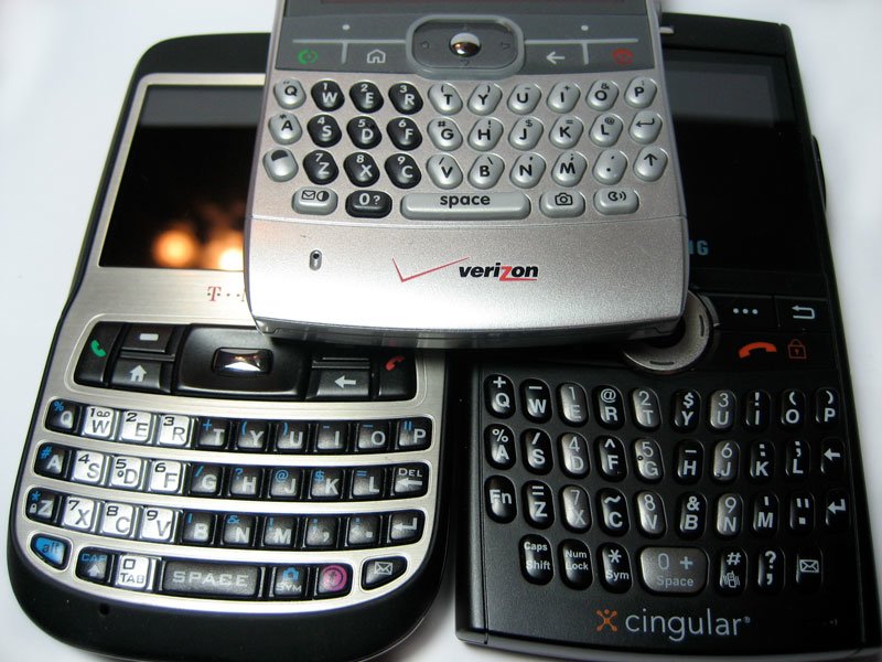
The backlights on all three devices are adequate. I personally like the Blackjack's (left) the best, find the MotoQ's (middle) a bit dim, and the Dash's (right) a little tough to see in medium-dark light. Really, though, there's nothing to see here.
Accuracy
Now, I've been using thumbboards ever since the release of the Treo 180 way back in 2002, so I'm pretty darn proficient with the things. For this test, then, I decided to type as quickly as possible in Pocket Outlook so that I could see if any of these phones "drop" keypresses when going quickly. Since each of these devices has slightly different placement for alt characters like apostrophes, commas, and the like, I tried to keep my test sentences very basic to help level the playing field:
I like typing on thumbboards. It is fun and easy you know. The quick brown fox jumps over the lazy dog. Jump fox jump.
I can bang the above out in 25 seconds or so on a Treo thumbboard with no mistakes (more on that Treo below). So: let's see what we come up with if I give myself 30 seconds on each device to type the above - no backspaces allowed:
MotoQ: "I like typing on thumbboards. It is fun and easy you know. The quick brownfox jmps over the lazy dog. Jump foz jump." 3 mistakes.
Dash: "I like typing on thu,bboards. It is fun and easy uou know. The quick nrowm fox jumps over the lazy dog. Jump fox junp." 5 mistakes.
Blackjack: "I like typing on thumbboards. It os fun andeasy you know. The quic brown fox jumps ovr the lazy dog. Jump fox jump." 4 Mistakes.
So this is far from scientific. On the other hand - it actually mirrors my experience of using these keyboard pretty closely. Overall, I feel like the MotoQ is easiest to type on, but sometimes it seems to drop a key here and there when I really get going. It's rare, but it does occur especially when I have a lot of apps open. The Dash's keyboard is responsive and I haven't seen it drop keystrokes - but the keys are so close together that I often hit the wrong one. The Blackjack, like the Q, seems to occasionally drop a keypress, but overall it's definitely in between the other two.
A few other points that need mentioning. All three devices have a nice feature where you can hold a key down to get an alternate character. On the Dash and the Blackjack, you hold a key down to get the "alt" character, whereas on the Q you can only hold it down to get accented versions of whatever letter you're pressing. So that's a knock against the MotoQ. Another knock: unlike the Dash and the Blackjack, there's no backspace button on the keyboard itself - you have to reach up to the main button board to hit the "back" button. Initially I thought it was weird that so many Qwerty WM5 devices have redundant back/delete buttons on the keyboard. In practice, however, it's just too deep down in our lizard brains that backspace is somewhere over to the right of the keyboard for device makers not to put it there.
The Winner
So after all that non-scientific meandering and griping, citizens demand to know: who wins? My answer might be a little bit of a surprise after reading all that: The Blackjack by a nose. Yes, it's more cramped width-wise than the other two - but it makes up for it with good tactile feedbac, a neat dial feature, and alt keys with nicer placement. Second place is definitely the MotoQ, which would have probably won if they'd just included a darn backspace key on the main keyboard. Coming up in the rear is the Dash. Sorry Dash.
Of course, comparing these keyboard differences is nitpicky. Of the three devices overall, my favorite is actually the Dash despite the sub-par keyboard. Why? Form factor + WiFi. As long as you're not trying to punch out an email as fast as humanly possible, any three of these thumbboards will work decently enough for you, even the Dash's.
Addendum: The Gold Standard
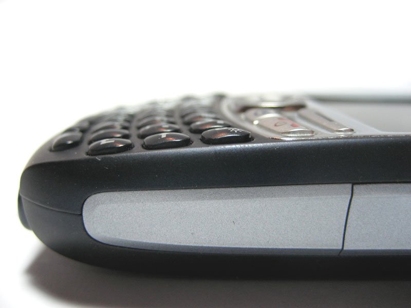
I mentioned earlier that I've been using thumbboards since the Treo 180 came out around 5 years ago. My main phone these days is a Treo 750v - and I'd be remiss if I didn't mention it. Partly because my muscle-memory is Treo-centric (and that might have skewed the results), but mostly because the Treo's thumbboard blows the above out of the water. Its buttons are nicely spaced, well rounded, and have great tactile feedback. Since it's a PPC-Edition phone, I didn't put it in the competition, but if you don't mind the thickness (or the cost!), the Treo 750 has the nicest non-slider thumbboard around these days.
Home to the most invested and passionate Microsoft fans, Windows Central is the next generation destination for news, reviews, advice and buying recommendations on the Windows, PC and Xbox ecosystems, following all products, apps, software, AI advancements, and accessories. We've been around for more than decade, and we take our jobs seriously. Windows Central writers and editors value accuracy and editorial independence in everything we do, never receiving compensation for coverage and never pulling punches.

