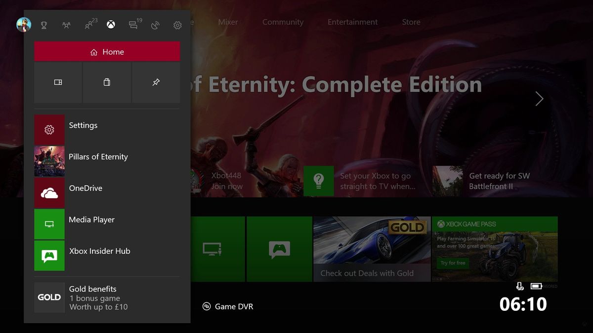
Chime in: What do you think of the new Xbox One Fluent Design dashboard?
So the new Xbox One dashboard UI is here, in all its Fluent Design System glory, but not everyone seems completely content.

A quick perusal across social media will display a whole collection of different opinions on the new Xbox dashboard. Some positive, some negative, some neutral, and some hopeful. This is indeed the first version, but the design direction is quite apparent, and Microsoft is looking for feedback. What better way to send them some by dropping it in our very own forums?
We'd like to hear from you with your thoughts about the new Xbox One Fluent Design update. We'll forward the thread to Microsoft too so they can get an idea of what the Windows Central community thinks. After all, we're all the most passionate Windows and Xbox fans out there, right?
Jump in the thread below and let us know what you think. If you haven't had a good look at it yet, take a look at my YouTube walkthrough beforehand too!
So the new Xbox One dashboard is here, carrying with it a whole load of fluent design, but what do you think of it so far? Of course there's going to be more updates down the line, but if you were to give Microsoft your feedback, what would you say on this first version? If you haven't seen it yet, here's my hands on video!
Jez Corden
Get the Windows Central Newsletter
All the latest news, reviews, and guides for Windows and Xbox diehards.

Jez Corden is the Executive Editor at Windows Central, focusing primarily on all things Xbox and gaming. Jez is known for breaking exclusive news and analysis as relates to the Microsoft ecosystem while being powered by tea. Follow on Twitter (X) and Threads, and listen to his XB2 Podcast, all about, you guessed it, Xbox!