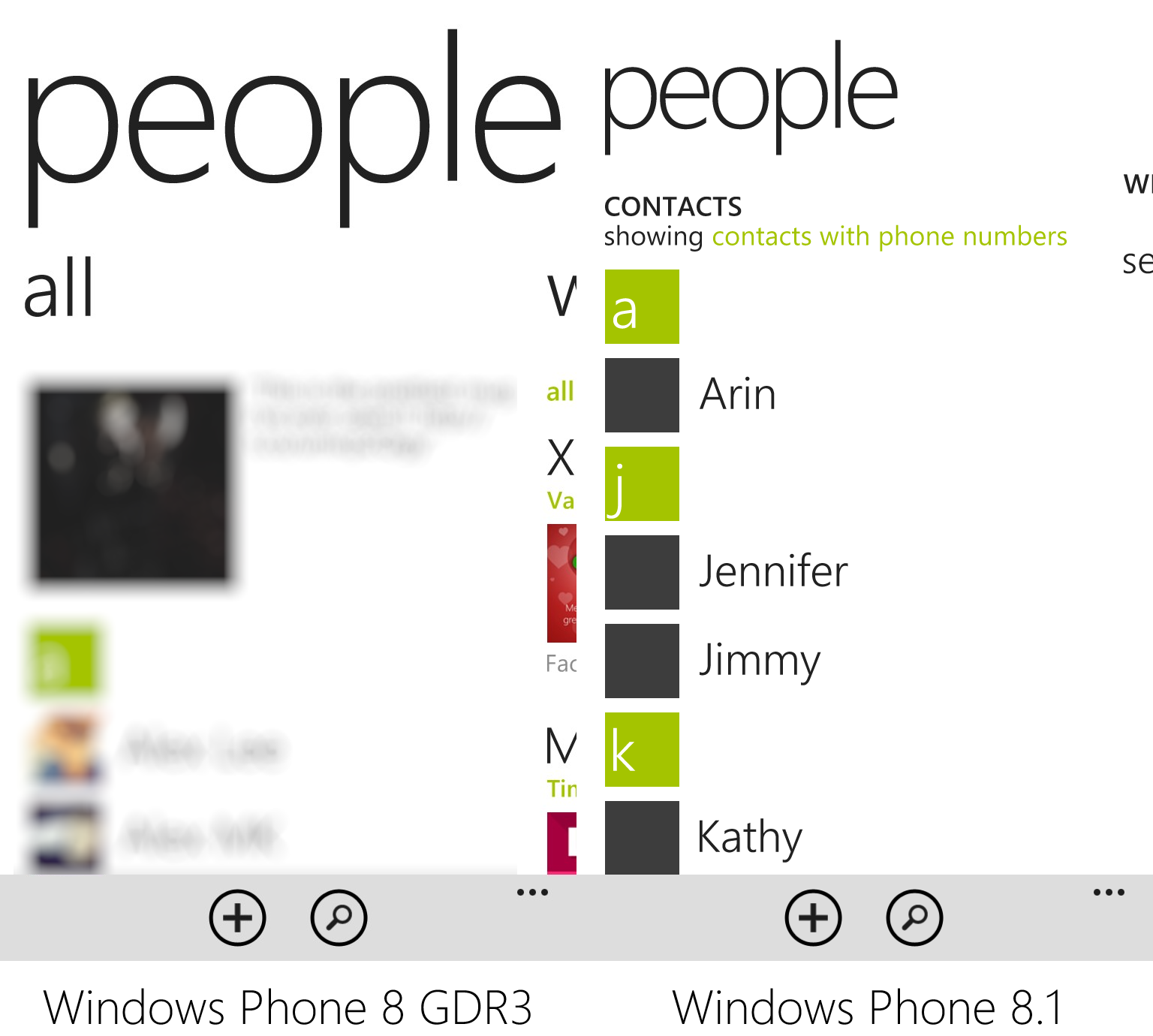
Windows Phone 8.1 will officially be shown to the world at Build 2014 in San Francisco on April 2nd. We do have a sneak peek of the update thanks to a leak of the Windows Phone 8.1 beta SDK. There isn’t going to be a drastic overhaul to the design language started in Windows Phone 7, but Windows Phone 8.1 will bring a few aesthetic differences.
Visually compare and contrast Windows Phone 8 versus Windows Phone 8.1 after the break!
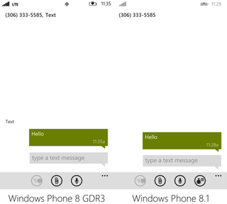
In messaging you’ll see ‘text’ dropped and an extra icon in the app bar.
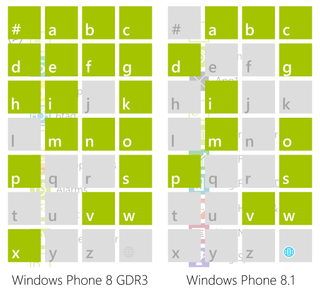
Not much has changed for the jump list in Windows Phone 8.1. The globe icon is colored though.
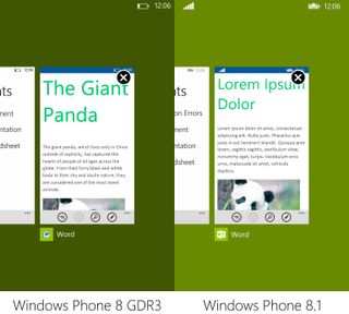
The multitasking view hasn’t changed much. You’ll see the updated Word icon and you’ll be able to swipe the card down to close the app. Something Windows Phone 8.1 learned from Windows 8.1.
The people hub has some new options. In Windows Phone 8.1 you’ll be able to only show contacts with phone numbers.
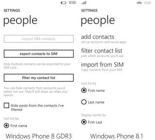
Here’s a settings page for contacts. This is where you’ll toggle to only show contacts with phone numbers in Windows Phone 8.1.
Get the Windows Central Newsletter
All the latest news, reviews, and guides for Windows and Xbox diehards.
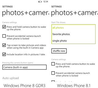
Settings for the photos+camera hub get updated. In Windows Phone 8.1 you can have the Start tile for the hub cycle through various photos.
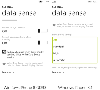
On a limited internet plan? You can now select the level of compression for web pages served up through Data Sense on Windows Phone 8.1.
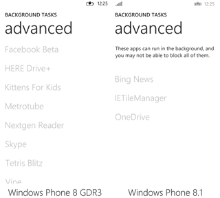
Check out the new background tasks settings page. It’s interesting for telling users that you won’t be able to block all apps running in the background.
There’s still a bit of work left between now and when consumers get Windows Phone 8.1. We don’t expect any drastic changes in the UI/UX, but don’t be surprised to see a few things moved around. We’ll be doing more comparisons like this in the future. Have any questions? Sound off below!
Big thanks to Matthew Miller (@millermk90) for sharing!
