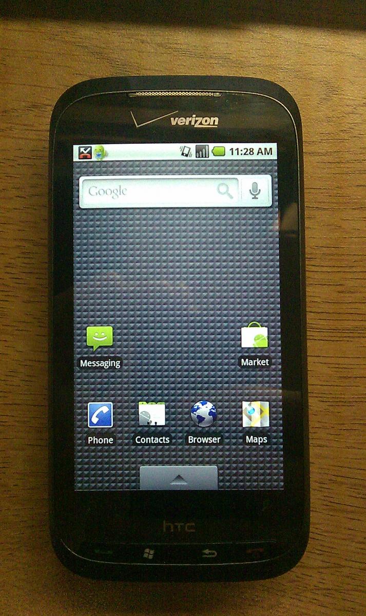
Verizon Touch Pro 2's switching housing, matching Sprint's. Or just a bad mistake?
All the latest news, reviews, and guides for Windows and Xbox diehards.
You are now subscribed
Your newsletter sign-up was successful
File this under confused.
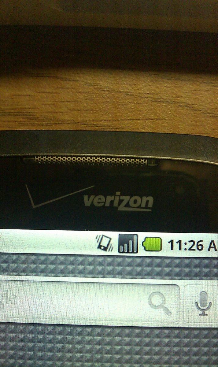
Verizon user QMeli907 got his third Touch Pro 2 replacement and immediately noticed some changes to the housing:
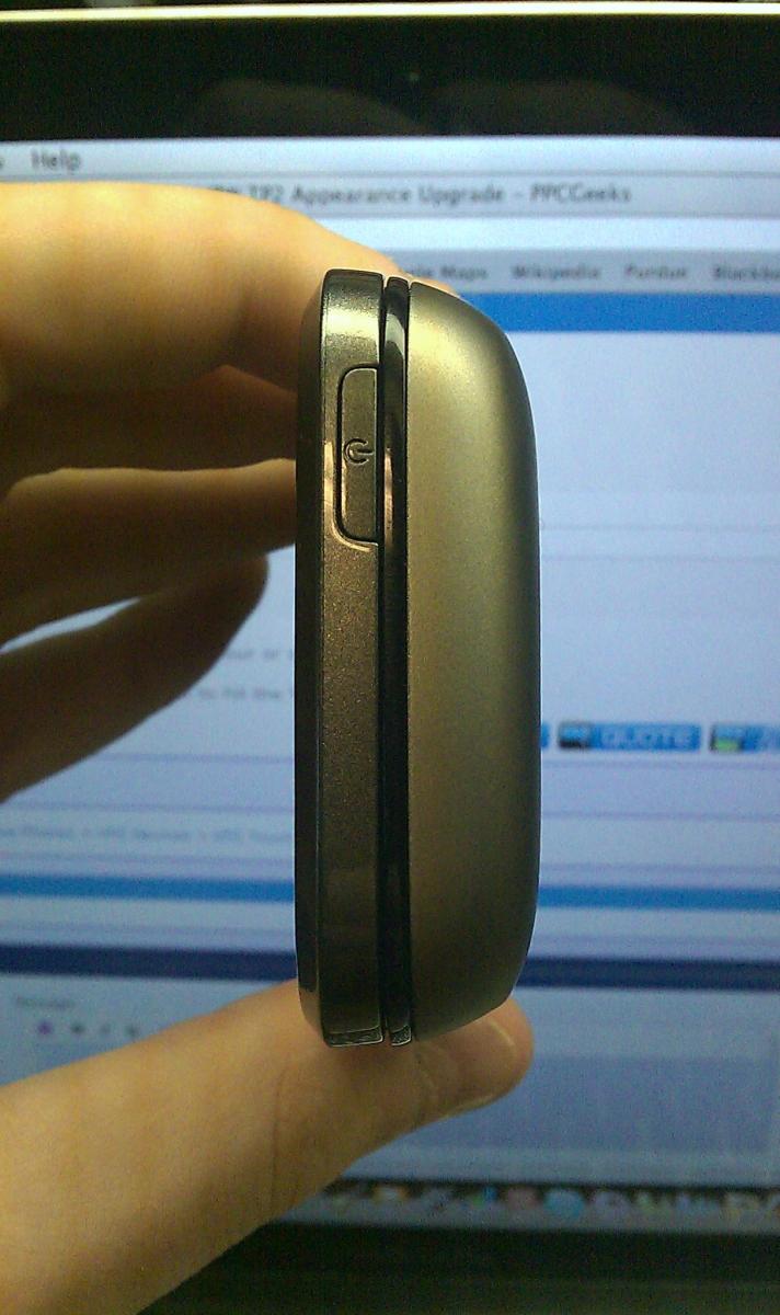
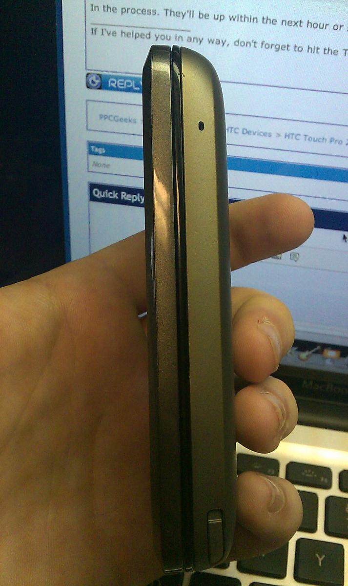
Article continues belowIt's different then my other TP2's that I've had since October. The bezel on the one I received today is a gunmetal grey color, rather than the plain gloss black. Its a very nice touch. Although it makes the face look better, when looking at the TP2 from the side, my old back case and the new front bezel colors clash. Just my two cents.
He's also running a rough version of Android (no radio function though), so don't let that distract you from the housing changes.
So what's up with the change? It seems to be a mistake as kern417 notes:
yeah thats definitely wrong because in the img003 you can see the display on/off button has a power sign on it, but for verizon tp2s you have to use the end key to turn it on/off.
Yeah, all of that raises more questions than answers. Anyone else with one of these? Care to shed some light in the comments?
All the latest news, reviews, and guides for Windows and Xbox diehards.

Daniel Rubino is the Editor-in-Chief of Windows Central. He is also the head reviewer, podcast co-host, and lead analyst. He has been covering Microsoft since 2007, when this site was called WMExperts (and later Windows Phone Central). His interests include Windows, laptops, next-gen computing, and wearable tech. He has reviewed laptops for over 10 years and is particularly fond of Qualcomm processors, new form factors, and thin-and-light PCs. Before all this tech stuff, he worked on a Ph.D. in linguistics studying brain and syntax, performed polysomnographs in NYC, and was a motion-picture operator for 17 years.
