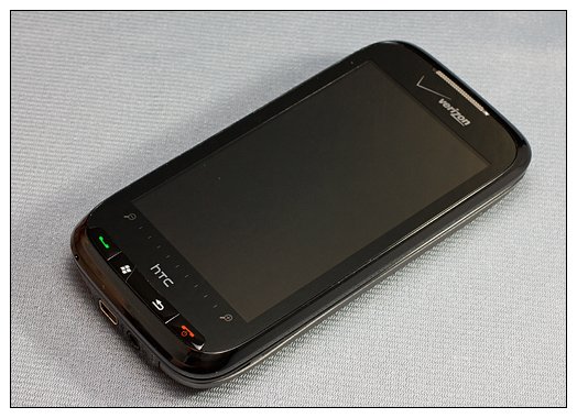
We've looked at the T-Mobile Touch Pro 2 and were impressed. We've looked at Sprint's Touch Pro 2 and were equally impressed. Now we turn our sites towards Verizon's Touch Pro 2 to see if we can go three for three with impressive versions of HTC's Windows Mobile Phone.
We'll cut to the chase on this one, so just follow the break for our impressions on the Verizon TP2.
Out of the Box
Verizon packages its HTC Touch Pro 2 much like T-Mobile and Sprint. You get the phone, spare stylus, USB cable, wall charger, software CD and owner's manual. You also get a set of international adapter clips for the wall charger. The Touch Pro 2 is a "world phone," so it makes sense to have it packaged with world charging abilities.
First Impressions
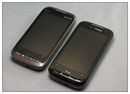
As with the other Touch Pro 2's that I've handled, the Verizon TP2 has a solid feel to it, with noticeably more heft than its older brother, the Touch Pro. The tale of the tape has the Verizon Touch Pro 2 coming in at 4.57x2.33x0.68 inches and weighing 6.35 ounces. I've compared the feel of the T-Mobile Touch Pro 2 to an iPhone, and the Verizon model isn't much different. If I hold my wife's iPhone fitted with a skinned case in one hand and the Verizon TP2 in the other, they would feel almost identical, with the iPhone being a smidgen thinner.
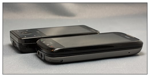
The Verizon Touch Pro 2 is fitted with a 1500mAh battery that has noticeable staying power. A full charge easily made it through an entire day of moderate to heavy use.
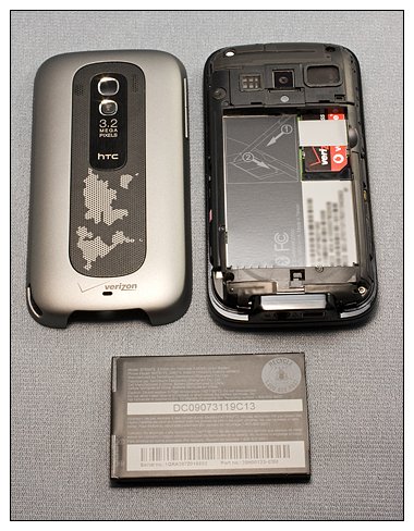
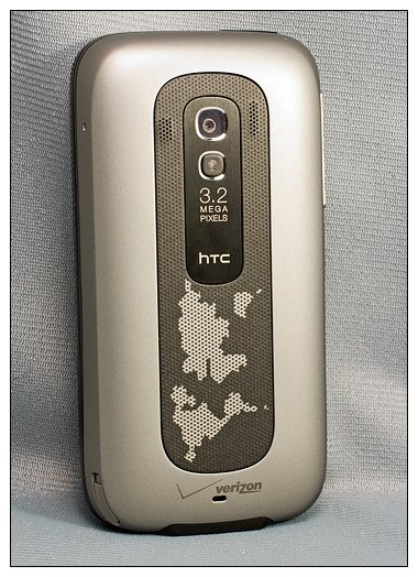
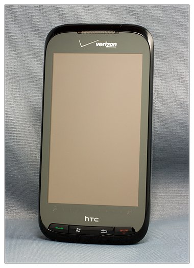
Verizon choose a shiny black finish for the Touch Pro 2's front and a silver/gray, matte finish for the back. A map pattern is printed on the speaker's mesh cover.
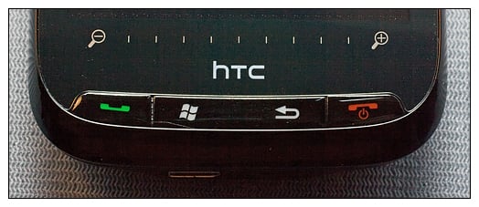
Whereas the other TP2's buttons are illuminated white,Verizon has gone with a green answer button and red end button. It adds a dash of color to an otherwise conservatively designed phone and definitely helps distinguish the Verizon Touch Pro 2 from the rest of the pack.
Another distinction is that the end button also serves as the power button. Pressing and holding the end button turns on/off the Touch Pro 2. There is a button located at the top of the phone but it is used to turn on/off (wake up/put to sleep) the phone's screen.
Design
For the most part, the Verizon Touch Pro 2 is designed identical to the Sprint Touch Pro 2. You have a different color scheme, back cover design, some software differences, and there are some variations with the keyboard.
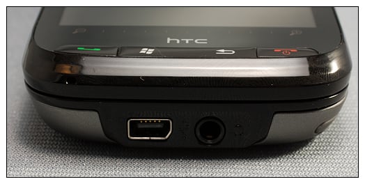
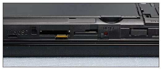
Verizon opted for the 3.5mm headphone jack (whoohoo!) that sits next to the mini-USB port. The micro-SD card slot and reset button are concealed beneath the battery cover. This leaves the entire right side of the Touch Pro 2 bare, save for the stylus. I'm still on the fence about having the expansion slot and reset button concealed. Having used the HTC Fuze/Touch Pro for the past year and coming from a Treo Pro, it was refreshing to be able to access the reset button without having to take off the back cover. Not so much here.
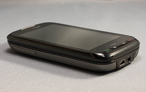
To the left side of the phone you have the volume keys and no abnormally large (and mostly useless) PTT button (whoohoo!). The sleep/wake button (power button on other Touch Pro 2's) sits at the top of the phone at the left corner. The sleep/wake button seem a little more recessed that the other Touch Pro 2's which makes it a little challenging to manipulate. It is more receptive to a finger tip or finger nail than the flat of your finger. On the plus side, it was more difficult to accidentally press.
The Screen
The Verizon Touch Pro 2 is fitted with a huge 3.6-inch 480x800 screen that really makes the Touch Pro's 2.8-inch screen look tiny. The "auto backlight" feature seems to dim the screen more noticeably than other Windows phones. The screen is really nice with this feature active. But when you manually set the backlight to a tick mark or two below maximum, the screen really pops.
The touchscreen is very responsive. I had no problems with the screen responding to swipes, taps, or touches.
Keyboard
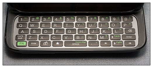
The Verizon Touch Pro 2's keyboard slides smoothly and is spring-assisted. The keyboard consists of five rows with the top row dedicated to numbers. You have fewer shortcut keys on the Verizon TP2 with only messaging, communications manager and a star key available.
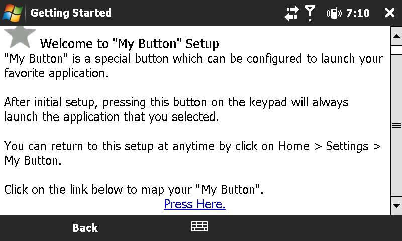
The star key or "My Button" is a customizable shortcut key that you can map in a similar way you would map holding down the send key or end key. It's nice, but I would have liked to have seen more than just one mappable keyboard key.
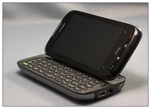
The keys were well-spaced and easy to type with. I'm still on the fence about the tilting screen. It does make viewing videos a little easier, but I can't seen any advantage to tilting the screen for typing. I'll stick with the opinion that it's better to have this feature and not need it, than need it and not have it.
Software
I've always been hesitant to spend too much time on the software aspects of Windows phones because if you don't like what's installed, you can (for the most part) change or add to it. I will say that the Qualcomm MSM7600 528MHz processor moves things along nicely. Apps loaded with ease and transitioned nicely.
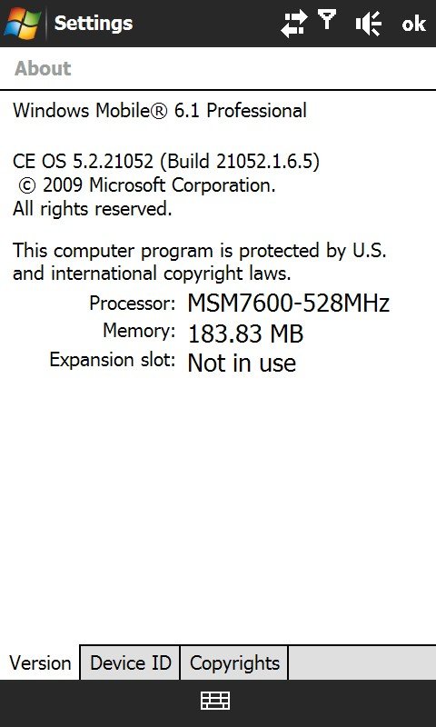
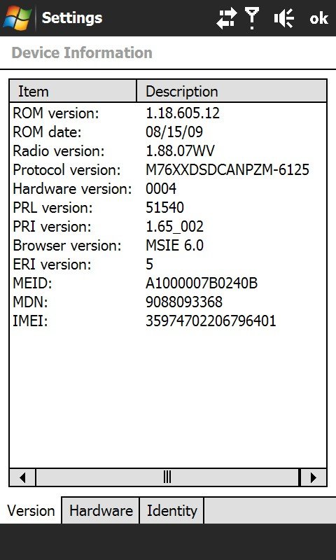
The Verizon TP2 is currently being shipped with Windows Mobile 6.1. It will be upgraded to Windows Mobile 6.5 at some point, presumably on or about Oct. 6.
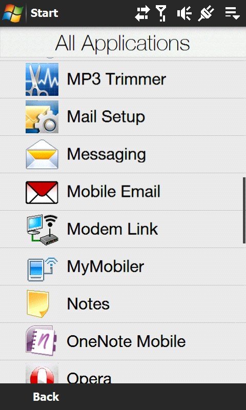
Verizon does have its fair share of bloatware installed on the Touch Pro 2, but it's not too obnoxious. You have Verizon Navigator (GPS software), Visual Voice Mail and a MP3 Trimmer pre-installed. There is a YouTube portal, WorldCard Mobile, Office Mobile and Opera Mobile (version 9.5) web browser installed as well. Verizon didn't overload it but but did install enough software to get a first-time Windows Mobile user up and running.
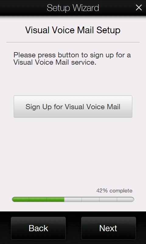
Verizon has one software feature that will prove to be a big help with those not as familiar with Windows Mobile. The Getting Started application launches a wizard that walks you through setting up e-mail accounts, visual voice mail, Bluetooth connections, WiFi setup, and weather setup. The application launches during your initial setup of the phone but can be restarted at any point to help guide you through setting up these features.
TouchFlo 3D
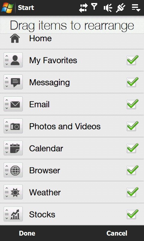
The Verizon Touch Pro 2 is running version 2.1.38240. It has the stock and calendar tabs as well as weather, music, messaging, e-mail, favorites, and camera tabs. The only tab noticeably missing it the Program Tab, which is replaced by the Start Menu of Windows Mobile 6.1. Tabs are customizable by hiding and re-organizing the order of the tabs.
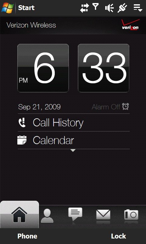
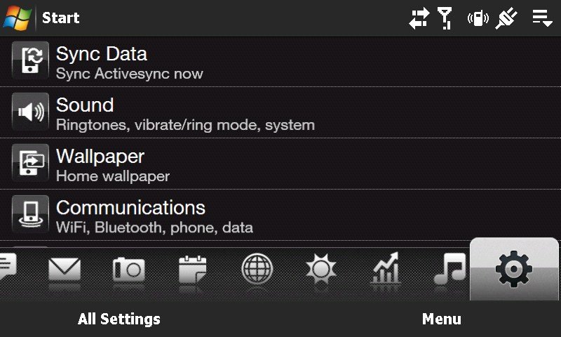
With the keyboard extended, you retain the Touchflo 3D appearance (no action screen) with the only exception being the sliding icons are minimized. You'll need to touch on the box at the bottom left to reveal the sliding icons. This makes Touchflo 3D functionality more consistent.
Camera
We've already looked extensively at the Sprint Touch Pro 2 camera as well as the T-Mobile Touch Pro 2 camera. The Verizon's Touch Pro 2's camera isn't much different. If anything, the Verizon version produces darker images. Nothing a little work in Photoshop couldn't handle, but noticeably darker. Here are a few sample shots and a video clip. Still images are straight from the TP2 and have only been re-sized for publication.



Please excuse the background noise on the video. My neighbor was pressure washing his driveway. But please note how well the Touch Pro 2's microphone reduces the background noise and picks up my voice while holding the phone at arm's length.
As with the Sprint and T-Mobile versions, there is no physical button to press to activate the shutter. Instead, you have a "shutter" symbol on the screen to serve as a shutter button.
GPS
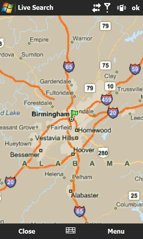
Here's a good news/bad news situation. While the Verizon Touch Pro 2 is fitted with a GPS receiver, which is unlocked and will work with applications other than Verizon Navigator, it is slow. The slowest I've handled with it taking in excess of 2 minutes to acquire a satellite fix. It works like a charm with Navigator, but with Google Maps or Live Search it's slow as ketchup in a glass bottle. I did find that if you get a fix through Navigator then switch to the other mapping apps, the GPS was more responsive. I did not experience any lag with the GPS tracking.
Phone Quality
One word can describe the phone quality of the Verizon Touch Pro 2: Outstanding. The dual microphones pick up your voice with very little background noise. The ear speaker volume is clear and the back speaker is loud.
I can't praise enough the inclusion of the proximity sensor on these phones. It is a welcome change from an HTC Fuze user who hated to have to hit the power button while on a call to turn on the screen.
Overall Impressions
Again, we were impressed with the T-Mobile Touch Pro 2 as well as the Sprint Touch Pro 2. The Verizon Touch Pro 2 will make it three for three. The AT&T version, the Tilt 2, is (hopefully) eventually heading to market, and we may go four for four with this HTC phone.
The Verizon Touch Pro 2 is an impressive phone that all levels of Windows Mobile users can appreciate. The added weight and size is well worth the price for the much larger 3.6-inch screen. This Windows phone zips along nicely with no annoying lags in software loading or transitions experienced. The screen was very responsive to the touch and call quality is extremely good.
I would have preferred the reset button to have been outside the battery cover. But if that's the price you have to pay for the 3.5mm jack, it's worth it. It's refreshing to use standard headphones with the Touch Pro 2.
I am quickly forming the opinion that the HTC Touch Pro 2 can easily be the centerpiece for any wireless service provider. If you happen to be with Verizon or considering them for service and want a Windows phone, you'll be hard pressed to do better than the Verizon Touch Pro 2.
George is the Reviews Editor at Windows Central, concentrating on Windows 10 PC and Mobile apps. He's been a supporter of the platform since the days of Windows CE and uses his current Windows 10 Mobile phone daily to keep up with life and enjoy a game during down time.
