Using Continuum for a week with the HP Elite x3
The HP Elite x3's main selling point is being your only device, meaning Continuum plays a big part. So how is it?
Continuum is probably one of the coolest Windows 10 Mobile features available, transforming your smartphone into a productivity powerhouse with a mouse and keyboard, full screen monitor and desktop-scaled apps. From this paragraph alone, Continuum sounds like the future, but right now it's not exactly perfect. Although the idea is strong, it isn't all there yet.
I received an HP Elite x3 a little under 2 weeks ago now, and decided to try out Continuum on it. I went one step further however, and decided to use Continuum almost exclusively, choosing it over my desktop or Surface Book when wanting to get work done or browse Reddit and watch YouTube videos. I used it as my only PC, and this was my experience.
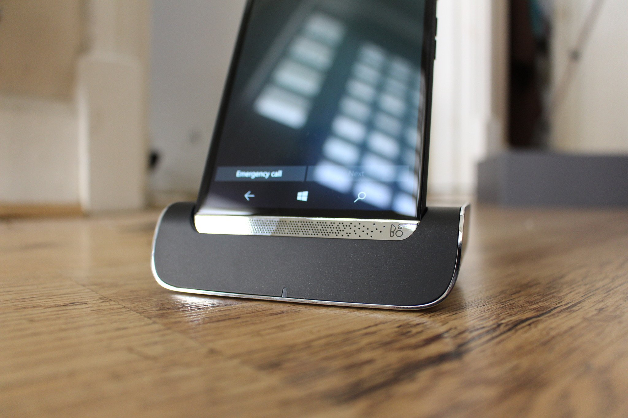
Using the HP Elite x3 Desk Dock, I hooked up my monitor with a DisplayPort cable, and plugged my wireless Microsoft 900 Keyboard and Mouse dongle into one of the two USB ports. Activating Continuum is pretty simple, simply dock your phone in and your monitor will come to life with a welcome introduction to what Continuum actually is, helpful if you're a newcomer.
From this point, I was entered into the somewhat familiar, yet completely different desktop environment. The Continuum for phones desktop environment is similar, but there's a few things missing that are vital to the Windows experience.
The Desktop Environment
For starters, the familiar taskbar is located at the bottom of the screen, where over 90% of people appear to like it. This taskbar isn't the same taskbar found on an actual desktop however, as it's missing a few key features. Firstly, Cortana's search bar is missing, although her icon is still present. The System Tray, found over on the right of the taskbar is also missing. Instead, the System Tray is at the top of the screen, where it resides on Windows 10 Mobile. It's here where the time, WiFi signal and battery icons live.
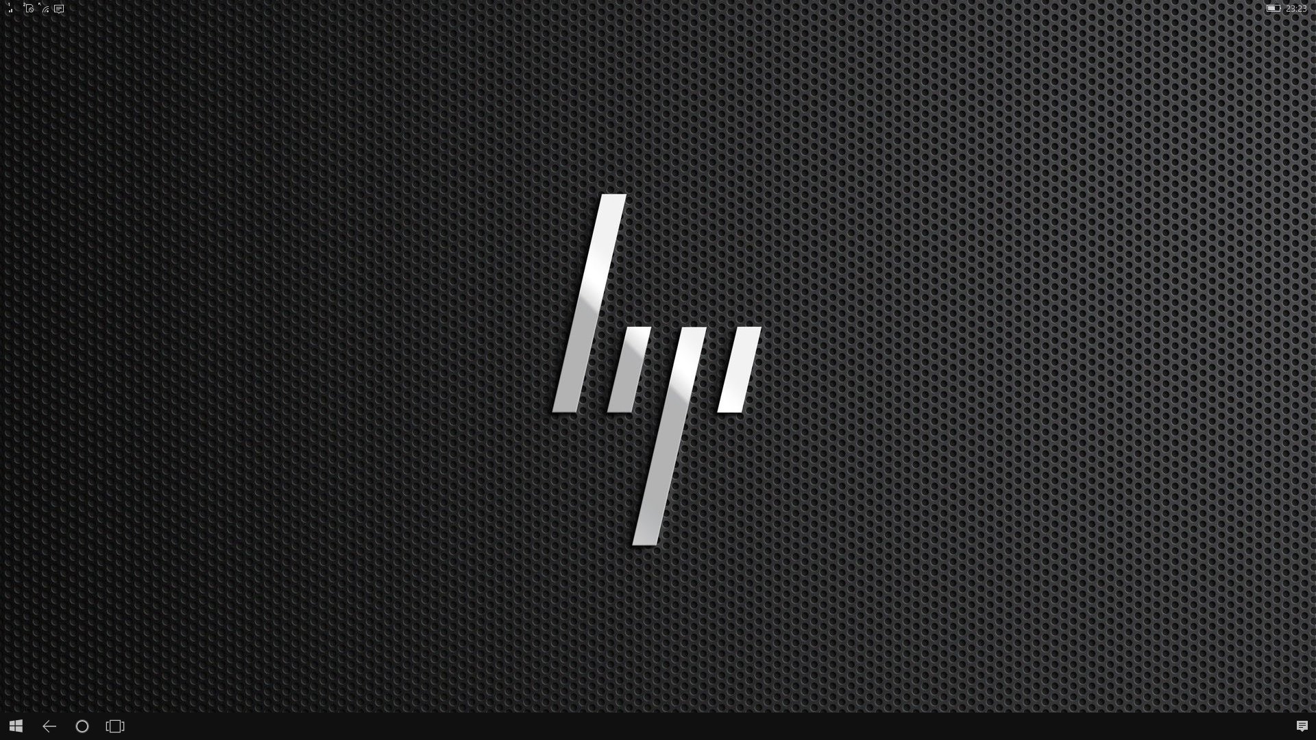
The Notification Center icon is in the correct place — the far right of the taskbar — but even the Notification Center isn't identical to the one found on desktop. For one, there's no transparency, which is bit of a bummer but an understandable decision by the design and engineering teams (the Elite x3 is powerful, but it's still nowhere near desktop-class powerful). Not only that, but the quick action buttons are at the top of the Action Center instead of the bottom like on desktop. This positioning mimics the mobile Action Center instead, which isn't bad at all, just a notable change.
On the HP Elite x3, the default desktop background was HP's new, sleek logo, a wallpaper I actually like and didn't need to change. You can change it if you wish however, much like you would expect to be able to do on a desktop. You can even change the colour of your taskbar, which is an additional bonus for those who love customizing their workspace.
Get the Windows Central Newsletter
All the latest news, reviews, and guides for Windows and Xbox diehards.
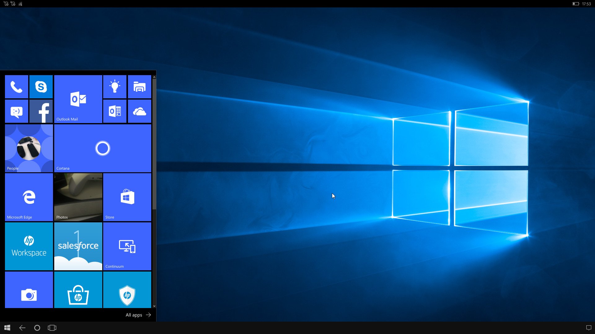
Moving onto the Start Button, which when pressed, brings you to a semi-familiar Start interface. Your phones Start Screen tile layout is present, and works much like you would expect, minus the added benefit of right-click menus that you would expect to find on a desktop. Not only that, but the Continuum Start Menu is missing the hamburger menu found on the Anniversary Update on desktop, as well as recently open apps. This isn't an issue, however, as the All Apps list is available by selecting "All Apps".
Productivity
Regardless of all of this, being able to be productive is the most important thing that Continuum must achieve. Microsoft has done well at making the Continuum environment similar to the desktop environment, but it's missing one vital feature that Continuum desperately needs. Windowed-mode.
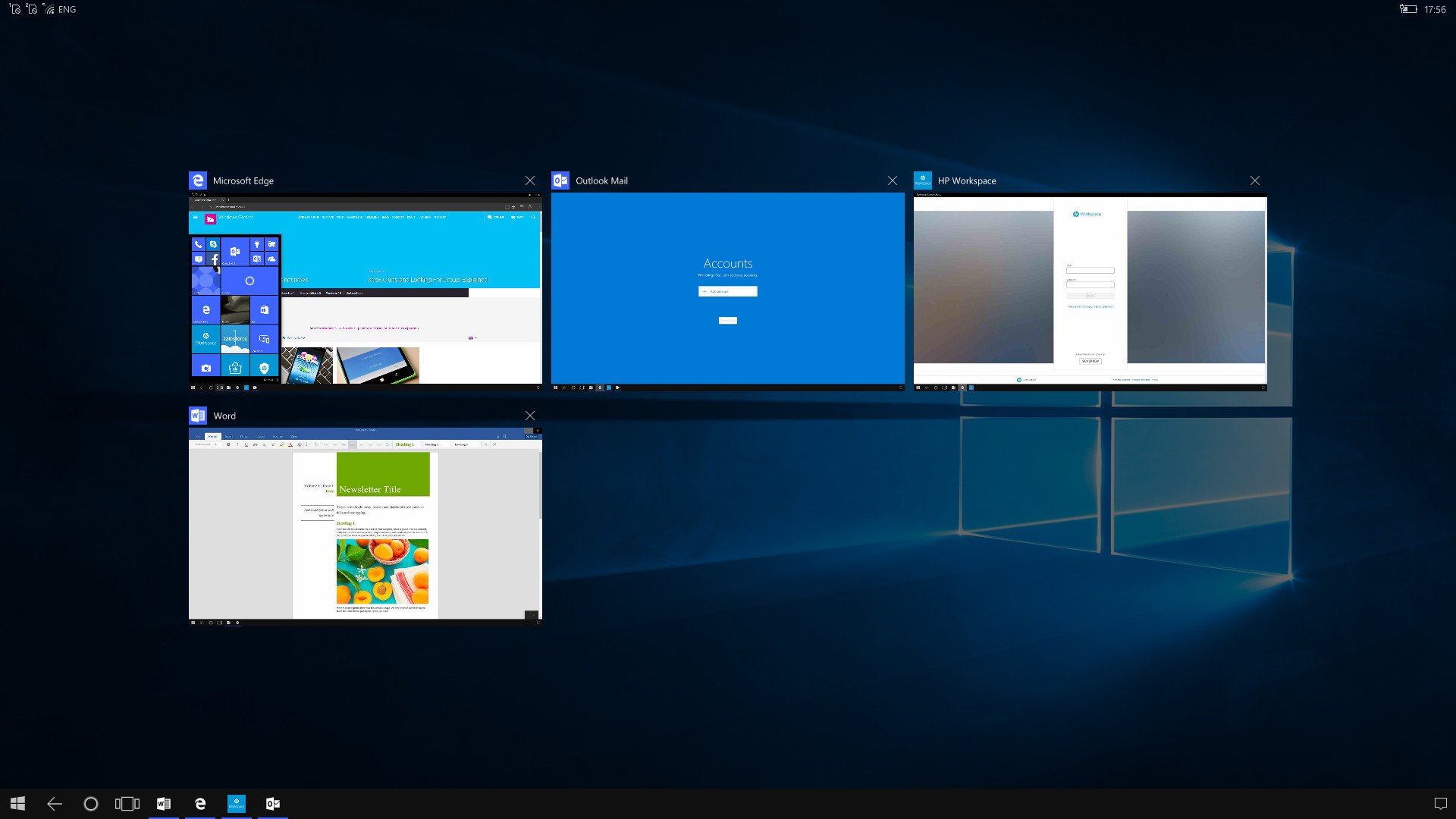
Continuum as it currently stands has no support for running multiple windows on screen at one time, something you'd expect a Windows desktop to be able to do. The taskbar is able to display running apps as well as switch between them much like on a desktop, but running apps side by side in windows? Not a feature you can take advantage of with Continuum right now, and that's a real shame.
As a writer, it is vital that I am able to see multiple windows at any given time, whether it be Twitter and a forum post, an article and a chat room, or something even more complex, most power-users and business-users will need to take advantage of windowed apps, and it's simply not there right now. This caused serious productivity problems for me, as it slowed down my workflow dramatically, manually switching between running apps via the taskbar instead of being able to glance at the app already running.
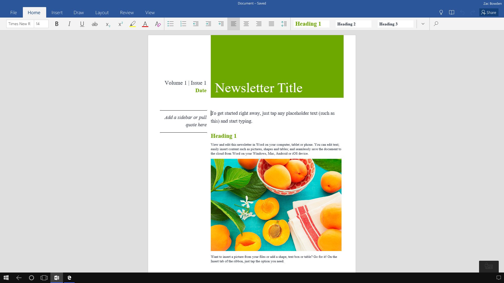
It's not all bad, however. Ignoring the lack of windowed-mode, Continuum is very productive. No longer do I need to bring something like a laptop with me, as I'm 95% in on the UWP experience, meaning all my apps are available from the Windows Store and run in Continuum mode. I use Twitter, Word Mobile, Microsoft Edge, Facebook, Readit, Outlook Mail and many more Windows 10 apps.
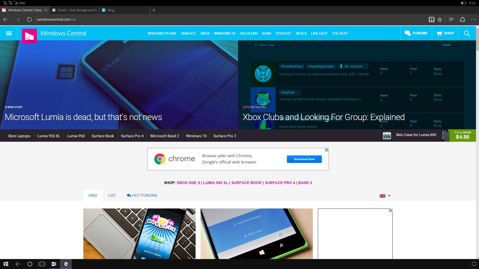
Microsoft Edge is possibly one of the star apps when Continuum is enabled, as it transforms into the full Edge experience you know and love on desktop. The only notable missing feature is Extensions, but that's not the end of the world and didn't affect me in any way. With Edge, I was able to fire up email, Windows Central and plenty more website in full-desktop mode.
HP bundles a few of it's own apps too, one of which is the HP Workspace, which aims to virtualize Win32 programs via the Cloud and beam them straight to your phone running Continuum. This feature is only for businesses however, meaning I was not able to take advantage of it. I was however able to take advantage of the Remote Desktop app, which I was able to run full desktop apps with from my home PC. I didn't need to use it often, but when the occasion came, it was an option that was available for me to use.
What I think is the best thing about Windows 10 Mobile and Continuum is being able to do things like insert a USB and edit documents from it. With the built in File Explorer, I can open a word document, make some changes, and save it back directly on the USB for editing elsewhere, much like a PC. This is super convenient, especially if you're not using a cloud service like OneDrive.
New features with the Anniversary Update
Continuum with build 10586 is a good experience for what's offered, but with the Anniversary Update Microsoft has added a few new features that make using Continuum even better. The lock screen when in Continuum now shows up on your connected display and you can enter your unlock PIN with the keyboard, instead of being required to do it via your phone.

Not only that, but Microsoft has added support for more resolutions, up to 4K which is fantastic. Previously, Continuum would max out at 1080p on displays, which was pretty annoying. Now it can adjust to most native widescreen display resolutions. What this means is more content on screen at one time on higher resolution monitors, and a clearer picture overall.
Unfortunately, Microsoft hasn't added support for ultrawide monitors, which is disappointing. Perhaps that'll arrive in a future update. There's also now an option to adjust the DPI scaling on the extended display too, meaning you can interface elements bigger or smaller to give you more or less real-estate for content on the screen.
Elite x3 Performance
Since I was using Continuum with the HP Elite x3, I was curious to see how much better the Continuum experience performed compared to the Lumia 950. In short, it's not worlds different, but there is a slight improvement. More apps can stay in memory, so switching between them is faster, but opening apps and generally using Continuum doesn't feel much different.
I think a lot of that is to do with the Snapdragon 820 not being entirely optimized for Windows 10 Mobile just yet, we're still waiting for a firmware update that is expected to bring new features and fix a number of issues. We'll likely revisit performance then, but for now, Continuum is only a little bit better on the HP Elite x3 performance wise.
Conclusion
Continuum is still a fantastic and ambitious idea, and one that I think has potential in the smartphone market. Unfortunately, right now at least, it's too different from the desktop experience we already know and love, even though Microsoft has tried so hard to make it look the same. Until Microsoft can get windowed-mode working, you're stuck with a slow experience.
Don't get me wrong, being productive is very possible, but that also depends on what kind of productivity you're doing. If you're writing, or doing research or using Office/email, then Continuum is great for you. If however, you need to do video editing of image editing, Continuum (at least right now) is not for you as the apps and functionality simply aren't there.
In short, using Continuum on the HP Elite x3, for me, was a good experience. I was able to get through the week without needing to use my actual desktop machine, but that's because I don't really depend on any Win32 apps. If you do, this challenge would be more difficult. If you're all in on the UWP idea, this is far easier.

