User experience report praises iOS 7, slams Windows Phone 8 on customisation, OS annoyances

With both the iPhone 5S and iPhone 5C announced already, just how good is Apple's iOS 7? We've been using it for a short while and we'll admit that it doesn't feel half bad, but Pfeiffer Consulting has taken a rather in-depth look at how Apple's new OS ranks against Windows Phone 8, BlackBerry 10 and Google's Android (note the firm used Samsung's implementation of Android over the stock version).
So how does iOS 7 fare against the competition? Quite well, according to the report. It's worth noting that the team looked at software alone, so forget high-end hardware and the best Lumia Windows Phones - we're strictly talking about the software layer. Here's what the firm scored each platform on:
- Cognitive load - The difficulty users face when familiarising themselves to use the operating system spontaneously and intuitively
- Efficiency - How efficiently key features and services are integrated for ease of operation
- Customization - How many options an operating system provides to allow a user to tailor it to their personal tastes
- User experience friction (UEF) - Pfeiffer describes this as "the bad stuff, the aspects of a device that can annoy you in a niggling way, or, in extreme cases, drive you crazy"
Some of the results aren't good for Windows Phone 8. For cognitive load, Microsoft came in a joint second with iOS 6, behind iOS 7 but ahead of the rest. It's a simple UI and we'll agree with the scoring provided. Moving onto efficiency, Windows Phone was hit hard due to offering "limited notification management and basic multitasking." We won't disagree there as these are some well documented suggestions from consumers.

Lack of customisation in Windows Phone?
Customisation is an interesting one. Windows Phone came in last, by a clear mile, but it's strange to have the OS slated for lack of personalisation. Granted, you can't customise the start screen to have a pink background and white tiles, but there's the emphasis on a sleek look, which is achieved by the level of customisation presently available.
To give the platform a 2/10 simply because you can't place an image as the background is ignoring other areas that are easily customisable. Lockscreen, Live Tiles themselves and the system themes available are ample enough to get cracking while developers ensure their app experiences are unique enough to draw attention.
Lastly, for user experience friction, Windows Phone came in the last spot again. iOS 7 scored 14, while Microsoft came away with 51 (lower is better). The "lack of customisation" is once again brought up. There are numerous niggles with the system that we've highlighted in the past, which Microsoft needs to address. The system wide volume control, no way to close apps easily, lack of a unified notification centre, "Other" storage issues, severe battery drain and more all ruin the experience for some.
Get the Windows Central Newsletter
All the latest news, reviews, and guides for Windows and Xbox diehards.
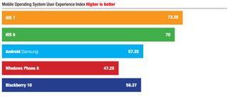
Wrapping up the report, Pfeiffer Consulting rates iOS 7 as the best operating system available for mobile devices. While Windows Phone fared better than Android and Blackberry 10 in some of the tests, it was shot down for lack of basic functionality and limited features (notification center, multitasking controls and more). Here's the overall picture:

Windows Phone 8 sitting in last place. We will agree with some of the niggles pointed out, but look forward to seeing what GDR3 and major Blue updates both address. Head on over to Pfeiffer and read the full document.

Rich Edmonds was formerly a Senior Editor of PC hardware at Windows Central, covering everything related to PC components and NAS. He's been involved in technology for more than a decade and knows a thing or two about the magic inside a PC chassis. You can follow him on Twitter at @RichEdmonds.