The UI for Internet Explorer 12 could look like a mix of Chrome and Firefox

A new rumor claims that the next version of Microsoft's Internet Explorer web browser for PCs, IE12, will have a flat design that is described as a mix of what's being used for Google's Chrome and Mozilla's Firefox browsers.
Neowin, using unnamed sources, says that the tabs in IE12 will be on top of the URL bar and will look like rectangles. The report says they will start on the far left of the browser window. The back, forward and refresh buttons are supposed to be below the tabs and next to the URL bar.
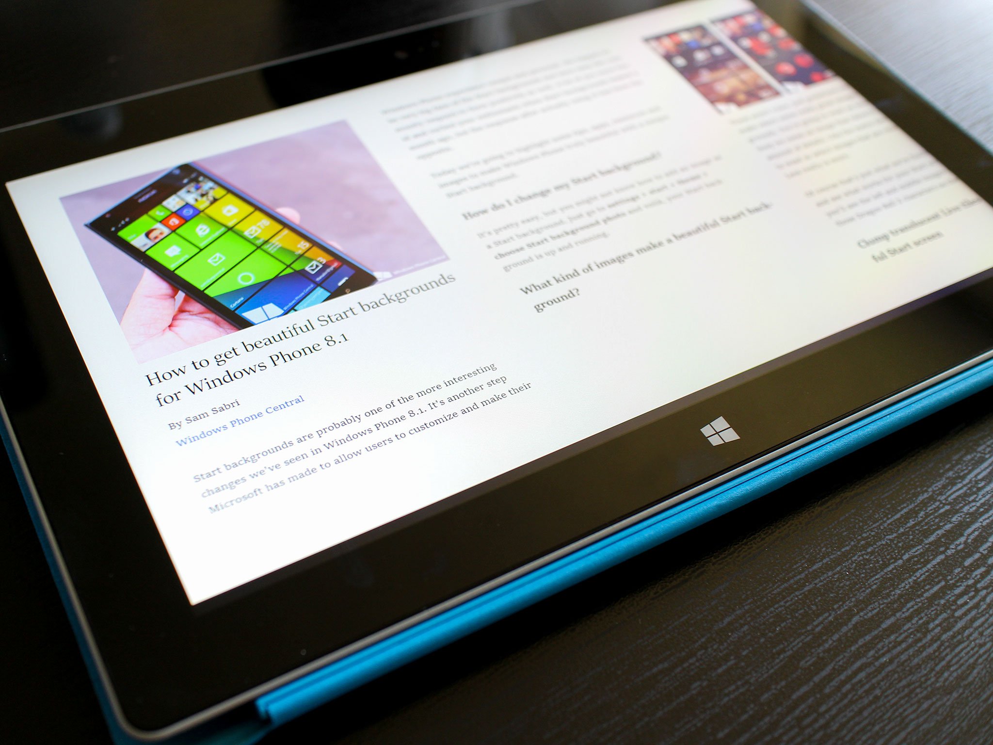
The report also says that IE12 will have some kind of extension support, similar to what Chrome has. The desktop version of IE11 does support plug-ins but the Modern UI version of IE11 on Windows 8 and 8.1, shown above, did away with third party plug-in support

Keep in mind that even if this new report is accurate, it's more than possible that Microsoft will make changes to IE12 before its official launch. IE12 is expected to be included in the next version of Windows, code named "Threshold", but it's possible that it won't be ready by the time that a rumored public preview of Threshold may be released in late September or early October.
What do you think about the prospect of IE12 having a look that's closer to Chrome or Firefox?
Source: Neowin
Get the Windows Central Newsletter
All the latest news, reviews, and guides for Windows and Xbox diehards.
