Meet UI CENTRIC, a consultancy creating incredible apps for Microsoft platforms
Windows Phone Central visits the Windows 8 and Windows Phone development group UI CENTRIC
All the latest news, reviews, and guides for Windows and Xbox diehards.
You are now subscribed
Your newsletter sign-up was successful
Join the club
Get full access to premium articles, exclusive features and a growing list of member rewards.
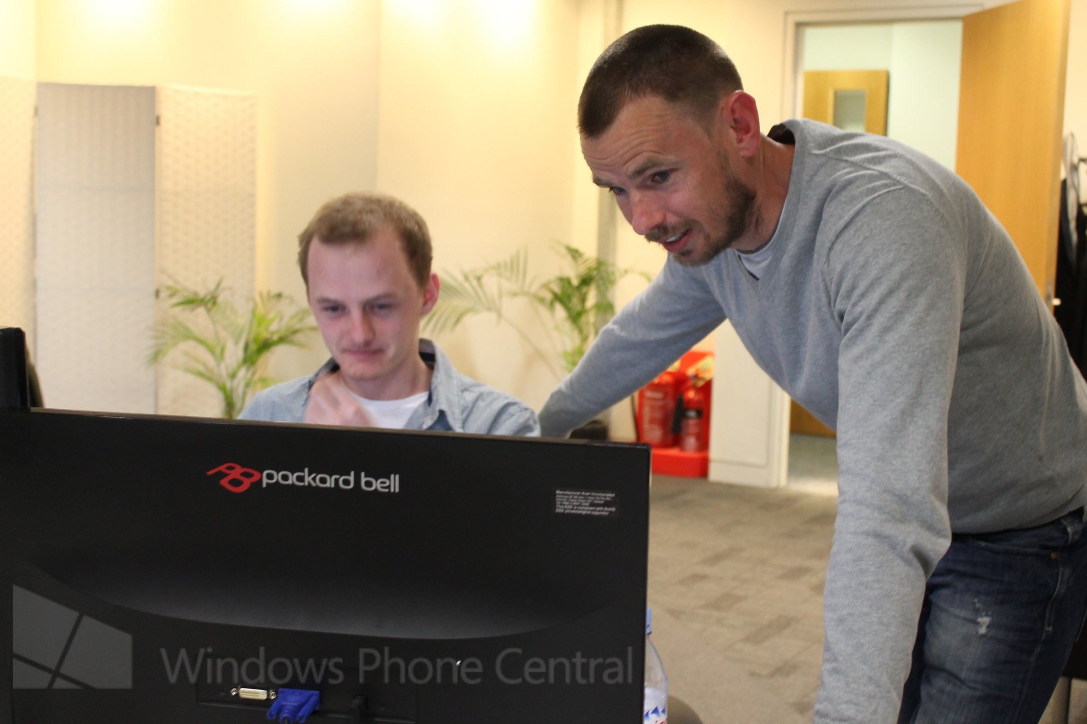
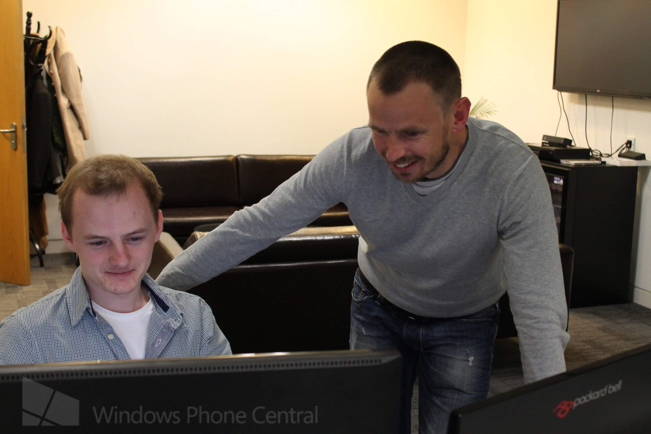
Located several floors up in an unassuming east London building is a quiet office where some of the most creative and beautiful experiences available on Windows Phone and Windows 8 are being developed. You may have never heard of them, but the guys at UI CENTRIC have produced quality apps that you’ve most likely enjoyed if you’ve been an avid Windows Phone user. We recently had the chance to visit that office and chat with CEO Dan Ulzhoefer, to find out how they work, what they’re most proud of, and their plans for the future.
Dan had some great experience to share which we’re sure would benefit any developers reading this article. UI CENTRIC are currently hiring developers with a passion for Windows Phone or Windows 8, so if that sounds like you, check out the interview below for more details on how to contact them.
Interview: Dan Ulzhoefer of UI CENTRIC
Dan thank you for meeting with me, let’s start off with getting to know you, tell me about UI CENTRIC, who are you, what is your specialty?
Article continues belowUI CENTRIC is a user experience consultancy and custom software development company, we founded back in late 2007. We specialise in user centred design, which means that we build experiences that put the needs of the user at the core of what we’re creating. In that regard we classify ourselves as technology agnostic, because if you’re technology led you can begin to forget about your users.
With that said, we are a Microsoft developer partner, and we have one of the largest portfolios of Microsoft ecosystem applications. We build not just for Windows Phone or Windows 8, but also for Xbox, as well as building consumer applications and enterprise line of business software.
You have quite an expansive portfolio of apps across Windows 8, Windows Phone, and Xbox, which was the biggest challenge and which are you most proud of?
I think what we’re actually proud of is the common thread of quality in our work across all of our projects, building standout application experiences, in which the UX is thoughtfully and meticulously planned and executed. We really want to build products which aren’t just downloaded once and then discarded, but are really valued by the users and subsequently revisited time and time again. That is what’s important to us.
All the latest news, reviews, and guides for Windows and Xbox diehards.
As for some examples of applications that we’re really proud of, I’d point to Great British Chefs, which we think is a beautiful app that serves a number of purposes. Beyond just presenting the client’s stunning content, it is about entertainment by creating an immersive browsing experience for the culinary fan and serving as a cooking aid which is designed to be as valuable as the knives in your kitchen.
You can take your tablet (or soon phone) into the kitchen and switch to the cooking mode to get step by step instructions to create your meal. That comes from fully understanding what are the requirements of the user, how can you solve for a potential problem and make their lives easier.
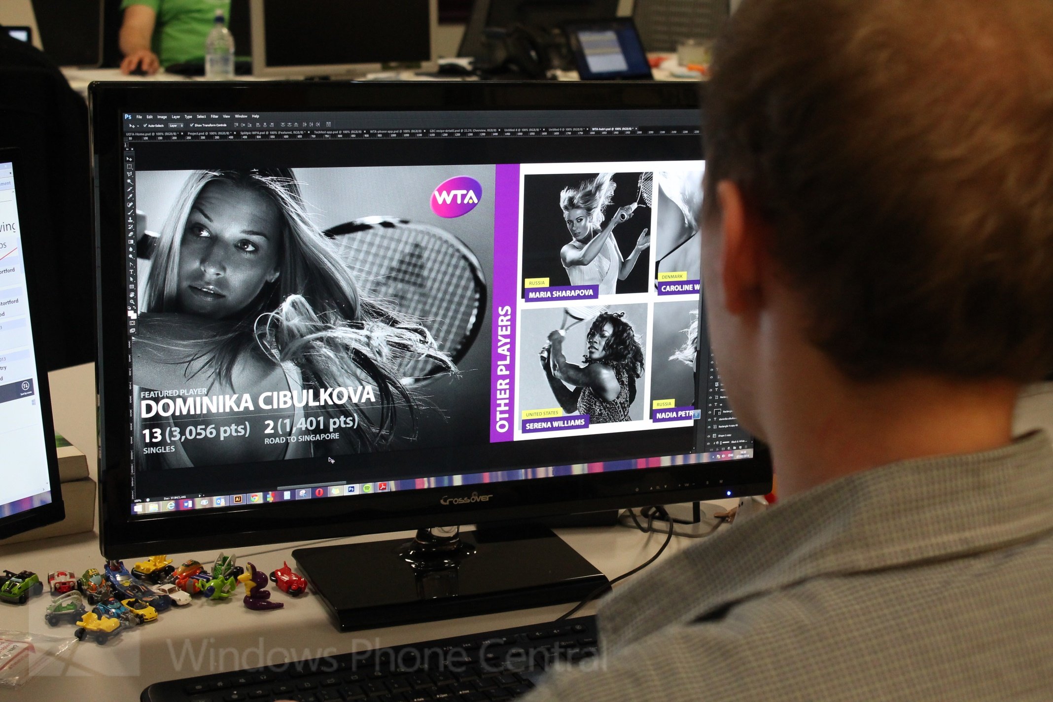
In terms of challenges, we were one of the early adopters of the platform, working with the pre-beta Windows 8 and building apps for Windows Phone 7 and have learned a lot through that journey.
"If you create great products you’ll compel other brands to get involved"
Early in the inception of Windows 8 there was a tendency towards brands slavishly following the guidelines, resulting in a lot of very generic experiences. We felt that it was doing a disservice to the platform, as an agency really focused on the user we saw the potential to create unique app experiences that followed the “content first” philosophy of Windows 8 in conjunction with leveraging the native capabilities of the platform. You could create standout applications, but that just wasn’t happening at the time, and that’s why we took the line that we wanted to produce some of the best products on the platform, and to hopefully generate interest and excitement about the platform. If you create great products, you'll compel other brands to get involved.
I’m a big fan of Great British Chefs, the design and animations are simply stunning, can you tell us about where you started when building that app? Is it the same process with everything you create?
Our standard production process is to separate information architecture and graphic design. That enables us to solely focus on the UX before delving into the visual design language. The reason we do that is because in design you can start to focus away from the user needs, thinking instead about the emotional aspect of the design.
"The client have invested heavily in producing high quality imagery, such beautiful content, we had to do that justice"
With Great British Chefs we spent considerable effort defining the user experience before we started design. Yet it is equally important to spend as much time on the visual design, to develop a level of inspiration by design so that people will want to interact with your product. If people aren’t inspired to use your app visually, then they often won’t learn how great it is to use.
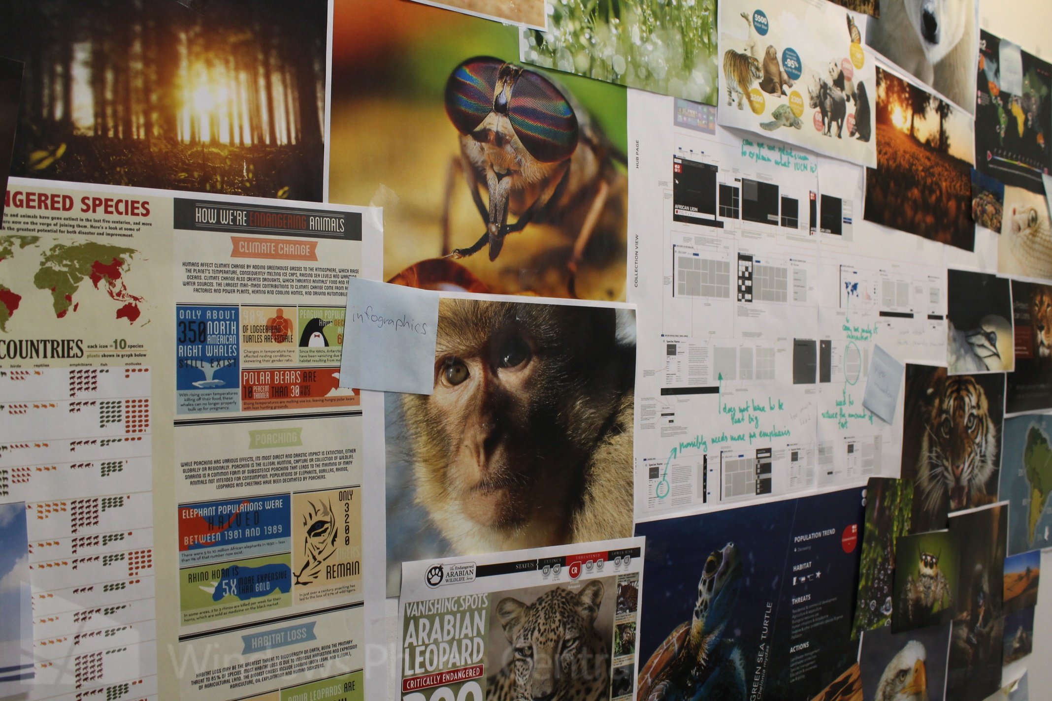
So you spent a lot of time on the emotional design of the app, how long did it take to complete that from inception to release?
It took about 3 months to complete from concept to store submission.
And was that with a full sized team? Or how many people worked on that product in relation to your other projects?
Well naturally different staff are involved at different stages of the process, UX, design and development, but it was an averaged sized team for us.
We felt a weight of responsibility with Great British Chefs. The client have invested heavily in producing high quality imagery, such beautiful content, we had to do that justice. In conversations with the client we both knew there was potential to create something really special and it’s always great to start with having fantastic content. Our objective always was to never make using the app feel like hard work, but always an enjoyable experience. We characterise it as gliding effortlessly across a surface of water rather than paddling like crazy.
That gliding takes thought and consideration. What Windows 8 also gives us to aid in that experience is some fantastic animations to play with which we could then customise quite a bit.
And how would you advise smaller developers to achieve that experience?
For start-ups and indie developers there’s a great set of animations to start getting to grips with, before trying your hand at customising them. The key advice with animations is that it’s very important that you use them judiciously, because they have the power to bring an experience to life, but if over used they can also kill it.
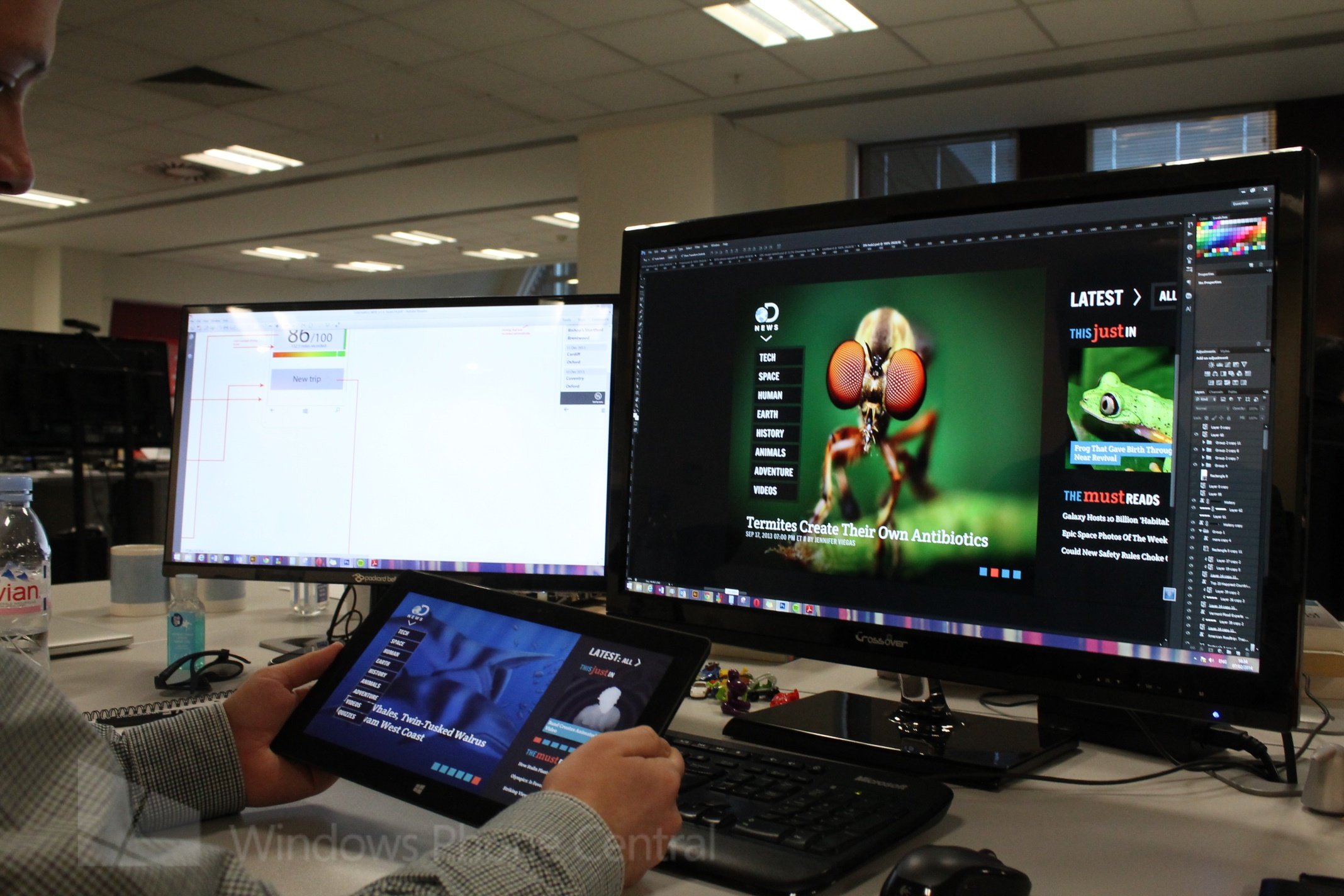
How do you ensure that you create a great user experience? What kind of testing is involved?
The first thing to do is understand who your users are. That can be as simple as starting with a conversation. There don’t need to be huge barriers to understanding the behavior of your users, you don’t necessarily need to start with complex testing or mind-bending techniques to achieve a simple premise. Start by engaging with your users and asking open questions, define your target user group, and understand the purpose of your product before you start building it. A great place to start is with a pencil and an eraser.
"Start by engaging with your users and asking open questions, define your target user group, and understand the purpose of your product before you start building it"
Yeah considering how many ideas I’ve thrown out I agree with the eraser! So does that mean that you guys spend a lot of time at the “sketch stage”? How many of your designs get thrown out?
Yeah we definitely spent time there, at the concept stage we will often start with very simple sketches, to visualise everything, get some simple ideas, and define the user core stories or journeys. We can go from that low level all the way to clickable prototypes very quickly, which are equally powerful for large and more complex products. Where it might be more difficult for the client to conceptualise the dynamic experience it’s much easier for them to click through it, and we get much better feedback from the clickable prototypes which reduces our project lifecycle time.
What I would like to emphasize is that we don’t just have a one size fits all approach, we use so many different tools, from sketches through to fully interactive prototypes. It’s really a matter of using the correct tools for the job.
Speaking of tools, one of the things I’m seeing here appears to be some sort of eye tracking test system, can you tell us a little about it?
Sure, we have a full service user test lab in house, which includes Tobii eye tracking with a rig for testing on PCs, tablets, mobiles, Xbox and smart TVs. The great thing about eye tracking is it enables us to run tests on our clients existing experiences, or to test our own concepts before we go into full production to gain quantitative insights on our user experience. The value of this to us is that it enables us to build high quality products for our users and for our clients. The value for the user is we create products that are useful to them. The other benefit is a productivity gain, because this testing is an additional function, a tool to be used if appropriate, not a stage that introduces more time. Instead it reduces rework prior to going into development, meaning our clients get high quality products in less time and for less money.
Some of our clients bring existing, established products to us and are looking to perform user testing and video record how users interact with the product. We can then use the eye tracking tool to analyse that information and create highly reliable evidence to support our recommendations. Those clients can then take that information and see how much they could benefit from re-developing sections of their product with more focus on user experience.
Are there any exciting apps or new features you’re working on that you can tell us about?
We’re due to launch Great British Chefs for Windows Phone 8 soon, which will includes an exclusive recipe binder that enables users to sync their saved recipes across the web and Windows Phone 8. They can also share images of the meal they have cooked and then share it via social channels against the professional chef’s recipe, which is kind of cool.
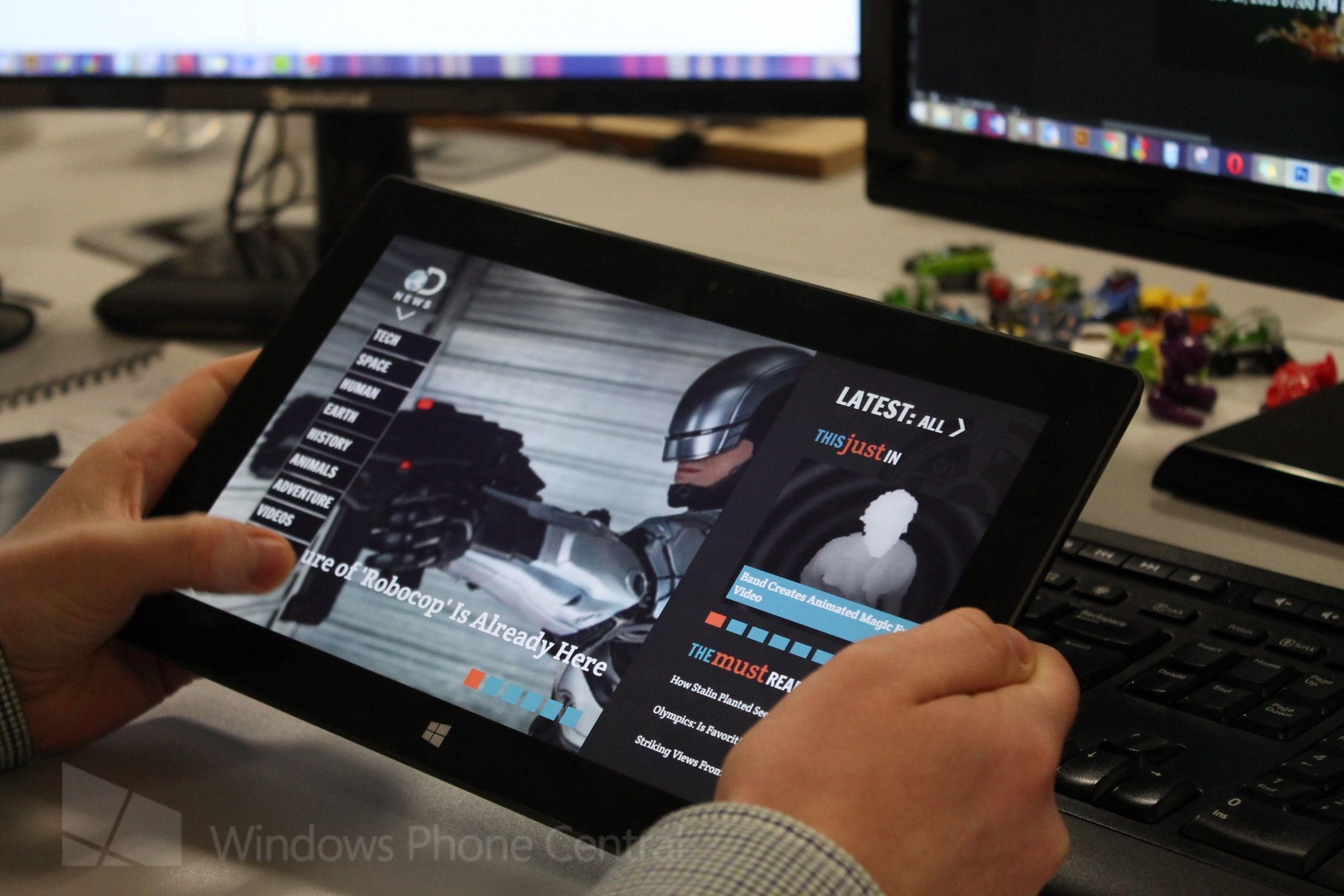
We’ve also recently released an update to Discovery News, as well as other apps which I can’t mention openly, but there is definitely more to come and I’m really excited about our projects this year.
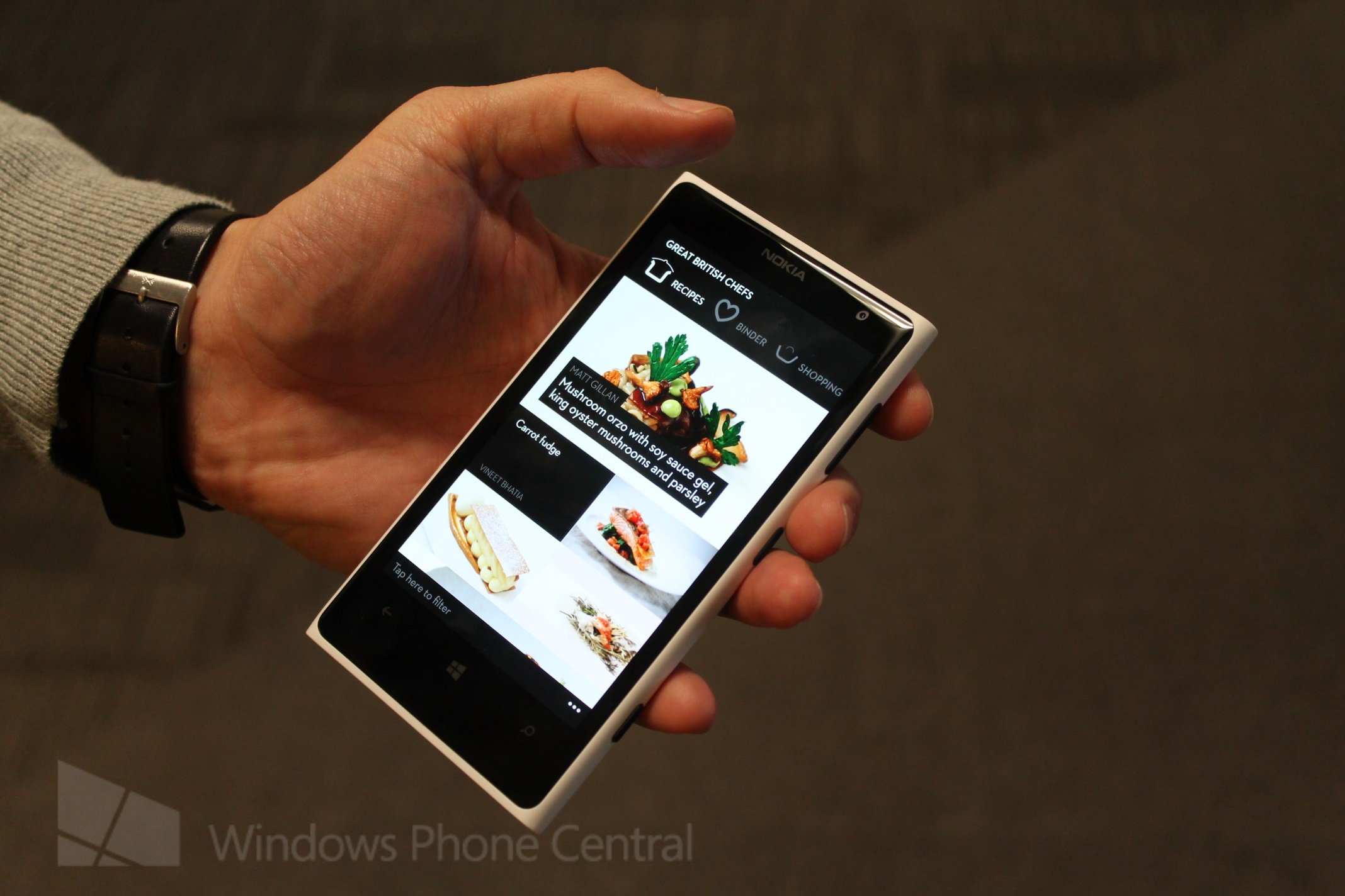
That recipe binder feature sounds very useful, you say for Great British Chefs it will be exclusive to Windows Phone 8, will it be coming to Windows 8?
Hopefully, if our client decides they’d like to bring it into that platform as well.
Do you continue to support apps? How does that progress?
We build products for our clients and they 100 percent own the full Intellectual Property. That being said we want to be there to fully support our clients and take a lot of pride in our work. Beyond the warranty period we’re always there to provide support because we want to build relationships with our clients, not just one off products.
We also knowledge share with our clients, we recognise that they often have minimal exposure developing for Windows 8 and Windows Phone 8 and we can step them through what we’re creating for them. We also co-locate with our clients at times to support a daily organic transfer of knowledge.
So you talked about building relationship with your clients, not just products, how do those relationships start? Are Microsoft involved?
It’s a mixture. We have a very strong relationship with Microsoft that we value. We have clients that we have been introduced to, and those who reach out to us based on our portfolio. The latter is increasingly becoming the case now as we’re seeing a clear growth in Windows Phone and Windows 8 interest.
We do also have a great relationship with Nokia as well, they are very hands on in offering support and guidance around the applications.
The difference between producing apps for Microsoft & Nokia ecosystem is that they are very involved and offer lots of support if needed, which is rare with other ecosystems. The level of support is fantastic.
What’s your favourite thing about Windows Phone and Windows 8 as either an end user or a developer?
It has to be the content over chrome philosophy and the focus on the user. I really love the de-cluttering whilst at the same time emphasizing what’s most important, driving the user right to the content.
With Windows 8 there are some great features. Semantic zoom and snap views all have a utility and value but also in design can be treated to make a product stand out.
"We’re seeing a clear growth in Windows Phone and Windows 8 interest"
You’re planning to move into the US market, what are your plans there and who are you looking to work with?
We already do a lot of work with clients in North America, but our production staff is based here in London. As the clients demand is growing in the States we feel it’s the right time to start to move some production out there. That’s going to be headed up by Kalem Fletcher, UI CENTRIC Founder and SVP of North America operations.
Our goal is to continue offering our great service and to grow our customer base. With the same ethos of building great digital products for our clients.
So are you moving out there with a particular view to work on Windows 8 or Windows Phone apps as your specialty?
We of course have a strong relationship with Microsoft North America and will continue to build our Windows 8, Windows Phone 8 and Xbox portfolio but we actively work across all the platforms to ensure users have a choice, and that our clients can be wherever their users are.
You mentioned in house software which I think is the only thing we haven’t covered, can you give us any examples of the kind of products you have produced?
We built a native touch-based business sales solution for the National Lottery, for their telesales and field sales teams, all powered with an Azure backend.
The client came to us with an ask; they had a number of legacy systems they wanted to rationalise, and produce a software solution that would provide productivity gains and a “single version of the truth” for their data, which could be shared with their portfolio of customers. Actually the way that we learned the brief was to shadow their sales team to understand their unique business functions.
We’ve covered everything you do in terms of products, does UI CENTRIC provide any other services?
We're running Windows 8 and phone 8 user experience workshops from participants that range from enterprises to start-ups. The workshop is very hands on. We take participants through the user centred design process. We present the core principles of the modern UI for Windows 8 and Windows Phone 8, as well as the underpinning benefits of those principles and how they relate to the user.
We then go to hands on and sketch the participants’ concepts. We then run development readiness session and have found those to be really valuable. People coming to these workshops typically have very little experience, but leave to progress their applications, confident in their knowledge of the Modern UI.
What about hiring: who are you looking for and how should they contact you?
We are looking for people in both the UK and the US who are enthusiastic and have a passion for building great digital products across all disciplines, in particular:
Developers, particularly indie devs coding in their spare time and just starting out who might want to learn about working with other like-minded people in all disciplines.
Graphic designers and people with experience or a desire to create great User Experiences.
We are always interested to hear from people who have the right attitude of wanting to build fantastic products and won’t compromise on quality, and care about the small details. If you’d like to get in touch you should go to http://www.uicentric.com/careers to find out more.
"We are looking for UK and US people who are enthusiastic [about] building great digital products"
Dan thank you for your time, it’s been a pleasure seeing your team at work.
Thank you, we hope you’ll enjoy what we can create this year!
If you want to check out some more of UI CENTRIC’s work we’ve got a list of just a few of the apps they have been involved with, a more comprehensive feature portfolio is here on their site. You can download all of these right now on either Windows 8, Windows Phone or Xbox 360, in fact Great British Chefs launched on Windows Phone 8 just yesterday, so make sure you pick up that one free in the store. Or you could check out the spotlight video above, recently created with Microsoft for more of Dan and the UI CENTRIC team.
- Great British Chefs (Windows Phone and Windows 8)
- Discovery News (Windows 8)
- WWE (Windows 8 and Xbox 360)
- The Daily Show Headlines (Windows 8)
- Time Out (Windows Phone and Windows 8)
- National Geographic World Atlas (Windows 8)

Jay is a Former Contributor for Windows Central.
 Join The Club


