Treo Pro, Full Round Robin Review

In my Video Review of the Treo Pro for the Smartphone Round Robin, I didn't spend as much time going over features as I did trying to figure out just what the Treo Pro is and where it fits in the smartphone market. Is it primarily a Windows Mobile smartphone? Is it really a Palm Treo, or just another smartphone. Answer those questions means answering this one: Just what is a “Treo” and what distinguishes it from other smartphones?
Let's get that answered, shall we? Give us your answer in the comments and you'll be automatically entered to win an HTC Fuze and a Redfly, both sponsored by Celio. Full details here.
Hardware
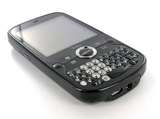
One of the things that has differentiated Treos from other smartphones is a certain kind of form factor: A QWERTY keyboard designed for one-handed usage positioned underneath a row of main buttons, itself positioned underneath a square touchscreen. There have been other smartphones that match this form factor (notably the Samsung Epix and Samsung Saga), however, so it's difficult to use that as the thing that clearly sets the Treo Pro apart from other Windows Mobile Smartphones.
While Treos are certainly not the sexiest devices around, they are generally well-built and can take a beating. The Treo Pro is a lot prettier than previous Treos, sure, but while its thin and glossy, it certainly doesn't hold a candle to the looks of devices like the Touch Diamond.

However the Treo Pro breaks with this tradition somewhat. It's thin! It has a flush touchscreen! It actually has WiFi and GPS built-in! It also has a somewhat un-utilitarian keyboard, which was necessary in order to pack as much as they have into such a small package. The Treo Pro doesn't have the elegance of the Bold, the nerd-chic of the G1, the sexiness of the iPhone, or grace of the Fuze, but it does have a sort of class all its own. Older Treos were bricks that 'got stuff done;' the Treo Pro is an elfin version of that.

One Step Access
Yet Treos do seem to be the most utilitarian for people who love them. There's a reason that Treos (and yes, BlackBerrys) users stick with them, and that has to do with one step access.
I'm indebted to sdgmcdon for this phrase and I think it fits the Treo like a glove. There are few, if any, smartphones out there that offer so many clear and easy-to-discover shortcuts out of the box.
Get the Windows Central Newsletter
All the latest news, reviews, and guides for Windows and Xbox diehards.
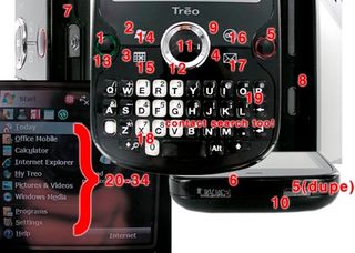
It's a Treo feature that doesn't get enough attention. With no configuration whatsoever, the Treo Pro gives you the ability to do the following with one hardware button.

- View a list of recent calls
- Open the start menu
- Open the calendar
- Open email
- Turn off and lock the screen (Or not lock!)
- Silence the entire device
- Toggle WiFi
- Open up the Camera application
- OK/Back out of your current app
- Toggle Airplane Mode
- Select/Enter
- Scroll in any direction, infinitely
Now add in the intuitive Opt+Button combos (13-17) and out of the box you get access to 5 more applications or functions, mapped by default to common applications, plus access via the keyboard to search and screen brightness (easily found via icons on the keyboard).
Next, add in the fact that since the original Treo you've been able to initiate a near-instantaneous contact search just by typing from the home screen (Today Screen on WinMo) (we won't even count this). Finally, add in whatever shortcuts you put on the Start Menu (two taps, one button + one on-screen tap) for 10 more shortcuts plus 5 more recent programs.
Add all that up and you come up with over thirty (34 to be exact) functions that take no more than two presses/taps. Sure, other apps have home buttons that allow you to quickly get to a list of applications, but on a Treo these shortcuts work anywhere. Were we to count the standard Today Screen we'd get a few more shortcuts tossed in -- shortcuts that also have the added benefit of actually displaying rich and useful information while they double as shortcuts to Alarms, Calendar, SMS, etc.
Here's the crazy thing: all but a half dozen or so require little to no learning curve because their functions are clearly displayed to the user either on a button or on screen. Discounting the Opt+button functions, a new user to the Treo Pro will find 10 hardware buttons with clear functions + 15 more functions in the Start Menu quickly, easily, and with consistent functions in any application they happen to find themselves in.
One Handed Use

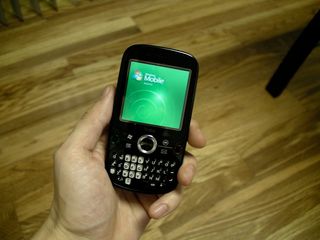
Every shortcut and function I enumerated above, in addition to being very discoverable (and yes, configurable) to new users is also one-handed. On every Treo1, including the Treo Pro, you can quickly access these thirty-odd functions with one hand.
Now toss in the fact that on every Treo you have the now-common feature (well, it's not on the iPhone, crazy gits) that Palm pioneered: you can simply start typing on the home/today screen to access your contacts quickly and easily. Even on my list of over 1100 contacts (thanks for the hard-to-mange list, Google Contacts), it never takes me more than 2 seconds tops to drill down to the person I'm trying to contact. This is something I've taken for granted as a long-time Treo user and so when I encounter a phone that doesn't do that by default it drives me bonkers.
The one-handed use bits doesn't just apply to shortcuts, either. It also applies to typing. While this is also true on BlackBerrys and several other devices, it's worth pointing out that you have always been able to type with just a single thumb on a Treo. Because of the relatively high quality of Treo keyboards (Treo Pro included, although it is a bit small for some), you can usually do it with a pretty high degree of accuracy too.
- Note that on earlier Windows Mobile Treos like the Treo 750 and Treo 700wx the Opt+Button combo does, in fact, require two hands since you need to simultaneously press both buttons. This has been fixed with the Treo Pro, where you can hit the Opt + Button combo in succession.
Software and the 'Special Sauce'

So it's pretty clear that a lot of thought goes into the hardware of the Treo -- everything seems to be designed with an eye towards 'getting things done' fast and efficient. However, that's obviously only half the story -- Palm prides itself on making the hardware and the software integrate very well together.
Of course, when it comes to PalmOS-based Treos, this sort of seamless integration between the software and the hardware is clear. Palm controls all of the elements here and so they are able to make sure that things happen properly. For Windows Mobile-based Treos, though, the story is a little more complicated.
I'm going to set aside the Treo Pro for a moment here, because it has a unique history among Treos. Ditto the Treo 500. Instead, I'd like to focus on the Treo 700wx, the Treo 750, and the Treo 800w. All three are clearly Windows Mobile Treos because they are an intelligent mix of 'stock' WM elements and Palm's 'Special Sauce.'
When the Treo 700w was originally announced (amidst much fanfare, I might add), one of the main things Palm focused on was the fact that they made some important modifications to Windows Mobile to make it quicker and easier to use. The most obvious was photo speed dialing on the Today Screen (no longer anything special), but the most important changes were actually under the hood.
If you take the Treo 700wx (let's not talk about the memory-anemic Treo 700w, kay?), the Treo 750, and the Treo 800w and compare them to any other Windows Mobile device with comparable processors and memory, you'll discover something somewhat surprising: the Treos are uniformly faster. Part of this extra speed is merely the subjective result of the relentless focus on One Step Access, but part of it is also under-the-hood enhancements. WM Treos are generally 'stripped' of unnecessary bits, registry entries, and so on.
While all WM manufacturers spend time tweaking their ROMs for performance and hardware compatibility, Palm seems to do so with a clearer focus on responsiveness. Instead of tweaking the ROMs to make sure they have everything the carriers require (though of course Palm must do that too), they seem to first tweak them for speed.
The result is an implementation of Windows Mobile that decidedly lacks polish, flash, and sex appeal. What you get in exchange for all that is speed. I put it this way in my review of the Treo 800w:
After all that, what's my final verdict on the Treo 800w? It's this: The Treo 800w is the best Treo ever. That shouldn't surprise anybody, it's the newest Treo and so it ought to beat out its predecessors. Here's the surprising part:The Treo 800w is the the most productive Windows Mobile Pro device I've ever used.If you need your phone to be shiny with lots of eye candy and other tomfoolery, the iPhone or the Touch Diamond are up your alley. If you need your phone to allow you to get work done, the 800w should be on your short list. It's very fast, well-integrated with the hardware, and has been bug free so far in my testing.
So that's the legacy of Windows Mobile Treos. How does the Treo Pro fit in?

Oddly.
As we've reported here at WMExperts before, the Treo Pro is not only manufactured by HTC, but appears to be significantly designed by them as well. A look at the Bootloader, the battery, the internals, and the ROM itself all indicate that Palm let HTC do the lion's share of the development for the Treo Pro. So what does that mean?
It means that the Treo Pro feels like it's somewhere in between a Treo and an HTC device. That's not to say that it experiences the kind of lag you sometimes see on HTC's slider devices (You definitely don't), but it also means that there doesn't appear to be the relentless focus on responsiveness throughout. In short: previous WM Treos have overperformed relative to their specs, the Treo Pro simply performs.
That's not necessarily a big knock against the Treo Pro. The specs on the device are definitely good and so you do get much of that same Treo speed that you see on other devices. There's just a feeling that, maybe, it could stand to be a little bit faster from time to time.
Also -- there's no photo speed dial out of the box, which is a bummer.
Enough already, what is a Treo?
Here's the cliché you've been waiting for:
The Treo is a Jack of All Trades, Master of None
Palm had intended the brand 'Treo' to imply a sort of generic, all-encompassing idea of a converged smartphone device. In an ironic sense, they have succeeded in that endeavor. You can stack a Treo up against any other smartphone out there and it will at least show up to the race and though it might finish second, it will finish.
Compared to Android:
You do get the mix of simplicity and power found on Android, that mix of touchscreen and keyboard is similar. Is the Treo Pro as good at Google as the G1? Obviously not, but the app library (for now) is bigger.
Compared to the BlackBerry:
The Treo is able to do push email out of the box, is relatively snappy, and most importantly to the BB set: features a good keyboard and set of efficient tools for getting stuff done on the go. Is email as good at the BlackBerry email setup? For most people, no (for me, though Outlook is better).
Compared to the iPhone:
The Treo can to pretty much everything the iPhone can do, but it's clearly not as pretty. The iPhone wins out on browsing and media (obviously), but the Treo is definitely a better messaging device.
Compared to the Fuze:
The Treo Pro is not as powerful as the Fuze. It doesn't have as large a screen or feel like it is the mini-computer the Fuze comes off as. On the other hand, the Treo can be used one-handed and the fact that it doesn't have resource-intensive skins like TouchFlo 3D makes it a bit faster.
...I could go on. The bottom line is that you can take pretty much any modern smartphone and hold it up to the Treo and say “This beats the Treo at X.” If you go feature-by-feature, most smartphones will come in with a 9 in one category, a 5 or a 6 in a few others, and a 4 or lower in the rest. The Treo, on the other hand, will give you a 6 or a 7 in every feature category. Making it excel in a single category takes some work (in the form of 3rd party software), but it can be done.
So why do people love Treos? Because of that consistent 6 or 7 in every feature category. It doesn't blow your mind, but it almost never falls flat.
Wrapping Up
It's not exactly a ringing endorsement or a rallying cry, but the Treo Pro gets the job done. That's one of the reasons I keep coming back to the Treo, though I can't say if it's going to be a life-long commitment kind of thing.
For now, I don't know anymore if the Treo Pro is the device for me. Yes, I love the one handed use and the one step access, but I wish for a bigger screen, a prettier interface, a better browsing experience, better gmail integration, easier email setup, better email, a more efficient OS, and so on. Lucky for Palm, there isn't a single smartphone that can deliver a 9 on all of those feature ticks. Lucky for me, I can decide which feature matters most and pick the smartphone that fits that.
When I can't decide which feature is most important but want them all to work 'pretty well,' I reach for the Treo.
Home to the most invested and passionate Microsoft fans, Windows Central is the next generation destination for news, reviews, advice and buying recommendations on the Windows, PC and Xbox ecosystems, following all products, apps, software, AI advancements, and accessories. We've been around for more than decade, and we take our jobs seriously. Windows Central writers and editors value accuracy and editorial independence in everything we do, never receiving compensation for coverage and never pulling punches.
