Touchflo 3D vs. SPB Mobile Shell
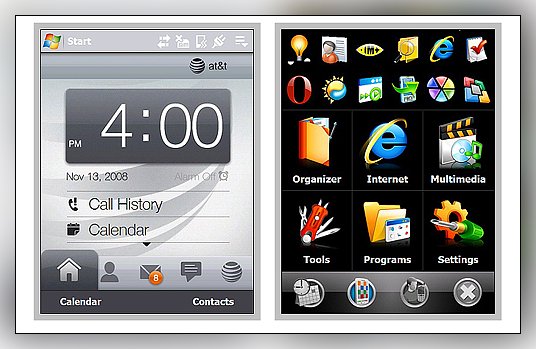
One of the attractions to the new HTC line-up is TouchFlo 3D. There is no argument that graphically, Touchflo 3D is a eye catching application. While it may be pretty to look at, how functional is it? Before Touchflo 3D hit the market, one of the more popular Today Screen alternatives was SPB's Mobile Shell. There are some reservations over Touchflo 3D's usefulness and SPB Mobile Shell might be a viable alternative for those HTC owners who are looking for something different. Could Mobile Shell hold it's own against the animated graphics of Touchflo?
We decided to compare these two applications and as Michael Buffer so aptly put it, "Let's get ready to rumble!" (key techno dance music please). Read on after the break to see how they measure up against each other.
The Players
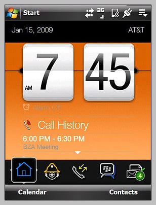
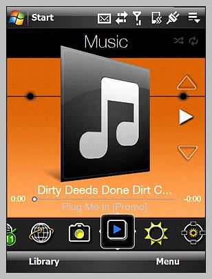
HTC has used touch navigation for some time as well but dramatically improved things with the graphic punch. Combining touch navigation with eye-catching graphics, Touchflo puts the more common applications and functionalities at your fingertips. Touchflo 3D's home screen includes a snapshot of your call history and appointments. A series of pages follow the Home screen that places key components of Windows Mobile at your disposal. Each page will not only launch the associated application but it brings key features to the fore ground. Instead of launching the web browser and then going to a bookmark, you can go straight to a bookmarked page from the Internet Page. The same can be done for a particular song or photo in the Music and Photo/Videos pages. Touchflo made it a little easier for one touch access to specific items on your Windows Mobile device. Additionally, with devices such as the Fuze/Touch Pro, it includes a navigational menu of popular apps (email, web, contacts, notes, etc.) when you extend the keyboard.
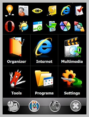
SPB's Mobile Shell was introduces a few years ago as an alternative to the one dimensional Today Screen. The Mobile Shell itself gives you access to applications, settings, and speed dialing. By using touch navigation, Windows Mobile users could go from the alarm clock to speed dialing or scroll through the Program and Settings windows with a swipe of a finger.
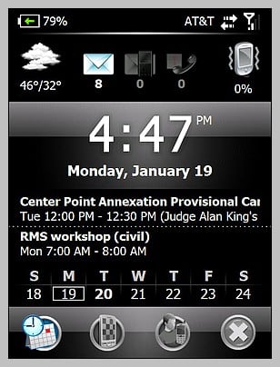
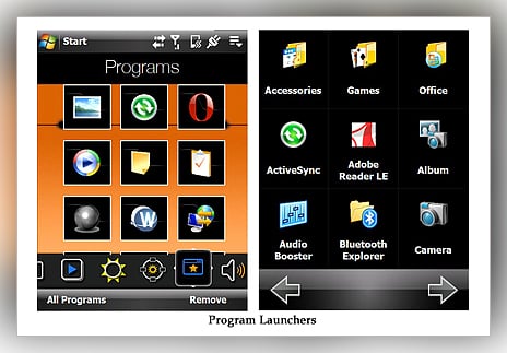
A Now Screen is available when you wake your device up that takes you into the shell and displays basic information such as the date/time, weather, appointments and unread messaging. While the Shell itself isn't much different than the Touchflo 3D concept, I think the strength of Mobile Shell comes from it's Today Screen plug-in. SPB Mobile Shell improves user interface and increased functionality of the Windows Mobile Today screen by adding a tabbed section that is customizable to allow Windows Mobile users access to applications, weather information, speed dialing, alarms and other items you would use on a daily basis.
Strengths and Weaknesses
With devices such as the HTC Fuze or the Touch Diamond, one of the keys to a successful user interface is how well the device compensates for the lack of a front-facing keyboard. I'll take the slide out keyboard of the HTC Fuze over the Treo Pro's any day for long winded typing but, for one handed use, the front facing keyboard is hard to beat. You can't always stop what your doing (or have both hands free) to operate your Windows Mobile device and the more convenient the interface, the better.
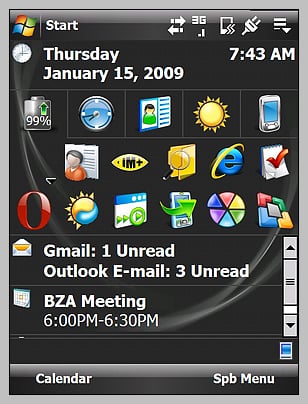
Both Touchflo 3D and Mobile Shell strive to increase the functionality and user interface of your Windows Mobile device. Hands down, Touchflo 3D beats Mobile Shell with respect to style. The Weather Page is simply stunning and with customizations such as Fuzeberry the graphical impact Touchflo 3D only increases. However, as far as functionality and convienance, Mobile Shell has a slight edge.
Get the Windows Central Newsletter
All the latest news, reviews, and guides for Windows and Xbox diehards.
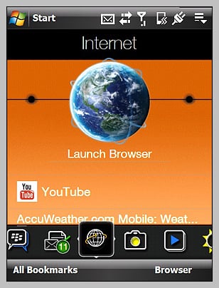
Touchflo 3D's strength lies with its ability to access specific items without having to go through an applications front door. You can go directly to a bookmarked page on your browser, play a specific song, view a certain photograph directly from the Touchflo pages. You can also access key settings such as communications from Touchflo without having to cycle through the Windows Mobile pages. The downside to all this is that all these features are on multiple pages of Touchflo 3D. There is not a page that centralizes these features.
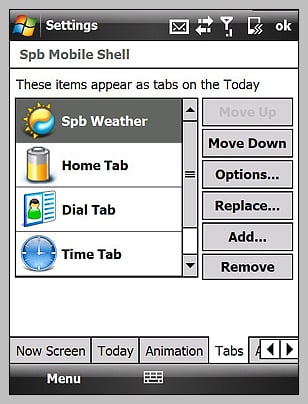
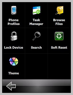
Mobile Shell does a better job of centralizing features. With the Today screen plug-in you have tabbed customizable access to speed dialing, weather, applications, alarms and other everyday items that you might need. Add the information that the Today screen already provides (tasks, calendar, messaging) and you have a lot at your disposal. Mobile Shell does come with a 'Tools' window that does put some of the more commonly used utilities at your finger tips (task manager, phone profile, file explorer) as well as a Soft Reset command (really nice if you don't have a convenient reset button). But it lacks the communications control Touchflo has. While Mobile Shell does a good job centralizing features, there's still room for improvement.
Everyday Use
While both Touchflo 3D and Mobile Shell are both capable interfaces for your Windows Mobile device, in everyday use I found Touchflo 3D to be a little cumbersome. For example, to speed dial a contact Touchflo has the People page which allows you to have a picture Rolodex of your favorite contacts. First I have to slide over to the People page, then by tapping on a contact your are launched you into a dial screen. From there you choose the number you want to dial and hit the dial key or tap the number display. With Mobile Shell, you also have a contacts page where if you tab a contact you're taken into a dial screen but you also have "one-touch" speed dialing from the Today Screen plug-in.
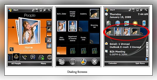
While the Weather page on Touchflo is simply "cool" with it's animation, you have to go to a separate screen to see the extended forecast or another selected city's conditions. With Mobile Shell's weather tab, you get the current conditions plus an extended forecast at a single glance. I'd call application access about a draw between these two. Touchflo has the Programs page and Mobile Shell has the program tab. I do like the settings page on Touchflo 3D as well as the Communications page that Fuzeberry adds. It makes your BT, Wifi, Data and radio controls easier to access. With Mobile Shell, you have to access the native communications settings of Windows Mobile. There's no question about it Touchflo 3D wins with regards to style points but Mobile Shell gets the nod for functionality.
Final Thoughts
So which is better? Does functionality give way to style with Touchflo 3D? Can the functionality of Mobile Shell overcome the graphics of Touchflo 3D? There's no question about it Touchflo 3D wins with regards to style points but Mobile Shell gets the nod for functionality. However, just when comparing Windows Mobile Standard to WM Pro or keyboard styles, there's really not a bad choice. The secret is finding what works best for you.
If you are looking for a solution for easier one-handed operation, simpler access to key items on your HTC Fuze, then the nod goes to Mobile Shell. I have access to all my pertinent information on my Home screen ranging from application launch to speed dialing. While Touchflo has similar access, you've got to swipe around to get to it.
If one-handed operation isn't as critical and you want to "wow" your friends with graphically pleasing screens, the Touchflo 3D wins out. Touchflo will allow you easier access to specific things (bookmarks, photos, videos, songs) as well as your communications control, but the display of appointments and multi-step speed dialing doesn't bode well for "on the go" operation.
Can they be better?
Sure.
We are anticipating a new version of Mobile Shell and while superficial, maybe SPB will enhance the graphics of Mobile Shell. Maybe a with little animation to compete with Touchflo 3D's graphic advantage. While the Now screen has its usefulness, I would rather see a home screen integrated with Mobile Shell and take the native Today Screen out of the loop. A communications setting tool would also be a welcomed addition to the existing "Tools" window.
The one addition to Touchflo 3D that I think would be welcomed is a more concentrated home page. The flip clock is a nice visual effect but it dominates the home page. If you reduced the size of the clock, you could expand the number of appointments that appear on the home screen, add 3-4 one-touch speed dial icons, and have a unread message summary. Have the People page have the layout option similar to the Programs page where you can display smaller icons for the contact making them easier to access. Finally, Touchflo 3D needs to have the option to add/hide pages that you don't want without having to go to a third party application/hack. It would be nice to see Touchflo 3D options beyond enabling sound when scrolling, enabling a larger Start Menu and showing the system status screen when status icons are tapped.
Touchflo 3D is a very capable application but it spreads out the functionality of Windows Mobile too much for someone who is on the go. I like the centralized organization that Mobile Shell presents. For those interested in trying Mobile Shell as an alternative to Touchflo 3D, a downloadable trial is available. You might be surprised at the difference.

