Touch Pro 2: Head to Head to Head to Head
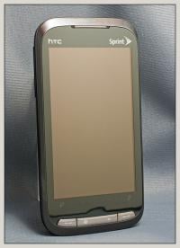
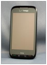
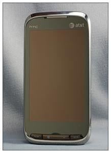
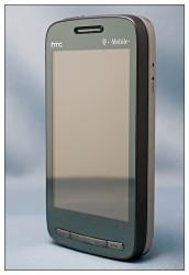
The HTC Touch Pro 2 has now landed at all four major U.S. carriers; AT&T, Sprint, Verizon and T-Mobile. For the most part, the choice of which Touch Pro 2 to go with is tied into your carrier service contract.
We've looked at all four Touch Pro 2's on the market and found each to be an impressive Windows phone. But, does one stand out above the other? Or has HTC produced a phone so impressive it doesn't matter what carrier offers it? Follow the break for a completely non-scientific comparison of the Touch Pro 2 versions.
Note: For the purposes of this article, any general reference to the Touch Pro 2 should be taken to include the AT&T Tilt 2.
Disclaimer
First, the Touch Pro 2 (regardless of carrier) is an impressive Windows phone in and of itself. If you are looking for a Windows phone with a physical keyboard, the Touch Pro 2 will be hard to beat.
HTC produces a stock Touch Pro 2 and accommodates certain production variations for individual carriers so the carriers' Touch Pro 2 design is distinguishable from the others (AT&T took this a step further by calling their Touch Pro 2 the Tilt 2). This used to be accomplished by simply branding the phone with a corporate logo. Today, however, carriers want their phone to stand out more.
The disclaimer to this article is that the comparison has nothing to do with the services provided by the specific carriers. We simply wanted to pull all four Touch Pro 2 models under one roof, comparing the design and features the carriers have chosen. We still believe that your choice of carrier should be based on the wireless service first, phone choice second.
The tale of the tape
When you first handle any of the Touch Pro 2 versions, one thing that stands out is the heft both phones possess. Each are solidly built and noticeably heavier than their older brother, the HTC Touch Pro. Dimensionally they are virtually equal in size with the AT&T Tilt 2 getting a slide nod for a more compact size (if you can consider a fraction of an inch "compact"). The T-Mobile version is the heavy weight of the four with the others being .05 ounces of each other. The differences in thickness is not enough to matter.
Get the Windows Central Newsletter
All the latest news, reviews, and guides for Windows and Xbox diehards.
| Category | Carrier | |||
|---|---|---|---|---|
| AT&T | Verizon | Sprint | T-Mobile | |
| Model Number | HTC Tilt 2 | XV6875 | Touch Pro 2 | Wing II |
| Operating System | WM6.5 Pro | WM6.1 Pro | WM6.1 Pro | WM6.1 Pro |
| Network | Quad Band GSM/GPRS/EDGE (850/900/1800/1900 MHz) - Broad global coverageTri Band HSDPA/UMTS: 850/1900/2100 MHz (3.6/7.2 Mbps w/ network availability) | EV–DO, 1X RTT capable (Rev. A capable); GSM Quad Band (GSM/GPRS/EDGE); UMTS/WCDMA/HSDPA/HSUPA | EV–DO, 1X RTT capable (Rev. A capable); GSM Quad Band (GSM/GPRS/EDGE); UMTS/WCDMA/HSDPA/HSUPA | Quad Band GSM/GPRS/EDGE (850/900/1800/1900 MHz)Bi Band HSDPA/UMTS: 1700/2100 MHz |
| International Roaming | Yes | Yes | Yes | Yes |
| Display | 3.6" wVGA 480 x 800 | 3.6" wVGA 480 x 800 | 3.6" wVGA 480 x 800 | 3.6" wVGA 480 x 800 |
| Dimensions (mm) | 4.54" Lx2.33" Wx0.65" D | 4.57" Lx2.33" Wx 0.68" D | 4.56"Lx 2.33"Wx 0.68"D | 4.59" Lx2.36" Wx0.68" D |
| Weight (oz) | 6.3 | 6.35 | 6.3 | 6.61 |
| QWERTY keyboard | Yes – AT&T optimized | Yes – standard HTC | Yes – standard HTC | Yes – standard HTC |
| Keyboard Acceleration keys | Yes | Yes | Yes | Yes |
| Processor | Qualcomm MSM 7201a, 528 MHz | Qualcomm MSM7600a528 MHz | Qualcomm MSM7600a528 MHz | Qualcomm MSM 7201a, 528 MHz |
| Memory | ROM: 512MB;RAM: 288MB | ROM: 512MB;RAM: 288MB | ROM: 512MB;RAM: 288MB | ROM: 512MB;RAM: 288MB |
| Wi-Fi | 802.11b/g/e/i+ AT&T Wi-Fi | 802.11b/g | 802.11b/g | 802.11b/g |
| PTT | Yes | No | No | No |
| Video Share | Yes | No | No | No |
| Visual Voicemail | No | Yes | No | No |
| Integrated 3.5mm | No | Yes | Yes | No |
| Tethering | Yes – BT or cable | Yes - cable | Yes – BT or cable | Yes – BT or cable |
| In Box Accessories | AC adapter (with power plug)USB Charge and sync cableExtra stylusSingle screen protector3.5mm stereo headset adapterQuick StartCD w/ User Guide | SIM Card pre–installedAC ChargerMini USB CableInternational Adaptor ClipsSpare StylusVZAccess Manager CDGetting Started CD (Includes User Guide)RF BrochureRead First PosterQuick Reference Guide | USB Charging CableAdditional StylusSIM CardAC ChargerLCD screen protectorGetting Started CDGet Started Poster, Basics Guide, Set Up Your Email Guide, and Features Guide | AC ChargerStereo Hands-Free HeadsetUSB CableMulti function audio cableCarrying caseStarted GuideGetting Started Disc |
*The full, comparative chart can be found here.
Under the hood
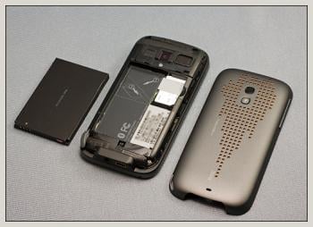
Both the T-Mobile and AT&T versions have Qualcomm MSM7201A, 528MHz processors while the Verizon and Sprint models sports the MSM7600, 528MHz process. Each have 512mb of ROM and 288mb of RAM. The T-Mobile and AT&T models have 32mb of memory in the baseband that does not show in the Device Information but serves some purpose in life. Each device sports a micro-SD expansion slot. Screen sizes are equal (3.6" 480x800 WVGA) as is battery size (1500mAh).
Feel and Finish
Each Touch Pro 2 felt good in the hand and very comparable to the feel of an iPhone (save the sliding keyboard).
The T-Mobile TP2 is more of a brownish/bronze finish while Sprint choose a gun metal gray finish. Verizon get's the award for the shiniest of finish (AT&T coming in a close second) with a shiny black face and a matte silver backside.
As is, each phone looks good and has a conservative, clean feel to it. The finishes still attracts its fair share of grease and fingerprints but not as bad as the Touch Pro models. Each version could have benefited from a textured finish on the battery cover to give the phone a little grip.
Key Design Differences
3.5mm Jack
The most noticeable design difference in the four Touch Pro 2's is the presence of a 3.5mm jack on the Sprint and Verizon versions. This is a feature that many have hoped for over the years and it's nice to see Sprint and Verizon finding a way to incorporate this feature into their design.
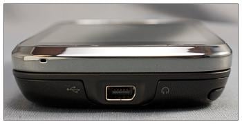
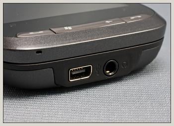
However, as I've mentioned in previous reviews, the absence of a 3.5mm isn't a deal breaker in my opinion. The 3.5mm jack is definitely more convenient but without it you still have the adapter and wireless options available. The importance of a 3.5mm jack is something based on individual needs but is not a universal drawback.
Expansion Slot and Reset Button
Another noticeable design difference is the location of the expansion card slot and the reset button. T-Mobile get's kudos in this respect for having the reset button on the side of the phone. I find having the reset button on the side or in the stylus port more convenient for those times your Windows phones lock-up completely. Having to pop the cover off to access the reset can get old.
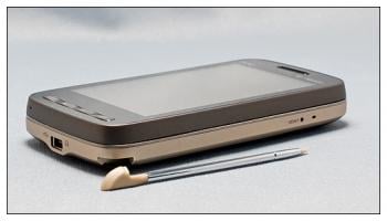
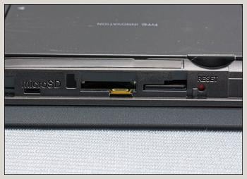
Each version requires the battery cover to be removed to access the expansion slot but the Sprint and Verizon versions also places the reset button beneath the cover. Hind sight being 50/50, I wonder why T-Mobile put the plastic hinged door over their expansion slot. If you have to take the cover off the phone to open the hinged door, why not opt for the design style Sprint and Verizon choose, using the battery cover to cover the expansion slot? Just keep the reset button out from beneath the back cover.
Keyboards
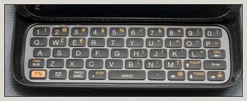
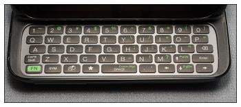
The keyboards are almost identical with only a few keys located at different spots on the keyboard. The Verizon version has fewer shortcut key but does have a mappable keyboard key.
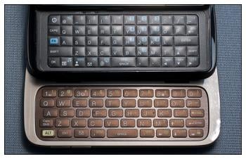
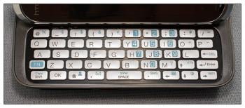
AT&T strays from the pack considerably with the Tilt 2's keyboard layout. AT&T stuck with the keyboard style found on the AT&T Fuze, replacing the numeric key row with symbols. The Tilt 2 has numbers buttons set as function keys.
Back Cover
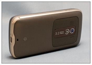
Granted this is subjective but I like the looks of the T-Mobile back cover a lot more than I do the others.
T-Mobile's cover has a more conservative, professional appearance.
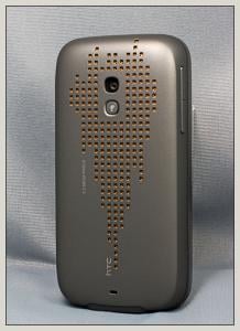
Sprints dotted pattern just doesn't do anything for me and I'm afraid all the square cut outs will be prone to collecting dust, gunk, and grime.
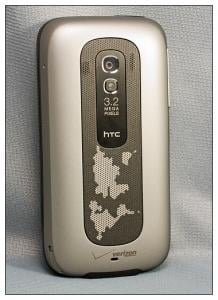
I'm on the fence with Verizon's back cover. Take away the global pattern and it may get the nod. Then again if you take away the pattern, you come close to the Tilt 2's design.
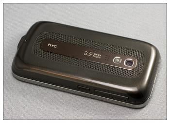
The Tilt 2 probably comes the closest to the unbranded HTC Touch Pro 2's design but neither of the Touch Pro 2 models' back covers are ugly ducklings.
Performance
With regards to being a phone, the Touch Pro 2's performance is outstanding. The dual microphones and noise reduction features put call quality amongst the best I've seen. I'd have to give the nod to the Verizon and AT&T versions with regards to speakerphone quality. While the T-Mobile and Sprint's speakerphone performed good, the Sprint and AT&T versions performed slightly better.
Software
With regards to running Windows Mobile, the Touch Pro 2 is, again, outstanding. The Tilt 2 gets the nod in this department because it ships with Windows Mobile 6.5 while the rest are waiting updated ROMs. I can't think of a single complaint about these phones with regards to processing speed or screen responsiveness.
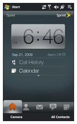
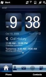
Sprint has customized TouchFlo 3D a little more by adding a Sprint Navigation and Sprint TV tab and the Music Tab has a link to Sprint's Music Store. Sprint get's the nod for making the most of TouchFlo 3D. AT&T gets de-merits for the bloatware tabs. Luckily, you can hide unwanted tabs with the version of TouchFlo 3D installed on each Touch Pro 2.
One last note with regards to TouchFlo 3D is that the Verizon, Sprint and T-Mobile versions use a more recent version of TouchFlo 3D than the AT&T Tilt 2. The most noticeable difference we've seen is with the calendar. The Tilt 2 version does not have the weather forecast incorporated into the calendar.
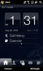
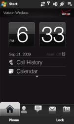
Regarding bloatware, each phone has its fair share of carrier labeled software (fondly known as bloatware). The AT&T and Sprint versions seem to have more bloat than the Verizon and T-Mobile. Some applications are tied into the carriers branded application stores, some of it offers trial offers of software titles, and each has a branded navigational app. As mentioned, the good thing is that you can hide the unwanted bloatware tabs. If you feel compelled, if you go to your MyDevice>Windows>Start Menu>Programs to remove the short cuts from your Start Menu. I'd recommend creating a temporary folder and move these shortcuts there so they can't be seen as opposed to deleting them out right.
Screen
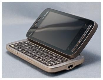
The 3.6" screen on the Touch Pro 2 models will spoil you. All four models' screens are impressive with clarity, sharpness and color. The AT&T Tilt 2 does seem to have a slight blue hue or cast to it but the color themes AT&T uses are very blue. The Touch Pro 2 is fitted with a light sensor to dim or brighten the screen as needed to better help manage power. Only in bright, direct sunlight did I have problems seeing the screen outdoors.
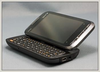
For the most part, I'm still on the fence about how useful the tilting screen is. In using the various Touch Pro 2 models over the past month, the tilt is growing on me. It makes viewing the screen easier (for viewing videos or reading email) when your at a table/desk but I still think typing is easier with the screen flat.
The Touch Pro 2 models are also fitted with a proximity sensor. When you are on a call, the sensor turns off the screen when you hold it up against your ear or lays it face down on a table. This a much welcomed addition and eliminates the need to hunt down the power button when your on a call to wake up the screen.
GPS

All four models performed well with regards to the internal GPS, save one exception, the Verizon Touch Pro 2. For some reason the Verizon Touch Pro 2 took noticeably longer to acquire a satellite fix when working from a cold start. Based on what we've learned from reader's comments and emails, this slow performance may be an isolated issue and not indicative of the device itself. Others, using the Verizon Touch Pro 2 state they have obtained satellite acquisitions under a minute.
Based on our experience and what we've heard from readers, the GPS performance is a push with each Touch Pro 2 performing well.
Camera
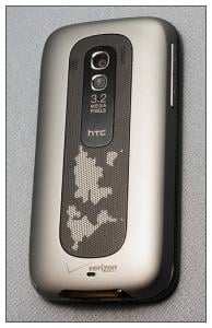
All four were "run of the mill", average cameras. The weakest camera performance we saw came from the AT&T Tilt 2. The Tilt 2's camera seemed to capture more muted photos with dull, low contrast colors. Video capabilities were about par for all four models as well.
A Unique Characteristic

We made note of this in the Tilt 2 review but each model has a slight oddity in that if the USB port comes into contact with a magnet (say, from a cell phone case) the screen will turn on. The Touch Pro 2 has an internal magnet that is used to activate the screen when the stylus is withdrawn from the Windows phone. It's simply a case of magnets being magnets. We don't see this as a drawback to any of the Touch Pro 2 models but instead an oddity.
And the Jury says....
Could the Touch Pro 2 be the ultimate Windows phone? For now, we'll hold off on such a distinction but will say that the Touch Pro 2 is going to be hard to beat. We have yet to get our hands on the HTC HD2, Samsung Omnia II, Toshiba TG01, the Sony Xperia X2 and other pending Windows phones, so time will only tell how well the Touch Pro 2 will eventually measure up.
It's almost impossible to say which Touch Pro 2 is better. After having handled all four, the Touch Pro 2 could easily be a Windows phone centerpiece for any wireless service provider. From phone quality to screen quality to Windows Mobile performance all four Touch Pro 2 versions receive high marks.
The only dividing line between these four Windows Phones may very well be your preference of carriers.
George is the Reviews Editor at Windows Central, concentrating on Windows 10 PC and Mobile apps. He's been a supporter of the platform since the days of Windows CE and uses his current Windows 10 Mobile phone daily to keep up with life and enjoy a game during down time.

