5 things Microsoft could do to improve tablet mode on Windows 10
With Windows 10 powered 2-1s on the rise, it's more important than ever that Microsoft perfects tablet mode on Windows 10.
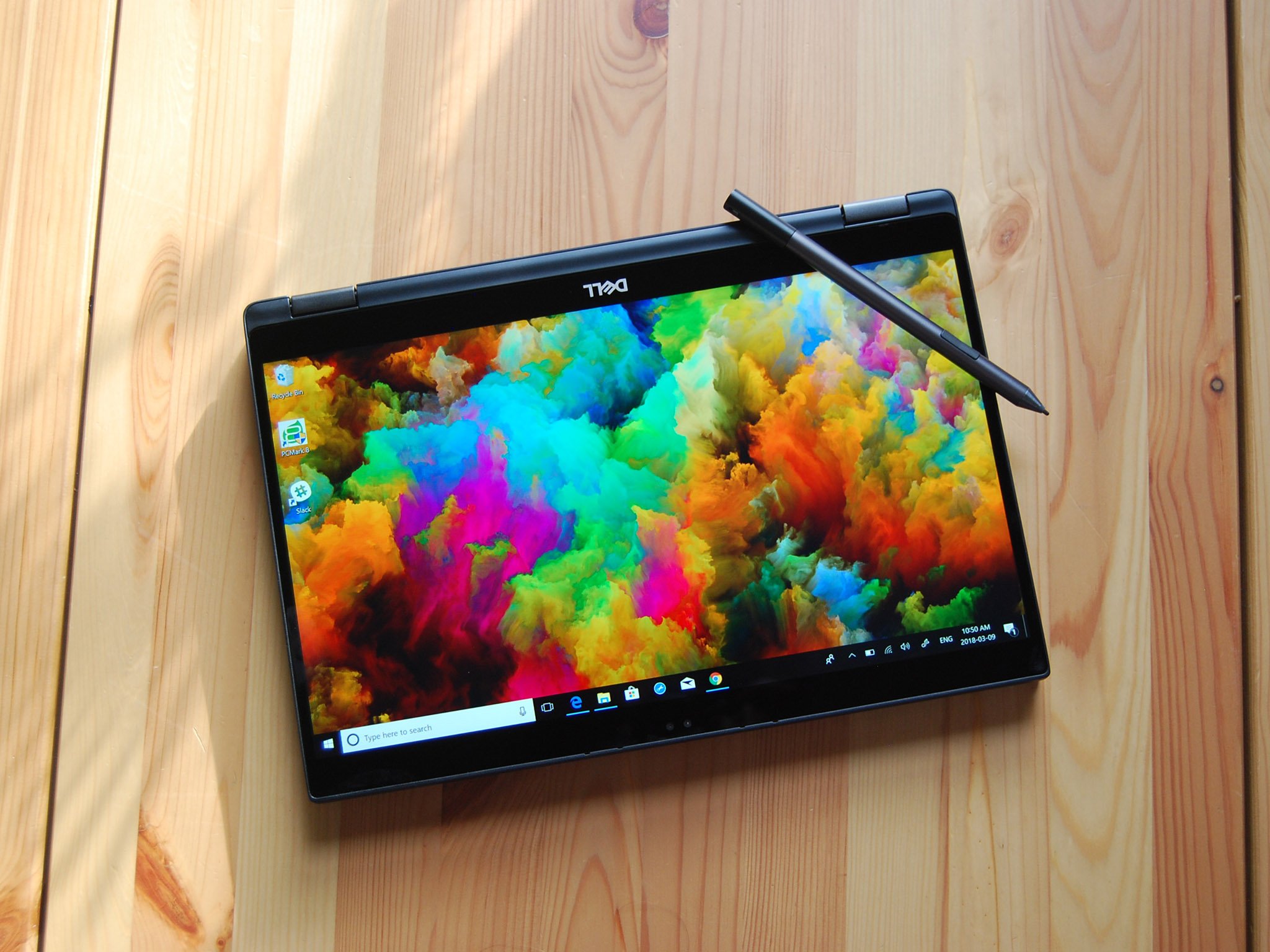
I've used Surface devices as my primary device for most of the time since the original Surface was released. I love the 2-in-1 form factor and used my Surface Pro 2 (RIP) primarily as a tablet for years. I never disliked the tablet mode of Windows 10, but after getting an iPad Pro for work, I've realized that the tablet mode of Windows 10 isn't up to snuff against its competition.
This isn't an indictment on Windows 10's tablet mode. There are things that it does very well, such as snapping multiple apps and scaling UWP apps. And Microsoft has made improvements to tablet mode over the years by adding features like pen scrolling and full-screen mode for Microsoft Edge. But ultimately, the tablet experience needs to feel less like a compromise and more like a dedicated tablet experience that can easily be switched in and out of.
There are entire threads and comment sections dedicated to improving tablet mode so I can't include every change I'd like to see, but these are the top five ways that I think Microsoft could improve tablet mode on Windows 10.
Improve portrait mode
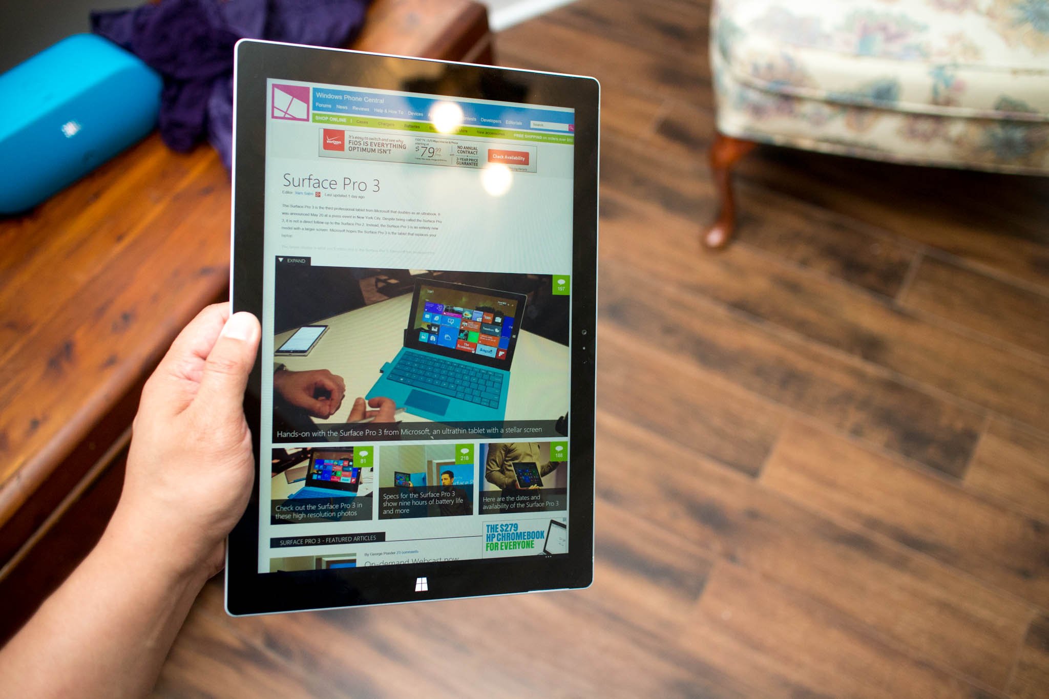
The 3:2 aspect ration is becoming more common across Windows 10 devices. And while there are advantages to having a 3:2 aspect ratio on a device like the Surface Laptop, the ratio is practically built for tablets. Using a 16:9 tablet in portrait mode was incredibly awkward so when Microsoft made the switch to 3:2 for Surfaces, it was a welcomed change. The only problem is that the operating system didn't change to meet the hardware upgrade.
At points, using tablet mode in the portrait orientation looks like someone hacked Windows 10 Mobile onto their PC. There's huge gaps of unused space in the Start Menu and apps list and the result is terrible. Compare this to the iPad which seamlessly flips between landscape and portrait and the difference is stark. I know that Windows 10 has a tiled interface compared to flat icons but that difference isn't the source of the issue.
Microsoft could further improve portrait mode by allowing devices to view apps in split-screen mode vertically rather than horizontally. The 3:2 ratio of the Surface line would scale apps split this way beautifully. If Microsoft needs any inspiration they can check out Android phones which can view two apps at once that are stacked vertically.
Microsoft also needs to find a way to better utilize the screen real estate of devices in portrait mode. Windows 10 Mobile did this wonderfully and I think Microsoft could take a lot of design cues from Windows 10's smaller sibling.
Get the Windows Central Newsletter
All the latest news, reviews, and guides for Windows and Xbox diehards.
Add more gestures
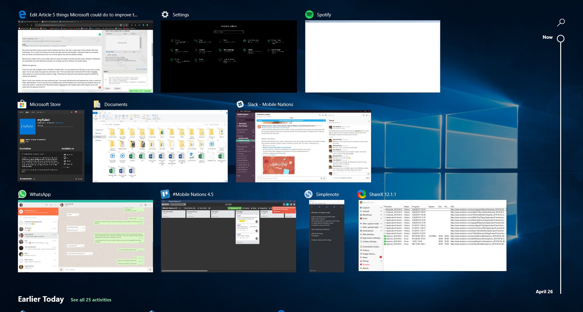
There are some nifty navigation tricks to Windows 10 tablet mode. You can swipe from the left open up any of your running apps. You can also easily bring apps into split-screen view. This has recently been enhanced with the rollout of Timeline which allows you to jump to previous instances of an app. Microsoft could streamline people's workflows by adding more gestures.
Most, if not all, touch devices now have multi-touch input. That means that Microsoft could implement two, three, or even four finger swipe gestures. I'd love to see the return of flipping back and forth between your current app and whatever app you've used most recently. I understand why Microsoft focused on taskview but with multiple inputs at their disposal, they could easily add more gestures to the OS.
UWP all the things
Despite what some may say, UWP isn't going anywhere. Microsoft is going to continue to push it to developers, add features, and increase the number of APIs that are available. But pushing it to developers and leading by example are two different things. Microsoft still has significant pieces of software that aren't native UWP apps. That means they don't scale as well on tablets, lack some features like built-in back buttons, and aren't touch friendly.
In some cases, apps and services aren't available on the Microsoft Store at all. More so than just apps, some major parts of the operating system are still legacy pieces of software that don't scale well, don't implement the new design language, and aren't touch friendly.
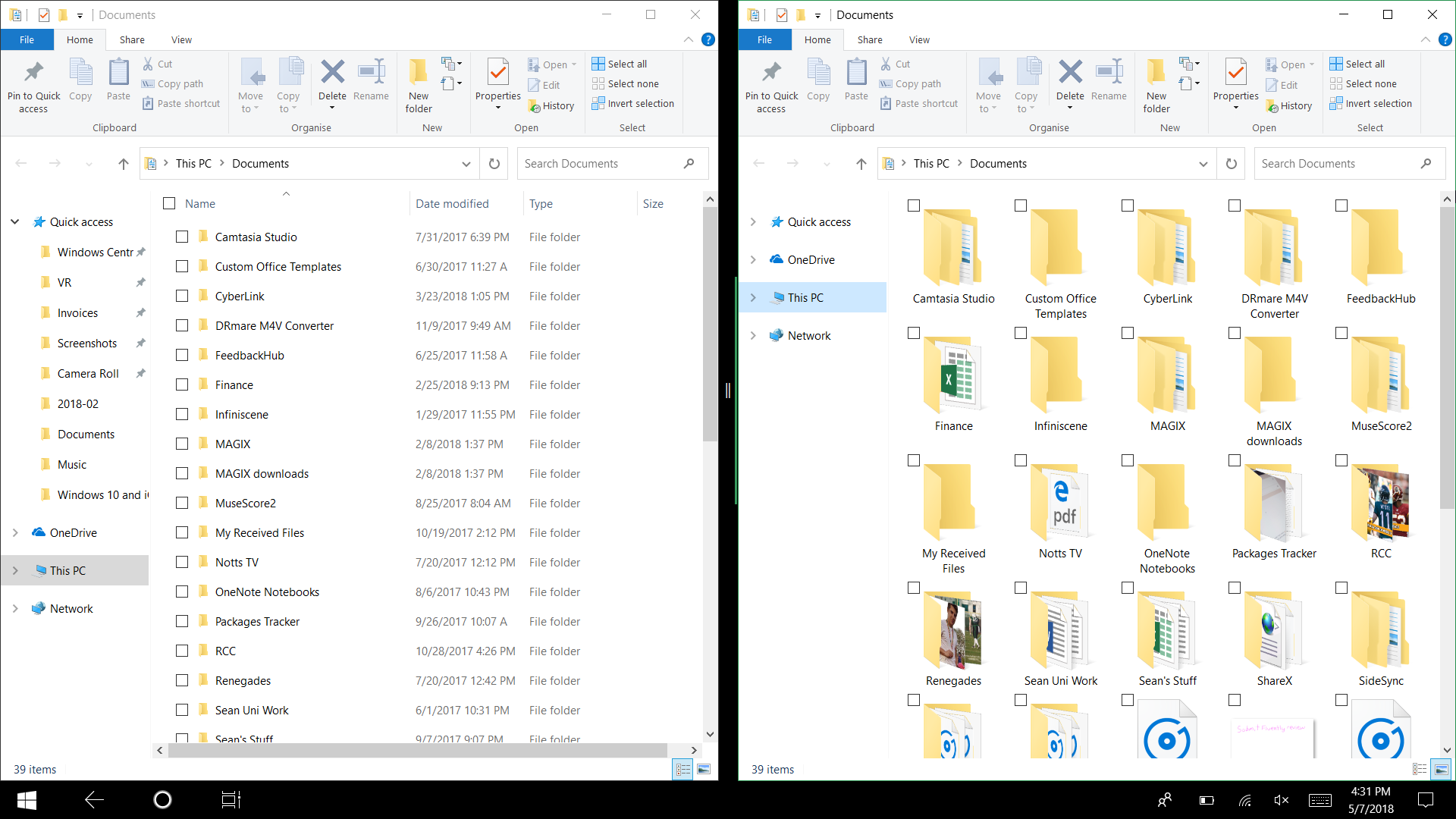
Microsoft is working on moving legacy software to UWP apps. The Settings app is taking more and more from the Control Panel and even the calculator app features a Fluent Design but the File Explorer is still difficult to use with touch.
The File Explorer is probably the biggest oversight in regards to tablet mode. I use the File Explorer multiple times a day on my iPad Pro and jumping back to Windows 10's tablet mode is startlingly bad. File browsing on an iPad is touch friendly but still very powerful. Drag and drop support works well, in my opinion, better than Windows 10's, and it looks like it belongs.
Luckily, Microsoft is working on a UWP File Explorer but at the moment it's frustrating to use and a major knock on Windows 10's tablet mode. I understand the File Explorer that needs to be replaced is complex but that doesn't make it easier to use the current version. Furthermore, even once the File Explorer becomes touch-friendly, there are still other Microsoft services that aren't. Microsoft needs to push touch-friendy and powerful apps out of Redmond and into the hands of users.
Add Compact Overlay for Microsoft Edge
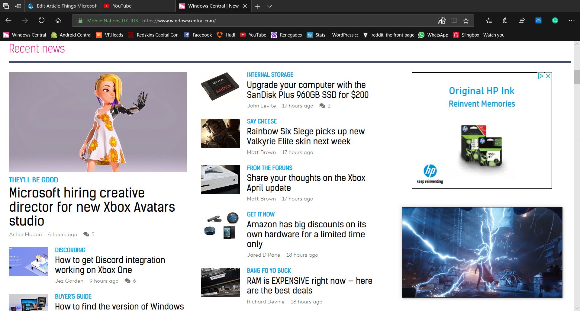
Compact Overlay was an excellent addition to Windows 10. It allows you to continue watching your favorite content without having to dedicate that much of your screen to what you're watching. The feature is especially useful when you're in tablet mode, jumping between apps and changing what's primarily on your screen, though I'd like the compact overlay to stay on the screen while switching apps. Any developer can add this feature to their app, and when it's added, it's great; myTube! being a wonderful example.
But sadly, Microsoft needs to operate under the assumption that developers aren't going to implement every API that's available. Windows 10 doesn't have the mainstream developer support of iOS so Microsoft needs to do as much as they can on their end to fill gaps and fix problems. Adding Compact Overlay mode to Edge would make the feature available for more sites and services.
Take YouTube for example. Google has a track record of not only ignoring the Microsoft Store but doing things that hinder YouTube clients. If you added a Compact Overlay mode for Edge, you could watch YouTube videos in a picture-in-picture mode directly from your browser. This same principle extends to any service that doesn't have an app that supports Compact Overlay, from Vimeo to Microsoft's Mixer that doesn't even have a first-party UWP app. This addition would be primarily for watching videos but could also work with PWAs such as Twitter.
Microsoft is going all in with Microsoft Edge, pointing more users towards it with features like Sets. Adding Compact Overlay mode to Edge would fill the gaps that developers and companies are leaving and also make Edge a more versatile browser. Additionally, it would allow users to have more persistent content on their screens while jumping around in tablet mode.
Bring back quick actions
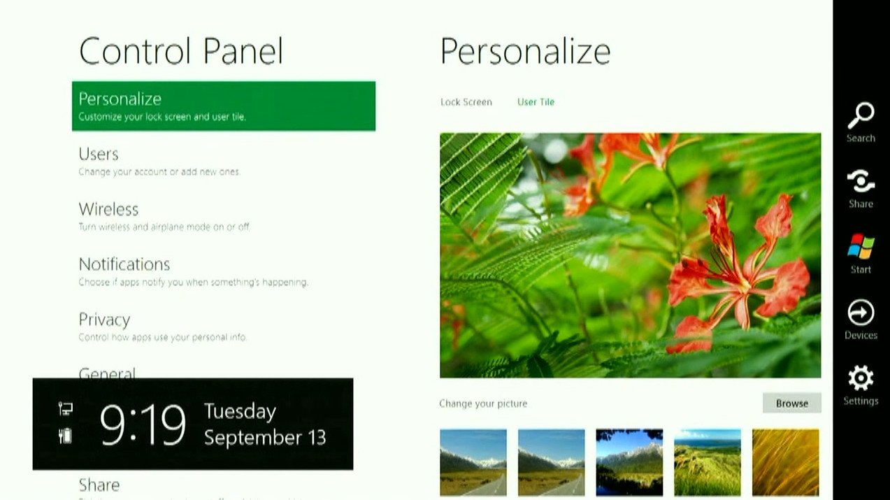
One of the features that Windows 8.1 users miss the most in the current tablet mode is the Charms Bar. This bar allowed you to almost instantly perform tasks like sharing content. Microsoft replaced the Charms Bar with the Notifications and Action Center. This new area can perform some things quickly, like toggling settings, but doesn't create the instant shareability that the Charms Bar did.
I don't think Microsoft would ever bring back the Charms Bar, and I'm not sure that's even the right thing to do, but they could add back the quick actions that were in it to the Notifications and Action Center. This is configurable anyway so they could add plenty of options and let users pick and choose what they'd like to use. Having this setup would mean a swipe from the left brings up taskview, and a swipe from the right allows you to do quick actions, utilizing the bezels that persist on tablets these days.
Microsoft could take it one step further and allow multi-finger gestures to perform specific actions or make them configurable. Imagine if you could two-finger swipe from the left to share something or three finger swipe from the left to cast your screen.
Wrapping things up
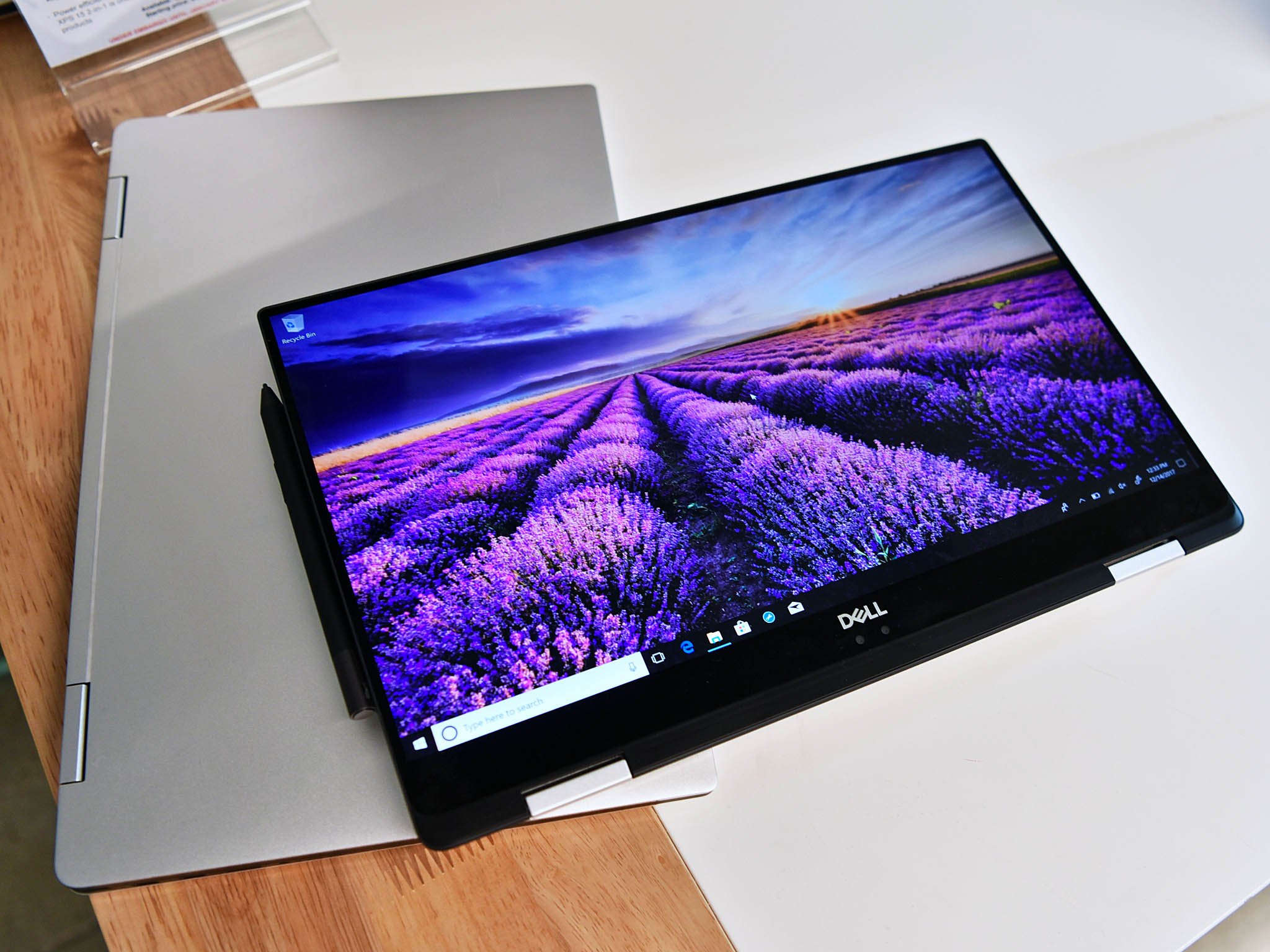
The tablet experience of Windows 10 is by no means terrible, but it still feels like a mix of a tablet and a desktop in some ways If 2-in-1 devices are going to compete as tablets, not just as ultra-portable PCs, then they need to be able to compete as just tablets.
What part of Windows 10 tablet mode would you like to see improved or changed? Is there another part of Windows 10 that you think needs fixing? Let us know in the comments below.

Sean Endicott is a tech journalist at Windows Central, specializing in Windows, Microsoft software, AI, and PCs. He's covered major launches, from Windows 10 and 11 to the rise of AI tools like ChatGPT. Sean's journey began with the Lumia 740, leading to strong ties with app developers. Outside writing, he coaches American football, utilizing Microsoft services to manage his team. He studied broadcast journalism at Nottingham Trent University and is active on X @SeanEndicott_ and Threads @sean_endicott_.
