Microsoft Surface Mini review: A teeny Windows tablet that never existed
We review Microsoft's canceled Surface Mini, with Windows RT and bezels galore, just like 2014.
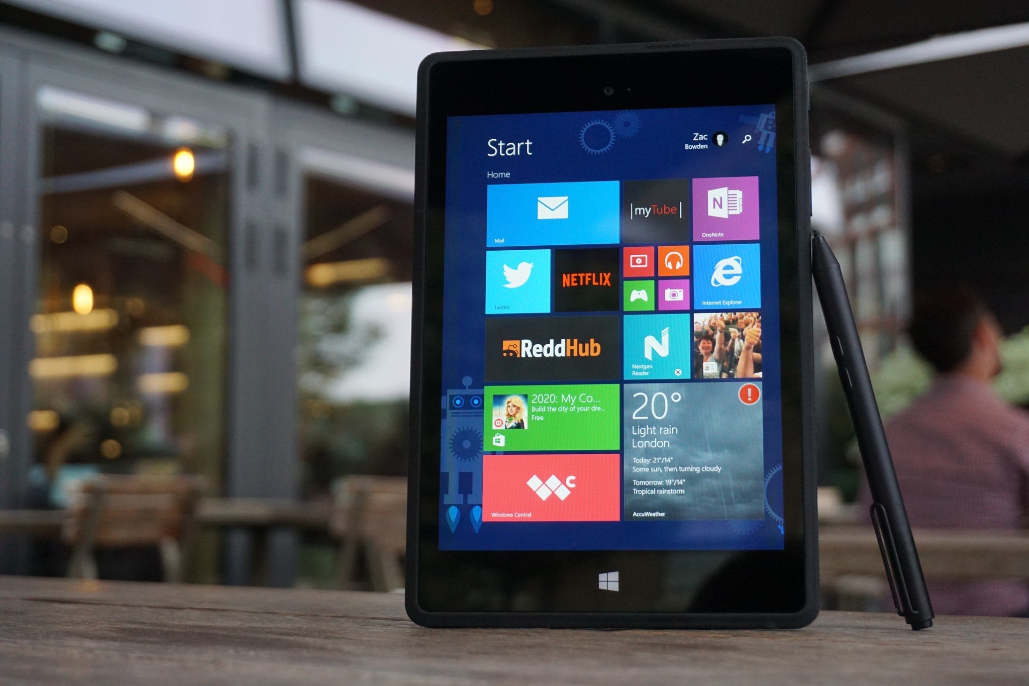
Back in 2014, Microsoft came incredibly close to launching a mini Surface alongside the Surface Pro 3 but ultimately decided to cancel the device just weeks before it was set to go on sale. It's a device many people were looking forward to at the time, so its cancelation was a massive blow to fans. Since then, the device has leaked in a few images and renders, but an in-depth look at the devices' hardware has never been done, until now. I've got my hands on a Surface Mini prototype, and while this isn't a retail unit, our prototype is very close to what would have shipped.
This is a review that so many people have been asking me to do since I first acquired the device over a year ago. And considering Microsoft is holding a major hardware event this week, I thought now would be an excellent time to do one. We've also done a hands-on, showcasing the device in all its glory in video format. So, buckle up, and prepare to learn about another Microsoft product you won't ever be able to buy.
Surface Mini specs
| Category | Surface Mini |
|---|---|
| Operating System | Windows RT 8.1 |
| Display | 7.5 inches, 4:3 aspect ratio, 1440x1080 (240 ppi) resolution |
| Processor | Qualcomm Snapdragon 800 |
| Memory | 1GB RAM |
| Storage | 32GB |
| Expandable Storage | MicroSD |
| Rear Camera | 5MP |
| Front Camera | 2.1MP |
| Connectivity | Wi-Fi 802.11a/b/g/n, Bluetooth 4.0 |
| Ports | Micro USB, 3.5mm headphone jack |
| Audio | Front-facing stereo speakers |
| Dimensions | 8-inches x 5.5-inches x 0.35-inches |
| Colors | Black, Red, Blue |
Surface Mini hardware and design
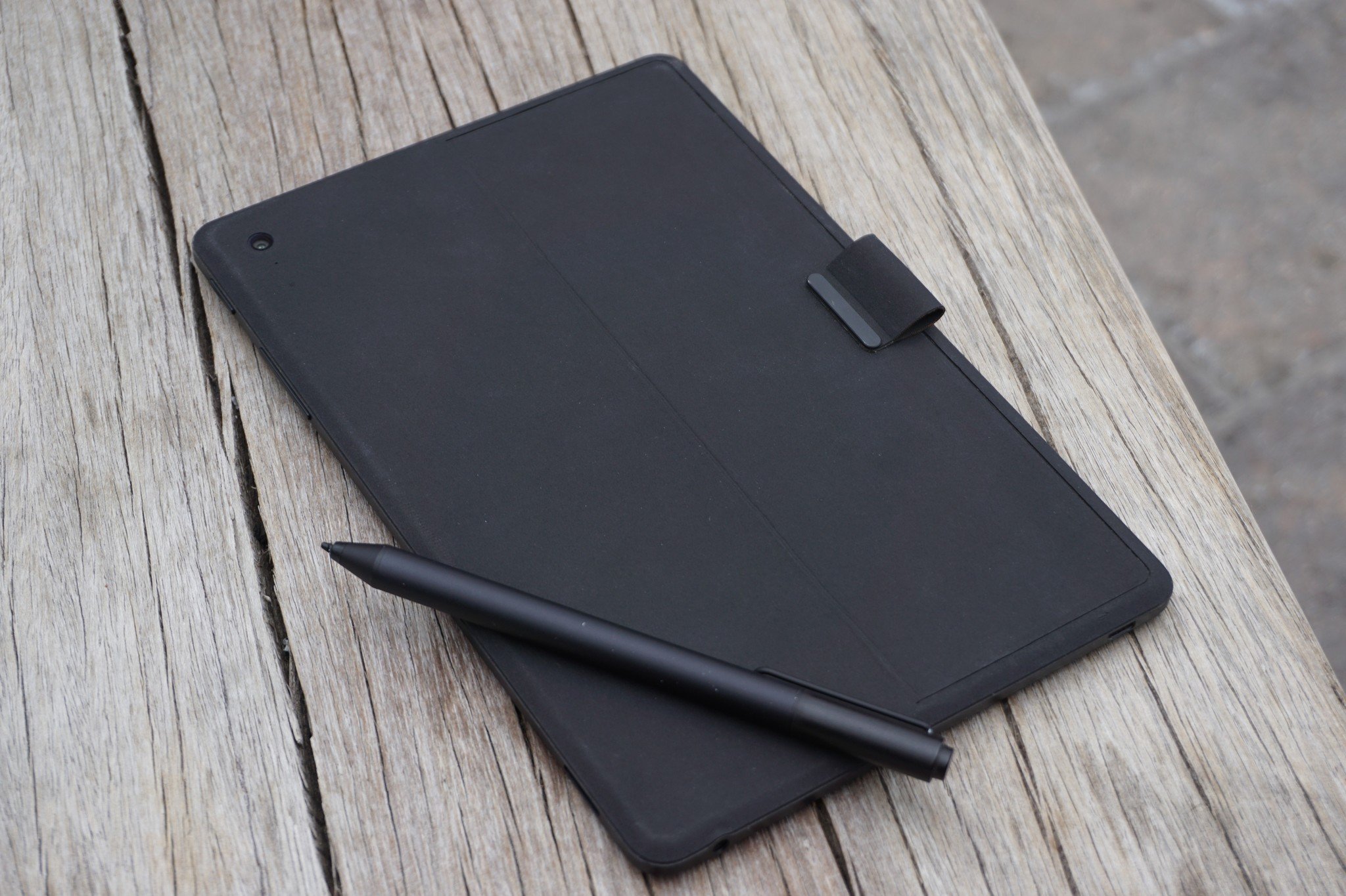
The Surface Mini is an attractive looking device, thanks to its combination of metal, glass, and polyurethane materials. Unique to the Surface Mini, its outer shell is covered in polyurethane, the same material found on the non-Alcantara Type Covers. This gives the Surface Mini a unique feel in hand, akin more like a book than a tablet. It also doesn't show scratches or damage as easily as glass or metal can, which is an additional bonus.
Built into this polyurethane back is a kickstand, just like any other Surface. This kickstand is tiny and limited to the same three positions found in the non-Pro Surface 3 released in 2015. It's an excellent addition to have, even if the device itself is built with the portrait orientation in mind. Having the kickstand there allows for super-easy content consumption, letting you place down the in an upright position to watch movies, or scroll through twitter.
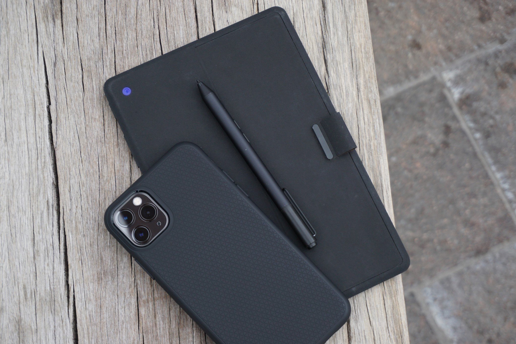
Built into this kickstand is a pen loop, which was Microsoft's solution to keeping the pen attached to the device when not using it back in 2014. This pen loop idea also made its way to the Surface Pro 3 in the form of an accessory you could attach to your Type Cover, so it's nice to see it built-in to the device here. The same pen loop is used to open the kickstand, as it sits flush with the rest of the body when closed and as such, you can't use your finger to open it initially.
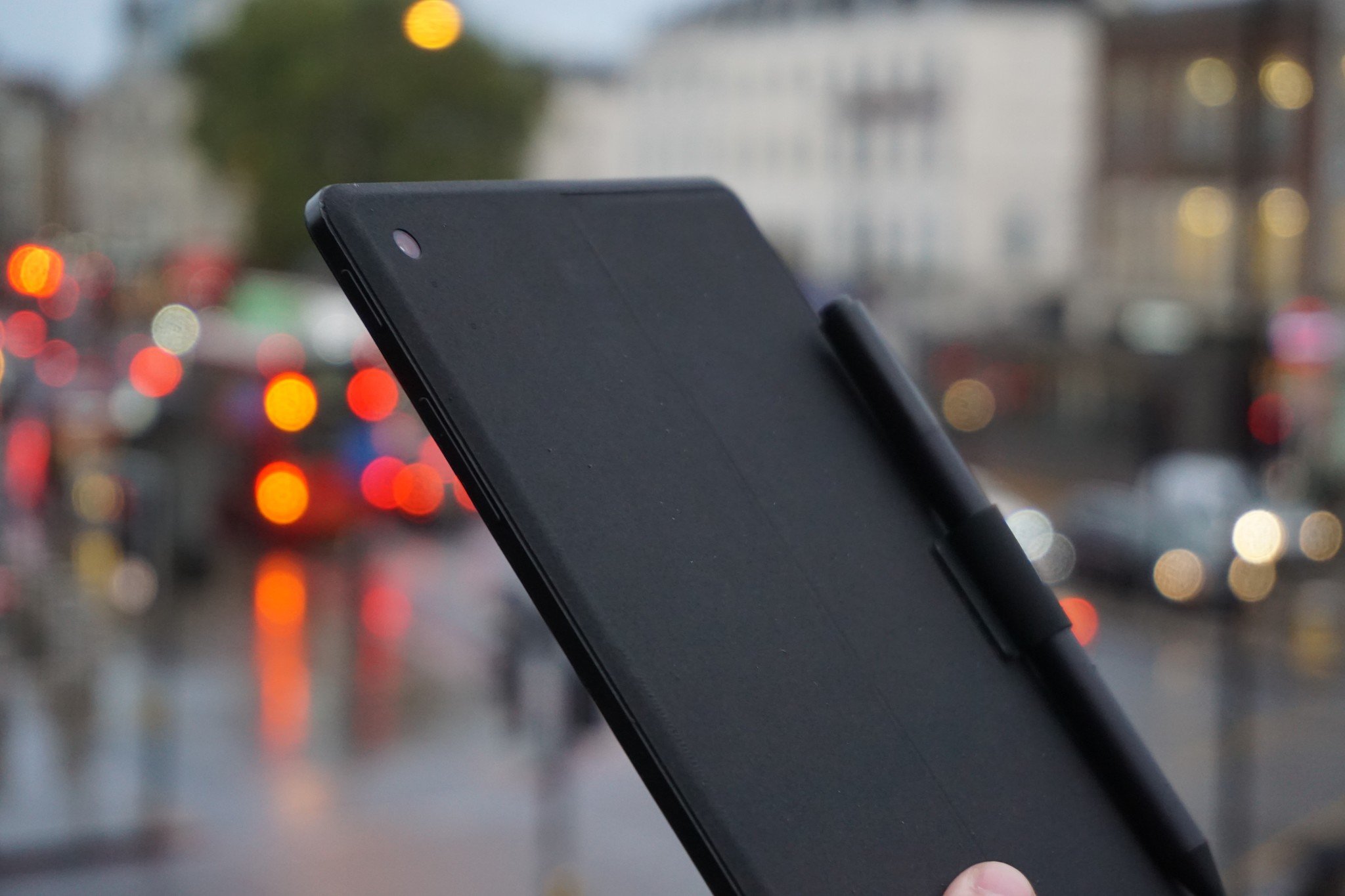
The sides of the device are metal and feature your traditional volume rocker, a power button, as well as a headphone jack, MicroUSB port, and Micro SD card slot. The buttons have a satisfying click, and although MicroUSB in 2019 is super gross, this was the standard back in 2014 on devices with Snapdragon processors, and as such, we can't complain too much about it.
Speaking of 2014, holy bezels batman. If you thought the Surface Go's bezels were terrible, check out these bad boys. The Surface Mini has enormous bezels on all four sides, most notably along the top and bottom of the device. Admittedly, the left and right bezels are a little smaller, but they're still pretty huge for a 7.5-inch device. But again, since this was supposed to be released in 2014, I'm not sure many people would have cared much about the size of the bezels. Our standards have changed quite a bit in the last five years.
Get the Windows Central Newsletter
All the latest news, reviews, and guides for Windows and Xbox diehards.
Another unique thing about the Surface Mini is that it's the only Surface to have been built with portrait as the default orientation. You can tell because underneath the display sits a capacity home button that's oriented so that the user knows to use the device in portrait. Of course, the device can also be used in landscape if the user wants, but the portrait orientation by default is super interesting and makes total sense.
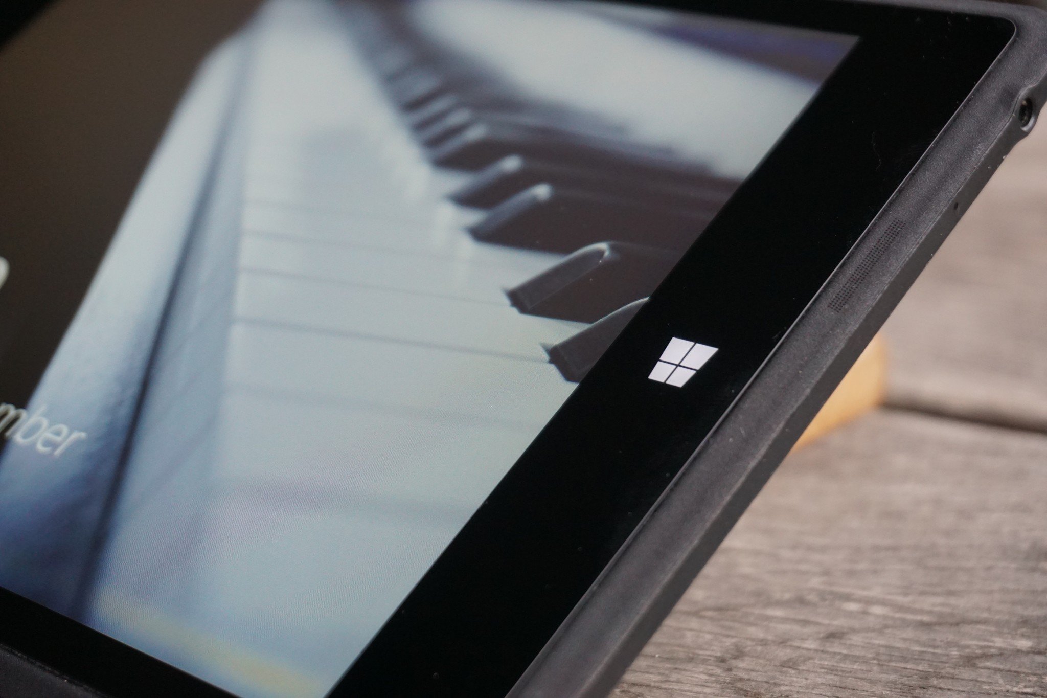
Microsoft built the Surface Mini with notetaking and inking in mind above anything else. Since it's designed to feel like a book, having the device default in a portrait orientation makes taking notes feel better. It fits in your hand well in the portrait orientation, freeing your other hand to take notes on the display. The display is also 4:3, which is overall nicer to use in portrait. The only time you'd want to use it in landscape is to watch a movie or play a game, just like a smartphone. The display itself is lovely. It's high quality, and text/images look great.
The device also has front-firing stereo speakers, which is nice to have. I can't say the speakers themselves are super amazing, though. If this were a real review, I'd recommend using a pair of headphones if you plan on watching or listening to any content on the Surface Mini.
Windows RT on the Surface Mini
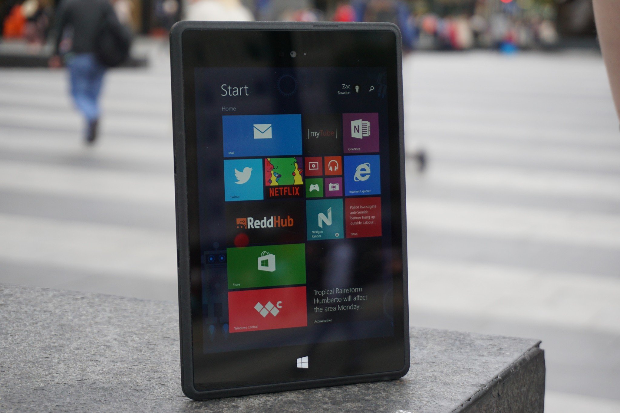
We all know the story of Windows RT. It was Microsoft's first attempt as a locked-down version of Windows for PCs, and it failed, miserably. The Windows Store never took off, and that was bad news as unlike Windows 10 on ARM today, Windows RT wasn't able to run Win32 programs from the web, even if they were compiled for ARM. So with no real apps, the only true selling point of Windows RT was that it came with Office 2013 for free.
Anyway, how does Windows RT run on the Surface Mini? The answer is a mixed bag. On the one hand, the Snapdragon 800 carries Windows RT very well, especially since the only real apps on the platform are in the form of modern apps. The problem comes with multitasking, when paired with 1GB RAM, leads to frustrating experiences. It's okay with two apps at a time, but any more, and you're going to start to see slowdowns, especially if you're running any of the Office applications.
Apps will frequently fall out of memory and require reloading when swiping through the multitasking UI, which can lead to small lags throughout the UI as you swoop through it. Now, it's worth noting that Microsoft was also planning to ship a model of the Surface Mini that doubled both the storage and RAM, and that may have helped, but I can't imagine it would have helped much. I think 3GB should have been the minimum for this device.
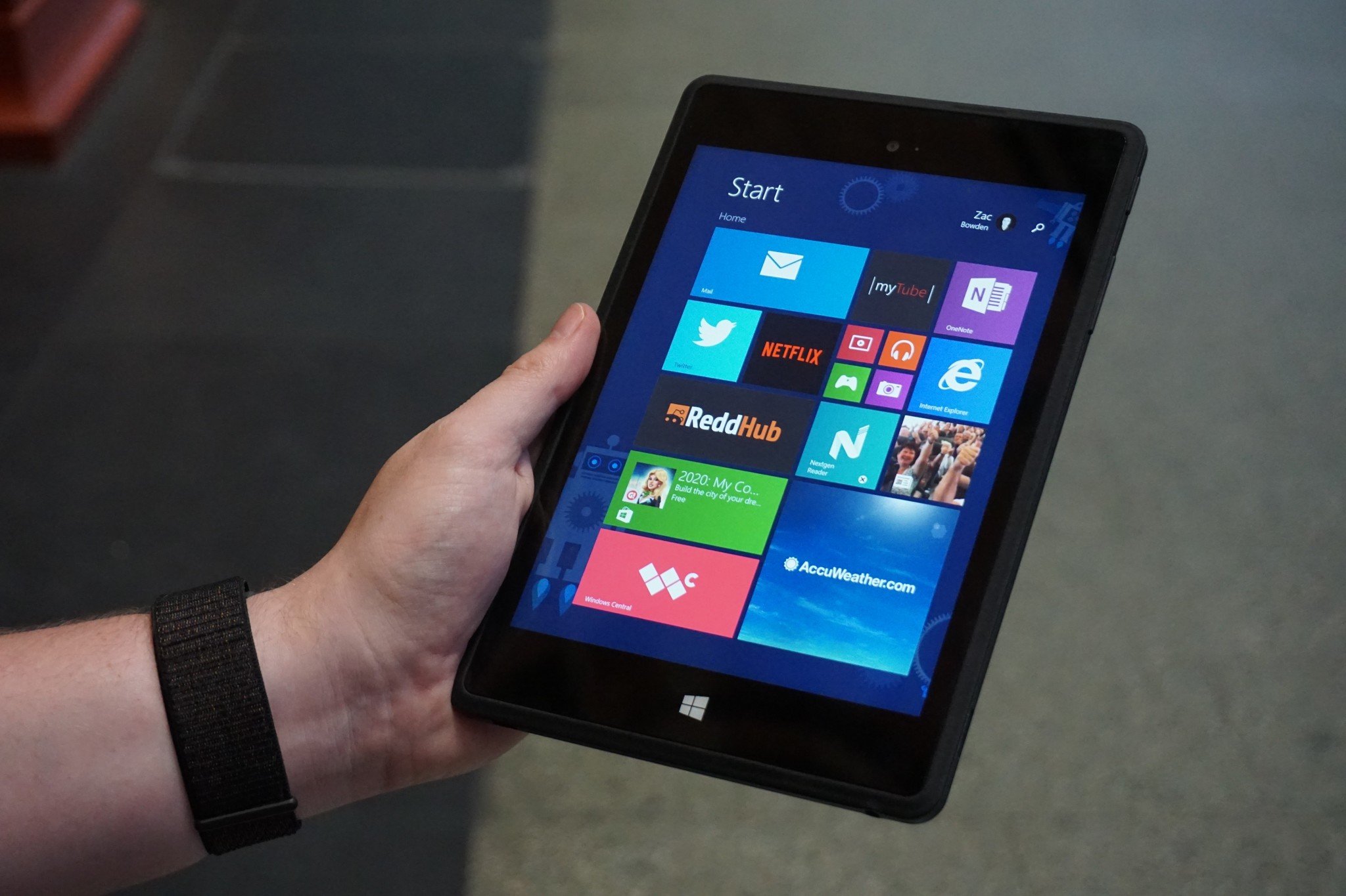
The overall user experience is quite lovely on the Surface Mini. Of course, the desktop experience is painfully small and difficult to manipulate with your finger, but the Surface Pen can help with that. The Windows RT metro interface, however, is a dream to use. It's fluid, and in my opinion, beautiful, even today. Microsoft was ahead of its time with Metro UI, and I think this is the best tablet interface that has ever existed.
It scales so well on the smaller 7.5-inch display too. We often saw Windows 8/RT running on devices that were 10-inches and up, so it's nice to see that the Metro UI can scale well to smaller screens. It's crazy how much worse the Windows 10 tablet UI is compared to the Windows 8/RT tablet UI, especially considering Windows 10 is the successor to Windows 8/RT.
So why was the Surface Mini canceled?
So, the ultimate question. What was so bad about this device that Microsoft opted to cancel it just weeks before it was supposed to go on sale? The answer is quite simple and has nothing to do with the quality of the hardware itself. The thing that killed the Surface Mini is Windows RT and the imminent arrival of Windows 10. If Microsoft were to have launched the Surface Mini in May 2014, it would have been dead within the next 12 months as Microsoft pushed on to Windows 10.
Microsoft already knew that Windows RT wasn't coming along for the ride with Windows 10, and the company wasn't ready to push Windows 10 on ARM at the time either, so the Surface Mini was stuck between a rock and a hard place. The only option was for Microsoft to cancel the device before it shipped.
I think the other reason Microsoft killed the Surface Mini is that mini-tablets weren't sticking around. Outside of the iPad mini, what 8-inch tablets exist that are any good today? There aren't any, because most OEMs don't make them anymore. That may be due in part to Microsoft's terrible tablet mode experience, but the point still stands. Nobody is interested in small tablets anymore, and that's a real shame.
What are your thoughts?
So that's the Surface Mini. It's a beautiful small Surface that I think would be great if it were updated with better specs and Windows 10, assuming they improved the tablet mode experience too. Unfortunately, Microsoft never did any of that, and as such, the Surface Mini is dead. Or rather, it was never alive to begin with. What are your thoughts on the Surface Mini? Let us know in the comments.
Pros:
- Unique design.
- Fits well in hand.
- Excellent note-taking experience.
Cons:
- Was never released.
- Windows RT.
- Speakers aren't great.
Interested in other unreleased products?
We've been collecting and reviewing all kinds of unreleased devices. Check out some of our other reviews:

