Surface Duo success (or failure) hinges on Microsoft's Android enhancements
It's all about the software UX on Surface Duo.

Surface Duo's success or failure will solely depend on whether Microsoft has nailed the software. That's the number one concern most people interested in this device should have. I know there are a load of debates out there regarding the hardware, including whether dual-screen makes sense when foldable displays are a thing. But I'm here to tell you that none of that matters if the software on this device isn't perfect.
Dual-screen devices aren't new. Sony tried to make a dual-screen phone in 2011, but it was terrible because the hardware was bulky, and the software was rubbish. LG has also tried many dual-screen phones, but they are also rubbish because the dual-screen aspect comes in the form of a plastic clip-on case with software that isn't well optimized for it. The dual-screen aspect of LG phones feels like an afterthought, unlike the Surface Duo.
Everything you need to know about the Surface Duo
This dual-screen idea has legs, but it depends almost exclusively on whether or not the user experience (UX) on the software side is done right. The hardware can be amazing, or it can be terrible, but as long as the software experiences are able to light up the form factor in new and unique ways, Surface Duo has a future.
Dual-screens need UX optimization

Microsoft is hell-bent on the idea that dual-screens makes you more productive. It's the number one reason why they went for a dual-screen setup over a single foldable screen. It truly believes dual-screen devices can make it easier to do the things you do everyday on existing single-screen phones, but for that to be true, the user experience needs to be optimized for it.
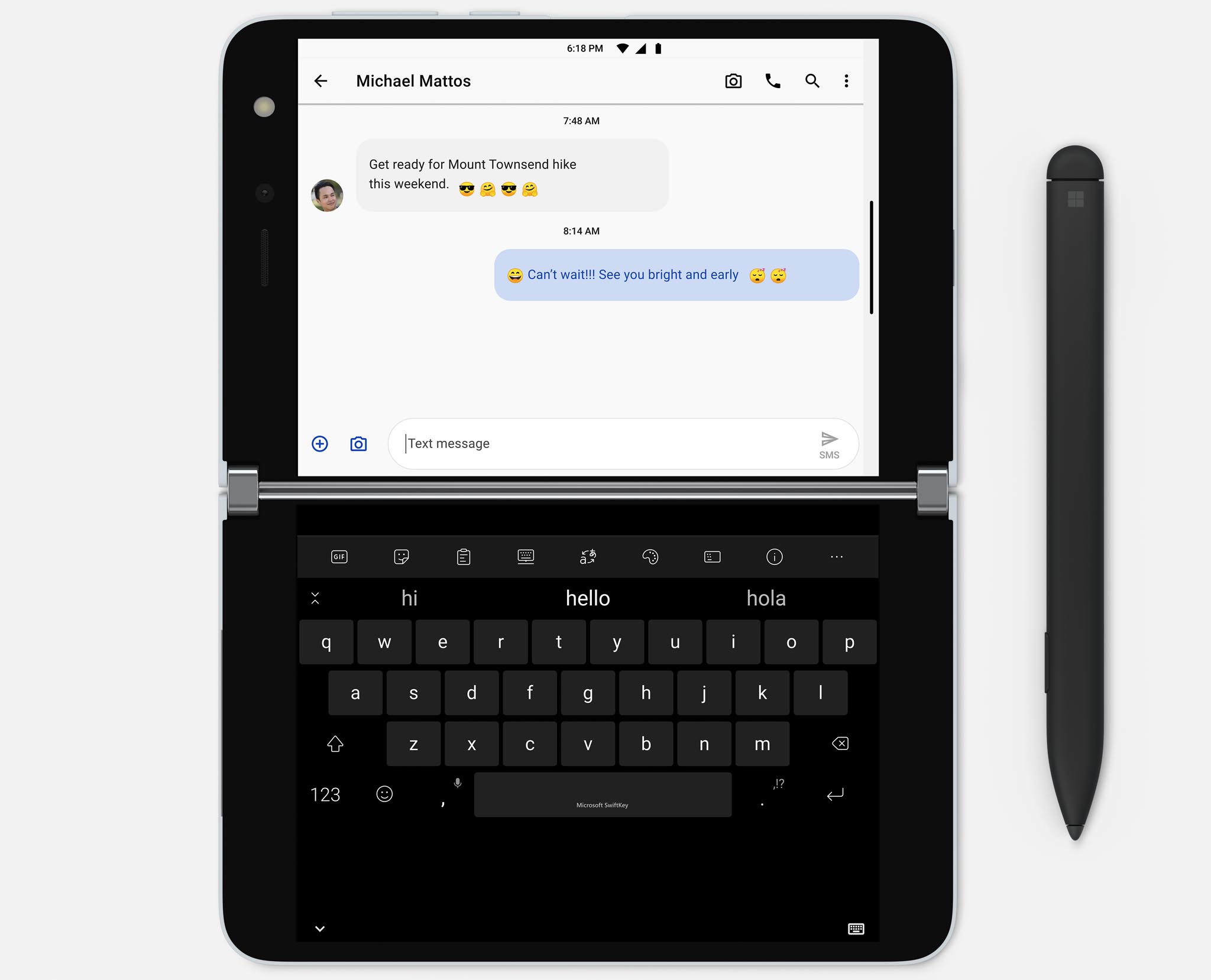
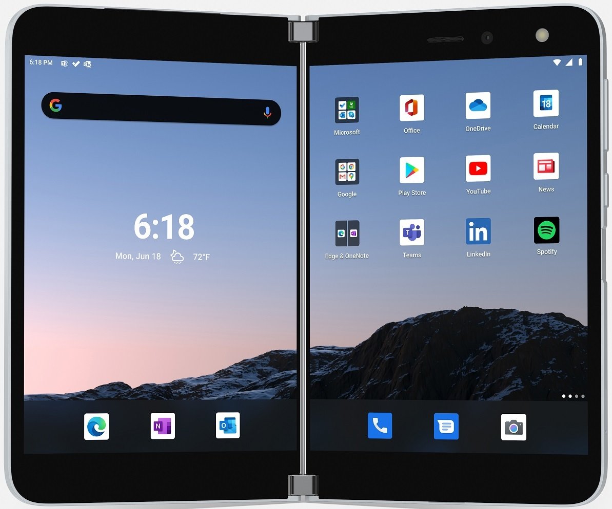
Microsoft hasn't just slapped Android on the Surface Duo and called it a day, it's really thought about how it can enhance the user experience so that manipulating the dual-screens is as easy as possible. This includes making the UI feel fast and fluid, with natural gestures that make moving content one from display to the other feel intuitive.
Android needs to be well optimized by Microsoft for dual-screens to work.
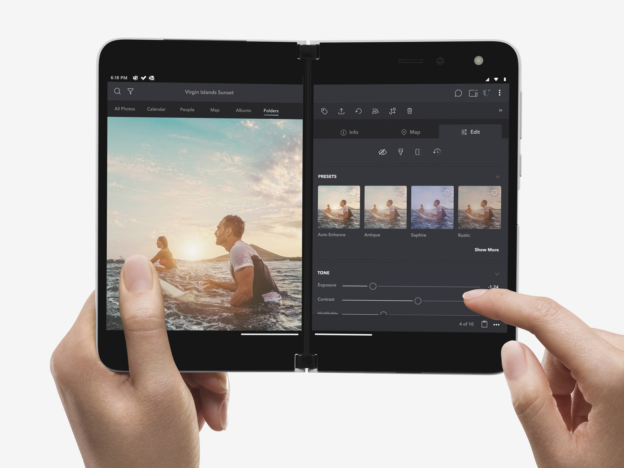
Being able to "pick up" an object or item on the screen and move it across the center bezel is a super important aspect that makes the Surface Duo's form factor much more approachable to normal people. You don't have to think about it as much if the software experience comes naturally to you, and that's exactly what Surface Duo needs to nail for this form factor to work.
Get the Windows Central Newsletter
All the latest news, reviews, and guides for Windows and Xbox diehards.
Then there's the software working in the background to deliver the best experience to the user depending on orientation. When folding the screens around, how does the phone react when in use? It needs to know which screen you're intending to use in phone mode, it also needs to remember what you had on the other screen for when you return to dual-screen mode.
Apps also need to flow around the center bezel when spanning across both displays. All apps can span, but only a handful of them will be built to flow around the bezel. If an app doesn't correctly span across both displays, it's not the end of the world, as the app will behave normally in single-screen mode. But all of Microsoft's first-party apps need to support spanning at least.
The UX cannot be clunky

If the user experience feels clunky or unfinished at any point, then that's a big problem for this device. You shouldn't have to think too hard about how to do something when in dual-screen mode, or worry about what the device is going to do when folding it into single-screen mode. It should just work as expected, and flow naturally at every opportunity.
I cannot stress enough how important the software experience is for this device. The gestures, sounds, animations, fluidity, and everything in-between are all equally important for this form factor. Microsoft needs to customize Android so that it fits well on dual-screens, and I think it knows that and has been working to deliver an experience that makes sense on Surface Duo.
Of course, whether or not the experience they've built is intuitive enough remains to be seen. Hopefully, the software isn't super buggy at launch. Any bugs that could possibly get in the way of the user experience, including issues with determining which orientation the device is being used in, could be a big problem for the flow of the device, and give off a bad first impression, something Microsoft needs to avoid.
In the meantime, what are your thoughts on the Surface Duo and its version of Android? Let us know in the comments.

Two screens are better than one
Microsoft delves into the future of foldables with an ambitious dual-screen device, featuring two ultra-thin 5.6-inch AMOLED displays bound by a 360-degree hinge. This pocketable inking-enabled Android smartphone marks the latest in the Surface lineup, geared for mobile productivity.
Microsoft Surface Duo
Main

