The Surface Duo 2's 'glance bar' feature needs to do more
Some thoughts on the glance bar feature on Surface Duo 2.

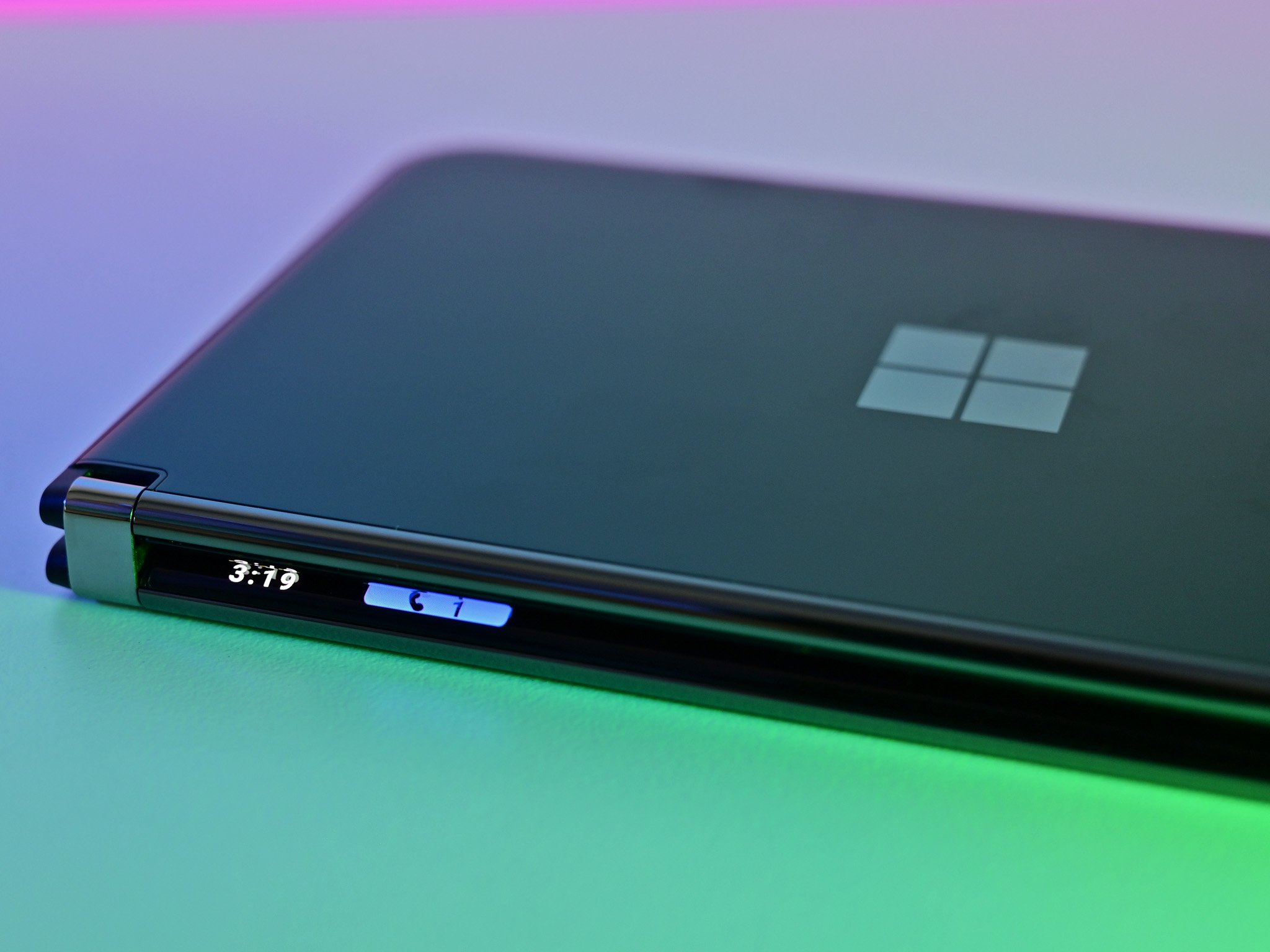
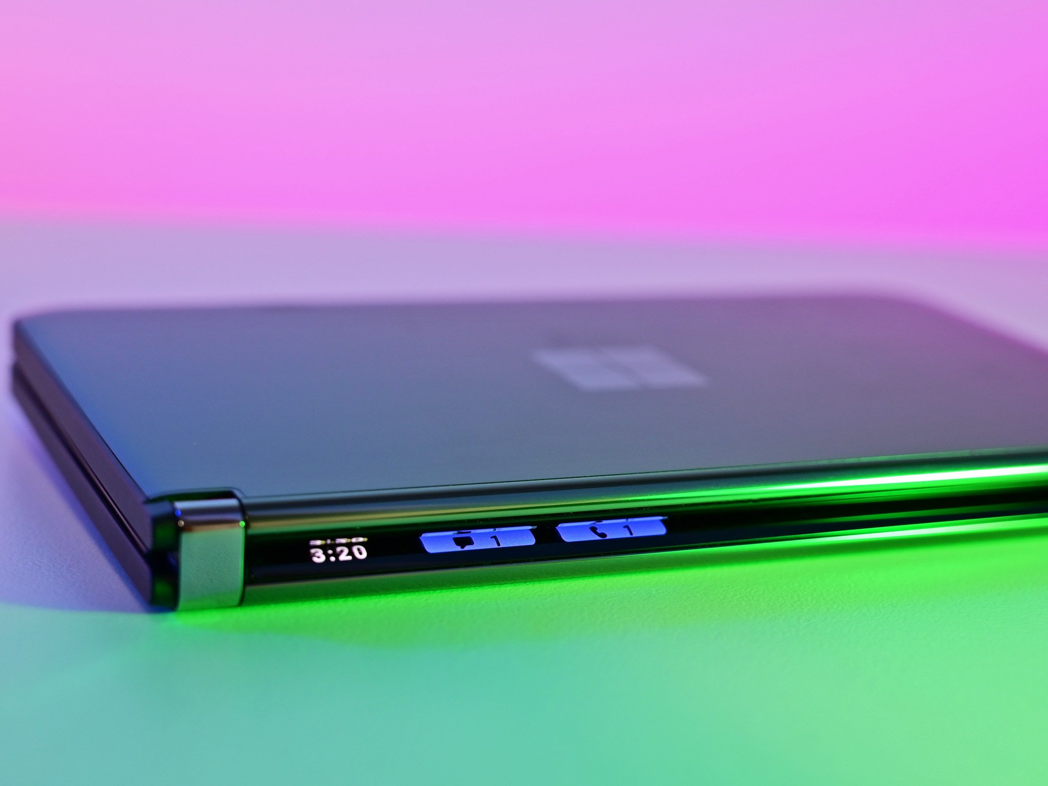
One of the stand-out new features on Microsoft's Surface Duo 2 is its clever "glance bar" that exists along the spine when the device is closed. It provides heads-up information when you're not using the device, which on paper is total no-brainer for a device like this. Unfortunately, the feature is basically useless for almost all the types of info you'd want displayed there.
I've been using Surface Duo 2 since it came out, and it's been fantastic. I love everything about this product, including the glance bar. But I just wish it would show me "more." In regard to notifications, right now the glance bar only shows you missed calls and SMS messages. It doesn't show anything else from your notifications shade. No WhatsApp, no Slack, no Outlook, nothing.
This really limits how useful the glance bar can be, because I don't SMS anyone, and people rarely call me in the year 2021. All of my communication happens thought instant messaging services like Telegram, WhatsApp, Slack, and Twitter. It's not happening through SMS. If I'm making or receiving a phone call, it's most likely through Slack or Skype. Not my Phone app.
I wish you could set the glance bar to show missed notifications for other apps. It'd also be great if you could set it so when a notification comes in, the contents of that message briefly run down the spine like a news ticker, so you can get an idea of what the notification is about in addition to which app it's coming from. So far, glance bar doesn't do this, but it would be infinitely more useful if it did.
In its current implementation, I have to open my device every time a notification comes in that isn't a phone call or SMS. And in the rare scenario where I do get an SMS, I still have to open it because the glance bar wasn't able to provide a brief ticker style message to inform me of what the notification was about.

I also briefly want to touch on its other features. The glance bar can also show you your battery and volume levels, but only in some scenarios. For the battery, it only shows your battery level when you plug in or unplug. And you can't check on charging progress as it's plugged in, as tapping the lock button only shows the notifications, not the battery percentage. Kind of annoying.
The volume level feature is likely bugged, as I can only get it to show up sometimes. It's supposed to only display when you have audio playing, and sometimes it does, but sometimes it doesn't as well. I'd love options to be able to configure when the battery when tapping the power button. I always want to see battery level when I initiate glance if it's plugged in before seeing my missed notifications, for example. I'd also love to be able to set it so the volume level always displays when I tap the volume rocker, regardless of if audio is playing.
Get the Windows Central Newsletter
All the latest news, reviews, and guides for Windows and Xbox diehards.
As an aside, the Peek Mode feature that first shipped on Duo 1 is still here on Duo 2, but it no longer shows the app icons that you've missed notifications from. Duo 1 does this on Android 10, but it seems the feature has been removed on Android 11. Hopefully Microsoft brings this back in a future update, as I found it incredibly useful being able to see which apps you're missing notifications from without opening the device fully.
Overall, the glance bar shows incredible promise, but its implementation right now is too basic to be useful for me, and I imagine most people. It needs to be able to show notifications from third party apps. Features like running messages down the spine and whatnot are advanced features that could come later. But at the very least, it needs to be able to show me apps like WhatsApp, Slack, Twitter, and Outlook.

