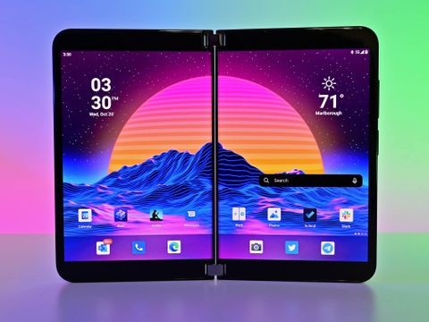
In late 2019, Microsoft surprised the world with its grand idea for a modern pocketable computing experience with Surface Duo, a phone with two displays that resembled a digital diary. A year later, that device hit store shelves with a thud. Buggy software, a high price, and severely lacking hardware made it nearly impossible to recommend except for the bold early adopters and risk-takers.
Based on ideas from years earlier, the Duo 1 was meant to be a pocketable Surface that ran a version of Windows, not Android. The concept was later salvaged as it was "converted" to an Android phone in a last-minute Hail Mary. If you wonder why there was no NFC, a lousy camera, no 5G, an old CPU, well, there you go.
So, what happens when Microsoft can completely redo the hardware knowing it's going to be a flagship Android phone in late 2021? You get Surface Duo 2 with Android 11 (an OS slightly more optimized for the dual-screen experience).
The good news is Surface Duo 2 is a giant leap forward in the concept. It is more impressive than ever with a triple camera array, 90Hz curved displays, NFC, 5G, and the potent Snapdragon 888. The software is also better — faster, snappier … and generally less buggy (more on that later).
At $1,500, Surface Duo 2 is still going to have a tough hill to climb to convince the masses to take the risk, but at least this time, it plays the part, even if it's still not ready for the mainstream.
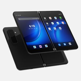
Bottom line: Surface Duo 2 is a significant improvement over the first-gen with much better hardware, attention to detail, and software that is significantly less buggy. There are still issues to solve, however, and the high price will keep many away.
For
- Fast, fluid dual-screen Android experience
- 5G, NFC, Snapdragon 888
- Brilliant hardware design
- Larger 90 Hz displays
- Respectable rear cameras
Against
- Even more expensive
- Occasional minor bugs
- No Wireless charging
- Not much for the pen to do (yet)
Surface Duo 2: Price and availability
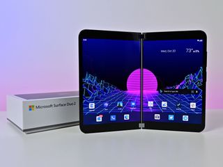
Surface Duo 2 has a starting price of $1,499, a $100 increase over the first Surface Duo's launch price. Even though it costs more, there is also less in the box with no free bumper case or a Type-C charger brick (though you do get the charger cable).
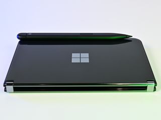
Optional accessories include the $40 Surface Duo 2 Bumper (redesigned with newer materials), the $65 Surface Duo 2 Pen Cover (pen not included), and the $130 Surface Slim Pen 2. The Surface Duo 2 Pen Cover can wirelessly recharge the Surface Slim Pen 1 or 2 and hold it in place with magnets. The pen also sticks to Surface Duo 2 without the cover, but it won't wirelessly recharge.
The device is available in more countries at launch compared to the first generation, however, and is expected to start shipping on October 21 in the following markets:
- United States
- United Kingdom
- Canada
- France
- Germany
- Australia
Surface Duo 2 can be had in Glacier White or Obsidian Black (new) colors, in either 128GB, 256GB, or 512GB storage configurations. The pricing for each spec is $1,499, $1,599, and $1,799 respectively.
Surface Duo 2: Hardware and design
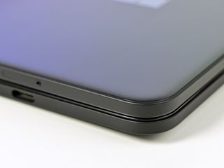
Surface Duo 2 looks like the first version save for the new (fingerprint-prone) obsidian black colorway from far away. But picking up the Duo 2, it is immediately apparent that this is not the same phone as last year. Microsoft completely rebuilt every aspect of Surface Duo 2, and it is all for the better.
On the outside of Surface Duo 2 is Corning Gorilla Glass, and on the inside, Corning Victus — the toughest glass there is currently. That glass now slightly curves at the edges in a "2D" falloff reminiscent of Nokia Lumia screens. The result is Duo 2 feels softer in the hands with fewer hard edges compared to the first-gen. Microsoft also reworked the frame and materials used for the entire phone with better seals, making it more resistant to damage. This includes a reinforced Type-C port, which is now in the middle. There is even rudimentary IPX1 water protection.
The device is a bit thicker at 5.5mm opened instead of 4.8mm (11mm and 9.9mm closed, respectively), but it's only noticeable if you directly compare Duo 2 to its predecessor. The weight increases from 250 grams to 284, making it slightly heavier than Samsung's Galaxy Fold 3 (271g).
Duo 2 spreads its bulk out more evenly compared to regular phones, making it less like an anchor in your pocket. That size and weight increase are due to the larger battery, which jumps from 3,577mAh to 4,449mAh, needed to power the 90Hz displays (up from 60Hz) and much faster Qualcomm Snapdragon 888 processor (vs. Snapdragon 855).


Ironically, that added weight and thickness work in the Duo 2's favor. The first Duo was almost too thin, making it feel fragile, which the included bumper case helped alleviate. Surface Duo 2 feels more substantial and less delicate, making the bumper feel non-essential.
Even the hinges are new with Surface Duo 2. Despite being an engineering marvel in how thin they are and housing the wiring for both displays, the Duo 1's hinges a very lightly click if you quickly opened the screens, which some users confused with breakage. That's gone now as the Duo 2's hinges are smoother with slightly more resistance — opening it up is even more satisfying, which is a notable achievement.
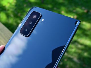
On the rear is the most significant difference with a new triple-camera array with ultra-wide, wide, and telephoto. Assisting those lenses is a flash and time-of-flight sensor for focusing assistance.
While there is a hump, the housing is angled to help when reverse-folding the Duo 2's displays. Many people have wondered how it feels when used this way, and it was no issue. Odd? Sure. Does it prevent usage? Nah. Indeed, the device has a satisfying "clap" when switched to this position, with the lenses being slightly recessed to protect them. It's a compromise design, indeed, but arguably the primary complaint of Duo 1 was the terrible camera situation, which this solves.
Internally, there is still a front-facing camera (minus the flash) for selfies and, more likely, video calls.


The Surface Slim Pen 1 and 2 now magnetically stick to the front cover. While it seemed like you could do with Duo 1, it was only a side-effect of the device's magnets. This time, it is intentional, and the magnets are respectably strong (the Pen Cover's are even more potent).
| Category | Surface Duo 2 |
|---|---|
| OS | Android 11 |
| Processor | Qualcomm Snapdragon 888 |
| Network | Wi-Fi 6 802.11ax (2.4/5GHz)Bluetooth 5.1LTE: 4x4 MIMO, Cat 20 DL / Cat 13 UL | Wi-Fi 5 802.11ac (2.4/5GHz)Bluetooth 5.0LTE: 4x4 MIMO, Cat.18DL / Cat 5 UL |
| SIM | Nano SIM + eSIM |
| Network bands | FDD-LTE: 1,2,3,4,5,7,8,12,13,14,19,20,25, 26,28,29,30,38,39,40,41,42,46,48,66,71WCDMA: 1,2,5,8GSM/GPRS: GSM-850, E-GSM-900, DCS-1800, PCS-1900 |
| Display | Single: 5.8 inches (1892x1344), 401 PPI, 4:3 aspect ratioDual: 8.3 inches (2688x1892), 401 PPI, 3:2 aspect ratioAMOLED, HDR, 800 nits, 90Hz |
| Memory | 8GB |
| Storage | 128GB, 256GB, 512GB |
| Camera | Front-facing: 12MP, ƒ/2.0, 24mm, 1.0umRear-facing wide: 12MP, ƒ/1.7, 27mm, 1.4umRear-facing telephoto: 12MP, ƒ/2.4, 51mm, 1.0umRear-facing ultra-wide: 16MP, ƒ/2.2, 13mm, 1.0um |
| Audio | Stereo speaker |
| Security | Fingerprint reader |
| Ports | USB-C 3.2 (Gen 2) |
| IPX Rating | Yes, IPX1 |
| Battery | 4,449mAhFast Charging |
| Dimensions | Open: 145.2mm (H) x 184.5mm (W) x 5.5mm (T)Closed: 145.2mm (H) x 92.1mm (W) x 11mm (T at hinge) |
| Weight | 284g |
| Color | GlacierObsidian |
The SIM tray is also now on the bottom edge and centered opposing the Type-C port. It's a single nano-SIM slot, although Surface Duo 2 supports simultaneous eSIM usage too, which is another change.


The side volume rockers feel untouched, which is OK. Microsoft correctly combined the power button and fingerprint reader into one, which makes more sense. It's an excellent reader too — fast, reliable. Double pressing that power button when Surface Duo 2 is closed enables the flash to be used as a flashlight; the same function launches the camera when the device is opened. You can turn this off in settings, but it's a crafty touch.
Audio is markedly improved. Whereas before the was a single speaker (in addition to the one for phone calls), there are now two (plus one for phone calls). Microsoft puts one on the top left display, and on the right, it's at the bottom, which helps sound balance regardless of the Surface Duo 2's postures. It's an immersive effect when using both displays. However, on a Microsoft Team's call, they were unusually quiet compared to playing a YouTube video or listening to music on Spotify, which was loud and vibrant. The audio works well when the device is closed, too, and is intended to be used that way if listening to music with no worsening in quality.
Bluetooth jumps from 5.0 to 5.1 with AAC support. Many people had issues with Bluetooth on Surface Duo 1 with inconsistent and deteriorated performance. I had no such concerns utilizing Microsoft's Surface Earbuds, Samsung Galaxy Buds 2, and use with the Tesla Model 3. With the Buds 2, I could walk 25 feet into another room and still had audio playing without missing a beat.
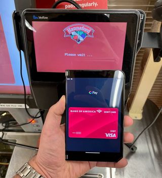
There is now NFC built into the left display to be used for Google Pay. Simply reverse fold Surface Duo 2 with the device unlocked, and you can make a payment. It works as expected.
Being unlocked, Surface Duo 2 works on any network with 5G. 5G can mean anything from blazing fast speeds to slightly faster than LTE, depending on your carrier and location. Using T-Mobile in downtown Marlborough, MA, I pulled 39.9 Mbps down and 54.2 Mbps up, which isn't bad.
If I could rate Surface Duo 2's hardware, it'd get an A+. If you can get yourself to a Best Buy to try a display model, I encourage you to do so.
So good
Surface Duo 2: Displays and pen
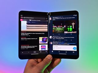
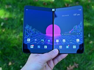
Opening Surface Duo 2, you're greeted with two 5.8 inches (1892x1344) AMOLED HDR glass displays that combine to form a larger 8.3 inches (2688x1892) one with 401 pixels-per-inch (PPI). That's an increase from last year's 5.6-inch display (8.1-inch total). It's noticeably larger. Those bezels are slimmer too. New this year is a higher 90Hz refresh rate, which, combined with the faster CPU, makes the whole device more responsive. You cannot disable 90Hz and drop down to 60Hz to save battery.
Peak brightness is a decent 800 nits, just enough to use outdoors in sunlight (below the 1,000+ nits of Samsung and Apple's latest). The screens are glossy, too, but easy to overlook due to the sharpness.
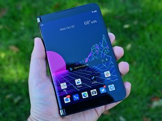
I don't want to mince words, and I'll just say these screens are tremendous. The color, contrast, and sizes make them nothing like any other device on the market.
While Fold 3 spans 7.6-inches with 374 PPI, the Duo 2's are larger (8.3-inches) and higher resolution (401 PPI). Samsung wins on the 120 Hz refresh, although I'd argue anything over 90 Hz has diminishing returns compared to the jump from 60 Hz. Plus, Microsoft uses glass displays versus Samsung's plastic.
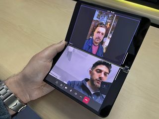
The Duo 2's displays now curve inwards like how paper in a book bends, complementing the analogy that Surface Duo 2 is like a digital moleskin. The curves help in multiple ways and aren't just for looks. The effective viewing area between the two screens is now closer than the original Duo, with only 67 pixels being obscured, down from 84 pixels letting you see more uninterrupted content.
Because the curved screens show a tiny portion when the device is closed, Microsoft utilizes this as a secondary external display called Glance Bar.
While not as effective as Samsung's outer screen, this Glance bar shows notifications for missed calls, SMS, and voicemails. It also displays a pulsing blue bar for an incoming call and uses a different animation for an incoming text. A green bar reveals the battery level when plugging into recharge, while a white bar appears when altering volume and playing audio. Hitting the power button turns on the bar indicating the current time and any missed notifications. It's an imaginative solution that helps the utility of Duo 2's odd form factor.
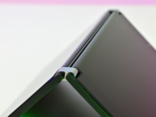
Microsoft has not opened the Glance Bar's APIs up to third parties or other apps, but it told the press it is investigating the idea.
The Surface Slim Pen 2 is not included, although if you have a Slim Pen 1, you can use that too. While Slim Pen 2 supports haptics in Surface Pro 8 and Surface Laptop Studio, Surface Duo 2 does not, although Microsoft is studying it (translation: don't expect it).


I wish there were more to say about the pen. The Bluetooth button still does nothing. There aren't many Android apps that make use of it. Microsoft didn't ship Outlook and Photos with inking support for this review, although the latter looks very useful. I suppose Whiteboard supports it, but it's only open for EDU accounts, so I can't tell you anything about it. You can use the pen in OneNote, and Slim Pen 2 glides like a dream in it — it feels better than a Surface PC. But that's about it.
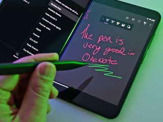
Microsoft should at least bring its Journal app over to Android if it expects anyone to take inking and Surface Duo seriously. And maybe another five apps. Samsung at least went all out with S Pen software, even if half of it is gimmicky. Right now, inking is still an afterthought on Surface Duo 2. Bummer.
These hybrid moments
Surface Duo 2: Software
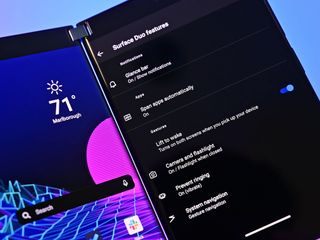
Hardware was only part of the problem with Surface Duo 1. But it was software that really ruined the experience of the first device. A lot of that is on Android 10, which is not built for dual screens. Duo 2 at least ships with Android 11 and, when combined with that better hardware, delivers a much-improved experience.
Interestingly, Microsoft is now leaning heavily into gaming, photography, and having fun with Surface Duo 2 — things all downplayed and ignored with the first version. It's a good move.
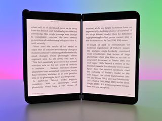
New is the ability to choose specific apps to "auto span," i.e., open the app to the dual-display mode by default. Such a feature makes sense for Amazon Kindle, Microsoft Outlook, OneNote, and Google Photos. Found under Settings, users throw a toggle to enable or disable it for each app.
Gameloft is on board this year, with Asphalt 9 being preinstalled. But this version, along with Modern Combat 5 and Dungeon Hunter 5 (separate downloads), is now customized to support dual-screen usage.
I'm not a typical mobile gamer, but Gameloft nailed the concept here. Asphalt 9 displays a map of the race on the bottom screen along with touch controls. Dungeon Hunter 5 also shows the map, touch controls, and dialogue with NPCs. None of it feels superfluous — Gameloft gave serious thought to utilizing a second display and delivered. And it's not just main gameplay; all levels where you customize your character (or car), choose levels, etc., all use the second display in ingenious ways.
Microsoft heavily plugs its value-driven Xbox Game Pass with cloud game streaming. They're right to do so as there are now 113 premium games that people can stream to Surface Duo 2 that utilize on-screen touch controls. It's an impressive accomplishment. Don't like touch controls? Just pair up an Xbox One controller and put Duo 2 into tent mode.
There is still the ability to pair apps — launching two apps simultaneously, one on each display. I pair my FedEx + UPS apps (Shipping), Eufy + Ring (Security), Google Maps + Yelp (Food), as well as Slack + Telegram (Work) to catch up on content that's important to me with a single touch.
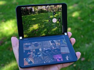
Perhaps the most impressive is Microsoft rebuilt the camera and photos apps. Whereas Surface Duo 1 was a terrible camera experience, Duo 2 fully embraces it. Launching the camera app, on the right side is the viewfinder (live image) and on the left is the camera roll. Snap a pic, and it quickly pops up on the left so you can review it. Tap the edit button, and that photo shifts to the right display, and now on the left, you have a whole editing suite. I was impressed with the edit functions, filters, and tools, negating my typical Google Photos or third-party apps usage. It's an excellent app.
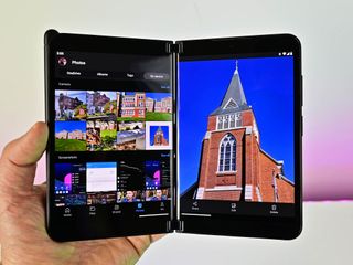
A standalone Microsoft Photos app is also part of OneDrive. By default, it shows all the on-device photos, separating them by camera roll, screenshots, and downloads where you can edit or share. With a single tap, you get access to all your OneDrive, shared files, and more. It worked seamlessly.
Microsoft reworked the notification shade to be wider and put in sliders for volume and display brightness. The idea is if you're using Surface Duo 2 in tent mode, you can now swipe and adjust the volume instead of lifting the device to reach the physical controls.
Swiping to the left, you get the "feed" area where news, weather, calendar, and other widgets are viewable. Weather and news widgets are updated to look more like those on Windows 11. Tapping a news item opens Microsoft's new Start app (rebranded News), which also now supports dual screens (browse the news feed on the left, read a story on the right).
There's "lift to wake" where the displays turn on if the device is opened but laying flat. Lift it, and the screens are awakened. All these Surface Duo-specific configuration options are now found under a subsection in Settings to find easily.
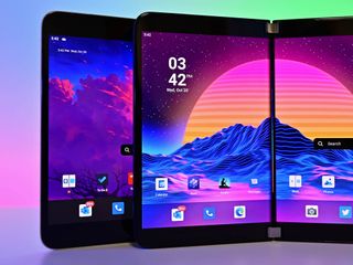
Previously, Surface Duo would try to guess which screen you were looking at based on how you were holding the phone in single-screen mode, but that turned out to be too difficult to predict, causing user frustration. Folding Surface Duo 2 Microsoft defaults to the right display. It's the correct solution, and users can always double-tap the left display to override it.
But while the overall experience is much better with Surface Duo 2, there are still quirks and growing pains.
Outlook and the Photos app both support inking or at least will support them. At the time of this review, those updates have not been pushed to the press. The apps let you draw in your emails or sketch up a photo. They're probably great, but they're not here yet.
Paired apps, which always worked on Surface Duo 1, sometimes fail on Surface Duo 2 with one app not launching (or being slow to do so). I've also had the camera app launch strangely (with the viewfinder and camera roll on the same side). These oddities were rare, but it shows the difficulty with executing this form factor when you don't build the OS.
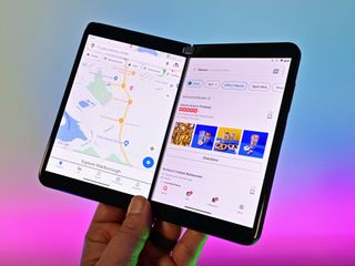
There's still some strange system behavior. Tap a news story in the Feed area, and it opens the Microsoft Start app (good), and it auto-spans as I've set it (also good), but it's not the default spanning behavior with the story on one side and news feed on the other. Instead, the story is split across two screens, making it difficult to read (weird).
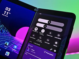
Actually, the Start app and feed areas are all a bit of a mess. Browsing news in dual-screen mode is OK, but as soon as you move to other sections in Start like weather, COVID, wallpaper, videos, etc., none of it is made for dual-screen usage. Even if you disable spanning for Start when you tap a news story in your feed (left side), Start opens on the left side too instead of the expected behavior (right side). This weird behavior happens for a lot of content in the feed area.
Amazon's Kindle app now requires less fiddling to work on dual screens (it's set up by default), which is excellent. But as soon as you leave the outstanding reading experience and head to the Kindle Store, the dual-screen setup falls apart. It's not a dealbreaker but is an excellent example of how apps can have these hybrid moments (cue the Misfits).
Though we're on Android 11, and it's a year after Surface Duo 1, none of Google's apps are optimized for dual screens (Photos works but seems to be more in tablet mode). Messages, Phone, Maps, Gmail, YouTube, YouTube TV, etc., still don't take advantage of the two screens despite Android 11 being better optimized for the form factor with improved dev tools.
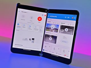
Many of Microsoft's apps are enhanced for dual screens (OneNote, To Do, Office, Outlook, Calendar, Teams). Still, a few peripheral stragglers like GroupMe, LinkedIn, Authenticator, Translator, and Xbox do not, and others like Bing and Start, which are partially optimized.
There is also the more significant issue of gestures. I'm still of the belief that Microsoft's sensitivity setting for swipes is too low, meaning you need to be deliberate in the motion for it to register. If you want to make a fast gesture and slide quickly, you may end up with the wrong action. The number of times I've wanted the notification panel only to get search instead is innumerable. Microsoft should offer a gradient tool for users to tune display sensitivity (it does for the back gesture).
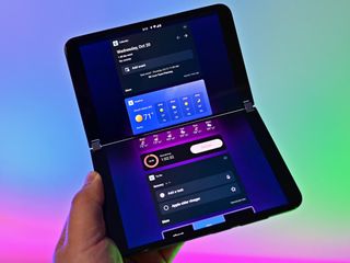
I didn't have any issues typing using SwiftKey (default keyboard), but I have heard from other reviewers who did, which may tie into what I think is the low sensitivity issue related to gestures. The bottom line is that for some people, touch feels a bit off on Surface Duo 2, a similar problem on Surface Duo 1. Hard to explain, likely just as hard to solve.
Likewise, for Microsoft Launcher, there is little else to report. There are still zero customization options with no themes, no ability to modify gestures, change icons, etc. It's a bit weird that Launcher has not gained any new functionality after a whole year and only modestly improved the experience.
Microsoft's Your Phone, which lets you wirelessly manage notifications, calls, photos, and more, works well, but the "new" version is not here yet. There is still no per-app streaming like how it works with Samsung devices and instead is still screen mirroring, which is not as effective or convenient.
Pretty darn fast
Surface Duo 2: Performance and battery
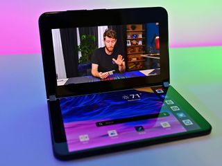
Surface Duo 2 packs the venerable Qualcomm Snapdragon 888 with 8GB of RAM and between 128GB and 512GB of storage. Apps fly open, switching is nearly instant, and it's like night and day between the previous model. I wouldn't mind 12GB of RAM, which is the standard for premium Android phones, but 8GB is a step up from 6GB in Surface Duo 1.
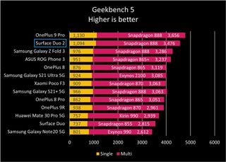
On Geekbench 5, Surface Duo 2 scored 1,094 on single-core and 3,476 on multi-core, whereas Surface Duo 1 only squeaked out 737 on a single-core score and 2,815 for multi-core. Comparatively, Surface Duo 2 blows past the Samsung Galaxy S21 Ultra 5G (Snapdragon 888), Galaxy Fold 3, and every other Android phone available today except for the OnePlus 9 Pro (1,130). For OpenCL (4,679) and Vulkan (4,411), Surface Duo 2 is ahead of all other Snapdragon 888 phones by a lot.
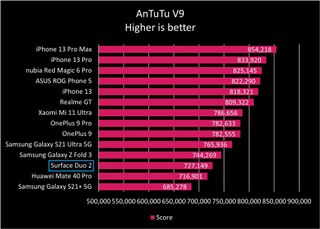
Turning to AnTuTu, which measures CPU, GPU, memory, and UX combined, Surface Duo 2 still does well but falls slightly behind Galaxy Z Fold 3. We can conclude that the CPU performance is exceptionally good with Surface Duo 2, whereas the overall performance is above average (beating 78% of other Android phones).
Battery life is decent but not extraordinary, although when you consider the processor and running dual 90Hz display, perhaps it is impressive. Over a 14-hour day with a 40-minute Microsoft Teams video call, 40 minutes of TikTok, and another 3 hours of general usage (email, notifications, Telegram, camera, Twitter, Slack), I had 15% battery left, putting screen-on-time near the 4-hour mark. Of course, that's not a controlled test with varying display brightness and workloads.
Over nearly a week of heavy usage, I was nearing close to 5 hours of screen-on-time with typical non-video call workloads (email, web, Slack, Telegram, SMS, phone, camera, Twitter, etc.) and often finished the day with 30% remaining battery. That makes this a daily-charge device and not multi-day.
Luckily, the quick-charge feature works remarkably well, gaining 16% every 10 minutes on the charger, or about 50% in 30 minutes.
Surface Duo 2 does not have Qi wireless charging, unfortunately. When asked, Microsoft is interested in the idea for future versions but already was tight on space with 5G, NFC, and a bigger battery. Maybe next time.
Surface Duo 2: Cameras
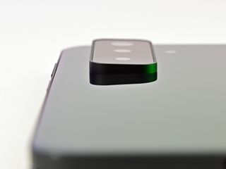
Microsoft packed three rear cameras onto the back, and while some may take issue with the look, as someone who used Surface Duo 1 for the last year, I'm not bothered in the slightest. The tradeoff in flat design for these cameras is worth it. Yeah, there's a slight wobble when it lays flat, but you can now take pictures of your pets or snap a pic at night and not recoil in horror.
The three cameras have the following specs:
- Wide: 12MP, ƒ/1.7, 27mm, 1.4um
- Telephoto: 12MP, ƒ/2.4, 51mm, 1.0um
- Ultra-wide: 16MP, ƒ/2.2, 13mm, 1.0um
The megapixel count is on the low side these days as some phones like the RealMe GT Master Edition Explorer feature a 50MP Sony sensor, so zooming in brings out the pixels.
Microsoft enlisted Morpho, a Japanese imaging company that leverages AI and deep learning for photo processing. The results paid off. While the live image is often just OK, the post-processed photo has a nice balance of colors, exposure, and contrast. See for yourself in the gallery below (all images untouched):


The standard fare of camera features includes slow-mo, video, photo, portrait, and panorama. Even a new night mode takes a slightly more prolonged exposure that merges with shorter ones, as found on many Android phones. The overall experience is a considerable improvement over Surface Duo 1, which admittedly isn't saying much.
Comparatively, these cameras feel more on par with a mid-range phone from 2020, still falling behind Samsung and Apple's best in 2021, but it often holds its own against my iPhone 12 mini, which is more than I was expecting.
Photographing my cat, the Surface Duo 2 properly exposed the window and slightly overexposed Zoe. Whereas the iPhone got the window right but underexposed the subject. Neither photo looks impressive. But this is a challenging photo for any camera to master due to the intensely backlit scene (direct sunlight) and the contrasting coat of the cat (difficulty metering). I'll take the Duo 2's image over the iPhone's.

Low-light also does well, although you see more grain and noise than an iPhone 12 mini.
Video is satisfactory thanks to hardware image stabilization, and it can shoot 1080P 30 or 60 FPS and 4K 30 or 60 FPS. It'll struggle a bit in brightly lit scenes to compensate for exposure, but it's still miles ahead of Surface Duo 1.
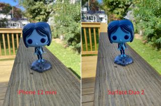
The bottom line is compared to Surface Duo 1, Microsoft has made a terrific attempt at improving the camera experience. The new array on the rear may not be pretty, but I now no longer need to take my iPhone 12 mini as a secondary phone. It pales compared to top-tier 2021 flagship phones, but those phones also don't have dual screens, so there's that. I doubt anyone will criticize these pics being posted on social media for being of poor quality.
Not much else
Surface Duo 2: Competition
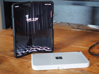
In many ways, Surface Duo 2 has no direct competition. There are no other dual-screen devices save for Surface Duo 1, trading around the $400 mark these days. While that phone is expecting Android 11 before the end of the year, no software can solve the limited hardware experience. Still, if you're looking for a "starter" dual-screen phone to use as an Android mini-tablet or superb Kindle reader, it could be fun as a secondary device.
Samsung's Galaxy Fold 3 is the next logical option and the overall safe bet. On the third generation, Samsung has mostly figured out the Fold 3's design and feature set. While the cameras haven't changed this year, the technology has around it, including support for the S Pen, which is welcomed. Still, the Fold 3 starts at $1,799 — $300 more than Surface Duo 2 — and there are still some questions regarding that folding screen and reliability (Samsung has a decent warranty, at least). To no one's surprise, battery life is also on the weaker side, but Samsung's software experience is more refined than Microsoft's.
Frustrating but good
Surface Duo 2: Should you buy it?
You should buy this if ...
- You liked Surface Duo 1
- You want a dual-screen phone
- You want a device that sits between a phone and a laptop
- You like the Microsoft ecosystem and Surface
You shouldn't buy this if...
- You don't do work on your phone
- You don't like using two hands for your phone
- $1,500 seems way too much
- You need a bug-free software experience
There's a lot to unpack with Surface Duo 2. Let's start with the most controversial question: Why even use it? The advantages for a dual-screen should be obvious; if not, answer the following:
- Why have dual displays for a desktop PC?
- Why snap apps side-by-side in Windows?
- Why use a portable screen for your laptop when traveling?
- Why buy a phone with a larger display?
The answer to all these inquiries is simple: You can see more information and multi-task easier. That's the same principle behind Surface Duo, and it's why it resonates with so many people. It's not any more complicated than that; it's not a profound riddle. Conversely, you should also figure out that not everyone needs those above choices — some people like small phones or a single screen for their PC. That's OK too.
As far as its place in tech, Surface Duo 2 sits between a phone and my Ultrabook. That's its value — think of it as a pocketable laptop. When I have it, I'm far less likely to hop on to the PC to do work, manage socials, chat in Slack or Telegram, etc. Toss in reading (Kindle) and gaming (Xbox Game Pass, Gameloft), and you have a new way to experience the modern digital wonders.
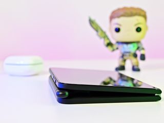
I still believe Microsoft is on the right track with Surface Duo 2 and the theory that some people prefer a device like this. I'm one of them; I love the darn thing. And Duo 2 goes a long way in making up for the outdated specs and missing features found in the first version. As a fan of the concept, Surface Duo 2 is what I wanted for specs and design.
Where Microsoft is failing is the software and support. True, Surface Duo 2 is launching in a much better state than the first iteration, but people who bought Surface Duo 1 are still waiting on Android 11. That's simply not acceptable. There are also the bugs, occasional software glitches, and some missing animations with Duo 2 that many people will find off-putting. And what about Android 12? Is it going to be another year before Surface Duo 2 gets it? The company has a lot to prove to win over consumers and even fans. (Microsoft promises three years of updates for what it's worth.)
These kinds of questions make it still hard to recommend Surface Duo 2 for regular folks, although there are far fewer dealbreakers this time. Fans of Surface Duo 1 will be pleased with the new hardware, but Microsoft cannot simply sell this device to some hardcore devotees forever.
Should Microsoft continue with Surface Duo? Absolutely. Version 2 feels very much like the middle of a story — it's coming into focus, improving in many areas, and making a lot of progress — but more needs to happen to complete the tale.
Don't let anyone tell you differently: Surface Duo 2 is a huge improvement over the first model. But the actual Surface Duo experience is waiting for another chapter, making Surface Duo 2 a nice milestone but still a novelty for many.
If you're on the fence, you don't need to take my word (or any other reviewer's). Microsoft lets you try Surface Duo 2 for 60 days via its Surface Promise. Most people will know within a week if it's for them or not. If the price drops during that period, Microsoft will refund the difference upon request.
As for me? I'm not giving up Surface Duo 2. My iPhone 12 mini is now on gym duty, and the Z Flip 3 will be sold off because I'm a convert, and I won't apologize for that.

Daniel Rubino is the Editor-in-chief of Windows Central. He is also the head reviewer, podcast co-host, and analyst. He has been covering Microsoft since 2007, when this site was called WMExperts (and later Windows Phone Central). His interests include Windows, laptops, next-gen computing, and watches. He has been reviewing laptops since 2015 and is particularly fond of 2-in-1 convertibles, ARM processors, new form factors, and thin-and-light PCs. Before all this tech stuff, he worked on a Ph.D. in linguistics, watched people sleep (for medical purposes!), and ran the projectors at movie theaters because it was fun.
