Sprint Touch Pro: Hands On and Video
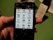
Sure, we just fed you the specs on the HTC Touch Pro on Sprint earlier today when it was officially announced, but they bear repeating: A WM6.1 slider with a 640x480 screen, EVDO, WiFi, 1340mAh battery, Opera 9.5, 512mb RAM and 288mb ROM, microSD for expansion, and a 3.2mp camera all make the Touch Pro the Touch Pro. Above, just a very quick little video of the new device.
So should you drop your $299.99 (after rebates) on October 19th? Well, we can't exactly tell you that, but we can give you our initial hands-on impressions and a photo gallery after the break.
Impressions
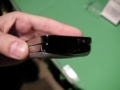
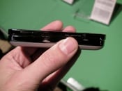
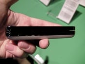
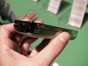
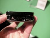
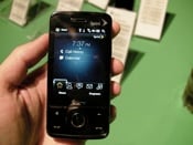
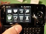
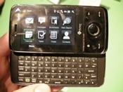
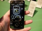
The Sprint Touch Pro is classy and professional, full stop. The back of the device has a silver, matte finish and is gently curved to improve the feel in the hand. The sides are finished with chrome and look really slick, and the front, while still a fingerprint magnet, is still fairly hot. The keyboard seems like a small step up from the Mogul in terms of tactility and usability, though I do think the keys are a tiny bit smaller. Notable: no more physical soft buttons on the front or when the device is open.
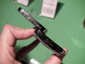
The thickness is, well, the thickness. It's thicker than I'd like by about half. The curve on the back of the device helps. However, comparing this to the Mogul is just night and day. HTC has trimmed up the width of the Touch Pro and it makes all the difference in the world. With the slider closed, the sucker feels like a phone, which is not something I've typically been able to say about WM Pro sliders with a straight face before.
Given that both the Touch Pro and the Mogul are .7“ thick, one might be tempted to say there's not enough innovation here. One ought not be -- going from 2.3” wide to 2“ wide while simultaneously adding a higher-resolution screen is feat enough and, again, I'm not fooling when I say it feels good in the hand. In the pocket, maybe not so much.
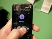
TouchFLO 3D, HTC's custom interface, is as snappy as I've ever seen it with the possible exception of the Sprint Touch Diamond I handed earlier today. It's darn good. One of my chief fears was that Sprint would muck it up like they did with the original TouchFLO and those fears have mostly been allayed. Everything is standard TouchFLO 3D here with two exceptions: they've added a Sprint TV shortcut (fine) and they've changed TouchFLO's music player to work with Sprint's instead of WMP. Now, Windows Media player on WM isn't much to begin with, so maybe it's no great loss, but Sprint's media player is worse, so that's disappointing. The good news is that you can still play the music direct through the TouchFLO Interface.
Gallery


All the latest news, reviews, and guides for Windows and Xbox diehards.

Home to the most invested and passionate Microsoft fans, Windows Central is the next generation destination for news, reviews, advice and buying recommendations on the Windows, PC and Xbox ecosystems, following all products, apps, software, AI advancements, and accessories. We've been around for more than decade, and we take our jobs seriously. Windows Central writers and editors value accuracy and editorial independence in everything we do, never receiving compensation for coverage and never pulling punches.
