What's new with the Outlook app for Windows 11
Windows 11 has a new Outlook email client, and here's a closer look at the new design.
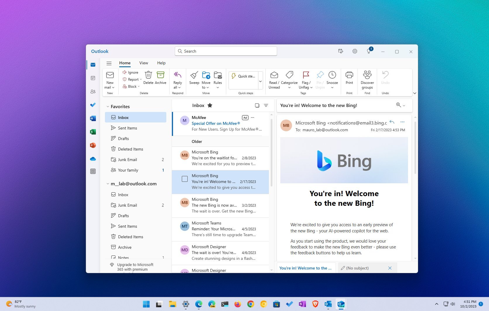
Close to the release of the Windows 11 update with Copilot, Microsoft also recently released a version of the Outlook app that introduces a new experience and functionalities.
In this new version, Microsoft's vision is to build a unified experience that combines the email client and calendar on an application that retains the familiar interface as the web version of the service to replace the legacy Mail and Calendar apps and eventually the desktop version of Outlook from the Office suite of apps on Windows 11 as well as on Windows 10.
The new Outlook app for Windows 11 is basically the web version of Outlook wrapped into a desktop application frame with support for the design language available across Windows 11 and additional features, including the ability to connect multiple accounts from various services, such as Outlook, Gmail, Yahoo, iCloud, and IMAP.
This guide dives deep into the new design changes, features, and missing components on the redesigned version of Outlook for Windows 11.
What's new with the Outlook app
If you ever logged in to the web version of Outlook, you already know how to use the new version, but here's an overview of what's new and missing.
Design changes
When comparing the legacy Mail app (originally designed for Windows 10), the new Outlook looks completely different, but not so much with the Office version of Outlook since it shares many similarities, including the command bar and left rail.
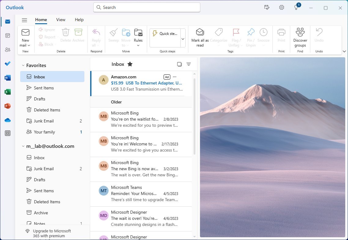
The new version of Outlook is divided into at least five parts, including the search box at the top and the command bar that you can switch to the classic ribbon view. Then, you have the left rail, the left side pane to access your email accounts, and the inbox view on the right side. Also, similar to other email experiences, you can have the reading pane on the right to view your emails.
Get the Windows Central Newsletter
All the latest news, reviews, and guides for Windows and Xbox diehards.
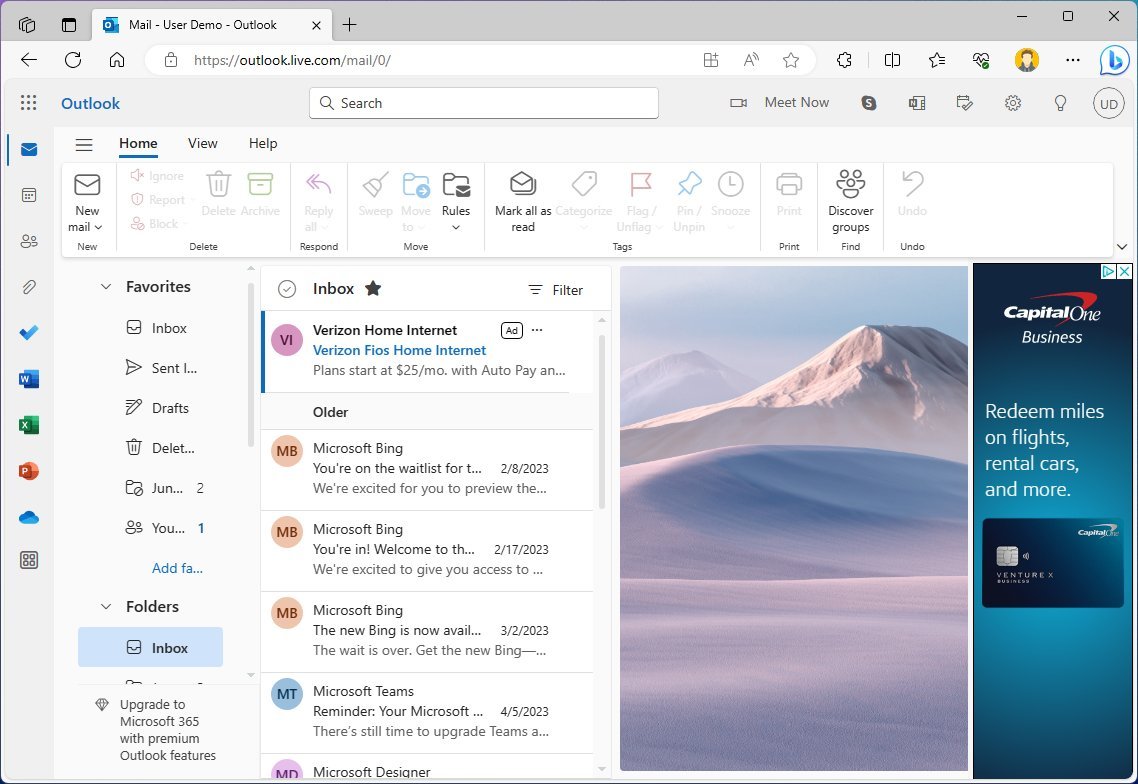
Although the app won't have an ad banner on the right side like the web experience, similar to the mobile app, you will see ads in the form of new emails at the top of the inbox.
One thing you will notice with this app is that it shares the same design language as other components of Windows 11, including the mica material that shines the background colors through a frosted effect. However, you can always change the theme to customize the appearance with different colors.
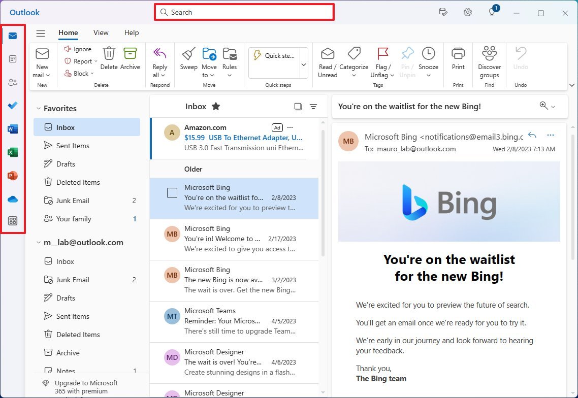
In the left rail, you will find shortcuts to access other applications, such as Calendar, Contacts, To Do, OneDrive, and others. The design problem I noticed with this design is that when invoking another app, such as Word, Excel, or PowerPoint, you're directed to the web version of the services instead of launching the desktop version of the apps when you have Office installed.
Search works as expected, and the ribbon allows you to find the command or feature you want to use quickly. However, the available features will differ depending on whether you have the free version or a Microsoft 365 subscription.
In the free version of Outlook, you get the "Home" tab with basic features like the ability to create a new email, an empty folder, access to rules, tags, and more. The new "View" tab allows you to access the different tools to change the view of the inbox, including turning on the reading pane or changing the density to roomy, cozy, and compact. And the "Help" that only includes a few links with help about the app.
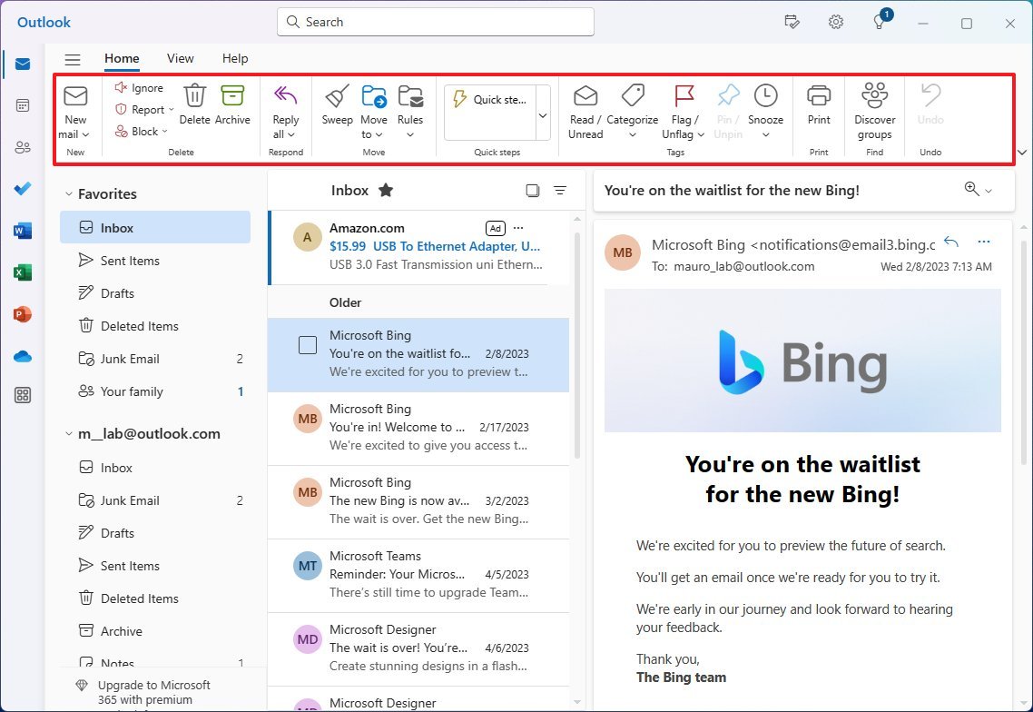
On the left pane, you will find your favorite locations and your email accounts. One aspect I miss in this version is the ability to rename the accounts with nicknames, like with the legacy Mail app.
Also, you can always use the three-line button on the top-left to collapse the left pane.
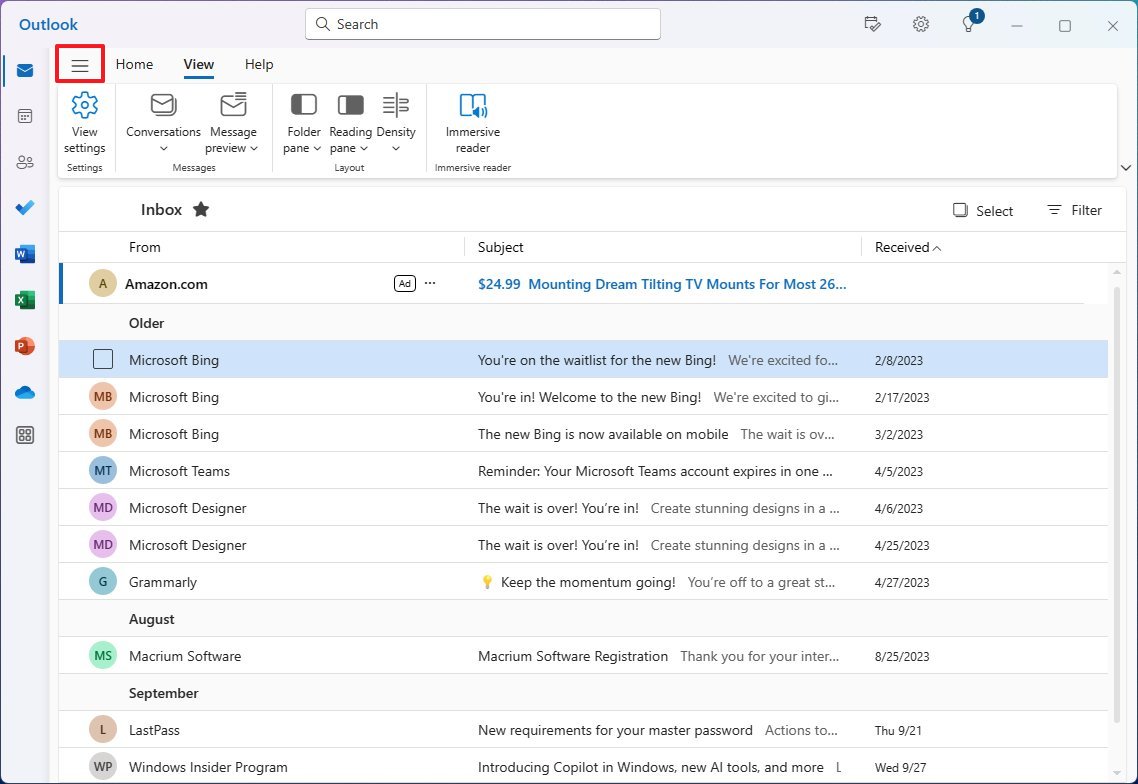
App settings
In the new Outlook app, you can access the settings with the gear button in the top-right corner.
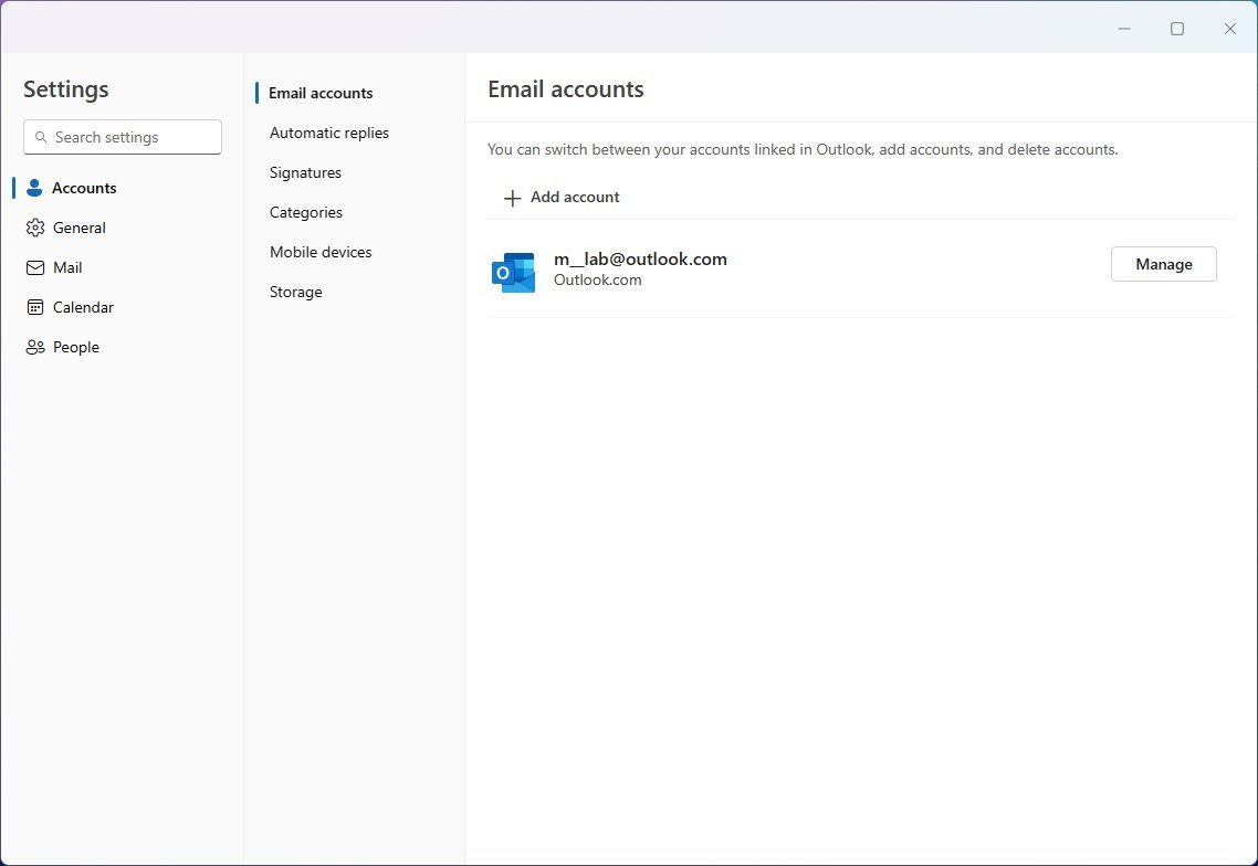
The settings are divided into five sections, including "Accounts," "General," "Mail," "Calendar," and "People."
In the "Accounts" section, you will find the option to add new accounts from different services, such as Outlook, Gmail, Yahoo, iCloud, and IMAP. Also, this is the place to manage automatic replies, signatures, categories, storage, and more.
The "General" section includes the settings to change language and time. Also, you can change the appearance with the dark or light mode. You can decide whether to enable a background image when no email is being shown, and you can choose from over 50 different themes.
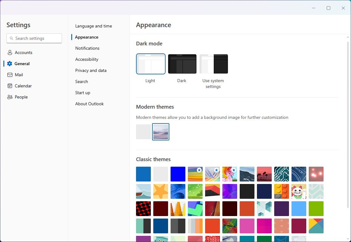
In this section, you can control the settings for notifications, accessibility, privacy, search, start-up, and more.
The "Mail" section lets you change the layout settings, including the ability to disable "Focused Inbox."
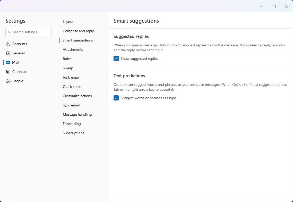
It's also possible to customize the settings for how you want to compose and reply to emails. You can control smart suggestions, which is a feature that uses AI to suggest replies and predict text.
Furthermore, this section allows you to control settings for attachments, rules, sweep, junk email, quick steps, actions, sync, handling, forwarding, and subscriptions.
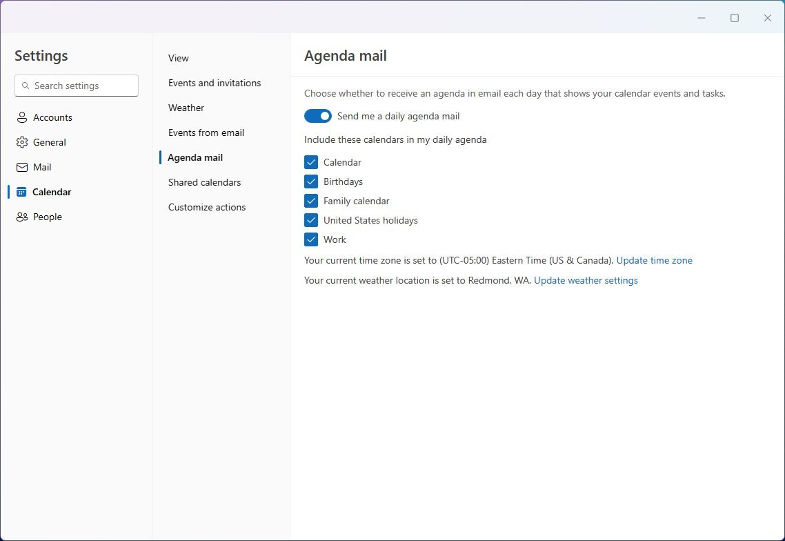
In the "Calendar" section, similar to the web version of Outlook, you will find settings to change the calendar appearance, events and invitations, weather, agenda, shared calendars, and action customizations.
Finally, in the "People" section, you can change how to display contact information in Outlook.
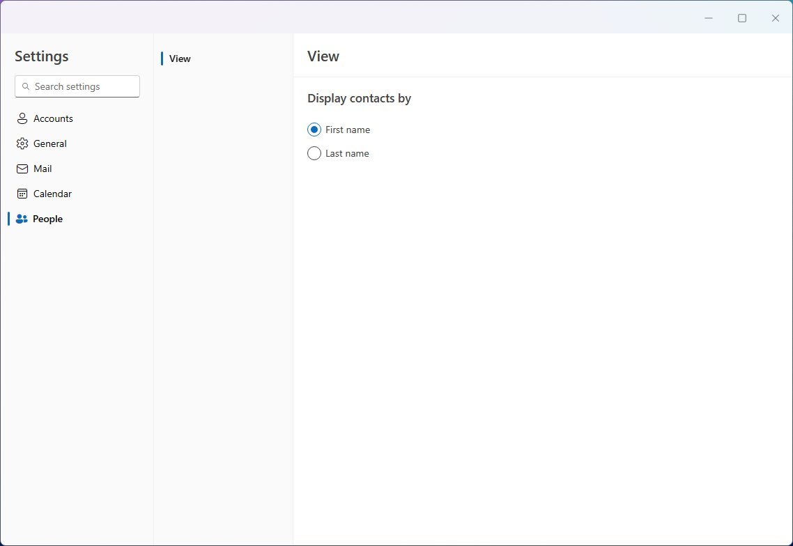
The settings for the new Outlook settings are virtually the same as the ones available in the web version of Outlook.com, with the difference of the accounts settings in the desktop version.
New features
As for the new features or the features that make the modern version of Outlook different from the web version, it is the ability to add multiple accounts.
In addition, Microsoft is adding the "Smart suggestions" feature that allows the app to suggest replies based on the content of the message you are trying to reply to, and you can always edit the message suggestion before sending it.
The "Text predictions" feature can suggest words and phrases as you compose your message to help you write impactful, clearer, mistake-free messages.
Also, if you use a Microsoft 365 Personal or Family subscription, you will be able to access AI tools through the Microsoft Editor, allowing you to write with more clarity, conciseness, and inclusive language.
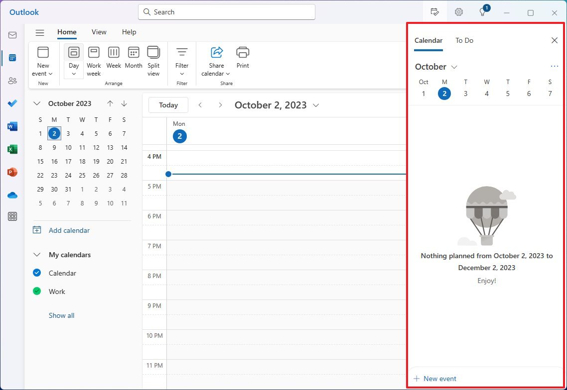
One of the key improvements with this version compared to the Mail and Calendar is the new "My Day" view option that appears in the top right and allows you to view upcoming calendar events and tasks, regardless of the place you're in the application.
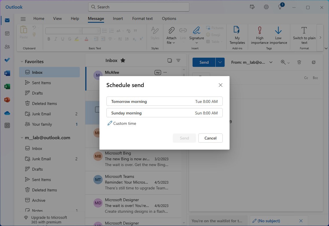
In addition, you can now pin emails to the top of the inbox, snooze or hide emails, and configure reminders for specific messages. Furthermore, you can now schedule or undo emails, and the sweep feature helps you declutter your inbox by using advanced rules for incoming emails.
As usual, the email client offers spam and malware filters, and those with a Microsoft 365 subscription can also access other security features, such as encryption.
Missing functionalities
Although the new version of the email client from Microsoft is available for everyone running Windows 11 or even Windows 10, the app experience is still missing a lot of functionalities.
For example, at the time of this writing, the new Outlook version only works with an internet connection, meaning the app doesn't include offline support.
In the calendar things of features, the new version of the app doesn't have support for ICS files. The ICS files are important for sharing calendar events with other people through emails or websites. Usually, when you receive an ICS file, you can open it to add the event automatically to your calendar.
Also, although you can change the color scheme of the new Outlook for Windows 11 through the settings and choose whether to show a background image, you can only use the default image since it's not possible to choose a custom background image.
It's important to note that missing features, such as offline support and ICS files, are expected to arrive sometime in October 2023, and other features (such as Copilot and additional AI functionalities) in future updates.
The new Outlook for Windows 11 is available now, and you can switch from the legacy Mail and Calendar apps or the classic desktop version of Outlook by clicking the "Try the new Outlook" toggle switch from the top-right corner.
Although the system provides a mechanism to transfer your configuration and messages to the new application, you may still need to reconfigure some settings, including signing in again to your accounts.
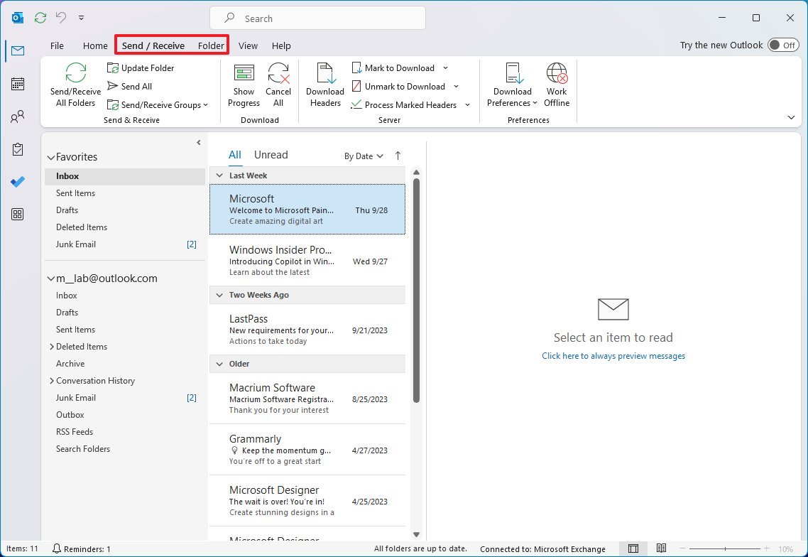
Also, if you're switching from the classic version, you will notice some additional features missing, including the "Send / Receive" and "Folder" options among other features.
More resources
For more helpful articles, coverage, and answers to common questions about Windows 10 and Windows 11, visit the following resources:
Mauro Huculak has been a Windows How-To Expert contributor for WindowsCentral.com for nearly a decade and has over 15 years of experience writing comprehensive guides. He also has an IT background and has achieved different professional certifications from Microsoft, Cisco, VMware, and CompTIA. He has been recognized as a Microsoft MVP for many years.
-
Padaung I've downloaded the Outlook app and like what I'm finding so far. However, the ads masquerading as emails keep appearing at the top of my inbox and I'm finding this really annoying.Reply
What's even more annoying is that I have a current Microsoft 365 subscription, but when I click on 'Go ad free' it takes me to a 'Buy now' webpage for Microsoft 365 but there is no option to tell it to login to my existing account/subscription.
In addition to this, the rest of my MS apps are all happily logged into my account (OneDrive, Word, Excel, etc.), so why doesn't Outlook know about my subscription? Very frustrating indeed.
If anyone at Windows Central can find a solution to this I would be very grateful. I've searched and so far not found a solution. -
Painfully_Candid Hard pass. I absolutely hate Outlook. The Mail app has all the features I need and none of the ones I don't. I use mostly touch devices, and Outlook is both ugly and user-spiteful when it comes to touch devices. Microsoft can take Outlook and shove it in a bin.Reply -
Jeffery L So I have been using Outlook for Windows for about two weeks. My main complaint is that it is SLOW; particularly when the app opens. Mail and Calendar app took sub-second to open. Outlook for Windows can take up to 10 seconds to open. I removed Mail and Calendar app, which now in Windows 10, I lost the agenda in the Taskbar > calendar. Also, Mail and Calendar would allow you to scroll the month view. Month view would also open with the current week on top. This is a critical feature; particularly when it gets near the end of the month and you want to see events on your calendar in the next few weeks. With Outlook for Windows, the month view aligns only to a single month at a time; like a paper calendar. You have to switch back and forth between months to see what is coming up. This takes more cognitive load. Microsoft should know better.Reply -
paulw3 Where do I find the latest version of this new Outlook. The one I have installed was from the MS Store which is dated 6/11/2022 . I can't seem to find a way to update it as the MS Store says it's installed.Reply

